17 Colors To Never Pair With Blue, According To Interior Designers
This post contains affiliate links, which means that I make a small commission off items you purchase at no additional cost to you. Please read my policy page for more information.
Blue may be the color of calm seas and clear skies, but pair it with the wrong shade and your design dreams can sink fast!While blue plays well with many colors, not every combo is a match made in hue heaven.
Think of this as your design no-fly list, a cheat sheet of clashing culprits that could leave your space feeling more “style SOS” than “coastal chic.” So, steer clear of those decor disasters and keep your space looking effortlessly curated.
Trust me, when it comes to color chemistry, a little insider know-how makes all the difference.
1. Muddy Brown
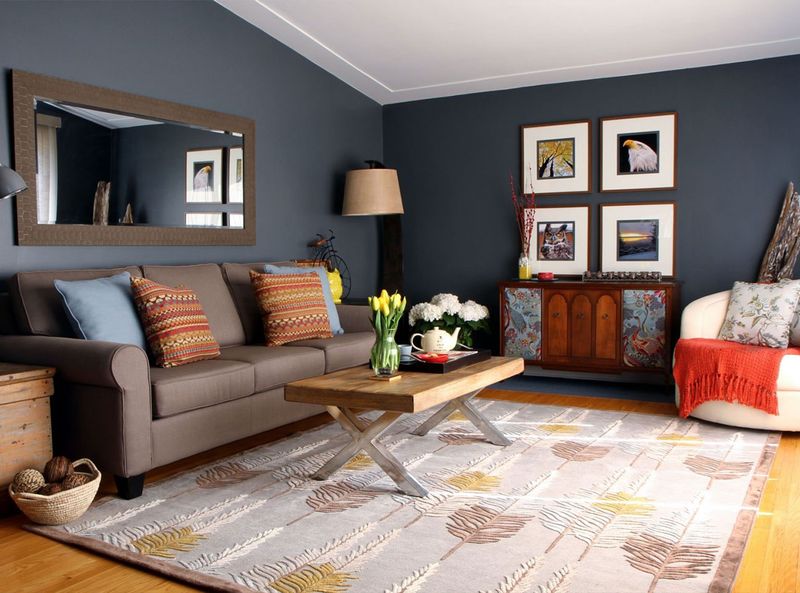
Whenever I see blue paired with muddy brown, I feel like I’m staring at a sad puddle after rainfall. The combination lacks vitality and creates a depressing atmosphere that sucks energy from a room.
Though brown can work with certain blues in specific contexts, this particular murky shade makes spaces feel dated and dreary.
Trust me, your living room deserves better than looking like an abandoned 1970s basement.
2. Neon Green
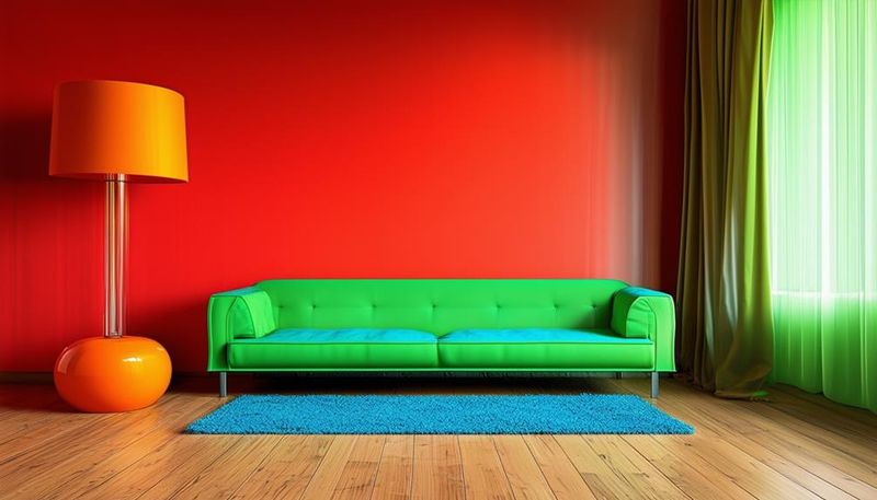
If you want your room to scream “I decorated during a power outage,” then by all means, pair blue with neon green. This eye-searing combination creates visual vibration that’s actually painful to look at for extended periods.
While blue and green are neighbors on the color wheel, this particular green lacks sophistication. Your home should be a sanctuary, not a laser tag arena.
Unless you’re designing a teenager’s gaming room, steer clear of this headache-inducing duo.
3. Salmon Pink
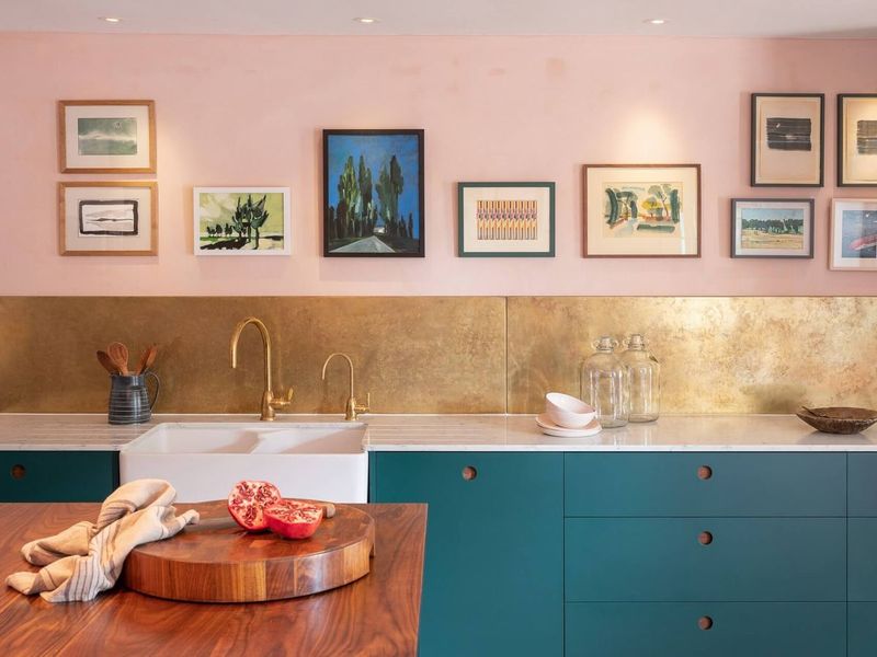
However trendy salmon pink might be on its own, pairing it with blue creates a childish combo that screams “gender reveal party gone wrong.” The resulting aesthetic feels uncomfortably like a baby nursery regardless of the room’s purpose.
I once had a client insist on this pairing for their formal dining room. Six months later, they called begging for a redesign.
Some color combinations simply can’t be elevated, no matter how expensive your furniture is.
4. Burgundy
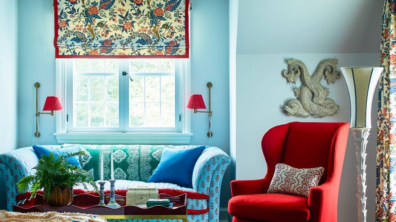
Though burgundy works beautifully with many colors, it creates a stodgy, overly traditional look when paired with blue. The combination instantly ages a room by about 30 years and evokes memories of outdated hotel lobbies.
If you’re under 80 and not decorating a historical recreation, avoid this pairing. I’ve seen it in countless aging bed and breakfasts across New England.
Unless your design goal is “dusty academic who hasn’t redecorated since the Reagan administration,” look elsewhere.
5. Mustard Yellow
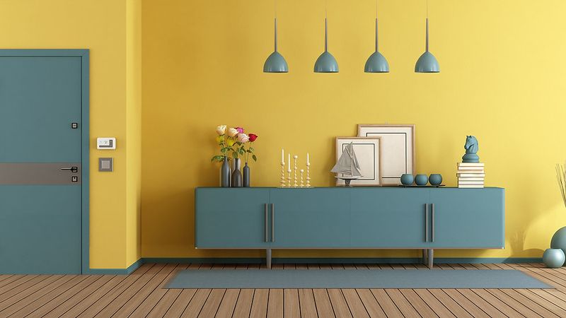
If your goal is to create a room that induces mild nausea, mustard yellow and blue is your ticket. This combination has a peculiar way of creating visual tension that makes spaces feel unstable and slightly sickening.
While yellow can complement blue beautifully, this particular muddy tone fights against blue’s natural serenity. I once walked into a client’s mustard and blue kitchen and immediately felt like I was on a rocking boat.
Save yourself the queasiness and choose a cleaner yellow if you must.
6. Burnt Orange
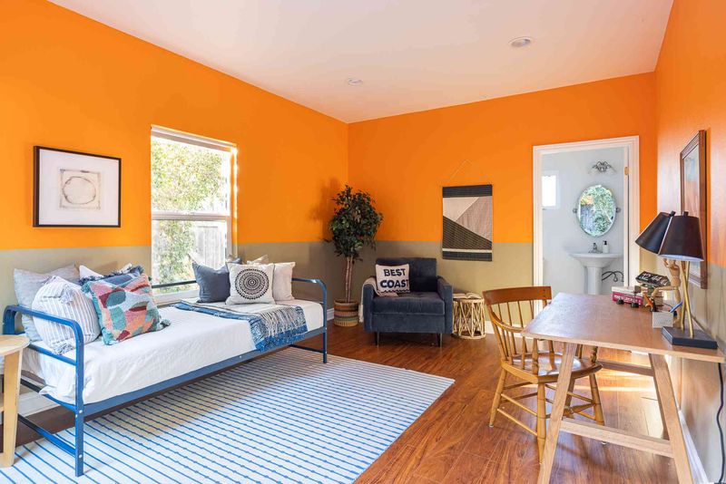
Burnt orange and blue create what I call the perpetual sunset syndrome, a room that feels like it’s stuck in that uncomfortable moment when day transitions to night. The result is neither cozy nor refreshing.
Though opposites on the color wheel should theoretically work well, this particular combination doesn’t quite deliver. Instead of balance, it creates a visual heaviness that can make a space feel smaller and more confined.
If you want your room to feel like a claustrophobic 1970s den where someone might offer you a questionable cigarette, go for it.
7. Forest Green
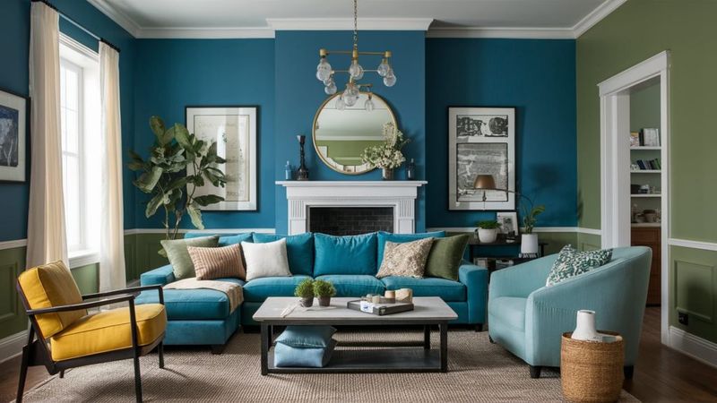
Forest green and blue may look stunning in nature, but indoors they often clash in unexpected ways. Instead of feeling serene, the combo can come off as forced, like nature-themed decor that’s trying a little too hard.
While both colors are found in nature, they compete for dominance indoors. Your home will feel like an underwater forest, conceptually interesting but practically disorienting.
I’ve seen this mistake in countless cabins where owners mistakenly believe that natural colors automatically work together.
8. Lavender
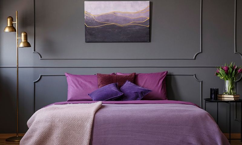
Ever walk into a room and instantly feel a chill, without the thermostat budging? That might be the power of color at play.
Blue and lavender, while both cool tones, can double down on each other’s iciness, creating a space that feels more clinical than cozy. Instead of striking a calming balance, they amplify the chill, leaving rooms feeling distant and unwelcoming.
Your home should wrap you in comfort, not make you wonder where you left your sweater.
9. Brick Red
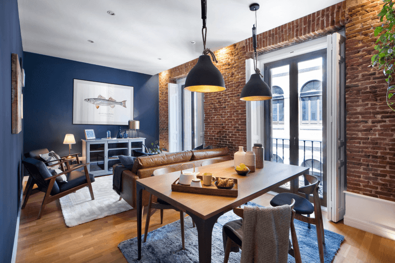
When colors start shouting, the room ends up with a serious case of color clash chaos. It’s like two loud voices competing for attention, leaving no room for harmony or balance.
This is exactly what happens when blue pairs with a bold, fiery red, they both demand the spotlight, refusing to play the supporting role. The result? Visual tension that’s anything but calming.
I once spotted this combo in a library meant to feel scholarly but instead looked like a patriotic parade gone wild. Unless you’re decking the halls for the 4th of July, this pairing misses the mark on the sophisticated vibe your home deserves.
10. Pastel Yellow
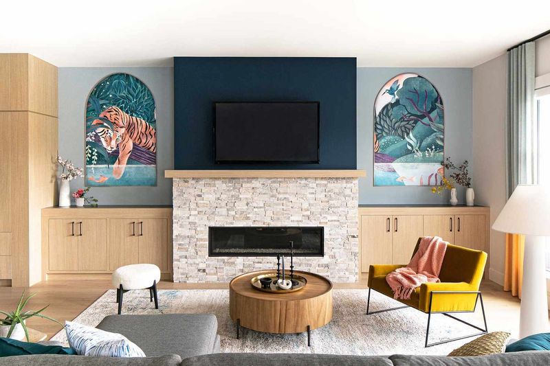
This pairing slips straight into what I like to call the “nursery effect.” Even with sleek furniture and upscale decor, it still screams playroom. It’s been typecast in children’s spaces for so long that shaking that vibe is nearly impossible.
If your design goal isn’t “expecting a bundle of joy,” avoid this pairing. I’ve had numerous clients insist this combination could work in adult spaces, only to admit defeat once they saw the finished room.
11. Tangerine
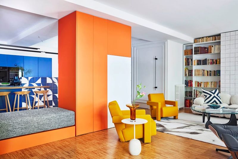
When bold colors compete for attention, your eyes don’t know where to land, retinal rivalry. A vivid orange clashing with intense blue can make a room feel chaotic and visually exhausting.
Although color theory suggests complementary hues should harmonize, this particular shade of orange is just too aggressive against blue.
This combination has even been known to cause headaches, with some people finding the intense contrast overwhelming enough to make them rethink their color choices within just a couple of weeks.
12. Olive Green
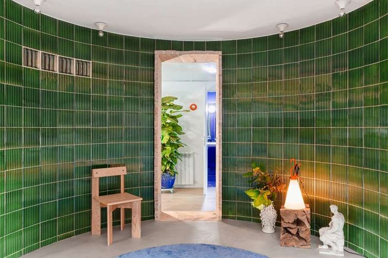
When certain colors come together, they can unintentionally evoke a very specific, and often unwelcome, vibe. This particular pairing tends to lean heavily into a utilitarian, institutional feel, conjuring images of government offices, school cafeterias, or even military surplus.
While both colors individually have earthy, grounded qualities, together they lack the warmth and personality that make a space feel truly inviting. Instead of creating a cozy, personal atmosphere, the combination can make rooms feel cold and impersonal.
So ask yourself, does this design choice create a space that truly feels welcoming and comforting, or is it steering you off course?
13. Hot Pink
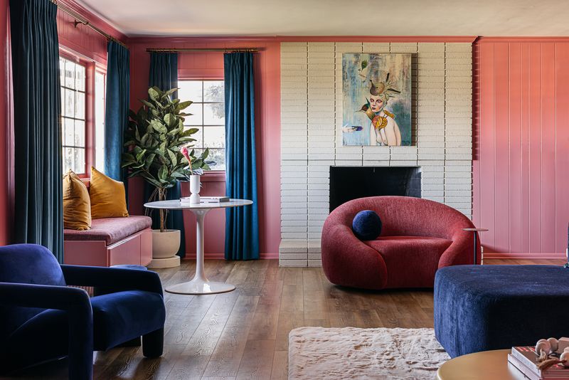
This shade of pink and blue together create perpetual gender reveal syndrome, a space that never evolves beyond its binary color coding. This combination feels simultaneously juvenile and dated, like a 1980s mall that never got renovated.
Though pink can work beautifully with certain blues, this particular shocking shade creates a visual tension that’s hard to resolve.
I once had clients who insisted this combination would be fun and energetic for their living room. Six months later, they admitted it felt like living inside a teenager’s bubblegum-popping fantasy.
14. Terracotta
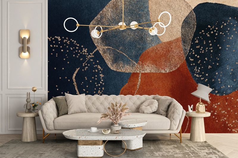
Mixing these two hues can send your space on a confused vacation, halfway between sun-soaked Mediterranean shores and dusty Southwestern deserts. It’s like your room booked a one-way ticket to “Geographic Confusion,” leaving visitors wondering if they’ve stumbled into a travel agency with too many brochures.
While each color shines on its own, together they clash like two tour guides arguing over the itinerary, pulling the design in opposite directions.
When your color scheme leaves guests asking, “So, what’s the theme here?” it’s safe to say the décor missed its destination. Sometimes, less wandering leads to a more focused and welcoming space.
15. Bubblegum Pink
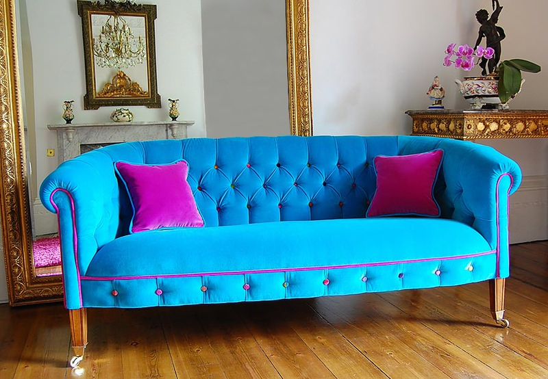
Pairing a sugary sweet shade with blue often results in what feels like a permanent throwback to childhood, a room stuck in eternal adolescence, no matter how grown-up the furniture might be. This combo has been so heavily used in kids’ rooms that it’s hard to shake the playful, youthful vibe it carries.
While blue and pink can work beautifully in the right shades, this overly sweet version tends to create a juvenile atmosphere.
A space like this can make it tough to be taken seriously, especially in professional settings. Your room should reflect who you are now, not your 12-year-old self’s dream bedroom.
16. Golden Yellow
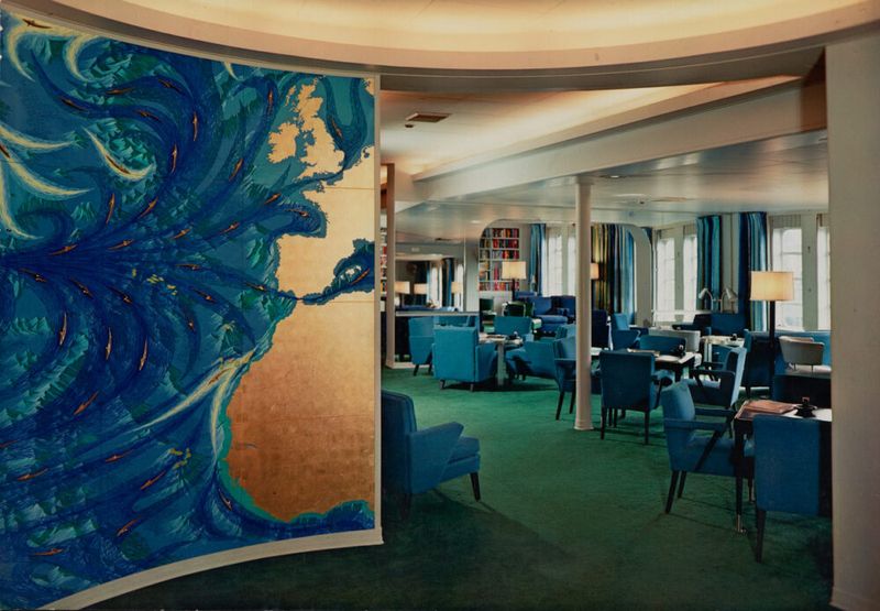
Have you ever stepped into a room and instantly felt like you were back in a school hallway or exam room? That’s the risk when certain color combos evoke too much of an institutional vibe.
While contrasting colors can definitely add energy and interest, this particular pairing is so strongly associated with schools and universities that it can make a space feel more public than personal.
If you’re aiming for a cheerful, inviting home, does it really make sense to recreate the “welcome to orientation” atmosphere? Unless you’re actually decorating a classroom, this combo might be better left out of your sanctuary. What kind of vibe do you want your home to send?
17. Coral
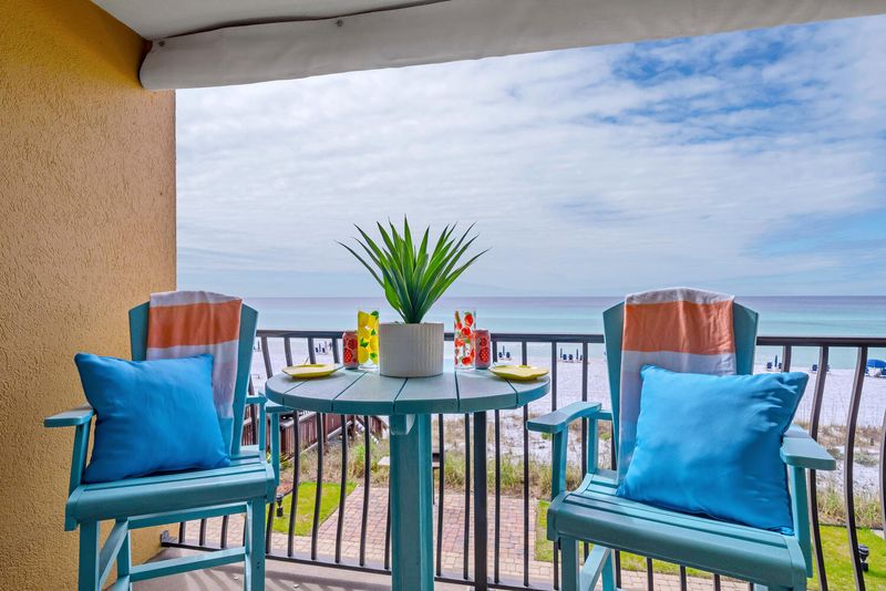
Pairing these vibrant hues often results in a space that feels like it’s perpetually set for vacation, a tropical resort vibe that can overwhelm rather than soothe. While the colors naturally evoke images of sun, sea, and sand, together they risk turning a home into a themed getaway rather than a place of true comfort.
The combination’s bright, lively energy can feel less like a personal retreat and more like a backdrop for a postcard, making it hard to fully unwind.
Without careful balance, what starts as a cheerful coastal reference can quickly become visually exhausting. And leaving the room feeling more like a rented beach house than a restful sanctuary.
