These Are The 22 Things Designers Say You Should Never Put In A Small Living Room
This post contains affiliate links, which means that I make a small commission off items you purchase at no additional cost to you. Please read my policy page for more information.
Navigating the design waters of a small living room can feel like trying to fit an elephant into a Mini Cooper. It just isn’t happening!
Trust me, as someone who’s spent years helping clients maximize their compact spaces, I’ve seen it all… The good, the bad, and the downright claustrophobic.
I’ll help you transform your snug living area from cramped to cozy! Let’s explore what professional designers (like yours truly) beg you to keep out of your petite parlor.
1. Oversized Sectionals That Swallow The Room
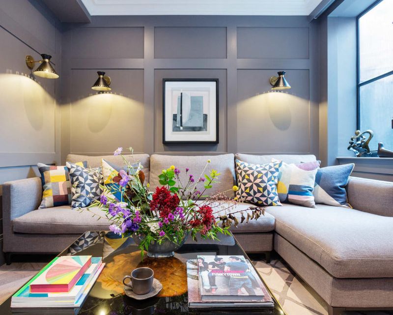
Nothing murders a small living room faster than a mammoth sectional sofa. While you might dream of sprawling out like a starfish, your room simply can’t breathe with that seven-seater behemoth hogging all the square footage.
If comfort’s your goal, consider a loveseat paired with an accent chair instead. This combo offers flexibility while maintaining proper circulation paths.
Your guests shouldn’t need a treasure map to navigate from the door to their seat!
2. Bulky Coffee Tables That Create Obstacle Courses
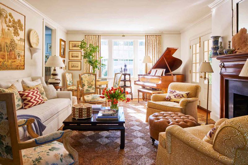
Whenever clients show me their massive coffee tables in tiny living rooms, I mentally prepare for an intervention. Those chunky wooden squares might display your collection of art books beautifully, but they’re spatial vampires.
Opt for something with a glass top or an airy base that allows your eye to travel through it. Nesting tables are my secret weapon, pull them out when needed, tuck them away when not.
Your shins will thank you for not creating an indoor obstacle course!
3. Dark, Heavy Drapes That Suffocate Windows
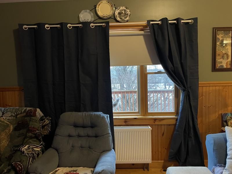
Heavy velvet drapes might work in a palace, but in your pint-sized living room? They’re like putting a winter coat on during summer, unnecessarily stifling. Those thick, dark curtains gobble up precious light and visually shrink your space.
Light, sheer fabrics are your friends here. They filter sunlight beautifully while maintaining privacy without the visual weight.
If you need blackout options, install them behind lighter panels or consider sleek blinds that disappear when not in use.
4. Too Many Accent Pillows Creating A Cushion Mountain
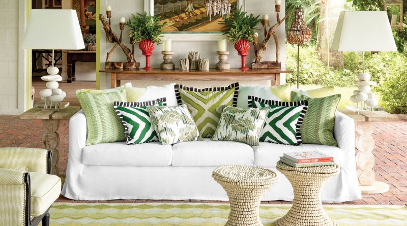
Though I adore a good pillow moment, your sofa shouldn’t look like it’s preparing for a cushion avalanche. In small spaces, those seventeen decorative pillows aren’t charming, they’re clutter with stuffing.
Stick to 2-3 well-chosen pillows that complement your design. Quality over quantity is the mantra here.
Remember, your guests need somewhere to actually sit without conducting a pillow removal ceremony first!
5. Floor Lamps With Gigantic Shades
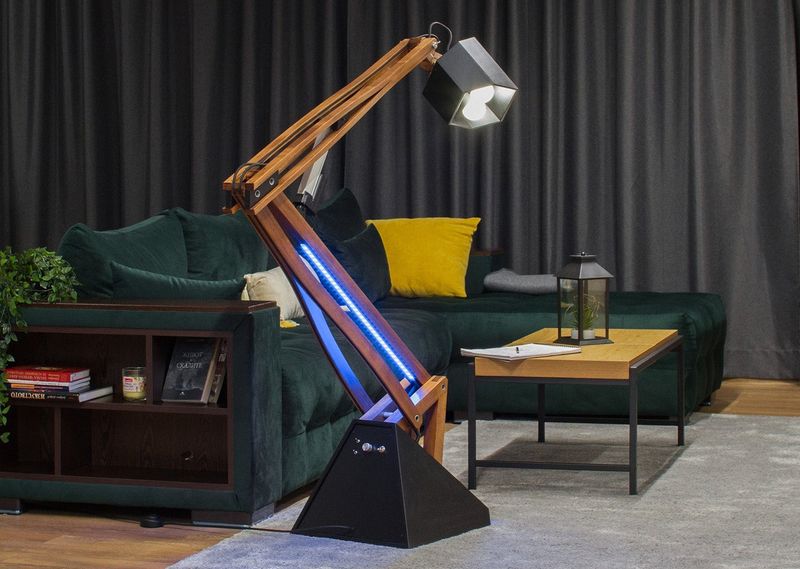
Giant mushroom-like floor lamps might look fantastic in showrooms. However, in your modest living area, they’re like putting a sombrero on a chihuahua, comically disproportionate.
These lighting fixtures with dinner-plate-sized shades consume precious floor space and create visual clutter.
Wall sconces or slim-profile task lighting offer illumination without the spatial commitment. Pendant lights can be another brilliant solution, drawing the eye upward.
Your lighting should complement your space, not compete with your furniture for territory!
6. Excessive Knickknacks Creating Visual Noise

Your collection of souvenir snowglobes might spark joy, but displaying all fifty in your compact living room creates visual chaos that would make Marie Kondo weep. Small spaces amplify clutter exponentially.
Instead, rotate your treasures seasonally, keeping only a select few out at once. Consider floating shelves to display items without consuming surface area.
A space should feel like a carefully curated gallery, not the storage room of a gift shop!
7. Massive Entertainment Centers That Dominate Walls
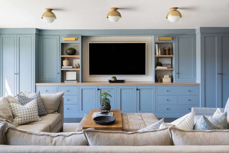
Those entertainment centers that could comfortably house a family of four? Absolute space-killers in petite living rooms. When your TV cabinet is deeper than your sofa, we’ve got problems.
Wall-mounted TVs with floating shelves underneath create the same functionality without the bulk. If storage is crucial, look for slimmer profiles with closed cabinets to hide visual clutter.
Your living room shouldn’t feel like it’s being held hostage by a furniture warehouse reject!
8. Rugs That Are Incorrectly Sized
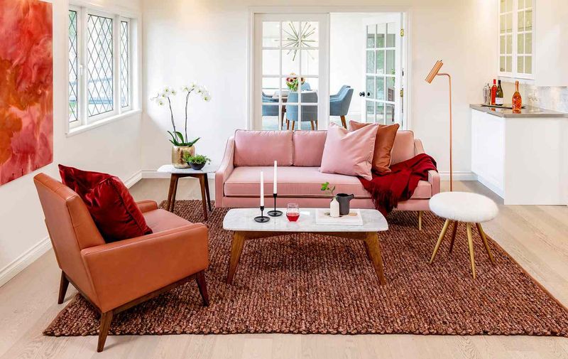
If your rug looks like a postage stamp under your coffee table or stops awkwardly mid-room, we need to talk. Undersized rugs create visual confusion and actually make your space feel smaller, not larger.
The right rug should allow at least the front legs of all seating pieces to rest on it. This creates a cohesive conversation area that feels intentional.
Conversely, a rug that’s wall-to-wall looks like failed carpeting. Aim for that Goldilocks zone, just right!
9. Tall Bookcases That Loom Overhead
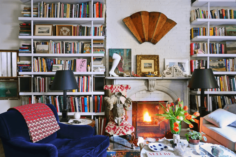
Though I’m a certified bibliophile, those towering 8-foot bookcases make small rooms feel like you’re at the bottom of a well looking up. They create oppressive vertical weight that visually pushes down on the space.
Lower, horizontal bookcases create storage without the looming presence. If vertical storage is necessary, consider units that taper or have an open back.
A living room shouldn’t feel like browsing the restricted section of the Hogwarts library!
10. Bulky Recliners That Transform Into Space Hogs
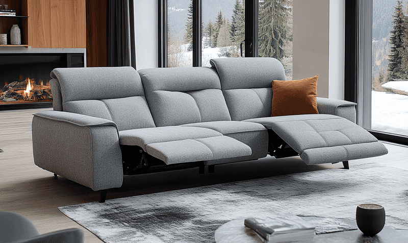
That oversized leather recliner might be your throne of comfort, but when extended, it practically touches the opposite wall in a small living room. These furniture pieces are deceptive space-consumers that transform into room-dominators with one lever pull.
If reclining is non-negotiable, look into wall-hugger models that need less clearance. Better yet, consider a sleek chair with a matching ottoman that can double as extra seating.
Should relaxation come at the cost of everyone else’s comfort and mobility? Definitely not!
11. Mismatched Furniture Collections Creating Visual Chaos
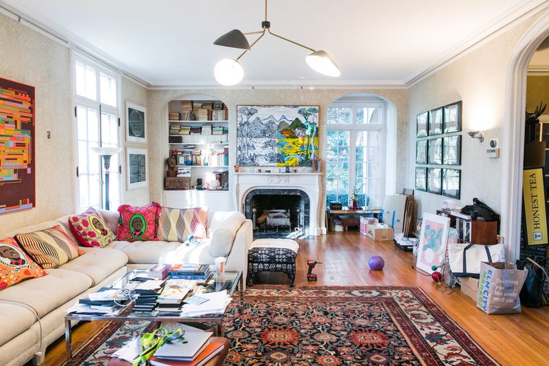
While I’m all for eclectic design, your small living room isn’t the place to showcase every furniture style from Victorian to Mid-Century Modern. Visual coherence becomes exponentially important as square footage decreases.
Stick to pieces with similar visual weight and complementary lines. If mixing styles, maintain consistency in either color palette or scale.
A living room should tell one cohesive design story, not an anthology of furniture eras clashing like a bad sequel! Keep it smooth, don’t let the decor time-travel and cause a space-time continuum crisis!
12. Wall-To-Wall Furniture Without Breathing Room
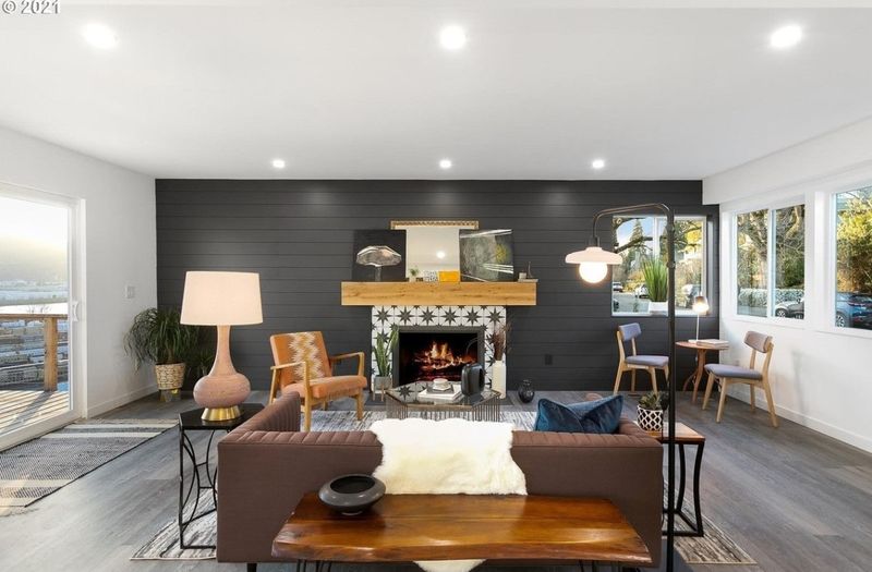
Shoving furniture against every available wall doesn’t maximize space, it creates a doctor’s waiting room vibe. Those precious few inches between pieces and walls matter tremendously in spatial perception.
Allow some furniture to float away from walls, creating conversation areas. Even a few inches of space around select pieces can make a room feel intentionally designed rather than desperately crammed.
Does your living room get enough fresh air? It deserves to breathe, so why not give it some space to stretch and shine?
13. Overly Ornate Picture Frames Creating Visual Weight
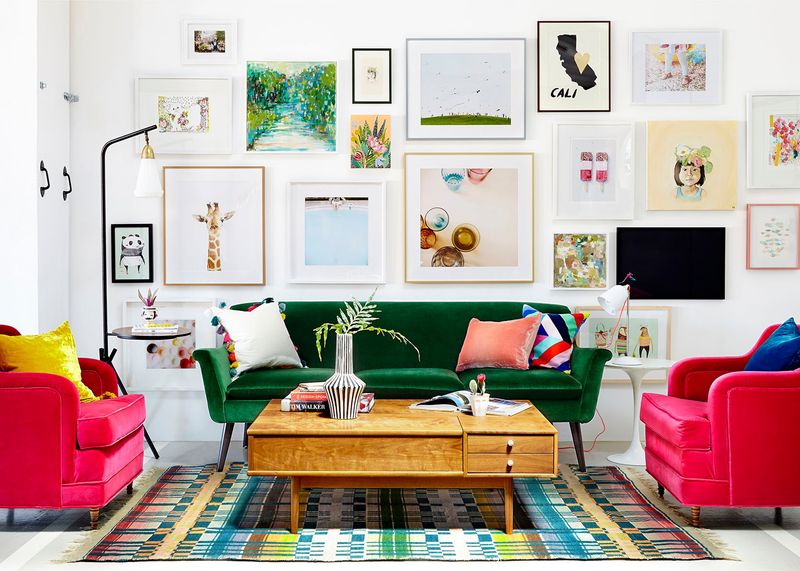
Those chunky, gilded frames might look magnificent in Versailles, but in your compact living area, they’re visual anchors dragging down your design. Heavy, ornate frames draw attention to themselves rather than your art.
Slim, simple frames in lighter finishes allow your walls to breathe while still showcasing your treasured pieces. Consider a gallery wall with consistent framing to create impact without heaviness.
In the end, your art should be the star, not upstaged by frames that look like they’re auditioning for a baroque opera!
14. Massive Potted Plants That Create Jungles
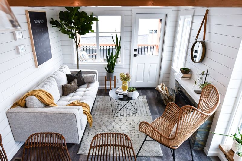
Though plants bring life and charm, that towering fiddle leaf fig crowding your ceiling is more like a leafy roommate hogging valuable space. Oversized greenery can quickly shift from accent to obstacle in tight quarters.
Opt for smaller plants or hanging varieties that draw the eye upward without eating up floor space. Wall-mounted planters are a smart way to add fresh vibes without the footprint.
Ultimately, the aim is to welcome nature’s charm, not to let it take over the whole room!
15. Dark Paint Colors That Shrink Visual Space
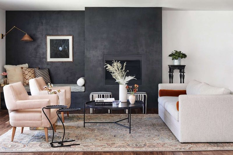
That moody charcoal paint might look sophisticated on Pinterest, but in your compact living room, it’s like wearing a black bodysuit in a cave, you disappear into the shadows. Dark colors advance visually, making walls feel closer than they actually are.
Lighter hues reflect light and create an airy feeling that expands space. If you crave drama, consider a single accent wall or bring in darker colors through accessories.
16. Chunky Media Consoles With Unused Features
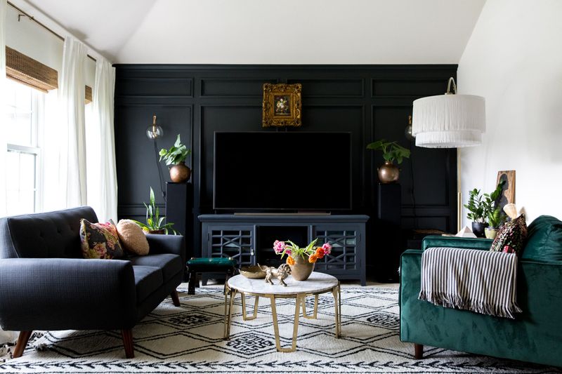
Entertainment units with built-in fireplaces, wine racks, and what might double as spaceship landing gear? That’s a lot of drama for a modest space!
Multi-function sounds great until every feature demands its own slice of real estate, talk about a space hog!
Keep it sleek with media solutions that actually fit your lifestyle. If streaming’s your jam, why hold onto a DVD graveyard? Your media console should support the show, not steal the spotlight in a cramped room!
17. Unnecessary End Tables Cluttering Traffic Flow
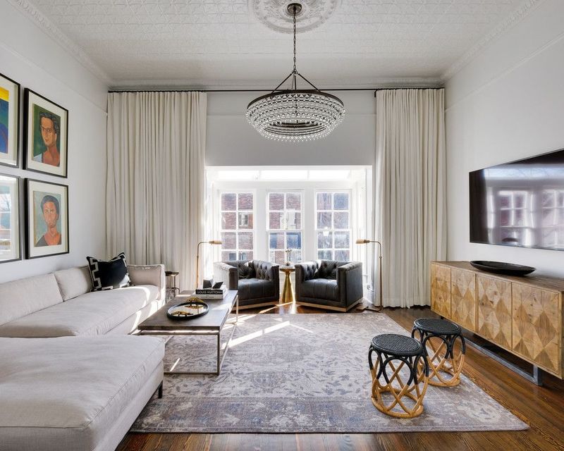
End tables reproduce like rabbits in small living rooms, suddenly you’ve got one by every seat, creating an obstacle course of wooden surfaces. While function matters, not every seating spot requires its own personal table.
Consider C-tables that tuck under sofas or nesting tables that can be deployed as needed. Floating shelves near seating can provide surface area without floor footprint.
Guests shouldn’t have to train for an obstacle course just to make it from the door to the sofa!
18. Ceiling Fans With Elaborate Light Fixtures
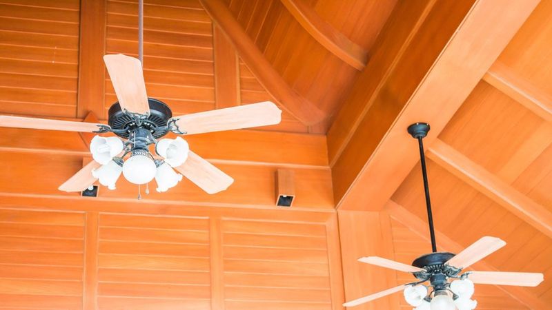
Ceiling fans with five wild light arms pointing every which way? It’s like your ceiling’s having a midlife crisis and can’t decide if it wants to be a fan or a chandelier.
Spoiler alert: it’s just confusing and shrinking your space. In a small room, that busy overhead clutter drags your ceiling down faster than a lead balloon. Instead, opt for sleek, minimalist fans that blend right in, think ninja-level stealth rather than disco diva.
Even bladeless fans are a smart move, giving you the breeze without the visual chaos. Remember, your ceiling should be a place to rest your eyes, not the site of a design identity crisis!
19. Thick, Chunky Curtain Rods That Dominate Windows
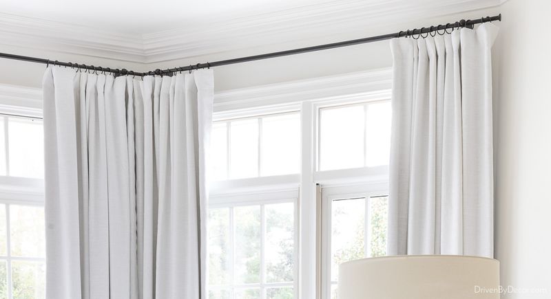
Curtain rods that look like they survived a medieval jousting match? They bring way too much visual armor to a cozy living room battle.
Bulky hardware piles on the weight just where you want things light and airy. Instead, choose slim, streamlined rods that blend into the wall like a stealthy ninja.
For the ultimate disappearing act, ceiling-mounted tracks let your drapes glide without stealing the spotlight. Window treatments should highlight the view, not stage a hardware showdown!
20. Furniture With Exposed Legs That Create Visual Clutter
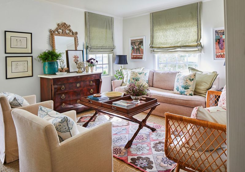
While conventional wisdom suggests visible legs create openness, having fifteen different furniture legs in view creates a forest of wooden sticks in a small room. This visual busyness at floor level can actually make a space feel more cluttered.
Mix pieces with visible legs with those that have skirts or solid bases. Consider furniture with similar leg styles to create cohesion.
From experience, I’ve seen how too many mismatched legs can turn a chic living room into a visual jungle. It’s definitely not the vibe anyone wants!
21. Oversized Art That Overwhelms Wall Space
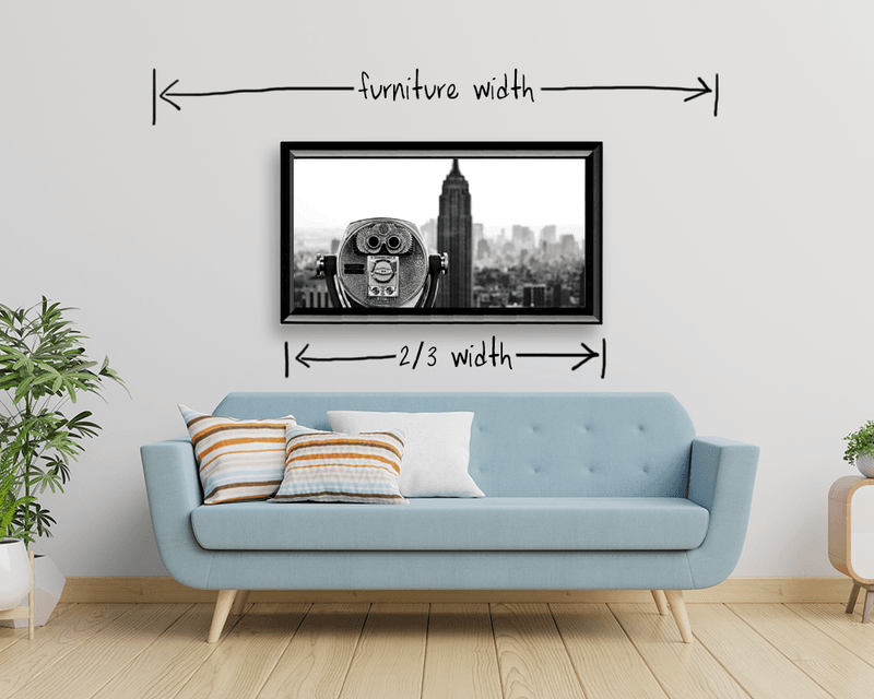
Though statement art can be magnificent, that canvas larger than your sofa creates uncomfortable proportions in modest rooms. Artwork should complement your space, not dominate it like a billboard in a phone booth.
Consider a gallery of smaller pieces that collectively create impact. If large-scale art speaks to you, ensure it’s proportional to your wall dimensions.
Choose the art that will enhance your room’s personality, not shout over it like an overeager karaoke performer.
22. Ornate Mirrors That Weigh Down Walls
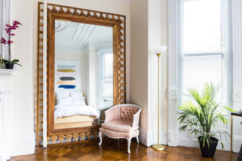
Mirrors are magical space-expanders, but those heavily carved, gilt-framed monsters do your small room no favors. They add visual weight precisely where you need visual lightness and often reflect more frame than space.
Frameless mirrors or those with slim, simple frames maximize reflective surface while minimizing visual bulk. Consider unusual shapes that add interest without heaviness.
The right mirror lets your room breathe and sparkle without stealing the spotlight.
