7 Common Decorating Mistakes And How To Avoid Them
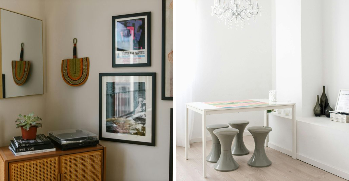
Have you ever looked at a room and felt like something just wasn’t quite right, but couldn’t put your finger on it? Decorating can be tricky, small choices can make a big impact, sometimes in ways you don’t expect.
Knowing the common pitfalls helps you create a space that looks great and feels comfortable. Are you willing to learn the most common decorating mistakes many people make and practical tips to avoid them?
Let’s start! A small note, decorating preferences are personal, and results may vary depending on individual style and space.
1. Supersized Furniture Syndrome
How many times have I entered a living room where the sofa practically swallows the space whole? Furniture proportions can make or break your room’s functionality and flow.
The supersized sectional might look amazing in the showroom, but measure your space before bringing home that behemoth. Leave at least 30 inches for walkways and consider the visual weight of pieces.
Conversely, tiny furniture floating in large rooms creates disconnected, uncomfortable spaces. Aim for the Goldilocks zone, not too big, not too small, but just right for your specific room dimensions.
2. The Single Bulb Blunder
Where did this idea come from that one ceiling light could adequately illuminate an entire room? Proper lighting requires layers, ambient, task, and accent, working together like a well-orchestrated symphony.
Without adequate lighting layers, rooms feel flat and uninviting. Your beautiful decor disappears into shadows after sunset! Add table lamps for cozy corners, pendants over work areas, and wall sconces for dimension.
Though it requires more planning, layered lighting creates depth, highlights architectural features, and allows you to adjust the mood with the flip of a switch. Your space deserves this thoughtful illumination.
3. Matchy-Matchy Madness
If I had a dollar for every matching furniture set I’ve had to break up! That 1990s trend of identical patterns, colors, and textures creates rooms that feel like furniture showrooms rather than lived-in homes.
Matching everything strips away personality and creates visual boredom. Instead, select complementary pieces that share a common element, similar wood tones, complementary colors, or related styles.
This doesn’t mean embracing chaos! Curate a cohesive look through thoughtful mixing. Your grandmother’s antique side table can absolutely live harmoniously with your modern sofa when united by color, texture, or purpose.
4. Tchotchke Overload Territory
Did you know there’s actually a psychological reason why cluttered spaces make us feel anxious? When every surface holds collections, souvenirs, and knickknacks, your eye has nowhere to rest, creating visual tension.
Accessories should punctuate your space, not dominate it. Edit ruthlessly, keeping only pieces that have meaning or serve a purpose. Group similar items together rather than scattering them throughout the room.
If everything is special, nothing is special. Create breathing room between objects, allowing important pieces to shine. This doesn’t mean embracing minimalism, just being intentional about what deserves display space in your carefully designed home.
5. Color Chaos Catastrophe
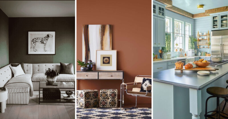
When colors clash or compete throughout your home, the result feels jarring rather than joyful. A cohesive color palette creates flow and harmony, even between rooms with different functions and moods.
The solution isn’t choosing one boring color for everything. Start with a neutral base, then add 2-3 complementary colors that repeat throughout your space in varying intensities. Pull colors from existing elements like artwork or textiles you love.
This approach creates a visual thread that ties spaces together while allowing for personality in each room. Colors should transition logically as you move through your home, creating a sense of intentional design rather than disconnected spaces.
6. Style Over Substance Slip-up
Are you guilty of choosing that gorgeous but uncomfortable dining chair? We’ve all been tempted by beautiful but impractical pieces that look stunning but fail miserably at their actual job.
Function should always lead form in home design. That sleek coffee table with sharp corners becomes a hazard with small children, while that stunning white sofa won’t survive a household with pets or red wine enthusiasts.
Hence, the designer’s golden rule…assess how you actually live before selecting pieces. Beautiful spaces should enhance your lifestyle, not fight against it. The most successful rooms balance Instagram-worthy aesthetics with real-world practicality.
7. The Art Hanging Height Headache
Though it seems like a minor detail, incorrectly hung artwork instantly broadcasts “amateur decorator” to anyone who enters your home. Art hung too high creates an uncomfortable disconnection with the furniture below it.
The center of the artwork should hang at approximately 57-60 inches from the floor, essentially eye level for the average person. When hanging art above furniture, leave only 4-8 inches of space between the furniture and the frame.
This simple rule transforms rooms immediately. Properly positioned art creates visual anchors that ground your space and establish relationships between your furnishings, making everything feel intentionally designed rather than randomly placed.

