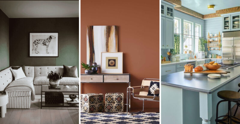
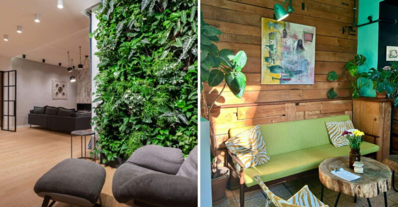
7 Enduring Hues Perfect For Any Space
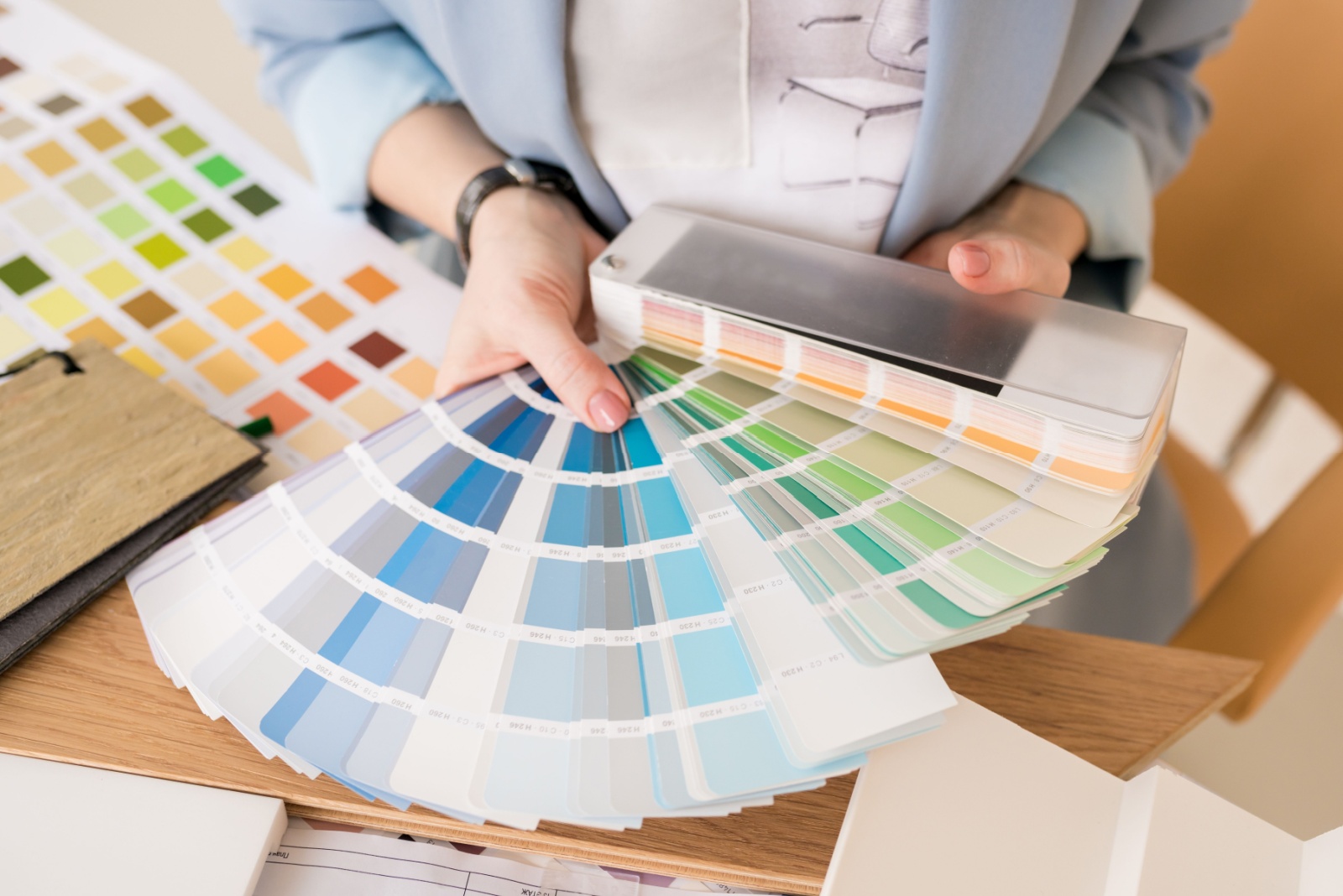
Ever stare at your walls and think, “Hmm… this color just isn’t doing it for me”? Picking the perfect shade can feel like decoding a secret language, one that transforms a room from meh to magical.
Whether you’re redecorating your living room or refreshing a cozy corner, choosing a timeless hue can make your space feel effortlessly stylish and welcoming. In this guide, we’ll explore colors that professionals keep coming back to for their versatility and staying power.
Keep in mind that color perception may vary depending on lighting, surface texture, and individual screen settings.
1. Soft White
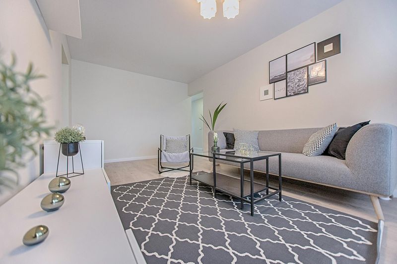
Ever walked into a room and felt instantly calm without knowing why? That’s the magic of soft white at work. Not stark like pure white, this gentle shade carries subtle undertones that shift beautifully throughout the day.
Soft white creates a clean canvas that makes artwork pop and furniture shine. My clients often gasp when they see how their old pieces suddenly look designer-worthy against this backdrop.
Think of it as your room’s best supporting actor, never stealing the show but making everything else look amazing.
2. Warm Beige
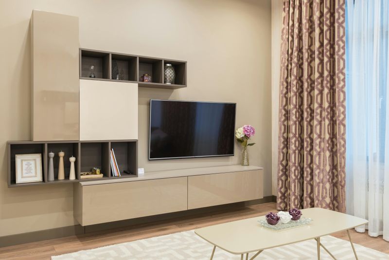
Where comfort meets sophistication, you’ll find warm beige waiting with open arms. This chameleon-like neutral adapts to virtually any style from farmhouse to ultra-modern.
Warm beige creates a cozy foundation that flatters skin tones and makes everyone look fabulous in your space. I’ve watched countless clients relax visibly when surrounded by these earthy tones.
Contrary to its boring reputation, this shade works brilliantly with both cool and warm accents, making it the ultimate team player in your color scheme.
3. Light Gray
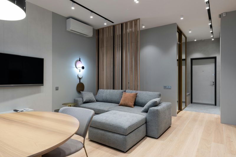
How this color manages to be both trendy and timeless simultaneously remains one of design’s greatest mysteries. Light gray brings sophisticated elegance without the coldness darker grays sometimes create.
Light gray serves as the perfect mediator between warring design elements. Got traditional furniture but love modern art? This shade bridges the gap effortlessly.
Though subtle, this versatile neutral never fades into the background. Instead, it creates depth and dimension that flat whites simply can’t match, especially in rooms with architectural details.
4. Navy Blue
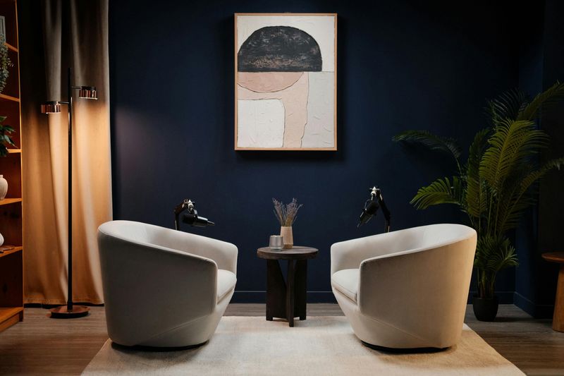
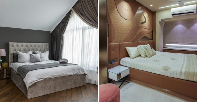
If colors had personalities, navy would be that sophisticated friend who somehow looks fabulous in everything. This deep, rich hue brings instant gravitas to any space while remaining surprisingly versatile.
Navy blue creates drama without darkness. I’ve converted countless color-phobic clients with this shade, proving that bold doesn’t have to mean overwhelming.
When other trends come and go, this maritime-inspired classic stands firm. Whether on all four walls or as an accent, navy delivers timeless appeal that works with virtually every decorating style.
5. Sage Green
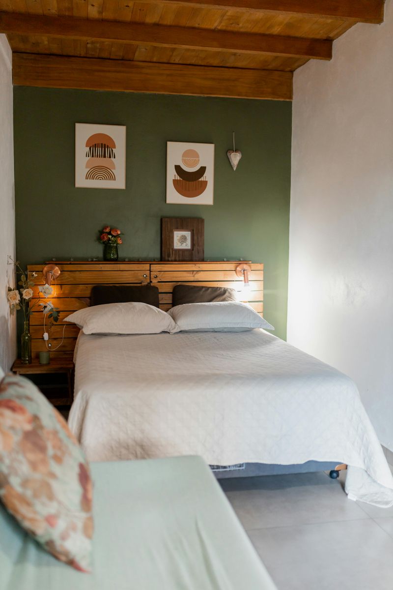
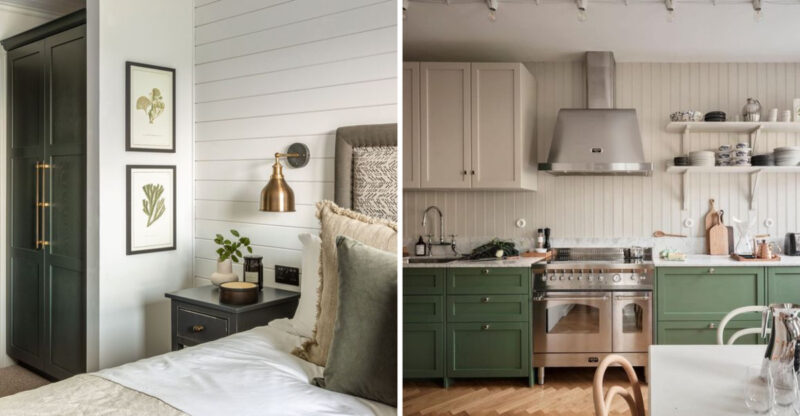
This nature-inspired hue brings the outdoors in without shouting about it. Sage green whispers rather than screams, creating spaces that feel instantly grounded and peaceful.
Sage green works beautifully in rooms that need a subtle color boost without overwhelming the senses. My clients often report feeling more relaxed and centered in spaces painted this gentle shade.
Though definitely a color rather than a neutral, this versatile green plays well with everything from rustic woods to sleek metals, making it surprisingly adaptable for a wide range of styles.
6. Charcoal
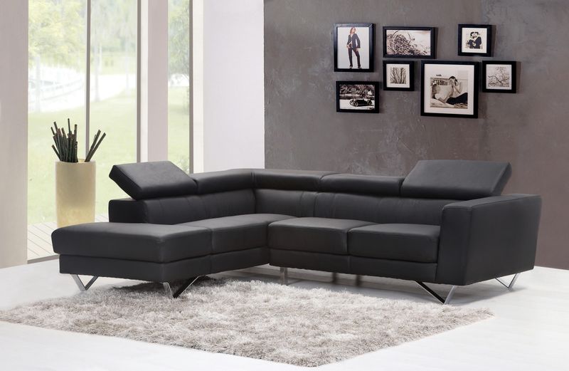
Are you ready for some drama? Charcoal delivers powerful presence without the harshness of pure black. This sophisticated near-neutral creates instant architectural interest even in the most cookie-cutter spaces.
Charcoal makes adjacent colors pop with unexpected vibrancy. White trim, brass fixtures, and wood tones all sing against this deep backdrop in ways that surprise even my most skeptical clients.
Though dark, this versatile shade never feels gloomy when balanced properly. Instead, it creates cozy, enveloping spaces that feel both modern and timeless simultaneously.
7. Classic Black
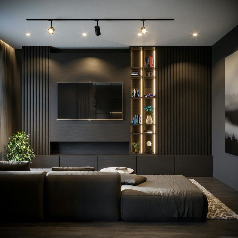
When someone tells me they’re afraid of black paint, I know they haven’t seen it done right. This boldest of neutrals creates spaces with undeniable character and surprising versatility.
Classic black transforms ordinary architecture into something extraordinary. Mundane doors, unremarkable built-ins, and forgettable furniture pieces suddenly become statement elements worthy of design magazines.
Though intimidating at first glance, this dramatic shade actually plays well with virtually every other color. From radiant brights to subtle neutrals, everything looks more intentional against a black backdrop.

