Colorado Designers Reveal 17 Home Trends Falling Out Of Favor
Colorado homeowners have always had a knack for blending mountain charm with modern style, but even the most beloved design trends eventually run their course.
Interior designers across the state are noticing shifts in what people want in their living spaces, moving away from certain looks that once dominated homes from Denver to Aspen.
Understanding which trends are fading helps homeowners make smarter choices when updating their spaces, ensuring their homes feel fresh and timeless rather than dated.
1. Sliding Barn Doors
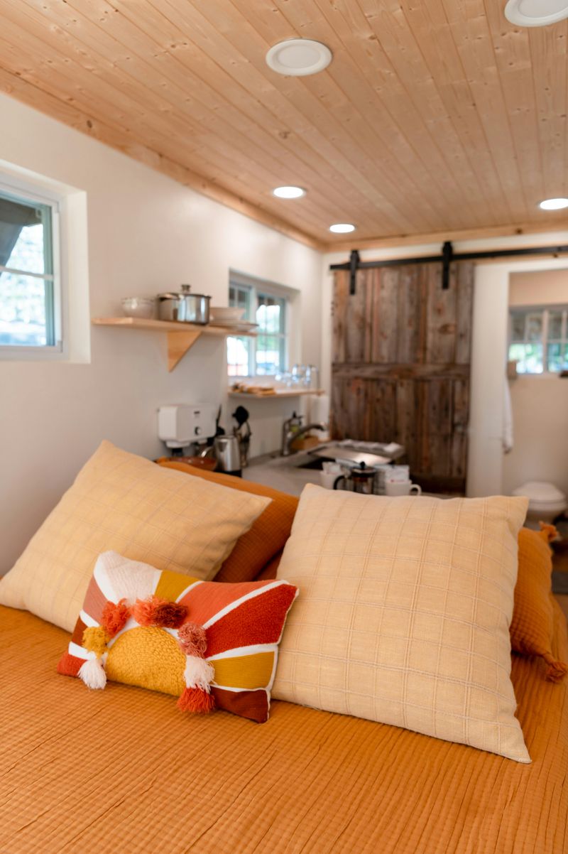
Sliding barn doors once brought rustic appeal and farmhouse charm, but their practical drawbacks are pushing them out of modern homes.
Privacy concerns top the list since these doors leave gaps that allow sound and light to pass through freely.
These gaps make them poor choices for bedrooms and bathrooms where privacy matters most.
Cleaning the exposed tracks requires regular attention as dust and debris accumulate quickly in the hardware.
The doors also demand significant wall space on either side, limiting furniture placement and artwork options in already tight rooms.
Pocket doors that disappear into walls offer a cleaner and more functional alternative.
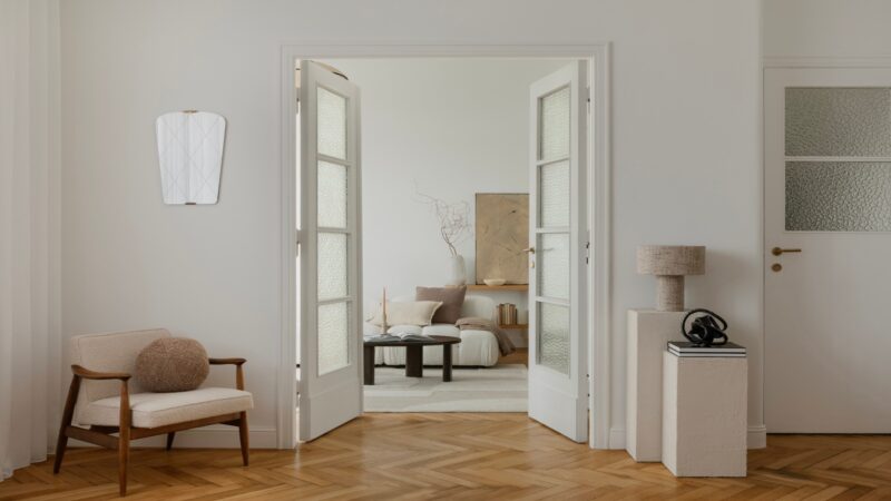
Classic French doors with glass panels also appeal to homeowners seeking better sound insulation and timeless style.
These options maintain architectural interest without the maintenance headaches or space constraints associated with barn doors.
2. All-White Kitchens
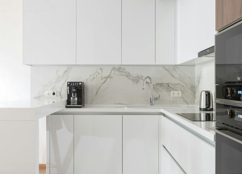
All-white kitchens once promised a clean and minimalist aesthetic, but many homeowners now find them sterile and impractical.
Every fingerprint, splash, and crumb shows up immediately on white surfaces, creating constant cleaning demands that exhaust busy families who actually cook in their kitchens.
The lack of visual warmth makes these spaces feel cold and unwelcoming, especially during Colorado’s long winter months when natural light becomes scarce.
Designers now recommend incorporating warm wood tones through floating shelves, butcher block countertops, or natural oak cabinetry to add depth and character.
Colorful lower cabinets paired with lighter uppers create visual interest without overwhelming smaller spaces.
Natural stone backsplashes in cream, beige, or soft gray tones bring texture while maintaining brightness, offering a balanced approach that feels both contemporary and inviting for everyday living.
3. Shiplap Walls
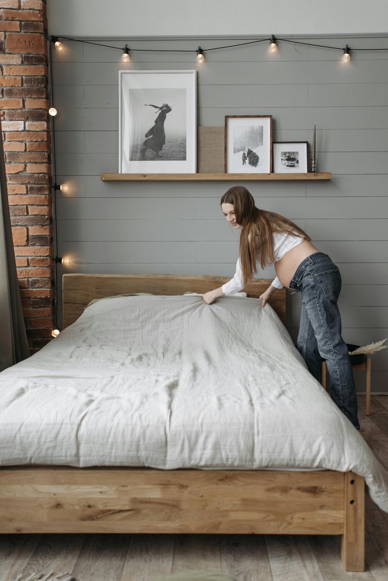
Farmhouse fever brought shiplap to nearly every wall surface imaginable, but the horizontal grooves that once seemed charming now trap dust and make cleaning a tedious chore.
What started as an accent wall treatment quickly overtook entire rooms, creating visual monotony that feels more manufactured than authentically rustic.
The trend’s oversaturation means homes featuring shiplap already look dated, even though many installations are only a few years old.
Those narrow gaps between boards collect pet hair, cooking grease, and allergens that standard dusting cannot reach effectively.
Textured wallpaper with subtle patterns or dimensional tiles offer similar visual interest without the maintenance burden or the dated association.
Plaster finishes with organic texture variations bring depth to walls while staying neutral enough to complement changing décor styles over time, providing longevity that shiplap simply cannot match anymore.
4. Gray-Toned Interiors
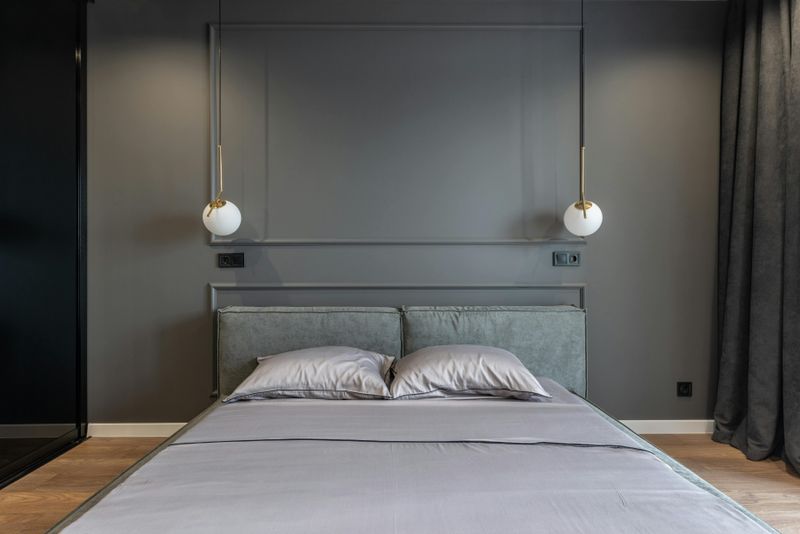
Cool gray dominated design magazines for years, but Colorado’s abundant sunshine calls for warmer palettes that complement rather than fight the natural light streaming through windows.
Gray-on-gray schemes can make spaces feel dreary and cold, especially in basement rooms or north-facing areas that already lack warmth.
The trend toward greige marked the beginning of the shift, but designers now push further into true warm neutrals like terracotta, sand, and clay tones.
These earthy colors reflect Colorado’s natural landscape from red rock formations to golden aspen groves, creating harmony between indoor and outdoor environments.
Warm whites with creamy undertones replace stark grays on trim and ceilings, while accent walls in rust or sage bring personality without overwhelming rooms.
This palette shift makes homes feel cozier and more inviting while still maintaining the neutral flexibility that allows furniture and artwork to shine.
5. Oversized Word Art
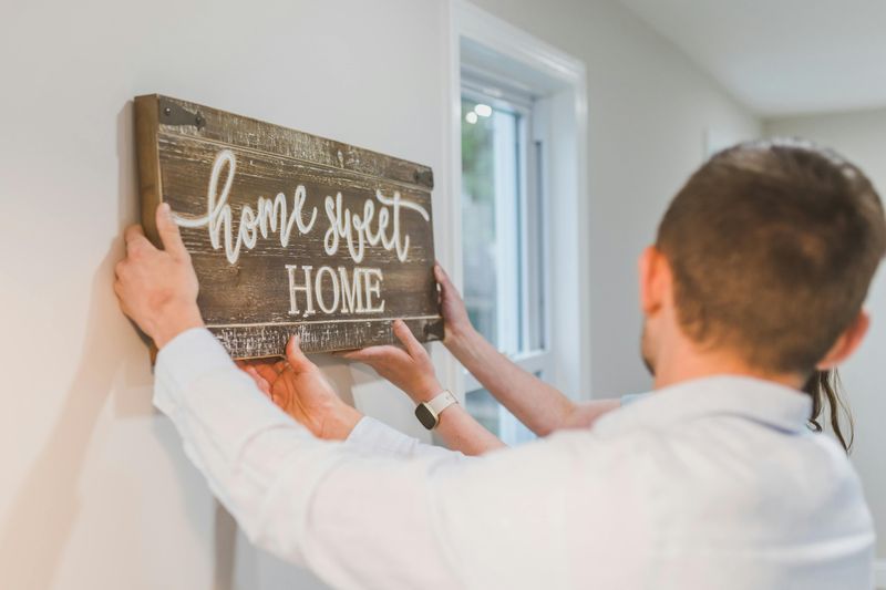
Mass-produced motivational phrases stamped across living room walls once seemed like an easy way to add personality, but these generic statements now feel impersonal and cliché.
Signs declaring “Live Laugh Love” or “Gather” offer no real connection to the homeowners who display them, making spaces feel like staged model homes rather than lived-in sanctuaries.
The oversized scale of these pieces dominates walls without contributing meaningful visual interest or conversation value.
Colorado’s thriving art scene offers countless opportunities to support local artists while finding pieces that genuinely resonate with personal experiences and values.
Vintage maps of favorite hiking trails, original paintings from mountain town galleries, or framed family photographs tell authentic stories that generic word art never could.
Even DIY projects using meaningful quotes in handwritten fonts or personal mantras feel more genuine than factory-produced signs that appear in thousands of identical homes nationwide.
6. Open Shelving In Kitchens
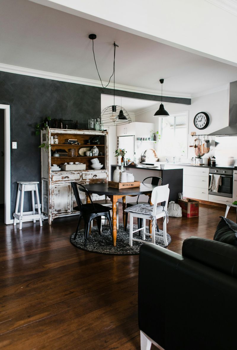
Instagram-worthy displays of perfectly arranged dishes looked appealing in photos, but the reality of maintaining open kitchen shelving quickly dampens enthusiasm.
Cooking grease becomes airborne and settles on every exposed surface, turning beautiful ceramics into greasy messes that require frequent washing even when not used.
Dust accumulation happens faster than most people anticipate, meaning those photogenic stacks of dishes need constant attention to maintain their styled appearance.
The visual clutter of everyday items like mismatched mugs or plastic food containers disrupts the curated aesthetic that made open shelving attractive initially.
Upper cabinets with glass-front doors offer a compromise, displaying cherished pieces while protecting them from kitchen grime.
Lower cabinets with pull-out drawers maximize storage efficiency without creating visual chaos, keeping countertops clear and functional for actual meal preparation rather than just looking pretty in photographs that require extensive staging.
7. Farmhouse Sinks
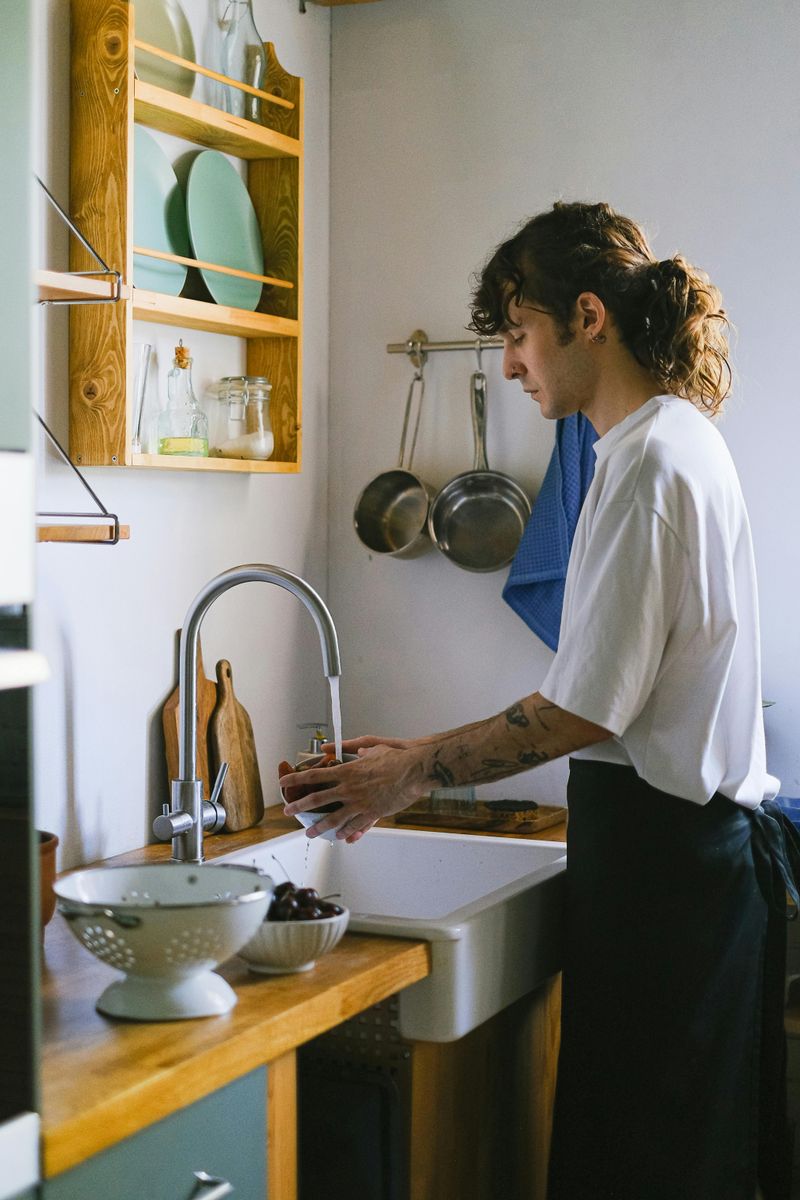
Deep apron-front sinks seemed practical for large families, but their excessive depth creates ergonomic nightmares that strain backs and shoulders during routine tasks.
Reaching down into these cavernous basins to wash dishes or rinse vegetables requires awkward bending that becomes painful over time, especially for shorter individuals or anyone with mobility concerns.
The exposed front panel collects water drips and soap residue, requiring extra wiping that standard undermount sinks avoid entirely.
Installation costs run higher because these heavy fixtures need reinforced cabinetry, and their prominent visual presence locks homeowners into a specific style that limits future design flexibility.
Standard-depth undermount sinks in stainless steel or composite materials provide adequate capacity without the physical strain or style commitment.
Workstation sinks with integrated cutting boards and colanders add genuine functionality rather than just aesthetic appeal, making kitchen tasks easier rather than creating unnecessary challenges in the name of trend-following.
8. Industrial Pipe Fixtures
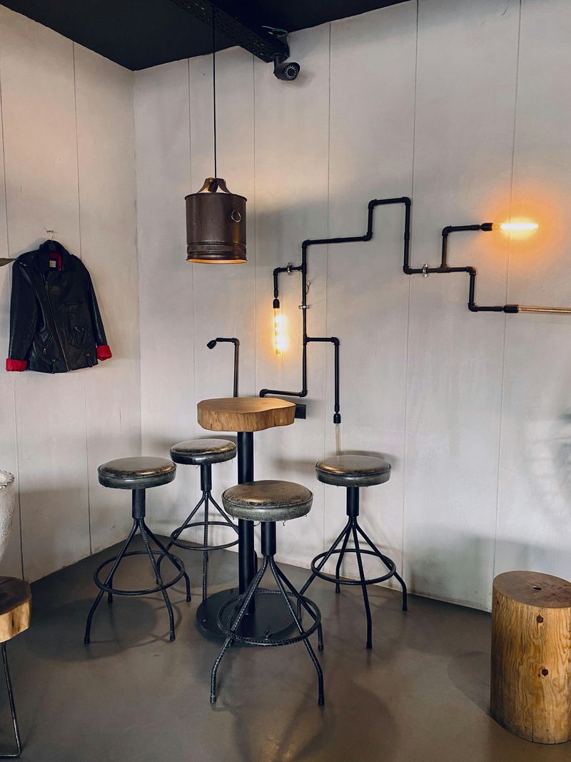
Exposed plumbing pipes repurposed as shelving brackets or towel racks brought urban loft vibes to suburban homes, but the rough aesthetic feels increasingly out of place in residential settings.
The unfinished metal develops rust spots over time, especially in humid bathrooms, creating maintenance issues that negate any initial cost savings from DIY installations.
Sharp edges and protruding joints pose safety risks in homes with children, while the heavy visual weight of black iron pipes overwhelms smaller spaces.
What worked in converted warehouses with soaring ceilings and concrete floors looks forced and try-hard in standard tract homes with eight-foot ceilings.
Sleek metal fixtures in brushed nickel or matte black finishes deliver modern sophistication without the harsh industrial edge.
Wooden brackets with simple metal supports bring warmth while maintaining clean lines, creating a refined look that feels intentional rather than like a Pinterest project gone wrong in someone’s garage workshop.
9. Chevron And Herringbone Patterns Everywhere
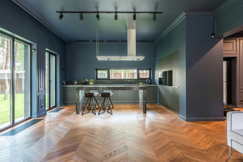
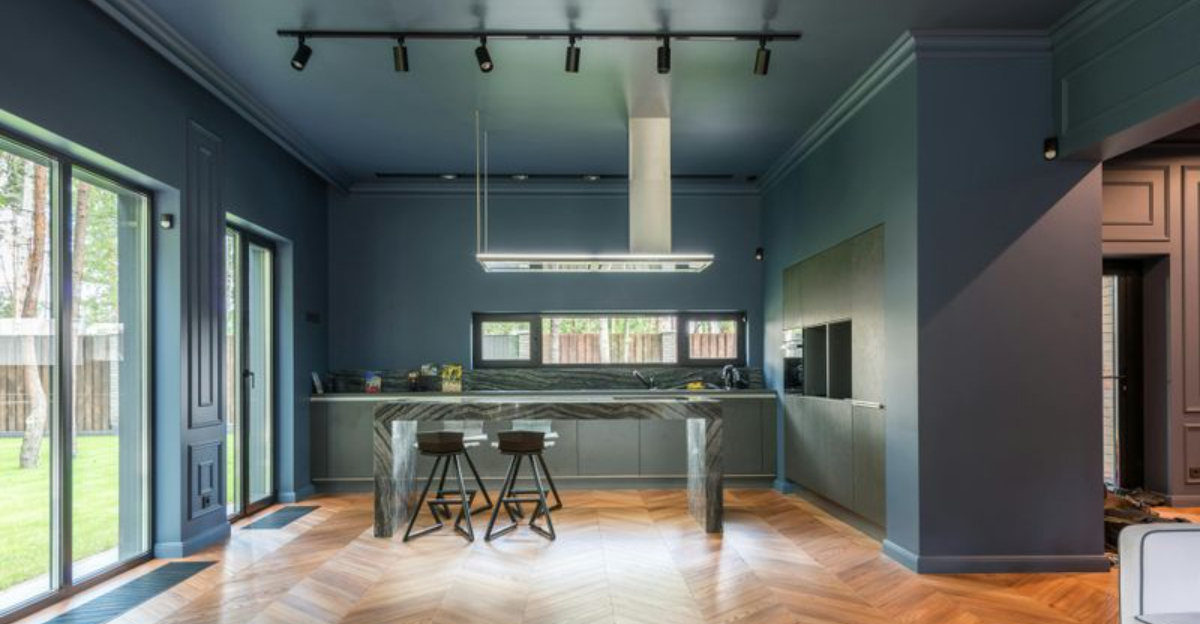
Zigzag patterns marched across floors, walls, backsplashes, and textiles with such intensity that homes began feeling dizzy rather than dynamic.
The busy visual movement of chevron and herringbone creates visual fatigue when applied to multiple surfaces in the same space, making rooms feel restless instead of cohesive.
These geometric patterns date themselves quickly because their popularity surged so dramatically within a concentrated timeframe.
Installation costs for angled tile or wood patterns run significantly higher than straight layouts due to increased labor and material waste from cutting.
Classic straight-lay patterns for tile and hardwood floors offer timeless appeal that won’t look trendy or dated in five years.
Simple grid patterns or subtle basket-weave designs add texture without overwhelming spaces, allowing furniture and décor to provide visual interest rather than competing with aggressive floor patterns that dominate every room.
10. Edison Bulb Light Fixtures

Exposed filament bulbs dangling from every ceiling promised vintage charm but delivered harsh glare and inadequate illumination for actual living spaces.
The amber glow produces insufficient light for reading, cooking, or detailed tasks, forcing homeowners to add supplemental lighting that defeats the minimalist aesthetic these fixtures claimed to provide.
The oversaturation of Edison bulbs in restaurants, coffee shops, and retail spaces has stripped them of any special appeal they once possessed.
Their association with hipster establishments makes them feel dated rather than timeless, while the high cost of specialty bulbs adds ongoing expense.
Modern LED fixtures with dimming capability offer better light quality and energy efficiency without sacrificing style.
Sculptural pendants with frosted glass shades or fabric drum fixtures provide ambient lighting that actually serves functional purposes while contributing to room design in meaningful ways beyond just following a played-out trend.
11. Reclaimed Wood Accent Walls
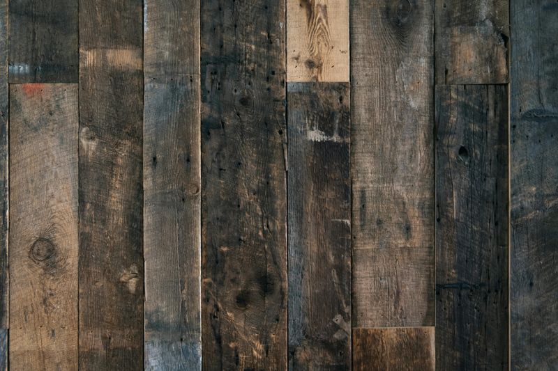
Weathered barn wood covering entire walls brought rustic character initially, but the dark, busy appearance makes rooms feel smaller and more cluttered than intended.
Authentic reclaimed wood carries significant cost, while cheaper alternatives made from new wood artificially distressed look obviously fake and undermine the supposed authenticity.
The rough texture collects dust and cobwebs in every crack and crevice, making cleaning difficult without damaging the finish.
Heavy visual weight pulls focus away from other design elements, and the strong style statement limits flexibility for changing décor over time.
Single floating shelves in reclaimed wood or a small mantel piece incorporate the material’s character without overwhelming spaces.
Framed wood art pieces or a headboard crafted from salvaged planks deliver rustic warmth in controlled doses, allowing the material to accent rather than dominate rooms while maintaining easier cleaning and greater design flexibility.
12. Overly Matchy-Matchy Furniture Sets
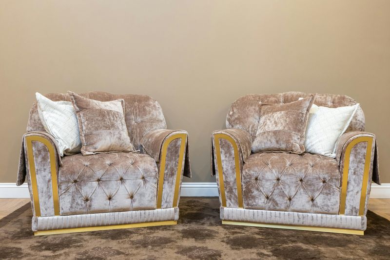
Buying entire living room or bedroom collections in one shopping trip seemed convenient, but the coordinated perfection creates spaces that lack personality and feel like furniture showrooms.
When every piece shares identical wood tones, hardware, and proportions, rooms lose the layered, collected-over-time quality that makes homes feel genuinely lived-in.
Matching sets limit flexibility when one piece wears out or needs replacement, forcing homeowners to either live with mismatched furniture or replace entire collections.
The uniformity prevents personal expression and makes spaces forgettable rather than memorable.
Mixing wood tones, combining vintage finds with new pieces, and selecting furniture based on individual merit rather than matching collections creates curated spaces with character.
Coordinating through color palette and scale rather than identical finishes allows rooms to evolve naturally as needs and tastes change, building homes that reflect actual personalities instead of catalog pages.
13. Granite Countertops In Busy Patterns
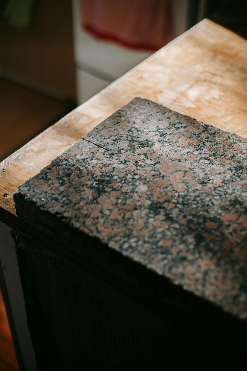
Speckled granite slabs in chaotic patterns dominated kitchens for decades, but their visual noise competes with everything else in the space rather than providing a neutral foundation.
The busy surfaces make rooms feel cluttered even when counters are clear, and the dated appearance screams early 2000s renovation rather than timeless design.
Matching the veining patterns across seams proves difficult, creating obvious breaks that disrupt visual flow.
The high-gloss finish shows water spots and fingerprints constantly, requiring frequent wiping to maintain the polished appearance.
Quartz countertops with subtle veining or solid matte finishes offer durability without visual chaos, creating calm surfaces that let cabinetry and backsplashes shine.
Butcher block sections for prep areas add warmth, while soapstone or concrete provides character through soft patina development rather than aggressive pattern competition that overwhelms kitchen design.
14. Overstuffed Sectional Sofas
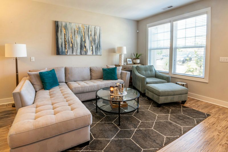
Massive L-shaped sofas promised comfortable lounging but instead devour floor space and trap rooms in rigid furniture arrangements.
Their enormous footprints limit traffic flow and make reconfiguring spaces nearly impossible without professional moving help, while the bulky proportions overwhelm average-sized living rooms.
Deep seats that seem cozy initially prove awkward for sitting upright during conversations or meals, and the attached configuration prevents separating pieces for cleaning or moving.
Corner sections create dead zones where cushions gap awkwardly and remotes disappear into unreachable crevices.
Modular seating with separate pieces offers flexibility to rearrange as needs change, while smaller-scale sofas with coordinating chairs create conversation areas without dominating rooms.
Apartment-sized furniture with streamlined profiles provides comfort without sacrificing livable floor space, allowing rooms to serve multiple functions rather than becoming single-purpose seating zones anchored by immovable furniture monsters.
15. Tuscan-Style Design Elements
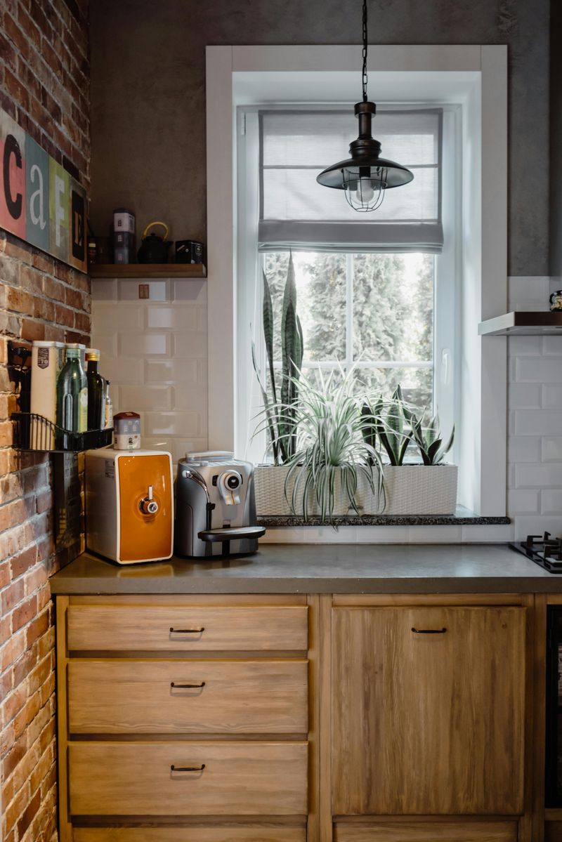
Faux-finished walls in burnt sienna, wrought iron scrollwork, and artificial grape clusters transported suburban homes to imaginary Italian villas, but the heavy-handed theme feels costume-like rather than authentic.
The dark color schemes make spaces feel cave-like, especially in Colorado homes where maximizing natural light should be a priority.
Arched doorways and columns added during renovations create awkward transitions that clash with the home’s original architecture.
The ornate accessories clutter surfaces without adding genuine function, while the warm Mediterranean palette conflicts with Colorado’s mountain environment.
Simple white walls with natural wood accents create clean backdrops that work with rather than against regional architecture.
Incorporating actual travel souvenirs or meaningful artifacts tells personal stories without resorting to theme park design, while earth-toned textiles add warmth through layering rather than permanent architectural commitments that cost thousands to reverse.
16. Wall-To-Wall Carpeting In Main Living Areas
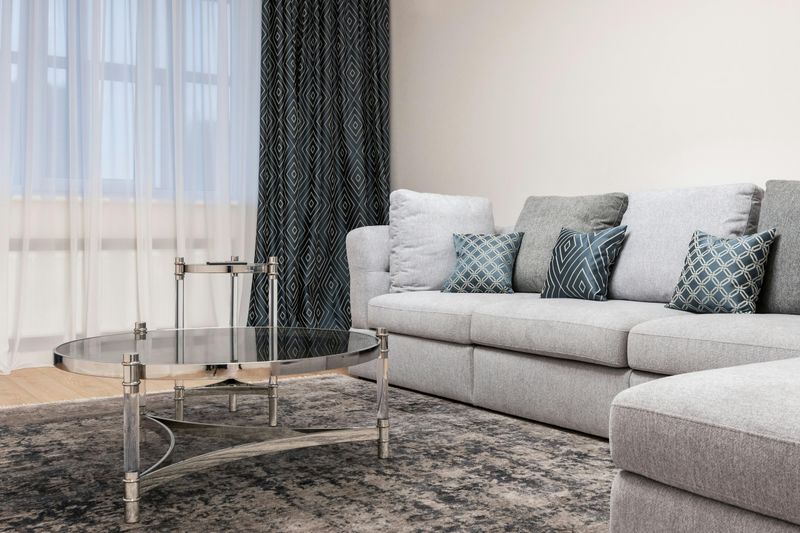
Soft underfoot appeal cannot overcome the practical drawbacks that make wall-to-wall carpet increasingly unpopular in primary living spaces.
Carpets trap allergens, pet dander, and dust mites that regular vacuuming cannot fully remove, creating air quality concerns for families with respiratory sensitivities or allergies.
Stains from spills become permanent markers of mishaps, and high-traffic patterns develop visible wear paths that make entire rooms look shabby.
The installation commitment means replacing carpet requires significant expense and disruption, while dated colors or patterns lock homeowners into specific design schemes.
Hardwood, luxury vinyl plank, or tile flooring with area rugs provides easier maintenance and better longevity while offering design flexibility.
Rugs can be cleaned thoroughly, rotated to prevent wear patterns, or replaced affordably when styles change, giving homeowners control over their spaces without the permanent commitment and maintenance burden of wall-to-wall carpet installations.
17. Oversized Tub Platforms In Bathrooms
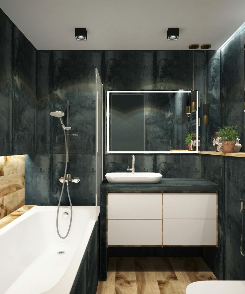
Raised platforms surrounding soaking tubs promised spa-like luxury but delivered awkward step-up hazards and wasted square footage in already tight bathrooms.
The elevated installation creates safety concerns for children and elderly family members, while the steps collect water and grime that breed mildew in grout lines.
Most homeowners rarely use soaking tubs, making the dedicated floor space and plumbing investment a poor return when quick showers dominate daily routines.
The platforms also complicate cleaning around and beneath the tub, creating maintenance headaches that negate any relaxation the feature supposedly provides.
Walk-in showers with bench seating and multiple spray heads deliver genuine luxury for daily use rather than special occasions.
Freestanding tubs placed directly on the floor provide visual interest without platform complications, while allocating bathroom space to double vanities or improved storage serves families better than rarely-used soaking tubs surrounded by tile steps nobody wanted to climb.

