10 Decor Tips That Could Make Your Home Look Timeless With Color
Ever wondered how some homes manage to stay stylish for decades? The secret lies in how colors are used to create lasting appeal.
Choosing the right colors and applying them thoughtfully can transform your space from trendy to timeless. I’ve gathered eleven simple yet powerful tips to help you create a home that looks elegant and enduring through smart color choices.
Results may vary depending on your home’s lighting, room size, and personal style preferences.
1. Neutral Walls
Soft beige, gentle gray, or warm white walls create the perfect backdrop for your home’s evolving style. These shades never go out of fashion and allow your furniture and accessories to shine.
I’ve found that neutral walls give you amazing flexibility to change up other elements in your room without needing to repaint. When I redecorate seasonally, my cream-colored walls adapt beautifully to whatever new accent colors I introduce.
Did you know? Interior designers often recommend neutral walls because they reflect light better, making spaces feel larger and more inviting. Plus, potential homebuyers find neutral walls much more appealing, which could increase your home’s value!
2. Accent Pieces
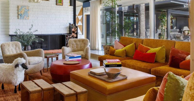
Bold accent pieces bring personality to timeless spaces without overwhelming them. Think emerald green vases, navy blue throw pillows, or a stunning red armchair against your neutral background.
When I want to refresh my living room, I simply swap out small colorful items rather than redecorating the entire space. This approach saves money while keeping my home feeling current and personal.
Seasonal changes become effortless too! During summer, I might display turquoise and coral accents, then switch to amber and burgundy for fall. The beauty of well-chosen accent pieces is how they instantly update your space while maintaining its classic foundation.
3. Layered Textures
Mixing different textures in similar color families creates depth that never goes out of style. Imagine cream-colored velvet pillows against a beige linen sofa, topped with a knitted throw in soft ivory.
Texture variations catch light differently throughout the day, making your space feel dynamic even with a limited color palette. I love how my living room feels completely different at sunrise versus sunset, despite using the same neutral colors.
Try combining smooth with rough, shiny with matte, or soft with structured elements. A polished wood coffee table, fuzzy wool rug, and sleek metal lamp can all share the same color family while creating visual interest through their contrasting surfaces.
4. Classic Patterns
Herringbone, houndstooth, and subtle stripes have adorned elegant homes for centuries. Unlike trendy patterns that quickly date your space, these timeless designs maintain their appeal across generations.
If you’re nervous about patterns, start small! I added striped curtains to my dining room five years ago, and they still look as fresh and relevant as the day I hung them. The key is choosing patterns in colors that complement your overall scheme.
Where should you incorporate classic patterns? Rugs, curtains, throw pillows, and even wallpaper can be excellent vehicles. Just remember to balance patterned elements with solid colors to prevent visual overwhelm in your carefully curated timeless space.
5. Balanced Contrasts
Creating visual interest through balanced dark and light elements keeps spaces feeling fresh for decades. A charcoal sofa against pale walls or dark wood floors beneath white furniture creates dramatic tension that never feels dated.
My dining room transformed when I paired my mahogany table with cream-colored chairs instead of matching dark ones. The contrast immediately made the space feel more intentional and designed, even though I hadn’t changed anything else.
Avoid going too extreme with your contrasts unless you’re creating a specifically dramatic look. Gentle contrasts like navy with light blue or chocolate brown with tan create sophisticated pairings that stand the test of time while remaining livable and welcoming.
6. Timeless Furniture
Furniture in enduring colors like navy, chocolate brown, or forest green creates a foundation that remains relevant despite changing trends. These rich, saturated hues have graced stylish homes for centuries.
When I invested in a navy blue sofa eight years ago, friends questioned my choice over the trendy light gray everyone was buying. Now their gray sofas look dated while my navy piece continues receiving compliments and pairing beautifully with evolving accent colors.
Quality furniture in classic colors lets you update your look inexpensively through accessories. My forest green armchair has seamlessly transitioned through three different decor schemes simply by changing the throw pillows and surrounding art proving that thoughtful color choices truly stand the test of time.
7. Natural Materials
Wood, stone, cotton, and wool bring inherent color variations that age beautifully and connect your home to nature. These materials carry subtle, complex colors that synthetic alternatives simply can’t replicate.
My oak dining table has developed a rich patina over years, its color deepening naturally in ways that manufactured pieces never achieve. Visitors often comment on its warmth and character qualities that come from embracing natural materials.
Stone countertops with their unique veining patterns, wool rugs with subtle color variations, and exposed wooden beams all contribute to a timeless quality. These elements ground your space in authenticity while synthetic materials often reveal their age through fading, yellowing, or simply falling out of fashion.
8. Harmonious Color Palette
Selecting colors from the same temperature family creates flow between rooms that feels intentional and cohesive. Cool blues, greens, and grays work beautifully together, as do warm terracottas, golds, and browns.
When I renovated my home, I chose warm neutrals for the entire main floor with varying intensities in different rooms. The kitchen features deeper tones while the living room stays lighter, but they clearly belong together and create a sense of harmony as you move through the space.
This approach doesn’t mean every room should look identical! You can vary the dominant color while keeping accents consistent. My bedroom features blue-gray walls but incorporates the warm wood tones from elsewhere in the house through furniture and picture frames.
9. Coordinated Artwork
Artwork that complements your color scheme creates cohesion that feels intentional rather than accidental. Look for pieces that pull colors from your furniture and accessories for a curated, timeless look.
Finding the right art doesn’t require a designer’s budget! I created a gallery wall using vintage botanical prints in frames that match my wood tones, with the plants’ green hues echoing my accent pillows. The result looks thoughtfully collected rather than hastily assembled.
Black and white photography offers another timeless option that works with any color scheme. I’ve displayed family photos in matching frames throughout my hallway, creating a personal touch that never clashes with my evolving decor choices while maintaining the timeless quality I’ve carefully cultivated throughout my home.
10. Soft Lighting
Warm-toned lighting transforms even the most basic spaces into inviting, timeless environments. Harsh overhead lights can make even expensive decor look cheap, while thoughtful lighting elevates everything it touches.
Layer your lighting sources for maximum impact! I use floor lamps, table lamps, and wall sconces to create pools of gentle illumination throughout my living room. This approach not only looks sophisticated but allows me to adjust the mood for different activities.
Consider the color temperature of your bulbs carefully. Bulbs in the 2700-3000K range cast a warm, golden glow that flatters skin tones and makes spaces feel cozy. This subtle yellowish light has illuminated elegant homes for centuries before electricity, connecting your modern space to timeless design traditions.

