Ditch These 12 Outdated Sofa Colors In California For Timeless Choices

California living rooms thrive on natural light, coastal breezes, and a relaxed yet polished vibe that feels effortlessly stylish.
Choosing the right sofa color can make or break that balance, and some shades that once dominated showrooms now feel stuck in the past.
Trading outdated hues for timeless alternatives keeps your space feeling fresh, inviting, and perfectly in tune with the Golden State’s laid-back elegance.
1. Chocolate Brown
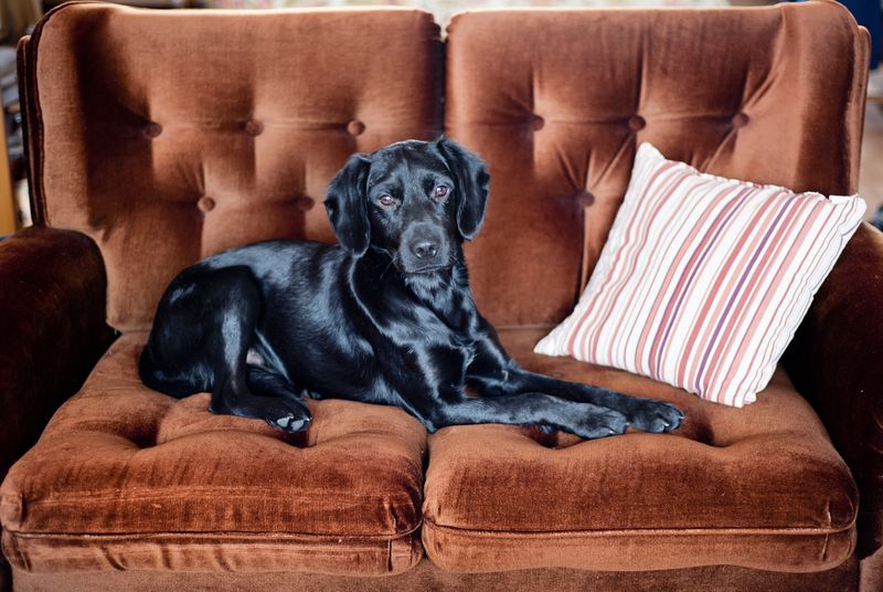
These dark, rich sofas carried major appeal in the early 2000s, anchoring living rooms with a sense of weight and formality.
California homes today lean toward airy, light-filled spaces where heavy tones can feel out of sync with the natural brightness streaming through floor-to-ceiling windows.
That deep shade tends to absorb light rather than reflect it, making rooms feel smaller and less inviting.
Swapping this look for warm earth tones like terracotta or clay brings a grounded, organic feel without the heaviness.
These softer shades complement coastal and modern farmhouse aesthetics while keeping the room open and breathable.
Pairing a lighter neutral sofa with wood accents and greenery creates a balanced, welcoming environment that feels current and timeless.
The shift away from darker browns reflects California’s ongoing love affair with natural materials, open layouts, and effortless sophistication that never tries too hard.
2. Burgundy

Once a symbol of elegance and old-world charm, this shade dominated formal living rooms designed for entertaining.
That deep red tone now reads as overly serious and out of step with California’s preference for casual, approachable interiors.
The color can dominate a room, making it harder to layer in lighter textiles, artwork, or seasonal décor without clashing.
Modern California spaces favor softer, more versatile tones that adapt to changing styles and moods.
Replacing it with warm neutrals or muted greens allows for greater flexibility in styling and accessorizing.
Cream, sage, or even soft gray sofas provide a fresh backdrop that works year-round, from summer linens to cozy fall throws.
The move away from this hue reflects a broader shift toward interiors that feel less staged and more lived-in.
3. Cobalt Blue
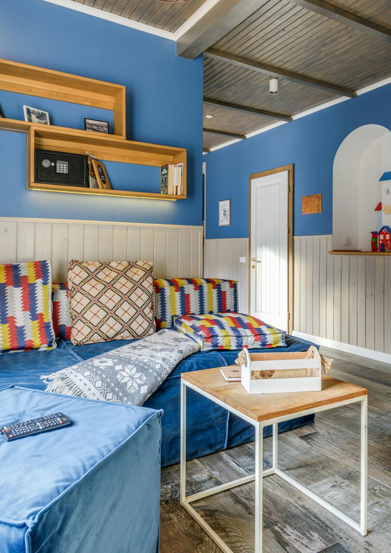
These sofas rode the wave of nautical-inspired décor, bringing bold splashes of ocean-inspired color into coastal homes.
While the intention was to echo California’s beach culture, the result often feels too literal and overly themed for today’s more nuanced interiors.
That intense blue can overwhelm a space, especially in smaller rooms or homes with abundant natural light where softer tones shine.
Current trends lean toward subtler nods to the coast, using sandy neutrals, driftwood textures, and muted blues that suggest the ocean without shouting it.
A sofa in soft sage or warm gray allows you to layer in blue through pillows, throws, or artwork without committing to a single bold statement.
This approach keeps the room feeling balanced and adaptable, letting you refresh the look seasonally or as tastes evolve.
Moving past this shade means embracing a more sophisticated, less obvious connection to California’s stunning shoreline.
4. Pastel Pink
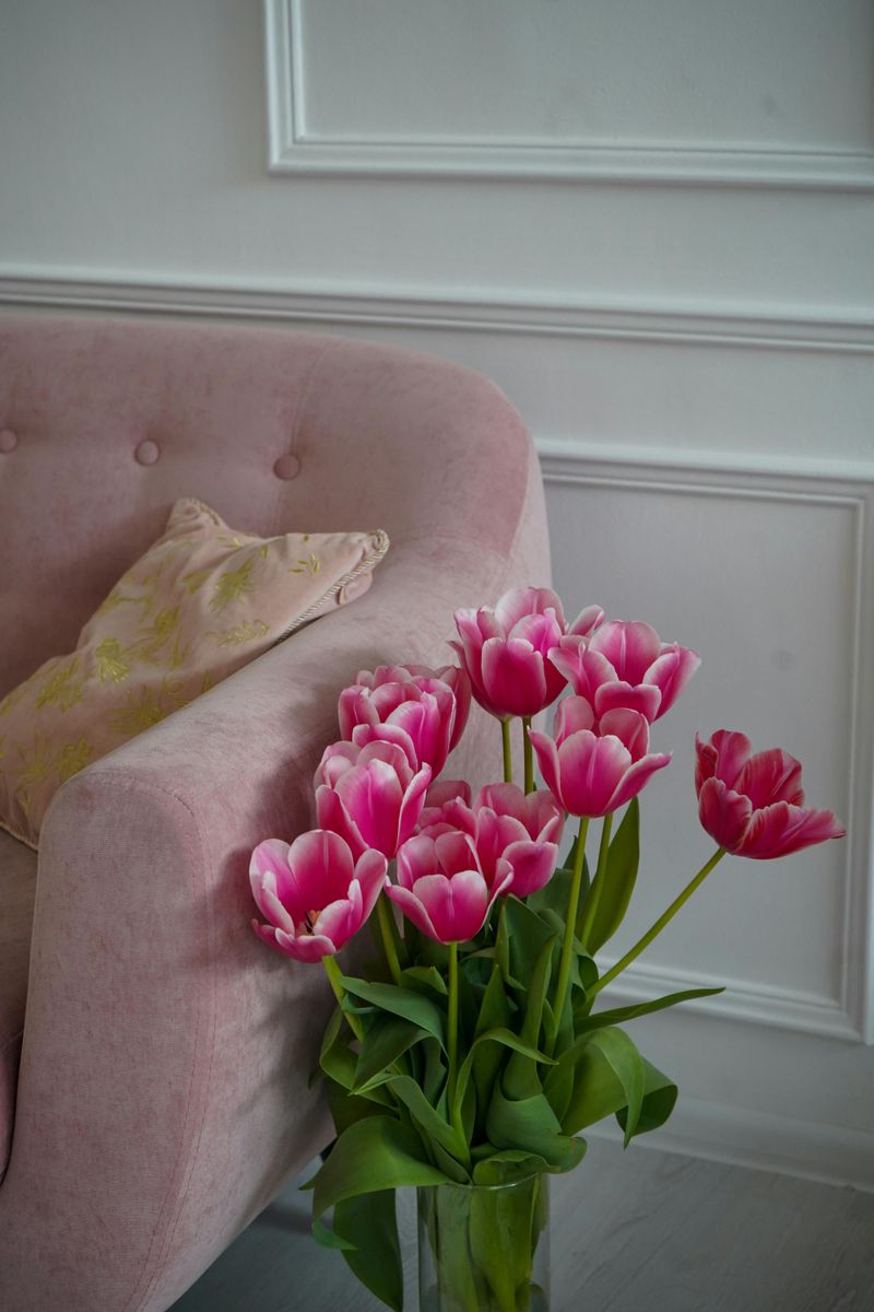
A wave of playful, fashion-forward interiors pushed this color into the spotlight through magazines and influencer homes.
That popularity has faded as homeowners seek more versatile, long-lasting color choices that grow with their evolving tastes.
This hue can be tricky to style, often requiring a careful balance of neutrals to avoid feeling too sweet or overly curated.
In California’s design landscape, where natural materials and earthy palettes dominate, this tone tends to feel out of place and less practical for everyday living.
Opting for warm beiges, soft grays, or even muted terracotta creates a more grounded foundation that pairs beautifully with wood, stone, and greenery.
These timeless shades offer the same warmth and approachability without the risk of feeling dated in a few years.
Letting go of this trend opens the door to interiors that feel more mature, adaptable, and effortlessly stylish without chasing fleeting trends.
5. Bright Orange
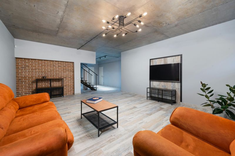
Strong retro influence helped this color rise during the height of mid-century modern design.
While that retro vibe can feel fun and nostalgic, it often overwhelms contemporary California spaces that prioritize calm, breathable interiors.
The intensity demands attention, leaving little room for other design elements to shine and making it difficult to switch up your style without a full overhaul.
Today’s California homes favor softer, more adaptable hues that complement rather than compete with natural light and architectural details.
Warm earth tones like ochre or clay offer a nod to that vintage warmth without the visual punch of a highly saturated shade.
These muted options blend seamlessly with modern and transitional styles, allowing you to layer in pops of color through accessories rather than anchoring the room with a single bold piece.
Moving away from this look reflects a desire for interiors that feel curated, comfortable, and timelessly chic.
6. Pure White
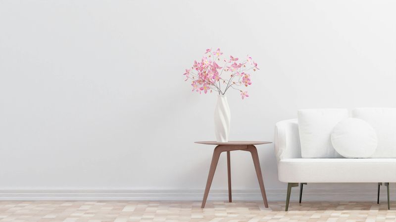
A flawlessly crisp look made this choice popular in staged interiors and design photography.
California’s sunny climate means constant exposure to bright light, which can highlight every speck of dust, pet hair, and inevitable spill.
Maintaining that pristine look requires frequent cleaning and careful living, which clashes with the state’s laid-back, family-friendly lifestyle.
Off-white and cream tones offer the same fresh, airy feel without the high-maintenance headache, blending better with natural textures and forgiving minor imperfections.
These softer neutrals still brighten a room but feel more lived-in and approachable, perfect for homes where comfort trumps formality.
Pairing cream sofas with natural wood, woven textiles, and greenery creates a warm, inviting space that feels effortlessly put together.
Letting go of this extreme option means embracing a more realistic, sustainable approach
7. Teal
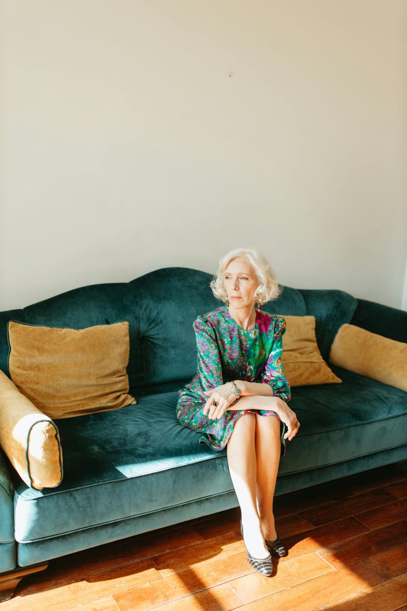
A surge in popularity turned this shade into a go-to option for homeowners craving a bold alternative to traditional neutrals.
That trend has cooled considerably, leaving many pieces feeling tied to a specific moment rather than timeless and versatile.
The color can be challenging to coordinate with other hues, often clashing with warm wood tones or competing with natural light instead of enhancing it.
California interiors today favor colors that echo the landscape, including soft greens, warm tans, and muted grays that feel organic and enduring.
Replacing this tone with sage or olive green maintains a connection to nature while offering far greater styling flexibility.
These softer greens pair beautifully with everything from crisp white walls to rich wood furniture, creating a cohesive, calming environment.
Moving past this trend reflects a shift toward colors that feel less trendy and more rooted in the natural beauty that defines California living.
8. Hunter Green
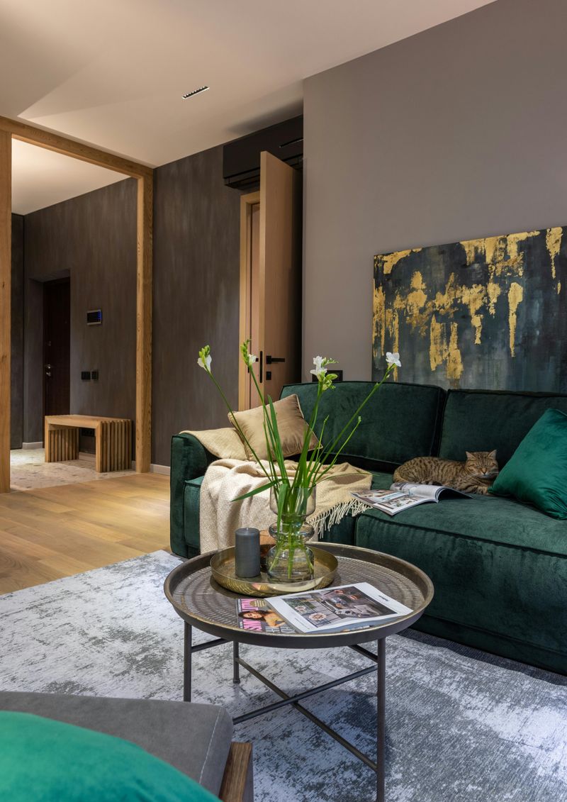
A sense of tradition once made this deep shade feel sophisticated and grounding in formal living spaces.
In California’s light-filled, open-plan homes, that depth can feel heavy and out of place, absorbing natural light rather than reflecting it.
The color tends to anchor a room visually, creating a look that feels dated when paired with breezier, casual interiors.
Lighter greens like sage, moss, or olive deliver the same earthy appeal without the visual weight.
These alternatives complement California’s natural surroundings and blend easily with coastal, modern, and farmhouse styles.
Swapping to a lighter option helps open up the room and strengthens the connection between indoor spaces and the outdoors.
The shift signals a broader move toward interiors that value lightness, simplicity, and relaxed elegance.
9. Overstuffed Floral Patterns

A love for maximalism once made these sofas popular, filling rooms with color, pattern, and visual storytelling.
While charming in the right setting, this look often clashes with California’s modern preference for clean lines and uncluttered spaces.
Busy patterns can overwhelm smaller rooms and make it difficult to introduce artwork, plants, or layered textures.
Today’s interiors lean toward solid colors and subtle textures that allow flexibility as styles and seasons change.
Choosing a neutral sofa with simple lines creates a foundation that works across design styles without feeling dated.
Solid sage, warm gray, or soft cream options offer longevity and styling freedom.
Moving away from heavy florals reflects a desire for calm, openness, and effortless sophistication.
10. Neon Yellow
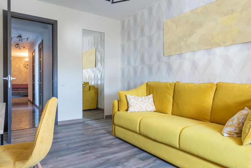
A bold, attention-grabbing statement can feel electric and energizing in the right context.
However, that intensity rarely translates well to California homes, where the preference leans toward colors that feel calming, natural, and easy on the eyes.
The brightness demands constant visual attention, making it difficult to relax or create a cohesive design scheme around such a dominant hue.
It can also come across as juvenile or overly playful, clashing with the sophisticated, laid-back elegance that defines California interiors.
Opting for warmer, muted yellows like ochre or soft mustard brings a touch of sunshine without the overwhelming glare.
These toned-down shades pair beautifully with natural wood, white walls, and greenery.
The result is a warm, inviting space that feels grounded and timeless.
Letting go of extreme brightness allows interiors to feel balanced, welcoming, and effortlessly stylish year after year.
11. Hot Magenta
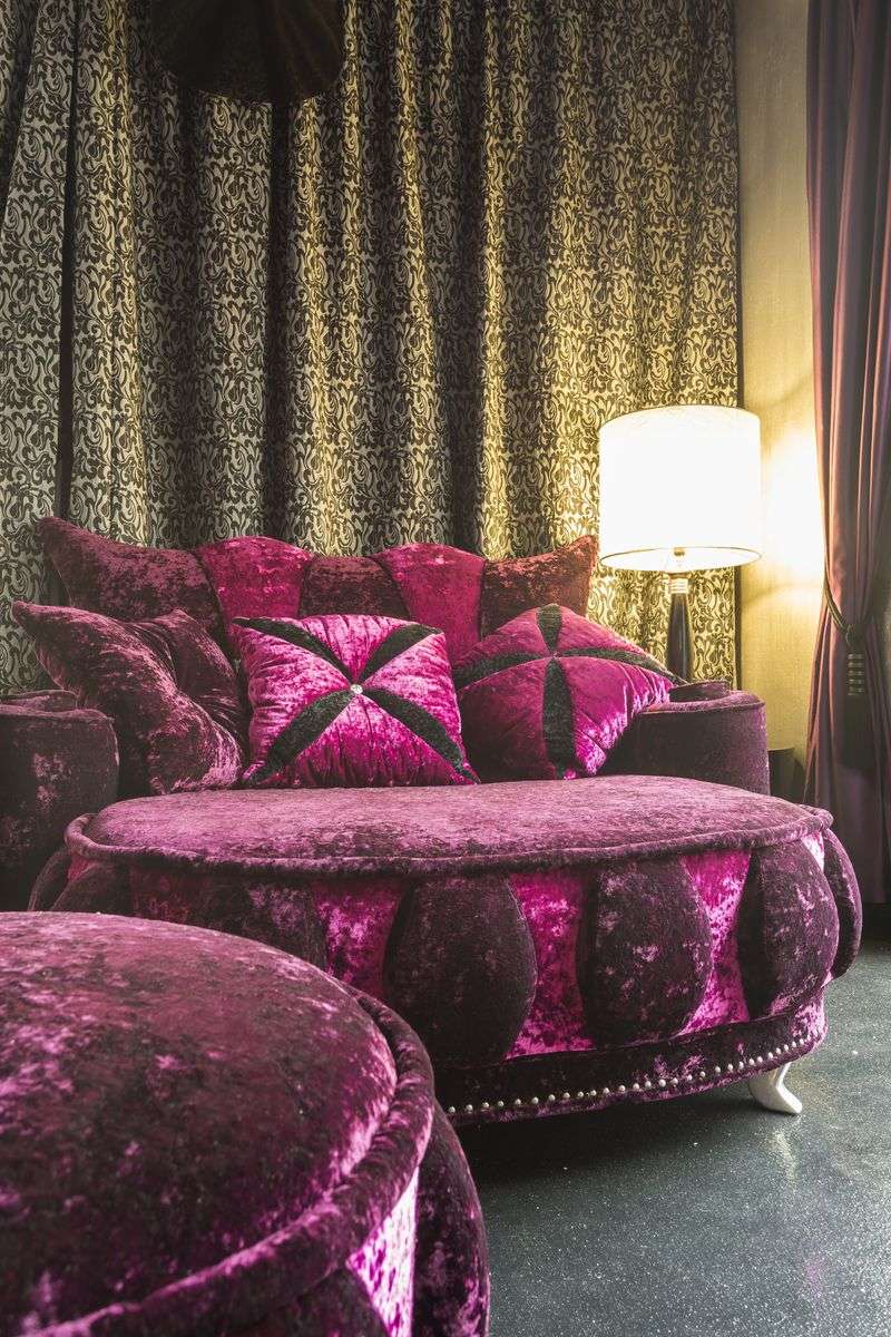
This hue burst onto the scene as a daring, fashion-forward choice for homeowners eager to make a bold statement.
The intensity can feel exciting at first but quickly becomes overwhelming in a space meant for relaxation and everyday living.
California interiors prioritize comfort, natural beauty, and ease, all of which are undermined by such a visually aggressive color.
The saturation limits decorating flexibility, making it difficult to introduce new textiles, artwork, or seasonal accents without clashing.
Softer alternatives like blush, terracotta, or warm gray provide personality without dominating the room.
These tones create a more adaptable foundation that supports evolving styles over time.
They allow homeowners to refresh the space with accessories rather than replacing major furniture pieces.
Moving away from hot magenta reflects a more mature design approach rooted in longevity, balance, and California’s relaxed sophistication.
12. Lime Green
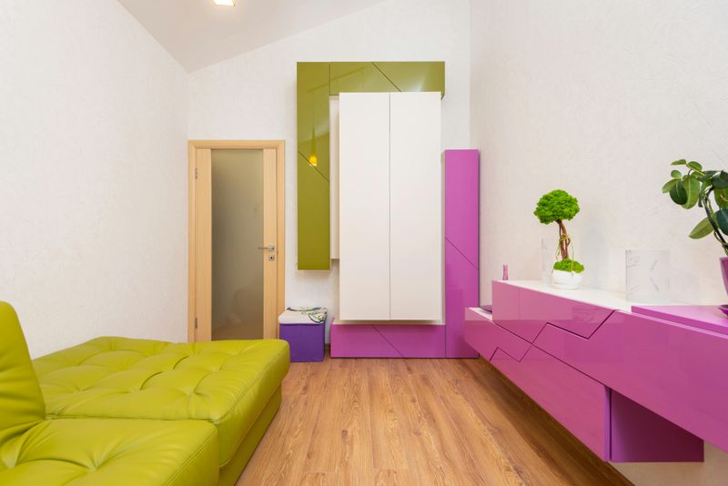
This shade once symbolized playful, youthful energy and appealed to homeowners eager to break away from safe, neutral palettes.
Over time, that boldness has come to feel more gimmicky than stylish, especially in California homes where natural, earthy tones dominate.
The sharp brightness can clash with soft, sun-drenched light, creating visual tension instead of harmony.
It also tends to date quickly, locking a living room into a very specific trend moment rather than offering lasting appeal.
Replacing it with softer greens like sage, moss, or olive creates a stronger connection to nature without the visual shock.
These muted alternatives allow the room to feel calm, cohesive, and easy to live in.
They pair effortlessly with materials like wood, linen, and stone across a range of styles.
Moving away from lime green opens the door to a more refined, grounded look that aligns naturally with California’s relaxed sense of style.

