9 Hues Poised To Gain Popularity In 2026 Home Design
Thinking about updating your home’s color scheme, but not sure where to start? As trends continue to shift toward comfort, personality, and subtle sophistication, certain hues are quietly making their way into the spotlight.
While no one can predict the future with certainty, these nine colors are showing up more and more in design forecasts, and they might just inspire your next paint project or decor refresh. From calming tones to richer, moodier shades, there’s something for every style.
Color trend predictions are based on current observations and may evolve as design preferences shift.
1. Sage Green
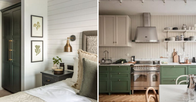
How could anyone resist the calming embrace of sage green? This earthy tone brings the outdoors inside without overwhelming your senses.
Sage green works beautifully in kitchens paired with wooden accents and brass fixtures. The color’s subtle depth changes throughout the day as natural light shifts, creating an ever-evolving atmosphere in your space.
Many homeowners find this versatile shade pairs well with nearly everything, from crisp whites to rich burgundies.
2. Soft Clay
Though reminiscent of traditional terracotta, soft clay brings a fresh, contemporary twist to this ancient color. The warmth it radiates can make even the most modern spaces feel instantly welcoming.
Soft clay pairs beautifully with cream textiles and dark wood furniture. I’ve noticed this color works wonders in dining rooms, creating an atmosphere that encourages lingering conversations over meals.
Consider introducing it through statement furniture pieces if painting walls feels too bold for your taste.
3. Dusty Blue
Where tranquility meets sophistication, you’ll find dusty blue waiting patiently. This muted shade carries hints of gray that prevent it from feeling too childish or nautical.
Dusty blue creates a perfect backdrop for living rooms and bedrooms, especially when complemented with natural textures like linen and jute. The color reminds me of foggy coastal mornings, serene yet somehow invigorating.
Try using it on an accent wall or through textiles if you’re hesitant about full commitment.
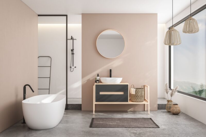
4. Warm Taupe
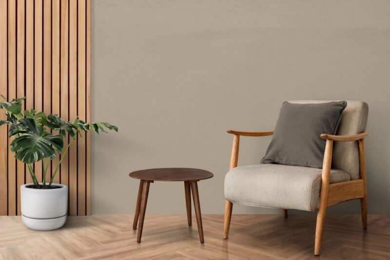
Are you looking for the perfect neutral that isn’t boring? Warm taupe answers the call with its sophisticated blend of gray and brown undertones.
Warm taupe creates a cozy foundation that works in any room, from bathrooms to home offices. The color feels like a soft cashmere blanket, comforting without being heavy or dark.
Homeowners appreciate how this chameleon-like shade shifts subtly throughout the day, always maintaining its welcoming presence while complementing virtually any accent color.
5. Teal Green
Hence comes a standout contender for 2026, teal! This rich, versatile hue adds depth and personality without overwhelming a space. It strikes a rare balance between boldness and tranquility, making it ideal for interiors that need both energy and calm.
Teal works beautifully in living rooms, home offices, and even bathrooms, where it can feel both refreshing and grounded. Many designers are pairing it with warm woods, brushed brass, and creamy neutrals for a sophisticated, contemporary look that still feels inviting.
6. Deep Auburn
When sophistication needs a touch of drama, deep auburn steps confidently into the spotlight. This rich, multidimensional hue brings undeniable warmth without the heaviness of traditional reds.
Deep auburn creates stunning accent walls in living rooms and libraries. The color reminds me of aged leather books and fine cognac, intellectual yet approachable.
Try introducing this bold tone through furniture pieces or textiles if you’re not ready to commit to painted walls.
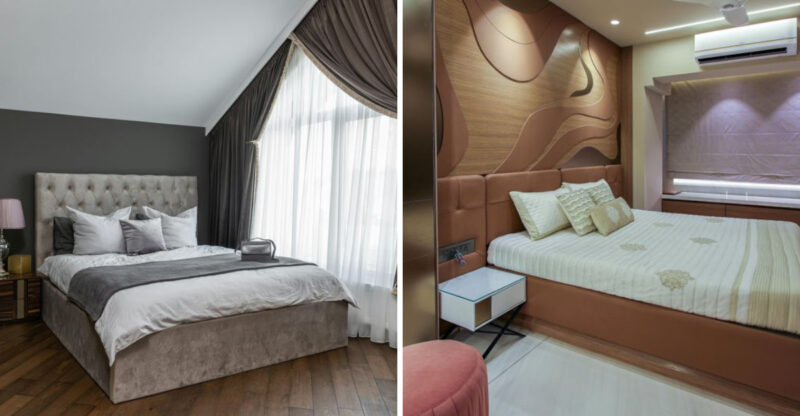
7. Plum-Brown
Though often overlooked, plum-brown deserves serious attention for its unique ability to add depth without darkness. This complex color carries rich purple undertones that emerge subtly in changing light.
Plum-brown creates cozy, enveloping dining rooms and bedrooms that feel both trendy and timeless. The color somehow manages to be both masculine and feminine simultaneously, making it perfect for shared spaces.
Consider using it in rooms that need warming up, especially north-facing spaces that receive cooler natural light.
8. Frosted White
Did you think white was just white? Frosted white proves otherwise with its subtle complexity that elevates it far beyond basic builder grade options.
Frosted white carries the faintest hint of blue-gray undertones, creating spaces that feel clean yet never sterile. The color works beautifully throughout entire homes, providing a sophisticated backdrop that makes artwork and furniture shine.
Many designers are using this nuanced white to create serene, gallery-like spaces that feel both contemporary and timeless.
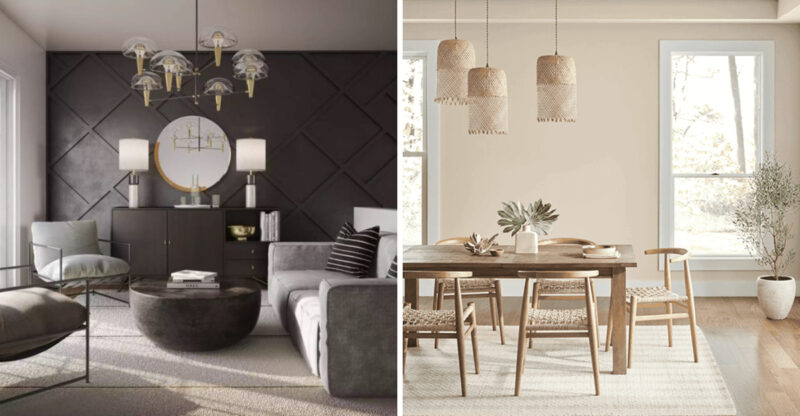
9. Graphite Gray
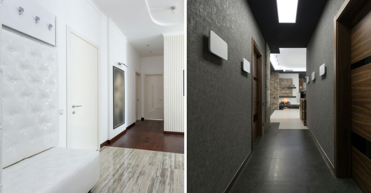
Graphite Gray offers a sophisticated, modern edge to any space, embodying elegance and versatility. This neutral color serves as a perfect backdrop for home offices and living areas, where it promotes focus and clarity.
When accented with radiant artwork or colorful textiles, graphite gray acts as a subtle canvas that highlights these features. Its timelessness ensures it remains a staple in contemporary design, easily adapting to changing trends.

