8 Key Colors Set To Transform Interiors In 2026
Ready to revamp your home with colors that’ll be all the rage in 2026? As a designer who’s spent years watching color trends evolve, I’m excited to share what’s coming next!
The palette for 2026 reflects our collective desire for both comfort and expression in our living spaces. These shades aren’t just pretty, they’re poised to revolutionize how we experience our homes.
Keep in mind that while trends offer inspiration, the best color choices are the ones that resonate with your personal style and space.
1. Sage Green: Nature’s Neutral Takes Center Stage
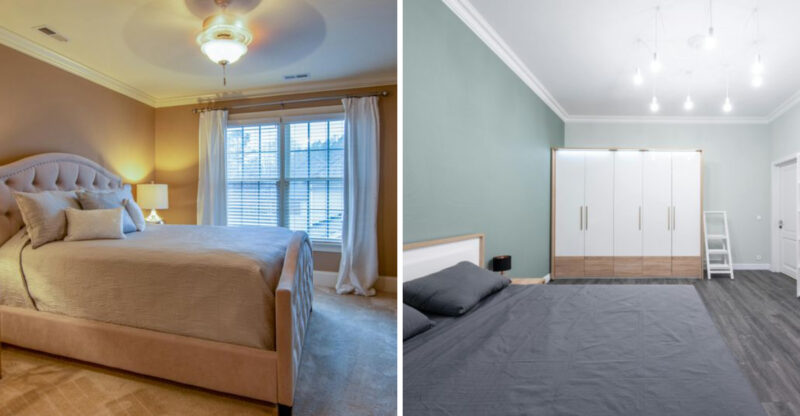
Ever noticed how some colors just make you exhale deeply? This mellow, earthy hue brings the outside in without screaming for attention. I’ve watched clients literally relax their shoulders when walking into a sage-painted room.
Sage green pairs beautifully with natural materials like rattan, jute, and raw wood. Consider it for kitchen cabinets, bedroom walls, or accent furniture where you want to create a sense of calm. The versatility makes it a designer favorite that won’t fade into the background.
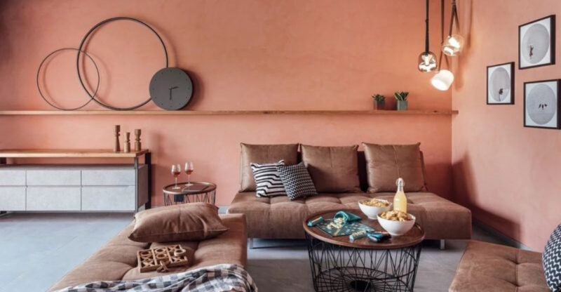
2. Warm Terracotta: The Sunset Shade Heating Up Homes
How quickly this earthy tone has moved from outdoor pottery to indoor statement walls! Warm terracotta creates instant coziness while adding unexpected sophistication to any space.
The rich clay color works wonders in dining areas, entryways, and accent walls where you want to foster connection. Terracotta plays well with brass fixtures, cream textiles, and desert-inspired décor.
Trust me, this isn’t the orange-brown from the 70s, it’s been refined with subtle undertones that make it surprisingly versatile.
3. Electric Turquoise: The Bold Accent Energizing Spaces
Electric turquoise is a captivating color that brings energy and vibrancy to any room. Its bold shade can transform dull spaces into lively environments. Imagine a minimalist living area where turquoise cushions and art pieces add a splash of excitement.
Often associated with creativity, this color is perfect for workspaces or areas where inspiration is needed. Pairing it with neutral tones like grey or beige can balance its intensity, making it suitable for both modern and eclectic styles.
Historically, turquoise has been used in various cultures as a symbol of protection and wisdom. Its striking appearance is sure to make a statement in any home.
4. Deep Navy Blue: The Bold Classic Making Waves
Though navy has been around forever, it’s finding new expression as a dramatic anchor in modern spaces. Deep navy blue commands attention while somehow remaining timeless and grounding.
Navy shines in home offices, libraries, and media rooms where focus and depth are welcome. The color creates instant sophistication when used on built-ins, island cabinetry, or statement furniture.
Contrary to popular belief, navy can actually make smaller rooms feel larger and more intentional when used confidently.
5. Golden Yellow: Sunshine Vibes For Everyday Spaces
Are you ready for some happiness on your walls? Golden yellow brings instant warmth without the intensity of primary yellows. The color feels like captured sunshine, elevating moods even during gloomy weather.
Yellow creates magic in kitchens, breakfast nooks, and playrooms where energy and creativity should flow freely. This cheerful hue pairs surprisingly well with charcoal grays, deep blues, and natural woods.
When clients worry yellow might be too much, I suggest starting with smaller doses, throw pillows, artwork, or a single accent wall.
6. Muted Taupe: The Sophisticated Neutral That Adapts
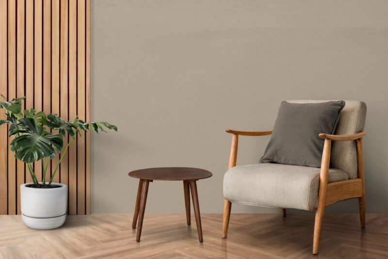
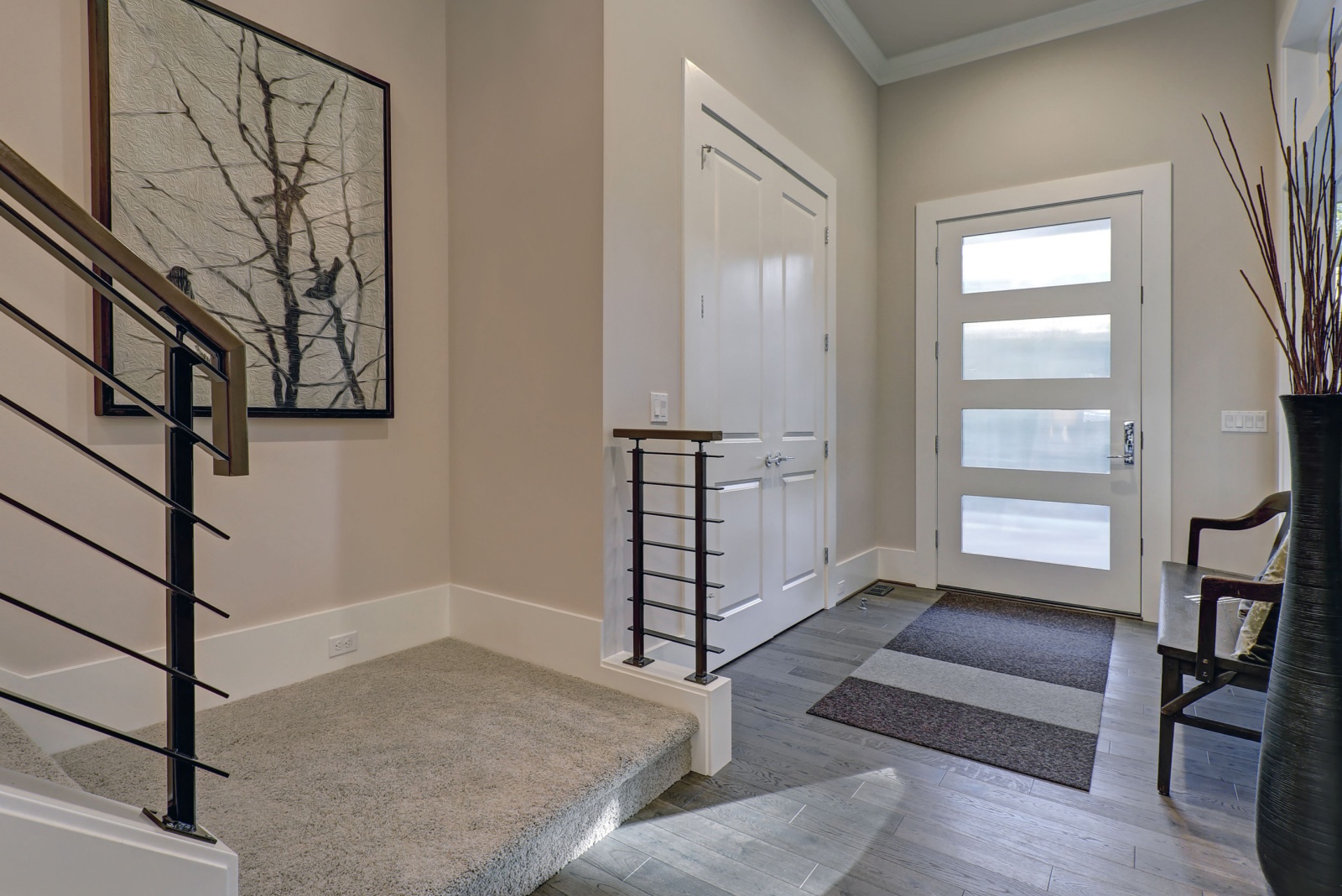
When clients ask for a color that literally goes with everything, taupe is my secret ingredient. This chameleon-like neutral sits perfectly between gray and beige, adapting to whatever it’s paired with.
Muted taupe creates harmony in open-concept spaces, hallways, and living areas where you need continuity. The color shifts subtly throughout the day, appearing warmer in morning light and cooler in the evening.
Unlike the flat beiges of yesteryear, today’s taupes contain complex undertones that add depth without dominating.
7. Rich Burgundy: The Luxe Color Adding Drama
If you’ve been playing it safe with color, rich burgundy offers the perfect entry into boldness. This sophisticated wine-inspired hue adds instant luxury and warmth to even the most minimal spaces.
Burgundy creates magic in dining rooms, reading nooks, and accent furniture where you want to create a sense of intimacy. The color pairs beautifully with brass, velvet textures, and dark woods.
When clients hesitate about going this bold, I remind them that rich, saturated colors actually create more restful spaces than bright primary ones.
8. Creamy Off-White: The Elevated Basic Making A Comeback
Forget stark whites, they’re being replaced by something much more interesting. Creamy off-white adds warmth and dimension that bright whites simply can’t match, while still maintaining that clean, fresh feeling.
This versatile shade works everywhere from trim and ceilings to entire rooms where you want a soft, light-reflective canvas. The slight warmth in creamy off-white flatters both architecture and occupants.
Unlike pure whites that can feel clinical, these creamier versions create spaces that feel both sophisticated and welcoming.

