9 Paint Colors That Just Work In Brooklyn Homes And Apartments
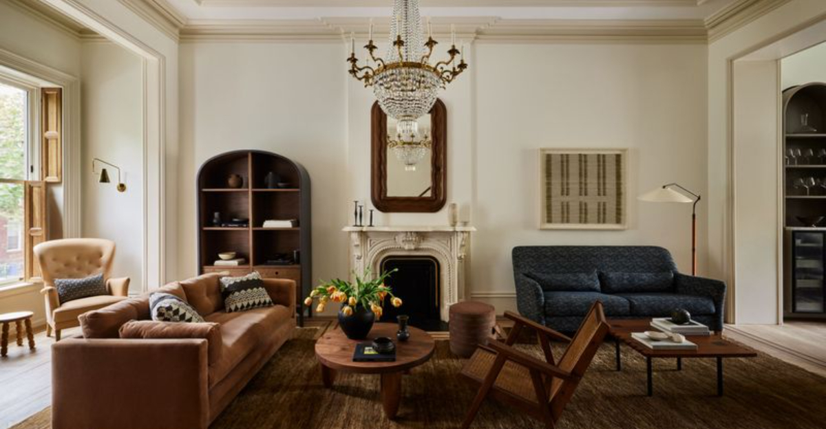
Choosing the perfect paint color for your Brooklyn home can feel overwhelming with thousands of options available. The right shade can transform your space, highlighting architectural details while complementing the borough’s unique character and natural light patterns. Whether you’re in a brownstone or a modern apartment, these nine colors consistently create stunning results in Brooklyn interiors.
1. Williamsburg Sage
A muted green-gray that pays homage to Brooklyn’s historical roots while feeling thoroughly modern. This versatile neutral creates a serene backdrop in both traditional brownstones and contemporary lofts.
The color shifts beautifully throughout the day, appearing more green in morning light and settling into a sophisticated gray by evening.
2. Brooklyn Navy
Bold yet timeless, this deep blue creates dramatic impact in dining rooms and bedrooms. Navy functions surprisingly well as a neutral in Brooklyn’s architectural landscape, pairing beautifully with original woodwork and brass fixtures.
The color’s maritime connection subtly nods to the borough’s waterfront history.
3. DUMBO Loft White
Not your basic white! This warmer off-white has subtle yellow undertones that prevent the industrial feel many stark whites create. Perfect for Brooklyn’s converted warehouse spaces where it softens concrete and exposed brick.
Morning light brings out its creamy qualities while maintaining brightness all day.
4. Cobble Hill Terracotta
Warm, earthy terracotta brings Mediterranean vibes to Brooklyn spaces. This rich, rusty hue works magic in kitchens and entryways, creating instant coziness while complementing both vintage and modern elements.
The color feels especially inviting during Brooklyn’s gray winters, adding warmth when natural light is scarce.
5. Prospect Park Green
Inspired by Brooklyn’s beloved park, this verdant green brings the outdoors in. The saturated yet sophisticated shade works beautifully in studies, bathrooms, or accent walls where it creates a focal point without overwhelming.
It pairs perfectly with the golden hour light that streams through west-facing Brooklyn windows.
6. Gowanus Charcoal
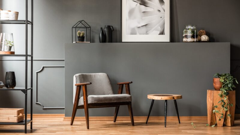
A complex dark gray with subtle blue undertones that references Brooklyn’s industrial heritage. This sophisticated neutral creates dramatic contrast against white trim and artwork in Brooklyn’s typically high-ceilinged spaces.
The color reads differently throughout the day, revealing its depth in changing light conditions.
7. Park Slope Blush
This subtle, dusty pink functions as a sophisticated neutral in Brooklyn’s brownstone-lined streets. The color brings warmth without sweetness, complementing both the honey tones of original woodwork and modern white furnishings.
Morning light enhances its rosy qualities while evening transforms it into a cozy neutral.
8. Brooklyn Heights Taupe
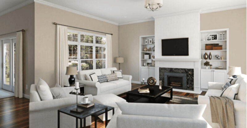
A chameleon-like neutral that bridges the gap between gray and beige. This sophisticated foundation color honors Brooklyn’s historic architecture while feeling fresh and current in contemporary spaces.
The color shifts dramatically with light changes, revealing subtle undertones that prevent it from ever feeling flat or boring.
9. Bushwick Mustard
Vibrant yet earthy, this golden yellow brings unexpected energy to Brooklyn interiors. The color works brilliantly in creative spaces, dining rooms, and kitchens where it stimulates conversation and complements Edison bulb lighting.
It pairs beautifully with exposed brick and industrial elements common in Bushwick apartments.

