Wall Colors That Make Homes Across Texas Feel Out Of Date
Wall colors set the tone for your entire home, yet many Texans are living with shades that scream ‘yesterday’ rather than ‘today.’
These outdated colors can make even the most beautiful homes feel stuck in a time warp. I’ve noticed certain paint choices that consistently date Texas homes, making them feel tired instead of fresh and inviting.
1. Harvest Gold
Remember those 1970s appliances in your grandma’s kitchen? That same mustard-yellow tone somehow made its way onto Texas walls and stayed way too long. This color instantly transports visitors back several decades, and not in a good way.
I’ve walked into numerous homes where this golden-yellow hue dominates living rooms and hallways. It creates a dingy atmosphere that no amount of modern furniture can overcome. Even accent walls in this shade can drag down your home’s overall appeal.
The warm undertones might seem cozy, but they clash with today’s cleaner palettes and make spaces feel smaller than they actually are. If your walls sport this retro shade, it’s definitely time for a refresh.
2. Hunter Green
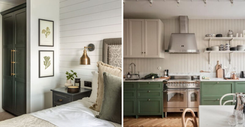
Dark, mossy hunter green was everywhere in 1990s Texas homes. While green is making a comeback, this particular muddy shade remains firmly in the past, creating cave-like spaces that feel heavy and oppressive.
The deep, saturated tone absorbs light rather than reflecting it a real problem during those scorching Texas summers when you want your home to feel airy. Many homeowners paired it with burgundy and gold accents, creating the ultimate dated combo.
If you’re still living with hunter green walls, you’re essentially broadcasting that your home hasn’t been updated in decades. Modern greens are lighter, brighter, and much more versatile than this overpowering forest shade.
3. Salmon Pink
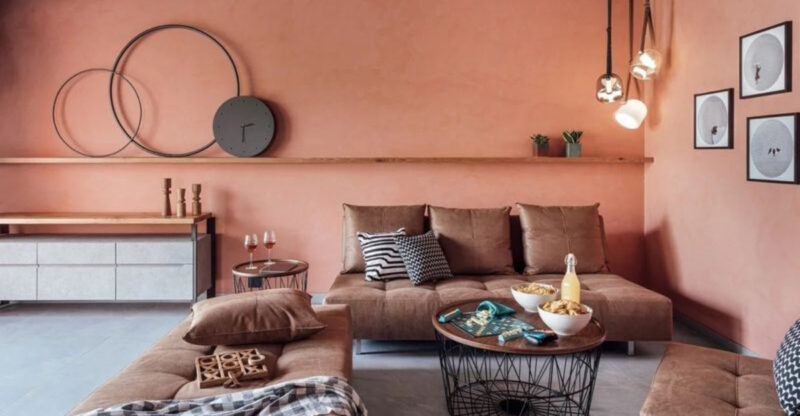
This peachy-pink disaster swept through Texas homes in the 1980s, leaving a trail of dated interiors in its wake. Unlike today’s sophisticated blush tones, salmon pink has that unmistakable artificial quality that immediately signals an outdated space.
Walking into a salmon-walled room feels like stepping into a time machine. The color often appears alongside teal accents and brass fixtures a combination that screams “Miami Vice era.” Many Texas homeowners thought this warm tone would complement the state’s sunny disposition, but it ended up looking more like sunburned walls.
The shade is particularly problematic because it casts an unflattering light on everything and everyone in the room. Your guests will thank you for painting over this relic of design history.
4. Chocolate Brown
Dark brown walls dominated Texas homes during the early 2000s Tuscan trend. This heavy, somber shade was once considered sophisticated but now makes spaces feel like windowless caves not ideal for our sun-loving state.
The oppressive nature of chocolate brown walls creates rooms that feel smaller and more confined. Many homeowners who embraced this trend paired it with heavy draperies and dark furniture, compounding the problem. I’ve seen countless Texas homes where this color choice makes living rooms feel perpetually dim, regardless of how many windows they have.
Though warm neutrals remain popular, today’s choices lean toward lighter, airier tones that expand spaces rather than shrink them. This dark chocolate shade belongs firmly in the design history books, not on your walls.
5. Mauve
If your walls are sporting this dusty pinkish-purple hue, you’re basically announcing that your home hasn’t been updated since the late 1980s. Mauve was absolutely everywhere in Texas homes during that era, often appearing alongside country blue and forest green accents.
This muted purple tone has a distinctly aged quality that no amount of modern furniture can overcome. Many Texans paired it with floral wallpaper borders and dried flower arrangements, creating the perfect storm of dated decor. The color’s muddy undertones make spaces feel dull rather than inviting.
While purple tones can work beautifully in contemporary homes, this particular shade carries too much baggage from decades past. Replacing mauve with a fresher alternative will immediately bring your Texas home into the current century.
6. Tuscan Gold
This intense yellow-orange shade invaded Texas homes during the Tuscan craze of the early 2000s. Homeowners were convinced it created Mediterranean warmth, but it actually produces a jaundiced glow that makes everything look sickly.
The color’s overwhelming intensity dominates any room, making it impossible to create a balanced design. I’ve visited countless Texas homes where this aggressive shade overpowers every piece of furniture, artwork, and accent. Many homeowners paired it with heavy wrought iron fixtures and faux-finished cabinets, creating the perfect dated trifecta.
Today’s warm neutrals are much more subtle and sophisticated, allowing other elements in the room to shine. If your walls are still sporting this intense golden-orange hue, it’s broadcasting your home’s last update date to every visitor.
7. Burgundy Red
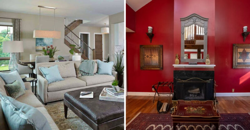
Deep, dramatic burgundy walls were once considered the height of elegance in Texas dining rooms and studies. Today, they read as oppressively dark and stuffy, creating spaces that feel perpetually stuck in the 1990s.
The intense color absorbs light rather than reflecting it, making rooms feel smaller and more confined than they actually are. Many Texas homeowners who chose this shade also incorporated heavy drapes, ornate furniture, and lots of gold accents amplifying the dated effect. The color’s inherent formality feels out of step with today’s more relaxed living styles.
While rich accent walls can still work beautifully, this particular wine-red shade carries too much baggage from decades past. Modern reds are brighter and more energetic, without the heavy, somber quality that makes burgundy feel so outdated.
8. Builder Beige
That flat, uninspired beige that came standard in thousands of Texas tract homes still dominates too many interiors. This isn’t just any neutral – it’s that specific shade with yellow undertones that instantly broadcasts “cookie-cutter home” vibes.
The color lacks character and depth, creating spaces that feel like blank boxes rather than personalized homes. Many Texas residents never bothered to paint over this default shade, resulting in interiors that feel perpetually unfinished and impersonal. The color’s yellowish cast often makes rooms look dirty even when they’re clean.
Today’s neutrals have more depth and personality, with greige, warm whites, and sophisticated taupes replacing this flat, characterless tone. If your walls are still sporting this developer special, your home is missing out on a chance to express your unique style.
9. Country Blue
This muted, dusty blue tone dominated Texas homes throughout the 1980s and early 1990s, often appearing alongside mauve, forest green, and plenty of country-style decor. Unlike today’s fresh, clear blues, this particular shade has a grayish quality that feels distinctly dated.
The color’s muted nature creates spaces that lack energy and vibrancy. Many Texas homeowners paired it with duck and heart motifs, dried flower arrangements, and oak furniture creating rooms that scream “Reagan era.” Its popularity was so widespread that entering a home with country blue walls is like stepping into a time capsule.
While blue remains a perennial favorite for walls, modern choices are either much bolder or much clearer than this dusty in-between shade. Updating this color will instantly bring your Texas home into the current decade.
10. Terracotta
This orange-brown shade swept through Texas during the Southwest design craze of the 1990s and early 2000s. While it was intended to evoke desert landscapes, it actually creates spaces that feel perpetually stuck in the era of “Friends” and flip phones.
The intensity of terracotta walls overwhelms most rooms, making them feel smaller and darker than they actually are. Many Texas homeowners paired it with Kokopelli figures, Southwestern patterns, and turquoise accents amplifying the dated effect. The color’s reddish-orange undertones can also make a space feel uncomfortably warm during our scorching summers.
While earthy tones are making a comeback, modern versions are more subtle and sophisticated. If your walls are still sporting this intense clay color, your home is broadcasting its last renovation date to every visitor.
11. Mint Green
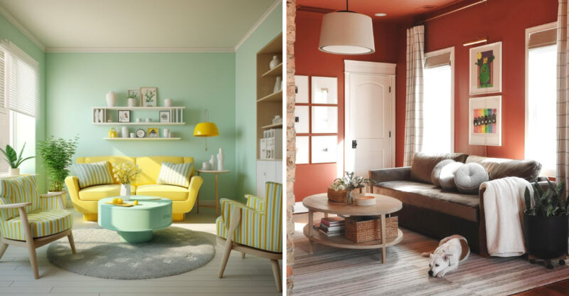
That specific pastel mint shade that dominated Texas bathrooms and kitchens in the 1950s and again in the 1980s instantly dates a home. Unlike today’s sophisticated sage greens, this color has a distinctly artificial quality that feels like a relic from another era.
The color’s cool, almost clinical tone creates spaces that feel institutional rather than homey. Many Texas homes still feature this shade paired with pink or black accents in bathrooms a combination that screams “decades since renovation.” The color’s candy-like quality makes it difficult to create a sophisticated design scheme around it.
While green is absolutely on-trend right now, modern choices have more depth and subtlety. If your walls are still sporting this sweet pastel tone, your home is stuck in a time warp that’s immediately apparent to everyone who visits.
12. Peach
Soft peach walls were inescapable in Texas homes throughout the 1980s and early 1990s. This not-quite-orange, not-quite-pink shade was once considered universally flattering but now reads as unmistakably dated – like shoulder pads and permed hair.
The color’s warm undertones can make spaces feel perpetually sunset-lit, regardless of the actual time of day. Many Texas homeowners paired it with seafoam green, floral patterns, and lots of brass fixtures – creating the perfect storm of dated decor. The shade’s inherent sweetness also makes it difficult to create sophisticated, adult spaces.
While warm neutrals remain popular, today’s choices have more subtlety and sophistication. If your walls are still sporting this fruity tone, your home is broadcasting its last update date to every visitor who walks through your door.
13. Avocado Green
This muddy yellow-green shade dominated Texas homes in the 1970s and has never successfully shaken its association with that era. Unlike today’s fresh, botanical greens, avocado has a distinctly artificial quality that feels immediately dated.
The color’s murky undertones create spaces that feel perpetually dim and slightly dingy. Many Texas homes paired this shade with harvest gold and wood paneling a combination that creates the ultimate throwback to the Nixon era. Even as a single accent wall, this particular green instantly transports a room back several decades.
While green is making a major comeback in home design, modern choices are clearer and more natural-looking. If your walls are still sporting this distinctive 70s shade, your home is stuck in a time warp that’s immediately apparent to everyone who visits.

