13 Outdated Sofa Colors To Avoid In California And The Timeless Ones To Pick Instead
Choosing the right sofa color can make or break your California living space. Some shades feel stuck in the past, while others stay stylish year after year.
I’ll walk you through the colors to skip and the ones that’ll keep your home looking fresh and inviting for years to come.
1. Mauve Pink Sofas
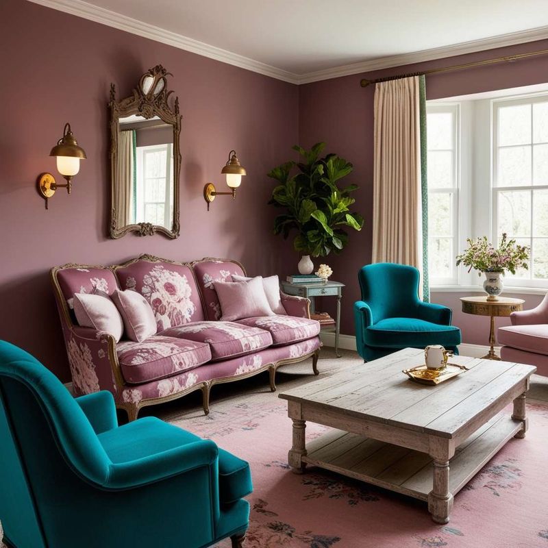
Remember when dusty rose ruled every living room? That era has passed, and mauve pink sofas now scream outdated rather than sophisticated.
California homes with abundant natural light make this color look even more washed out and tired. Your space deserves better than this relic from decades past.
I recommend steering clear unless you’re aiming for a retro theme that few guests will appreciate.
2. Hunter Green Velvet
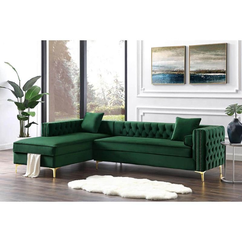
Dark forest green felt luxurious in the nineties, but today it weighs down California’s breezy aesthetic. The heaviness clashes with our love for open, airy spaces filled with sunshine.
This shade absorbs light rather than reflecting it, making rooms feel smaller and gloomier. Your bright California lifestyle calls for something more uplifting and contemporary instead of this brooding tone.
3. Burnt Orange Upholstery
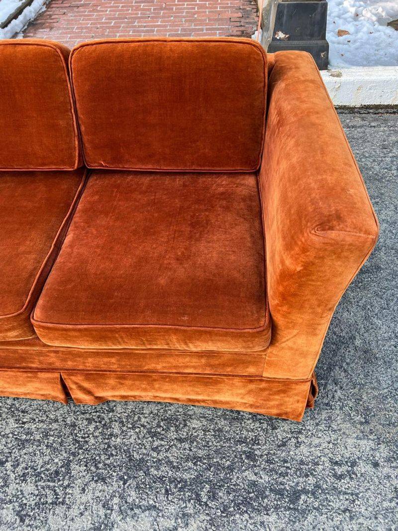
That seventies vibe might sound fun until you’re stuck with a pumpkin-colored couch year-round. Burnt orange feels aggressively retro in ways that don’t translate to modern California living.
The color fights against neutral palettes and makes coordinating throw pillows a nightmare. I’ve seen too many homeowners regret this bold choice within months of purchase.
4. Burgundy Leather
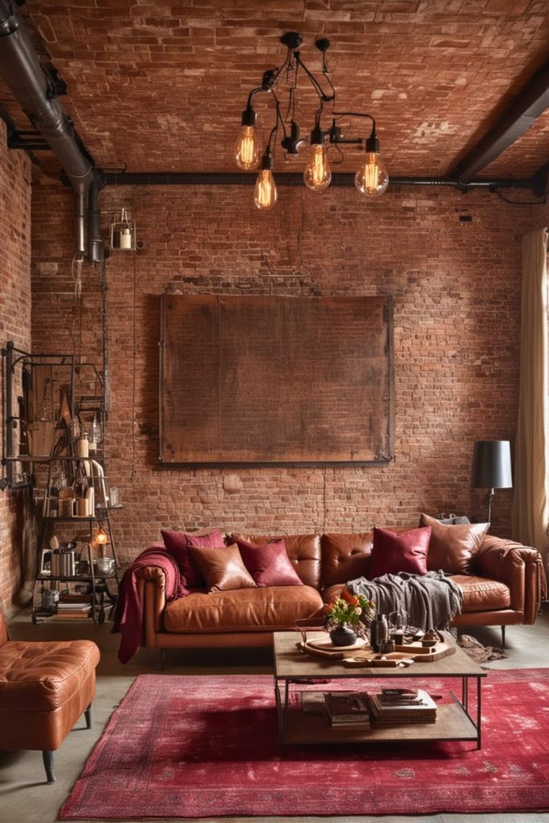
Wine-colored leather belongs in old-school libraries, not California living rooms. The formal, stuffy appearance contradicts our state’s relaxed, casual lifestyle.
This shade makes spaces feel dark and closed off, especially in smaller homes or apartments. California’s indoor-outdoor living style needs furniture that feels welcoming and light, not something from a Victorian gentleman’s club.
5. Teal With Gold Undertones
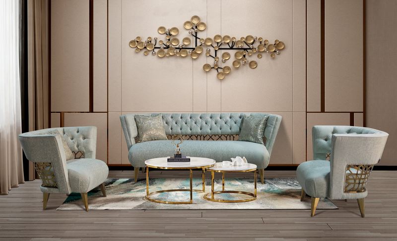
Peacock-inspired furniture had its moment about fifteen years ago. Now, this blue-green hybrid with metallic hints looks confused rather than sophisticated.
The color doesn’t play well with California’s natural color palette of sandy neutrals and ocean blues. I find it creates visual chaos instead of the calm, cohesive look most homeowners want in their relaxation spaces today.
6. Salmon Peach Fabric
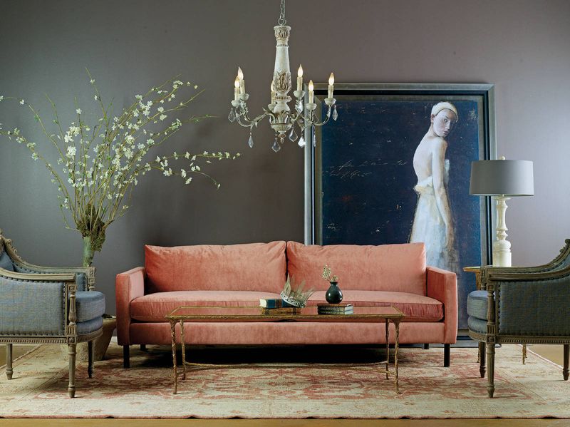
Coral’s softer cousin looked fresh in beach houses decades ago. Today, salmon peach reads as faded and tired, especially under California’s strong sunlight.
The color has an unfortunate way of clashing with skin tones in photographs too. Your Instagram-worthy California home deserves furniture that photographs beautifully and stays stylish beyond a single season or fleeting trend.
7. Brown With Red Tones
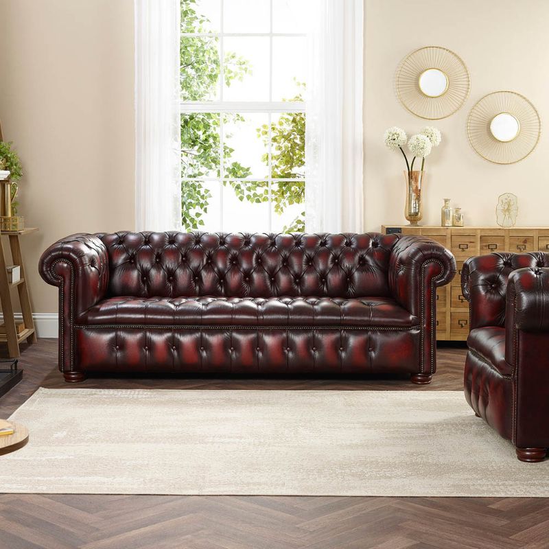
Mahogany-toned furniture dominated the early two-thousands. This particular brown carries red undertones that feel heavy and dated now.
California’s design trends favor cooler, grayer browns that feel more modern and versatile. The reddish cast makes rooms feel darker and less spacious, working against the bright, open aesthetic we love here on the West Coast.
8. Bright Yellow Couches
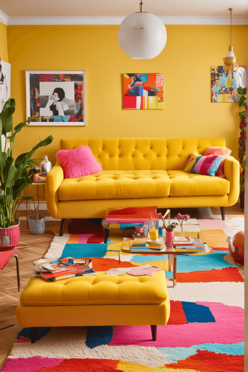
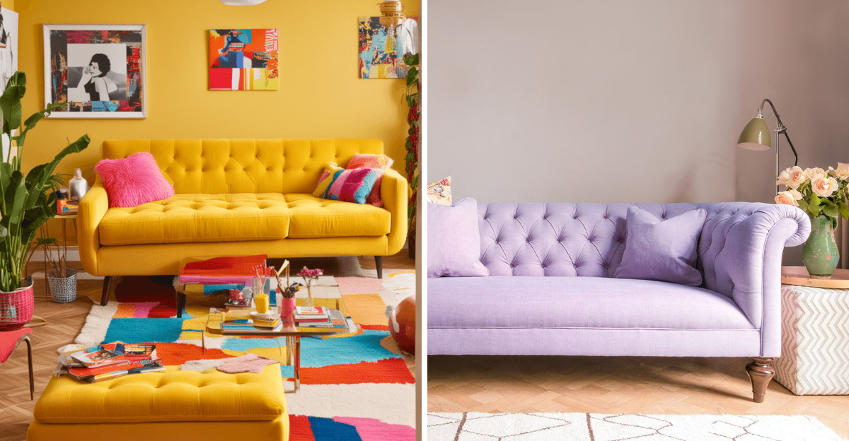
Sunshine sounds perfect for California until it’s sitting in your living room demanding attention. Canary yellow overwhelms spaces and makes everything else look dull by comparison.
The color also shows every stain and mark, requiring constant cleaning to maintain its intensity. I’ve watched homeowners grow tired of this aggressive shade faster than any other, usually covering it with throws within months.
9. Lavender Purple Seating
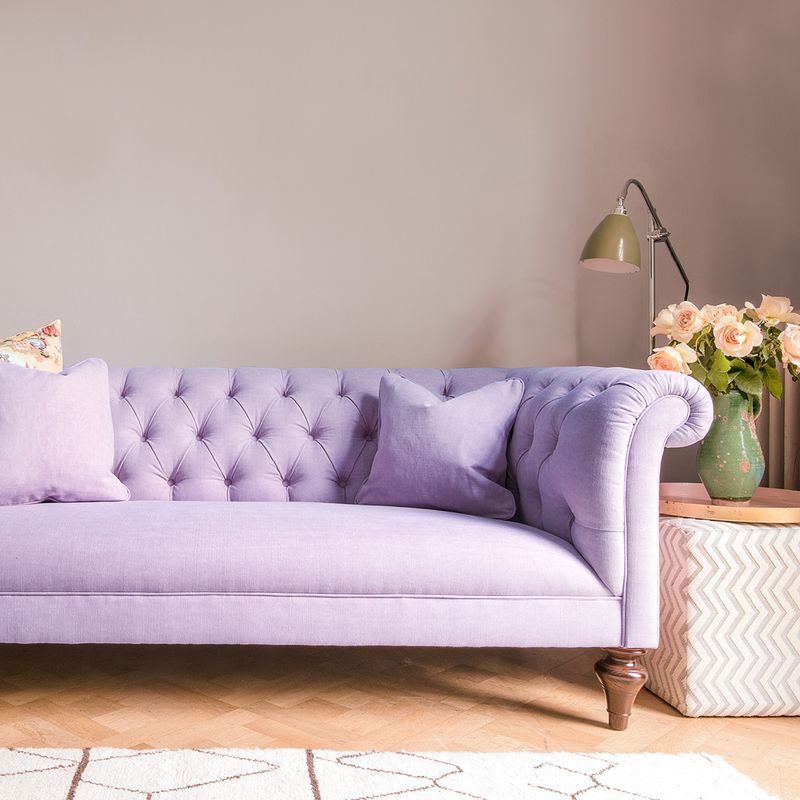
Soft purple seemed whimsical and different a while back. Now it feels juvenile and hard to decorate around in adult spaces.
The color doesn’t coordinate well with California’s natural landscape colors or modern neutral palettes. Your living room isn’t a child’s bedroom, and this shade unfortunately blurs that line in ways that diminish your space’s sophistication and grown-up appeal.
10. Olive Drab Green
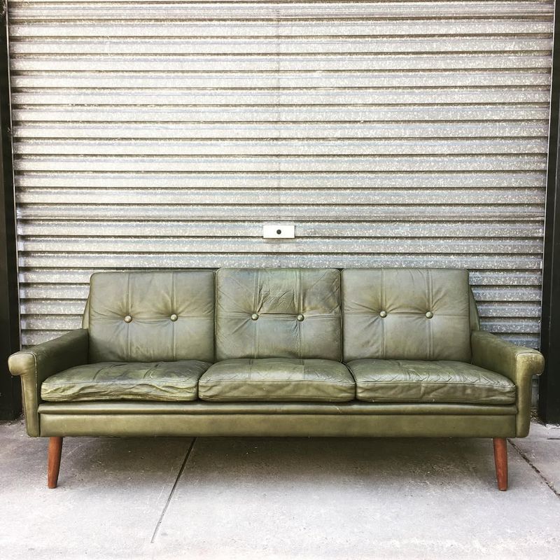
Military-inspired colors rarely translate well to comfortable home furnishings. Olive drab carries a muddy quality that drains life from California’s naturally vibrant spaces.
Unlike sage or eucalyptus greens that feel fresh, this version looks dingy even when brand new. I recommend avoiding this particular green entirely in favor of clearer, more appealing shades that won’t make your space feel like a barracks.
11. Rust Orange Brown
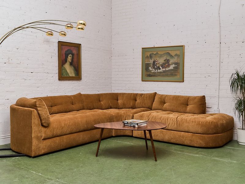
Earthy bohemian styles pushed rust into popularity recently. The trend has already peaked, leaving these sofas looking dated faster than most color choices.
This muddy orange-brown hybrid doesn’t complement California’s coastal aesthetic or modern farmhouse trends. The color photographs poorly and makes spaces feel cluttered rather than curated, which matters when you’re proud of your home and want it looking its absolute best.
12. Hot Pink Statement Pieces
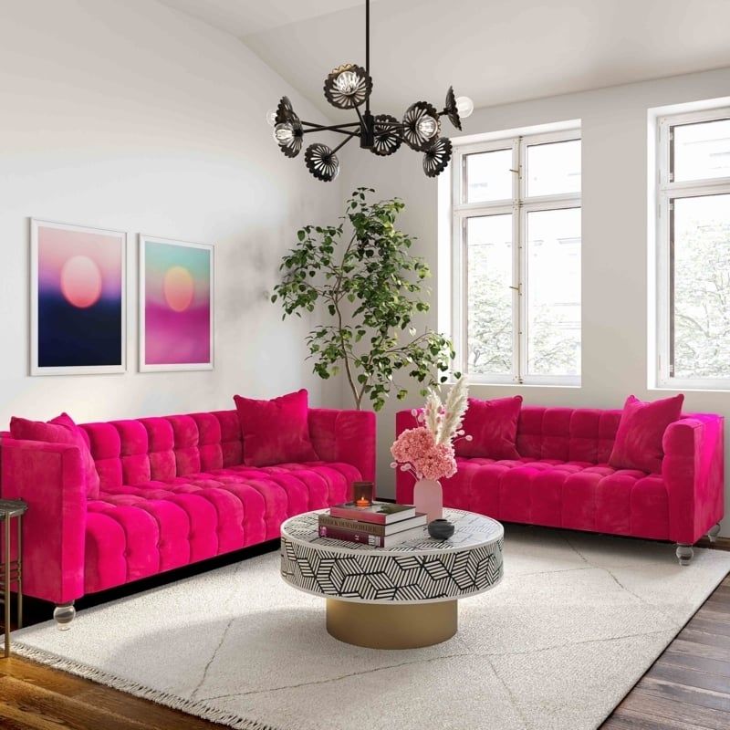
Fuchsia makes a statement, but not the kind you’ll appreciate long-term. This aggressive shade dominates rooms and limits your decorating options severely.
California style embraces personality without overwhelming spaces with single bold elements. Hot pink demands to be the center of attention constantly, which grows exhausting when you’re trying to create a relaxing, balanced home environment where everything works together harmoniously.
13. Navy Blue With Purple Cast
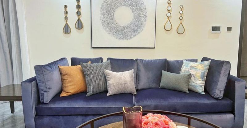
Not all navy blues are created equal, and this purplish version missed the mark. The undertones give it an artificial quality that doesn’t feel natural or timeless.
True navy works beautifully in California homes, but this variation looks cheap and dated. I suggest testing colors in your actual lighting before committing, because purple-cast navy photographs differently than it appears in showrooms under artificial lights.
14. Timeless Warm White
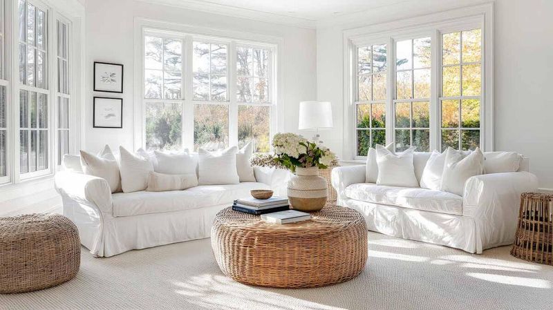
Creamy whites never go out of style in California homes. They reflect our abundant sunshine while creating clean, fresh spaces that feel larger and more inviting.
This shade works with every design style from coastal to modern farmhouse. Yes, maintenance requires some effort, but performance fabrics have made white sofas more practical than ever before for families who want that timeless, sophisticated look.
15. Classic Light Gray
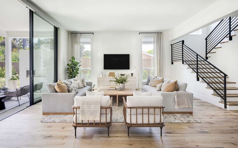
Soft gray serves as the perfect neutral foundation for California living spaces. The color complements our natural landscape while offering versatility that few other shades can match.
You can change your entire room’s look with different pillows and throws without replacing the sofa. I love how light gray photographs beautifully and never competes with your decor choices or personal style evolution over the years.
16. Sophisticated Charcoal
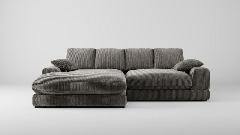
Deeper than light gray but not quite black, charcoal brings sophistication without the heaviness. This shade anchors California rooms while maintaining an airy, modern feel.
The color hides wear and stains better than lighter options while staying timeless and elegant. Charcoal works particularly well in open-concept spaces where you need visual weight without overwhelming the flow between indoor and outdoor living areas we cherish.
17. Soft Beige Tones
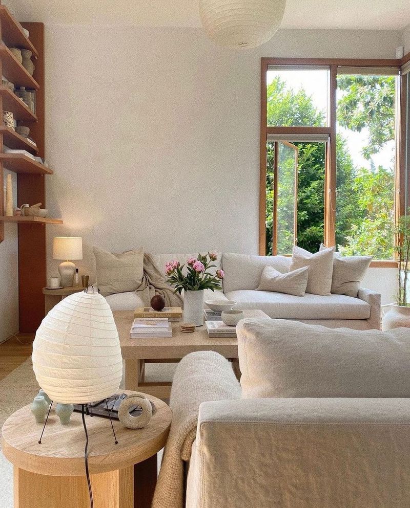
Sandy beiges echo California’s beaches and desert landscapes naturally. This warm neutral creates cozy spaces that still feel light and open under our abundant sunshine.
The color works with virtually every accent color you might choose over the years. Beige has unfairly gotten a boring reputation, but modern versions with subtle depth look anything but dull when styled with texture and thoughtful accessories.
18. True Navy Blue
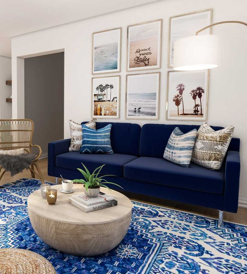
Clean navy without weird undertones remains eternally stylish in California homes. The color brings depth while connecting to our ocean surroundings in sophisticated ways.
Navy pairs beautifully with whites, creams, and natural woods that define California coastal style. I find this shade particularly forgiving with stains and wear while maintaining that crisp, put-together appearance that makes your home feel intentionally designed and thoughtfully curated.
19. Warm Camel Leather
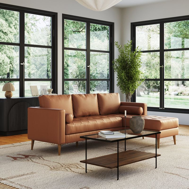
Rich camel leather brings warmth and ages beautifully over time. This golden-tan shade fits perfectly with California’s love for natural materials and organic textures.
The color develops character with use rather than looking worn out or shabby. Camel leather works across design styles from mid-century modern to contemporary farmhouse, making it a smart investment that adapts as your taste evolves through different life stages.
20. Soft Sage Green
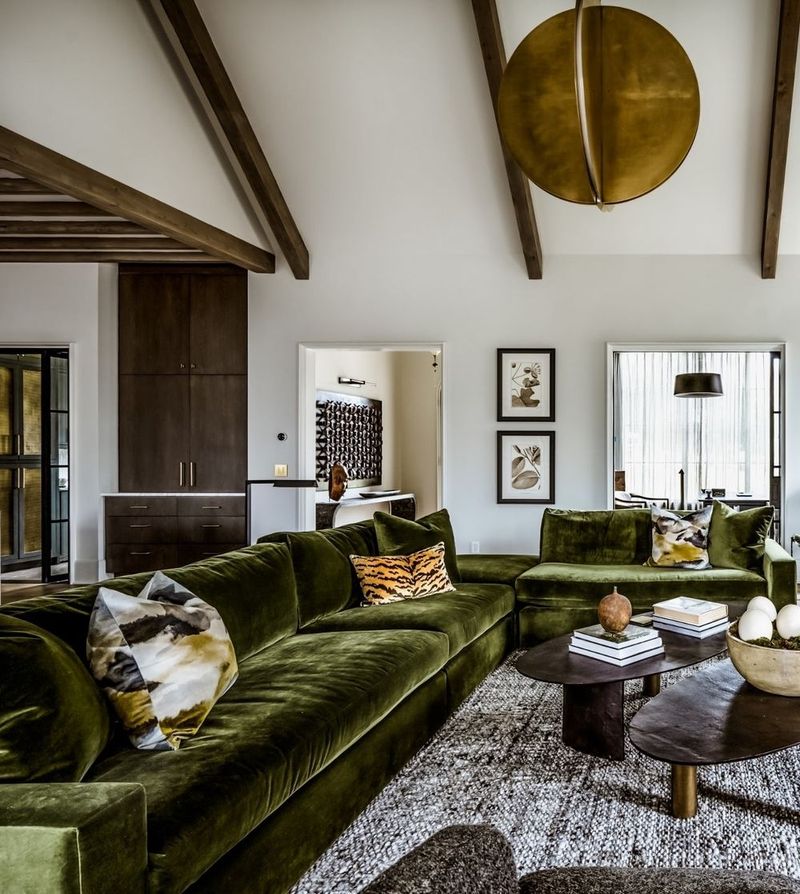
Muted sage connects your indoor space to California’s natural landscape. This gentle green feels calming and organic without the dated quality of darker or brighter greens.
The color complements both warm and cool tones, giving you decorating flexibility. Sage has staying power because it’s rooted in nature rather than trendy color forecasts, meaning your sofa will look current for years while creating that peaceful atmosphere we all crave.
21. Crisp Cream Shades
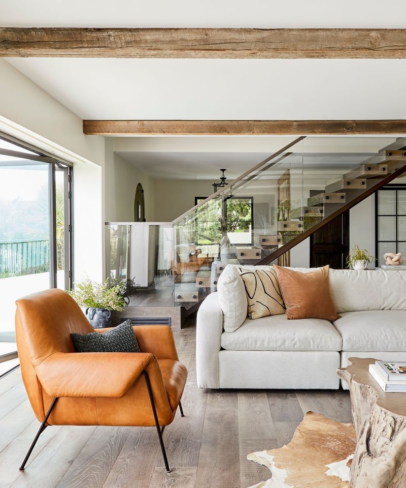
Warmer than stark white but just as versatile, cream brings softness to California interiors. This shade creates inviting spaces that feel elegant without being too formal or stuffy.
Cream works beautifully with our state’s indoor-outdoor lifestyle and natural light. The color provides a neutral backdrop that lets your personality shine through accessories while maintaining that timeless quality that never needs updating or apologizing for its presence.
22. Greige Perfection
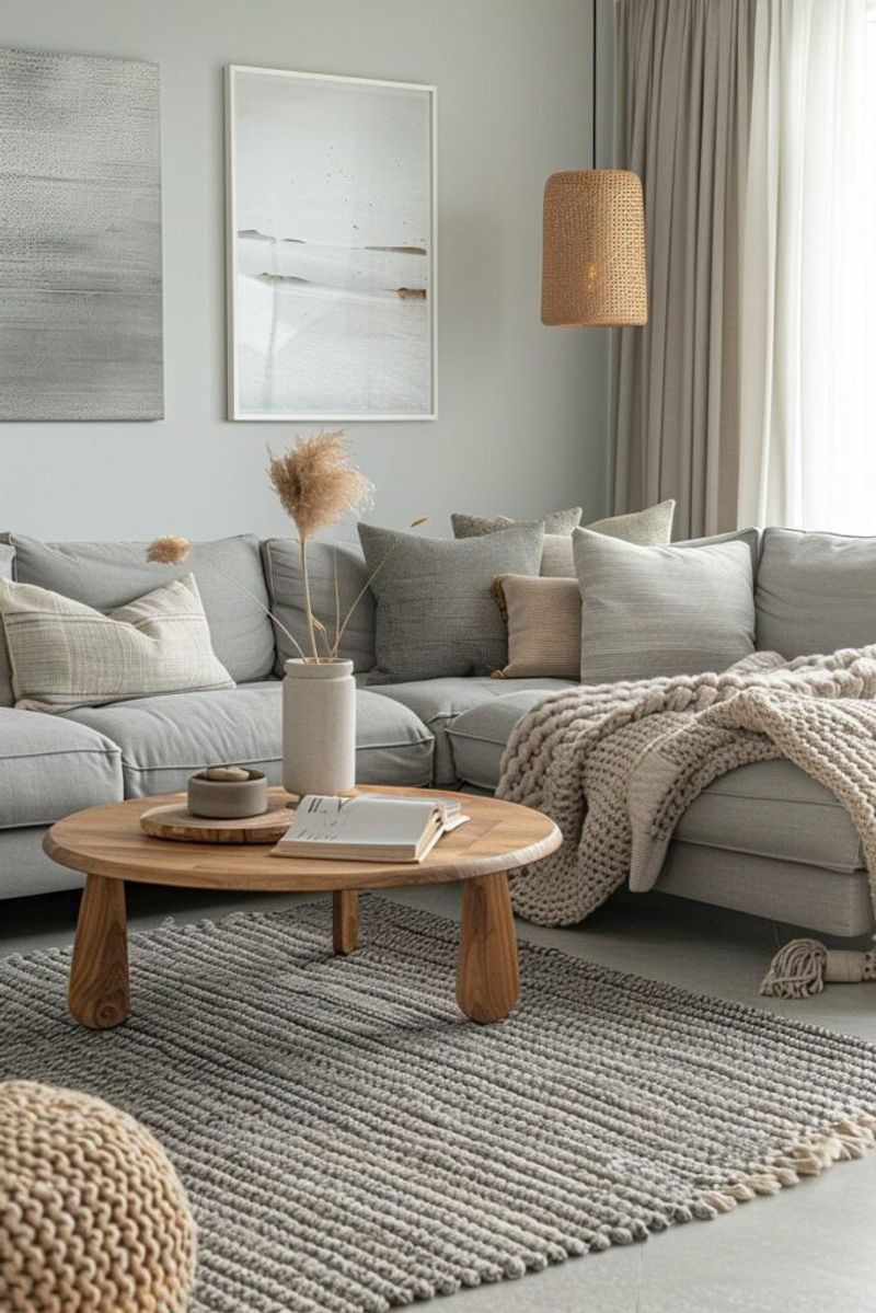
Gray meets beige in this perfect hybrid that’s conquered California design. Greige offers the best of both worlds, bringing warmth and coolness simultaneously.
This balanced neutral works with any accent color and every design trend. I’ve watched greige maintain its popularity longer than most colors because it truly is universally flattering, photographing beautifully and creating spaces that feel both current and timeless regardless of changing trends.
23. Soft Dusty Blue
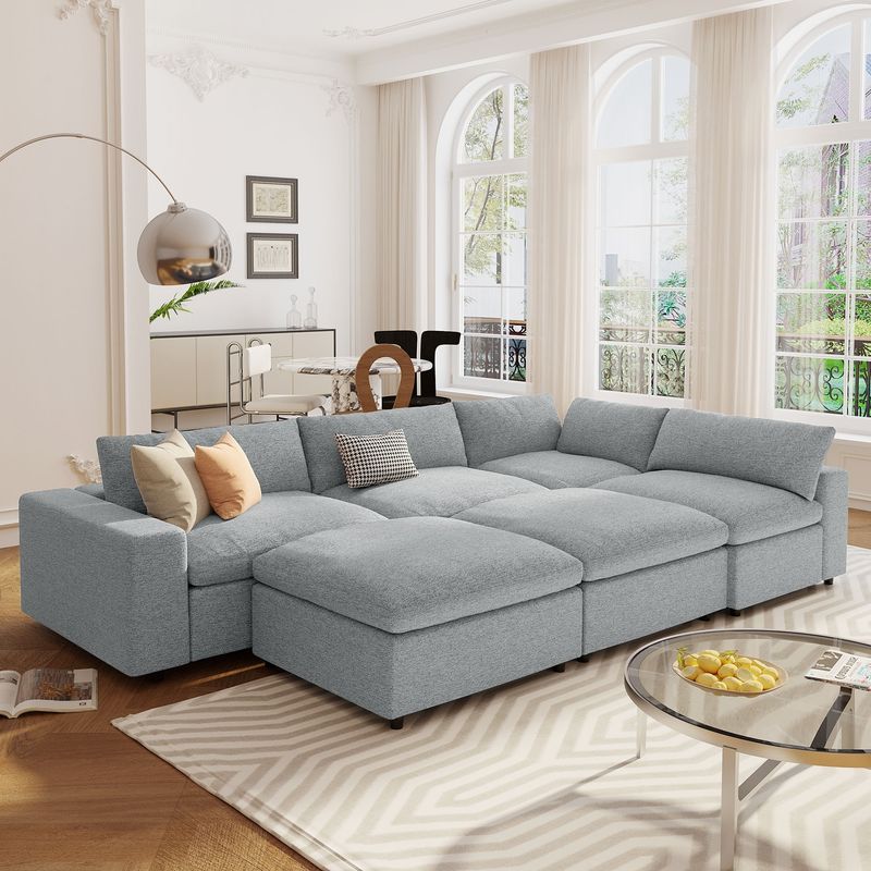
Muted blue-gray tones bring tranquility without feeling cold or distant. This shade references California skies and ocean horizons in subtle, sophisticated ways.
Dusty blue works particularly well in bedrooms converted to sitting areas or reading nooks. The color creates restful environments while staying current and stylish, offering more personality than pure gray without the commitment of bolder blues that might eventually feel limiting.
24. Classic Tan
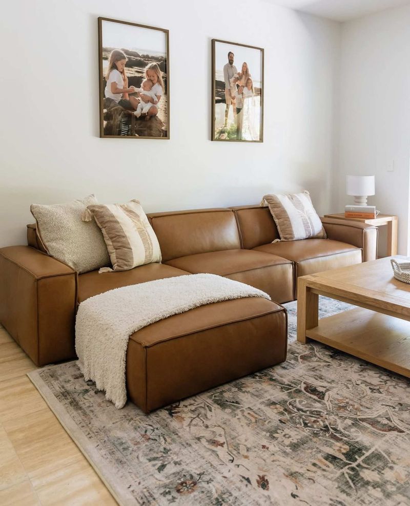
Straightforward tan never tries too hard and always delivers. This honest neutral works in California homes from San Diego to San Francisco without missing a beat.
The color hides dirt and wear while maintaining a polished appearance year after year. Tan provides the perfect backdrop for seasonal decor changes, letting you refresh your space’s look without the expense of new furniture every time your style preferences shift slightly.
25. Charcoal Brown
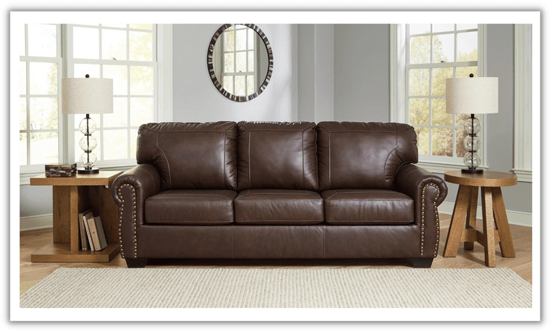
Deeper than typical browns, this gray-brown hybrid brings sophistication and practicality together. The color grounds California spaces without the heaviness of pure black furniture.
Charcoal brown hides stains exceptionally well while looking intentional and stylish. I recommend this shade for families who want durability without sacrificing style, as it maintains a polished appearance even with daily use and the inevitable wear that comes with actually living life.
26. Pure Ivory White
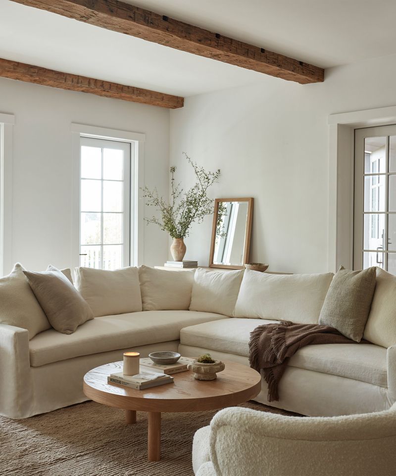
Slightly warmer than stark white, ivory brings elegance without coldness. This shade maximizes California’s natural light while creating spaces that feel luxurious and intentional.
Modern fabric treatments make ivory surprisingly practical for real life, not just showrooms. The color elevates any space instantly, making rooms feel more expensive and thoughtfully designed while maintaining that breezy, effortless California aesthetic we all love and aspire to achieve.

