7 Curtain Colors Designers Say Are Officially Out Of Style In 2025 Projects + 7 They’re Replacing Them With
Home design trends evolve with each passing season, and window treatments continue to reflect those changing preferences. As 2025 unfolds, interior designers are moving away from curtain colors that once defined entire decor styles.
Some hues that felt timeless are now making way for fresher, more dynamic choices. Discover which curtain shades are falling out of fashion and which modern tones are emerging as favorites in today’s most thoughtfully designed spaces.
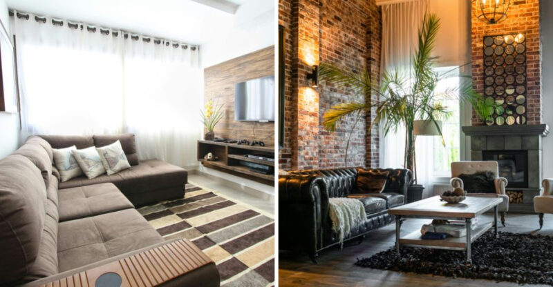
1. Out: Chocolate Brown Curtains
Remember those heavy, dark drapes that seemed to absorb all the light in a room? The once-popular chocolate brown curtains are rapidly disappearing from designer portfolios.
This deep, earthy tone that dominated early 2000s decor now makes spaces feel dated and smaller than they actually are. Designers cite its tendency to create a heavy, somewhat gloomy atmosphere as the main reason for its decline.
2. In: Terracotta And Clay Tones
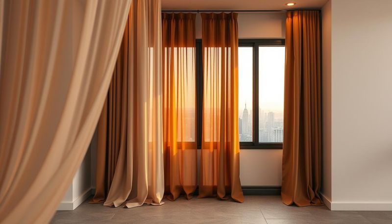
Earthy elegance has arrived at our windows! These warm, natural hues bring the outdoors in while adding depth without the heaviness of darker predecessors.
Terracotta curtains create a sophisticated yet welcoming ambiance that complements both modern and bohemian interiors. Their subtle orange-red undertones catch morning light beautifully, casting a gentle, warm glow throughout your space that changes with the day’s progression.
3. Out: Basic Beige Curtains
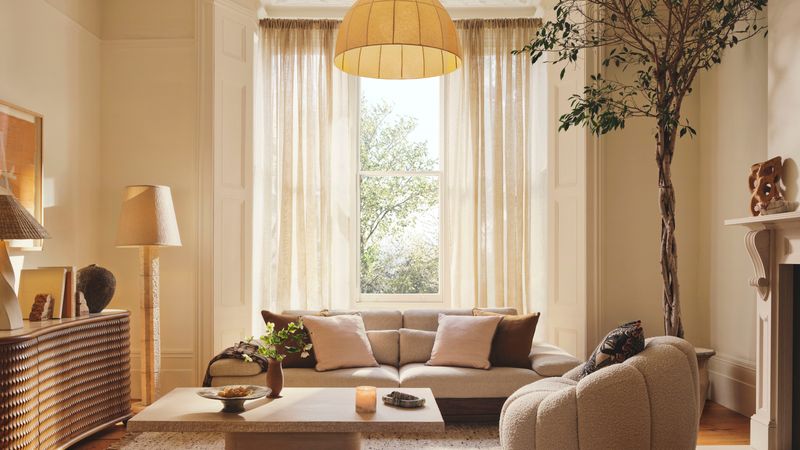
Gone are the days when playing it safe with neutral window coverings was the norm. Basic beige has lost its appeal in forward-thinking design circles.
While once considered a versatile backdrop, these uninspired curtains now read as a missed opportunity rather than a design choice. The flat, often yellowish undertone fails to enhance any space, instead creating what designers now describe as “rental property energy” in even the most custom homes.
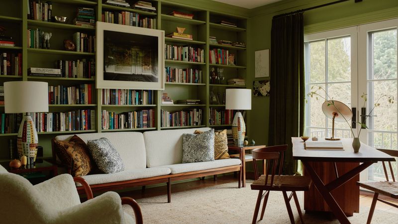
4. In: Sage And Olive Green
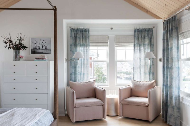
The plant parent generation has spoken! Verdant window dressings are experiencing a major moment in contemporary homes across the country.
Sage and olive green curtains introduce a natural serenity while still functioning as a soft neutral. These botanical-inspired hues pair beautifully with natural materials like wood and rattan, creating spaces that feel grounded yet fresh. Their subtle color variation adds dimension without overwhelming other design elements.
5. Out: Bright Cherry Red Curtains
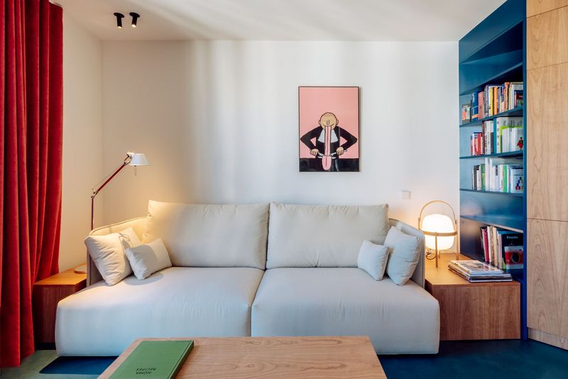
Bold statement pieces have their place, but the overly dramatic cherry red curtains have taken their final bow. Their intense, attention-demanding presence has fallen from grace in sophisticated design circles.
Red curtains that once seemed daring now read as aggressive and overwhelming. The high-energy color creates visual fatigue rather than excitement, with designers noting that clients increasingly request their removal during renovations. Plus, they tend to fade unevenly, looking patchy over time.
6. In: Dusty Rose And Muted Berry
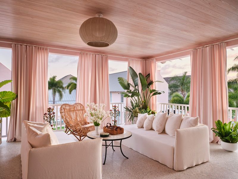
Soft blush tones have evolved into something more sophisticated for 2025. The new iteration brings depth without sacrificing that coveted warm glow.
Dusty rose curtains introduce subtle color while maintaining an air of refinement. These muted berry shades act almost like a neutral but with personality, creating rooms that feel thoughtfully designed rather than simply decorated. They’re especially stunning in spaces with afternoon light, where they cast a flattering pink glow.
7. Out: Navy Blue Block-Out Curtains
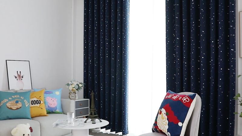
Heavy navy drapes that once signaled luxury have sailed into the sunset. Their light-absorbing qualities and overwhelming presence are being left behind by forward-thinking designers.
Navy blue block-out curtains can make even spacious rooms feel confined and cave-like. What once seemed rich and traditional now appears unnecessarily somber and formal. Designers note that these dark, heavy treatments create visual weight that drags down the entire room’s energy.
8. In: Misty Blue And Seafoam
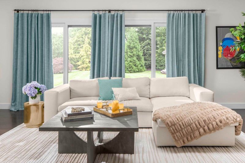
Coastal grandma meets modern minimalism in this refreshing color trend. Light, airy window treatments are taking precedence in homes that prioritize wellbeing and connection to nature.
Misty blue curtains introduce serenity without the heaviness of their navy predecessors. These oceanic hues filter light beautifully, creating an almost ethereal quality throughout the day. Designers praise their versatility, noting they complement both warm and cool color schemes while enhancing natural light.
9. Out: Metallic Gold Curtains
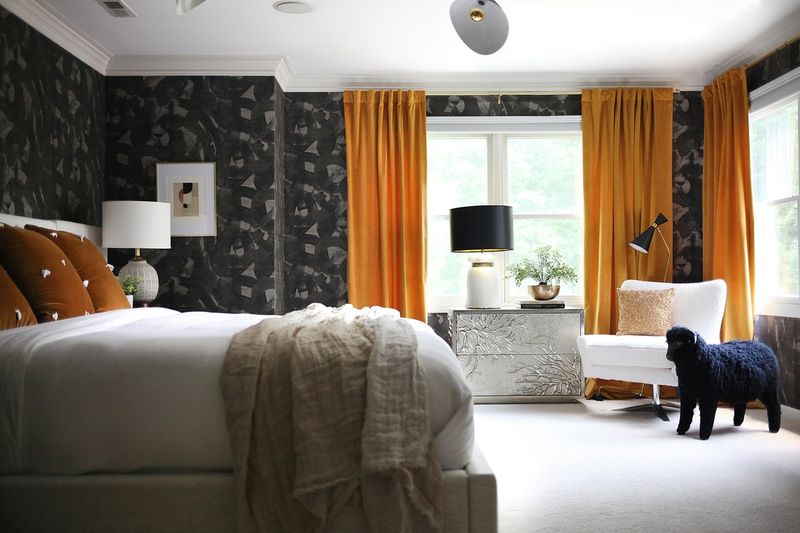
The glitz and glamour of shimmery window treatments have lost their luster. Once considered the epitome of luxury, metallic gold curtains now read as outdated and excessive.
Their flashy appearance often clashes with today’s more authentic design approach. Designers report that these high-maintenance fabrics show wear quickly, with threads breaking and the metallic finish wearing off unevenly. What once seemed opulent now looks like a relic from the early 2010s McMansion era.
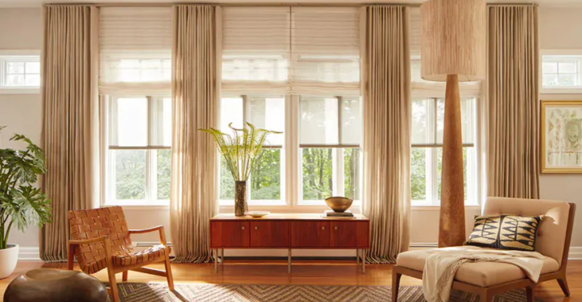
10. In: Natural Linen In Oatmeal Tones
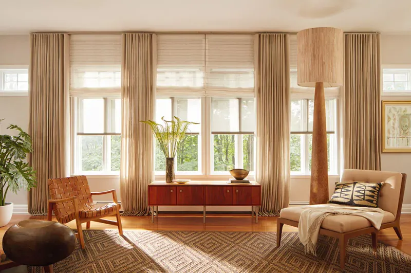
Authenticity reigns supreme in 2025’s window treatment trends. Raw, textural fabrics with visible weaves are captivating designers and homeowners alike.
Oatmeal linen curtains bring organic texture and subtle variation that synthetic fabrics simply can’t replicate. Their slightly imperfect drape creates visual interest while maintaining a relaxed elegance. Designers love how these natural fibers interact with light, creating a soft diffusion that changes subtly throughout the day.
11. Out: Busy Floral Patterns
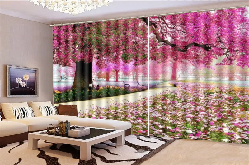
Grandma’s garden has withered on the vine when it comes to window treatments. Those busy, multi-colored floral prints that once dominated country-chic interiors have fallen decisively out of favor.
Designers cite their visually chaotic nature and tendency to clash with other elements as major drawbacks. The dated patterns often feature unrealistic colors and overwhelming designs that fight for attention. Even worse, they tend to fade unevenly, with certain dyes deteriorating faster than others.
12. In: Abstract Botanical Prints
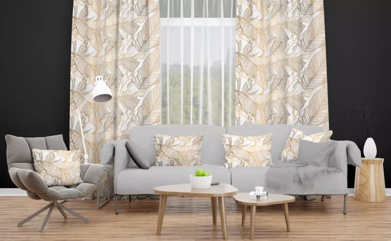
Nature-inspired patterns have evolved into something more sophisticated and artistic. The new botanical curtains feature abstracted forms rather than literal representations.
These modern interpretations use simplified shapes and thoughtful color palettes that complement rather than compete with other design elements. Abstract botanical prints offer just enough visual interest without overwhelming the space. Designers appreciate how they add personality while maintaining a sense of calm and cohesion.
13. Out: Pure Bright White Curtains
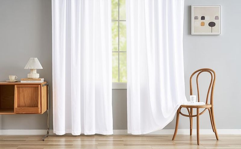
Clinical and cold, the stark white curtains that once signified minimalist perfection are fading from designer specifications. Their unforgiving nature has finally caught up with them.
Pure white window treatments show every speck of dust and quickly develop a dingy appearance, especially in high-traffic areas. Designers note that they create a harsh, institutional feeling rather than the clean, fresh look homeowners actually desire. Their unforgiving brightness can also create uncomfortable glare.
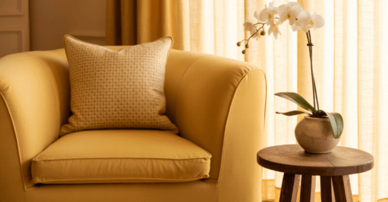
14. In: Warm Ivory And Buttermilk
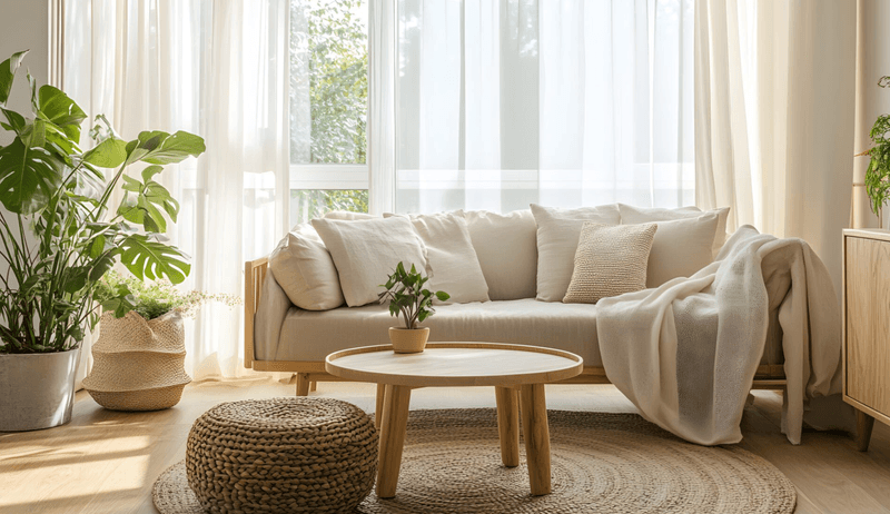
Softness is the new sophistication when it comes to light-colored window treatments. These warmer off-whites bring a gentle luminosity without the harsh glare of pure white.
Ivory and buttermilk curtains create an inviting atmosphere while still maintaining visual lightness. Their subtle cream undertones complement both cool and warm color schemes. Designers love how these shades diffuse light beautifully throughout the day, creating spaces that feel both bright and nurturing.

