These Outdated Wall Colors Are Still In Homes But Need To Go ASAP
Walking into a home with dated wall colors feels like stepping into a time machine, and not in a cool, retro way! As a designer, I’ve seen countless beautiful spaces diminished by paint choices that scream yesterday’s trends.
While personal taste matters, some wall colors have definitely overstayed their welcome in the design world.
Come along, this journey through tired hues that are making your home look stuck in the past is one worth taking. I’ll also serve up some fresh color cures guaranteed to kick those outdated shades to the curb and make your walls party-ready.
1. Burgundy Accent Walls
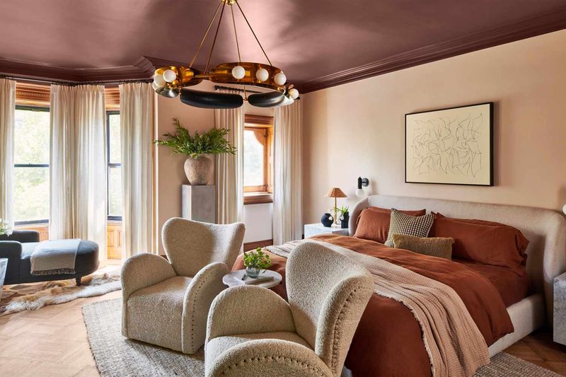
Remember the early 2000s when everyone wanted that deep wine-colored statement wall? Burgundy once signaled sophistication but now reads as heavy and dated.
Modern homes embrace lighter, more versatile accent colors that don’t overwhelm the space. Consider swapping that dark red for a soft sage green or dusty blue that creates interest without dominating the room.
Your guests will notice the refreshed energy immediately. You’ll also be amazed how much larger and more inviting your space feels!
2. Builder Beige Everywhere
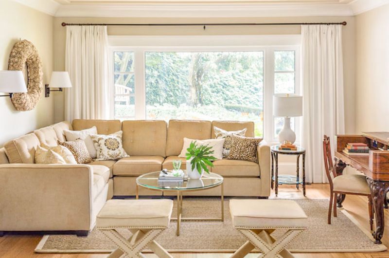
Ah, builder beige, that safe, uninspired tan that developers slapped on every surface because it offended absolutely no one. Yet it excites absolutely no one either!
Though neutral walls remain popular, today’s sophisticated palettes have evolved toward greiges, warm whites, and soft taupes with actual character. These modern neutrals create a clean canvas while still offering subtle depth.
Replacing those flat, yellowish beiges instantly updates your home from generic subdivision to thoughtfully designed space.
3. Chocolate Brown Drama
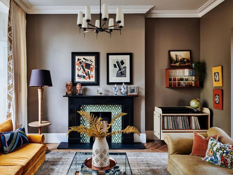
Once the height of early 2000s luxury, those chocolate brown walls that were supposed to feel rich and cozy now just make rooms feel like dark caves. The trend paired with turquoise accents has especially aged poorly.
Today’s approach to creating warmth uses softer, more complex browns with gray or taupe undertones. Alternatively, try caramel or cognac shades that bring warmth without the heaviness. Your space will immediately feel more current and breathable!
4. Tuscan Gold And Terracotta
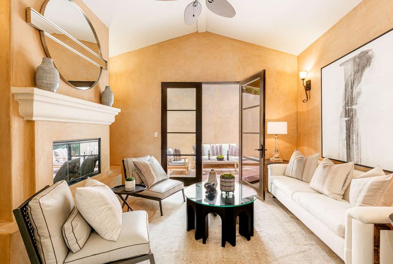
Nothing screams “I decorated in 2005” quite like those goldish and terracotta walls from the Tuscan-inspired trend. While warm colors remain beautiful, these specific orangey-yellow tones have lost their appeal.
Modern homes embrace earthy tones in more subtle ways. Just imagine muted clay, soft terracotta, or buttery cream with less yellow undertone. These updated versions bring warmth without the dated Mediterranean vacation home vibe.
Guests will notice how much more sophisticated and current your space feels!
5. Pastel Pink And Baby Blue
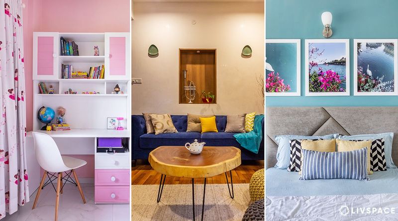
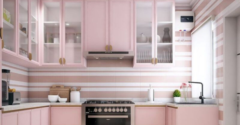
Those candy-colored walls popular in the 80s and 90s, particularly that distinctive pastel pink or baby blue, instantly age your home. While pastel colors are making a comeback, those specific dated tones feel childish rather than sophisticated.
Modern pastels have evolved into complex, dusty versions with gray undertones. Think muted blush instead of bubblegum, or smoky blue instead of nursery blue.
The contemporary versions create subtle interest while maintaining a grown-up atmosphere throughout your home.
6. Hunter Green Overload
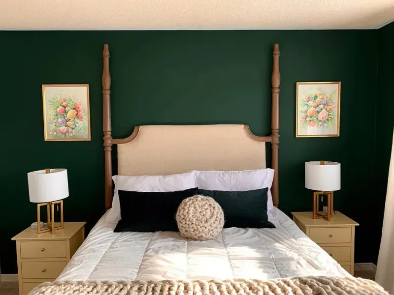
We all remember the period when hunter green ruled the 90s alongside cranberry and navy blue. While green is totally back in style, that dark, slightly yellowish hunter shade screams “I haven’t left the past yet.”
Today’s greens are way more sophisticated. Olive with a moody gray undertone, sage flirting with a splash of blue, or emerald showing off some serious depth.
These modern greens bring the outdoors in without turning your kitchen into Grandma’s country retreat.
Now, do you have what it takes to ditch hunter green and give your walls a fresh new vibe?
7. Bright Primary Colors
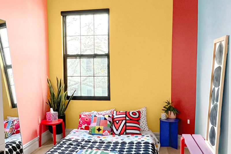
Those fire-engine red dining rooms and cobalt blue bedrooms popular in the early 2000s create spaces that feel chaotic rather than energizing. Fully saturated primary colors on walls have fallen out of favor for good reason!
Current color trends embrace the same hues but in muted, complex versions. Think brick instead of cherry red, or navy with gray undertones instead of royal blue.
Make your rooms feel more sophisticated and restful without losing personality or color impact.
8. Cool Gray Everything
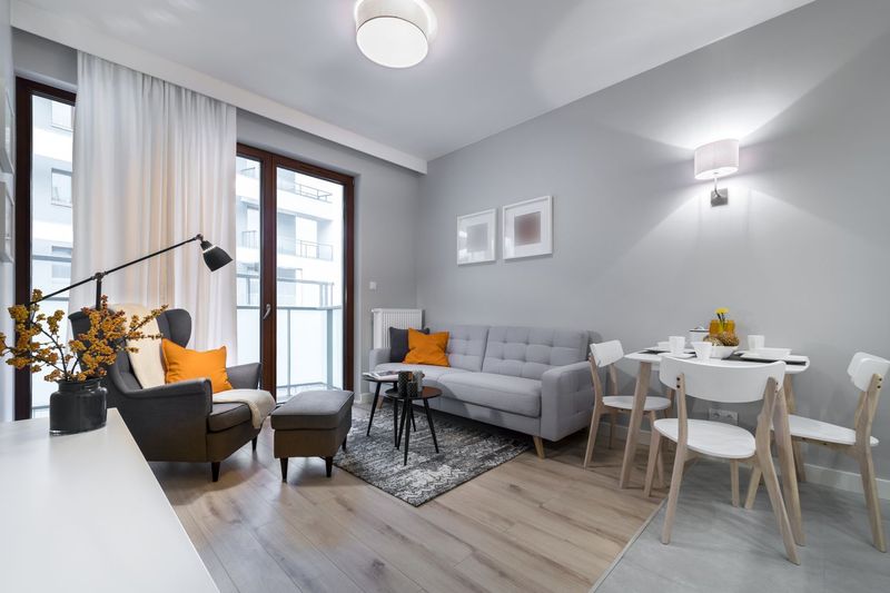
While not exactly “old,” the cool gray trend that dominated the 2010s has quickly become dated. Those blue-toned grays that once felt modern now create spaces that feel cold and impersonal.
Today’s neutrals have shifted toward warmer territory, greiges that balance gray and beige, taupes with subtle depth, and warm whites with creamy undertones. These updated neutrals create a welcoming atmosphere while maintaining clean lines.
Warming up those cool grays instantly makes your home feel current.
9. Purple Passion
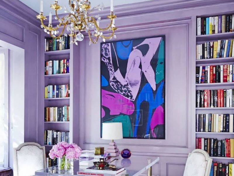
The bright lavender or deep eggplant purple walls popular in the 2000s create spaces that feel specifically tied to that era. While purple can be beautiful, those particular tones often clash with modern furnishings.
Current purple trends favor muted, dusty versions with gray undertones. I’m talking about lavender-gray or muted plum. These sophisticated purples add interest without overwhelming the space.
Updating those bright purples will instantly make your home feel more refined and timeless.
10. Sponge-Painted Anything
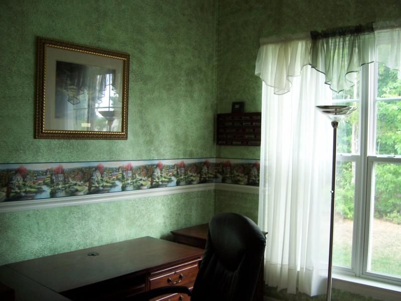
Oh, the sponge-painted walls of the 90s! That textured, mottled finish in contrasting colors was once the height of DIY sophistication. Now it just looks busy and dated.
Modern texture comes from actual wall treatments like subtle plaster finishes or very light color washing techniques, never from obvious sponging or rag-rolling. Simple, uniform wall colors allow your furnishings and art to shine.
Your home is begging you to bring it into this decade by covering those sponged walls with a clean, contemporary color.
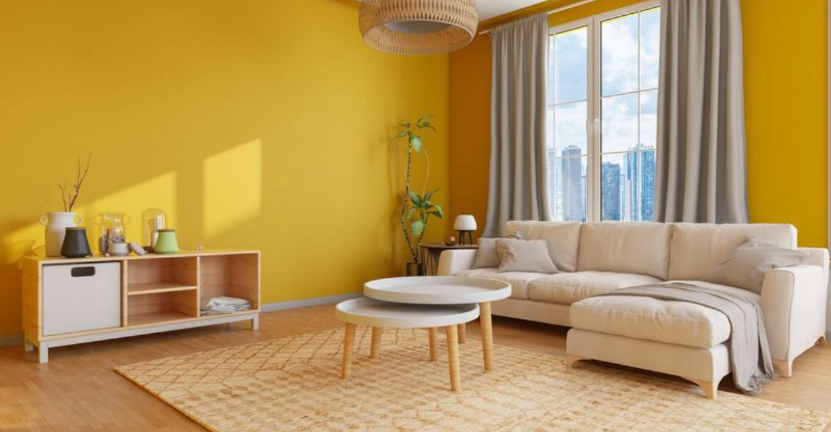
11. Mustard Yellow Catastrophes
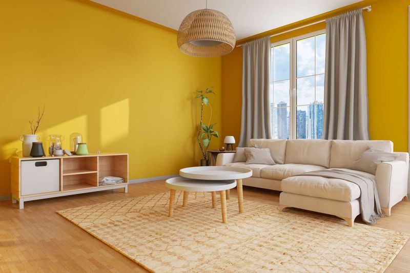
Mustard yellow was supposed to feel ‘warm and inviting’? Spoiler alert: it just makes rooms look like they caught jaundice!
The sickly undertones create an atmosphere that’s about as welcoming as a dentist appointment on Monday morning.
However, the worst offense is how mustard absorbs light like a black hole. Your living room essentially becomes a dimly lit cave where style goes to die.
Try swapping this 1970s holdover for buttery creams or rich ochres instead. Your visitors will stop wondering if they need to adjust their vision prescription, and your furniture will finally stop looking like it’s floating in a sea of condiment!
12. Flamingo Pink Bathroom Nightmares
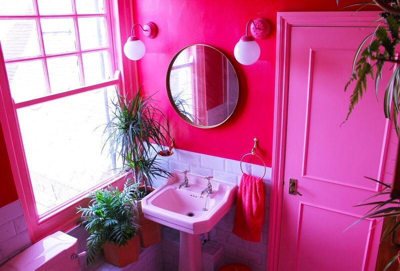
This cotton-candy catastrophe somehow survived decades of design evolution and continues to assault eyeballs in vintage homes across America.
The worst part? Pink bathrooms make everything else look off. Your reflection appears slightly sunburned, makeup application becomes a guessing game, and those white towels suddenly look dingy.
Replace this retro disaster with spa-inspired sage greens or sophisticated grays.
Your morning routine will thank you when you no longer feel like you’re brushing your teeth inside a bottle of Pepto-Bismol!
