I’ve Seen These 12 Sofa Colors Age NYC Interiors Try These Modern Alternatives For A Chic Look
Living in NYC for years, I’ve watched certain sofa colors transform from fresh and exciting to dated and tired.
As an interior designer, I’ve helped countless clients breathe new life into their living spaces with just a simple sofa color change. The right hue can completely transform your apartment, making it feel larger, more sophisticated, or cozier depending on your goals.
Let’s explore outdated sofa colors I frequently see in NYC apartments and the modern alternatives that will instantly elevate your space.
1. Burgundy Velvet – Swap for Soft Taupe
Burgundy velvet sofas were once the hallmark of upscale NYC apartments, but they’ve grown increasingly stuffy and formal. Their dark, heavy appearance tends to dominate smaller living spaces, making rooms feel cramped and dated.
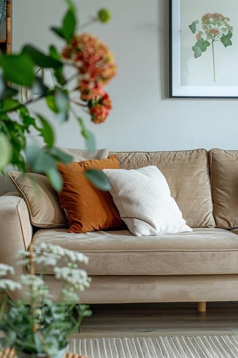
Soft taupe offers a refreshing alternative with its versatile, light presence. This neutral shade brings warmth without overwhelming your space, allowing other design elements to shine. I’ve noticed how taupe creates an instant sense of calm in hectic city apartments.
My clients are amazed at how this subtle color makes rooms appear larger while complementing virtually any decor style from minimalist to eclectic. Pair with textured throw pillows in jewel tones for a contemporary look that maintains visual interest without the heaviness.
2. Forest Green – Replace with Sage Green
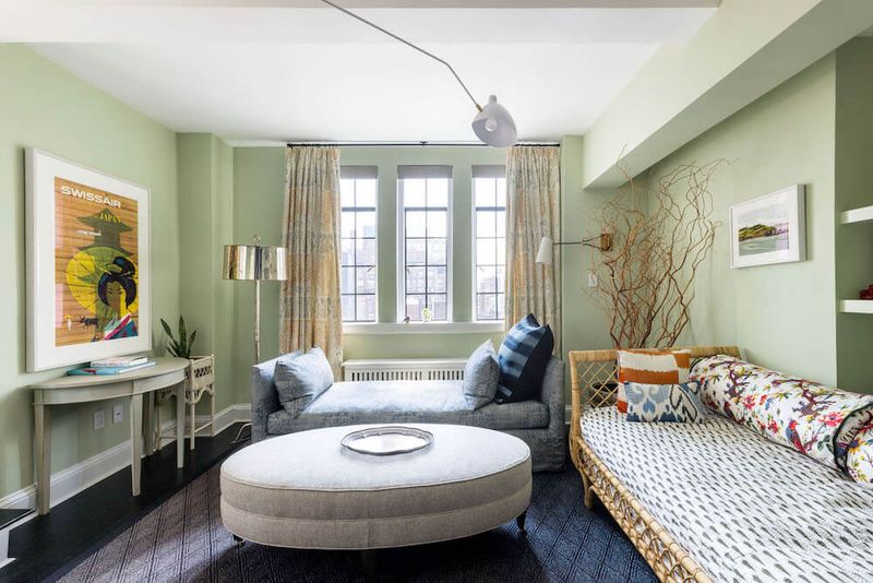
Forest green sofas dominated NYC apartments in the late 90s and early 2000s. While attempting to bring nature indoors, these dark green pieces often created gloomy, outdated interiors that felt heavy and closed-in.
Sage green offers the perfect modern update – it maintains that connection to nature while feeling airy and contemporary. The muted, greyish undertones work beautifully with natural light, a precious commodity in city apartments.
My favorite thing about sage green is its chameleon-like quality to appear sophisticated yet relaxed. I recently helped a client in a Brooklyn brownstone replace their forest green sectional with a sage alternative, instantly transforming their space from dated to magazine-worthy. This versatile hue pairs wonderfully with brass accents and natural woods.
3. Navy Blue – Transition to Slate Blue
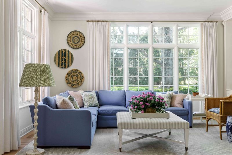
Navy blue sofas have been NYC apartment staples for decades. Though classic, they’ve become somewhat predictable and can make smaller spaces feel dark and confined. Many of my clients initially request navy, thinking it’s the safe choice.
Slate blue offers a sophisticated evolution lighter, more nuanced, with gray undertones that feel distinctly contemporary. This shade manages to be both calming and interesting, creating a perfect backdrop for both neutral and vibrant accent pieces.
When I introduced slate blue to a client’s Upper East Side apartment, she was hesitant until seeing how it brightened her north-facing living room. The color shifts beautifully throughout the day with changing light. For maximum impact, I recommend pairing slate blue with warm metals and cream accents rather than stark whites.
4. Chocolate Brown – Upgrade to Warm Terracotta
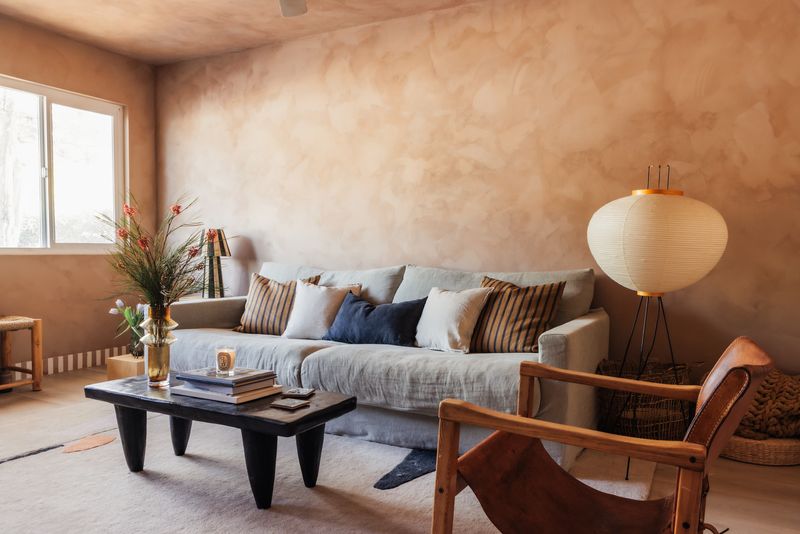
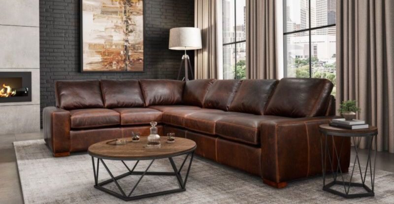
Chocolate brown leather sofas were everywhere in NYC during the early 2000s. While they promised practicality, they’ve aged poorly, often looking heavy and uninspired in today’s design landscape. Their dark tone absorbs light – the last thing most city apartments need!
Warm terracotta brings earthy richness without the darkness. This clay-inspired hue adds instant warmth and character while feeling decidedly current. I love how terracotta connects to nature while maintaining an urban sophistication perfect for city living.
A recent client in Chelsea was skeptical about this switch until seeing how terracotta transformed her industrial loft into a welcoming haven. The color works brilliantly with both modern and vintage pieces, creating depth without heaviness. For best results, pair with creamy whites and natural textures rather than competing bold colors.
5. Dusty Rose – Elevate with Blush Pink
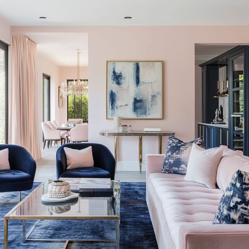
Dusty rose sofas had their moment in NYC apartments, particularly during the 80s and early 90s. This muted, somewhat muddy pink often reads as dated and can make spaces feel stuck in a bygone era. The undertones tend to clash with modern color schemes.
Blush pink offers a fresh, sophisticated alternative that feels both timeless and current. Its subtle warmth brings life to neutral spaces without overwhelming them. I’ve used blush sofas in everything from pre-war apartments to sleek high-rises with stunning results.
The key difference lies in the undertones – blush has cleaner, more versatile undertones than dusty rose. When I helped a client in Gramercy update her living room, the switch to blush instantly modernized her space while maintaining the femininity she loved. Pair with charcoal accents and mixed metals for a look that feels intentionally designed rather than trendy.
6. Deep Plum – Modernize with Misty Grey
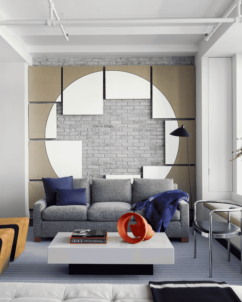
Deep plum sofas were once considered luxurious statement pieces in NYC apartments. Unfortunately, they’ve aged into looking heavy and overly dramatic, often dominating spaces rather than complementing them. The saturated purple undertones can feel jarring against modern color palettes.
Misty grey provides a sophisticated alternative that maintains visual interest without the theatrical effect. This versatile neutral has subtle undertones that shift with the light, creating depth without demanding attention. I’ve recommended this switch countless times to clients seeking elegance without excess.
A Financial District client recently made this transition, transforming her living room from dated to timeless overnight. The misty grey created a perfect foundation for seasonal accent changes through pillows and throws. For maximum impact, choose a grey with slight blue or lavender undertones rather than brown-based greys that can feel drab.
7. Mustard Yellow – Switch to Light Camel
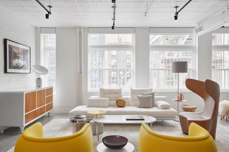
Mustard yellow sofas gained popularity during the mid-century revival but have quickly dated themselves in NYC interiors. Their intense color often fights with other elements and can make spaces feel chaotic rather than cohesive. Many clients regret this bold choice within a few years.
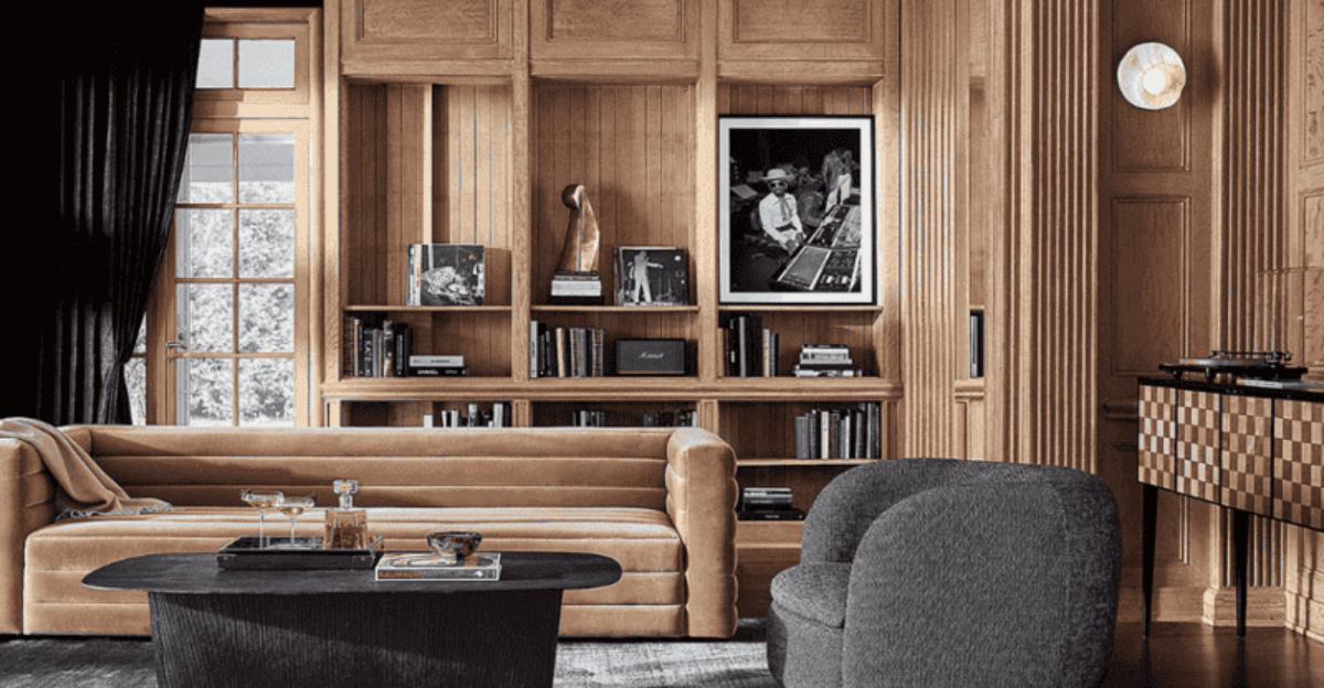
Light camel offers warmth without the visual loudness. This sophisticated neutral brings a similar golden undertone but in a much more versatile package. I love how it complements both cool and warm color schemes while creating an instant sense of calm.
When I helped a SoHo loft dweller make this switch, the transformation was remarkable – suddenly her art collection stood out instead of competing with her sofa. Light camel creates the perfect backdrop for both minimal and maximalist styles. Choose a version with honey undertones rather than orange ones for a truly timeless look that will age beautifully.
8. Hunter Green – Refresh with Creamy White
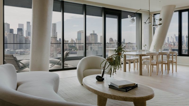
Hunter green sofas were fixtures in upscale NYC apartments during the 90s. While intended to convey sophistication, they now read as formal and outdated, often making spaces feel smaller and darker than necessary. The deep, saturated color absorbs light in already limited urban spaces.
Creamy white sofas offer a dramatic yet practical alternative that instantly brightens and expands visual space. Modern performance fabrics have made white sofas surprisingly practical even for city living. I’ve witnessed countless transformations where this simple switch makes apartments feel twice as large.
A client on the Upper West Side was hesitant about white with young children, but performance fabrics have made maintenance simple. The creamy undertones (versus stark white) add warmth while maintaining a clean aesthetic. For balance, incorporate natural elements like wood and plants to prevent the space from feeling sterile.
9. Dark Charcoal – Lighten with Misty Grey
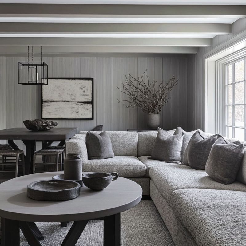
Dark charcoal sofas became ubiquitous in NYC apartments during the industrial and minimalist design waves. While practical for city living, they often create a heavy, somber feeling that can make spaces feel smaller and less inviting. I see them everywhere in Manhattan lofts and high-rises.
Misty grey provides a lighter alternative that maintains the sophisticated neutral appeal without the visual weight. The subtle undertones create dimension while reflecting rather than absorbing light. This seemingly small change can dramatically transform the feel of an entire room.
A client in Hell’s Kitchen couldn’t believe the difference when we swapped her charcoal sectional for a misty grey version in the same style. Her north-facing apartment suddenly felt brighter and more welcoming. For best results, look for greys with subtle blue undertones rather than purple or brown, which can feel dated quickly in urban settings.
10. Maroon Leather – Update with Warm Terracotta
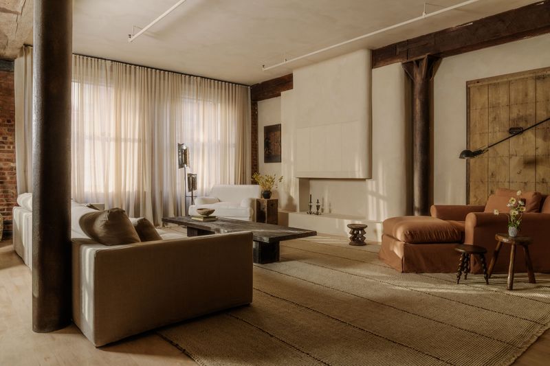
Maroon leather sofas once signaled luxury in NYC apartments but have become synonymous with outdated corporate aesthetics. Their dark red undertones often clash with contemporary color schemes and can make spaces feel smaller and stuck in time.
Warm terracotta offers a modern evolution that maintains richness while feeling current and versatile. This earthy hue brings warmth without the heaviness or dated associations. I’ve recommended this switch to numerous clients seeking to update their spaces without losing character.
A Tribeca client recently made this change, transforming his bachelor pad from feeling like a dated executive office to a sophisticated urban retreat. The key is finding the right terracotta – not too orange, not too brown – with a subtle texture that adds dimension. Pair with natural materials like jute, brass, and walnut for a layered look that feels intentionally curated rather than trendy.
11. Olive Green – Transform with Sage Green
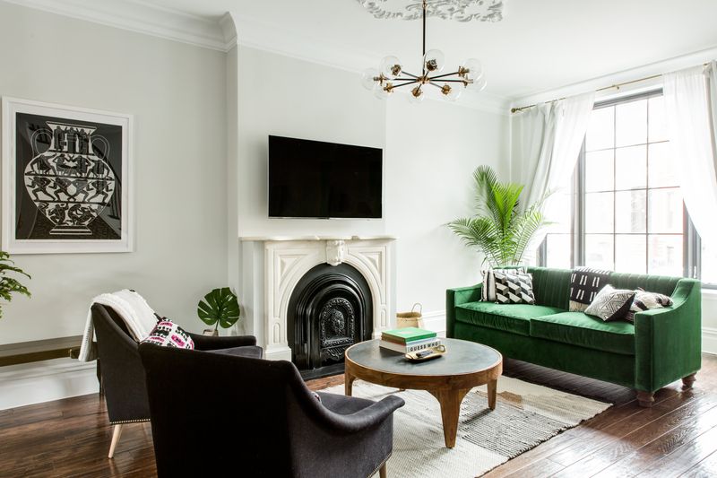
Olive green sofas gained popularity during the 70s revival but have quickly dated themselves in NYC interiors. Their murky, yellowish undertones often create a drab, army-surplus feel rather than the sophisticated look most urban dwellers desire.
Sage green provides a refined alternative with its softer, grayer undertones that feel both natural and elegant. This versatile color works beautifully in both traditional and contemporary settings while maintaining that connection to nature city dwellers crave.
When I helped a Park Slope brownstone owner update her living room, the switch from olive to sage instantly elevated the entire space. The subtle shift created harmony with her existing art and accessories rather than fighting them. For maximum versatility, choose a sage with more gray than yellow undertones, and pair with natural linens and raw woods for an organic yet sophisticated aesthetic.
12. Beige Microfiber – Enhance with Light Camel
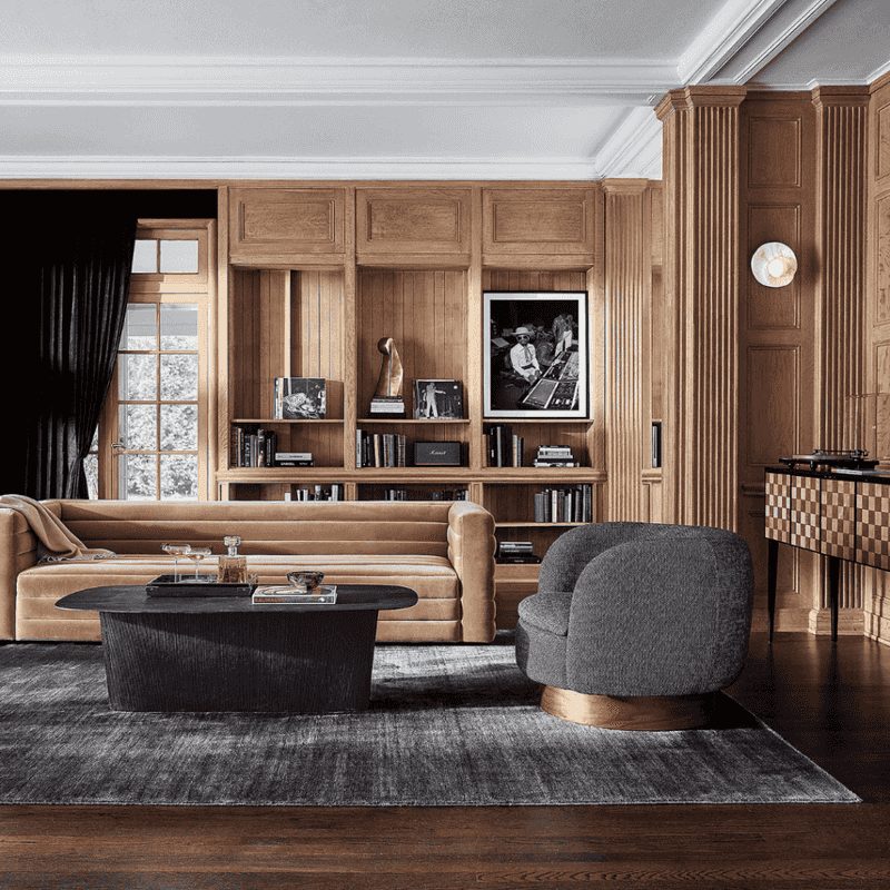
Beige microfiber sofas were standard issue in countless NYC apartments and rentals. While attempting to be inoffensive, they instead read as builder-grade, temporary, and lacking intention. Their flat appearance and often yellowish undertones do nothing to elevate a space.
Light camel offers a sophisticated upgrade that maintains neutrality while adding character and warmth. The richer undertones create depth that basic beige lacks, instantly making a space feel more curated and intentional.
I recently helped a first-time homebuyer in Williamsburg make this switch, transforming her apartment from looking like a temporary rental to a thoughtfully designed home. The subtle richness of camel created a perfect foundation for her eclectic accessories and art collection. Look for light camel with honey rather than orange undertones, and consider textured fabrics like bouclé or linen blends that add visual interest beyond just color.

