I’m An Interior Designer And These Are 19 Things I Would Not Do In My Home
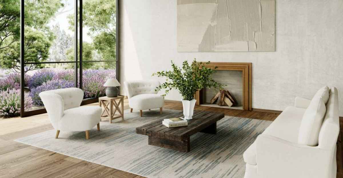
After years of transforming homes into beautiful living spaces, I’ve learned what works and what doesn’t in interior design. While everyone’s taste differs, some design choices consistently create problems or quickly look outdated.
I’ve compiled my professional insights into this list of design pitfalls I personally avoid in my own home.
1. Matching furniture sets
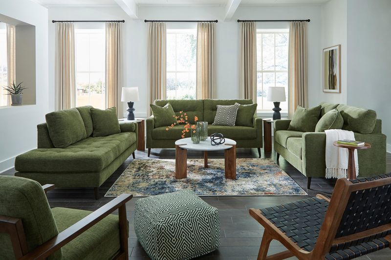
Walking into a room where every piece matches perfectly feels like stepping into a furniture showroom, not a lived-in home. I prefer mixing complementary pieces that share design elements but aren’t carbon copies of each other.
This creates visual interest and makes spaces feel collected over time rather than purchased in one afternoon. Your home should tell your unique story through carefully curated pieces.
2. All-white kitchens
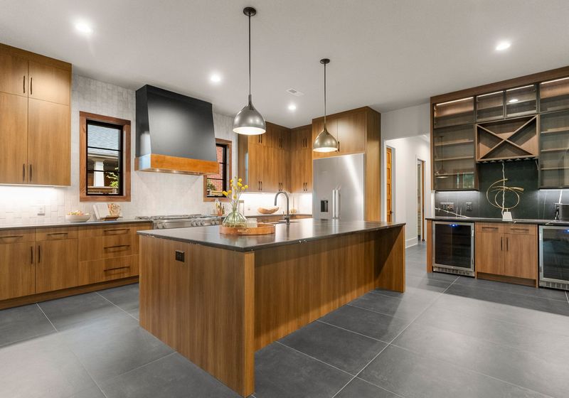
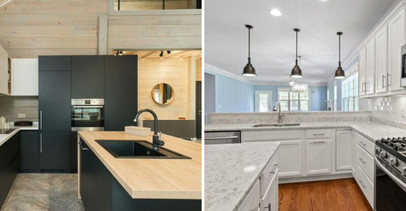
The pristine all-white kitchen trend is beautiful in magazines but impractical in daily life. Coffee splashes, sauce splatters, and fingerprints show immediately on white surfaces, creating constant cleaning demands.
Instead, I incorporate warm woods, natural stones with variation, or cabinets in soothing blues and greens. These elements add character while hiding everyday messes that come with actually cooking in your kitchen.
3. Trendy accent walls
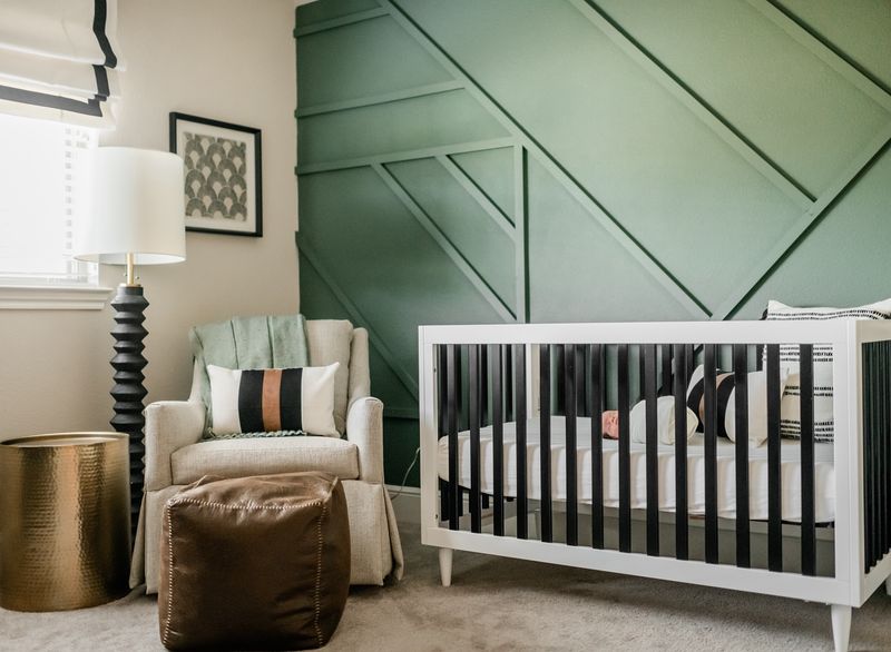
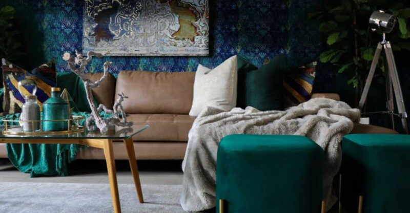
Remember those burgundy dining rooms or teal bedroom walls? Accent walls date a space faster than almost any other design choice. The moment that specific color falls from trend status, your whole room screams “last decade.”
For visual interest, I use textural elements like wood paneling, subtle wallpaper, or artwork that can be easily changed. These options create focal points without committing to a color that might feel tired next year.
4. Wall-to-wall carpeting
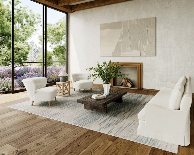
Once a suburban staple, wall-to-wall carpeting traps allergens, stains easily, and generally looks dated. Spill a glass of red wine, and you’re facing a permanent reminder of that accident.
Hardwood, luxury vinyl, or tile floors with strategically placed area rugs offer more flexibility, easier maintenance, and better longevity. Area rugs can be cleaned professionally or replaced entirely when they’ve seen better days.
5. Oversized sectionals
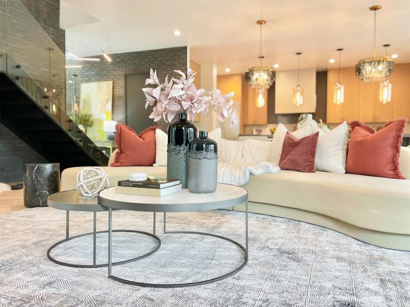
Giant sectionals that dominate the entire living room limit furniture arrangement possibilities and can make spaces feel smaller than they are. They’re often too large for the scale of most rooms.
I prefer a well-proportioned sofa paired with occasional chairs that can be rearranged for different gatherings. This approach maintains proper scale while offering flexibility for conversation groupings or accommodating extra guests when needed.
6. Faux finishes on walls
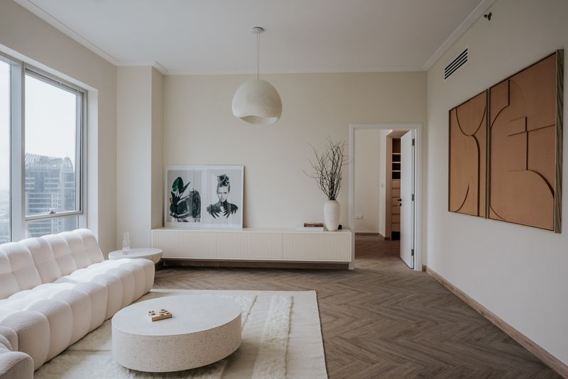
Sponge painting, rag rolling, and other faux finishes had their moment in the 90s, but they’ve become dated design elements that immediately age a home. They’re also incredibly time-consuming to apply and even more painful to remove.
Clean walls in quality paint create a timeless backdrop for art and furnishings. If you crave texture, consider subtle grasscloth wallpaper or properly executed Venetian plaster by a professional—techniques that stand the test of time.
7. Mason jar everything
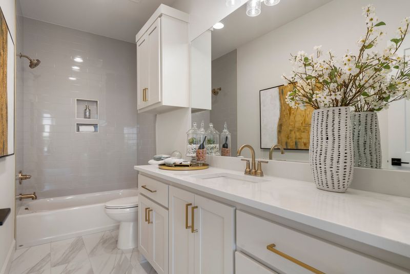
Mason jars as drinking glasses, light fixtures, soap dispensers, and vases quickly read as “Pinterest circa 2012.” This farmhouse trend has become so overused that it’s lost its charm and originality.
Actual vintage pieces with history or quality modern alternatives bring more authenticity to a space. I select items designed specifically for their purpose rather than repurposing jars meant for canning. Quality glassware and proper lighting fixtures elevate the everyday experience.
8. Word art typography
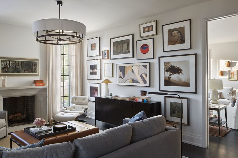
“Live, Laugh, Love” and similar phrases plastered on walls create spaces that feel like they’re trying too hard to convey personality. These mass-produced signs rarely reflect genuine personal style or interests.
Meaningful art that resonates with you makes a stronger statement. Family photos, original paintings, or prints that catch your eye tell your unique story. Your walls should showcase what truly matters to you, not generic sentiments from a big box store.
9. Uncomfortable dining chairs
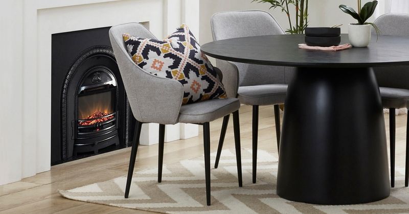
Stylish but uncomfortable dining chairs guarantee shorter, less enjoyable meals with family and friends. No one lingers over dessert when their back aches from poor support.
I choose dining chairs with proper padding, supportive backs, and comfortable seat heights. The best conversations happen when everyone feels physically at ease. Remember that function should never be sacrificed entirely for form, especially in spaces meant for gathering and connection.
10. TV above the fireplace
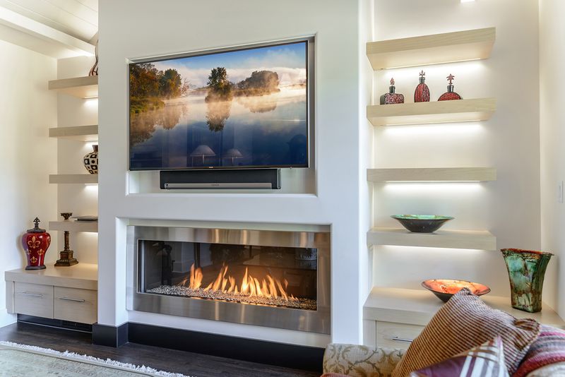
Mounting televisions above fireplaces creates neck strain from looking upward and exposes electronics to heat damage. It also forces these two competing focal points to awkwardly share prominence.
I position TVs at eye level when seated and create separate zones for conversation versus media watching when possible. This arrangement supports better viewing angles and allows the fireplace to serve as its own beautiful focal point without competition from a black screen.
11. Furniture pushed against walls
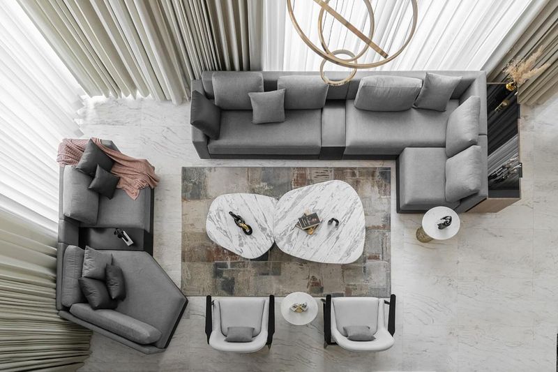
Shoving all furniture against walls creates a cavernous middle space and makes conversation difficult. This “high school dance” arrangement fails to create intimate, functional seating areas.
Floating furniture away from walls defines conversation zones and creates a more sophisticated layout. Even in smaller rooms, pulling a sofa just a few inches from the wall can create breathing room that makes the space feel more intentionally designed.
12. Fake plants that collect dust
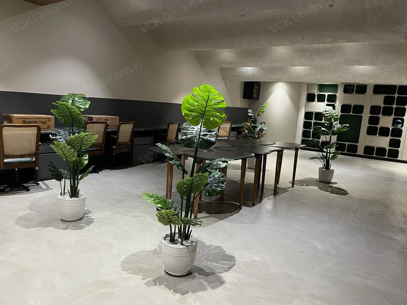
Artificial plants from previous decades gather dust in hard-to-clean crevices and often look obviously fake. They contribute nothing to air quality and lack the vibrant energy of living things.
Low-maintenance real plants like ZZ plants, snake plants, or pothos add life and improve air quality. If you truly lack a green thumb, quality preserved plants or dried arrangements offer natural texture without the plastic fakery of cheap silk plants.
13. Overstuffed furniture
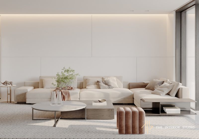
Puffy, overstuffed furniture pieces quickly look dated and take up excessive visual space in a room. Their bulky proportions overwhelm other design elements and make spaces feel smaller than they are.
Clean-lined, well-proportioned pieces with quality construction provide comfort without the bulk. A sofa with a tailored silhouette can be just as comfortable as an overstuffed one while maintaining visual lightness that helps rooms feel more spacious and refined.
14. Microwave above the range
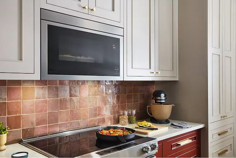
Placing microwaves above stoves creates an awkward reaching position that can be dangerous when handling hot foods. It also typically provides poor ventilation compared to proper range hoods.
I prefer microwaves built into lower cabinetry or on countertops where they’re accessible to everyone, including children and shorter adults. A proper ventilation hood above the cooking surface removes odors and grease more effectively, keeping your kitchen fresher.
15. Accent pillows everywhere
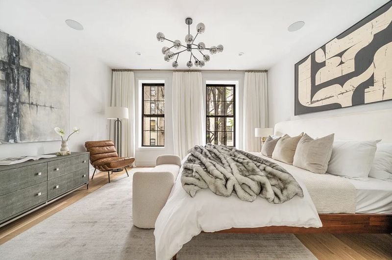
Beds piled so high with decorative pillows that you need a separate storage solution just to sleep is a design pet peeve of mine. These pillow mountains create daily hassle with minimal practical benefit.
I limit decorative pillows to 2-3 on beds and sofas – just enough to add color and texture without creating clutter. This approach still provides the design impact without the nightly chore of removing and storing a dozen pillows.
16. Matching window treatments throughout
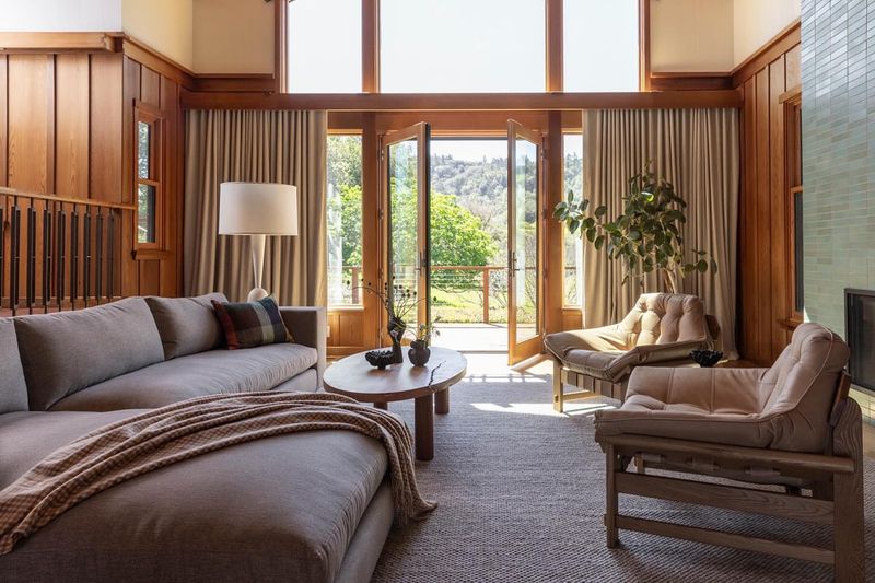
Identical curtains or blinds in every room create a cookie-cutter feel that ignores each space’s unique needs and personality. Different rooms have different light requirements and functions.
I select window treatments based on each room’s specific privacy, light control, and aesthetic needs. Bedrooms might need blackout options for better sleep, while living areas might benefit from sheer layers that filter light beautifully throughout the day.
17. Furniture without proper clearance
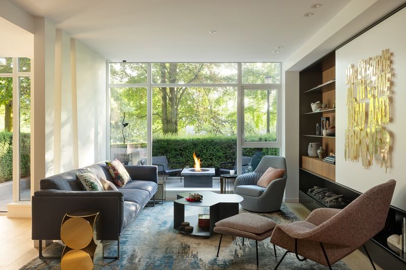
Cramming oversized furniture into tight spaces creates awkward traffic flow and makes rooms feel smaller. Nobody enjoys shuffling sideways to navigate around a coffee table or bumping into dining chairs.
I maintain proper clearances – at least 30-36 inches for walkways and 18 inches between coffee tables and seating. These measurements ensure comfortable movement and prevent the claustrophobic feeling that comes from overcrowded rooms.
18. Granite countertops everywhere
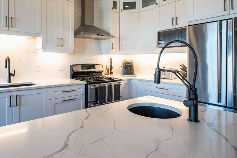
The speckled granite countertops that dominated the early 2000s now date homes instantly. Their busy patterns compete with other design elements and can make kitchens feel visually cluttered.
I prefer quartz, soapstone, or honed marble for their cleaner appearance and often better durability. Even butcher block or concrete countertops offer more character than dated granite patterns. Today’s options provide both beauty and functionality without the time-stamped look.
19. Poor lighting solutions
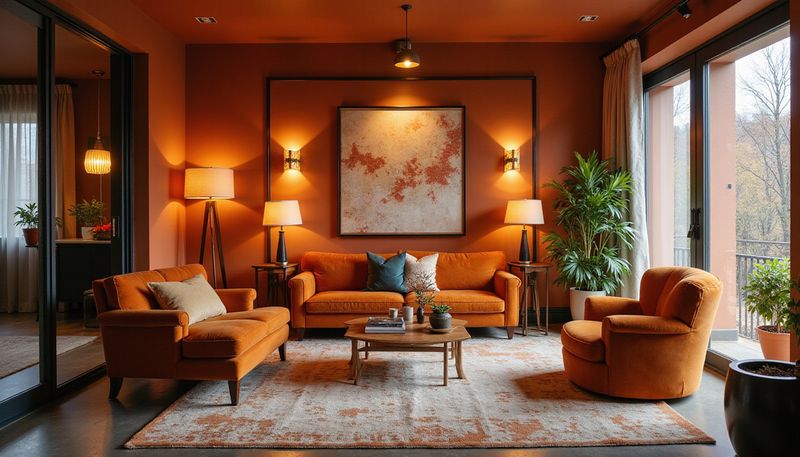
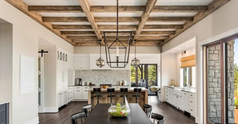
Relying solely on recessed cans or harsh overhead lighting creates unflattering shadows and fails to highlight architectural features. Good lighting transforms spaces in ways few other design elements can.
I layer lighting with ambient, task, and accent sources at different heights. Table lamps, floor lamps, sconces, and properly placed overhead fixtures create depth and flexibility. Dimmers on every switch allow for mood adjustment throughout the day.


