10 Color Picks Wyoming Pros Say Are Out For Kitchens And 3 That Disappeared Sooner
In Wyoming homes, where wide-open spaces and rustic charm influence design choices, kitchen color trends shift with a distinct local flair. Designers here are starting to move away from certain shades that once felt fresh but now fall flat against the natural beauty outside.
Some colors faded fast, while others quietly overstayed their welcome. According to local pros, it’s time to rethink these outdated picks and consider tones that better reflect Wyoming’s grounded, timeless style.
If your kitchen’s due for a refresh, these expert tips will help steer you in the right direction.
1. Cherry Red Cabinets Are Fading Fast
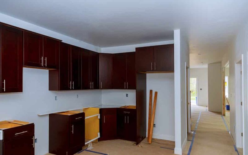
Remember when these bold cabinets were the height of kitchen fashion? Local designers now consider them dated and overwhelming for most spaces.
The intensity of cherry red tends to make kitchens feel smaller and more closed-in. Plus, they limit your decor options since not many colors complement such a dominant shade.
I recommend replacing them with more versatile neutrals that won’t look tired in a few years.
2. Mustard Yellow Walls Lost Their Zest
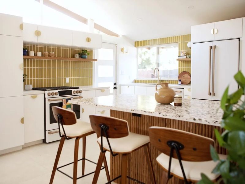
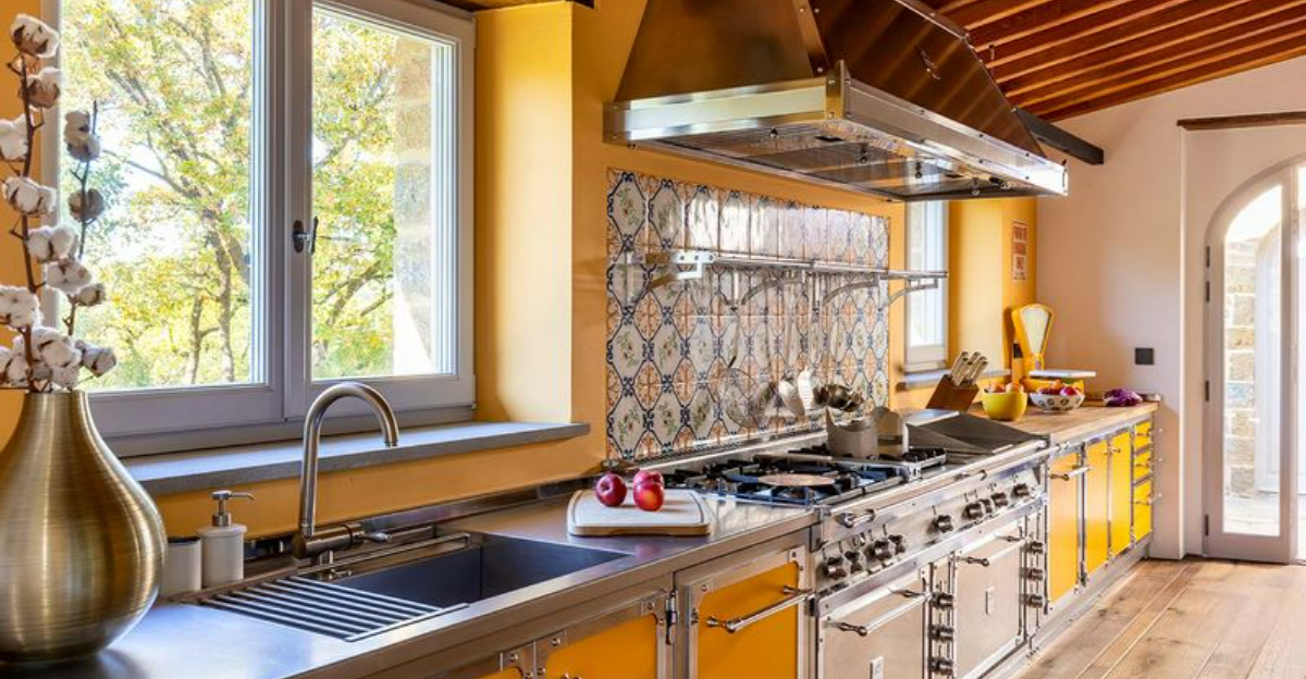
Wyoming designers are waving goodbye to mustard yellow walls that once dominated rustic kitchen designs. The color that promised warmth now reads as dingy and depressing in most lighting conditions.
Many homeowners who chose this trend find themselves repainting much sooner than expected. The shade tends to make food look less appetizing – not ideal for a cooking space!
Brighter, cleaner yellows or soft creams offer a better alternative if you’re after that sunny feeling.
3. Mint Green Appliances Melted Away
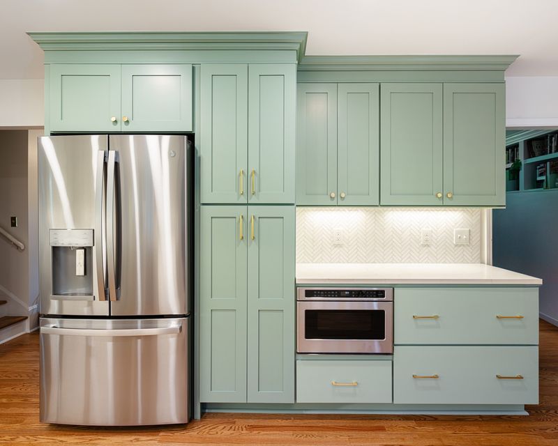
The retro mint green appliance trend crashed faster than most other kitchen fads. While briefly popular for their nostalgic appeal, these colored appliances quickly revealed their downside.
Appliance technology evolves rapidly, making colored versions feel outdated when newer models arrive. The mint shade also clashes with most modern kitchen palettes favored in Wyoming homes.
Stainless steel and integrated appliances remain the smart choice for longevity, according to every designer I interviewed.
4. Terracotta Everything Has Crumbled
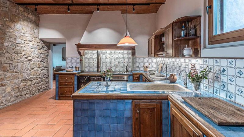
The earthy terracotta trend that swept through Wyoming kitchens has officially lost its appeal. This orange-brown shade dominated everything from tiles to backsplashes to accent walls just a few years back.
The color tends to make spaces feel dark and dated, especially during Wyoming’s long winters when natural light is limited. Many homeowners complain that terracotta makes their kitchens feel smaller and more confined.
Lighter neutrals and whites are taking its place, making kitchens feel more spacious and timeless.
5. Burgundy Accents Spilled Out Of Style
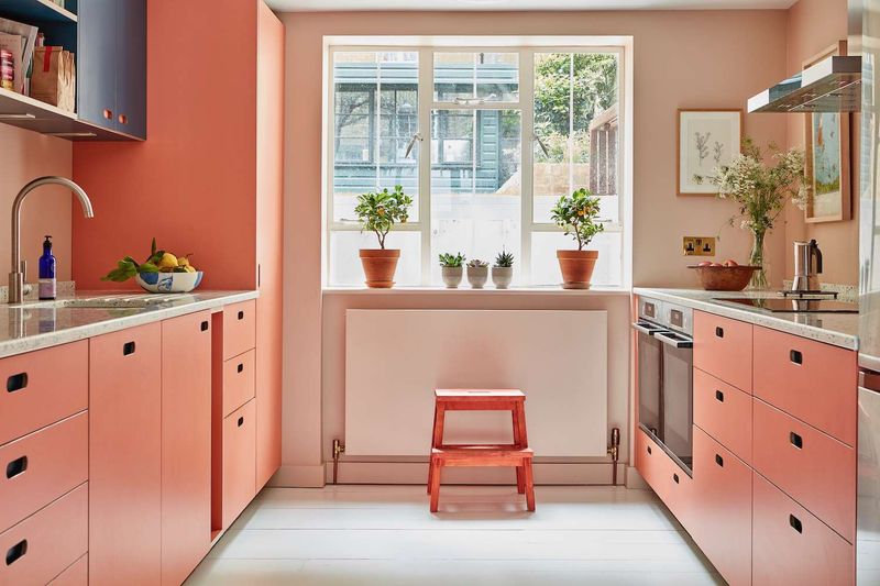
Once considered sophisticated, burgundy accents have lost their place in Wyoming kitchens. Those deep red-purple tones that adorned everything from dish towels to canisters now feel stuffy and formal.
The heavy wine-inspired color makes spaces feel older and more traditional than most homeowners want today. It’s particularly problematic in smaller kitchens where the dark tone can feel oppressive.
Blue-greens and sage tones have become the preferred accent colors, bringing a fresh mountain vibe that better suits Wyoming’s natural landscape.
6. Chocolate Brown Cabinets Got Stale
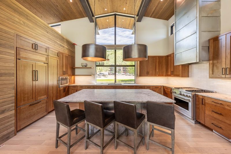
Dark chocolate brown cabinets that once dominated Wyoming kitchens have fallen from grace. These cabinets were installed in countless homes during the early 2000s renovation boom.
Dark cabinets make kitchens feel smaller and more confined – a major issue in Wyoming’s mountain homes where natural light can already be limited. They also show dust and fingerprints more readily than lighter options.
Local designers now recommend warmer whites, grays, or natural wood tones that brighten spaces while maintaining that cozy mountain feel.
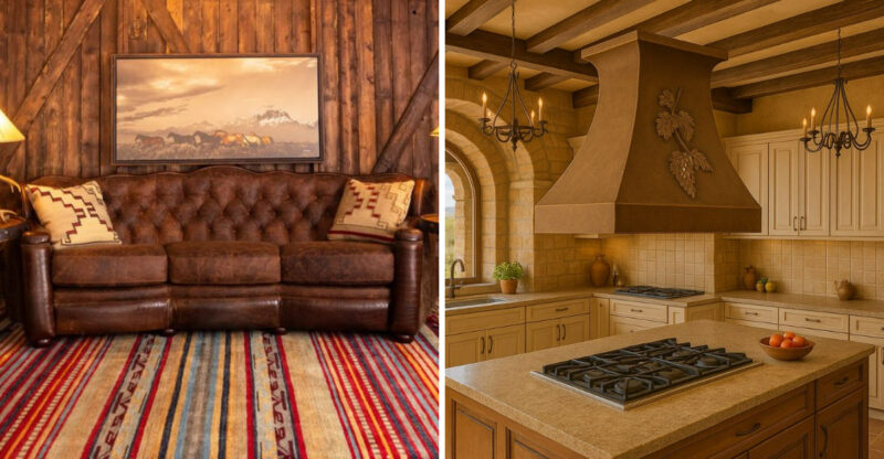
7. Tuscan Gold Walls Lost Their Shine
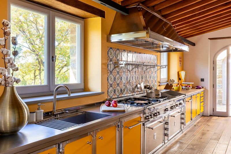
The Tuscan-inspired gold walls that once dominated Wyoming kitchens now look painfully dated. This yellowish-gold tone was meant to create warmth but often results in a dingy, aged appearance instead.
The color reflects poorly in Wyoming’s unique mountain lighting conditions, sometimes taking on a greenish cast. It also tends to make white cabinets look dirty rather than crisp.
Cool whites and pale grays have become the preferred wall colors, creating a clean backdrop that highlights architectural features and allows other elements to shine.
8. Eggplant Purple Accents Rotted Away
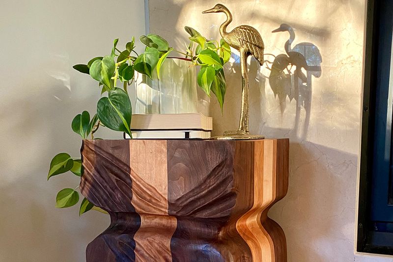
Eggplant purple accents had their moment in Wyoming kitchens, but designers now consider them heavy and depressing. The deep purple tone was trendy for everything from backsplashes to island bases.
The color absorbs light rather than reflecting it – a serious drawback during Wyoming’s darker winter months. It also tends to look dated alongside today’s preferred wood tones and metals.
Lighter lavenders or soft blues offer a better alternative for those who want color without the visual weight that eggplant brings to a space.
9. Coral Pink Backsplashes Washed Out
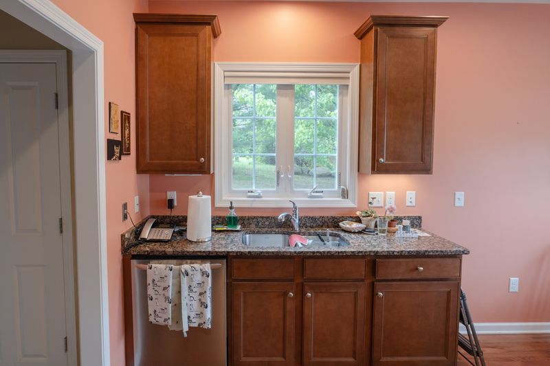
Coral pink backsplashes briefly captured Wyoming homeowners’ attention before fading faster than most trends. This peachy-pink tone promised to add warmth but quickly became the first thing homeowners wanted to replace.
The color clashes with most wood tones found in Wyoming mountain homes and tends to look dirty once cooking splatters hit it. It also reflects an unflattering pinkish light onto countertops and faces.
Subway tiles in white or soft neutral tones have proven more timeless and versatile for backsplash applications.
10. Hunter Green Cabinetry Got Lost In The Woods
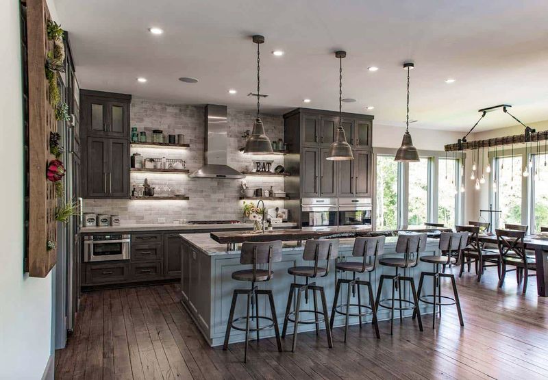
Hunter green cabinetry has officially lost its appeal in Wyoming kitchens. This deep forest tone was once considered the height of mountain chic but now reads as heavy and dated.
The dark green absorbs light rather than reflecting it, making kitchens feel smaller and more closed-in. It also limits your options for countertops, as few materials complement this strong color well.
Softer sage greens or blue-greens offer a more current take on nature-inspired colors while keeping spaces feeling open and fresh.
11. Copper Everything Tarnished Quickly
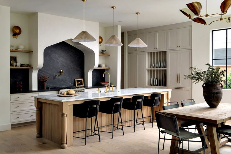
The all-copper-everything trend barely had time to shine in Wyoming kitchens before designers started advising against it. From range hoods to sinks to backsplashes, copper dominated briefly then disappeared.
The material requires significant maintenance to prevent tarnishing, especially in Wyoming’s varying climate conditions. Many homeowners discovered the patina developed unevenly, creating a spotted appearance rather than an elegant aged look.
Mixed metals have replaced the copper monotony, with designers suggesting thoughtful combinations of stainless steel, matte black, and brass for a more balanced approach.
12. Neon Accent Colors Burned Out Fast
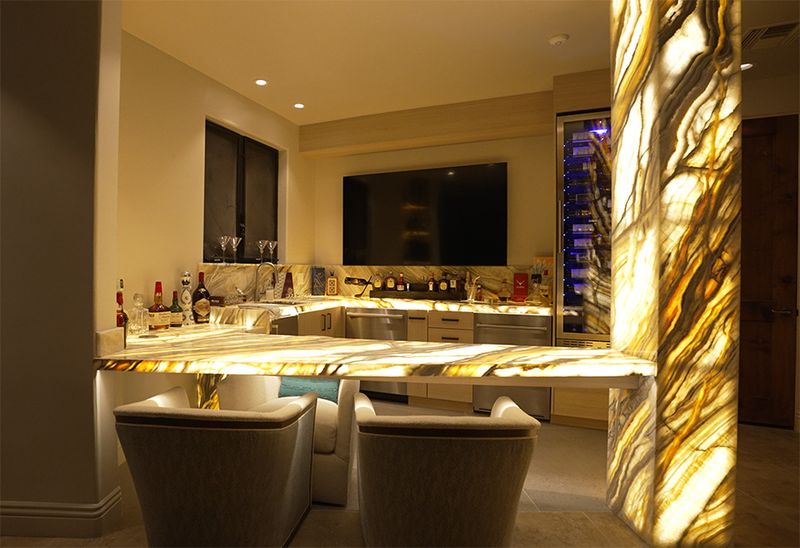
Neon accent colors in kitchens had the shortest lifespan of any Wyoming design trend. These electric hues – think bright lime green or shocking pink – were briefly incorporated into kitchen accessories and small appliances.
Homeowners quickly tired of these attention-grabbing colors that clashed with Wyoming’s natural aesthetic. The harsh artificial tones felt particularly out of place against mountain views and natural materials.
More organic accent colors inspired by the local landscape – sage greens, dusty blues, and warm taupes – have proven more enduring and harmonious in Wyoming kitchen designs.
13. Primary Color Combinations Schooled Out
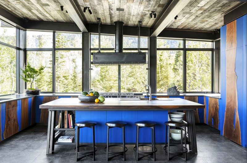
Bold primary color combinations – red, yellow, and blue – rapidly fell from favor in Wyoming kitchens. This playful, almost childlike palette briefly appeared in everything from tile work to cabinet colors.
The high-contrast combination proved visually exhausting in daily use and clashed with the serene natural environment that Wyoming homes typically embrace. The boldness also made kitchens feel smaller and more chaotic.
Today’s Wyoming designers recommend tone-on-tone color schemes or palettes drawn directly from the surrounding landscape for a more harmonious and timeless kitchen environment.
