11 Common Decor Errors That Shrink The Look Of Your Home
Making your home look spacious doesn’t always require knocking down walls or major renovations. Sometimes, the problem lies in simple decorating choices we make every day.
I’ve seen how certain decor decisions can instantly make a room feel cramped and closed-in.
By identifying and fixing these common mistakes, you can transform your space from cluttered to open and airy without spending a fortune.
1. Dark Wall Colors Everywhere
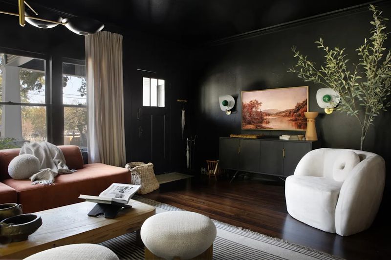
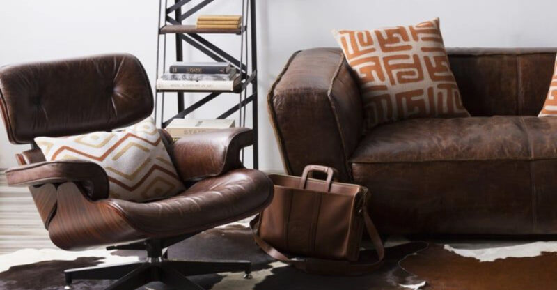
Painting every wall in your home dark colors is like wearing an all-black outfit when you’re trying to look slimmer – except with your house, it backfires!
Dark colors absorb light rather than reflect it, making rooms feel like caves rather than open spaces. I recommend using darker shades strategically as accent walls instead. This creates depth while maintaining brightness elsewhere. For smaller rooms, lighter colors like soft blues, gentle greens, or classic whites can make the space feel airy and expansive.
If you absolutely love dark colors, balance them with plenty of lighting and reflective surfaces. Remember that ceiling color matters too a white ceiling helps prevent that closing-in feeling that dark colors can create.
2. Heavy, Dark Curtains
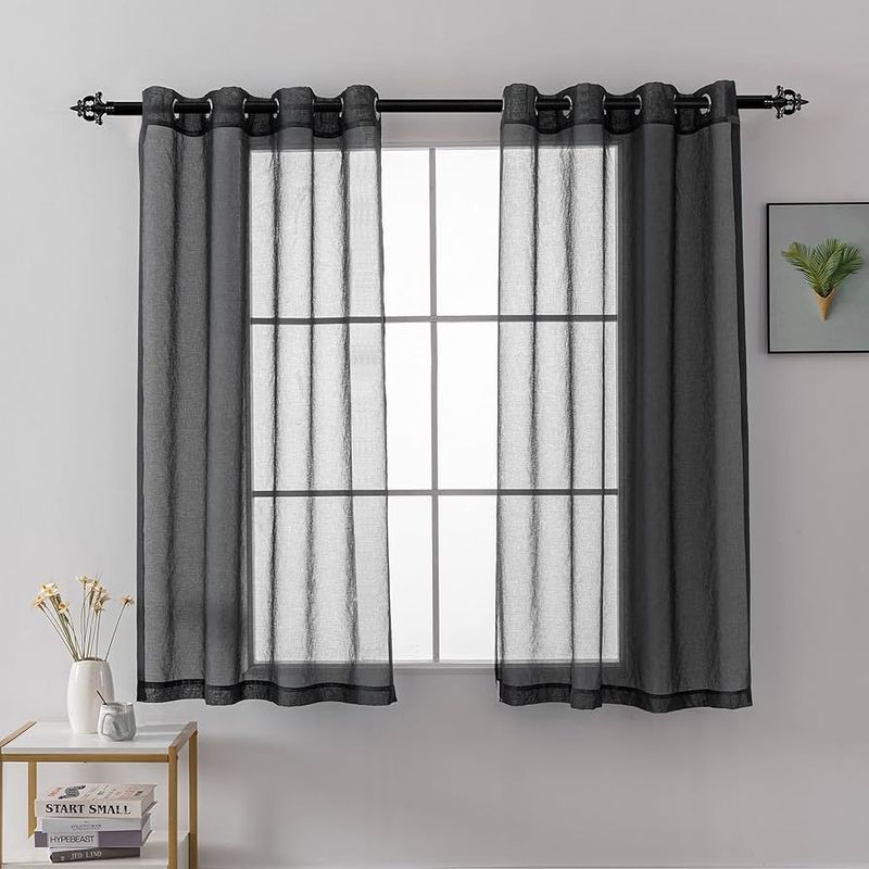
Those thick, floor-length velvet drapes might look luxurious in design magazines, but they’re stealing precious visual space from your rooms! Heavy curtains block natural light and create visual weight that drags down your space.
Switching to lightweight, sheer fabrics allows sunlight to filter through while maintaining privacy. Hanging curtains closer to the ceiling instead of right at the window frame creates an illusion of height. When choosing curtain colors, lighter tones or those that closely match your wall color help maintain visual flow.
Did you know that simply pulling curtains back during daylight hours can make rooms feel up to 30% larger? Let that sunshine in – it’s the cheapest way to visually expand your space!
3. Too Much Large Furniture
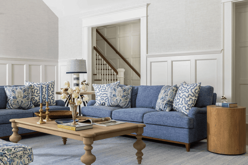
That oversized sectional might be comfy for movie nights, but it’s probably eating up your living room! Bulky furniture pieces overwhelm smaller spaces and create obstacle courses instead of comfortable flow. I’ve seen rooms where you practically need a map to navigate around furniture islands.
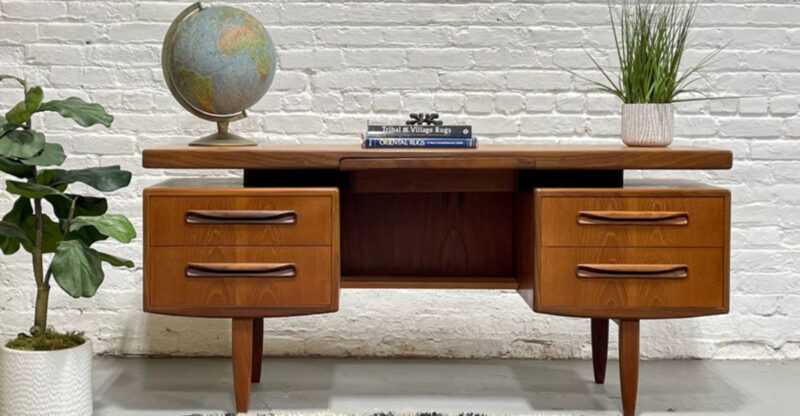
Scale matters tremendously in smaller homes. Choose furniture with visible legs rather than pieces that sit directly on the floor this creates visual breathing room underneath. Multi-functional pieces like storage ottomans or nesting tables offer practicality without sacrificing space.
When furniture shopping, always measure your room first and create a floor plan. Just because something fits technically doesn’t mean it fits proportionally. Remember: fewer, appropriately-sized pieces beat many large ones every time.
4. Cluttered Surfaces
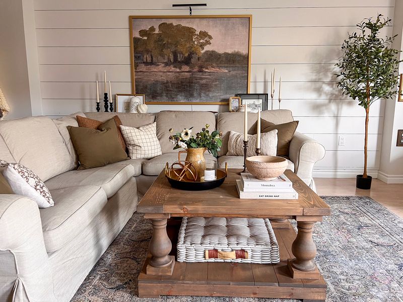
If your coffee table resembles a miniature museum exhibition, we’ve identified a major space-shrinker! Horizontal surfaces that disappear under collections of knickknacks, magazines, and everyday items make rooms feel instantly smaller and more chaotic.
Though personal touches make a house a home, practicing restraint is key. I suggest the rule of three for decorative groupings odd numbers look more natural and intentional than even ones. For everyday items like remote controls or charging cables, pretty baskets or decorative boxes offer hidden storage.
When displaying collections, consider rotating pieces seasonally rather than showing everything at once. This approach gives your space visual breathing room while still letting you enjoy your treasures. Remember that negative space (empty areas) is actually a positive design element!
5. Small Rugs that Don’t Fit the Space
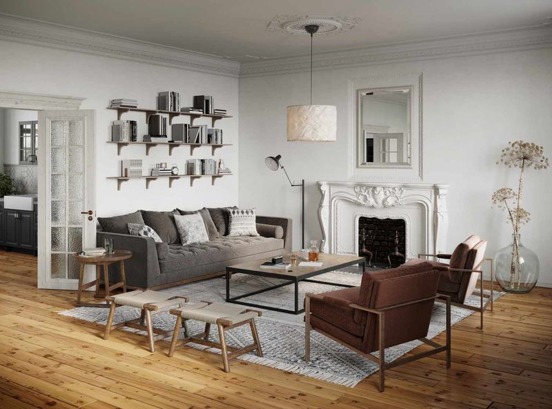
That postage-stamp sized rug floating in the middle of your living room is actually making the entire space look smaller! Undersized rugs create visual choppiness and make rooms feel disconnected and cramped rather than cohesive.
The right rug should be large enough for at least the front legs of furniture to rest on it. In living rooms, ideally all furniture legs should touch the rug. For dining areas, ensure the rug extends at least 24 inches beyond the table edge so chairs remain on it when pulled out.
If budget is a concern, layering is a clever solution place an inexpensive larger jute or sisal rug underneath a smaller decorative one. This creates the right scale while adding texture and interest. Your floors are valuable design real estate – don’t shortchange them!
6. Low Lighting Levels

Are you living in the shadows? Insufficient lighting is like wearing sunglasses indoors – it shrinks your perception of space dramatically! Many homes rely solely on a single overhead fixture that creates harsh shadows and leaves corners dark and forgotten.
Layered lighting transforms rooms instantly. Combine ambient (general), task (functional), and accent (decorative) lighting at different heights. Floor lamps in corners illuminate previously dark areas, while table lamps create pools of light that draw the eye around the room, increasing perceived size. Where possible, install dimmer switches for flexibility throughout the day.
Smart bulbs that allow color temperature adjustments are worth the investment warmer light feels cozy, while cooler light can make spaces feel more open during daytime. Remember that well-lit rooms always feel larger than dimly lit ones!
7. Busy Patterns on Every Surface
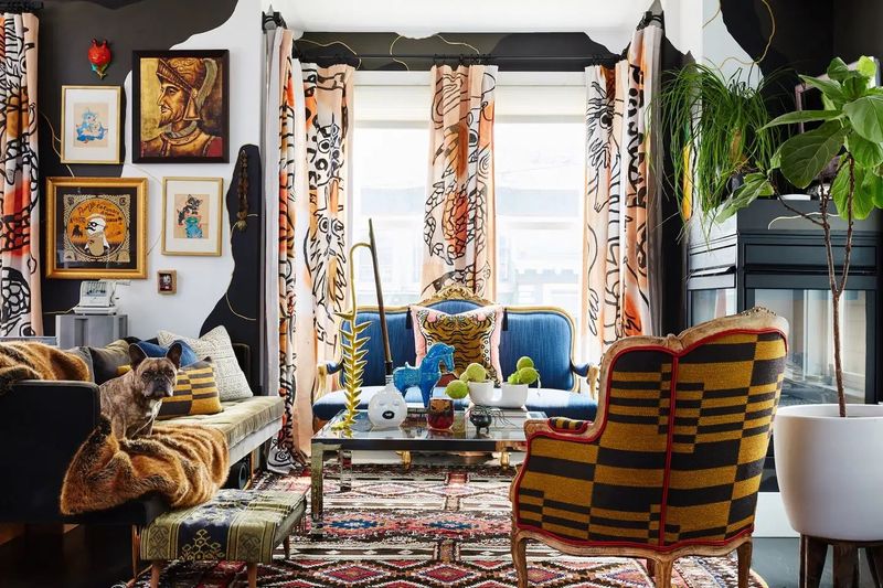
When florals fight with stripes and geometrics battle with paisleys, your space loses the war on visual clutter! Too many competing patterns create visual noise that makes rooms feel chaotic and smaller than they actually are.
Instead of pattern overload, try the 60-30-10 rule: 60% dominant solid color, 30% secondary pattern or texture, and 10% accent pattern with personality. This creates balance while still keeping things interesting. When mixing patterns, vary their scale pair larger prints with smaller ones so they complement rather than compete.
If you absolutely love patterns, consider containing them to easily changeable elements like throw pillows or accessories. This allows you to indulge your pattern passion without overwhelming your space. Solid-colored larger pieces provide visual resting places that help rooms breathe and feel more spacious.
8. Furniture Pushed Against All Walls

The “high school dance” furniture arrangement everything pushed against walls with empty space in the middle – actually makes rooms look smaller, not larger! This common layout creates a bowling alley effect rather than a welcoming, proportional space.
Pulling furniture slightly away from walls creates breathing room and makes spaces feel more intentional. Try floating your sofa with a slim console table behind it, or angle chairs in corners for unexpected interest. Creating conversation areas where pieces face each other encourages interaction while defining functional zones.
Even in tiny apartments, leaving just a few inches between furniture and walls can make a significant difference. The key is creating pathways that allow easy movement while maintaining proportion. Furniture arrangement is like a puzzle – sometimes the less obvious solution creates the most spacious-feeling result!
9. Overfilled Bookshelves
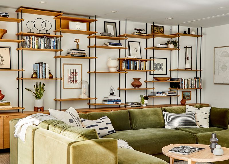
Books crammed into every available shelf space create visual heaviness that weighs down your entire room! While your impressive collection showcases your literary interests, overstuffed bookshelves can make walls feel like they’re closing in.
The secret to visually lighter shelving is incorporating negative space. Try arranging books in both horizontal and vertical groupings with space between collections. Add a few decorative objects, framed photos, or small plants to break up the monotony of book spines. Consider color-coordinating sections for a more cohesive look.
If space is truly limited, be selective about which books earn shelf space. Store rarely-used references elsewhere, and rotate display books seasonally. Remember that bookshelves don’t need to be filled to capacity – those empty spaces actually make your room feel larger and your collection more intentionally curated.
10. Too Many Small Décor Pieces
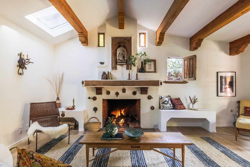
That army of tiny figurines marching across your mantel is making your room feel like a crowded flea market! Small decorative items, when scattered individually throughout a space, create visual clutter that diminishes perceived room size. Instead of many little items, try fewer, larger statement pieces that make an impact.
Group smaller objects into cohesive collections using trays or similar containers to create the visual effect of a single, larger item. Three medium-sized vases make a stronger statement than ten tiny ones scattered about.
When displaying collectibles, consider rotating them seasonally rather than showing everything at once. This approach prevents visual overload while still honoring your treasures. Remember that in decorating, negative space is just as important as the objects themselves those empty areas allow your eyes (and your room) to breathe!
11. Skipping Mirrors to Reflect Light
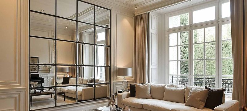
Missing out on mirrors? You’re passing up the oldest trick in the decorator’s handbook for making spaces feel larger! Mirrors are magical in how they bounce light, create the illusion of depth, and visually double your space. Strategic mirror placement works wonders position them across from windows to maximize natural light reflection or at the end of hallways to extend perspective.
Oversized mirrors leaning against walls create dramatic impact while making rooms appear almost twice their size. Mirrored furniture pieces like side tables or cabinet fronts add reflective qualities without dominating walls. Beyond basic wall mirrors, consider mirrored trays on coffee tables or clusters of small decorative mirrors as art groupings.
Even metallic, high-shine surfaces contribute to the reflective quality that expands spaces. Remember that clean, streak-free mirrors reflect better regular polishing keeps their space-expanding power at maximum!
12. Low Ceiling Light Fixtures
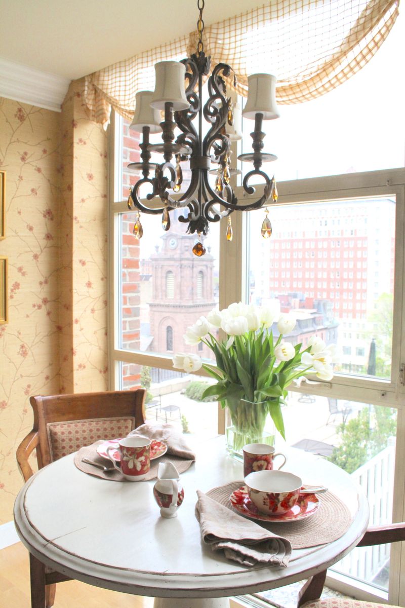
That beautiful chandelier hanging at eye level might be a hazard to tall guests while also making your ceiling appear lower than it actually is! Fixtures that hang too low create a visual ceiling line that compresses your space vertically.
For standard 8-foot ceilings, pendants and chandeliers should typically hang 7 feet above the floor in walking areas. Over tables or kitchen islands, 30-36 inches of clearance works well. When ceiling height is limited, consider semi-flush or flush-mount fixtures that provide style without sacrificing headroom.
If you’re in love with a dramatic pendant, try hanging it in areas where people don’t walk underneath, like over bathtubs or reading nooks. Recessed lighting is another space-expanding alternative that provides illumination without visual interruption. Remember that drawing eyes upward expands perceived space, so properly positioned lighting is crucial!

