11 Of The Best Exterior Paint Colors According To Designers – These Are The Go-To Shades From Tried And Trusted Brands
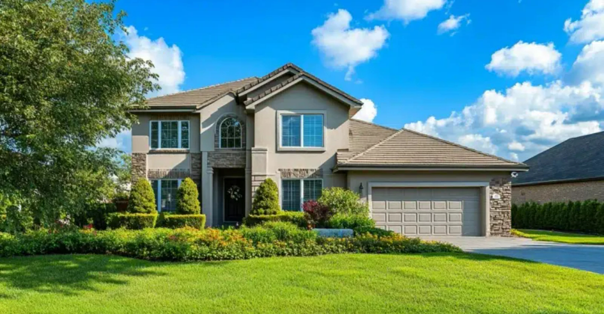
Choosing the right exterior paint color can transform your home from ordinary to extraordinary. Professional designers often rely on specific shades that consistently deliver stunning results across different architectural styles and settings.
I’ve gathered the top exterior paint colors that design experts swear by, helping you narrow down the overwhelming options to the most reliable and beautiful choices from respected paint brands.
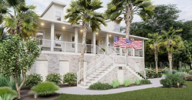
1. Crisp Arctic White
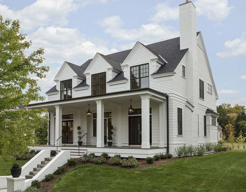
Nothing beats a classic white exterior for timeless appeal. Arctic White creates a clean canvas that makes architectural details pop while reflecting heat in warmer climates. I’ve seen this shade work wonders on everything from colonial homes to modern farmhouses.
The bright finish resists yellowing over time, maintaining that fresh look for years. Pro tip: Pair with black shutters and door hardware for a striking contrast that never goes out of style.
2. Sophisticated Naval
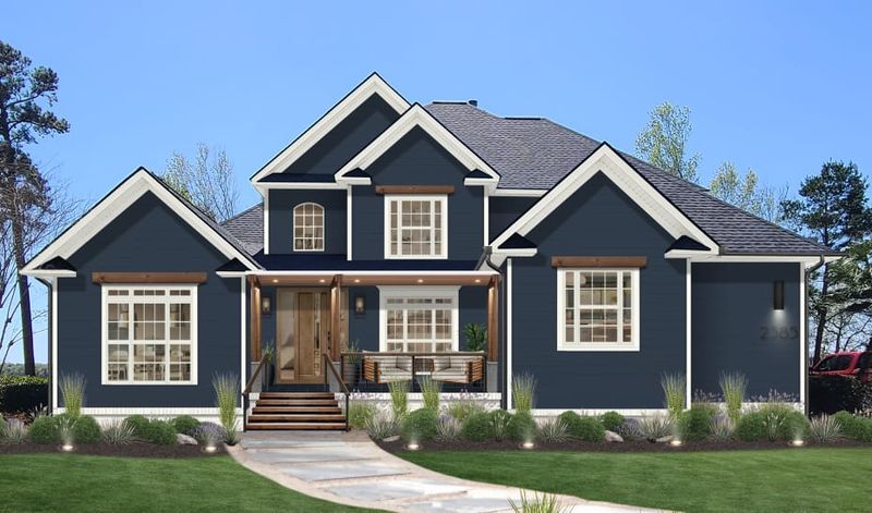
Rich navy blue exudes confidence and elegance on home exteriors. Naval creates dramatic curb appeal while still feeling grounded and traditional – perfect for those wanting something beyond neutrals. The depth of this shade changes beautifully throughout the day as sunlight shifts.
Many of my clients who choose this color receive endless compliments from neighbors and passersby. For a winning combination, try white trim and brass light fixtures to complement this stately blue.
3. Earthy Kendall Charcoal
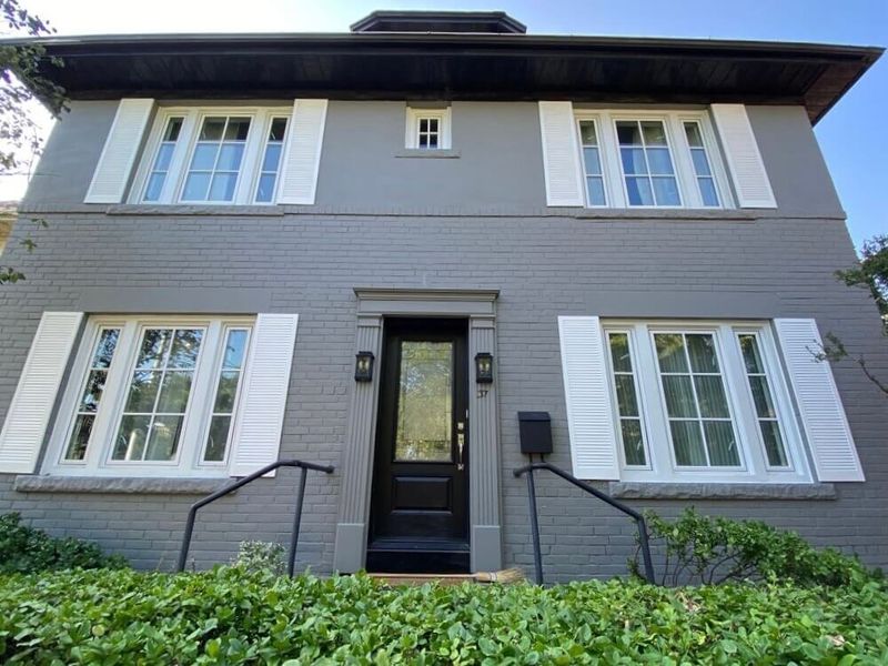
Warm gray tones have taken the design world by storm, and Kendall Charcoal leads the pack for exteriors. This deep, complex shade sits between true gray and brown, creating a sophisticated neutral that works in any neighborhood.
I love how this color anchors a home to its landscape without feeling too dark or imposing. The subtle brown undertones prevent that cold feeling some grays can have. Limestone accents and natural wood elements pair beautifully with this versatile charcoal.
4. Cheerful Wythe Blue
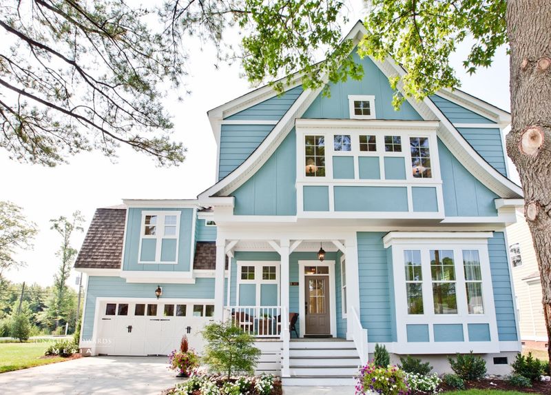
Looking for a happy medium between bold and subtle? Wythe Blue offers a refreshing blue-green that brightens exteriors without overwhelming the senses. The calming quality of this shade works wonders on beach cottages and suburban homes alike.
I’ve noticed this color photographs beautifully and maintains its charm in all seasons. White trim creates a crisp look, while natural wood accents bring out the warmth in this versatile hue that designers reach for again and again.
5. Timeless Revere Pewter
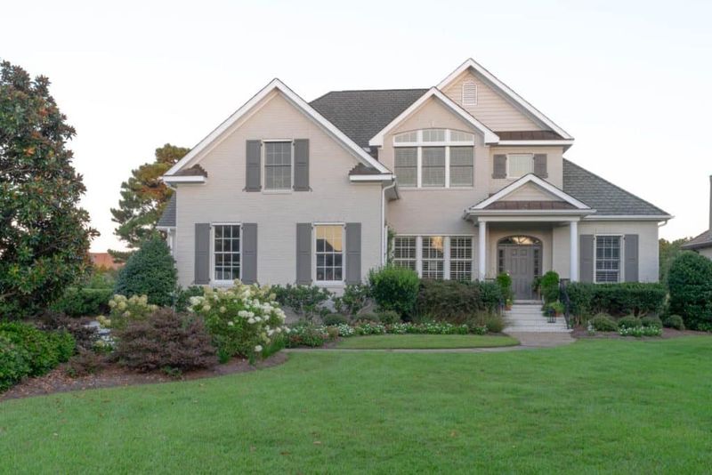
When clients ask for a foolproof neutral, Revere Pewter is my go-to recommendation. This perfect greige (gray-beige blend) adapts to its surroundings, appearing warmer in some lights and cooler in others. The versatility makes it ideal for homes in changing climates or those with complex landscaping.
I appreciate how this shade complements both modern and traditional architectural elements. Black windows and doors create striking contrast against this sophisticated neutral that never seems to go out of style.
6. Bold Hale Navy
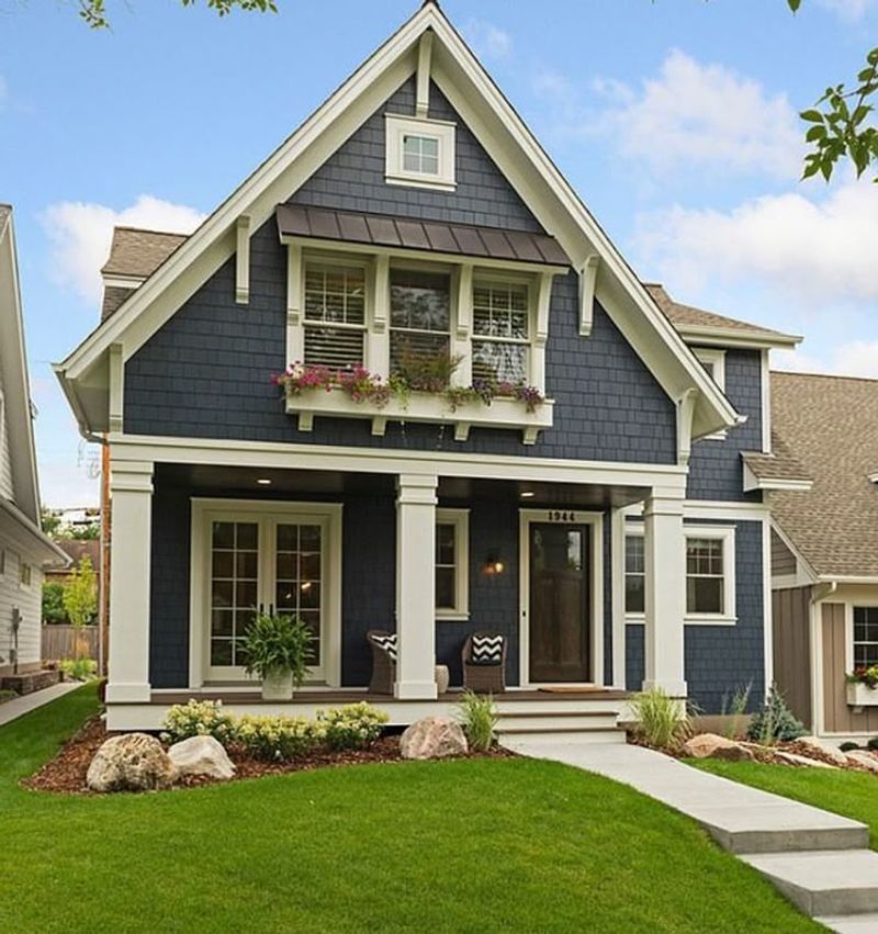
For homeowners seeking a statement color with staying power, Hale Navy delivers dramatic impact without feeling trendy. This deep blue has just enough black undertones to feel sophisticated rather than nautical. I’ve used this shade on Victorians, Craftsman bungalows, and even modern homes with stunning results.
The richness creates a sense of permanence and history even on newer builds. Bright white trim makes this navy pop, while brass or copper fixtures add warmth to balance the cool undertones.
7. Soothing Oyster Shell
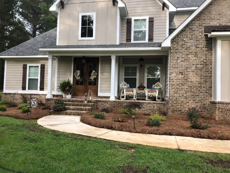
Soft gray with the faintest green undertones, Oyster Shell creates a tranquil exterior that blends beautifully with natural surroundings. The subtle complexity of this shade reveals itself differently throughout the day.
My clients love how this color evokes a sense of calm while still maintaining character. It’s particularly stunning on Craftsman-style homes where the understated color allows architectural details to shine. Stone accents and dark bronze fixtures complement this versatile neutral perfectly.
8. Dramatic Urbane Bronze
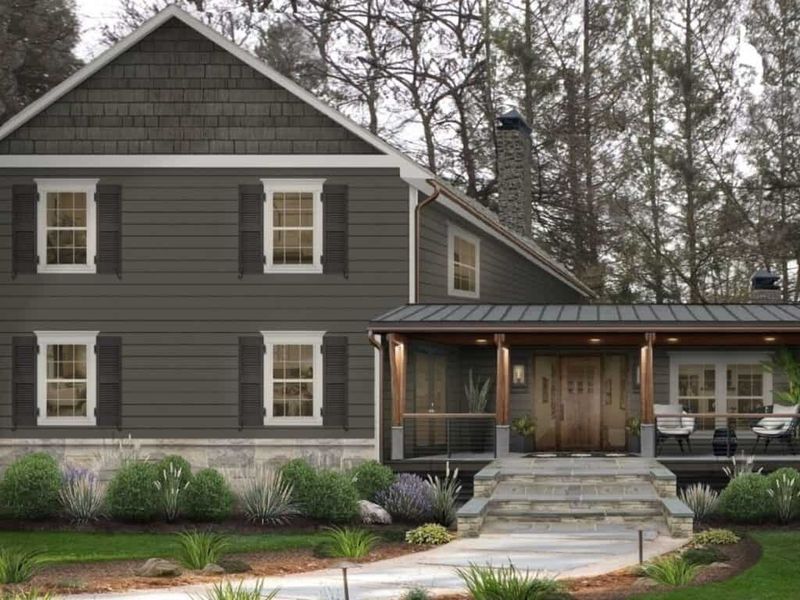
Once considered too bold for entire exteriors, deep bronze has become a designer favorite for creating striking curb appeal. Urbane Bronze offers a perfect balance of warmth and drama that feels both modern and timeless.
The earthy quality of this shade grounds a home in its landscape while making architectural details pop. I’m consistently impressed by how this color transforms ordinary homes into showstoppers. Light cream trim and natural wood elements soften the intensity of this rich, sophisticated hue.
9. Fresh Sage Green
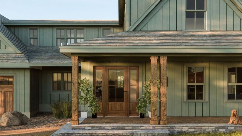
Nature-inspired colors create harmony between a home and its surroundings, and Sage Green leads this category for exteriors. The muted, earthy quality feels both fresh and traditional simultaneously. I’ve seen this versatile shade work wonders on cottages, farmhouses, and even urban row homes.
The color shifts beautifully throughout the day, appearing more gray in shadows and more green in direct sunlight. Cream trim and natural stone accents enhance the organic quality of this designer favorite.
10. Welcoming Accessible Beige
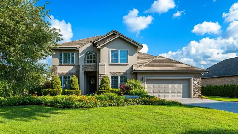
Finding the perfect neutral is challenging, but Accessible Beige has earned its reputation as the most versatile warm neutral for exteriors. The balance of gray and beige creates depth without feeling too yellow or pink. This chameleon-like shade adapts beautifully to different lighting conditions and architectural styles.
I recommend it constantly for clients who want a warm, inviting exterior that won’t look dated in five years. Dark bronze accents and rich wood tones enhance the sophisticated warmth of this timeless neutral.
11. Statement-Making Tricorn Black
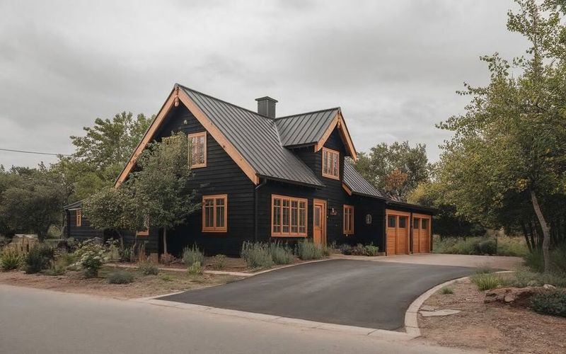
Bold black exteriors have moved from daring trend to modern classic, with Tricorn Black leading the charge. This true black creates dramatic sophistication without the blue or green undertones that can make some blacks appear murky.
I’ve watched this shade transform ordinary homes into architectural statements. The dramatic backdrop makes landscaping and architectural details truly pop in a way lighter colors simply can’t match. Warm wood accents and brass fixtures soften the intensity while maintaining the powerful visual impact.
