20 Common Mistakes That Make Your Home Look Tacky – And What To Do Instead
Ever stepped into a room and felt an instant sense of discomfort without knowing exactly why? Crafting a beautiful home goes far beyond filling it with trendy furniture or high-end pieces. It’s often the little details – or missteps – that can sabotage the overall look, leaving spaces feeling cluttered, dated, or downright tacky.
From scale and color choices to lighting and accessories, certain habits quietly undermine even the best intentions. The good news? A few thoughtful changes can turn things around, helping any home look effortlessly polished, stylish, and uniquely yours.
1. Overusing Matching Furniture Sets
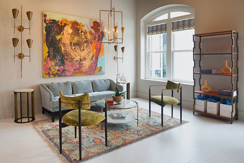
Walking into a showroom and buying everything that matches might seem convenient, but it creates a boring, catalog-like atmosphere. Instead, mix complementary pieces that share common elements.
Matching furniture sets lack personality and dimension. Try pairing that sofa with different end tables or adding accent chairs in contrasting fabrics to create visual interest and a more collected, thoughtful look.
2. Hanging Art Too High Or Too Low
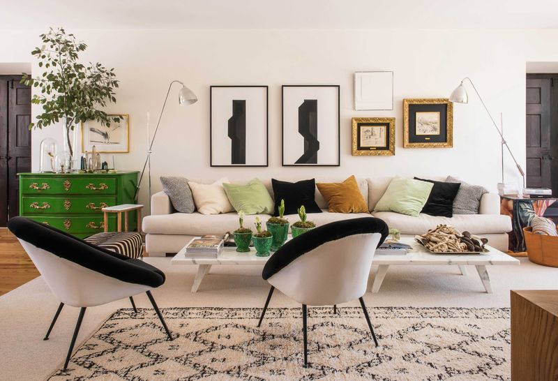
Gallery walls become awkward when pieces float too high or sink too low on your walls. The sweet spot? Center your artwork at eye level, approximately 57-60 inches from the floor. Hanging art incorrectly throws off the entire room’s balance.
Remember to consider the room’s purpose – dining rooms might need slightly higher placement than living spaces where people are typically seated.
3. Relying On Harsh Overhead Lighting
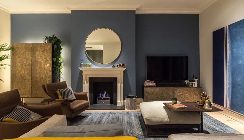
Ceiling fixtures alone create unflattering shadows and harsh environments that make even beautiful rooms feel cold and unwelcoming. Layer your lighting instead with multiple sources at different heights. A well-designed room incorporates ambient, task, and accent lighting.
Add floor lamps, table lamps, and wall sconces to create depth and warmth while highlighting architectural features and art.
4. Choosing Rugs That Are Too Small
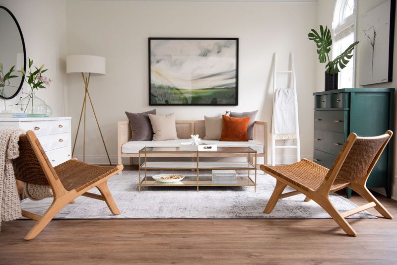
Tiny area rugs floating like islands make rooms feel disjointed and visually smaller. A properly sized rug should accommodate at least the front legs of all furniture in a seating arrangement.
Rugs anchor your space and define conversation areas. For dining rooms, ensure the rug extends at least 24 inches beyond the table edge so chairs remain on the rug when pulled out.
5. Cluttering Surfaces With Too Many Decor Items
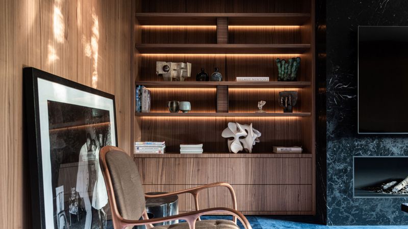
Crowded shelves and tabletops overwhelm the eye and create visual chaos that screams “tacky.” Edit your collections ruthlessly and give important pieces room to breathe.
Surface clutter makes spaces feel smaller and more chaotic. Try grouping similar items in odd numbers (three or five work well) with varying heights, and leave plenty of negative space around each grouping.
6. Using Fake Plants That Look Obvious
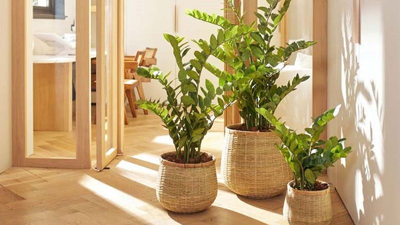
Dusty, plastic greenery instantly cheapens your space with its artificial appearance. If maintenance concerns you, invest in high-quality faux options or choose low-maintenance live plants like snake plants or pothos.
Modern artificial plants have become remarkably realistic. Look for variations in color, imperfect details, and natural-looking containers. When possible, mix in some real plants for authenticity.
7. Ignoring Curtain Length And Placement
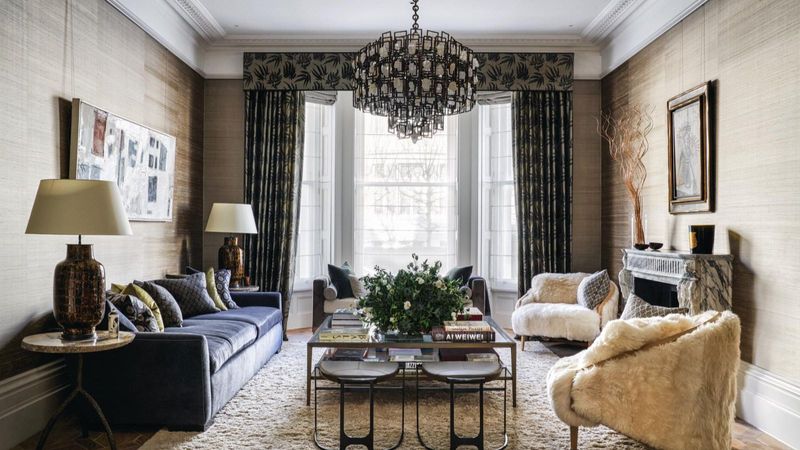
Short, floating window treatments create an awkward, unfinished look that draws attention for all the wrong reasons. Proper curtains should either lightly touch the floor or puddle slightly for a luxurious effect.
Curtain rods belong higher than you think! Mounting them 4-6 inches above the window frame and extending 8-12 inches beyond each side makes windows appear larger and ceilings higher.
8. Displaying Excessive Themed Decor
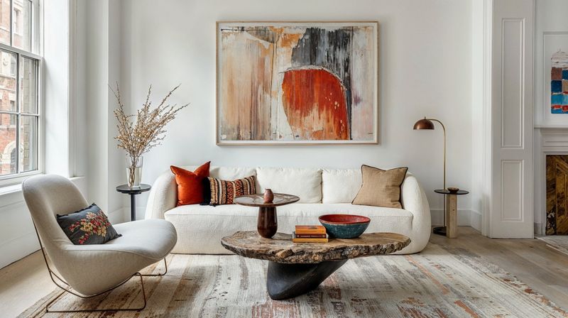
Going overboard with beach shells or farmhouse signs creates a one-dimensional, kitschy atmosphere rather than a sophisticated space. Subtle nods to your favorite theme work better than all-out commitment.
Themed elements should integrate naturally. Try incorporating beach colors rather than seashells everywhere, or rustic textures instead of “Live, Laugh, Love” signs. This creates depth while maintaining your personal style.
9. Leaving Cords And Wires Exposed
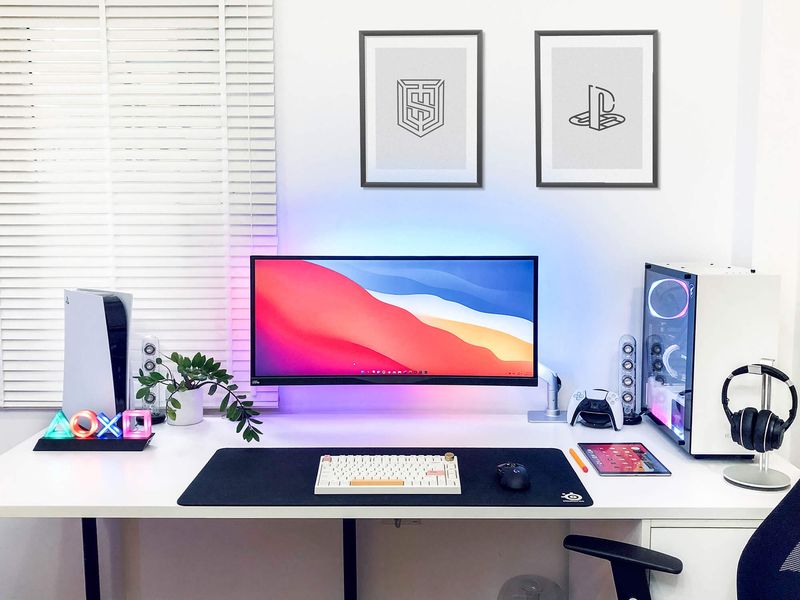
Tangled cables snaking across floors and walls create visual chaos that undermines even the most thoughtful design. Simple cord management solutions like cable covers, cord clips, or decorative boxes make a dramatic difference.
Modern homes contain countless electronics. Plan furniture placement with outlets in mind, use cord channels painted to match walls, or invest in furniture with built-in cable management for a cleaner look.
10. Picking Paint Colors Without Testing Samples
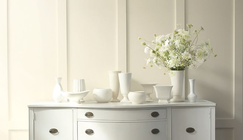
Spontaneously choosing paint based on tiny swatches leads to costly mistakes and rooms that feel off. Colors appear dramatically different depending on lighting, room orientation, and surrounding elements.
Paint large sample boards (at least 2×2 feet) with your potential colors. Move them around the room at different times of day to see how natural and artificial light affects them before committing.
11. Overloading Walls With Excessive Art Or Photos
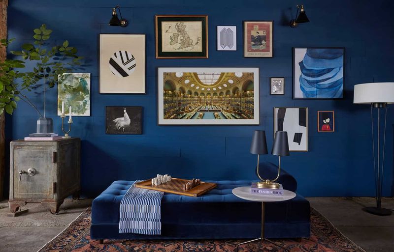
Cramming every inch of wall space with frames creates visual noise that prevents any single piece from standing out. Quality over quantity makes a more sophisticated statement. Wall displays need breathing room.
Consider creating one impactful gallery wall rather than spreading frames throughout every room. Leave ample white space between pieces and group them with intention.
12. Opting For Cheap, Flimsy Hardware
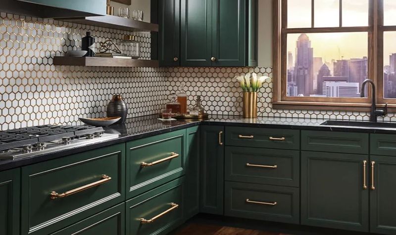
Builder-grade knobs and pulls drag down the appearance of your entire kitchen or bathroom. Hardware functions as jewelry for cabinets – it should feel substantial and look intentional.
Replacing generic hardware with quality pieces instantly elevates your space. Choose weighty metals in finishes that complement your overall design. This small investment delivers outsized visual returns.
13. Decorating Entire Rooms In One Color
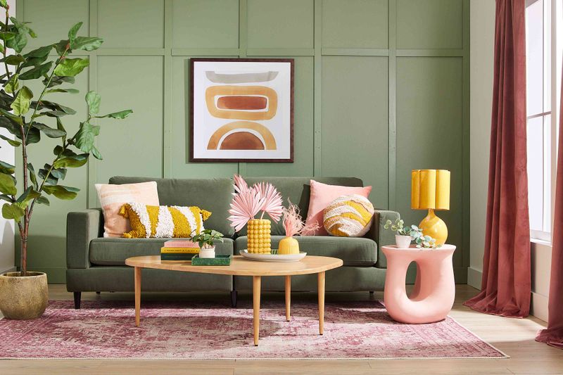
Monochromatic extremes create flat, uninspiring spaces lacking dimension and personality. Even when working with a favorite hue, variation is essential for visual interest. Colors need contrast companions.
Try using the 60-30-10 rule: 60% dominant color, 30% secondary color, and 10% accent color. Include different textures, patterns, and materials to add depth to your color scheme.
14. Keeping Old, Worn-Out Throw Pillows
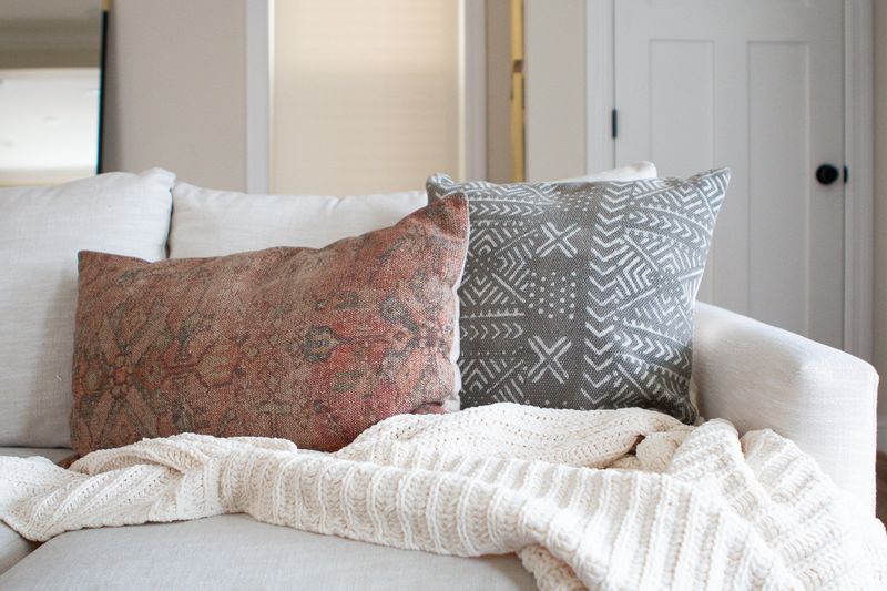
Flat, stained, or dated cushions instantly age your entire seating area. Pillows take daily abuse and should be replaced when they lose their shape or freshness. Throw pillows offer affordable room refreshes.
Look for covers with hidden zippers so you can wash or swap them seasonally. Invest in quality inserts filled with down or down-alternative for pillows that maintain their loft.
15. Choosing Trendy Pieces Without Considering Longevity
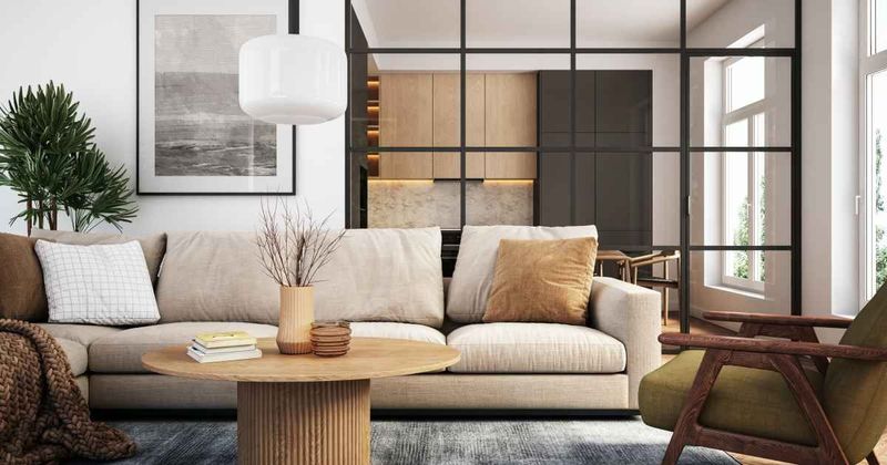
Jumping on every design bandwagon leads to dated interiors requiring frequent, expensive updates. Remember the chevron craze or the brief obsession with popcorn ceilings? Trendy elements work best in easily changeable items.
Keep larger investments (sofas, built-ins, flooring) classic and timeless. Add current trends through accessories, paint colors, or smaller furniture pieces you can replace affordably.
16. Neglecting Front Entryway Appeal
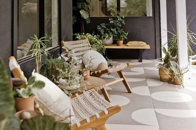
First impressions start before anyone steps inside. Overlooking your entrance with worn welcome mats, cluttered shoes, or poor lighting sends the wrong message about your entire home. Entryways deserve special attention.
Add a stylish light fixture, a small bench or table, and thoughtful organization. Consider a fresh coat of paint on the door in a welcoming color that complements your home’s exterior.
17. Using Low-Quality, Thin Window Treatments
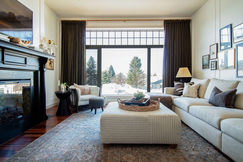
Flimsy curtains or blinds that let light bleed around the edges create an unfinished, budget appearance. Window treatments frame your views and significantly impact your room’s overall impression.
Quality window coverings provide proper light control and privacy. Look for lined curtains with appropriate weight and fullness. When using blinds or shades, ensure they fit properly within or outside the window frame.
18. Buying Art Prints Without Frames
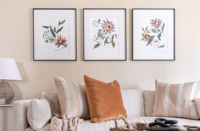
Tacking unframed posters directly to walls creates a college dorm vibe rather than a sophisticated aesthetic. Proper framing elevates even inexpensive prints to statement pieces.
Artwork deserves proper presentation. Simple frames with mats transform basic prints into polished decor. For a budget-friendly option, look for vintage frames at thrift stores or standardized frames from big box retailers.
19. Choosing Oversized Furniture For Small Spaces
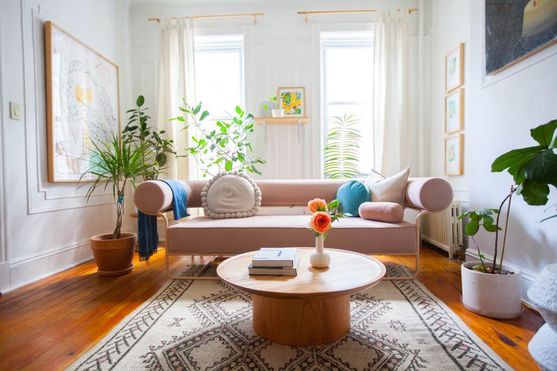
Cramming bulky pieces into tight areas creates awkward traffic flow and makes rooms feel cluttered and smaller than they actually are. Scale matters tremendously in design. Furniture should be proportional to your space.
Measure carefully before purchasing and leave breathing room around pieces. Consider apartment-scale options, multi-functional furniture, or pieces with exposed legs that create visual lightness.
20. Skipping Personal Touches And Making Spaces Feel Generic
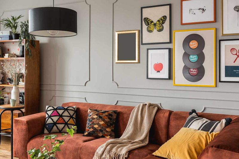
Rooms straight from a catalog lack soul and personality, regardless of their technical perfection. Without personal elements, spaces feel like hotel rooms rather than homes. Your space should tell your story.
Incorporate meaningful items like family photos, travel souvenirs, or heirloom pieces. Display collections thoughtfully, showcase artwork that resonates with you, and choose elements that spark joy and conversation.

