23 Outdated Things You Should Avoid In Your Kitchen, According To Designers
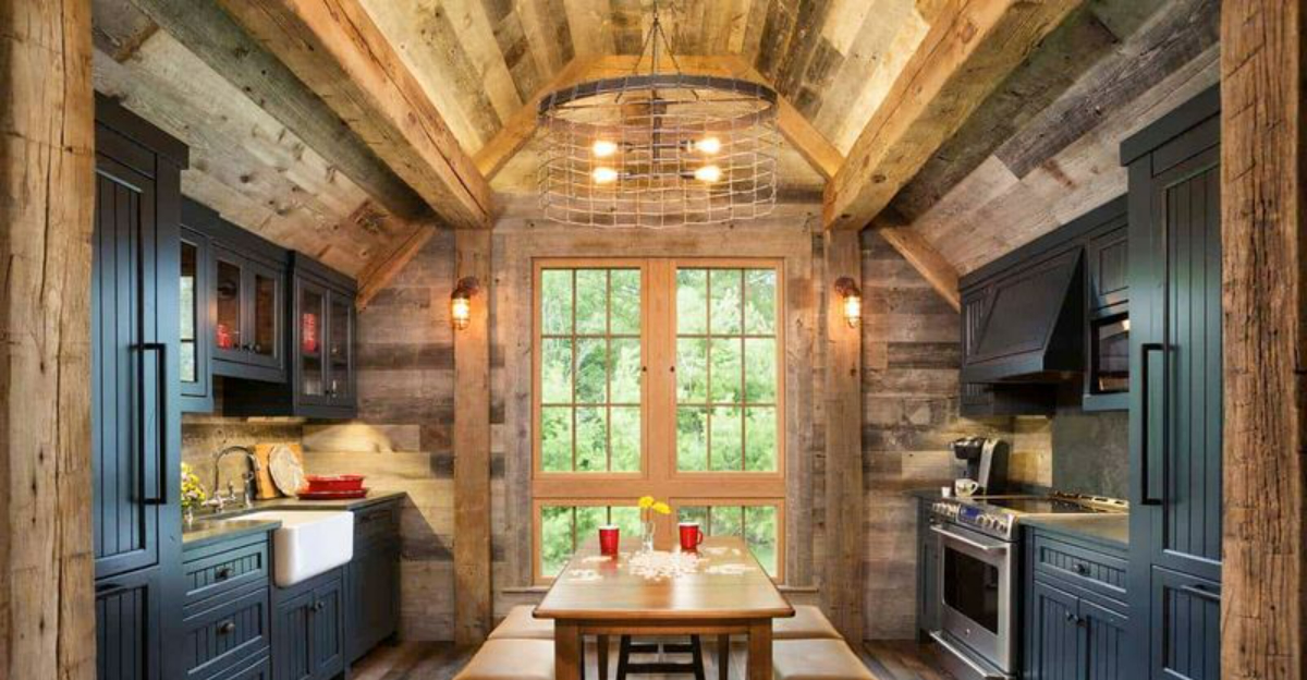
Your kitchen deserves a modern makeover that combines style with functionality. Many of us are holding onto outdated elements that make our cooking spaces look tired and dated. I’ve consulted with top designers to identify the kitchen features that scream “last decade” and should be shown the door.
Ready to transform your kitchen into a contemporary culinary haven? Let’s explore what needs to go.
1. Tuscan-Inspired Decor
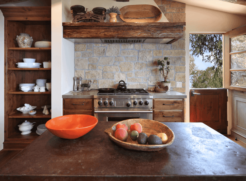
Remember those faux-finished walls with earthy tones and grape motifs? That Mediterranean fantasy has officially overstayed its welcome in American kitchens.
Designers now favor clean lines and simplified color palettes that create a timeless appeal. The heavy wrought iron accessories and terracotta tiles that once dominated kitchen spaces now make rooms feel cluttered and dark.
If you still love Mediterranean vibes, incorporate them subtly through fresh herbs or a quality olive oil display instead of themed decor.
2. Oak Cabinets with Orange Undertones
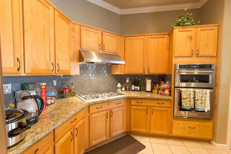
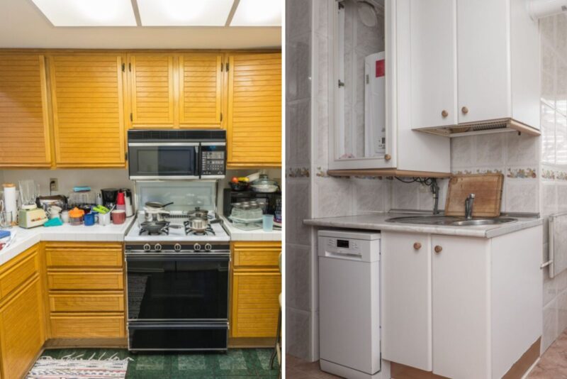
Those honey-colored oak cabinets that dominated homes in the 90s create an instantly dated look in your cooking space. The yellowish-orange tint clashes with most modern color schemes and makes your kitchen feel stuck in a time warp.
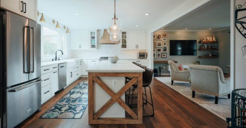
White, gray, or even navy cabinets offer a fresh alternative that brightens your space. For wood lovers, consider walnut, maple, or oak with cooler undertones instead.
A simple cabinet refacing project can dramatically transform your kitchen without the cost of a full renovation.
3. Granite Countertops with Busy Patterns
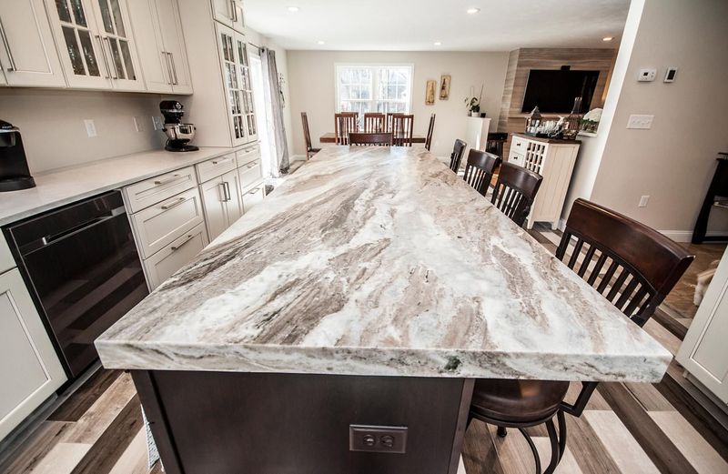
The speckled, multi-colored granite that once represented luxury has lost its appeal among design professionals. Those busy patterns with gold, brown, and black flecks overwhelm the eye and limit your design flexibility.
Quartz and marble-look surfaces have taken center stage for their clean appearance and practical benefits. Solid colors or subtle veining creates a more sophisticated backdrop for your culinary adventures.
If you’re not ready for a full replacement, consider a solid-colored island countertop to break up the busy pattern.
4. Pot Racks Hanging from the Ceiling
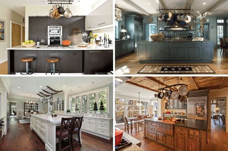
Those suspended copper pot collections might have impressed visitors in the early 2000s, but they’ve fallen from favor in contemporary kitchens. Hanging pots collect dust and grease while creating visual clutter that makes your ceiling feel lower.
Modern kitchens prioritize clean sightlines and hidden storage solutions. Deep drawers with custom dividers keep cookware accessible without sacrificing style.
If you truly need your pots visible for convenience, consider a wall-mounted rail system that takes up less visual space than overhead racks.
5. Fluorescent Box Lighting
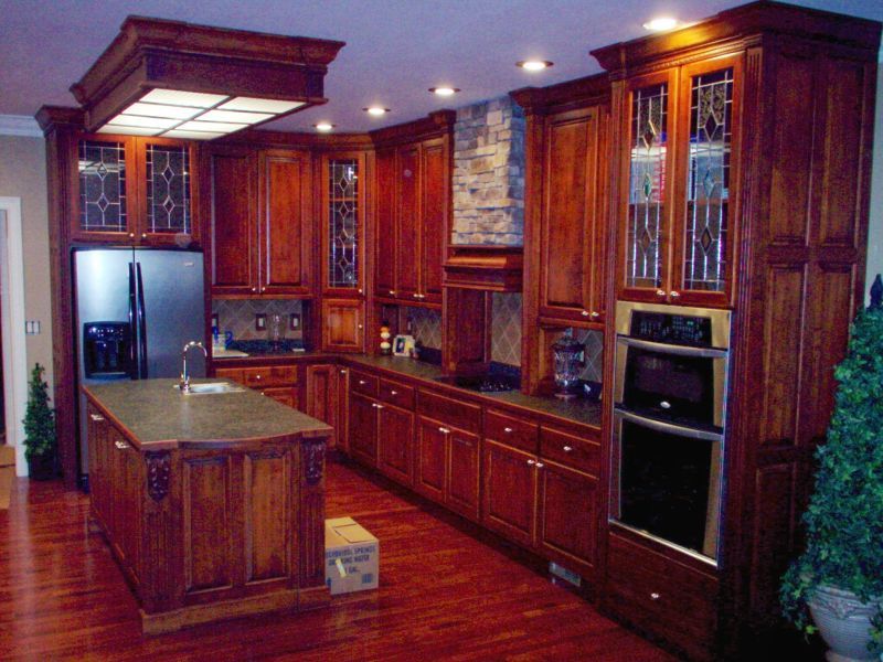
Nothing screams “outdated kitchen” like those rectangular fluorescent fixtures with their harsh, unflattering light. They cast a clinical glow that makes even the freshest food look unappetizing and creates an institutional atmosphere.
Layered lighting has become the gold standard in kitchen design. Recessed ceiling lights provide general illumination, while pendant fixtures add style and targeted task lighting.
Under-cabinet LED strips eliminate shadows on work surfaces and create a warm ambiance when other lights are dimmed. The right lighting transforms both the function and mood of your kitchen.
6. Ornate Cabinet Hardware
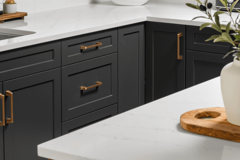
Those elaborate cabinet pulls with scrollwork and antique finishes are collecting dust both literally and figuratively. Overly decorative hardware competes for attention and makes your kitchen feel fussy rather than functional.
Sleek, minimal hardware in matte black, brushed nickel, or integrated finger pulls represent the modern approach. These understated options complement rather than dominate your cabinetry.
The good news? Swapping out hardware is one of the easiest and most affordable kitchen updates you can make this weekend for an instant style refresh.
7. Themed Tile Backsplashes
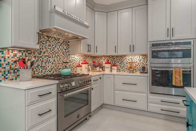
Those fruit-decorated tiles or mosaic scenes might have seemed charming when installed, but designers now view them as personalized time capsules that quickly feel dated. The busy patterns and specific motifs limit your future design choices and overwhelm the visual space.
Timeless backsplashes feature simple subway tiles, solid glass, or large-format porcelain with minimal grout lines. These classic options create a clean backdrop that allows other elements to shine.
For personality, add color through paint or accessories that can easily change as trends evolve, rather than permanent tile installations.
8. Over-the-Range Microwaves
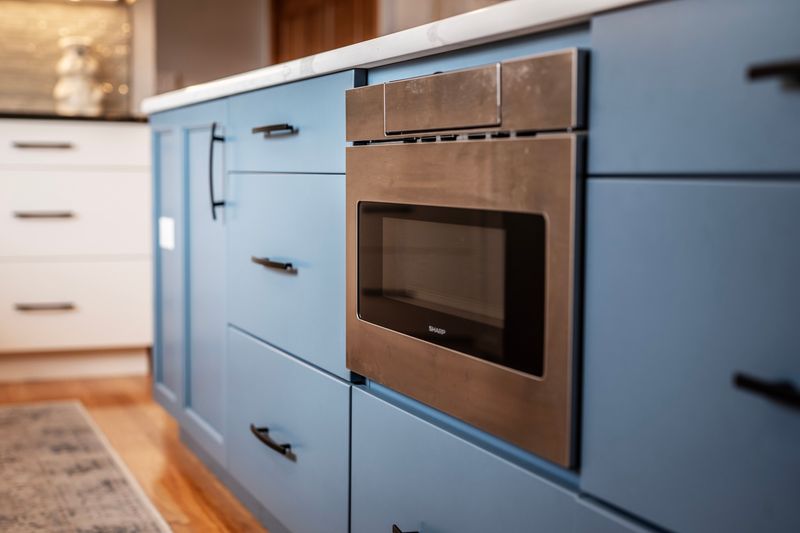
That bulky microwave hovering above your stove represents a functional compromise that designers now avoid. These appliances create a visual barrier at eye level and often provide inadequate ventilation for serious cooking activities.
The microwave drawer, built into lower cabinetry, has become the preferred solution in updated kitchens. This placement improves accessibility while freeing up space for a proper ventilation hood.
A powerful range hood not only removes cooking odors more effectively but also serves as a sculptural focal point that enhances your kitchen’s design rather than detracting from it.
9. Raised Panel Cabinet Doors
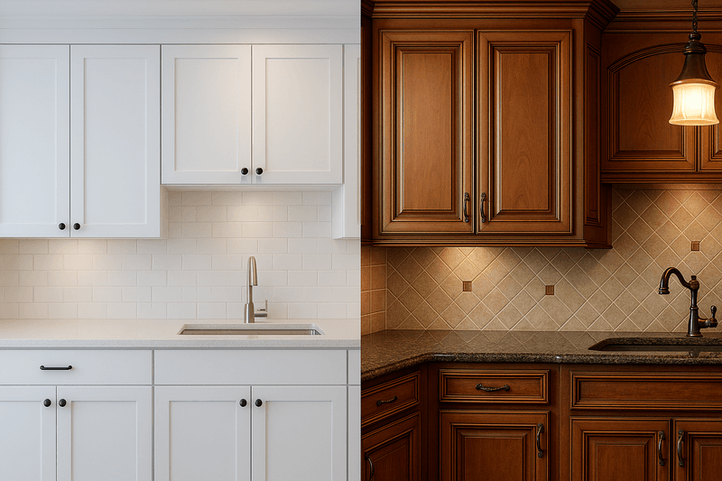
Heavy, ornate cabinet doors with multiple raised panels and decorative edges give your kitchen an unnecessarily formal, old-fashioned appearance. These detailed profiles collect grease and dust in their crevices, making cleaning a constant challenge.
Flat-panel or shaker-style doors have become the standard for their versatility and timeless appeal. Their clean lines work equally well in traditional and contemporary settings.
The simplified profiles also allow beautiful hardware and countertops to take center stage rather than competing with busy door designs that overwhelm the space.
10. Mismatched Appliances
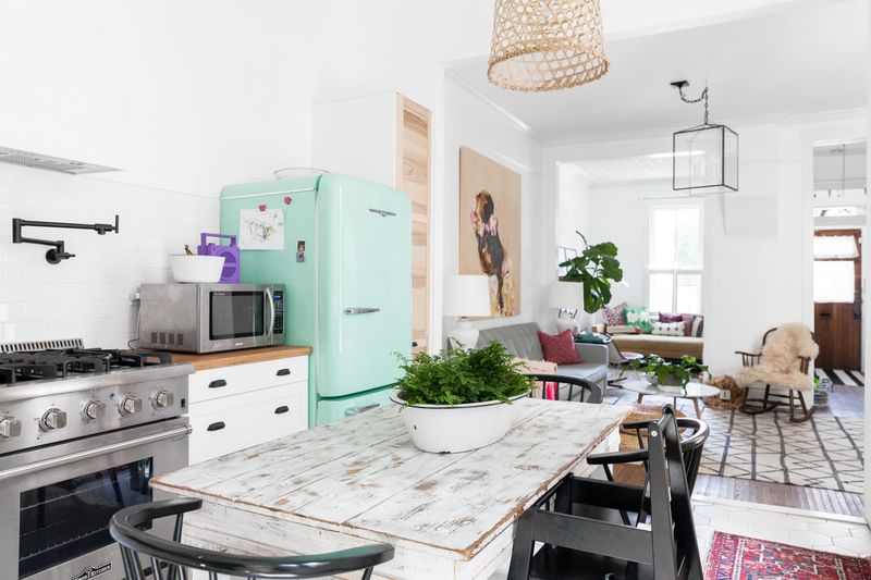
A refrigerator from one decade, a dishwasher from another, and a vintage stove might seem eclectic, but designers see this mix as visually chaotic rather than charming. Different finishes, handles, and technologies create a disjointed look that suggests piecemeal updates.
Coordinated appliance suites create a cohesive, intentional aesthetic that elevates your entire kitchen. If a complete replacement isn’t in your budget, prioritize matching the most visible appliances first.
Some manufacturers now offer panels that can update the appearance of existing appliances, allowing you to create a more unified look without replacing everything at once.
11. Short Upper Cabinets with Soffits
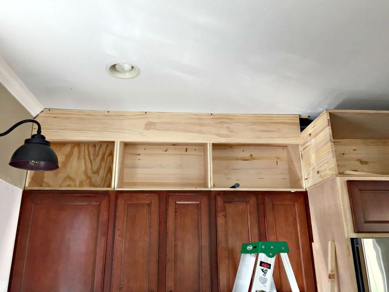
Those standard-height upper cabinets with empty soffits above them waste valuable storage space and create a choppy visual line that makes ceilings appear lower. The dead space collects dust and makes your kitchen feel like it’s wearing high-water pants!
Cabinets that extend to the ceiling maximize storage while creating a more architectural, custom look. The vertical lines draw the eye upward, making your kitchen feel taller and more spacious.
If full-height cabinets aren’t possible, consider adding decorative molding or display space above existing cabinets to eliminate that awkward gap that dates your kitchen.
12. Cluttered Refrigerator Doors
Your collection of magnets, photos, and children’s artwork might hold sentimental value, but they create visual noise that designers immediately notice. The cluttered display makes even the most expensive refrigerator look chaotic and detracts from your kitchen’s overall aesthetic.
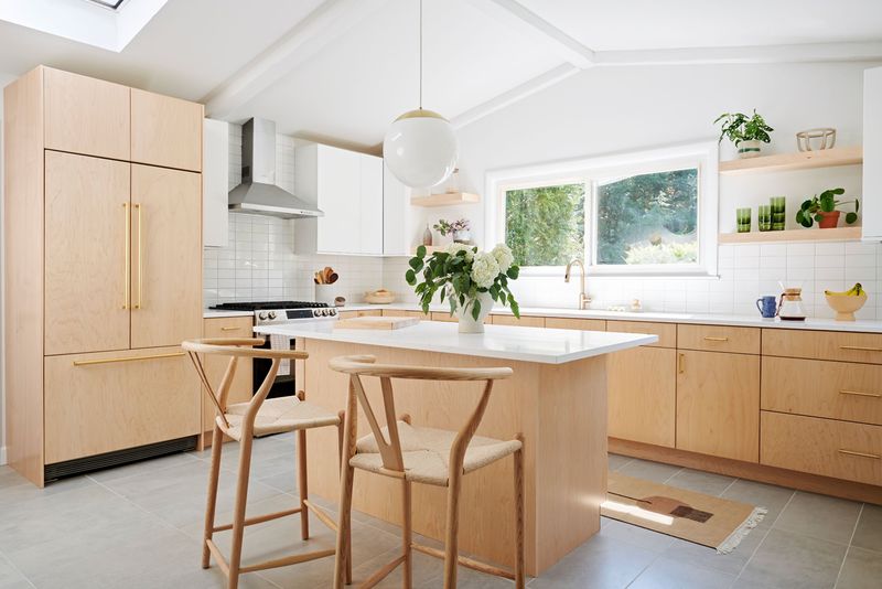
Clean, unadorned appliance surfaces contribute to a more peaceful, intentional environment. Panel-ready refrigerators that blend seamlessly with cabinetry represent the height of current kitchen design.
For family memories and schedules, consider creating a dedicated command center in a less prominent area, keeping your main kitchen space visually serene.
13. Faux Plants Collecting Dust
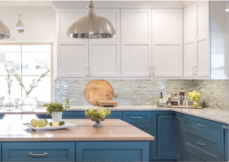
Those silk flower arrangements and plastic greenery might have seemed low-maintenance, but they’ve become dust collectors that instantly date your kitchen. Artificial plants fade over time and develop a telltale dusty film that no amount of cleaning can disguise.
Live plants bring actual benefits to your kitchen beyond aesthetics. They improve air quality, add life to the space, and provide fresh herbs for cooking.
Even self-proclaimed plant killers can succeed with nearly indestructible options like pothos, snake plants, or aloe that thrive with minimal attention while adding authentic natural elements to your space.
14. Desk Areas Built Into Kitchen Cabinetry
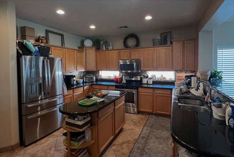
Remember when kitchen desks were the must-have feature for managing household paperwork? These awkward nooks have become obsolete in the age of laptops and smartphones. They typically end up as clutter catchers rather than functional workspaces.
Designers now recommend reclaiming this valuable real estate for more practical kitchen purposes. Coffee stations, specialized storage, or expanded pantry space provide daily utility that a rarely-used desk cannot.
If you still need a household management zone, consider creating a proper workspace elsewhere rather than squeezing it into your kitchen where cooking odors and noise make concentration difficult.
15. Excess of Open Shelving
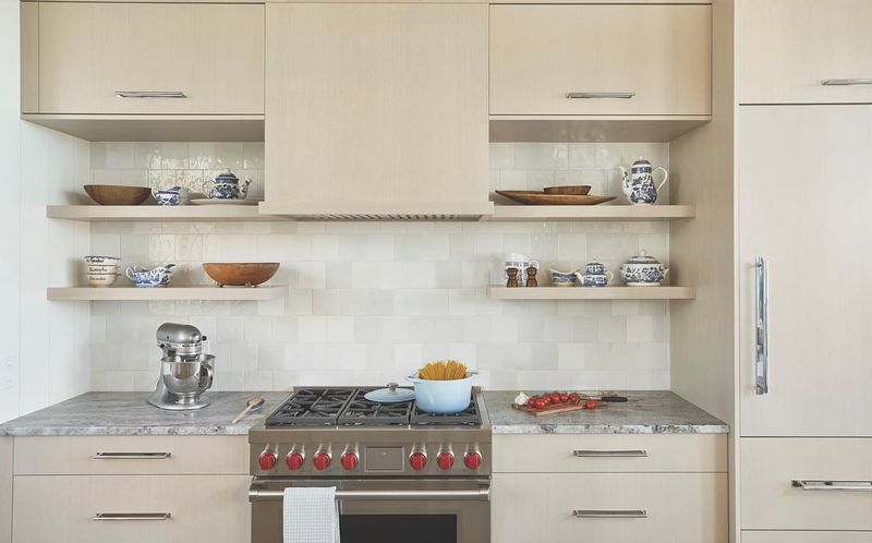
While a limited amount of open shelving can look stylish, the trend has been overused to the point of impracticality. Those Instagram-worthy arrangements require constant maintenance to prevent a cluttered appearance, and everyday items quickly gather grease and dust.
Designers are returning to closed upper cabinets for most storage needs, with perhaps one or two open sections for display. This balanced approach maintains clean lines while allowing some personality.
Glass-front cabinets offer an elegant compromise, showcasing special pieces while keeping them protected from kitchen grime – the best of both worlds for style and function.
16. Wine Glass Racks Hanging Under Cabinets
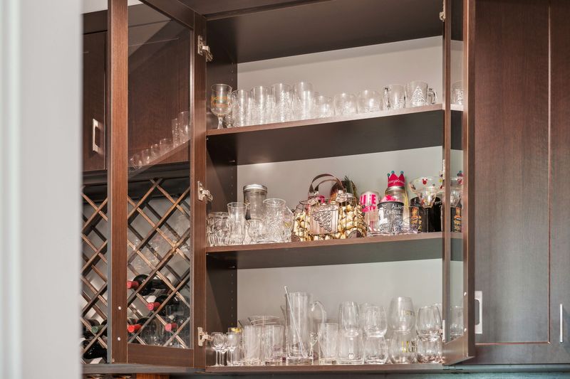
Those suspended wine glass racks that showcase stemware might seem convenient, but they’ve fallen out of favor with design professionals. The hanging glasses collect dust, create visual clutter, and turn your glassware into decor whether it matches your aesthetic or not.
Modern kitchens keep stemware behind cabinet doors, preferably in specialized storage that protects delicate items. Designated wine drawers with custom inserts offer superior protection.
If you entertain frequently, consider a proper bar area separate from your main kitchen workspace, where glassware storage makes functional sense rather than serving as questionable decor.
17. Heavily Distressed Furniture and Finishes
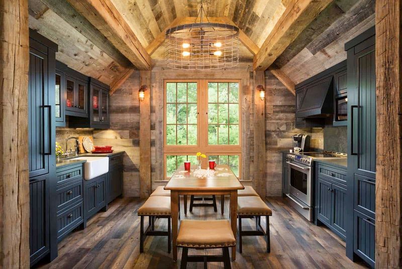
That artificially aged “shabby chic” island or heavily distressed cabinetry has passed its prime in kitchen design circles. The exaggerated rustic look often appears contrived rather than authentic and can make your kitchen feel like a theme restaurant rather than a sophisticated home.
Genuine patina develops naturally over time and cannot be convincingly manufactured through aggressive techniques. Today’s approach embraces subtle character marks in real wood rather than manufactured distressing.
If you love the warmth of traditional elements, incorporate them through natural materials with authentic finishes rather than faux-aged treatments that try too hard.
18. Decorative Corbels and Ornate Moldings
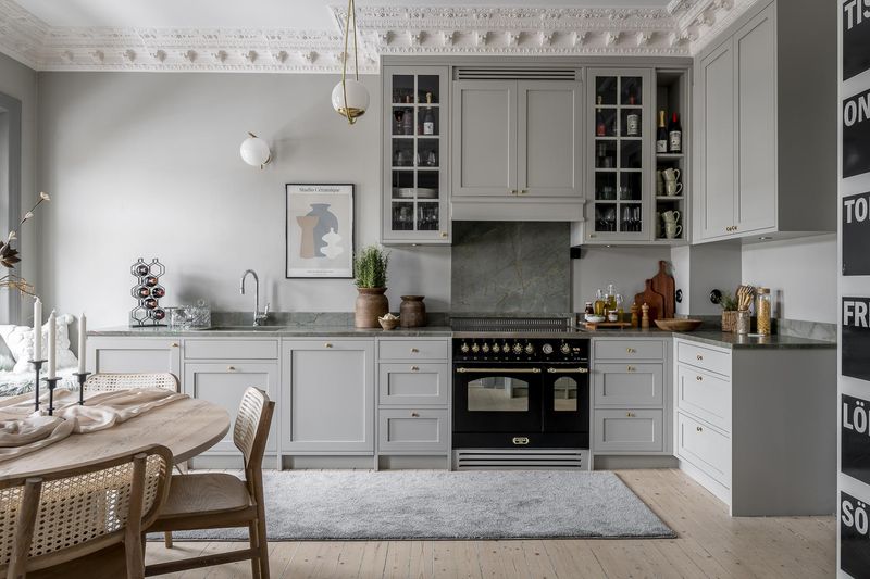
Those elaborate brackets and ornamental trim pieces that were once considered luxurious details now read as fussy and excessive. Oversized corbels under countertops and multilayered crown moldings create visual weight that makes spaces feel smaller and more dated.
Clean lines and thoughtful simplicity have replaced ornate detailing in contemporary kitchen design. When architectural details are used, they’re more restrained and purposeful.
If you appreciate traditional elements, consider incorporating them in more subtle ways through quality materials and craftsmanship rather than decorative add-ons that collect dust and compete for attention.
19. Wallpaper Borders Along the Ceiling
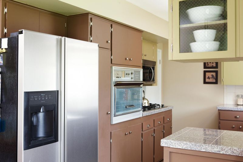
Those narrow strips of patterned wallpaper running along the top of your kitchen walls instantly transport viewers back to the 1990s. Fruit motifs, country geese, or floral patterns create a dated horizontal line that chops up your wall space and limits design flexibility.
Designers now favor clean, continuous wall treatments that create a sense of height and openness. If you love pattern, consider using it on a full accent wall or through temporary elements like window treatments.
The good news is that removing a wallpaper border is a relatively simple DIY project that can immediately modernize your kitchen’s appearance without major renovation costs.
20. Rooster-Themed Decor Collections
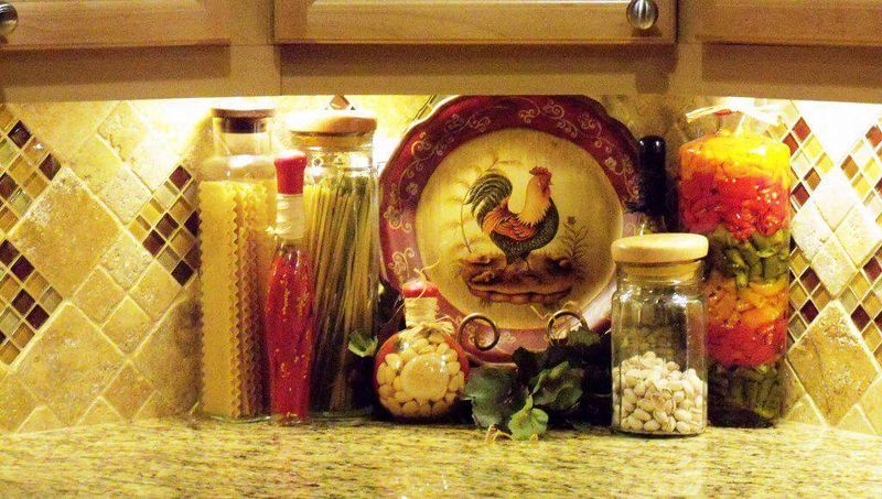
Your collection of rooster figurines, canisters, and tea towels might have country charm, but designers identify this specific theme as a hallmark of outdated kitchens. When one motif dominates a space, it creates a one-dimensional, predictable look that lacks sophistication.
Current design approaches favor more subtle nods to personal style through carefully edited accessories. One special piece makes more impact than a themed collection that overtakes the space.
If farmhouse style speaks to you, incorporate it through authentic elements like natural wood, vintage utensils, or actual antiques rather than mass-produced themed items that reference country living.
21. Tiled Countertops with Grout Lines
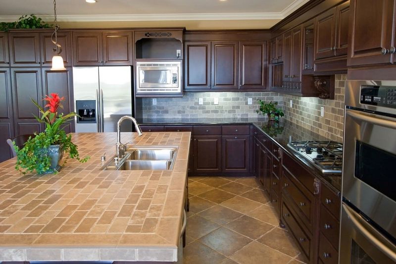
Those ceramic tile countertops with their grid of grout lines might have seemed practical decades ago, but they’ve become a maintenance nightmare and design liability. The uneven surface makes working with dough or writing difficult, while grout lines trap food particles and stains despite your best cleaning efforts.
Seamless surfaces like quartz, solid surface, or even butcher block provide the continuous work area that today’s cooks prefer. These modern materials combine practicality with clean aesthetics.
If you’re on a budget, consider laminate options that mimic stone or concrete without the grout lines that date your kitchen and complicate food preparation.
22. Builder-Grade Hollow Core Doors
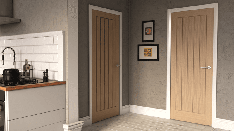
Those flimsy, flat interior doors that came with your house make a surprisingly negative impact on your kitchen’s overall impression. Their lightweight hollow construction and basic appearance signal builder-grade basics rather than thoughtful design choices.
Solid core doors with architectural detailing add substance and character to your kitchen entrances. Panel designs that complement your cabinetry create a cohesive, intentional look throughout the space.
For pantry or laundry areas, consider replacing basic doors with frosted glass, sliding barn doors, or other specialty options that transform purely functional elements into design features worth showcasing.
23. Cherry Wood with Red Undertones
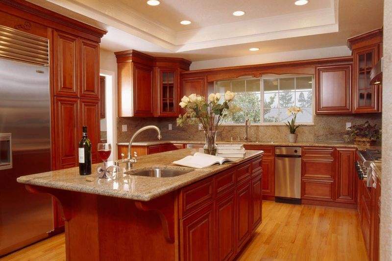
The reddish cherry cabinetry that dominated high-end kitchens in the early 2000s has fallen from favor among design professionals. The strong red undertones clash with most contemporary color palettes and immediately date your space to a specific decade.
Today’s wood finishes trend toward either natural, light tones or cooler, darker stains that provide warmth without the red cast. White oak, walnut, and ash have replaced cherry as the premium wood choices.
If you’re stuck with cherry cabinetry, consider painting the perimeter cabinets while keeping the island in wood, creating a deliberate two-tone look that minimizes the red undertones that date your kitchen.

