16 Paint Colors You Should Never Choose For Your Front Door
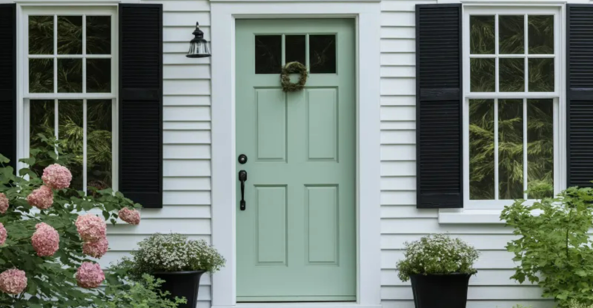
Your front door makes a powerful first impression on visitors and neighbors alike. Choosing the right color can boost your home’s curb appeal and even increase its value. But some paint colors can clash with your home’s style, fade quickly, or send the wrong message.
Here are 16 front door colors you might want to avoid when planning your next exterior update.
1. Bright Neon Yellow
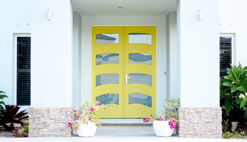
Walking up to a neon yellow door feels like staring directly at the sun. This eye-straining shade not only looks out of place on most homes but also fades unevenly, leaving you with a patchy, sickly appearance within months. The color also attracts insects like nobody’s business!
I’ve seen homeowners constantly swatting away bugs that mistake their door for a giant flower. Unless you’re running a funhouse or want the neighborhood kids using your home as a landmark, steer clear of this attention-grabbing mistake.
2. Pure Black in Hot Climates
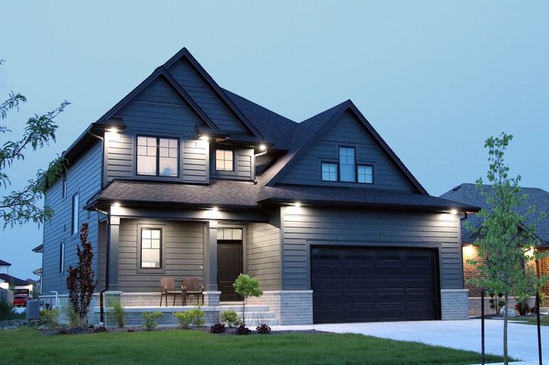
Have you ever touched a black car that’s been sitting in the summer sun? That’s exactly what happens with a pure black front door in warm regions. The paint absorbs tremendous heat, potentially warping the door and making the handle too hot to touch comfortably.
Many of my clients in southern states have learned this lesson the hard way. Beyond the practical issues, black can look forbidding and create a stark contrast that overwhelms your home’s other features. Save yourself the literal and figurative burn by avoiding this heat-trapping shade.
3. Pastel Pink
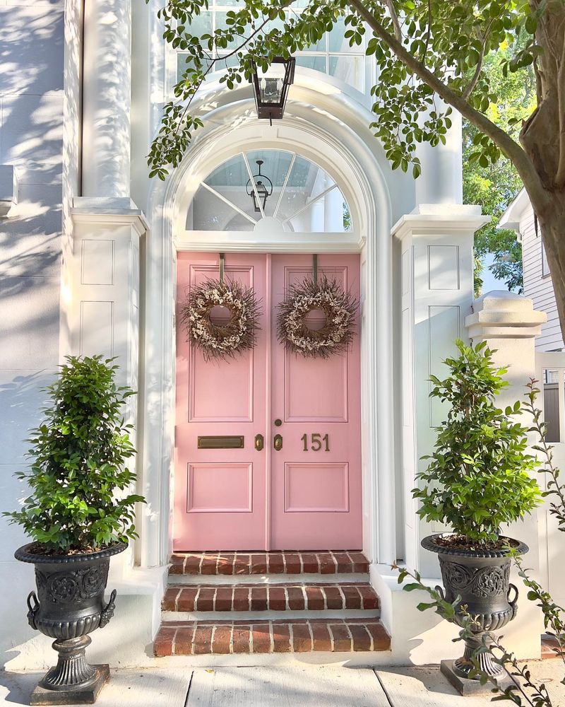
Remember Barbie’s dreamhouse? Unless that’s your specific aesthetic goal, pastel pink creates a childish impression that most potential buyers find off-putting. The color fades quickly in sunlight, turning into an unpleasant salmon shade that matches nothing.
I’ve witnessed neighbors raise eyebrows at pink doors during block parties. The color also shows dirt and handprints remarkably well, requiring frequent cleaning. While bold doors can work beautifully, this particular shade rarely complements exterior home palettes and can single-handedly tank your resale value.
4. Metallic Gold
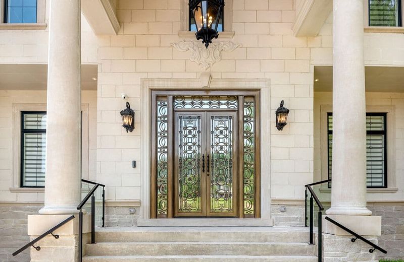
Nothing screams “trying too hard” quite like a metallic gold front door. The reflective finish highlights every dent, scratch, and imperfection in your door’s surface. Fingerprints become immediately visible, making maintenance a constant chore.
The flashy appearance often clashes with natural surroundings and can make your home look gaudy rather than elegant. Weather exposure typically causes uneven tarnishing, resulting in a blotchy appearance over time. Gold may symbolize wealth, but this particular application usually communicates poor taste rather than luxury.
5. Chocolate Brown on Dark Exteriors
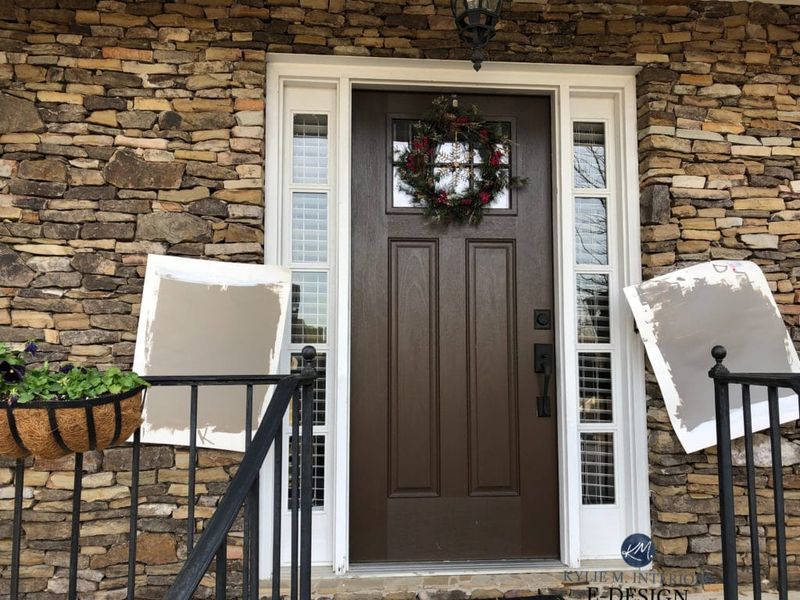
Brown might seem like a safe choice, but pairing chocolate brown with already-dark siding creates a gloomy, uninviting entrance that disappears into your home’s facade. Visitors might actually struggle to find your door! The lack of contrast also diminishes your home’s architectural features and depth.
I’ve seen beautiful homes rendered flat and lifeless by this monochromatic mistake. Brown doors can work wonderfully on lighter exteriors, but when combined with dark siding, they create a dreary cave-like entrance that feels unwelcoming and visually heavy.
6. Traffic Cone Orange
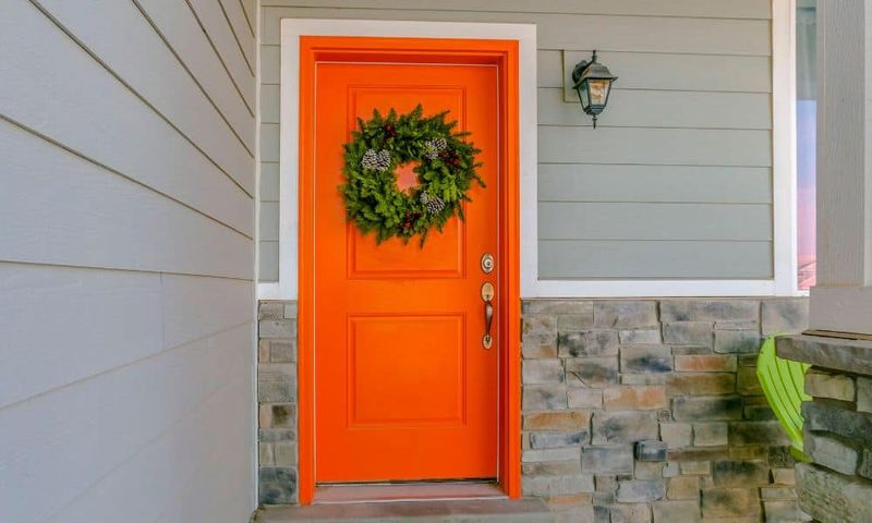
Bright orange might work for traffic cones and safety vests, but it rarely translates well to front doors. This aggressive shade creates a jarring focal point that overwhelms everything else about your home’s exterior. The intense pigments also fade unevenly in sunlight, often turning a bizarre peachy color within a year.
Your neighbors will definitely notice – and not in a good way! While warm terra cotta or burnt orange can look sophisticated, this fluorescent version screams “look at me” with all the subtlety of a carnival barker.
7. Pure White in High-Traffic Areas
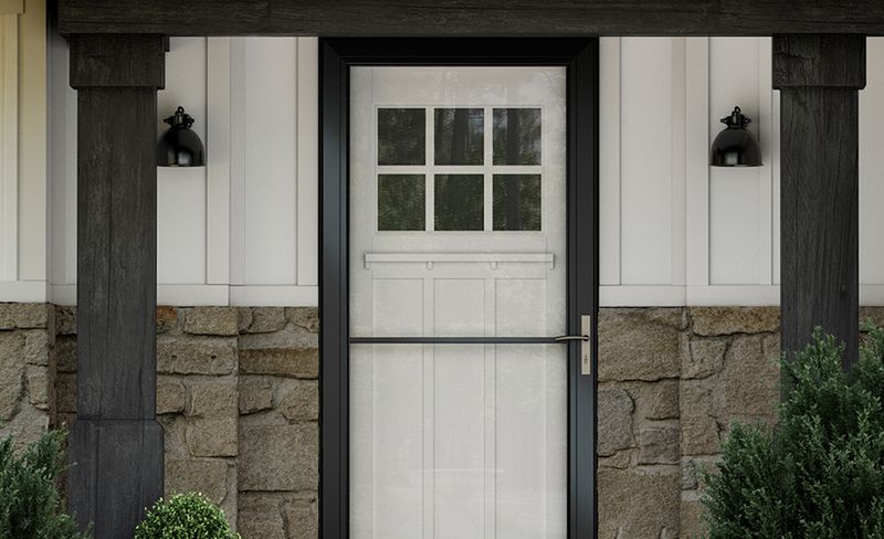
Pure white doors look crisp and clean—for about five minutes. In busy households, white doors quickly become showcases for fingerprints, scuff marks, and dirt. Even rain splatter creates noticeable mud spots that are impossible to ignore. Maintaining a white door’s pristine appearance requires near-constant cleaning.
The bright sunlight also tends to yellow white paint faster than other colors. My clients with children or pets find this color particularly frustrating. If you value your sanity and free time, skip this high-maintenance choice for your front entrance.
8. Clashing Primary Red
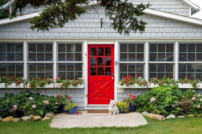
Red doors can be striking, but choosing the wrong shade is a disaster waiting to happen. Bright primary red often clashes horribly with brick exteriors or homes with warm undertones, creating a visual conflict that hurts the eyes. This harsh shade also fades quickly, transforming into an unappealing pinkish-orange that matches nothing.
Several of my clients have regretted this choice within months. While deeper burgundy or brick reds can look sophisticated, this elementary-school-crayon version rarely complements existing exterior elements and makes your home look disjointed.
9. Mint Green on Traditional Homes
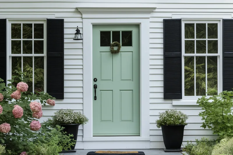
Mint green might work for retro diners or coastal cottages, but slapping this color on a traditional Colonial or Tudor home creates an uncomfortable historical mismatch. The pastel shade undermines the architectural integrity of classic home styles.
This color also shows dirt readily and fades to a sickly pale shade that resembles hospital walls. My clients who’ve tried this trendy color typically repaint within two years. While period-appropriate colors enhance your home’s character, this anachronistic choice creates a jarring disconnect that makes your entrance look thoughtlessly updated.
10. Flat Gray Without Dimension
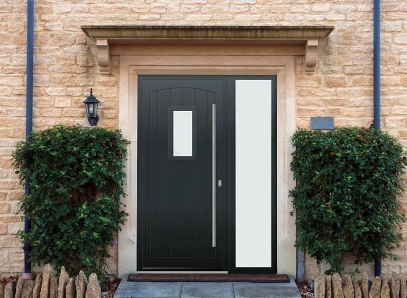
Flat gray might seem like a safe neutral choice, but without any depth or undertones, it creates a lifeless, institutional appearance reminiscent of office buildings or prison facilities. The color reads as unintentional and neglected rather than deliberately chosen.
During overcast days (which are plentiful in many regions), a flat gray door virtually disappears, creating a gloomy, uninviting entrance. I’ve watched visitors walk past these doors, assuming they’re side or garage entrances. Gray can be sophisticated when it has blue, green or warm undertones, but this flat version screams “I gave up on choosing a real color.”
11. Bright Purple
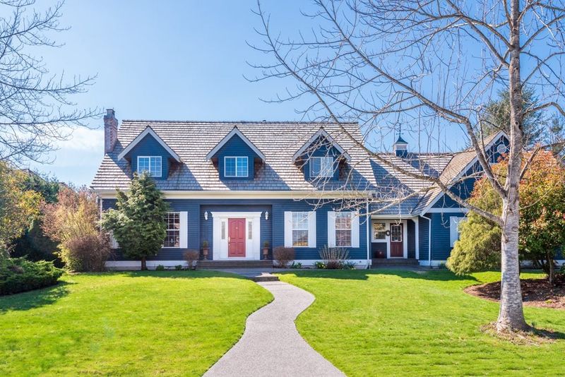
Unless you’re deliberately going for eccentric vibes, bright purple doors rarely complement residential architecture or landscaping. This bold color creates an unintentionally comical effect that draws attention for all the wrong reasons. The resale implications are serious too.
Real estate agents report that unusual door colors like purple can significantly reduce buyer interest. Even if you love purple, consider how this color interacts with your brick, siding, and roof colors – it typically clashes with at least one exterior element. For most homes, this playful shade belongs on children’s toys, not your front entrance.
12. Sunshine Yellow on Red Brick
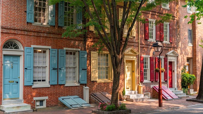
Yellow and red create one of the most jarring color combinations in design. Placing a sunshine yellow door against red brick creates an unfortunate fast-food restaurant vibe that cheapens even the most elegant home. The warm undertones fight each other visually, creating a clash that’s genuinely unpleasant to look at.
Yellow also shows dirt easily and fades quickly in sunlight. Several of my clients have made this mistake, thinking it would look “cheerful” but instead creating an entrance that resembles a children’s playground equipment. This combination virtually guarantees color-clash headaches.
13. Electric Blue
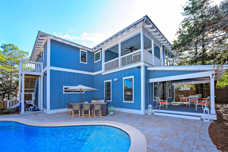
Electric blue might work for sports cars, but on front doors, this artificial-looking shade creates a startling, synthetic appearance that rarely complements natural home exteriors. The intensity overwhelms other design elements and makes your entrance look like it belongs in a children’s playground.
This unnatural blue also tends to fade unevenly, developing blotchy patches within a year. My neighborhood has one such door, and it’s become an unintentional landmark (“Turn left at the crazy blue door”). Navy and slate blues can look sophisticated, but this neon version typically clashes with landscaping and architectural elements.
14. Pale Lavender
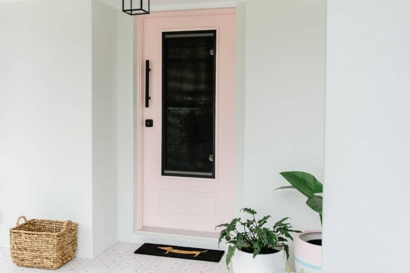
Lavender might seem like a gentle, pretty choice, but this pale purple quickly becomes the neighborhood eyesore. The color fades dramatically in sunlight, transforming into an undefined grayish hue that looks like a painting mistake rather than an intentional choice.
The cool undertones also clash with most home exteriors, which typically feature warm bricks or siding. I’ve had clients choose this thinking it was unique and charming, only to repaint within months. While purple doors have historical significance in some cultures, this washed-out version lacks the richness to make a positive statement.
15. Neon Green
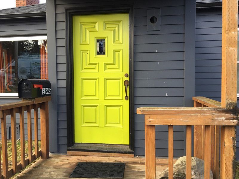
Nothing says “I make questionable decisions” quite like a neon green front door. This radioactive-looking shade creates an alien glow effect that makes your home look like a Halloween attraction rather than a welcoming residence. The intense color reflects onto nearby surfaces, casting an unflattering green tint on visitors’ faces.
Most architectural styles and neighborhoods simply can’t accommodate this aggressive color choice. While darker forest or sage greens can look elegant, this blinding version guarantees your home will be known as “that house” in neighborhood conversations.
16. Peach or Salmon
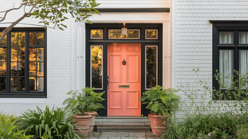
Peach might seem inoffensive, but this dated shade screams “1980s bathroom” rather than “welcoming entrance.” The color fades quickly and unevenly, often developing blotchy patches that look diseased rather than deliberate. This shade also tends to clash with nearly all brick colors and most siding options.
Several of my clients have inherited these doors from previous owners and repainted immediately. The color lacks the clarity and definition to make a positive statement, instead creating a wishy-washy impression that suggests indecision rather than design confidence.

