Kitchen Paint Colors That Designers Say To Skip
Ready to paint your kitchen but feeling overwhelmed by the rainbow of options? Choosing the wrong color can do more than clash with your countertops, it can make your kitchen feel like a cave or a cafeteria.
Paint can make or break your kitchen’s vibe, affecting everything from your mood to your home’s resale value. Picking the wrong shade might have you regretting it faster than you can say “fresh coat.”
Before you grab that brush, steer clear of these five kitchen paint colors that make designers cringe harder than an overcooked steak
1. Stark, Clinical White
Pure, brilliant white might seem like a safe choice, but it creates a sterile, laboratory-like atmosphere that lacks warmth. Nobody wants to sip morning coffee in what feels like a hospital waiting room.
White shows every speck of dirt and grease in this high-traffic area. Within weeks, those pristine walls will look dingy and demand constant cleaning.
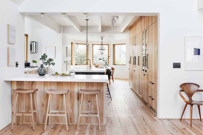
Rather than stark white, consider creamy off-whites or warm whites with subtle undertones that still feel bright but add dimension and coziness to your cooking space.
2. Garish Cherry Red
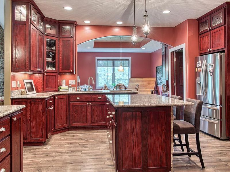
Though red stimulates appetite (hello, fast food logos!), cherry red walls quickly become overwhelming in real kitchens. The intensity creates a visually exhausting environment that can actually raise stress levels while cooking.
Red also makes spaces feel smaller and more confined. Unless you enjoy feeling trapped in a tomato, avoid this claustrophobic effect.
Moreover, bright red tends to clash with food colors and can cast unflattering reddish tints on everything from your morning toast to family photos.
3. Muddy Beige-Brown
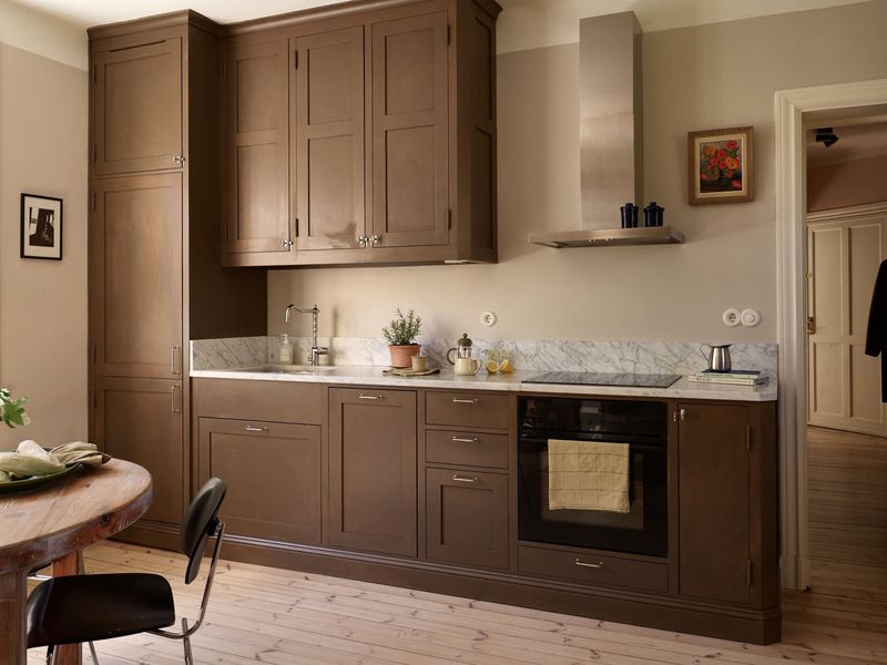
Why do beige-brown tones keep sneaking into kitchens, promising safety but delivering snooze-worthy vibes? Often chosen as “safe” neutrals, they can quickly age a space, making it feel stuck in a 1990s time warp.
Without good lighting, these colors turn as muddy as a rain-soaked trail, leaving your kitchen looking less clean and more like a cooking swamp.
And don’t forget, these shades are experts at camouflaging food stains, letting messes sneak by until they become permanent wall art. Now that’s a shade with a real talent for “disappearing acts”!
4. Neon Lime Green
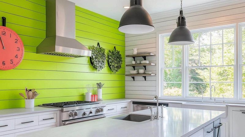
Nothing screams “amateur designer” quite like neon lime green kitchen walls. While you might love the energetic vibe initially, this color quickly becomes the visual equivalent of someone constantly shouting in your ear.
Green reflects onto food in unflattering ways. Trust me, nobody wants their scrambled eggs looking slightly green under this harsh glow.
Furthermore, this trendy shade dates your kitchen almost immediately. Five years from now, you’ll look at those walls and wonder what fashion disaster possessed you to choose such an attention-demanding color.
5. Aggressive Mustard Yellow
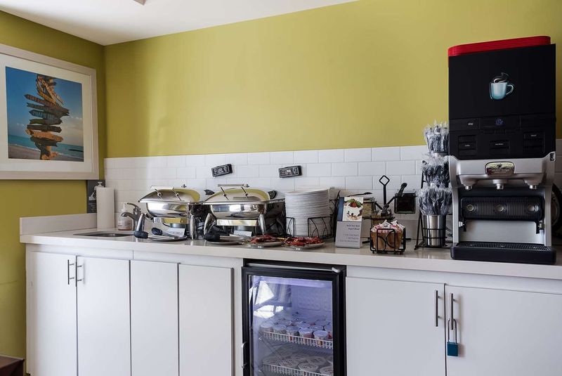
Overwhelming and hard to pair with other elements, aggressive mustard yellow creates a jarring visual experience in kitchens. The intense yellow-brown undertones can make food look unappetizing and cast a sickly glow on countertops and cabinetry.
Many choose this bold shade, hoping for warmth and character, but designers caution that it often feels dated, reminiscent of 1970s design trends that haven’t aged well. The color also tends to absorb light rather than reflect it.
For a similar but more palatable option, consider softer butter yellows or warm creams that provide cheerfulness without the visual assault. These alternatives complement wood tones and create a welcoming atmosphere without dominating the space.
6. Bubble Gum Pink
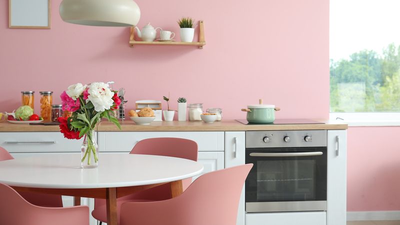
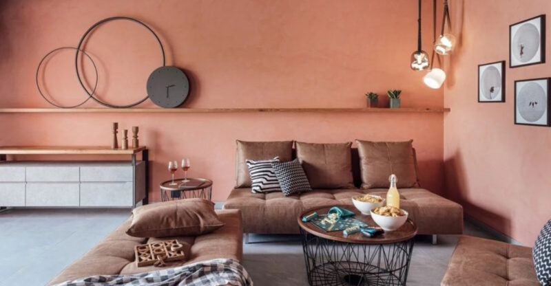
Remember that pack of bubble gum you loved as a kid? That vivid, artificial pink has no place on kitchen walls! Professional designers consistently rank bubble gum pink among the worst kitchen color choices for its tendency to create an overly juvenile atmosphere.
The saccharine brightness reflects poorly on skin tones, making everyone look flushed while they cook. Plus, this candy-colored nightmare clashes with nearly all food items, making your culinary creations look less appetizing.
If pink speaks to your heart, designers suggest sophisticated alternatives like muted coral, soft blush, or dusty rose. These refined options add warmth without the kindergarten vibes that bubble gum pink inevitably brings to your cooking space.
7. Fluorescent Orange
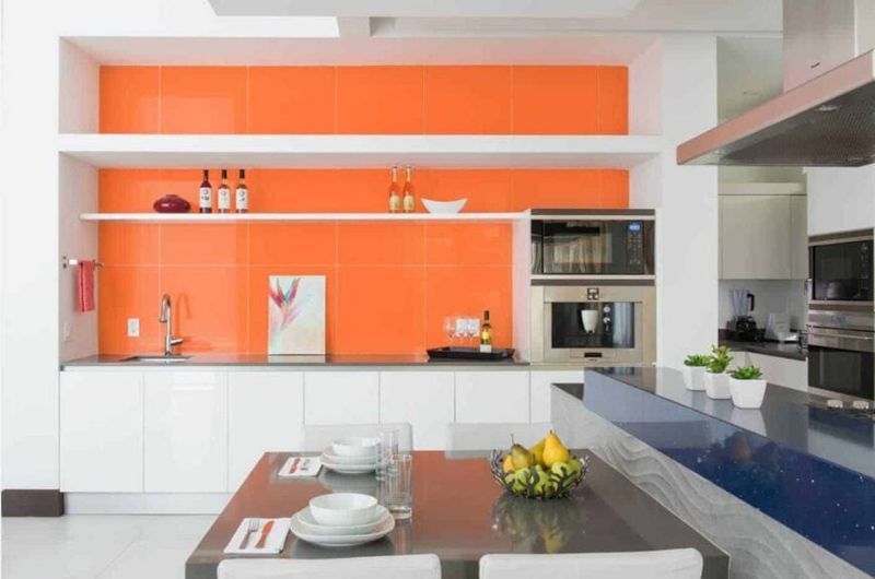
Fluorescent orange might work for traffic cones and safety vests, but it’s a disaster for kitchen walls. This high-energy color creates a space that feels perpetually alarming, making it impossible to relax while cooking or entertaining.
Beyond the psychological impact, fluorescent orange has practical downsides too. It reflects an unflattering tint onto everything in the room, from countertops to your morning coffee. Food photography enthusiasts beware, nothing looks appetizing under an orange glow!
For those drawn to orange’s warmth, designers recommend terra cotta, burnt sienna, or apricot as sophisticated alternatives. These earthy variations bring orange’s energy without the visual screaming match that fluorescent versions create in your cooking space.
8. Gloomy Dark Navy
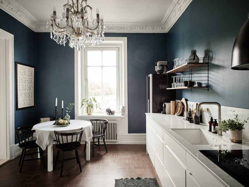
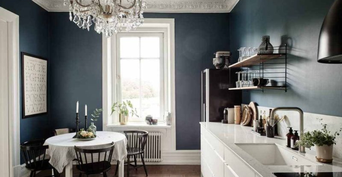
While navy can look sophisticated in glossy magazine spreads, in real kitchens, especially smaller ones, it tends to absorb light and create a cave-like atmosphere. Your morning routine shouldn’t feel like you’re cooking in a submarine!
This deep shade also shows every water splash, flour dusting, and cooking splatter. Unless you love constant touch-ups, it can quickly become a high-maintenance headache.
Poor lighting only makes things worse, as navy walls cast shadows on work surfaces, making food prep more challenging when you need clear visibility the most.

