7 Dated Home Features That Still Miss The Mark, And 4 More That Designers Avoid
Some home features were never great to begin with, and others have simply worn out their welcome. From tired trends to design choices that still make pros cringe, these details are dragging down your space without you even realizing it.
Craving a refresh? Here’s your guide to the outdated features worth replacing, and the ones designers wouldn’t touch with a ten-foot tape measure.
1. Popcorn Ceilings That Collect More Than Compliments
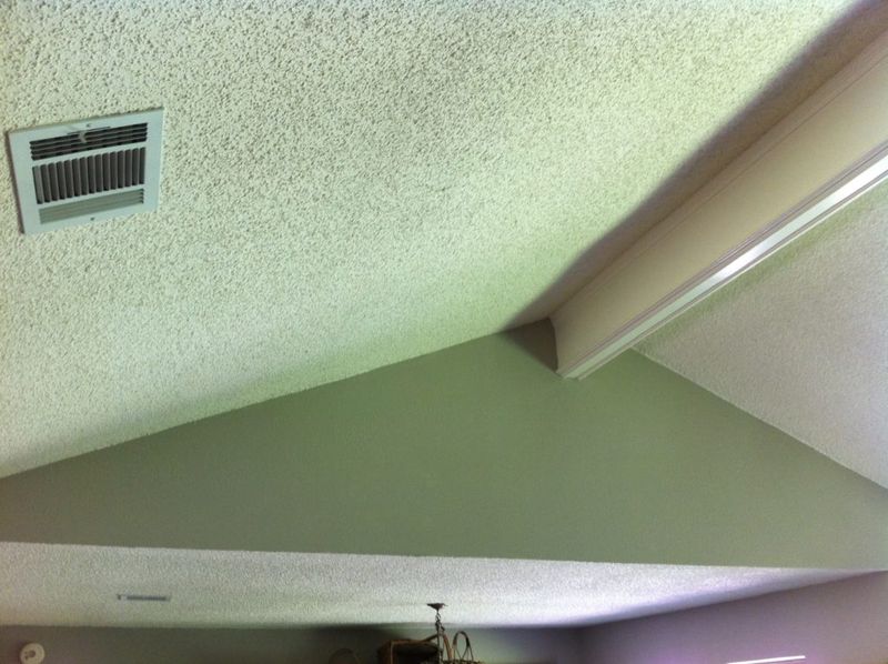
Whoever invented popcorn ceilings clearly never had to dust them. These textured nightmares from the 1970s trap dirt, cobwebs, and probably the ghosts of fashion choices past.
Homeowners often think they add character, but trust me, the only character they add is ‘neglected rental property.’ Modern homes crave clean lines and smooth surfaces.
Removing these bumpy beasts isn’t just aesthetic. Many pre-1980s versions contain asbestos, making them health hazards disguised as design choices.
2. Carpet In Bathrooms, Where Mold Throws A Party
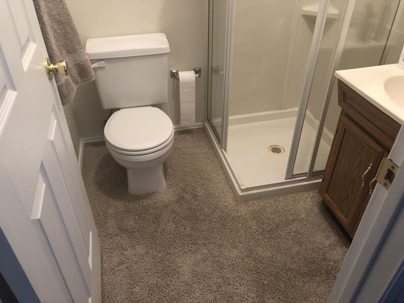
Nothing says ‘I enjoy cultivating science experiments’ quite like wall-to-wall carpet in bathrooms. This puzzling trend from decades past creates the perfect breeding ground for mold, mildew, and questionable odors.
Water and carpet have never been friends. Yet somehow, builders convinced an entire generation this pairing made sense.
Hard surfaces like tile, vinyl, or even waterproof laminate offer both practicality and style without the fungal garden bonus features.
3. Wallpaper Borders That Frame Nothing But Regret
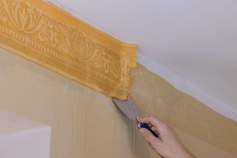
Remember those skinny strips of wallpaper that ran along the top of walls? Usually featuring country geese, apples, or floral patterns that looked like your grandmother’s couch exploded.
These borders were the participation trophies of wall decor, trying hard but ultimately pointless. They visually chop rooms into awkward sections and date your space faster than a newspaper headline.
Today’s walls prefer clean paint, statement wallpaper that covers the entire surface, or nothing at all.
4. Tuscan Kitchens That Never Saw Italy
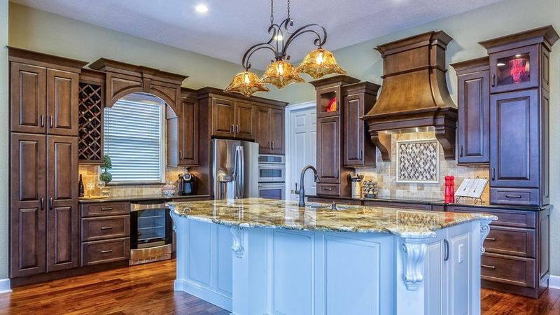
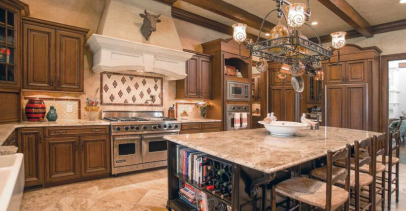
Those faux-finished walls, heavy wrought iron accents, and enough ornate scrollwork to make a Renaissance artist blush? That’s the American ‘Tuscan’ kitchen, and it’s about as authentically Italian as pizza with pineapple.
These kitchens typically feature dark cherry cabinets, busy granite with gold flecks, and those weird hanging pot racks nobody uses. The overall effect screams ‘I watched too many home shows in 2005.’
Modern kitchens embrace cleaner lines, lighter colors, and actually functional layouts without the theatrical Mediterranean cosplay.
5. Glass Block Walls Trapping Light And Good Taste
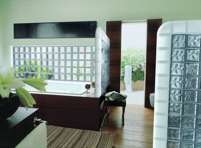
Glass blocks had their moment in the 80s and 90s, showing up in bathrooms and entryways like unwanted party guests. These chunky translucent blocks supposedly offered privacy while letting light through, but mostly just screamed ‘Miami Vice set design.’
The problem isn’t just their dated appearance. They’re also impossible to clean properly and create those distorted shadows that make your bathroom feel like a funhouse.
Modern alternatives like frosted glass, smart glass, or simple window films provide the same benefits without the time-capsule effect.
6. Tiled Countertops That Collect Crumbs And Criticism
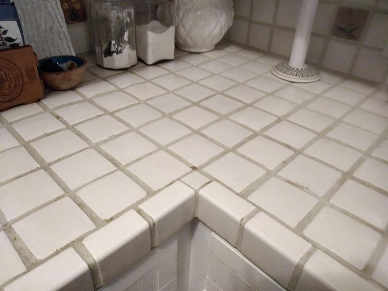
Whoever decided grout lines belonged where we prepare food clearly never had to scrub crusty spaghetti sauce out of them. Tiled countertops were popular in the 70s and 80s when apparently nobody cooked anything messy.
Beyond the cleaning nightmare, they provide an uneven surface that makes rolling dough or writing a check feel like doing it on a cobblestone street. The grout inevitably stains, chips, and harbors enough bacteria to start its own civilization.
Solid surface options like quartz, granite, or even butcher block offer seamless, practical alternatives.
7. Hollywood Glam Bathrooms That Blind Rather Than Shine
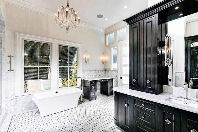
Those bathrooms with giant mirror arrays surrounded by exposed vanity bulbs? They’re less ‘Hollywood starlet’ and more ‘community theater dressing room.’ These harsh lighting setups cast shadows that make you look like you haven’t slept since 2003.
The mirrored walls, gold-plated fixtures, and jacuzzi tubs big enough to house a small family were the bathroom equivalent of a sequined jumpsuit, flashy but impractical. Nobody has time for all that cleaning and maintenance.
Modern bathrooms favor sustainable fixtures, practical lighting that flatters rather than frightens, and materials that don’t require a hazmat suit to clean.
8. Overly Themed Rooms That Scream ‘Tourist Trap’
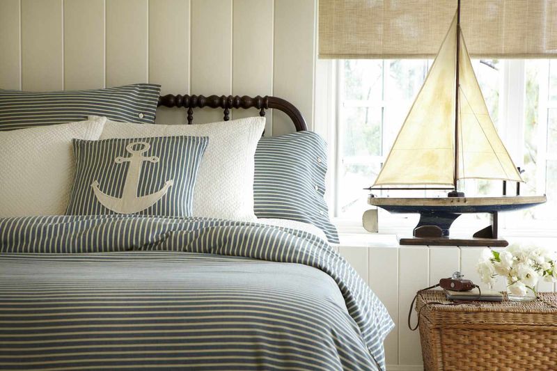
Nautical bedrooms with more anchors than an actual ship. Bathrooms where seashells cover every surface like they’re planning an invasion. Basements transformed into sad replicas of English pubs that have never seen an Englishman.
These aggressively themed rooms feel less like living spaces and more like you’re sleeping in a gift shop. The commitment level is admirable but misguided.
Today’s design favors subtle nods to themes rather than full immersion. A few carefully chosen maritime accessories speak volumes more than a room where everything is literally shaped like a boat.
9. Sunken Living Rooms Creating More Falls Than Conversations
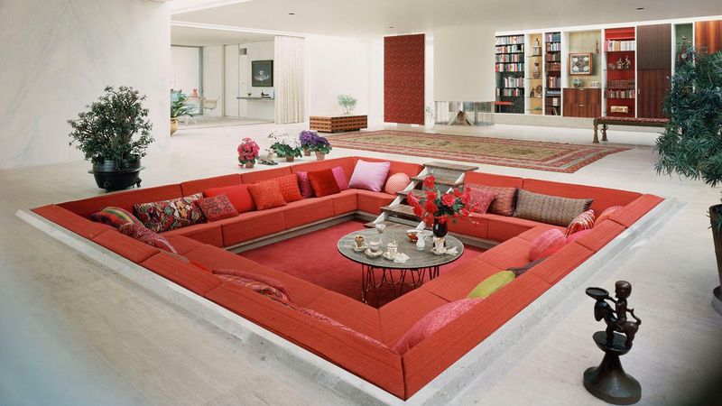
Nothing says ‘I enjoy unexpected trips to the emergency room’ quite like a sunken living room. These conversation pits from the 70s were supposed to create intimacy, but instead created hazards for everyone from toddlers to tipsy adults.
Beyond the safety issues, there are architectural commitment issues. Future residents can’t easily reconfigure the space without major construction work.
Modern open floor plans create flow and connection without requiring a step down that inevitably gets forgotten during midnight snack runs.
10. Chevron Everything That Zigzags Past Good Taste
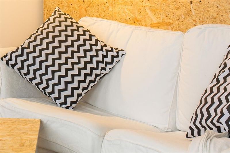
There was a dark period around 2010 when chevron patterns attacked every surface in homes across America. Walls, floors, bedding, towels, nothing was safe from these aggressive zigzags.
While a subtle chevron can add visual interest, the trend quickly became the design equivalent of eating an entire chocolate cake, too much of a somewhat good thing. These bold patterns fight with everything else in the room and quickly become visually exhausting.
Designers now use patterns more judiciously, allowing statement pieces to shine without competing against a backdrop that looks like Charlie Brown’s shirt went wild.
11. Vessel Sinks That Splash More Than They Serve
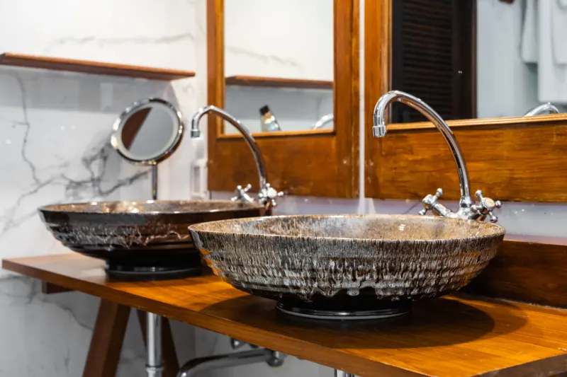
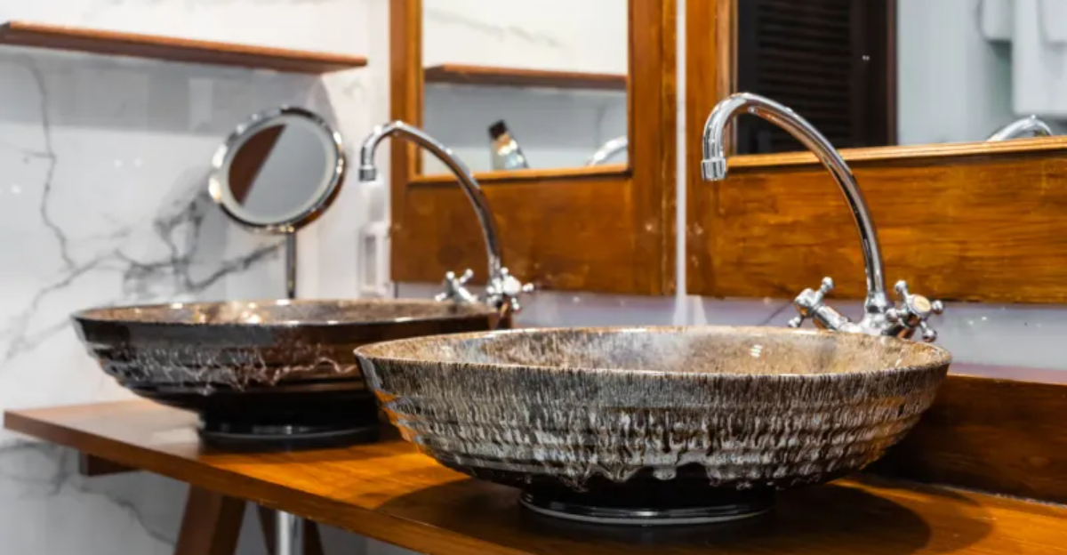
Vessel sinks look stunning in magazine photos and disastrous in daily use. These bowls that sit atop counters rather than being inset create splash zones rivaling water parks.
The awkward height makes simple tasks like washing your face an Olympic sport. The seam where sink meets counter collects gunk that would make a biologist reach for a microscope.
And the novelty shapes? That seashell or leaf design becomes significantly less charming when you’re scrubbing toothpaste out of its crevices.
Undermount sinks offer the same contemporary look without turning bathroom cleanup into a part-time job.

