Avoid These 6 Kitchen Paint Mistakes In 2025 And Opt For These 8 On-Trend Colors
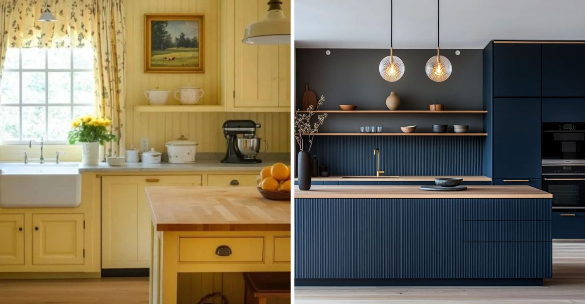
Giving your kitchen a fresh coat of paint can transform the heart of your home completely. But not all color choices are created equal, especially as we look ahead to 2025’s design trends.
I’ve put together this guide to help you sidestep common painting pitfalls and embrace the colors that will make your kitchen shine in the coming year. Your kitchen deserves to be both beautiful and timeless!
1. Glossy Red Walls (Mistake)

Fire-engine red might seem bold and exciting initially, but glossy red walls quickly overwhelm a kitchen space. The high-shine finish reflects light harshly, making the intense color even more dominating and visually exhausting.
Food psychologists have found that bright red actually stimulates appetite and increases heart rate not always ideal for a space where you’re trying to practice mindful eating! Plus, glossy finishes show every fingerprint, splash, and imperfection.
When cleaning day arrives, you’ll regret this choice as glossy surfaces highlight rather than hide kitchen grime. If you love red, consider incorporating it through accessories or a single accent wall in a matte finish instead.
2. Bright Neon Green (Mistake)

Walking into a kitchen bathed in neon green feels like stepping into an alien spaceship rather than a cooking sanctuary. This eye-straining shade creates visual fatigue and can make even the freshest foods look unappetizing under its sickly glow.
Homebuyers consistently rank extreme color choices like neon green among their biggest turnoffs, potentially decreasing your home’s resale value by thousands. The color’s intensity also makes your kitchen feel smaller and more claustrophobic than it actually is.
Even worse, neon shades tend to date quickly, meaning you’ll likely tire of the look long before it’s time to repaint. Save the electric green for small accessories that can be easily swapped out when trends change.
3. Stark White Without Contrast (Mistake)

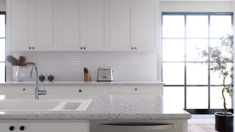
Though all-white kitchens dominated design magazines for years, stark white walls without any contrast elements create a clinical, almost sterile environment. Without visual breaks, the space feels more like a laboratory than a welcoming heart of the home.
Maintaining pristine white walls in a cooking space quickly becomes a nightmare every splash of tomato sauce or coffee drip shows immediately. Studies show that completely monochromatic spaces can actually increase stress levels by creating a sensory deprivation effect.
If you love the clean look of white, add warmth through wood accents, colorful dishware displays, or textured backsplashes. Even a slightly warmer white with subtle undertones creates more visual interest than stark, gallery-white surfaces.
4. Dark Brown All Over (Mistake)

Chocolate brown might seem cozy in theory, but painting your entire kitchen this deep shade creates a cave-like atmosphere that swallows natural light. Dark brown on every surface makes even spacious kitchens feel cramped and oppressive.
Many homeowners who choose all-brown kitchens report that the color makes food preparation more difficult by reducing visibility. The darkness also hides dirt initially but shows every water spot and dust particle in certain lighting.
Brown has its place in kitchens through wood elements, but as an all-over wall color, it’s consistently ranked among the most-regretted choices. If you crave warmth, consider lighter taupes or just one accent wall in a rich chocolate tone instead of total immersion.
5. Cool Gray with Blue Undertones (Mistake)

Cool gray might look sleek in showrooms, but in real homes, these blue-toned grays often read as cold and uninviting in kitchen spaces. The color actually lowers perceived temperature, making your kitchen feel chilly even when it’s perfectly warm.
Food photographers avoid cool grays because they make food look less appetizing not ideal for the room where meals are prepared and often enjoyed! As natural light changes throughout the day, cool grays can shift dramatically, sometimes appearing almost purple or blue in certain lighting.
Real estate agents report that cool gray kitchens typically receive more negative feedback from potential buyers than warmer-toned spaces. If you love gray, opt for versions with warm undertones (greige) that create a more welcoming atmosphere while maintaining that sophisticated look.
6. Dull Beige (Mistake)

Flat, builder-grade beige might seem like a safe choice, but this dated shade lacks personality and often gives kitchens a tired, neglected appearance. Housing experts call this particular shade “landlord beige” for good reason – it’s the color of playing it too safe.
This uninspired neutral absorbs rather than reflects light, making your kitchen feel dim even during daylight hours. Without proper undertones, basic beige can clash with cabinet finishes and countertops in ways that more thoughtfully chosen neutrals wouldn’t.
Studies show that bland environments actually reduce creativity not what you want in a cooking space! If you prefer neutral walls, today’s sophisticated options like greige, soft creams, or warm taupes offer much more character and design flexibility than flat, dull beige ever could.
7. Sage Green

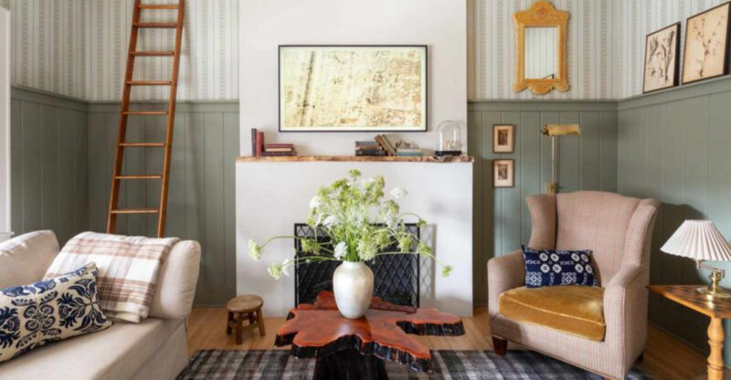
Sage green brings the tranquility of nature indoors, creating a peaceful backdrop for morning coffees and family dinners. This versatile mid-tone green works beautifully with both light and dark cabinetry, adapting effortlessly to various kitchen styles from farmhouse to modern.
Unlike trendy colors that quickly feel dated, sage has historical staying power it’s been used in homes for centuries because it naturally complements wood tones and stone surfaces. The color’s subtle gray undertones make it sophisticated rather than childish or overly vibrant.
Interior designers love sage because it enhances natural light rather than absorbing it. Research shows that green hues can actually reduce stress and promote focus perfect for the sometimes chaotic kitchen environment. This calming color creates a perfect foundation for both everyday cooking and special gatherings.
8. Warm Terracotta

Terracotta brings Mediterranean warmth and earthy authenticity to kitchens, creating an instant feeling of lived-in comfort. This rich, clay-inspired hue adds depth without darkness, making it ideal for north-facing kitchens that need warming up.
Unlike the harsh oranges of decades past, today’s sophisticated terracotta contains subtle brown undertones that pair beautifully with trending brass fixtures and natural wood elements. The color actually enhances food presentation, making fruits and vegetables appear more vibrant against its warm backdrop.
Design psychologists note that earthy colors like terracotta create feelings of groundedness and security perfect for the heart of your home. This shade works equally well as an all-over color or as an accent wall paired with creamy neutrals. Its timeless connection to traditional pottery and tilework gives it staying power beyond typical color trends.
9. Soft Greige

Greige masterfully walks the line between cool gray and warm beige, creating a chameleon-like neutral that shifts subtly throughout the day. This sophisticated blend offers the perfect backdrop for both colorful accessories and monochromatic designs.
Unlike stark whites or cold grays, greige creates a soft, forgiving atmosphere that hides minor imperfections while still feeling clean and current. Kitchen designers particularly love this shade because it complements virtually every cabinet finish from maple to navy.
The color’s versatility extends to style preferences too it works equally well in modern, farmhouse, traditional or transitional kitchens. Home stagers consistently choose greige for kitchens because it appeals to the widest range of potential buyers while still feeling intentional and designed. This adaptable neutral creates a perfect foundation that won’t compete with your culinary creations.
10. Creamy Off-White

Creamy off-white delivers the brightness of white without the harsh, clinical feel. This buttery shade contains subtle yellow undertones that add warmth and depth missing from stark whites, creating an inviting glow rather than a sterile glare.
Design experts favor creamy off-whites because they enhance natural materials like wood, stone, and metal rather than competing with them. The softness of this shade forgives imperfections while still reflecting plenty of light ideal for smaller kitchens that need brightening.
Historical kitchens often featured these warm whites, giving the color timeless appeal that transcends trends. Photographers note that food looks particularly appetizing against creamy backgrounds, which is why many high-end restaurants choose similar shades for their dining spaces. This gentle neutral creates a perfect canvas for both everyday moments and special gatherings.
11. Muted Navy

Navy blue with a slight gray undertone creates surprising versatility in kitchen spaces, functioning almost as a neutral while adding unmistakable character. Unlike brighter blues that can feel trendy, muted navy has classical roots that promise staying power through changing design fads.
Kitchen design experts particularly recommend this shade for spaces with ample natural light, where it creates a dramatic backdrop without absorbing too much brightness. The color pairs beautifully with brass or copper fixtures, creating a rich, layered look that feels both traditional and fresh.
Did you know navy actually makes white trim and cabinets appear brighter and cleaner by contrast? This optical illusion makes your kitchen feel more spacious and well-maintained. The deep tone also hides minor scuffs and marks better than lighter colors, making it surprisingly practical for busy cooking spaces.
12. Dusty Rose

Dusty rose brings unexpected sophistication to kitchens, offering warmth without the intensity of bolder pinks. This muted, slightly grayed shade acts as a “new neutral” that flatters all skin tones making everyone look their best in the heart of your home.
Unlike trendy millennial pink, dusty rose has historical precedent in design, appearing in everything from Victorian homes to Art Deco palettes. The color creates a subtle glow effect, especially in evening light when it takes on an almost magical quality during dinner preparations.
Culinary experts note that this gentle pink creates an appetite-enhancing backdrop without the intensity of red. It pairs beautifully with both light woods and darker finishes like walnut or mahogany. For those seeking something beyond basic neutrals without committing to bold color, dusty rose offers the perfect balance of interest and restraint.
13. Matte Charcoal

Matte charcoal creates dramatic sophistication without the heaviness of pure black, offering depth that shifts beautifully throughout the day. Unlike glossy dark finishes that show every fingerprint, the matte texture hides imperfections while creating a velvety backdrop for metallic accents and light-colored cabinetry.
This deep neutral actually makes kitchens feel larger when used strategically, especially when paired with well-placed lighting that creates contrast. The color’s subtle blue-gray undertones keep it from feeling too warm or too cool, making it exceptionally versatile across design styles.
Chefs particularly appreciate how this sophisticated shade makes colorful ingredients and dishware pop visually. For those worried about committing to dark walls, charcoal makes an excellent accent color on a single wall or lower cabinets. The depth creates a grounding effect that makes kitchens feel intentionally designed rather than simply painted.
14. Buttery Yellow

Buttery yellow infuses kitchens with sunshine regardless of weather or window placement. This soft, golden-toned shade has been proven to elevate mood and energy perfect for morning coffee or meal preparations after long workdays.
Unlike the harsh, neon yellows of past decades, today’s buttery version contains subtle cream undertones that create sophistication rather than childish brightness. The color naturally enhances both natural and artificial light, making your kitchen feel consistently welcoming throughout changing seasons and times of day.
Food photographers often use yellow backdrops because the color makes food look more appetizing a scientific effect related to how our brains process warm colors. This cheerful hue pairs beautifully with classic white cabinets but also complements deeper wood tones and navy or green accents. For happiness in color form, buttery yellow delivers consistent joy to kitchen spaces.
