San Francisco’s Favorite 13 Sherwin-Williams Colors According To The Pros
San Francisco homes have a distinctive style that blends Victorian charm with modern sensibilities.
Local interior designers and painting contractors know exactly which Sherwin-Williams colors complement the city’s unique architecture and famous foggy light.
I’ve gathered insights from top Bay Area professionals to reveal the 13 Sherwin-Williams paint colors that dominate San Francisco’s most stylish interiors.
1. Alabaster: The Versatile Neutral
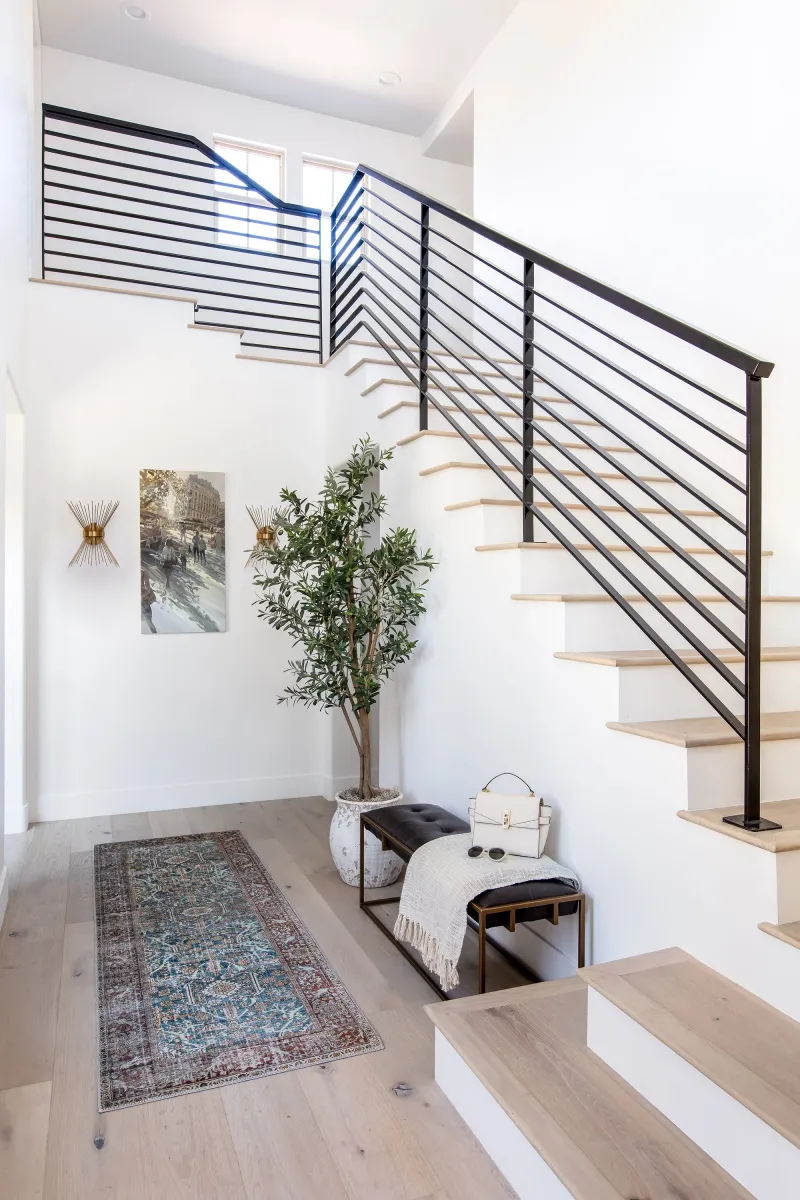
Alabaster creates magic in San Francisco’s Victorian homes where natural light is often at a premium. This creamy off-white brings warmth without feeling yellow, making rooms feel instantly more spacious and airy.
Local designers love pairing it with dark hardwood floors and brass fixtures for a timeless look that honors the city’s architectural heritage. The color shifts beautifully throughout the day as fog rolls in and out.
Many Bay Area professionals consider Alabaster their go-to trim color because it complements both cool and warm palettes. It’s particularly stunning in homes with views of the Golden Gate, as it allows the iconic orange-red to be the star while providing a sophisticated backdrop.
2. Sea Salt: The Fog-Inspired Favorite
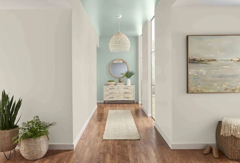
Sea Salt captures the essence of San Francisco’s misty mornings with its perfect balance of green, gray, and blue undertones. When the fog rolls in from the bay, this chameleon-like hue shifts to match the atmospheric conditions outside your window.
Homeowners in neighborhoods like Pacific Heights and Noe Valley gravitate toward this shade for its calming effect. Professional painters report that Sea Salt creates a seamless transition between indoor and outdoor spaces, especially in homes with views of the water.
The color’s subtle complexity means it never feels flat or boring, even in spaces with limited natural light. I’ve seen Sea Salt transform ordinary bathrooms into spa-like retreats and make compact San Francisco kitchens feel refreshingly open.
3. Repose Gray: The Urban Sophisticate

Repose Gray reigns supreme in modern San Francisco lofts and renovated Edwardians alike. This sophisticated neutral leans neither too warm nor too cool, making it incredibly adaptable to the city’s variable lighting conditions.
Local color consultants recommend this shade for open-concept spaces where you need a cohesive backdrop that won’t compete with architectural details or statement furniture. The subtle warmth prevents it from feeling cold even when the infamous Karl the Fog makes an appearance.
Many SoMa and Mission District homeowners choose Repose Gray to balance industrial elements like exposed brick or concrete. What makes this color truly special is its chameleonic quality – appearing greige in some lights and taking on a subtle lavender cast in others.
4. Mindful Gray: The Dramatic Neutral
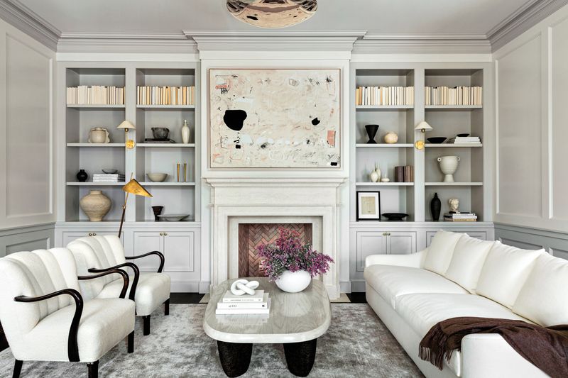
Mindful Gray delivers the perfect amount of drama for San Francisco’s historic Victorians and Edwardians without overwhelming their intricate architectural details. This medium-toned neutral has enough depth to create contrast against white trim but remains light enough to keep spaces feeling open.
Design professionals throughout the city favor this shade for dining rooms and studies where a more intimate atmosphere is desired. The color takes on a cozy, enveloping quality when fog descends on the city, yet still feels crisp and defined on sunny days.
Homeowners in Pacific Heights particularly appreciate how Mindful Gray highlights period moldings and medallions. If you’re looking for a color that bridges traditional and contemporary sensibilities, San Francisco designers consistently point to this versatile shade.
5. Pure White: The Modern Minimalist
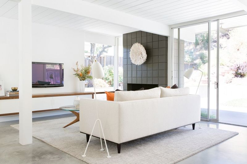
Pure White transforms San Francisco’s compact spaces with its clean, bright character that never feels stark or clinical. Unlike many whites that can appear yellow or pink in certain lights, this shade maintains its crispness throughout the day.
Marina District designers regularly specify Pure White for contemporary homes where a gallery-like backdrop is desired. The color beautifully showcases art collections and statement furniture while maximizing the sense of space in the city’s notoriously tight quarters.
What’s remarkable about Pure White is how it enhances natural light without glare, even in south-facing rooms flooded with sunshine. Mission District contractors note that clients who choose this color often comment on how their spaces suddenly feel larger and more cohesive, making it perfect for San Francisco’s smaller footprints.
6. Chantilly Lace: The Crisp Classic
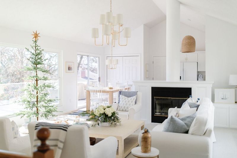
Chantilly Lace brings extraordinary luminosity to San Francisco’s light-challenged spaces, especially in foggy western neighborhoods like the Sunset and Richmond. This pristine white has the slightest blue undertone that counteracts the city’s often gray natural light.
Professional stagers working in San Francisco swear by this color for its ability to make even basement-level apartments feel airy and inviting. The color reflects available light beautifully without appearing harsh or institutional.
Russian Hill homeowners particularly love how Chantilly Lace highlights Bay views by creating a clean visual break between interior and exterior. For anyone renovating a classic San Francisco home, local painters recommend this shade for ceilings and trim to maximize height and architectural definition while maintaining a timeless appeal.
7. Comfort Gray: The Spa-Like Sanctuary
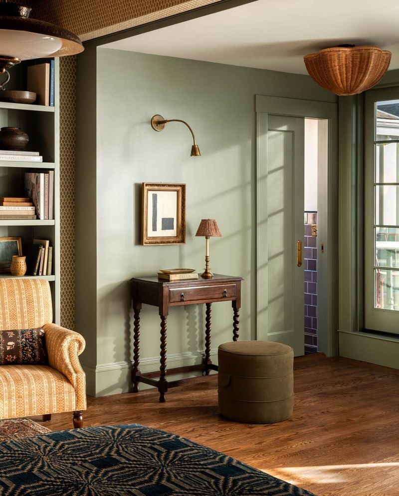
Comfort Gray creates an instant sense of tranquility in San Francisco homes, mimicking the misty sage-green quality of eucalyptus groves that dot the city’s parks. This muted green-gray seems to absorb the stress of urban living the moment you walk through the door.
Designers in Cole Valley and Hayes Valley frequently recommend this shade for bedrooms and bathrooms where a spa-like atmosphere is desired. The color shifts throughout the day, appearing more green when the sun breaks through and more gray during foggy mornings.
Homeowners with period Craftsman bungalows find that Comfort Gray beautifully complements original woodwork and built-ins. What makes this color particularly suited to San Francisco is its ability to bridge indoor and outdoor spaces, creating visual harmony with the city’s abundant greenery and often gray skies.
8. Accessible Beige: The Fog-Friendly Neutral
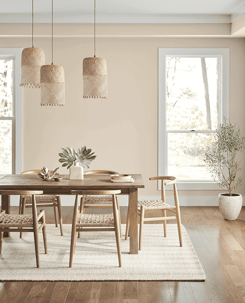
Accessible Beige performs beautifully in San Francisco’s challenging northern light, maintaining its warmth even when bathed in cool, foggy illumination. This chameleon-like neutral reads as a soft taupe in some lights and a warm gray in others, making it incredibly versatile.
Nob Hill designers favor this shade for historic buildings where a color with depth is needed but anything too bold would compete with architectural details. The subtle warmth creates an inviting atmosphere that counteracts San Francisco’s frequently cool climate.
Homeowners with east-facing rooms particularly appreciate how Accessible Beige glows golden in morning light yet remains sophisticated throughout the day. For anyone seeking to unite different flooring materials or bridge traditional and contemporary furnishings, local color consultants consistently recommend this adaptable hue.
9. Gray Screen: The Tech-Savvy Neutral
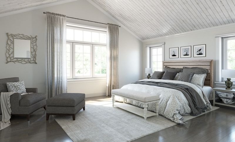
Gray Screen captures the essence of San Francisco’s tech-forward personality with its clean, contemporary vibe. This mid-tone gray has subtle blue undertones that echo the bay waters visible from many city hillsides.
SOMA loft owners gravitate toward this shade for its urban sophistication and ability to make architectural details pop. When paired with white trim and natural wood, Gray Screen creates a distinctly modern yet welcoming atmosphere that many tech professionals seek in their homes.
Designers working in converted warehouse spaces love how this color responds to changing light conditions throughout the day. During foggy mornings, it takes on a cozy, enveloping quality, while in afternoon sunlight, it brightens to reveal subtle blue-gray dimensions that keep walls from ever feeling flat or lifeless.
10. Urbane Bronze: The Dramatic Accent
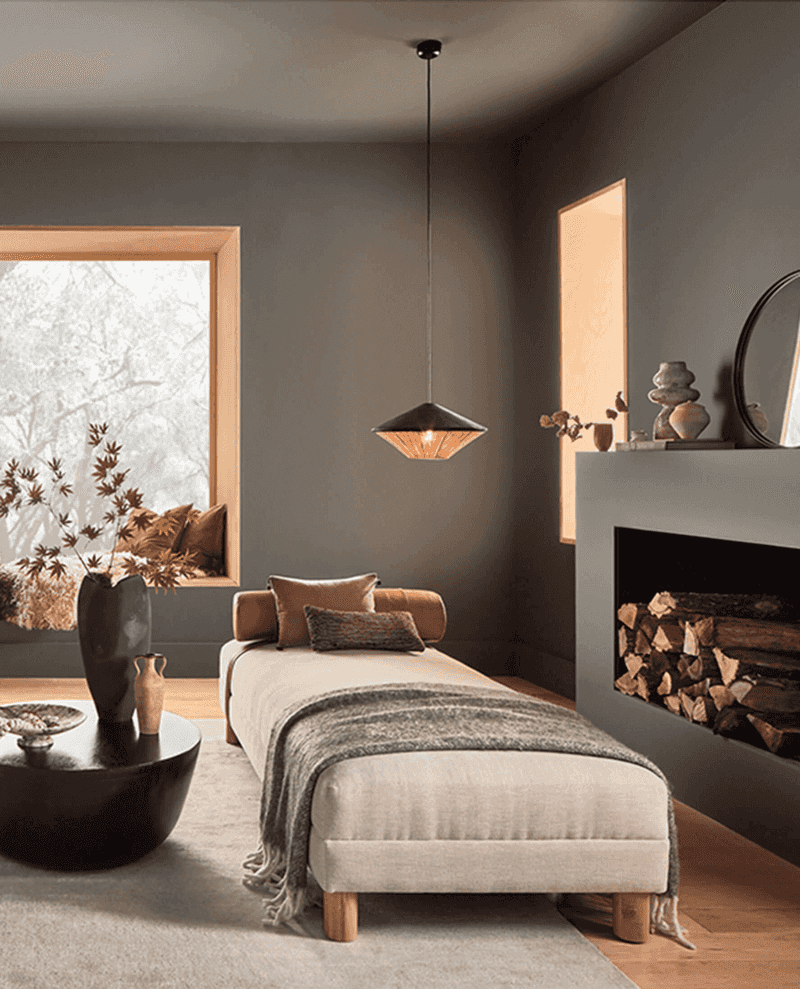
Urbane Bronze delivers sophisticated drama to San Francisco interiors, evoking the rich patina of the Golden Gate Bridge and the city’s industrial heritage. This deep, complex neutral makes a statement without overwhelming a space.
Castro and Noe Valley designers frequently use this color for accent walls or cabinetry to anchor light-filled spaces. The earthy undertones provide warmth even in north-facing rooms that receive limited direct sunlight. Homeowners with smaller San Francisco spaces appreciate how Urbane Bronze creates depth and interest without requiring much square footage.
Many local professionals recommend this shade for home offices and media rooms where a cocooning effect is desired. Against the city’s frequent fog, this color takes on an almost velvety quality that feels simultaneously modern and timeless.
11. Naval: The Bay-Inspired Bold
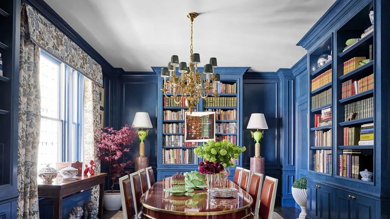
Naval captures the deep blue hues of San Francisco Bay on a clear day, bringing maritime elegance to Victorian parlors and modern penthouses alike. This sophisticated navy has enough black in its formulation to feel grounded rather than bright.
Pacific Heights designers often recommend Naval for dining rooms and libraries where a sense of intimacy and drama enhances the experience. The color creates a stunning backdrop for art collections and makes gold or brass accessories positively glow.
Homeowners in historic districts find that Naval honors the traditional color schemes of San Francisco’s painted ladies while feeling thoroughly contemporary. What makes this color particularly successful in the city is how it stands up to the variable natural light, maintaining its rich depth even when bathed in cool northern exposure.
12. Tradewind: The Bay View Blue
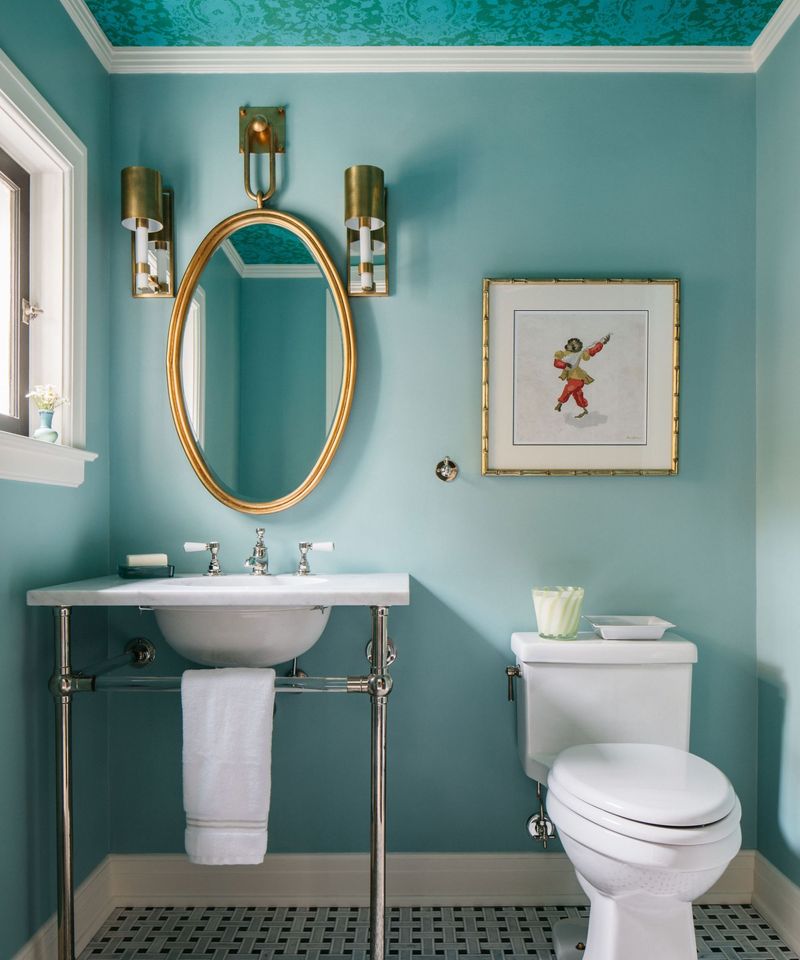
Tradewind evokes the distinctive blue-green waters of San Francisco Bay on those rare, perfectly clear days. This serene aqua creates an instant connection to the city’s maritime setting without feeling overtly coastal or themed.
Designers working in hillside homes with water views particularly favor this shade for its ability to harmonize interior and exterior vistas. The color shifts throughout the day, appearing more blue when skies are clear and more green when fog descends. Homeowners in neighborhoods like Telegraph Hill and Russian Hill appreciate how Tradewind brightens spaces that might otherwise feel shadowed by surrounding buildings.
Many local color consultants recommend this versatile hue for kitchens and bathrooms, where it creates a fresh, clean feeling while adding just enough personality to elevate basic white fixtures.
13. Balanced Beige: The Hillside Neutral
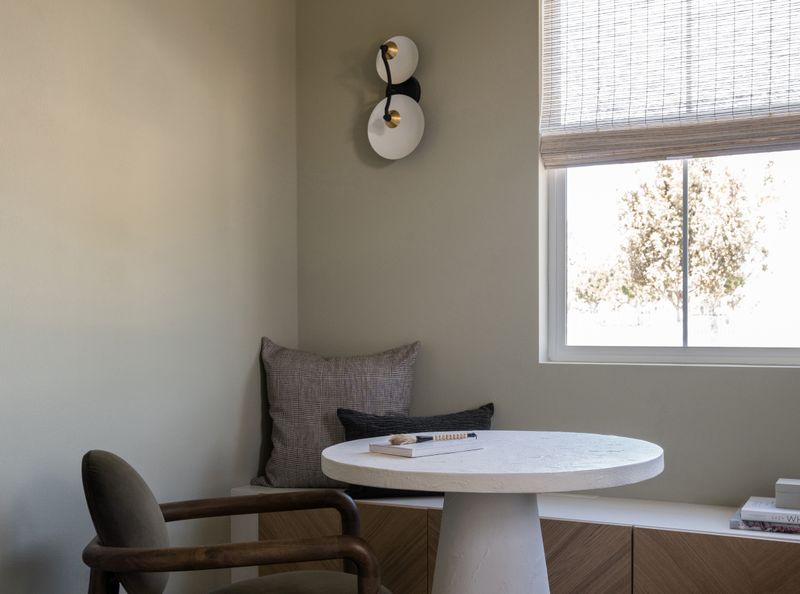
Balanced Beige mirrors the golden hills surrounding San Francisco, bringing warmth and earthiness to interiors throughout the city. This versatile neutral reads differently depending on exposure more taupe in northern light, more golden in western exposures.
Bernal Heights and Potrero Hill designers regularly specify this shade for living spaces where a connection to the landscape is desired. The color creates a beautiful backdrop for both contemporary and traditional furnishings, making it ideal for eclectic San Francisco homes. Homeowners with original hardwood floors particularly appreciate how Balanced Beige complements the amber tones in vintage oak without competing.
For anyone seeking to create a cozy atmosphere that stands up to the city’s frequently gray days, local painting contractors point to this reliable neutral that never feels too yellow or too gray.

