38 Cheap Tricks To Make Your Home Look More Expensive

38 Cheap Tricks To Make Your Home Look More - Decor Hint

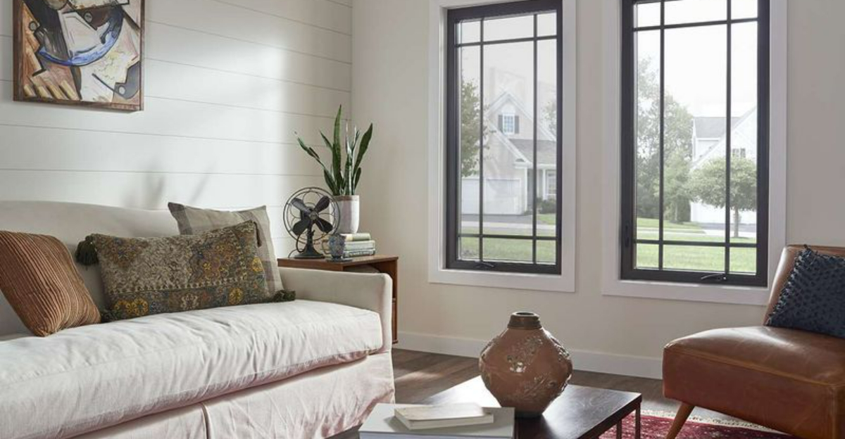
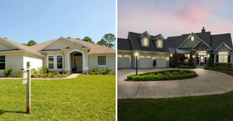
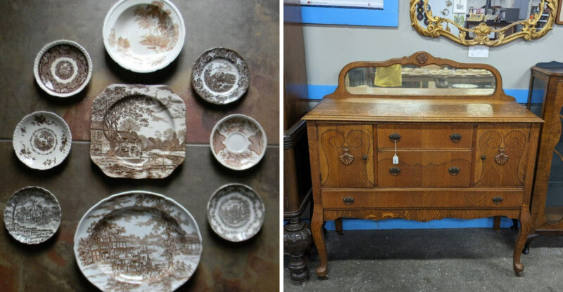
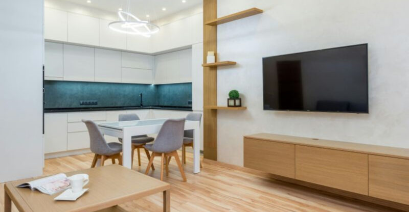
Transforming your home into a luxurious space doesn’t have to drain your bank account. With some creativity and smart shopping, you can create that high-end look without the matching price tag.

I’ve gathered 38 budget-friendly tricks that will help you elevate your living space and impress your guests without spending a fortune.

1. Crown Molding Magic

Crown Molding Magic
© This Old House

Adding crown molding instantly elevates any room from ordinary to elegant. You can find inexpensive foam crown molding at home improvement stores that’s lightweight and easy to install without professional help.

I painted mine white to create a clean, classic look that frames my ceiling beautifully. The corners can be tricky, but pre-made corner pieces save time and frustration.

The transformation is remarkable – guests often comment on how “custom” my rooms look now, never guessing the entire project cost less than $100 per room.

2. Strategic Mirror Placement

Strategic Mirror Placement
© Apartment Therapy

Mirrors are magical for making spaces feel larger and reflecting light throughout a room. Positioning a large mirror across from a window doubles the natural light and creates the illusion of another room beyond.

Framing an inexpensive mirror elevates it instantly. I found a plain $30 mirror and added trim painted in metallic gold for a designer look that would cost hundreds retail.

Consider grouping smaller mirrors gallery-style for an artistic statement wall that brightens your space while looking deliberately curated rather than budget-conscious.

3. Paint Interior Doors Black

Paint Interior Doors Black
© Small Stuff Counts

Black interior doors create architectural interest and instantly make spaces feel more custom. This unexpected touch signals thoughtful design choices rather than builder-grade basics.

You’ll want to use semi-gloss or satin finish for durability and a smooth appearance. I painted mine over a weekend, and visitors immediately noticed the upgrade without realizing what specifically had changed.

The contrast between white trim and black doors creates a sophisticated framework for each room. This simple change cost under $30 but transformed the entire feel of my hallway.

4. Floating Shelves Display

Floating Shelves Display
© Southern Living

Floating shelves create architectural interest while providing functional storage. They look especially high-end when installed in unexpected places like narrow hallways or bathroom walls.

Keep styling minimal – overcrowded shelves scream “clutter” not “custom.” I group items in odd numbers with varying heights, incorporating both decorative and useful pieces for a collected-over-time appearance.

Inexpensive shelves from home improvement stores look instantly upgraded when painted the same color as your walls. This creates a built-in look that appears seamless and intentional rather than an afterthought.

5. Upgrade Your Shower Head

Upgrade Your Shower Head
© Walmart

Nothing says budget bathroom like a basic shower head. Replacing it with a rainfall or handheld model creates an instant spa feeling for relatively little money.

My $35 rainfall shower head transformed my daily routine into a luxury experience. The installation required no special tools and took less than 20 minutes from start to finish.

Opt for brushed nickel or matte black finishes that hide water spots better than chrome. Guests always comment on my “amazing shower” without realizing it’s the same standard stall with one simple upgrade.

6. Layered Lighting Scheme

Layered Lighting Scheme
© Martha Stewart

Professional designers always incorporate multiple light sources at different heights. Adding table lamps, floor lamps, and sconces creates ambiance that builder-grade overhead lights never achieve.

Thrift stores are goldmines for unique lamp bases that can be refreshed with new shades. My favorite living room lamp cost $7 at Goodwill but looks like a high-end ceramic piece after a quick makeover.

Smart bulbs allow you to adjust brightness and warmth throughout the day, mimicking natural light patterns. This attention to lighting quality makes even the simplest spaces feel intentionally designed.

7. Curtain Height Illusion

Curtain Height Illusion
© The Shade Store

Hanging curtains close to the ceiling rather than just above the window frame creates the illusion of higher ceilings and larger windows. This designer trick works in any space, regardless of actual window size.

Choose curtains that barely touch the floor – pooling fabric looks messy while hovering curtains appear ill-fitted. I found ready-made panels at Target that I lengthened with iron-on hem tape for a custom look.

Opt for simple, solid fabrics in neutral tones for timeless elegance. The transformation is dramatic – my standard 8-foot ceilings now appear much taller, giving my entire apartment a more spacious feel.

8. Coordinate Bathroom Accessories

Coordinate Bathroom Accessories
© Walmart

Mismatched plastic bathroom accessories scream “budget bathroom.” Replacing them with a coordinated set in glass, ceramic, or metal creates instant sophistication without major renovation.

I found an oil-rubbed bronze set including a soap dispenser, toothbrush holder, and tissue cover for under $40. The matching finish ties everything together beautifully with my existing fixtures.

Remove product labels and transfer items like cotton balls and Q-tips into matching containers. This simple swap eliminates visual clutter and creates that high-end hotel bathroom feeling that looks intentionally designed rather than randomly accumulated.

9. Statement Entry Light

Statement Entry Light
© Capitol Lighting

Your entryway light fixture sets the tone for your entire home. Replacing a builder-grade fixture with something more distinctive signals thoughtful design choices from the moment someone enters.

I installed a dramatic pendant light that became an instant conversation piece. While it looks expensive, I actually found it on clearance and assembled it myself in about 30 minutes.

Consider scale carefully – entryway fixtures should be proportional to your space but slightly larger than you might initially think. This creates a focal point that draws the eye up and makes the entire entry feel more intentional.

10. Unified Bookshelf Styling

Unified Bookshelf Styling
© Erica Galles

Bookshelves often become cluttered catchalls that create visual noise. Creating a more cohesive look instantly elevates their appearance without buying anything new.

Try arranging books by color for an artistic display that looks intentionally curated. I turned some books spine-in for a neutral palette that serves as a calming backdrop for special objects.

Leave plenty of negative space rather than cramming shelves full. My rule is removing one item for every three I display, which creates breathing room that makes even inexpensive items appear more valuable when they have space to shine.

11. Painted Interior Door Frames

Painted Interior Door Frames
© Livingetc

Painting interior door frames in a contrasting color adds architectural interest that looks intentional and custom. This unexpected detail signals design confidence that elevates your entire space.

I painted my white door frames charcoal gray while keeping doors white for a modern twist on traditional molding. The project required only a quart of paint and painter’s tape but created remarkable impact.

This works especially well in homes with limited architectural details. The contrast draws attention to transitions between spaces, creating definition in open floor plans while adding visual interest to plain hallways.

12. Upgraded Switch Plates

Upgraded Switch Plates
© Etsy

Standard plastic switch plates are practical but visually interrupt your walls. Replacing them with decorative versions in materials like brushed nickel, bronze, or ceramic creates subtle sophistication.

This small change makes a surprisingly big impact because we interact with switches daily. My favorites are the hammered bronze plates that cost about $5 each but look like custom metalwork.

For a truly custom look, paint switch plates the exact same color as your walls. They virtually disappear, creating a seamless appearance that high-end designers use to maintain visual flow throughout a space.

13. Strategic Throw Pillow Arrangement

Strategic Throw Pillow Arrangement
© The Spruce

Throw pillows can look either luxurious or haphazard depending on their arrangement. The secret is varying sizes while maintaining a cohesive color story that ties everything together.

Start with larger pillows (22-24 inches) at the outer corners, then layer smaller ones (18-20 inches) in front. I found high-end looking covers at discount stores and simply swap the inserts from my old pillows.

Mix textures like velvet, linen, and subtle patterns while keeping colors harmonious. The pillow arrangement on my basic IKEA sofa makes it look significantly more expensive and deliberately chosen rather than a budget necessity.

14. Unified Plant Containers

Unified Plant Containers
© The Spruce

Mismatched plant pots create visual clutter that reads as unintentional. Unifying containers with a consistent color palette instantly creates a more curated, expensive look.

White ceramic pots give a clean, gallery-like appearance to even common houseplants. I transformed my random collection by spray painting terracotta pots matte black for an instant style upgrade that cost under $10.

Consider grouping plants with similar containers in odd numbers. My collection of three different plants in identical white pots creates a striking vignette that draws compliments despite being incredibly simple and budget-friendly.

15. Framed Fabric Art

Framed Fabric Art
© This is our Bliss

Custom artwork is expensive, but framed fabric creates large-scale wall art for a fraction of the cost. Remnants of designer fabrics or even beautiful scarves become instant statement pieces when properly framed.

I found a vintage silk scarf at a thrift store for $3 and framed it in a simple black frame. Visitors always ask about my “painting” without realizing it’s actually repurposed fabric.

Floating the fabric on a neutral mat creates museum-quality presentation. The key is choosing fabrics with interesting patterns or textures that hold visual interest from across the room while complementing your color scheme.

16. Painted Interior Window Frames

Painted Interior Window Frames
© Martha Stewart

White window frames disappear, but painting them creates architectural interest that frames your view like artwork. This unexpected detail signals intentional design choices rather than builder-grade basics.

I painted my window frames charcoal gray while keeping trim white, creating a picture-frame effect around my ordinary view. The contrast makes windows feel larger and more significant within the room.

This works especially well with black curtain rods that continue the color story. My simple windows now look like deliberate design features rather than functional necessities, elevating the entire room for the cost of a quart of paint.

17. Bathroom Towel Presentation

Bathroom Towel Presentation
© Homes and Gardens

Hotel-style towel presentation elevates your bathroom instantly. Rolling towels instead of hanging them creates a spa-like display that looks intentionally designed rather than merely functional.

I added a simple floating shelf above my toilet for rolled hand towels, creating a visual feature from something typically hidden in a cabinet. The uniform rolling technique makes even budget towels look more luxurious.

Consider investing in a few matching towels in a signature color rather than many mismatched sets. My bathroom features only white towels, creating a clean, cohesive look that feels intentionally minimal rather than limited by budget.

18. Upgraded Cabinet Liners

Upgraded Cabinet Liners
© Amazon.com

Lining kitchen cabinets with patterned contact paper creates an unexpected pop of luxury whenever doors open. This hidden detail signals attention to every aspect of your home, not just visible surfaces.

I chose a subtle herringbone pattern that coordinates with my kitchen’s color scheme. The washable surface is actually more practical than bare cabinet interiors while adding a custom touch guests always notice.

Focus on cabinets that open frequently, like those holding glasses or plates. My guests always comment on this detail when grabbing a water glass, impressed by the thoughtful touch that cost less than $15 for the entire kitchen.

19. Consistent Baseboard Height

Consistent Baseboard Height
© 3Rs Construction

Taller baseboards signal custom construction rather than builder-grade finishes. Adding a simple strip of molding above existing baseboards creates this high-end look without replacing anything.

I attached a thin strip of decorative molding about 1-2 inches above my original baseboards, then painted everything white to create the illusion of a single, substantial baseboard. The visual impact is remarkable for minimal cost.

This trick works in any room but makes the biggest impact in hallways and larger spaces. My guests assume I’ve done major renovations when they notice this detail, never guessing it’s actually a simple DIY enhancement.

20. Cohesive Hanger Collection

Cohesive Hanger Collection
© Driven by Decor

Opening a closet to find mismatched plastic hangers instantly breaks the luxury illusion. Switching to uniform wooden or velvet hangers creates a boutique closet experience for relatively little money.

I found black velvet hangers in bulk for less than 50 cents each. The transformation was immediate – clothes hang better, space is maximized, and my closet suddenly feels like an upscale boutique rather than storage.

This upgrade is particularly impactful in guest rooms or entryway closets where visitors are likely to see inside. My guests often comment on how organized my closet looks, never realizing it’s simply the uniform hangers creating that impression.

21. Painted Interior Doors

Painted Interior Doors
© Making Home Base

Interior doors are often overlooked, but painting them a statement color creates architectural interest instantly. This unexpected detail signals confidence in your design choices and elevates ordinary spaces.

I painted my bedroom door navy blue while keeping trim white for dramatic contrast. The door now functions as a design element rather than just a functional necessity.

Choose colors that complement your overall palette but don’t match walls exactly. My navy doors coordinate with blue accents throughout my home, creating cohesion while adding unexpected visual interest to what was previously a bland hallway.

22. Upgraded Outlet Covers

Upgraded Outlet Covers
© Amazon.com

Standard plastic outlet covers are practical but visually disruptive. Replacing them with decorative versions or painting them to match your walls creates a more seamless, high-end appearance.

I switched to brushed nickel covers in my kitchen and bathroom to coordinate with fixtures. In living spaces, I painted covers the exact same color as my walls so they virtually disappear.

This small change makes a surprising difference because outlets appear throughout every room. The cohesive look signals attention to detail that’s characteristic of professional design, though the entire house upgrade cost less than $50.

23. Strategic Mirror Grouping

Strategic Mirror Grouping
© The Home Depot

A collection of smaller mirrors arranged gallery-style creates more visual impact than a single large mirror. This approach looks deliberately curated rather than like a budget alternative.

I found assorted mirrors at thrift stores for $3-10 each and unified them with spray paint in a metallic finish. The arrangement reflects light from multiple angles, making my dining room appear significantly larger.

Vary shapes while maintaining a cohesive finish – my collection includes round, square and hexagonal mirrors all in antique gold. The dimensional quality creates interest that flat artwork can’t match while performing the practical function of making spaces feel larger.

24. Drawer and Cabinet Organization

Drawer and Cabinet Organization
© Joseph Joseph

Organized drawers and cabinets create a luxury experience every time you open them. Simple dividers transform chaotic storage into something that feels custom-designed for your specific needs.

I used inexpensive bamboo dividers in my kitchen drawers to create designated spaces for each utensil type. The transformation is both functional and visually satisfying – everything looks intentionally placed rather than haphazardly stored.

Extend this approach to bathroom vanities and bedroom dressers. My guests always comment on how “put together” my home feels, not realizing it’s largely due to these hidden organizational systems that create order behind closed doors.

25. Upgraded Doorknobs

Upgraded Doorknobs
© Emtek

Builder-grade doorknobs are purely functional, but decorative versions add character to every room transition. This small hardware upgrade creates cumulative impact throughout your home.

I replaced my plain round knobs with crystal versions that catch light beautifully. The installation required only a screwdriver and about 5 minutes per door, but the effect is striking.

Consider door usage when selecting styles – lever handles offer easier access for primary doors while more decorative knobs work well for closets or less-used rooms. My crystal knobs cost $15 each but completely transformed the feeling of my bedroom doors.

26. Furniture Feet Elevation

Furniture Feet Elevation
© Curbed

Basic furniture often sits directly on the floor, but adding decorative feet creates a more custom, high-end appearance. This simple modification makes pieces look deliberately chosen rather than budget necessities.

I attached tapered wooden feet to my plain IKEA sideboard, instantly transforming it from flat-pack to custom-looking. The elevation also creates useful shadow lines that add visual interest to the piece.

Furniture supply stores sell various styles for a few dollars each, while ready-made options attach easily with included hardware. My $300 sideboard now looks remarkably similar to the $1,200 version I originally wanted.

27. Coordinated Bedding Layers

Coordinated Bedding Layers
© Sheet Market

Hotel-style bedding instantly elevates any bedroom from basic to luxurious. The secret is creating multiple layers with different textures while maintaining a cohesive color palette.

Start with crisp white sheets as your foundation. I add a quilt folded at the foot of the bed, then layer two sizes of pillows with coordinating but not matching cases. The varied textures create visual interest without looking busy.

White bedding looks especially high-end and can be bleached to maintain that pristine appearance. My bedroom feels like a boutique hotel suite despite using budget-friendly components assembled thoughtfully rather than expensive matched sets.

28. Unified Bathroom Fixtures

Unified Bathroom Fixtures
© Delta Faucet

Mismatched bathroom fixtures create a cobbled-together appearance. Unifying all metal finishes – from faucets to towel bars to shower heads – instantly creates a more intentional, high-end look.

I gradually replaced chrome fixtures with brushed nickel versions as budget allowed. Starting with the most visible elements (faucet and towel bar) created immediate impact while allowing me to spread costs over time.

Consider spray painting existing fixtures if replacement isn’t feasible. My rental bathroom’s dated gold towel bar and toilet paper holder look completely different after careful application of brushed nickel spray paint specifically formulated for metal.

29. Strategic Art Placement

Strategic Art Placement
© A House in the Hills

Artwork placement significantly impacts how expensive it appears. Positioning pieces at eye level rather than too high creates an intentional gallery feeling that elevates even inexpensive prints.

Consider creating a focal wall with multiple pieces arranged around a central point. I grouped black and white photographs in varying sizes but matching frames to create a statement wall that draws everyone’s attention.

The secret is consistent spacing – I maintain exactly 2 inches between frames for a polished look. My collection includes family photos in professional-looking frames, creating personalized art that cost almost nothing but looks deliberately curated.

30. Painted Ceiling Detail

Painted Ceiling Detail
© Clare Paint

White ceilings are standard, but painting them creates unexpected architectural interest. This designer trick draws the eye upward and makes rooms feel more intentionally designed.

I painted my dining room ceiling pale blue, creating a subtle contrast with white walls that frames the space beautifully. The unexpected color makes the ceiling feel higher while adding visual interest to an often-overlooked surface.

For a subtle effect, choose a color that’s 2-3 shades lighter than your walls. My guests always notice something different about the room without immediately identifying what’s changed – exactly the subtle enhancement that signals thoughtful design rather than random decoration.

31. Custom Roman Shade Look

Custom Roman Shade Look
© Honestly WTF

Custom window treatments are expensive, but you can fake the look of Roman shades using inexpensive mini blinds and fabric. This creates the appearance of custom window coverings for a fraction of the cost.

I removed most of the slats from mini blinds, leaving just enough for the fold structure. Then I glued fabric to the remaining slats, creating perfect folds when raised. The entire project cost under $30 per window.

Choose fabric that coordinates with your overall color scheme for a cohesive look. My DIY Roman shades in a subtle striped linen completely transformed my kitchen windows from rental-basic to seemingly custom-made.

32. Tray Organization

Tray Organization
© Hello Hayley

Decorative trays instantly organize random items into deliberate collections. This simple addition makes everyday objects look curated rather than cluttered.

I use a wooden tray on my coffee table to corral remote controls, coasters, and a small plant. The grouping creates an intentional vignette rather than scattered items. My bathroom counter features a marble-look tray (actually melamine) that elevates ordinary products into a spa-like display.

Look for trays at discount stores or thrift shops – the shape matters more than the material since many can be easily painted or modified. My favorite living room tray was a $2 thrift store find transformed with gold spray paint.

33. Upgraded Light Switch Dimmers

Upgraded Light Switch Dimmers
© Lutron

Standard on/off switches offer limited lighting control, but dimmers create ambiance that transforms how rooms feel at different times of day. This small electrical upgrade makes a remarkable difference in creating luxury atmosphere.

I installed simple rotary dimmers in my dining room and living room for under $15 each. The ability to adjust light levels completely changes how the spaces feel, especially during evening entertaining.

Dimmers work particularly well with pendant lights and chandeliers. My basic dining fixture looks significantly more elegant when dimmed to a warm glow during dinner parties – guests always comment on the “perfect lighting” without realizing it’s simply a $12 switch making all the difference.

34. Consistent Candle Display

Consistent Candle Display
© | illuminate your world with the magic of candles

Scattered candles can look haphazard, but grouping similar styles creates intentional decorative moments. This simple styling trick costs nothing but creates immediate visual impact.

I collect pillar candles in varying heights but matching colors, arranging them on a simple mirror for added reflection. The grouping creates a focal point that draws the eye while providing practical ambient lighting.

Consider unifying candles you already own by placing them in matching holders. My collection of random jar candles looks deliberately curated when placed in identical glass hurricanes, creating a cohesive display that elevates their appearance without buying anything new.

35. Book Spine Color Coordination

Book Spine Color Coordination
© Lisa Tselebidis

Bookshelves often become visually chaotic, but organizing books by color creates an artistic display from items you already own. This zero-cost styling trick transforms ordinary shelves into deliberate design features.

I arranged my books in rainbow order, creating a gradient effect that draws compliments from every visitor. The organization makes even paperback novels look like intentional decor elements rather than just reading material.

For a more subtle approach, try organizing by color family – all blues together, all neutrals together, etc. My office bookshelf features only black, white, and gray spines, creating a sophisticated monochromatic display that looks deliberately curated rather than randomly collected.

36. Unified Picture Frames

Unified Picture Frames
© The Spruce

Mismatched frames create visual clutter, but unifying them with a consistent finish transforms random photos into a cohesive gallery. This simple project elevates personal photos into seeming art installations.

I collected various wooden frames from thrift stores for $1-3 each, then spray painted them all matte black. The unified color makes the arrangement look intentionally curated rather than gradually accumulated.

Consider creating themed groupings – all travel photos or all family portraits – with matching frames and mats. My hallway features black-framed travel photos with white mats, creating a striking display that looks professionally designed despite costing less than $30 total.

37. Strategic Textile Layering

Strategic Textile Layering
© Standard Textile Home

Thoughtfully layered textiles create depth and visual interest that elevates any space. This approach works in every room, from bedding to living areas to dining tables.

I layer throw blankets across the foot of my bed, drape them over sofa arms, and fold them in baskets nearby for both practical function and visual texture. Varying materials – chunky knits with smooth cottons or linens – creates dimensional interest.

Extend this approach to table settings with layered placemats and runners. My simple white dishes look significantly more elegant when placed on textured jute placemats over a linen runner – the layered foundation elevates even basic dinnerware into seeming deliberate design choices.

38. Painted Interior Window Sills

Painted Interior Window Sills
© Martha Stewart

Window sills often remain white by default, but painting them creates architectural definition that frames your views like artwork. This unexpected detail signals thoughtful design decisions rather than builder-grade basics.

I painted my window sills charcoal gray while keeping trim white, creating a picture-frame effect around my ordinary neighborhood view. The contrast makes windows feel more substantial and deliberately designed.

This works especially well when coordinated with curtain rods in the same finish. My simple windows now look like intentional design features rather than functional necessities, elevating the entire room for the cost of a sample pot of paint.

More to Explore