You Might Think These 11 Home Trends Are Chic, They’re Not
Home design trends come and go faster than you can say ‘farmhouse chic.’ As a designer, I’ve watched countless homeowners fall for flashy fads that quickly become tomorrow’s eyesores.
What seems cutting-edge today often becomes laughably dated within a few years. Let me save you from design regret by revealing which supposedly stylish home trends actually make professional decorators cringe.
1. All-White Everything
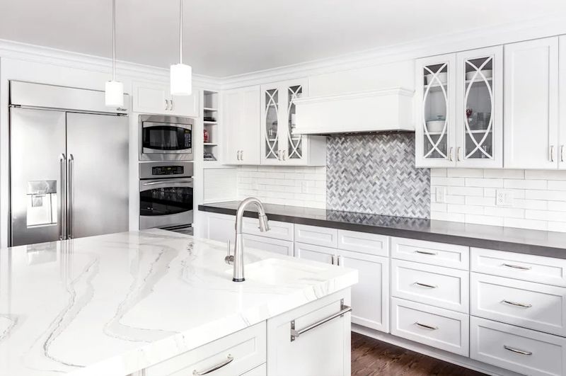
How many operating rooms have you visited lately? That’s exactly what your all-white kitchen resembles. This sterile trend strips away personality and warmth from what should be the heart of your home.
All-white spaces show every speck of dirt and require constant maintenance. Instead, incorporate warm woods, colorful backsplashes, or painted cabinets to create a kitchen that feels lived-in rather than laboratory-grade.
2. Word Art Everywhere
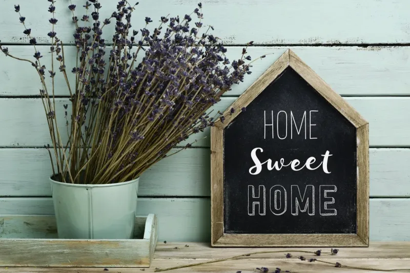
Nothing screams ‘I lack original design ideas’ quite like filling walls with generic phrases. Those ‘Live Laugh Love’ signs and ‘Bless This Mess’ plaques aren’t quirky conversation starters.
Word art became popular as an easy decorating shortcut, but now it’s simply visual noise. Replace these tired textual clichés with actual artwork that sparks genuine emotion or family photos that tell your unique story.
3. Barn Doors On Everything
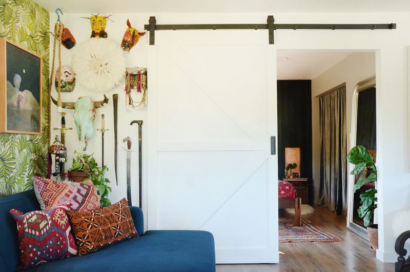
Though they promised space-saving solutions, barn doors quickly became the mullet of home design, business in concept, party in execution. These sliding monstrosities offer minimal privacy and maximum noise leakage.
Barn doors collect dust in their tracks and often look completely out of place in non-farmhouse settings. Unless you’re living in an actual converted barn, consider pocket doors or traditional hinged options that don’t scream ‘I watched too much HGTV in 2015.’
4. Gray-On-Gray-On-Gray
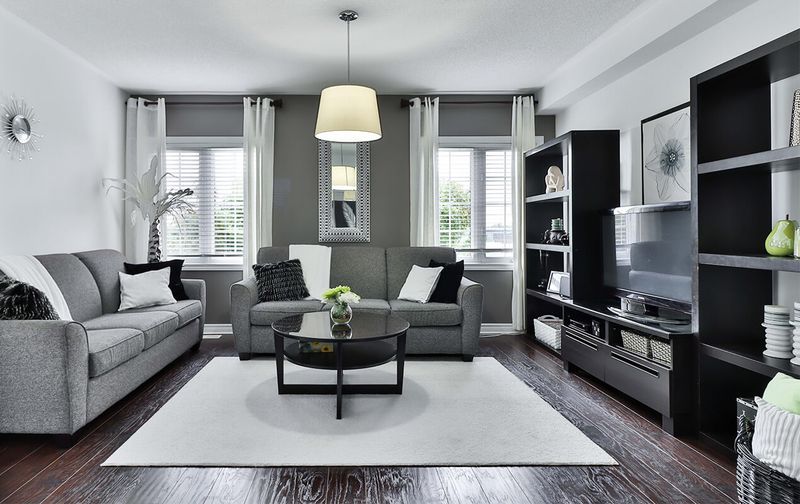
Where’s the personality in your fifty shades of bland? The all-gray trend turned lively homes into cloudy, depressing caves devoid of character or warmth.
Gray walls with gray furniture on gray floors create spaces that feel cold and unwelcoming. Break up monochromatic misery by introducing rich accent colors, natural textures, or bold patterns that actually make your space feel alive rather than embalmed.
5. Mason Jar Everything
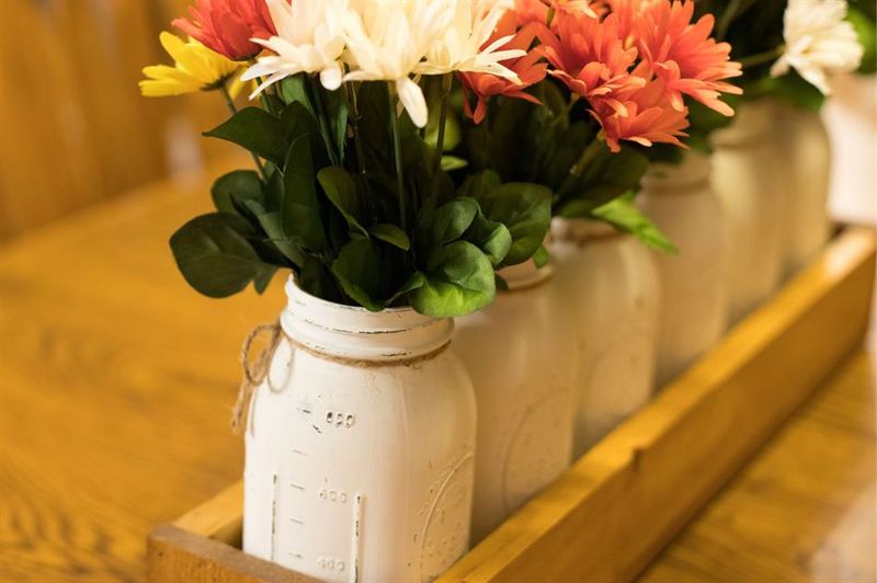
Are you preserving fruits or just bad design choices? Mason jars had their moment as charming rustic vessels, but now they’re the most overworked glass in America.
Mason jar chandeliers, soap dispensers, and vases scream ‘I have no original ideas.’ These once-practical canning containers belong in your pantry, not as light fixtures or bathroom accessories.
Choose purpose-built items designed specifically for their intended function instead of forcing mason jars into roles they were never meant to play.
6. Open Shelving Overload
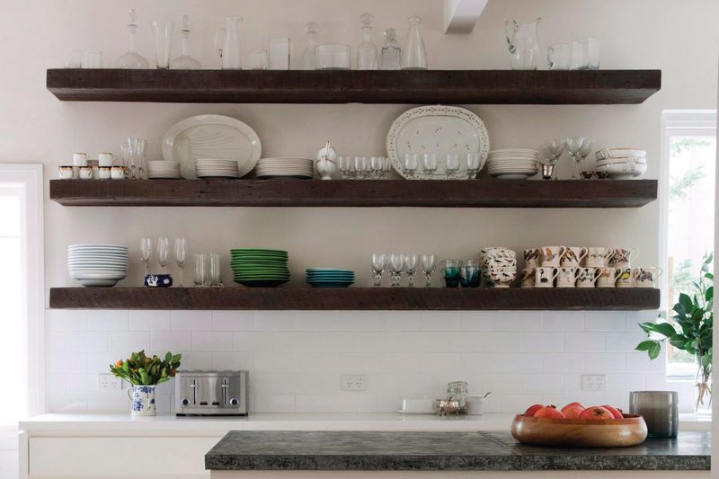
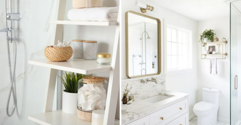
Unless you enjoy dusting each plate weekly and maintaining museum-worthy dish arrangements, open shelving is more punishment than design statement. This trend ignores the reality of how most people actually live.
Open shelves force you to curate every item and keep everything perpetually tidy. Most kitchens look better with a mix of closed storage for practical items and limited open shelving for display pieces. Your everyday cereal boxes and mismatched mugs deserve privacy too.
7. Accent Walls Gone Wild
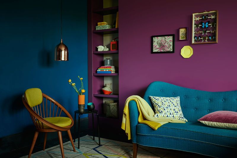
That single navy blue wall isn’t as sophisticated as you think. Accent walls often feel like commitment issues manifested in interior design, afraid to fully embrace color but unwilling to stick with neutrals.
Accent walls frequently make spaces feel unbalanced and choppy rather than cohesive. Consider using color throughout your space in more subtle ways through textiles, artwork, and accessories.
If you truly love a bold color, have the confidence to use it thoughtfully throughout the room.
8. Fake Plants That Fool No One
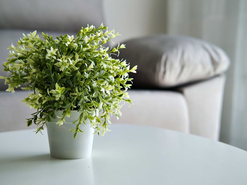
Those plastic monstrosities collecting dust aren’t bringing nature indoors, they’re bringing sadness. Fake plants have improved, but most still scream artificial from across the room.
Artificial greenery often looks cheap and dated, regardless of how much you spent. If you can’t maintain real plants, focus on other natural elements like wood, stone, or textiles rather than filling your home with unconvincing plastic impostors that add neither life nor authenticity to your space.
9. Chevron Pattern Overload
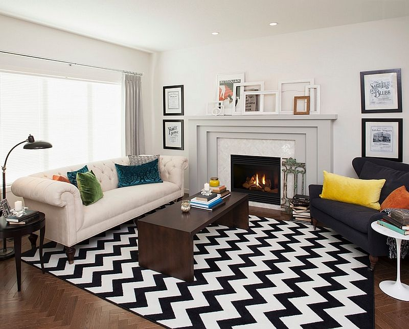
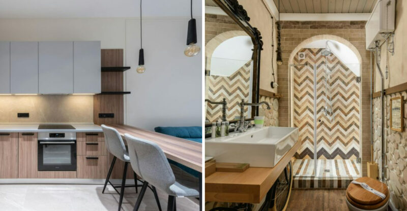
When did zigzags take over our homes? Chevron exploded as a pattern that supposedly worked with everything, but now it’s the most dated pattern this side of 2013.
Chevron rugs, chevron walls, chevron pillows, it’s visual chaos that makes spaces feel busy and anxious. If you love geometric patterns, consider more timeless options like stripes or subtle herringbone that won’t immediately date your space to a specific Pinterest era.
10. TV Above The Fireplace
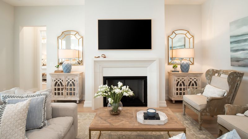
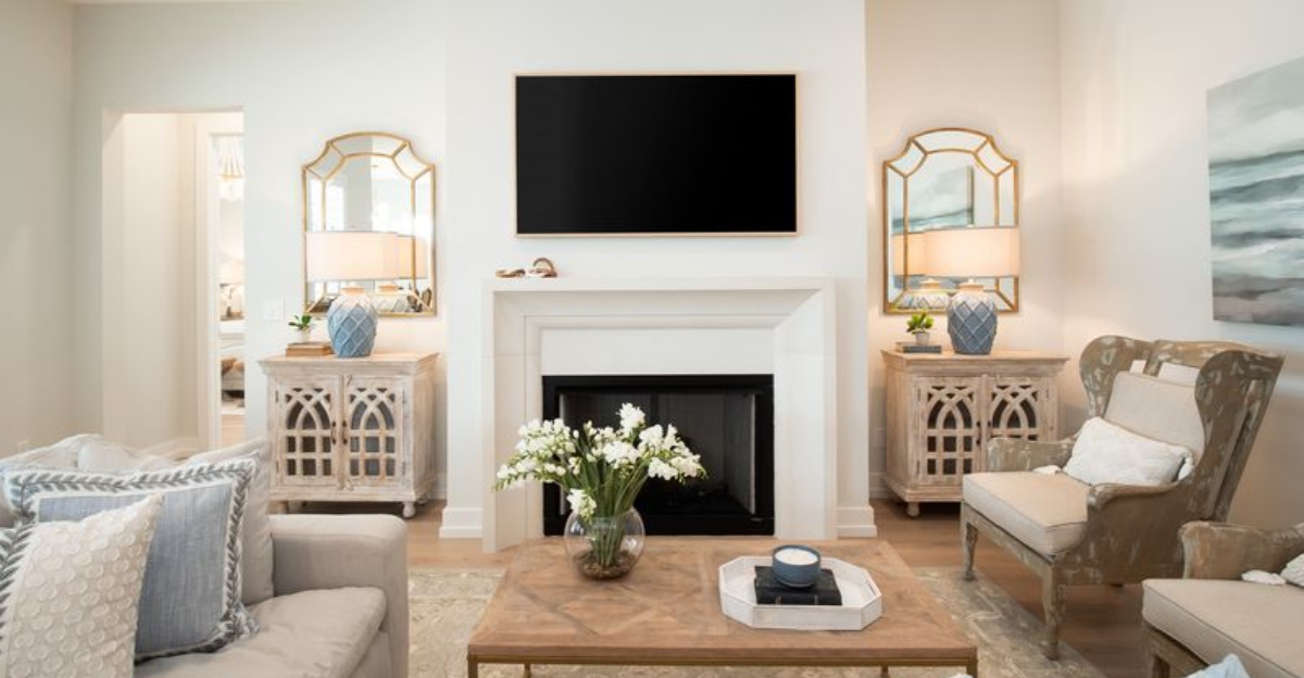
Your neck called, it wants you to stop causing it pain. Mounting televisions above fireplaces creates awkward viewing angles that require uncomfortable craning.
This placement also exposes expensive electronics to heat and soot damage. The fireplace should be a focal point on its own, not competing with a giant black screen.
Consider arranging your furniture to allow the TV and fireplace to exist as separate but harmonious elements in your room.
11. Edison Bulbs Everywhere
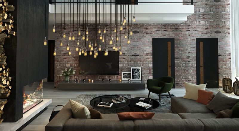
Those exposed filament bulbs were novel in 2010, but now they’re just illuminating your lack of lighting innovation. Edison bulbs provide poor lighting while consuming excessive energy.
Beyond their inefficiency, these bulbs create harsh, unflattering light that can make even the most beautiful space feel like an interrogation room. Consider fixtures with proper diffusion that create ambiance without the industrial cliché. Your electric bill and your guests’ complexions will thank you.
