Avoid These 17 Slip-Ups In Your Open-Plan Living Space
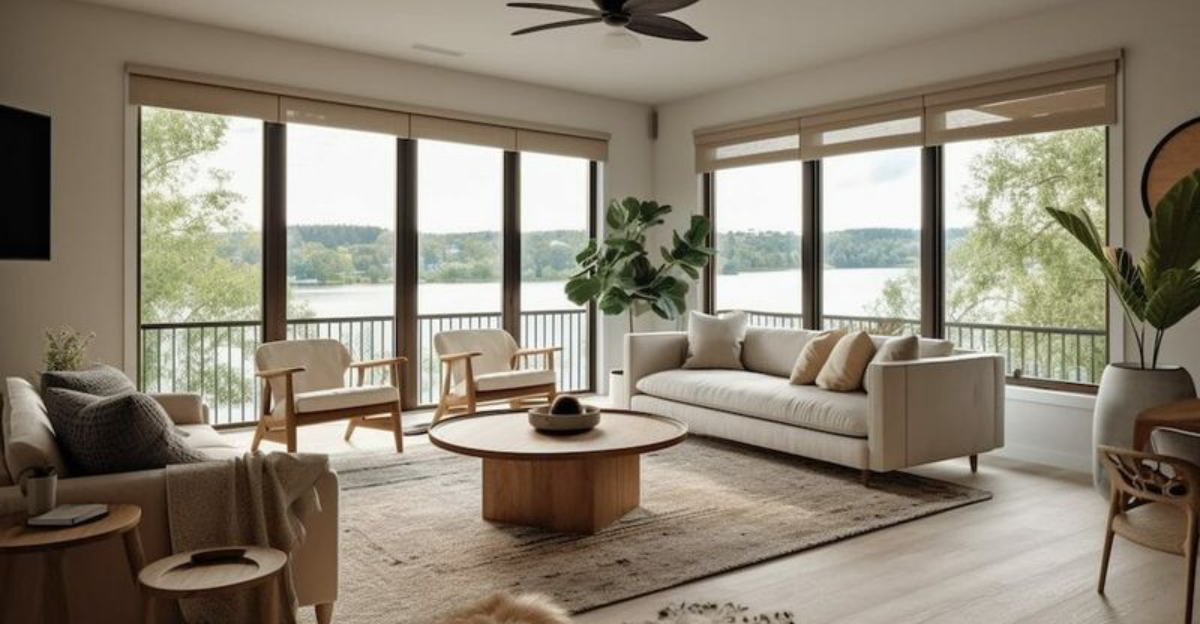
Creating a harmonious open-plan living space isn’t just about knocking down walls. It requires thoughtful planning to avoid common design errors that can make your space feel disjointed or uncomfortable.
Many homeowners make the same mistakes when designing their open-concept areas, turning what should be a dream layout into a frustrating living experience.
Let’s explore the pitfalls you should sidestep to create a functional, beautiful open-plan home.
1. Overcrowded Furniture
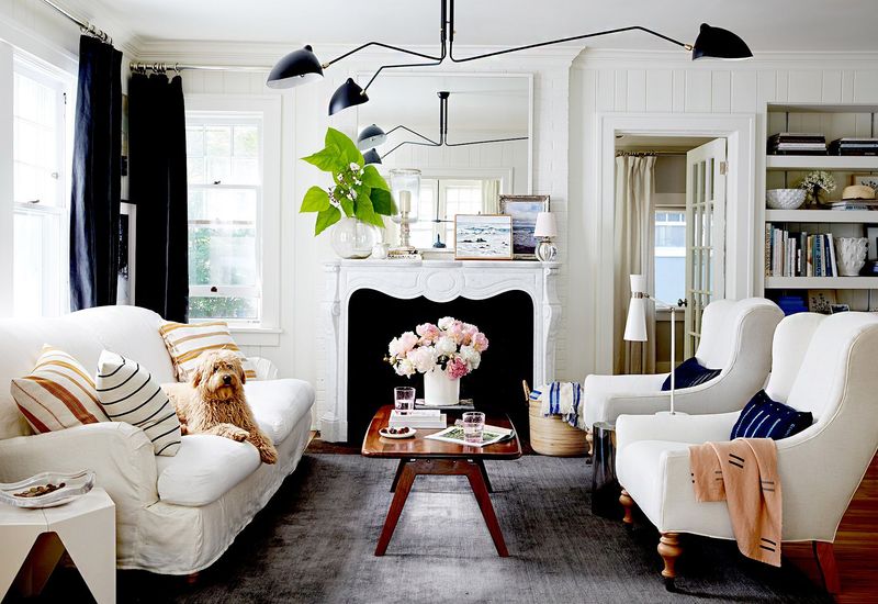
Jamming too many pieces into your open-plan space creates instant visual chaos. When every inch is occupied, the freedom and flow that make open layouts special disappear completely.
I’ve seen countless beautiful spaces ruined by furniture overload, where walking becomes an obstacle course of coffee tables and accent chairs. Remember that negative space (the empty areas) plays a crucial role in open-plan design.
Try the one-in-one-out rule: for every new piece you bring home, remove something else. Your space will breathe easier, and so will you. Measure carefully before purchasing, and consider multi-functional pieces that serve double duty without doubling your footprint.
2. Poor Lighting
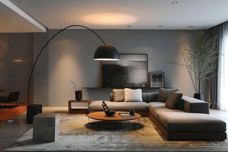
Lighting can make or break your open-plan space. Many homeowners rely solely on overhead fixtures, creating flat, uninspiring environments that feel more like offices than homes.
Without proper layered lighting, activities like reading become difficult in certain areas, while other spots feel like you’re under interrogation. Your lighting should adapt to different needs throughout the day.
For a well-lit space, incorporate three essential layers: ambient lighting for general illumination, task lighting for specific activities, and accent lighting to highlight architectural features or art. Smart lighting systems let you control different zones independently, transforming your space from work mode to dinner party with a single tap.
3. Lack of Defined Zones
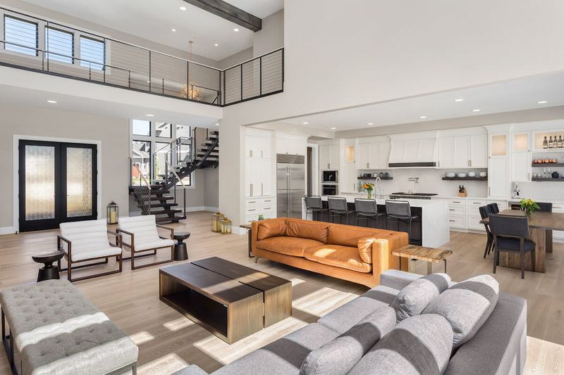
Without clear boundaries, open-plan spaces can feel like one amorphous blob where activities blend together chaotically. Your dinner guests shouldn’t feel like they’re eating in your living room, and your workspace shouldn’t bleed into your relaxation area.
Zone definition doesn’t require walls subtle visual cues create psychological boundaries that help organize your space. Area rugs work wonders to anchor furniture groupings and define separate functional areas.
Furniture arrangement creates natural divisions try positioning your sofa with its back to the dining area, creating a barrier between zones. Pendant lights suspended over specific areas draw the eye and establish purpose. Even ceiling treatments can delineate spaces, with lower sections over intimate areas and higher ones for communal spaces.
4. Clashing Patterns
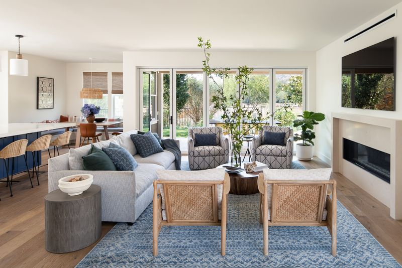
When patterns compete for attention in an open-plan space, the visual noise can be overwhelming. Since everything is visible simultaneously, mismatched patterns create a disjointed feeling that undermines the cohesive flow of your home.
Pattern coordination doesn’t mean everything must match perfectly. The key is finding complementary designs that speak the same visual language. Start with a color palette that ties everything together, then vary pattern scale mix large, medium, and small-scale patterns for balance.
Limit yourself to 3-4 patterns maximum across the entire space. If you love bold patterns, use them sparingly as statement pieces against neutral backgrounds. Repetition creates harmony, so consider echoing a pattern element from your kitchen backsplash in your living area throw pillows for subtle connection.
5. Visible Cables
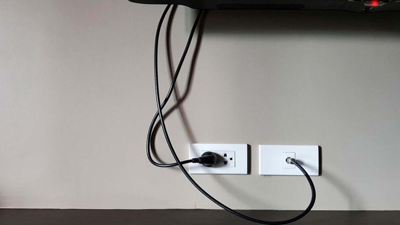
Nothing ruins the sleek look of an open-plan space faster than a tangle of black cables snaking across your floor. With fewer walls to hide technology connections, cable management becomes even more critical in open layouts.
Those exposed wires aren’t just unsightly they’re trip hazards waiting to happen. Plus, they collect dust and make cleaning more difficult than it needs to be.
Cable management solutions have come a long way. Cord covers that match your wall color make necessary connections virtually disappear. Furniture with built-in cable management keeps things tidy, while cord-organizing boxes hide power strips and transformers. For ultimate invisibility, consider working with an electrician to install additional outlets in strategic locations, including floor outlets under furniture groupings.
6. Incoherent Paint Colors
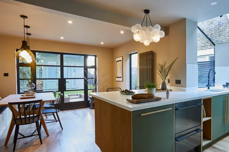
Random color choices in an open-plan space create visual stopping points that chop up your flowing layout. Since all areas are visible simultaneously, color transitions need thoughtful planning to maintain harmony.
Many homeowners make the mistake of treating each functional area as a separate room, using dramatically different colors that fight for attention. This approach undermines the connected feeling that makes open plans special.
Color continuity doesn’t mean painting everything the same shade. Instead, choose colors from the same family or with similar undertones. If you crave variety, use the 60-30-10 rule: 60% dominant color, 30% secondary color, and 10% accent color. Consider using different shades of the same color to create subtle transitions between zones while maintaining visual flow.
7. Too Many Rugs
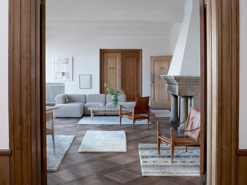
Rug overload is a common mistake that fragments your open-plan space into disconnected islands. When multiple small rugs compete for attention, they visually chop up your floor and create a busy, cluttered feeling underfoot.
While rugs help define zones, using too many different styles, colors, or sizes works against the unified flow that makes open plans appealing. The floor is your space’s foundation treating it as a cohesive element helps tie everything together.
Instead of numerous small rugs, opt for fewer, larger ones that properly anchor furniture groupings. Allow at least 18-24 inches of bare floor between rugs to create breathing room. If you need multiple rugs, choose designs with complementary colors or patterns to maintain visual connection. Consider using the same rug style in different sizes across zones for subtle cohesion.
8. Unbalanced Layout
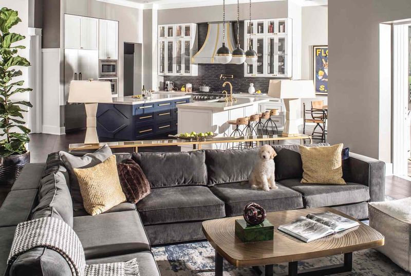
Balance matters tremendously in open-plan spaces where everything is visible at once. When furniture clusters on one side while the other remains sparse, the entire room feels lopsided and uncomfortable.
Visual weight distribution affects how we experience a space psychologically. Heavy pieces concentrated in one area create a sensation of tipping, while proper distribution makes a room feel stable and welcoming.
To achieve balance, distribute larger pieces throughout your space rather than grouping them together. Consider both horizontal and vertical planes tall bookshelves or plants can balance low-slung seating. If your kitchen has substantial upper cabinets, balance that visual weight with taller elements in your living area. Remember that dark colors and patterns appear heavier than light ones, so factor color into your balance equation.
9. Lack of Storage
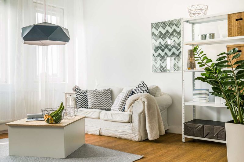
Without adequate storage, open-plan spaces quickly become cluttered showcases of everyday life. Since everything is visible at once, those piles of mail, toys, and random objects become part of your permanent decor.
Hidden storage solutions are absolutely essential for maintaining the clean, spacious feeling that makes open plans appealing. Closed storage allows you to tuck away visual noise while keeping necessities accessible.
Multi-functional furniture with hidden storage compartments works wonders ottomans that open to store blankets, coffee tables with drawers, or window seats with lift-up lids. Built-in cabinetry along walls provides substantial storage without stealing floor space. Even decorative baskets can corral small items while adding texture. The goal is creating a place for everything, so nothing needs to live on your surfaces permanently.
10. No Traffic Flow
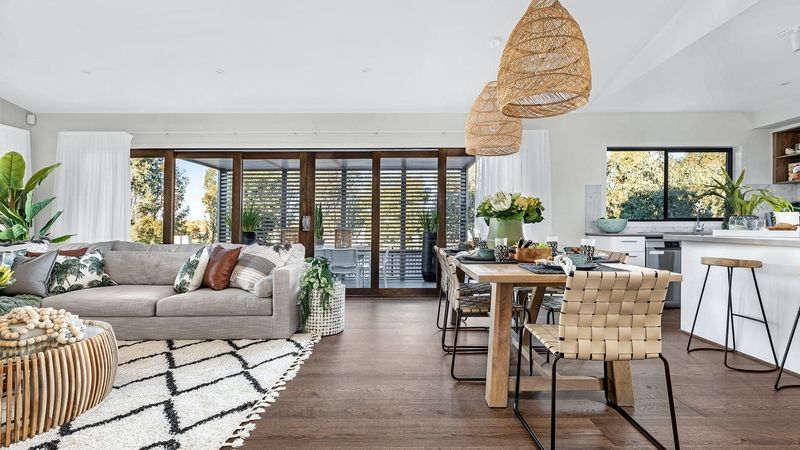
Poor traffic patterns turn open-plan living into an obstacle course of furniture. When walking paths cut through conversation areas or force awkward detours, the freedom of open space is completely lost.
Traffic flow issues aren’t just annoying they make your space less functional and can even create safety hazards. Many homeowners focus on how furniture looks rather than how people will move through the space.
Map clear pathways that allow movement between all functional areas without disrupting activities. Main routes should be at least 36 inches wide, with secondary paths at least 24 inches. Avoid placing furniture that forces people to zigzag through the room. Position seating groups away from high-traffic zones, and ensure entrances and exits remain unobstructed. Consider how multiple people use the space simultaneously before finalizing your layout.
11. Overstuffed Seating
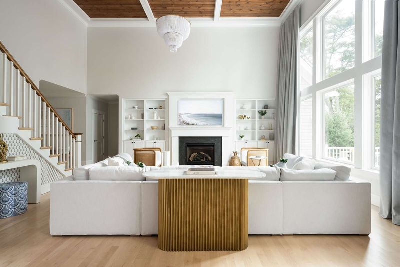
Massive, overstuffed furniture pieces swallow space in open-plan living areas. Those giant sectionals and oversized recliners that look perfect in showrooms often overwhelm real-world spaces, making movement difficult and rooms feel smaller than they are.
Scale matters tremendously in open layouts. When seating is too bulky, it creates visual heaviness that works against the airy feeling you’re trying to achieve.
Choose furniture with a lighter visual footprint pieces with exposed legs create a sense of space underneath, while lower-profile backs don’t block sightlines across the room. If you crave comfort, focus on quality cushioning rather than excessive size. Consider modular pieces that can be reconfigured as needed, and remember that multiple smaller seating options often work better than one massive piece, allowing for more flexible arrangements and easier conversation.
12. Insufficient Acoustics
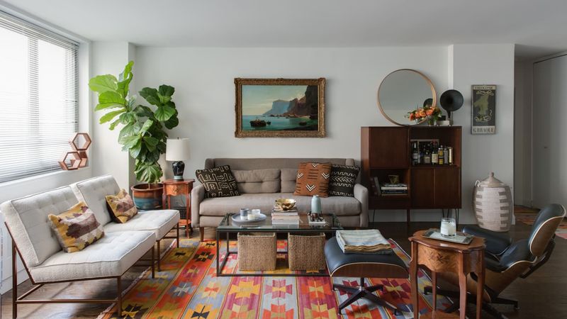
Sound bouncing off hard surfaces creates acoustic nightmares in open-plan spaces. Without proper sound management, conversations compete with kitchen noise, TV sound travels everywhere, and echoes make the space feel cold and unwelcoming.
Acoustic challenges are among the most overlooked aspects of open-plan design. Many beautiful spaces become practically unusable because nobody considered how sound would behave in the environment.
Soft furnishings are your first defense against noise problems plush rugs, upholstered furniture, and fabric window treatments all absorb sound waves. Strategic placement of bookshelves filled with books creates irregular surfaces that diffuse sound. Acoustic ceiling treatments or decorative sound panels can be incorporated as design elements. For serious sound issues, consider zone-specific solutions like partial height dividers or glass partitions that block sound without blocking light.
13. Mismatched Furniture Styles
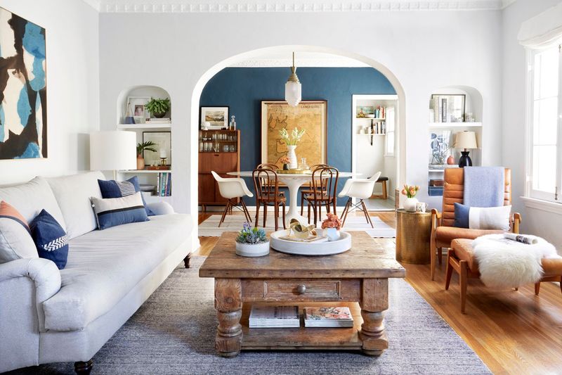
Furniture style whiplash occurs when your dining area screams farmhouse while your living room shouts mid-century modern. Since everything is visible simultaneously in open plans, stylistic inconsistency creates visual confusion.
Style cohesion doesn’t mean everything must match perfectly. The goal is creating dialogue between pieces so they feel intentionally collected rather than randomly assembled.
Find a common thread to unite different styles perhaps similar wood tones across various pieces, consistent metal finishes, or a color palette that ties everything together. If mixing periods, look for complementary shapes or proportions. Transitional pieces that bridge different styles help create harmony.
14. Over-reliance on Wi-Fi Setup

Wireless dead zones plague many open-plan homes, where signals must travel greater distances and through more obstacles. Frustrating connectivity issues arise when your router placement doesn’t account for your space’s specific challenges.
Many homeowners assume a single router will cover their entire open space, only to discover mysterious dead zones where streaming buffers endlessly or video calls drop. These problems worsen when multiple people use the network simultaneously.
Router position matters tremendously central locations at eye level work best, away from signal-blocking appliances. For larger spaces, mesh network systems with multiple access points eliminate dead zones by creating a blanket of coverage. Hardwired connections for stationary devices like smart TVs reduce wireless congestion. Consider consulting with a networking professional during renovation planning to incorporate ethernet wiring in walls before they’re closed up.
15. No Greenery
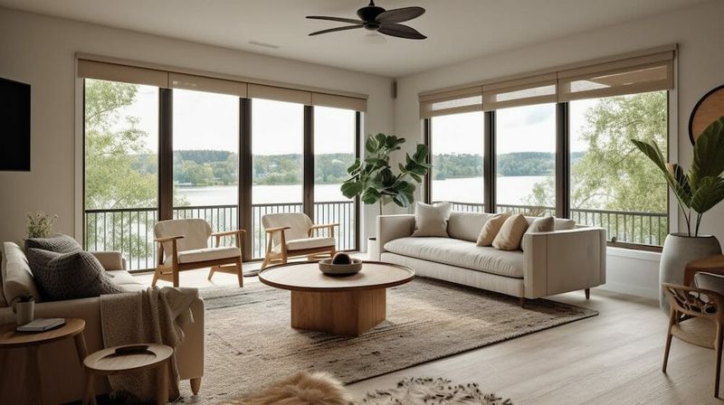
Plant-free open spaces often feel sterile and lifeless, missing the organic element that connects our indoor environments to nature. Without greenery, even beautifully designed spaces can feel cold and uninviting.
Living plants do more than just look pretty they improve air quality, regulate humidity, and have been proven to reduce stress levels. They’re also perfect for softening the hard edges and surfaces common in contemporary open plans.
Strategically placed plants create natural divisions between zones without blocking sightlines. Tall floor plants draw the eye upward, connecting ceiling and floor planes. Trailing plants soften shelving units or kitchen islands. For low-maintenance options, consider snake plants, ZZ plants, or pothos that thrive with minimal care. If natural light is limited, high-quality faux plants have become increasingly realistic alternatives that still provide visual texture.
16. Exposed Pipes
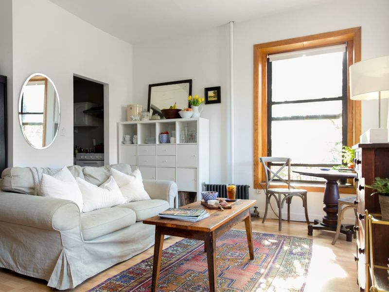
Unintentional industrial chic happens when plumbing, ductwork, or electrical components remain exposed without thoughtful integration. Unlike deliberately styled industrial spaces, these random exposed elements create visual distraction rather than design interest.
During renovations to create open plans, structural elements sometimes can’t be fully concealed. Without proper planning, these necessary components become eyesores that draw attention for all the wrong reasons.
If complete concealment isn’t possible, intentional integration is key. Paint exposed pipes and ductwork to match ceiling color for minimal visual impact. Alternatively, embrace them as design features by painting them in contrasting colors or metallic finishes. Boxing in pipes with decorative covers creates architectural interest while hiding utilitarian elements. Remember that lighting draws attention avoid spotlighting areas with exposed mechanical components unless they’re part of your intentional design scheme.
17. Too Little Contrast
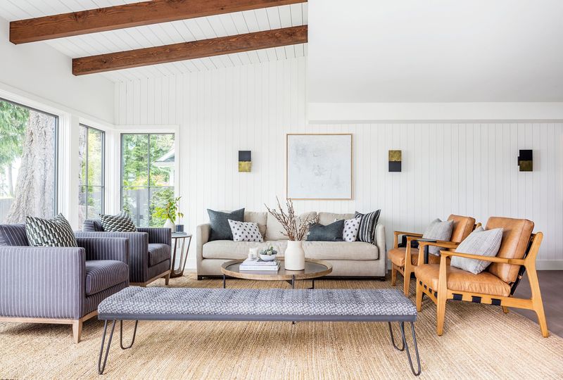
Monochromatic blandness happens when everything blends together in a sea of sameness. While coordination matters in open plans, spaces without sufficient contrast lack the visual interest that makes rooms memorable and engaging.
Contrast creates focal points that draw the eye and establish visual hierarchy. Without these variations in color, texture, or form, your space feels flat and uninspiring, like a hotel room rather than a personal sanctuary.
Add contrast through varied textures even within a limited color palette smooth leather against nubby fabric, glossy surfaces against matte finishes. Incorporate darker accent pieces against lighter backgrounds to create depth. Architectural details like exposed beams or molding add structural contrast. Even subtle variations matter different wood tones within the same family create richness without clashing. Remember that contrast doesn’t require bold color it can be achieved through materials, finishes, and forms.

