11 California Paint Colors That Date Living Rooms
When it comes to home decor, paint colors can make or break your living space. California’s design trends have seen many paint colors come and go over the years. If you’re wondering why your living room feels stuck in a time warp, the culprit might be on your walls.
Let’s explore 11 California paint colors that instantly age your living room and what you might consider instead.
1. Avocado Green
This iconic 70s shade made a brief comeback in the early 2010s California eco-design movement. Now it sits firmly in the “retro but not in a good way” category.
The yellowish-green tone creates a dingy atmosphere that’s hard to complement with modern decor. I’ve seen countless clients struggle to make this work in their spaces. Modern alternatives like sage or olive provide similar natural vibes without the dated feel.
2. Builder Beige
The infamous pinky-beige that covered walls across California developments from the 90s through early 2000s is the ultimate living room ager. You know the one – not quite tan, not quite pink, just… blah.
This color wasn’t even attractive when it was popular! It was simply inoffensive enough for mass appeal. The undertones clash with virtually everything, making your space look perpetually dingy. Modern neutrals with clearer undertones – warm greige or cool taupe – offer sophistication that basic beige never could.
3. Terracotta Overload
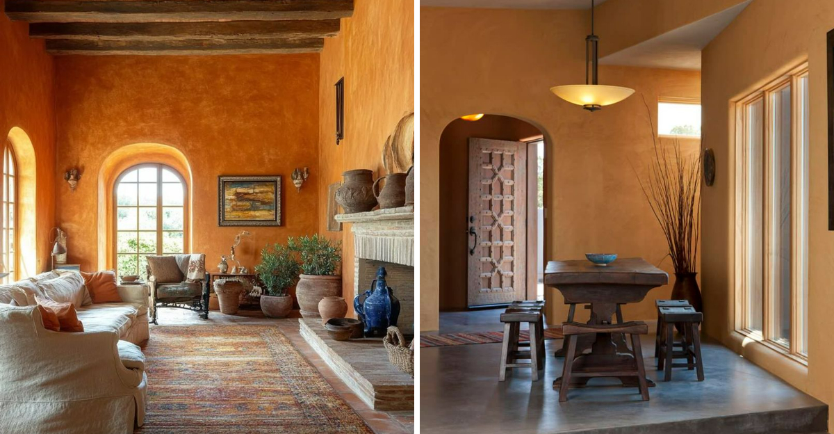
Remember those earthy orange-brown walls that swept through California homes in the early 2000s? This warm hue once represented Mediterranean luxury but now screams “outdated desert aesthetic.”
The heavy, clay-like color makes rooms feel smaller and darker than they actually are. Plus, it clashes with most modern furniture styles. If you still love warmth, consider softer terracotta accents instead of full walls.
4. Mauve Madness
The dusty purple-pink shade that took California by storm in the late 80s and early 90s is a dead giveaway of an untouched living room. Often paired with seafoam green accents and brass fixtures, this color creates an instant time warp.
The powdery, muted quality of mauve makes spaces feel stuffy and formal in all the wrong ways. I’ve helped many homeowners transform these spaces by switching to cleaner colors. If you love purple tones, contemporary lavenders or deep plums offer similar color families without the dated baggage.
5. Tuscan Yellow
Nothing says “I haven’t updated my home since 2005” quite like those golden yellow walls that dominated the California Tuscan trend. The overly saturated yellow-gold tone instantly transports visitors back to the era of McMansions and faux-finish everything.
Paired with the dark cherry wood and wrought iron that typically accompanied this look, your living room becomes a time capsule. For a fresher take on yellow, pale buttery tones or muted mustards offer warmth without the dated associations.
6. Chocolate Brown
Dark brown walls were California’s answer to sophistication in the mid-2000s. Popularized by celebrity designers, this color turned countless living rooms into cave-like spaces that now feel impossibly dark and heavy.
The oppressive quality makes rooms feel smaller and more confined – exactly what most California homeowners try to avoid. Natural light gets swallowed up instead of bounced around. For a modern take on richness, consider deep navy or charcoal as sophisticated alternatives that won’t shrink your visual space.
7. Teal Overload
The jewel-toned teal that dominated California coastal homes around 2008-2012 has quickly become a time stamp on living room walls. What once felt beachy and bold now reads as a trendy choice from a specific era.
The intensity of this color makes it particularly challenging to update without a complete overhaul. Many of my clients still love blue-green tones but need something more timeless. Softer sage greens or muted slate blues provide similar refreshing qualities without screaming “I decorated during the Obama administration.”
8. Burgundy Accent Walls
Those deep red accent walls that California designers once recommended as a “pop of color” now serve as monuments to early 2000s design trends. The wine-colored focal point that was supposed to add drama now just adds years to your living room’s perceived age.
The heavy, formal quality feels disconnected from California’s current preference for lighter, more natural aesthetics. If you still want dimension, consider textured treatments in neutral tones or large-scale art instead. Your living room will instantly feel more current without losing personality.
9. Peachy Coral Explosion
Remember when Miami Vice style influenced everything in California homes? That peachy-coral shade plastering your walls screams 1980s faster than a neon sign. The salmon-adjacent tone creates a dated, washed-out atmosphere that fights with nearly every piece of modern furniture.
Interior designers now recommend replacing this faded tropical tone with more timeless neutrals or contemporary pastels. The warm undertones often make rooms feel smaller and stuffier than they actually are.
Fun fact: This color became popular during California’s 1980s building boom, appearing in thousands of tract homes from Orange County to the Bay Area. Nearly four decades later, it remains one of the first colors real estate agents recommend changing before listing a home.
10. Forest Green Saturation
Nothing dates a California living room quite like forest green paint covering every surface. Popular during the 1990s West Coast nature-inspired design movement, this overwhelming dark green creates cave-like spaces that feel perpetually stuck in the grunge era.
The heavy pigmentation absorbs rather than reflects California’s beautiful natural light. When paired with the oak trim and brass fixtures that typically accompany it, you’ve got a time capsule that screams “Clinton administration.”
Many homeowners inherited these emerald chambers when purchasing older homes throughout San Diego and Los Angeles suburbs. Professional stagers now recommend lighter, more versatile green-gray tones that honor California’s connection to nature without the dated heaviness.
11. Sponge-Painted Blue Disaster
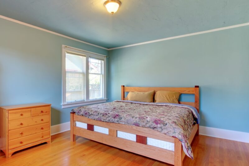
The textured blue sponge-painted walls that swept through California homes in the late 1990s now mark your living room as hopelessly outdated. This faux-finish technique was meant to add Mediterranean flair to coastal properties from La Jolla to Malibu, but instead created busy, distracting surfaces that fight with everything else in the room.
The uneven application and multiple blue tones create a choppy visual effect that makes spaces feel smaller and more chaotic. Modern California design embraces clean lines and simple surfaces.
Surprisingly, this labor-intensive technique required significant skill to apply, making it an expensive upgrade at the time. Today, designers recommend flat or eggshell finishes in singular, carefully chosen hues that allow California’s spectacular natural light to work its magic without competition.

