12 Color Rules The Property Brothers Swear By
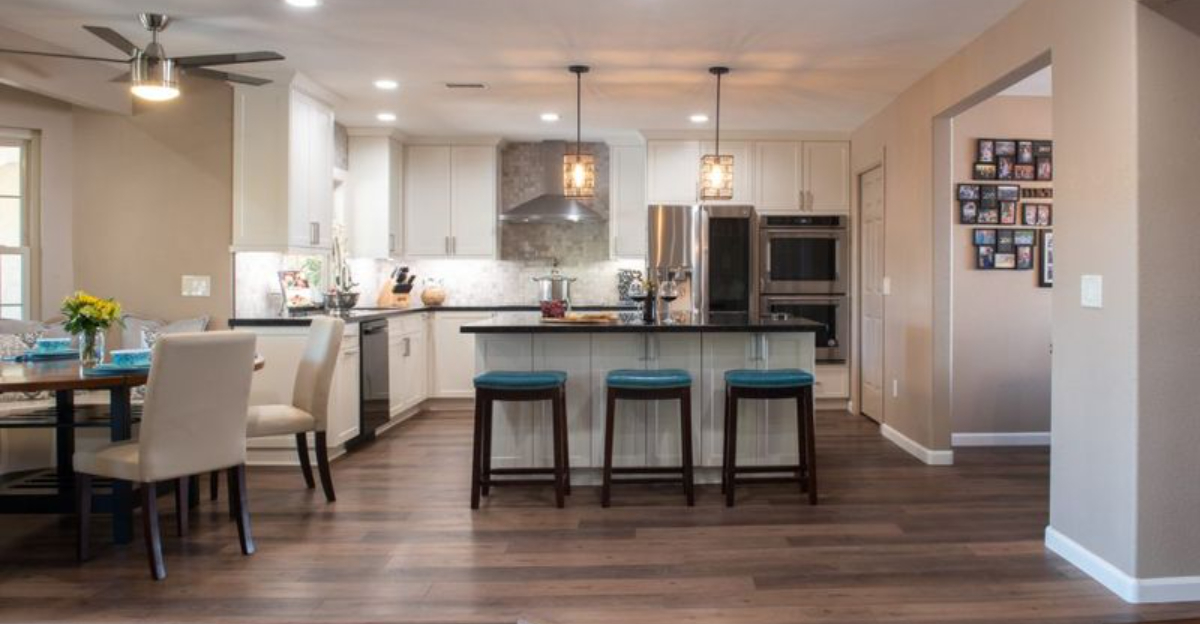
When it comes to transforming houses into dream homes, few experts have the color know-how of HGTV’s Property Brothers.
Drew and Jonathan Scott have turned countless drab spaces into stunning showplaces with their smart color choices.
Their approach isn’t just about picking pretty hues it’s about creating spaces that feel balanced, personal, and perfectly put together. Let’s explore the color rules these renovation superstars live by when designing picture-perfect homes.
1. Stick to a neutral base
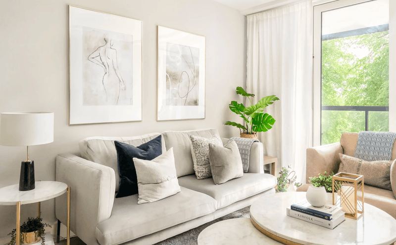
Neutral walls create the perfect canvas for any room’s design. The Property Brothers often recommend shades like greige (gray-beige), soft taupe, or warm white for main living spaces. These versatile backgrounds let furniture and accessories truly shine.
I’ve noticed they particularly favor Benjamin Moore’s ‘Revere Pewter’ and Sherwin-Williams’ ‘Agreeable Gray’ in many of their renovations. These chameleon-like colors adapt beautifully to different lighting conditions throughout the day.
Your neutral base doesn’t mean boring! Jonathan often points out that texture in neutral walls like subtle grasscloth or a matte finish adds depth without overwhelming the space.
2. Add contrast for depth
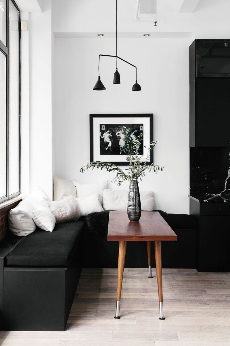
Contrast makes rooms feel dynamic and intentional. The brothers frequently pair light walls with darker furniture pieces or vice versa to create visual interest that draws the eye around the space.
During a recent renovation, Jonathan explained how black window frames against white walls created architectural definition that made the entire room feel more expensive. This high-contrast approach works especially well in open-concept spaces where you need subtle visual boundaries.
If you’re nervous about too much contrast, try incorporating it through smaller elements first dark picture frames, light curtains, or patterned pillows that blend your light and dark tones together.
3. Use bold colors sparingly
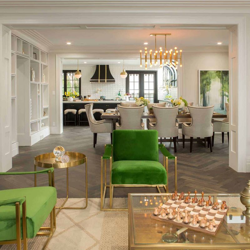
Bold doesn’t mean everywhere! Drew often reminds homeowners that vibrant colors work best as accents rather than dominant features. Think colorful throw pillows, artwork, or a single statement piece of furniture.
The brothers’ approach typically involves selecting one or two bold accent colors that repeat throughout the space in small doses. This creates a cohesive look without overwhelming the senses. On a recent episode, they used emerald green accents in pillows, a vase, and artwork to tie a neutral living room together.
When using bold colors, quality matters more than quantity. One gorgeous teal chair can make more impact than painting an entire wall.
4. Keep ceilings light to open space
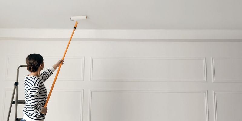
White ceilings are a signature element in Property Brothers renovations. Jonathan explains that light-colored ceilings reflect more light and create the illusion of height, making spaces feel larger and more open.
Even in rooms where they experiment with darker wall colors, the brothers almost always keep ceilings bright. This technique works particularly well in basement renovations or rooms with limited natural light where maximizing brightness becomes crucial.
If pure white feels too stark against your wall color, try an off-white or the lightest shade on your wall color’s paint strip. The brothers recommend ceiling paint with a flat finish to hide imperfections and reduce glare.
5. Match undertones in finishes
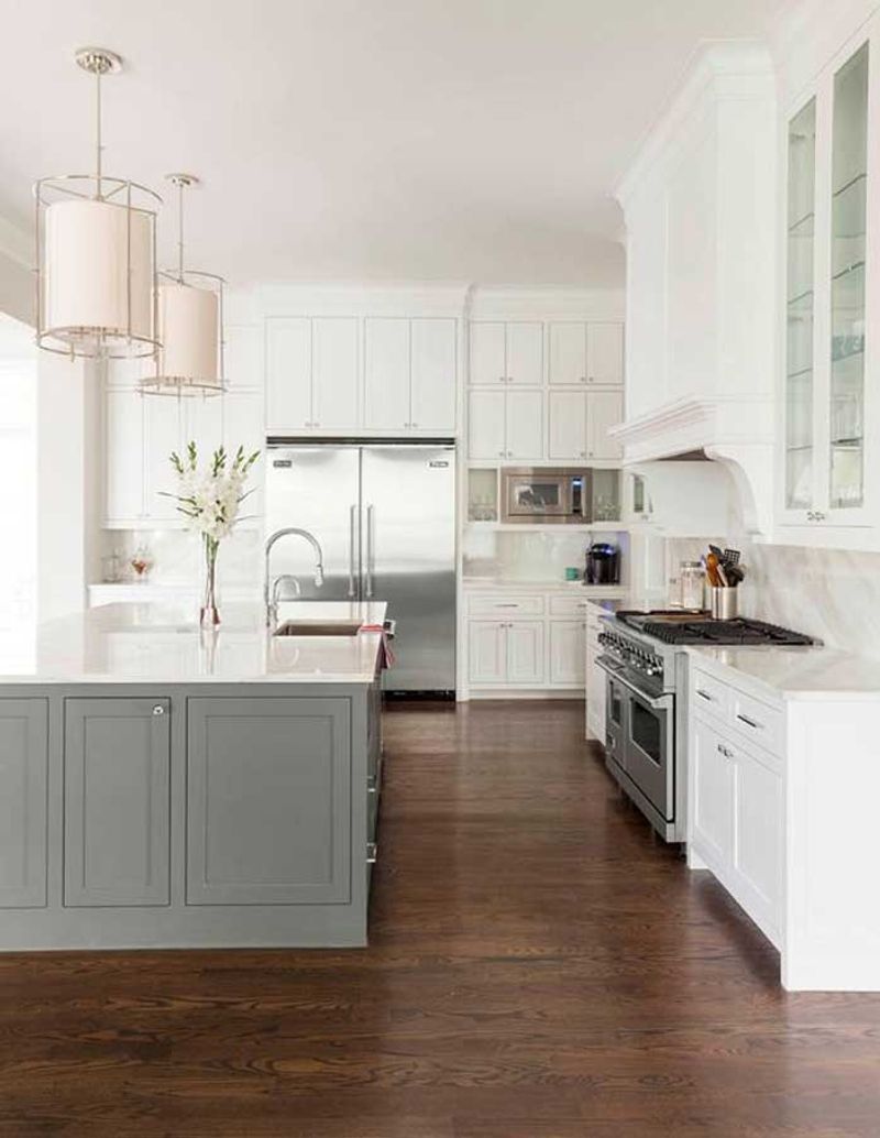
Undertone coordination is something the Property Brothers emphasize constantly. When selecting paint, flooring, countertops, and cabinetry, they ensure all undertones work together – whether warm or cool.
During a kitchen renovation, Drew pointed out how they chose a warm greige paint to complement honey-toned hardwood floors, while cool gray walls would have clashed. This attention to undertones creates a harmonious flow that might not be immediately obvious but makes spaces feel professionally designed.
I’ve learned from watching their shows that holding samples next to each other in natural light is the best way to check if undertones complement each other. Warm undertones have hints of yellow or red, while cool undertones contain blue, green, or purple.
6. Let natural light guide choices
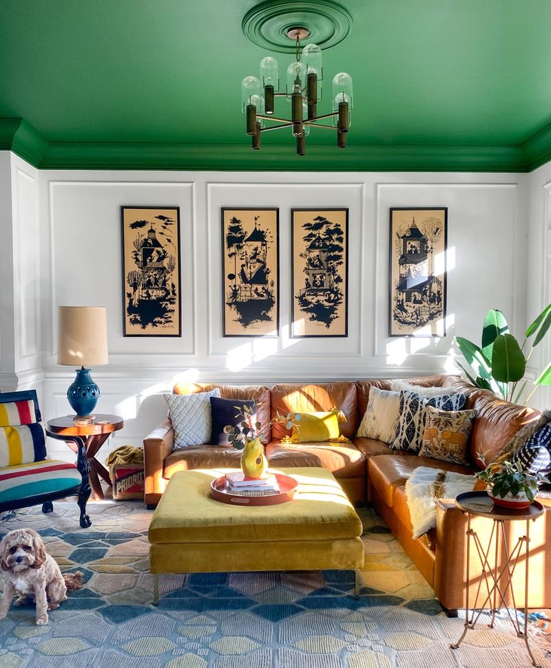
Natural light dramatically affects how colors appear in a space. The Property Brothers always consider a room’s exposure when selecting paint colors north-facing rooms might need warmer tones to counteract cooler light, while south-facing spaces can handle cooler colors without feeling chilly.
Jonathan often mentions how the same paint color can look entirely different from morning to evening. That’s why they recommend testing paint samples at different times of day before committing.
If a room lacks natural light, the brothers suggest slightly warmer paint tones than you might initially choose. Cool colors in dark rooms can sometimes feel dreary, while warmer tones create a cozy, welcoming atmosphere even without abundant sunlight.
7. Don’t ignore trim and doors
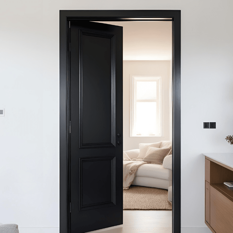
Trim and doors offer perfect opportunities for subtle contrast that elevates a home’s design. While many homeowners focus exclusively on wall color, the Property Brothers demonstrate how thoughtful trim colors create architectural interest.
White trim against colored walls is their classic choice, but they’ve also used black trim for drama and painted trim the same color as walls for a modern, seamless look. In one memorable renovation, they painted interior doors a deep navy while keeping trim white creating focal points throughout the home.
Semi-gloss or satin finishes work best for trim and doors since they’re more durable and easier to clean than flat paint. The slight sheen also creates a pleasing contrast against matte wall finishes.
8. Use color to define zones
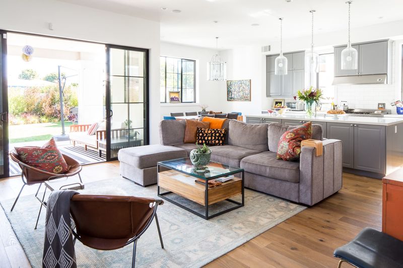
Color zoning is brilliant for open-concept spaces. The brothers often use subtle color shifts to visually separate areas without disrupting flow. A slightly deeper shade in the dining area compared to the living room, for instance, creates definition while maintaining harmony.
Another technique they employ is using consistent wall colors but changing accent colors between zones. The kitchen might feature blue accessories while the adjacent living area incorporates orange accents, creating distinct spaces within the same visual plane.
Rugs also play a crucial role in their color zoning strategy. A bold area rug can anchor a conversation area with its unique color palette while still connecting to the room’s overall scheme through subtle color threads.
9. Stick to a 60-30-10 balance

Balance is everything in color distribution. The Property Brothers regularly apply the 60-30-10 rule: 60% dominant color (usually walls), 30% secondary color (typically furniture), and 10% accent color (accessories and art).
This formula creates spaces that feel cohesive rather than chaotic. During a recent home transformation, Jonathan explained how they used warm gray for 60% (walls and some furniture), wood tones for 30% (floors and case goods), and emerald green for 10% (pillows, vases, and artwork).
You don’t need to measure exactly, but keeping this rough proportion in mind helps create rooms that feel professionally designed. The 10% accent color is where you can incorporate trendy or bold hues that might be overwhelming in larger doses.
10. Test paint in daylight and evening
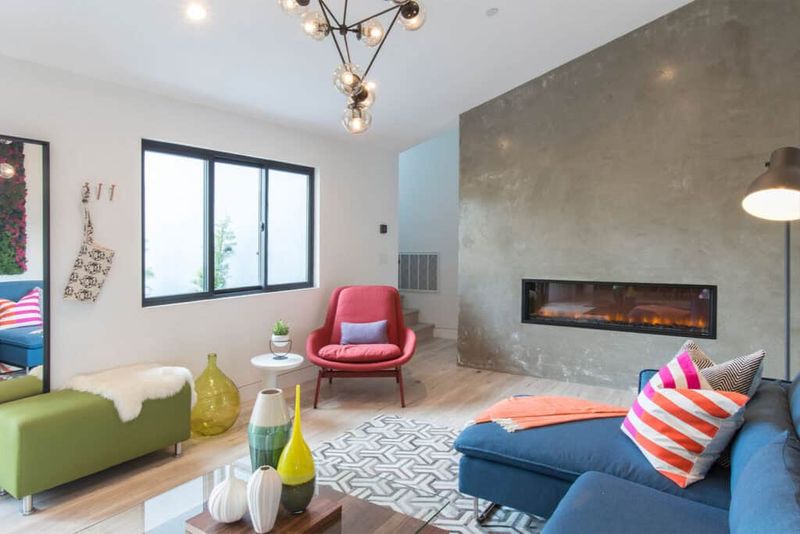
Paint testing is non-negotiable according to the Scott brothers. They consistently show homeowners how dramatically colors shift between morning, afternoon, and evening light – sometimes appearing completely different.
Their method involves painting large swatches (at least 2’x2′) on multiple walls and living with them for several days. This approach reveals how the color interacts with your specific lighting conditions and existing furnishings.
Drew often points out that paint colors generally appear darker on walls than on small sample cards. If you’re torn between two shades, the brothers typically recommend going with the lighter option, as it will likely look closer to your vision once covering an entire wall.
11. Layer texture, not just color
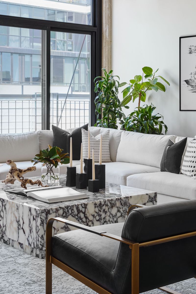
Texture creates dimension that flat color alone cannot achieve. The Property Brothers regularly incorporate textural elements in neutral spaces to add visual interest without relying solely on bold colors.
In a recent monochromatic bedroom, they created depth through varied textures: velvet pillows, a chunky knit throw, grasscloth wallpaper, and a woven headboard. Though all elements shared a similar color family, the room felt rich and layered rather than flat.
Mixing textures also helps spaces feel lived-in rather than staged. Jonathan often suggests incorporating natural materials like wood, stone, metal, and plants to add organic texture that complements your color palette while making rooms feel more inviting and complete.
12. Always swatch before committing
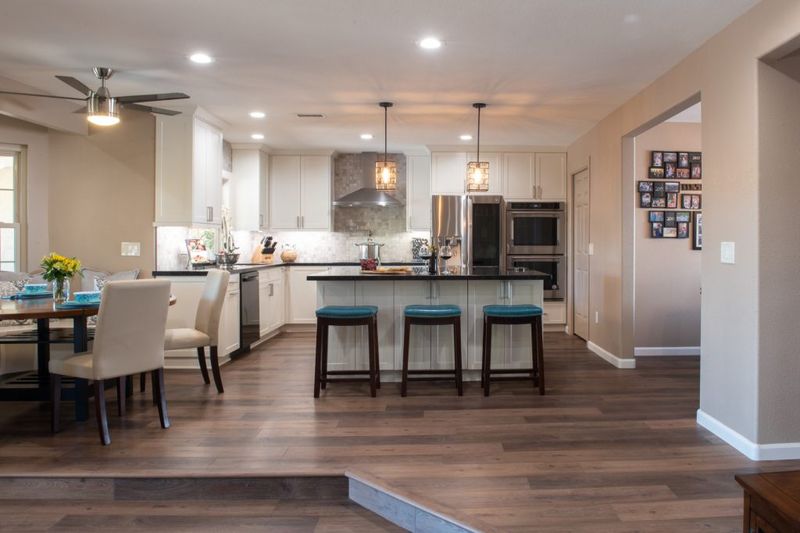
Paint swatching is perhaps the brothers’ most emphatic rule. They’ve shown countless examples of homeowners who skipped this step and regretted their color choices once seeing them on all four walls.
Their swatching technique involves painting at least three options on multiple walls and observing them for a minimum of 48 hours. This reveals how each color responds to your specific lighting conditions throughout the day and evening.
Jonathan recommends painting swatches near architectural elements like trim and flooring to see how colors interact with existing finishes. Drew adds that viewing swatches alongside fabric samples, countertop materials, or furniture pieces helps ensure your entire color scheme works together before you commit to gallons of paint.


