14 Couch Colors South Carolinians Are Slowly Phasing Out
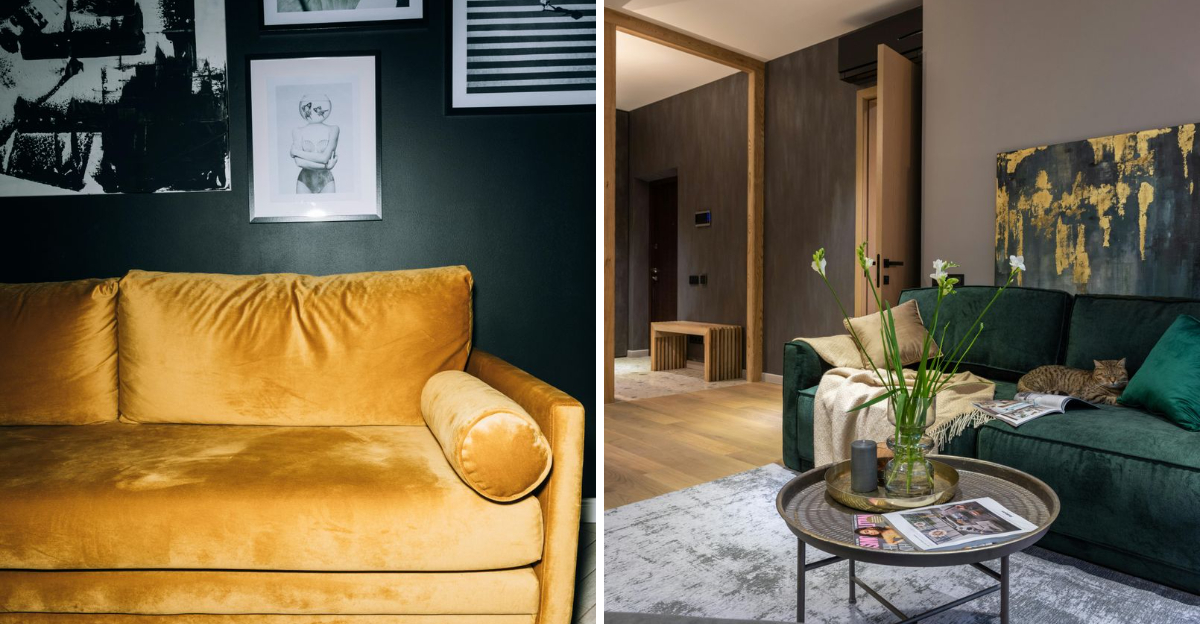
South Carolina living rooms are undergoing a quiet transformation.
Homeowners across the Palmetto State are rethinking their furniture choices, particularly when it comes to couch colors that once dominated showrooms and catalogs.
Whether it’s the relentless red clay stains, the blazing summer sun fading fabrics, or simply evolving tastes, certain hues are getting left behind in favor of more practical and timeless options.
1. Cool Gray
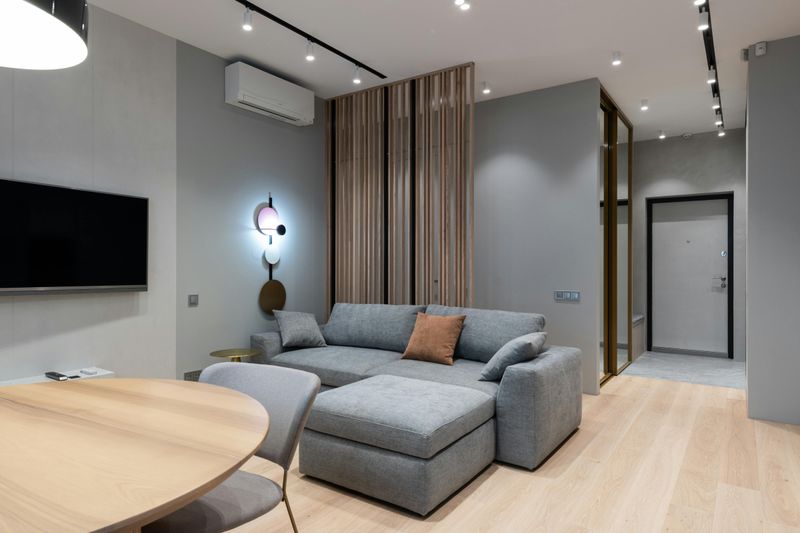
Cool gray once felt like the ultimate neutral choice for South Carolina homes.
Everyone wanted that sleek, modern vibe that seemed so sophisticated in magazines.
But reality hit hard when homeowners realized these tones felt cold and unwelcoming.
The abundant natural light pouring through Carolina windows made these couches look washed out and sterile.
Rooms lost their warmth and personality, feeling more like waiting rooms than cozy family spaces.
Dust and pet hair showed up relentlessly on the fabric, creating constant maintenance headaches.
The one-dimensional quality meant cool gray couldn’t adapt to seasonal decor changes.
Now, folks are choosing warmer neutrals like taupe, greige, or soft beige instead.
These alternatives bring comfort back into the living room without sacrificing style or versatility.
2. Bright White
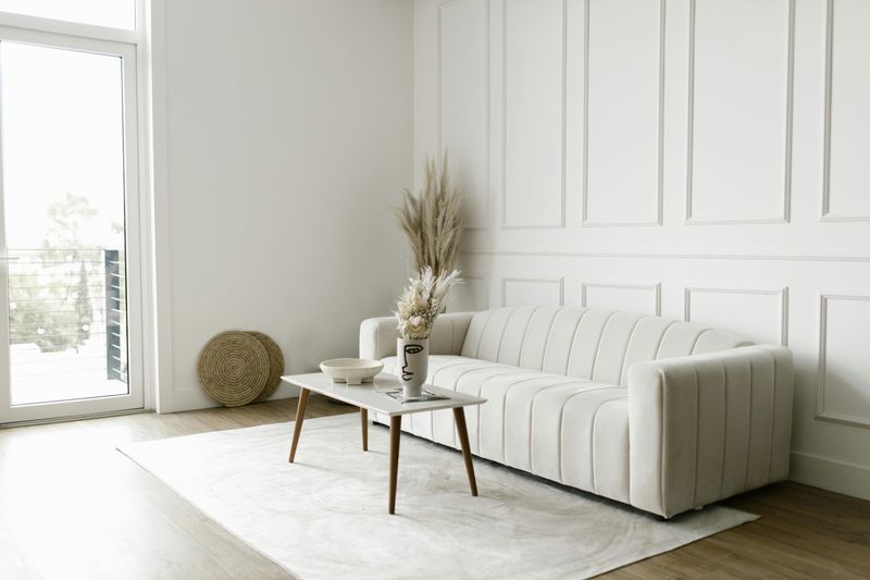
Bright white couches promised a clean, airy aesthetic that looked stunning in showrooms.
South Carolinians quickly discovered this color was a maintenance nightmare in real life.
Red clay from shoes, beach sand tracked in from coastal trips, and inevitable sweet tea spills created constant staining challenges.
Families with kids or pets found themselves living in fear of every snack and muddy paw print.
The fabric demanded professional cleaning far more often than anyone anticipated.
Coastal humidity also meant white upholstery could develop mildew or yellowing over time.
Even the most careful homeowners struggled to keep these couches looking fresh.
Practical alternatives like cream, ivory, or light tan offer similar brightness without the stress.
These shades hide minor imperfections while still creating an open, welcoming atmosphere.
3. Dark Gray
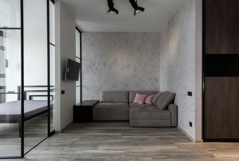
Dark gray seemed like the perfect compromise between style and practicality at first glance.
Homeowners thought this deeper shade would hide stains better than lighter options.
Instead, they discovered it absorbed natural light, making rooms feel cramped and cave-like.
Every piece of lint, thread, and pet hair stood out like a beacon against the dark fabric.
Crumbs from snacks became glaringly obvious, requiring constant vacuuming and upkeep.
The heavy, somber tone made spaces feel smaller and less inviting for gatherings.
South Carolina’s love for bright, cheerful interiors clashed with this oppressive darkness.
Furniture stores now report customers gravitating toward mid-tone grays or warm charcoals instead.
These alternatives provide depth without the light-absorbing, space-shrinking effects that made dark gray so problematic for everyday living.
4. Navy Blue
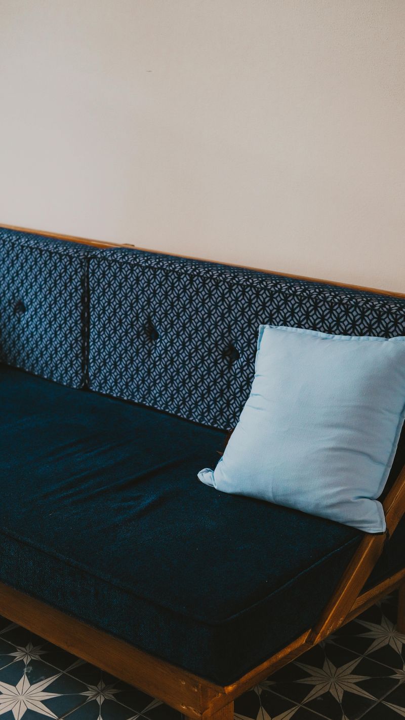
Navy blue couches once represented timeless elegance and coastal sophistication throughout the Lowcountry.
The reality proved far less romantic for South Carolina homeowners with sun-drenched living rooms.
Large windows allowed UV rays to fade the rich blue dramatically within just a couple of years.
Spring brought another challenge as yellow pollen coated everything, showing up starkly against navy fabric.
The contrast made the sofas look perpetually dirty, no matter how often they were cleaned.
Deep blue also made small rooms feel darker and more confined than expected.
Matching decor became tricky as the faded patches created uneven coloring across cushions.
Homeowners now prefer lighter blues like powder or sky tones that age more gracefully.
These softer shades maintain their color longer and create a fresher, more adaptable foundation for changing decor styles.
5. Aqua
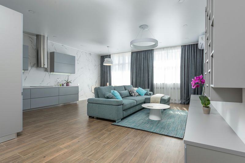
Aqua couches captured the imagination of coastal Carolina homeowners seeking that beachy vibe.
The vibrant turquoise tones felt fun and vacation-like when first purchased from showrooms.
But this bold choice quickly revealed itself as too theme-specific for long-term satisfaction.
Homeowners felt trapped in a permanent beach house aesthetic that limited decorating flexibility.
Changing throw pillows or adding seasonal decor became challenging when the couch screamed summer year-round.
The loud, attention-grabbing color dominated rooms rather than complementing them gracefully.
Guests often commented on the bold choice, making owners self-conscious about their decision.
Resale value suffered too, as potential buyers couldn’t envision their own style around such a statement piece.
Neutral coastal tones like sand, driftwood gray, or soft seafoam now offer beachy charm without the overwhelming commitment that made aqua so problematic.
6. Millennial Pink
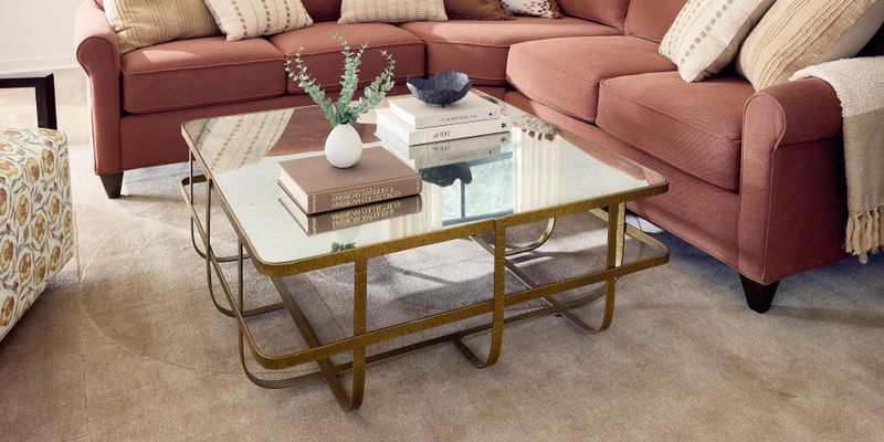
Millennial pink dominated Instagram feeds and furniture showrooms for years across South Carolina.
The soft blush tone felt fresh and youthful when it first gained popularity.
But homeowners eventually tired of the overly sweet, juvenile quality that made living rooms feel less sophisticated.
The trend-driven color quickly dated itself, making homes feel stuck in a specific era.
Guests could instantly pinpoint when the furniture was purchased based on this telltale hue.
Pairing millennial pink with other colors proved surprisingly difficult as tastes evolved.
The shade clashed with emerging trends toward earthier, more grounded palettes.
Resale became problematic as younger buyers associated it with an outdated aesthetic.
Richer tones like terracotta, rust, or clay now offer warmth and personality without the overly trendy, soon-to-be-dated quality that made millennial pink lose its appeal so rapidly.
7. Chocolate Brown
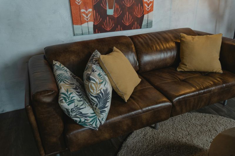
Chocolate brown leather couches were once the gold standard for South Carolina family rooms.
Every suburban home seemed to feature this dependable, masculine shade in the early 2000s.
But times have changed, and this once-popular choice now feels heavy and outdated.
The dark color absorbs light and makes spaces feel closed-in rather than open and welcoming.
Modern design preferences favor lighter, airier aesthetics that chocolate brown simply cannot provide.
Heat retention became another issue in South Carolina’s humid climate, making leather uncomfortably sticky.
The formal, traditional vibe clashed with contemporary desires for relaxed, casual living spaces.
Younger homeowners especially reject this shade as reminiscent of their parents’ decorating choices.
Lighter caramels, tans, or cognac tones offer warmth without the oppressive darkness that pushed chocolate brown out of favor in modern Carolina homes.
8. Burgundy
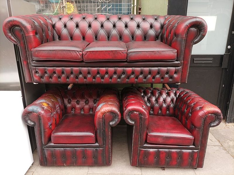
Burgundy couches once signaled refined taste and formal elegance in upscale Carolina homes.
The wine-colored upholstery appeared in countless traditional living rooms throughout the state.
However, this dramatic shade now reads as stuffy and old-fashioned to contemporary sensibilities.
The deep red tone made rooms feel darker and smaller than homeowners desired.
Matching throw pillows and decor became a constant challenge with such a dominant color.
Burgundy also showed fading and wear patterns more obviously than expected over time.
The formal, uptight vibe contradicted modern preferences for comfortable, livable family spaces.
Resale values dropped as buyers walked away from homes featuring this dated furniture choice.
Softer reds like terracotta, coral, or burnt sienna now provide warmth and character without the heavy, old-world formality that made burgundy feel like a relic from another era entirely.
9. Sage Green
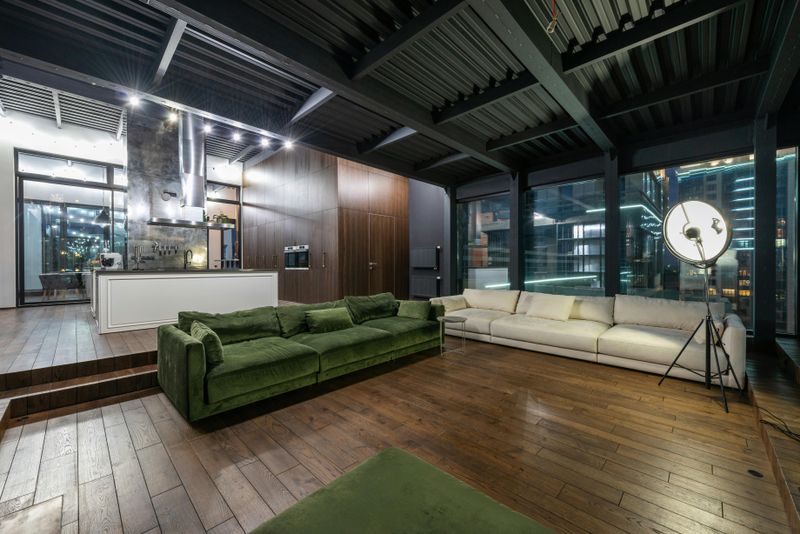
Sage green enjoyed a brief moment as the darling of farmhouse-style decorating across South Carolina.
The muted, earthy tone promised to bring nature indoors with calming, organic vibes.
But homeowners discovered this particular shade of green felt dull and lifeless in actual living spaces.
The color appeared muddy rather than fresh, especially in rooms without abundant natural light.
Pairing sage with other colors proved surprisingly tricky as it clashed with many popular palettes.
Seasonal decorating became frustrating since the green limited holiday and occasion-specific styling options.
The farmhouse trend itself began fading, leaving sage green furniture feeling dated and overdone.
Resale concerns mounted as buyers increasingly rejected this overly trendy choice from recent years.
Brighter greens like emerald or forest tones now offer more versatility and timeless appeal without the washed-out, trend-trapped quality that ended sage green’s brief popularity.
10. Mustard Yellow
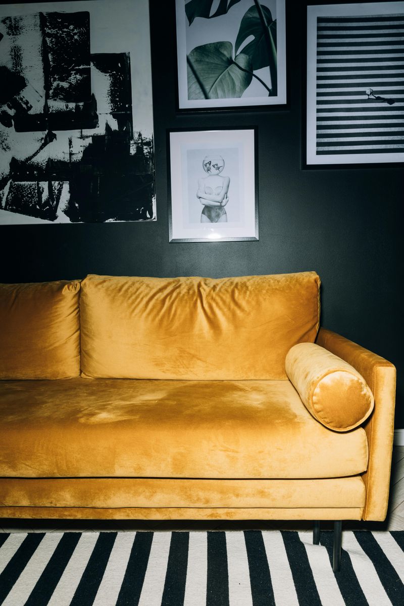
Mustard yellow burst onto the scene as a bold, statement-making choice for adventurous decorators.
The golden-toned upholstery promised to inject energy and personality into South Carolina living rooms.
Reality proved less sunny as homeowners struggled with the overwhelming presence of this intense hue.
The color dominated spaces rather than enhancing them, making rooms feel visually exhausting.
Coordinating throw pillows, rugs, and wall colors became an endless challenge with such a demanding shade.
Mustard also clashed with South Carolina’s red clay undertones that inevitably found their way indoors.
The trendy color quickly dated itself, signaling a specific design moment rather than a timeless style.
Guests often had strong reactions, making homeowners second-guess their bold choice repeatedly.
Softer golds, buttery yellows, or warm ochres now provide warmth without the aggressive, look-at-me quality that made mustard yellow too much for everyday living.
11. Black
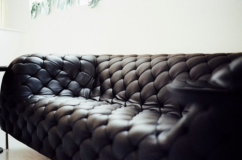
Black couches promised sophisticated drama and easy maintenance for style-conscious South Carolinians.
The sleek, modern aesthetic looked stunning in furniture showrooms under perfect lighting conditions.
But real-world living revealed black as impractical and high-maintenance for most households.
Every speck of dust, lint, and pet hair showed up with startling clarity against the dark surface.
The color absorbed light ruthlessly, making rooms feel cave-like and uninviting during evening hours.
Black leather became uncomfortably hot in South Carolina’s climate, sticking to skin during humid months.
The stark, severe tone felt cold and unwelcoming rather than cozy and comfortable.
Families found the formal vibe incompatible with relaxed, everyday living and entertaining needs.
Softer charcoals, deep grays, or rich browns now offer sophistication without the impractical, space-shrinking, dust-showing qualities that made black couches more trouble than they were worth.
12. Coral
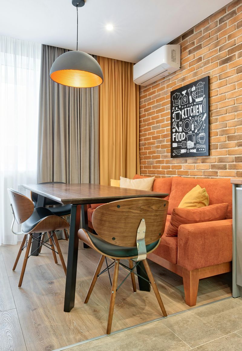
Coral couches rode the wave of tropical-inspired decorating that swept through coastal Carolina communities.
The peachy-orange tone felt vibrant and vacation-ready when first brought home from stores.
But this attention-grabbing shade quickly proved too bold for long-term satisfaction in most homes.
The color clashed with undertones in flooring, creating visual discord that bothered homeowners daily.
Seasonal decorating became nearly impossible as coral dominated every design decision year-round.
The tropical vibe felt forced and theme-park-like rather than authentically coastal or sophisticated.
Guests frequently commented on the bold choice, making owners increasingly self-conscious about their purchase.
Fading became noticeable quickly, turning vibrant coral into washed-out salmon tones within months.
Softer peaches, muted terracottas, or warm tans now provide coastal warmth without the overwhelming, trend-dependent quality that made coral a regrettable choice for so many Carolina homeowners.
13. Olive Green
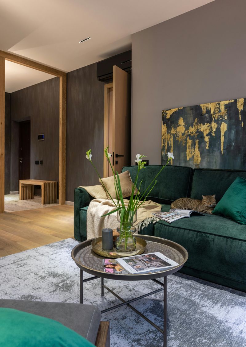
Olive green emerged as a sophisticated alternative to brighter, trendier green shades recently.
The earthy, military-inspired tone appealed to homeowners seeking grounded, natural aesthetics for their spaces.
But South Carolinians discovered olive felt heavy and depressing rather than calming and organic.
The dark, muddy quality absorbed light and made rooms feel smaller and more confined.
Pairing olive with other colors proved challenging as it muddied rather than enhanced most palettes.
The shade showed dust and wear patterns more obviously than expected over time.
Seasonal decorating felt limited since olive’s strong personality clashed with many holiday color schemes.
The military association made some guests uncomfortable, creating unexpected conversation topics during gatherings.
Brighter forest greens, emeralds, or even soft eucalyptus tones now offer natural appeal without the dark, heavy, mood-dampening quality that made olive green ultimately unsatisfying for most Carolina living rooms.
14. Mauve
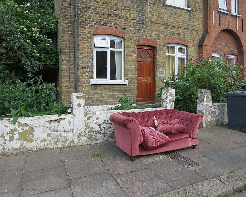
Mauve represented a softer, more sophisticated take on purple tones for Carolina homeowners.
The dusty purple-pink shade felt romantic and unique when compared to standard neutral options.
But this distinctive color quickly revealed itself as difficult to live with long-term.
The murky, undefined quality made mauve appear dirty rather than elegantly muted in most lighting.
Coordinating decor became frustrating as the shade clashed with both warm and cool color families.
The 1980s association crept into conversations as guests commented on the retro vibe.
Younger buyers especially rejected mauve as reminiscent of outdated decorating trends from decades past.
The color also showed stains and wear more noticeably than anticipated over time.
Clearer purples like lavender or plum now offer uniqueness without the muddy, dated, hard-to-style quality that made mauve a regrettable furniture choice for so many South Carolina homes seeking something different from standard neutrals.


