9 Couch Colors That Don’t Fit The Minnesota Vibe, And 9 That Totally Do
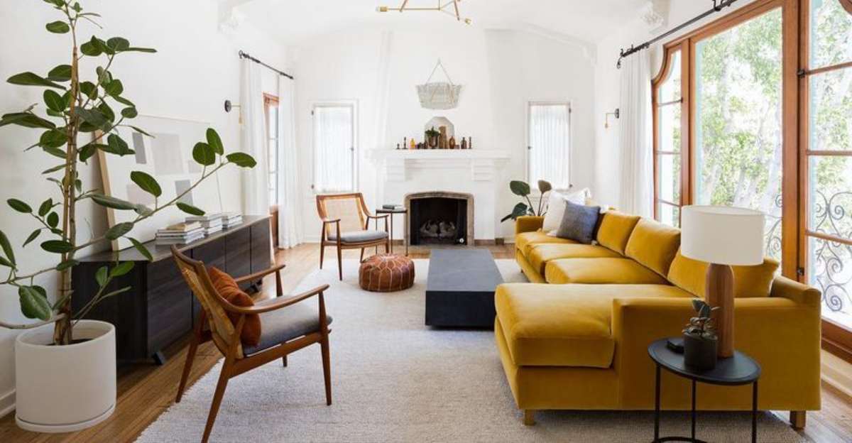
Picking the perfect couch color for your Minnesota home isn’t just about what’s trending. It’s more about finding shades that resonate with our unique northern lifestyle and landscape.
When I help clients choose furniture, I always remind them that some colors just feel right in our cozy cabins and prairie-inspired living rooms, while others seem jarringly out of place.
Let’s explore which couch colors clash with our laid-back, nature-loving Minnesota aesthetic and which ones will make your space feel authentically northern.
1. Neon Pink: Too Bold For Our Northern Sensibilities

This shade of pink screams Miami Beach, not Minneapolis! These electric shades fight against our subtle northern aesthetic, where understated charm rules the day.
Though occasionally eye-catching in small doses, a full-sized neon pink sofa creates visual chaos in spaces designed for winter coziness and natural light. Your living room should be a sanctuary, not a nightclub.
Moreover, these flashy tones clash dramatically with our seasonal changes. While pink can work in Minnesota homes, stick to dusty rose or muted berry instead of these attention-demanding neon varieties.
2. Bright Orange: Overwhelming For Northwoods Retreats
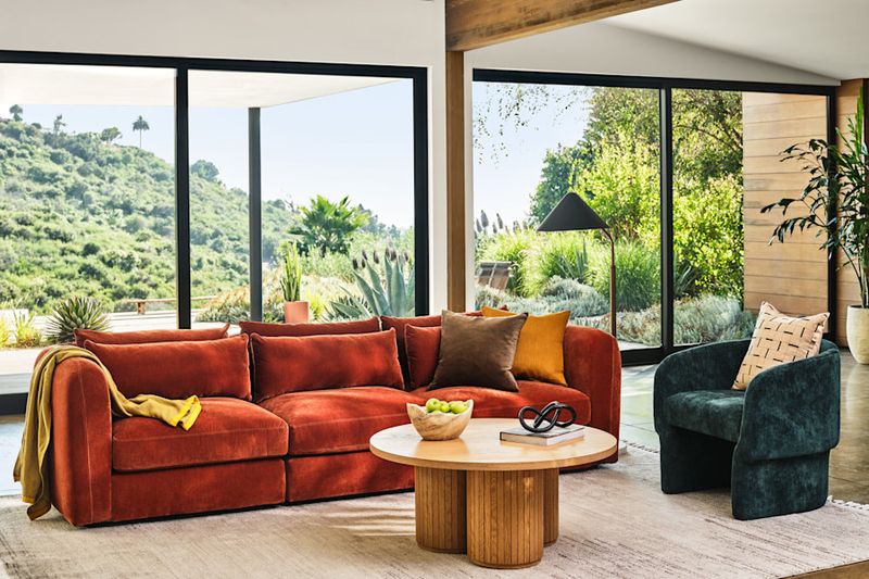
Bright orange sofas bring too much visual heat to our cool-toned Minnesota spaces. This radiant citrus shade competes with rather than complements our natural surroundings.
Guests often feel unsettled in rooms anchored by such an aggressive color. The intensity creates a restless energy that contradicts our state’s peaceful, laid-back vibe.
However, don’t confuse this with all orange tones! While this fluorescent version feels imported from a California beach house, there are earthier orange variations that work beautifully in our northern homes (more on that later).
3. Fluorescent Green: A Startling Mismatch For Our Natural State
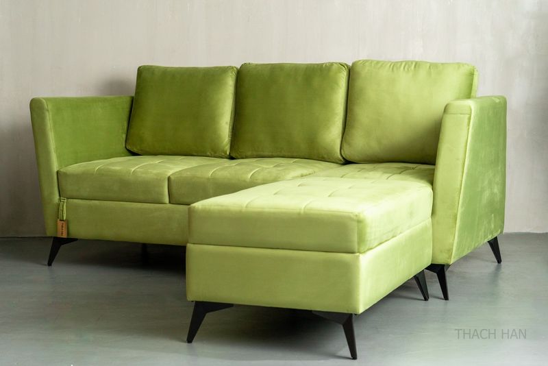
Ever wondered why fluorescent green furniture feels like a neon sign screaming “Look at me!” in Minnesota’s calm, cozy homes? This electric shade causes serious visual fatigue, totally clashing with the soft greens of our northern forests and prairie grasses.
Instead of blending with nature, it sticks out like a sore thumb, definitely not the kind of “green” that says welcome home. Especially during our long winters, these glaring hues zap the warm, inviting vibes we crave, turning cozy spaces into harsh, eye-popping zones.
Time to ditch the shock factor and stick with nature’s own palette!
4. Metallic Gold: Too Flashy For Our Humble Heritage
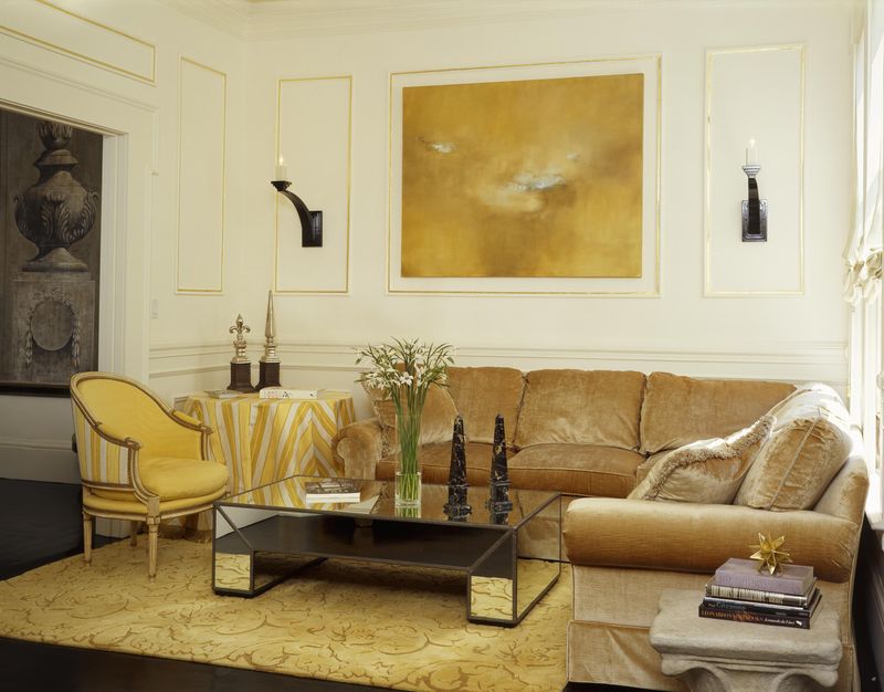
Metallic gold couches bring an ostentatious energy that contradicts Minnesota’s unpretentious character. Our state values substance over show, making these glitzy pieces feel culturally disconnected.
Beyond the philosophical mismatch, these reflective surfaces create practical problems. The harsh glare from metallic upholstery competes with our precious natural light during short winter days when every sunbeam matters.
Additionally, gold’s inherent formality clashes with our casual, family-friendly living spaces. Minnesota homes prioritize comfort and functionality, qualities that shiny, rigid metallic fabrics simply cannot deliver regardless of how trendy they might be elsewhere.
5. Glossy Red: Too Slick For Our Organic Aesthetic
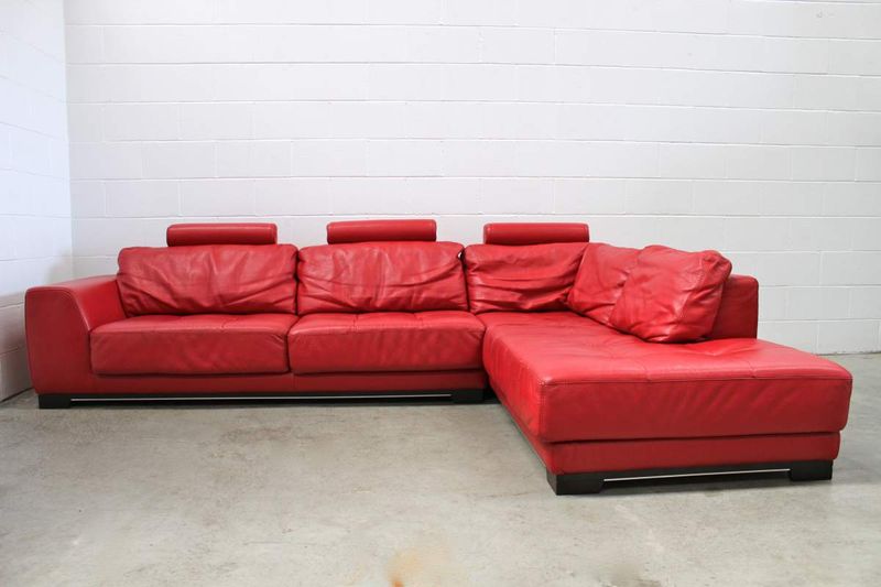
A glossy finish in fiery hues can introduce an artificial vibe that clashes with Minnesota’s nature-inspired, authentic interiors. This high-shine look often feels plastic and commercial rather than warm and inviting.
The intensity overwhelms the typically neutral backgrounds found in Minnesota homes, where rich wood tones, stone accents, and subtle textures take center stage. While warm colors have their place, a slick, shiny surface lacks the depth and character that create the cozy, genuine feel Minnesotans cherish. Homes built on honest craftsmanship and natural materials.
6. Shiny Silver: Too Cold For Our Cozy Refuges
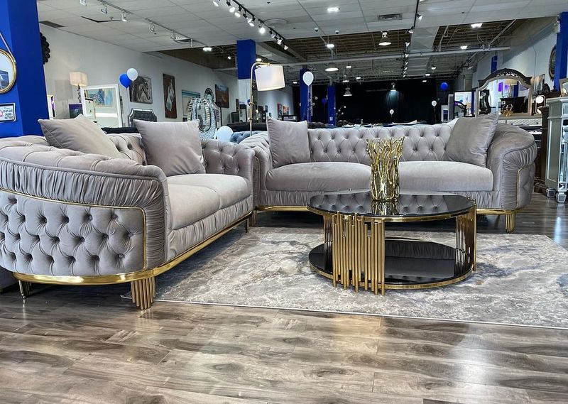
Nothing says “winter chill” quite like a metallic silver couch in a Minnesota living room that’s begging for warmth. Its reflective surface creates a sterile, laboratory-like vibe instead of the snug, inviting atmosphere we crave.
During our long winters, interiors need to visually warm us up, yet this cool sheen does just the opposite, amplifying a sense of cold and distance that feels especially harsh in sub-zero months.
While modern design has its place, the ultra-sleek, space-age look clashes with Minnesota’s love for heritage, tradition, and earthy warmth.
7. Electric Blue: Too Intense For Our Subtle Landscape
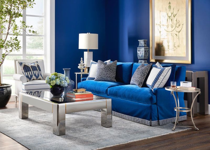
Couches in electric blue create visual noise in our tranquil Minnesota rooms. This artificial shade bears no resemblance to our beloved natural blues, the subtle hues of our lakes, twilight skies, or morning mist.
Such lively tones fight against the muted, complex color palettes that define our regional aesthetic. Minnesota interiors typically embrace nuance and subtlety rather than shouty, primary colors.
Furthermore, these high-energy blues can actually affect mood, creating restlessness in spaces meant for relaxation. After braving our challenging weather, Minnesotans need homes that calm the spirit. Something these buzzy, electric hues simply cannot provide.
8. Hot Purple: Too Dramatic For Our Practical Sensibilities
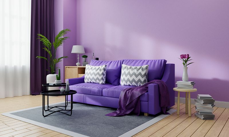
Energetic purple couches bring a theatrical flair that clashes with Minnesota’s straightforward, practical design vibe. This bold hue tends to overpower the calm balance typical of our interiors.
Such intense purples disrupt the harmony with seasonal outdoor views, competing rather than blending with nature’s changing colors.
While Minnesotans appreciate creativity, everyday spaces usually favor functionality and subtle beauty. These dramatic sofas demand too much attention, making it tough for the rest of the room to keep up.
9. Day-Glo Yellow: Too Artificial For Our Natural Habitat
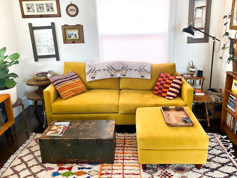
Looking to brighten your living room without turning it into a construction zone? Day-Glo yellow couches might just cross that hard-hat line! This highlighter-hued furniture brings more “stop, look out!” vibes than cozy comfort.
Minnesota’s natural palette calls for grounded, harmonious tones, not eye-straining neon that makes your eyes want to file a complaint. Plus, these fluorescent shades fade faster than a summer tan, leaving your couch looking more “oops” than “oh wow.”
When it comes to home style, Minnesotans prefer pieces that stand the test of time, not ones that scream for attention and then ghost on you!
10. Forest Green: A Perfect Echo Of Our Beloved Pines
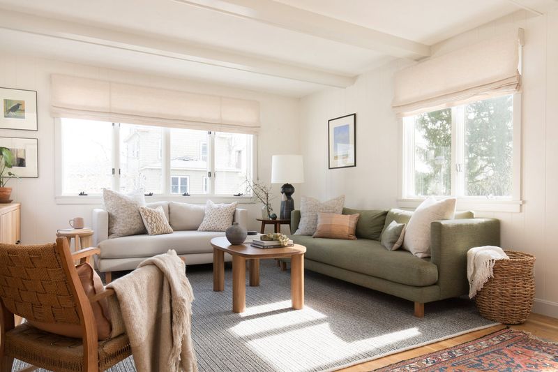
The forest green couches capture the essence of Minnesota’s magnificent woodlands. This rich, deep shade brings the tranquility of our northern forests indoors, creating an instant connection to our natural heritage.
Unlike its flashier cousins, forest green provides a substantial presence without overwhelming a space. It anchors Minnesota rooms with quiet confidence, allowing other elements, like our cherished wood accents and natural stone, to shine alongside it.
Additionally, this versatile color transitions beautifully through all four seasons. It complements fall’s amber tones, winter’s pristine whites, spring’s fresh palette, and summer’s lush greenery, making it truly at home in our ever-changing landscape.
11. Deep Navy Blue: Echoing Our Legendary 10,000 Lakes
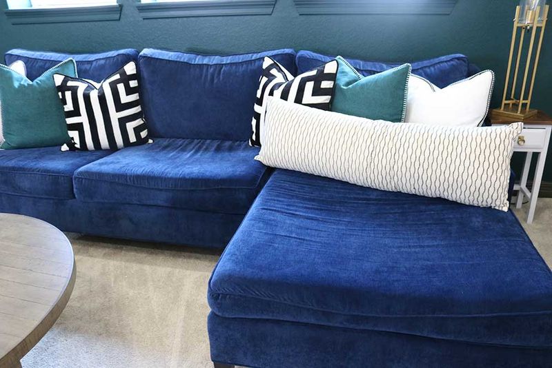
When it comes to couch colors that truly resonate with Minnesota’s natural beauty, deep navy blue brings the serene depth of our beloved lakes into living spaces. This rich, contemplative color carries the quiet dignity of our waters without shouting for attention.
Navy’s versatility makes it exceptionally practical for our lifestyle. It hides the occasional spill from hot cocoa during game nights, yet still looks sophisticated when entertaining guests from out of state.
Furthermore, this timeless shade creates a perfect backdrop for displaying colorful throws in winter and breezy linens in summer. Much like our adaptable Minnesota character, navy blue furniture gracefully transitions through seasons while maintaining its steadfast, reliable presence.
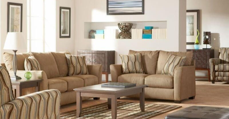
12. Warm Taupe: Channeling Our Prairie Heritage
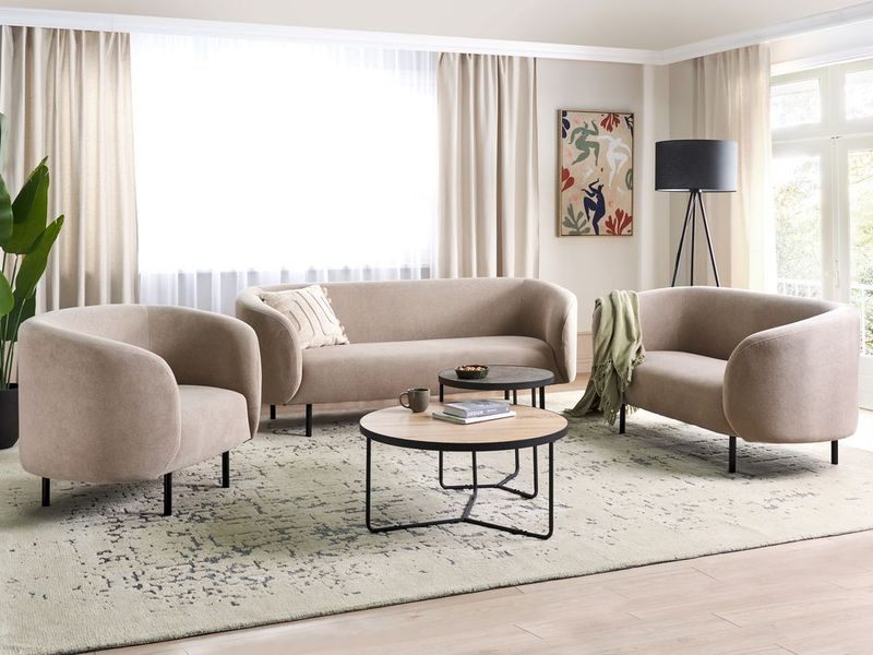
For a sofa color that feels as inviting as a cozy cabin retreat, warm taupe couches capture the essence of Minnesota’s sweeping prairies and agricultural roots. This grounded neutral embodies the humble beauty of our landscape without trying too hard.
The subtle complexity of taupe, not quite gray, not quite brown, mirrors Minnesota’s own nuanced character. It provides a sophisticated backdrop that welcomes both rustic elements and refined touches, much like our state embraces both wilderness and cultural richness.
Additionally, taupe’s warmth creates visual coziness during our long winters without feeling heavy or dark. It brightens with morning light and glows amber in evening firelight, responding to our changing northern light in ways that feel authentically Minnesotan.
13. Soft Gray: Mirroring Our Misty Northern Mornings
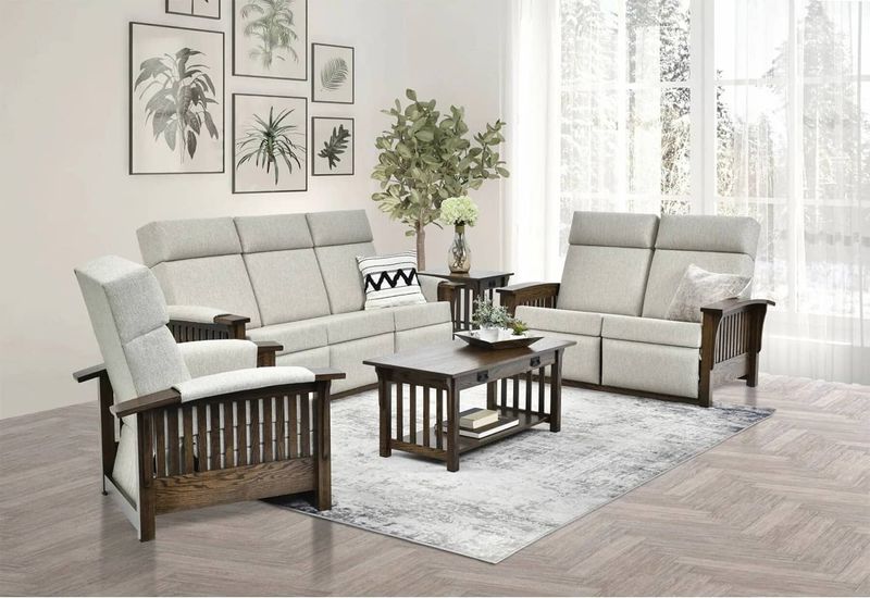
Soft gray couches capture the quiet beauty of Minnesota’s foggy lake mornings and winter skies. This understated neutral creates a serene foundation that never competes with our spectacular seasonal views.
Unlike colder, corporate grays, these softer variations carry a gentle warmth that welcomes rather than chills. They create the perfect backdrop for displaying colorful accent pieces that can change with the seasons, from spring wildflower hues to autumn harvest tones.
Gray’s remarkable versatility makes it particularly suited to our practical Minnesota mindset. It pairs beautifully with our beloved wood elements, stone features, and natural textiles while hiding the occasional evidence of real life in active households.
14. Burnt Orange: Celebrating Our Spectacular Fall Season
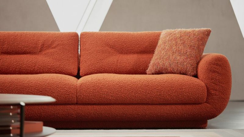
Looking to bring a touch of Minnesota’s autumn magic indoors all year long? Burnt orange couches perfectly capture the deep, smoldering hues of our October maple trees, adding warmth and charm.
This rich, inviting shade creates a natural focal point that draws people together, radiating the cozy energy Minnesotans love in their homes. It’s especially comforting during snowy winters, offering a visual glow that helps chase away the gloom of short, gray days.
Unlike fleeting trends, burnt orange feels timeless here, deeply connected to our landscape and seasonal rhythms. It’s a color that honors Minnesota’s unique spirit while making any room feel welcoming and warm.
15. Rust Red: Honoring Our Iron Range Heritage
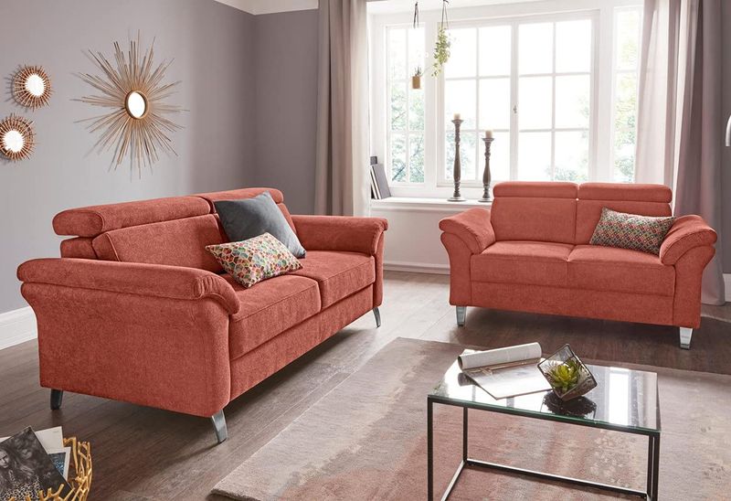
Paying homage to Minnesota’s Iron Range history while also creating spaces that feel authentically northern is something only rusty red sofas can do. This rich, earthy red carries the character of our mining heritage without the harshness of brighter reds.
Unlike glossy variations, rust’s matte depth brings a grounded warmth that perfectly complements our wood-rich interiors. It creates a natural partnership with pine, oak, and birch elements that feature prominently in Minnesota homes.
The subtle complexity of rust, with its brown and orange undertones, mirrors the sophisticated simplicity valued in northern design. It feels honest and unpretentious while still offering visual interest that evolves beautifully as natural light changes throughout our dramatic seasonal shifts.
16. Mustard Yellow: Bringing Warmth To Our Northern Winters
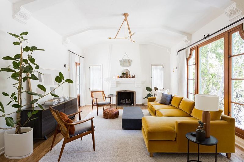
Unlike its fluorescent cousin, this earthy, golden-toned yellow brings a sophisticated warmth that feels particularly welcome during Minnesota winters.
The historical resonance of mustard connects beautifully with our state’s appreciation for heritage and craftsmanship. This classic shade has adorned Scandinavian and German homes, deeply woven into Minnesota’s cultural fabric for generations.
Additionally, mustard’s natural compatibility with blues, greens, and neutrals makes it surprisingly versatile. It creates a perfect backdrop for displaying treasured objects from summer lake adventures or winter woodland walks, celebrating our connection to the outdoors year-round.
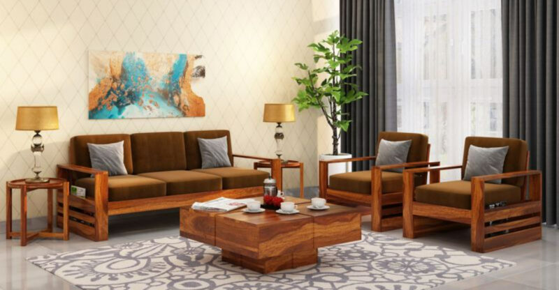
17. Earthy Brown: Grounding Us In Our Woodland Traditions
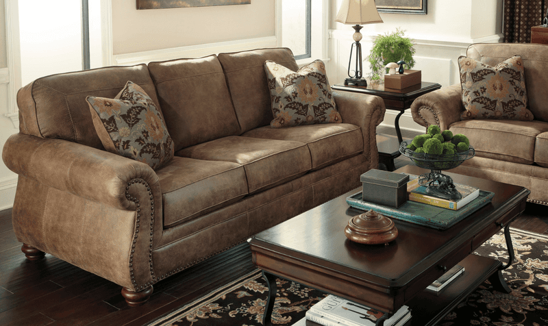
These rich, soil-inspired tones bring the comforting presence of Minnesota’s forests and fields into our living spaces. The gentle brown tones create an instant sense of stability and connection to the land we cherish.
The natural depth of brown leather or textiles ages gracefully, developing character over time much like our beloved cabin furniture. These pieces tell a story and welcome the marks of family gatherings, game nights, and quiet evenings by the fire.
Brown’s remarkable versatility makes it a practical choice for our active lifestyle. It transitions seamlessly from hosting sledding parties to summer barbecues, maintaining its warmth and welcome through all of Minnesota’s dramatic seasonal changes.
18. Creamy Beige: Reflecting Our Fresh Snow Landscapes
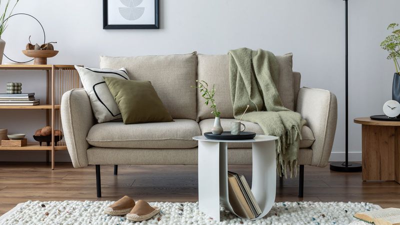
Ever noticed how fresh Minnesota snow glows golden in the evening light? Creamy beige couches capture that soft, luminous quality, adding warmth without the harsh chill of pure white.
This gentle neutral brightens rooms while keeping them cozy, a crucial combo when winter keeps us indoors more than we’d like. It reflects natural light beautifully, making even the shortest days feel a little longer and lighter.
Plus, creamy beige acts as the perfect backdrop to showcase Minnesota’s rich textile traditions, from Native American patterns to Scandinavian weaves and classic cabin plaids. It’s a shade that honors our diverse heritage while keeping interiors calm and inviting.

