8 Designer-Approved Sherwin-Williams Paints And 6 That Miss The Mark
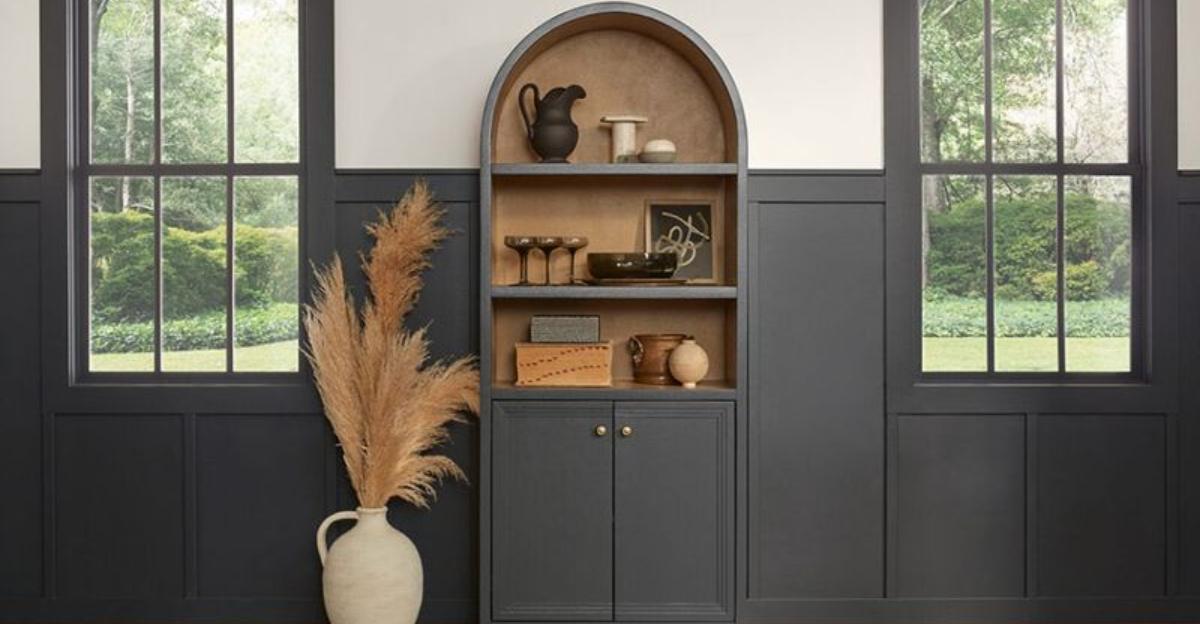
Color has the power to completely transform a space – but only if you choose the right one. Sherwin-Williams may be a go-to for quality paint, but not every shade earns high marks from design pros.
Some colors deliver timeless style and versatility, while others look great on a swatch but fall flat on your walls.
If you’re aiming for a polished, designer-approved finish, it pays to know which hues shine and which ones miss the mark.
1. Alabaster
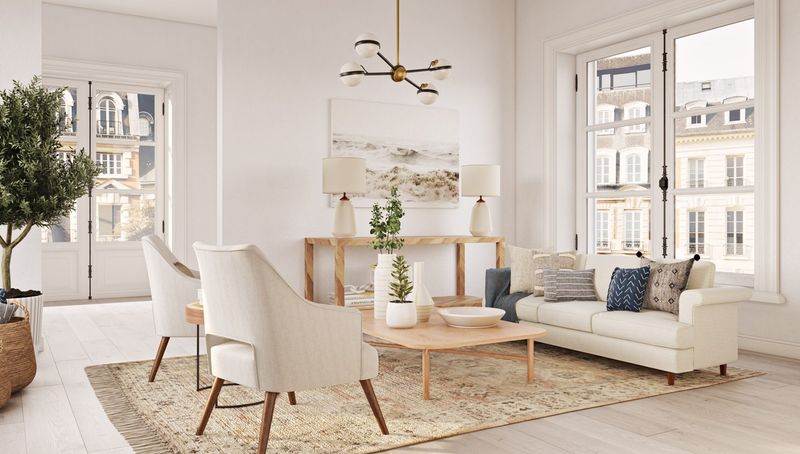
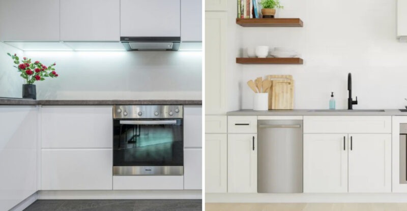
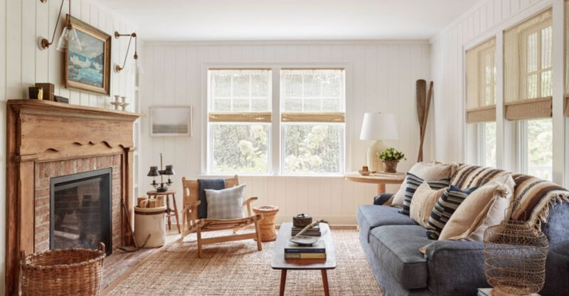
Warm and inviting without being too yellow, Alabaster creates an airy feeling in any room. The soft white provides the perfect backdrop for artwork and furnishings.
Many designers choose this shade for its ability to complement both modern and traditional decor styles. It works beautifully in spaces with either natural or artificial lighting.
2. Evergreen Fog
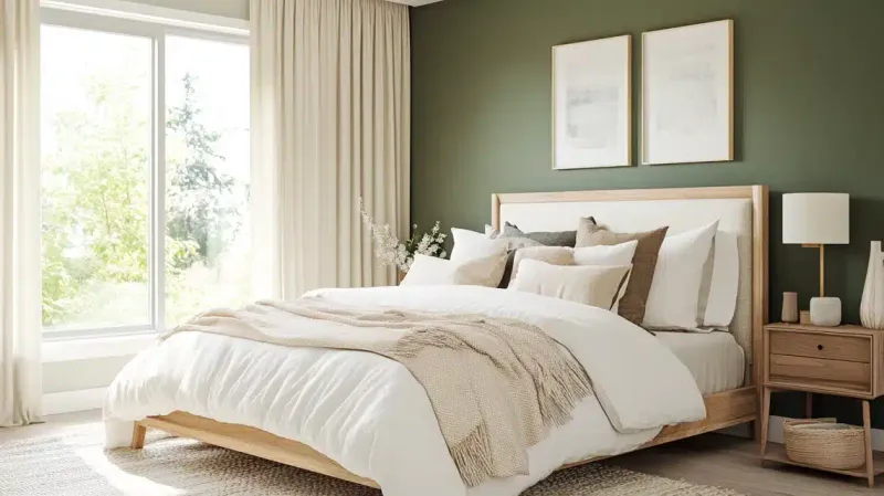
Named Sherwin-Williams’ 2022 Color of the Year, this misty sage tone brings natural tranquility indoors. The perfect balance between green and gray creates a sophisticated atmosphere.
Designers appreciate how it shifts throughout the day, appearing more green in natural light and more gray in the evening. Pairs wonderfully with natural wood tones and brass accents.
3. Naval
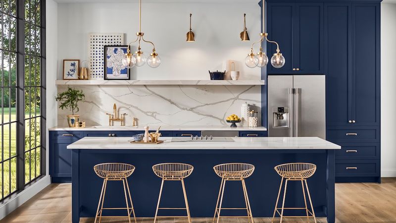
Rich and commanding, this deep navy blue exudes confidence without overwhelming a space. Designers frequently recommend it for statement walls, kitchen islands, and built-in cabinetry.
The versatile hue works equally well in traditional and contemporary settings. Its slight undertone of warmth prevents it from feeling cold, making spaces feel both elegant and welcoming.
4. Urbane Bronze
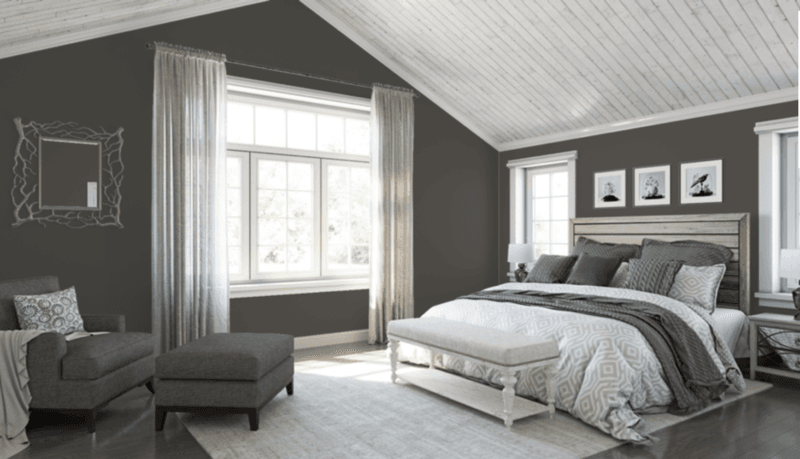
Celebrated as Sherwin-Williams’ 2021 Color of the Year, this deep, earthy brown-gray creates instant sophistication. The rich tone brings warmth and groundedness to contemporary spaces.
Designers love using it on exterior doors, accent walls, and furniture pieces. Its chameleon-like quality allows it to read as either a soft black or a deep taupe depending on lighting conditions.
5. Accessible Beige
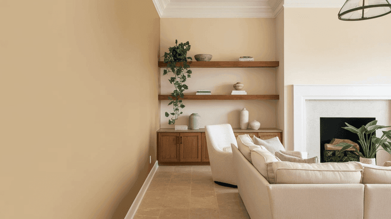
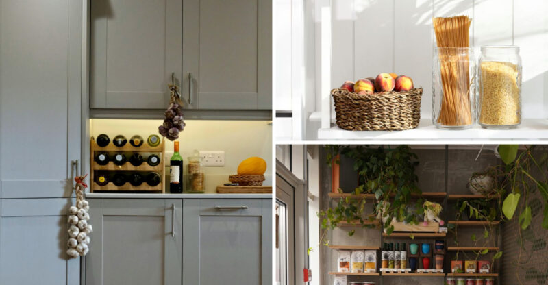
Neither too gray nor too brown, this perfectly balanced beige creates a warm foundation for any design style. The subtle warmth makes rooms feel instantly welcoming without being too yellow or pink-toned.
Designers recommend it for open floor plans where you need a consistent neutral that works with varying light conditions. Pairs beautifully with both cool and warm accent colors.
6. Iron Ore
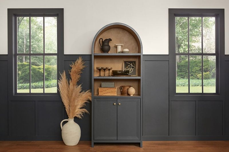
Softer than pure black but deeper than charcoal, this rich hue adds dramatic contrast without the harshness of true black. The subtle warmth prevents spaces from feeling cold or stark.
Designers frequently specify it for interior doors, window frames, and exterior accents. The depth creates architectural interest, especially when paired with lighter wall colors for striking contrast.
7. Sea Salt
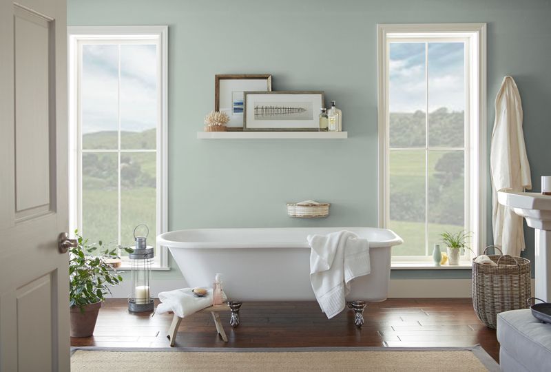
Capturing the essence of ocean-kissed air, this soft blue-green-gray creates instant serenity in any space. The chameleon-like quality shifts throughout the day, sometimes appearing more blue, sometimes more green.
Professionals particularly love it for bathrooms, bedrooms, and sunrooms. The subtle complexity provides interest without overwhelming the senses, making it perfect for creating relaxing environments.
8. Tricorn Black
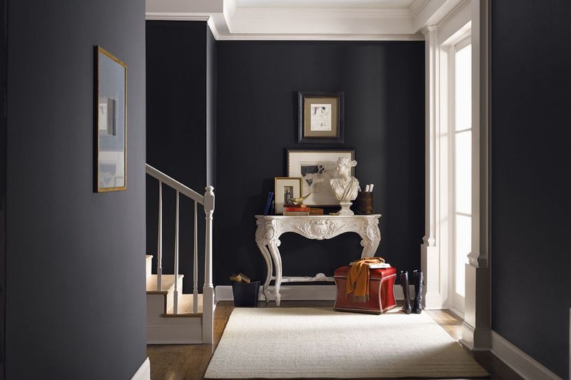
Pure and unapologetic, this true black delivers maximum impact without unwanted undertones. Unlike many blacks that skew blue or brown, Tricorn remains consistently neutral. Designers choose it for statement walls, exterior accents, and modern trim work. The dramatic depth creates architectural interest, especially when used in high-contrast applications alongside crisp whites.
9. Repose Gray
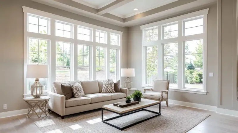
Popular on social media but tricky in real spaces, this gray can unexpectedly shift to purple or blue tones. What looks perfect on Pinterest often surprises homeowners once applied to walls.
The undertones become particularly problematic in rooms with northern exposure. Many designers report clients requesting repaints after seeing how dramatically the color changes throughout the day.
10. Agreeable Gray
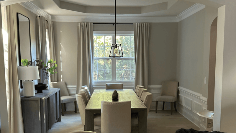
Despite its immense popularity, this beige-gray hybrid often creates bland, uninspired spaces. The color lacks the depth and character found in more nuanced neutrals.
Designers note that while inoffensive, it frequently disappoints clients hoping for warmth and interest. In north-facing rooms, it can appear dull and lifeless, creating a rental-unit feel rather than a personalized home environment.
11. Lemon Twist
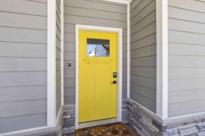
Bright and cheerful in small doses, this intense yellow becomes visually exhausting when covering entire walls. The high-energy hue reflects strongly, casting an unflattering yellow glow on everything in the room.
Pros caution against using it in bedrooms or living spaces where relaxation is the goal. The intense color can contribute to visual fatigue and make spaces feel smaller and more chaotic.
12. Duration Home High-Gloss Colors
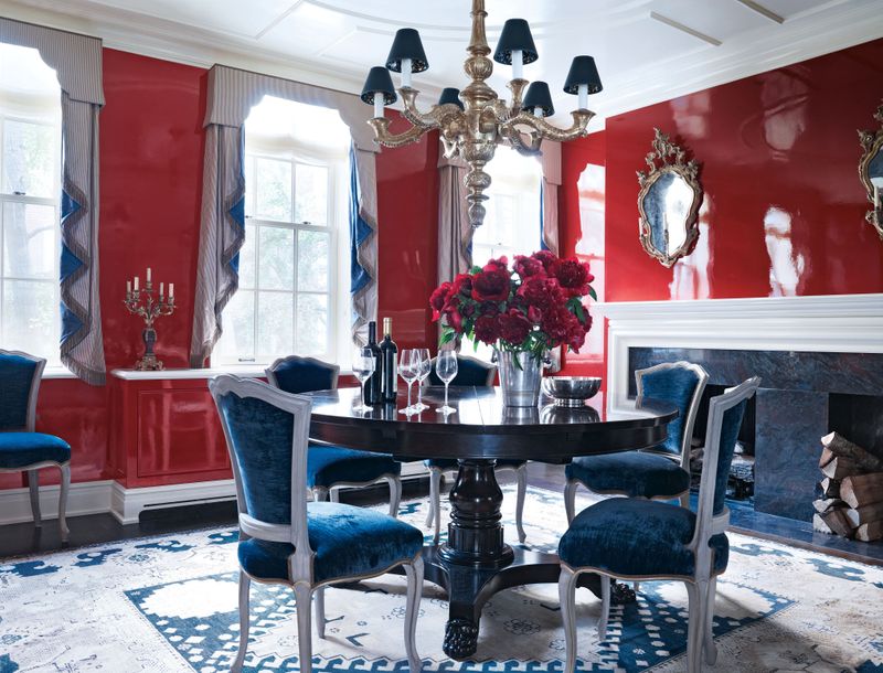
While the paint formula itself is excellent, the high-gloss finish magnifies every wall imperfection. Designers warn that colors in this reflective sheen highlight every bump, dent, and patch job.
The mirror-like quality creates distracting glare in well-lit spaces. Most professionals recommend reserving high-gloss finishes for trim, doors, and furniture rather than entire walls.
13. Pure White
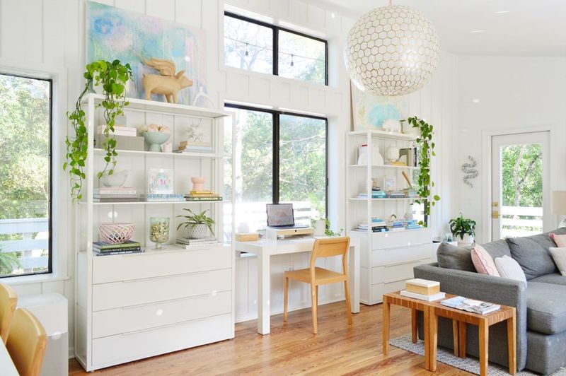
Despite its clean appearance on color cards, Pure White often reads as stark and clinical in poorly lit spaces. The lack of warmth creates an institutional feeling rather than a welcoming atmosphere.
Designers note that in rooms without abundant natural light, it can appear dull or even slightly gray. Northern exposures particularly exacerbate the problem, making spaces feel cold and unwelcoming.
14. Red Bay
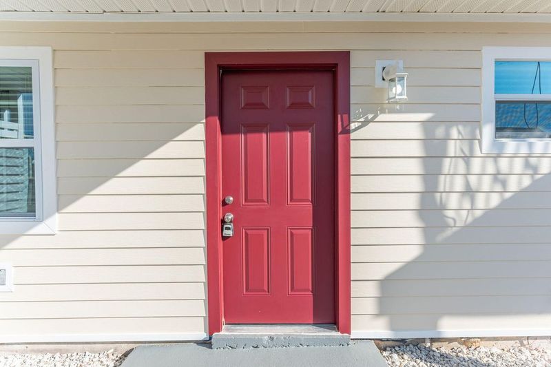
Reminiscent of 1990s design trends, this deep red-brown creates heavy, oppressive spaces that feel instantly dated. The murky undertones can make rooms appear smaller and darker than they actually are.
Home decor professionals report that clients who choose this color often request repainting within a year. The intense hue tends to dominate a space, making it difficult to create balanced, harmonious interiors.
