9 Enduring Paint Shades Designers Suggest You Should Consider
Choosing the right paint color can transform any space from ordinary to extraordinary. Professional designers often rely on certain timeless shades that have proven their staying power through changing trends and seasons.
These enduring paint colors work in virtually any home, complementing various design styles while creating the perfect backdrop for your personal style to shine.
Effectiveness may vary depending on lighting, room size, and your individual décor choices.
1. Soft Gray
Whispered conversations and gentle morning light seem to find their perfect match in soft gray walls. This versatile neutral creates a sophisticated backdrop that doesn’t compete with your furniture or artwork.
I’ve seen soft gray transform cramped rooms into airy retreats. It reflects light beautifully, making spaces feel larger while providing just enough color to avoid the stark feeling sometimes created by pure white.
What makes this shade truly special is its chameleon-like ability to shift subtly throughout the day, appearing warmer or cooler depending on your lighting. Pair it with crisp white trim for a classic look or bold accents for something more contemporary.
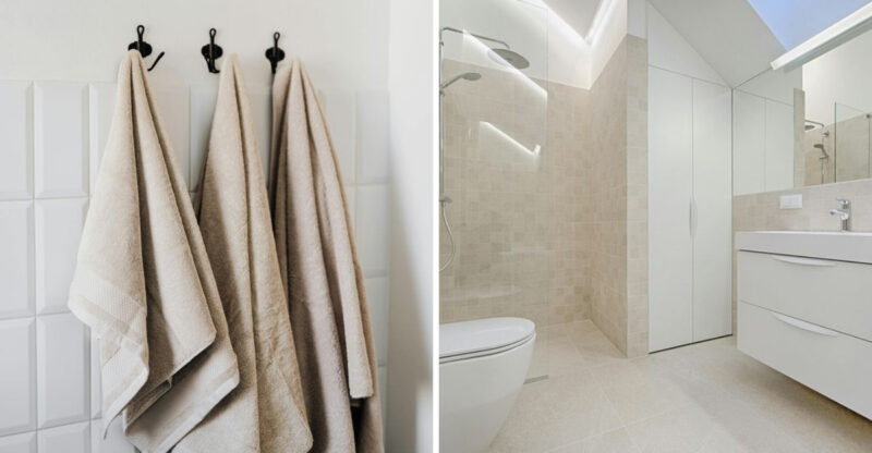
2. Warm Beige
Nothing says ‘welcome home’ quite like warm beige walls embracing you after a long day. This comforting neutral has remarkable staying power because it creates an instant sense of calm while complementing almost any décor style.
Warm beige isn’t just another boring neutral it’s the foundation that lets your furniture and accessories truly shine. The subtle yellow undertones bring a cozy warmth that cool grays simply can’t match.
If you’re worried about your space feeling dated, pair warm beige with crisp white trim and contemporary furnishings. This combination creates a timeless backdrop that won’t need repainting every few years as trends change. Your wallet will thank you!
3. Classic White
Bright and endlessly versatile, classic white paint remains the ultimate designer secret weapon. Far from boring, the right white creates a clean canvas that makes artwork pop and architectural details shine.
Did you know there are actually hundreds of white paint shades? Some lean cool with blue undertones, while others feel warm with hints of yellow or cream. The perfect white for your space depends on your lighting, flooring, and even which direction your windows face.
My clients are often amazed at how white walls can make small rooms feel spacious and dark rooms brighter. When choosing your white, bring home several samples and observe them throughout the day you’ll be surprised how differently they appear from morning to evening.
4. Muted Blue
Stepping into a room painted in muted blue feels like taking a deep breath of fresh air. This tranquil shade has been proven to lower blood pressure and reduce stress, making it perfect for bedrooms and bathrooms.
Muted blue carries subtle gray undertones that prevent it from feeling childish or overly sweet. Instead, it creates a sophisticated atmosphere that works beautifully with both traditional and modern furnishings.
Where should you use this versatile color? I love muted blue in spaces where you want to unwind think primary bedrooms, reading nooks, or even home offices. Pair it with warm woods and soft textiles for a look that’s both timeless and on-trend without trying too hard.
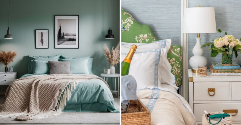
5. Sage Green
Bringing the outdoors inside, sage green creates an immediate connection to nature that simply makes people feel good. This earthy yet sophisticated hue has surged in popularity because it works as a ‘new neutral’ present but not overwhelming.
Sage green pairs beautifully with natural materials like wood, stone, and linen. I’ve used it in everything from farmhouse kitchens to modern apartments, and it always feels appropriate rather than trendy.
The subtle gray undertones in sage green help it avoid the dated look of brighter greens from decades past. For a foolproof combination, try sage green walls with cream trim and brass accents this palette creates a timeless look that will still feel fresh years from now.
6. Pale Taupe
Hovering between gray and beige, pale taupe might be the most underrated color in a designer’s toolkit. This chameleon-like neutral adapts to its surroundings, appearing warmer or cooler depending on your furniture and lighting.
Are you struggling to choose between gray and beige? Pale taupe offers the perfect compromise. It provides the contemporary feel of gray with the warmth of beige, creating spaces that feel both modern and welcoming.
The true magic of pale taupe happens when you pair it with different accent colors. It serves as a sophisticated backdrop for everything from jewel tones to pastels without competing for attention. This adaptability makes it perfect for open-concept homes where one color needs to flow seamlessly through multiple spaces.
7. Creamy Ivory
Warmer than white but lighter than beige, creamy ivory paint wraps your rooms in a soft glow that flatters everything and everyone. This buttery shade has remained popular for centuries because it creates an instant sense of warmth without feeling heavy.
Unlike stark whites that can feel clinical, creamy ivory brings a subtle richness that makes spaces feel established and thoughtfully designed. It’s particularly magical in rooms with northern exposure that might otherwise feel cold.
When should you choose creamy ivory? I recommend it for historic homes where bright white would feel jarring, formal dining rooms where you want guests to look their best, and any space where you’re aiming for timeless elegance rather than contemporary crispness.
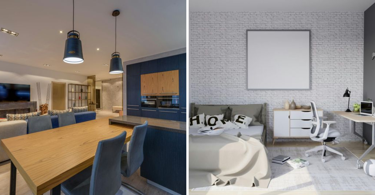
8. Deep Navy
Bold yet timeless, deep navy creates instant drama without the commitment issues of true black. This rich, saturated blue brings a confidence to walls that few other colors can match.
Deep navy functions as a sophisticated neutral that works with virtually any decorating style. In traditional spaces, it creates a classic, library-like feel, while in contemporary rooms it provides a striking backdrop for modern art and furnishings.
Though dark colors are often avoided in smaller spaces, deep navy can actually make a room feel larger by blurring the boundaries between walls. I especially love it in dining rooms, where it creates an intimate atmosphere for evening gatherings, or as an accent wall in bedrooms where it promotes restful sleep.
9. Charcoal
Mysterious and moody, charcoal gray creates spaces with undeniable presence and sophistication. This deep neutral has become a designer favorite for creating dramatic backdrops that still feel timeless rather than trendy.
Unlike true black, charcoal contains subtle undertones (often blue, green, or purple) that add depth and prevent it from feeling flat or harsh. The result is a rich, nuanced color that changes throughout the day as light shifts across your walls.
Charcoal works beautifully in spaces where you want to create atmosphere home offices, media rooms, or dining areas. For balance, pair it with lighter flooring and trim to prevent the room from feeling too heavy. The contrast creates a striking, architectural look that highlights your space’s best features.

