18 Front Door Colors To Avoid At All Costs And 5 Timeless Alternatives To Go With Instead
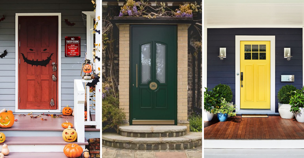
Your front door sets the tone for your entire home, making a powerful first impression about your style and personality.
The right color can boost curb appeal and even increase property value while the wrong shade might send the wrong message.
I’ve rounded up the front door colors best left behind, along with timeless alternatives that always make a welcoming statement.
1. Neon Green: The Color That Screams ‘Look At Me!’
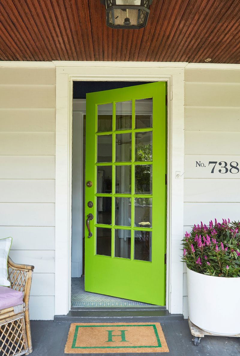
Imagine walking down a peaceful suburban street when suddenly BAM! a door so bright it practically glows in the dark. Neon green creates this jarring effect on your home’s exterior, making it stand out for all the wrong reasons.
This fluorescent shade clashes with virtually every type of architecture and surrounding landscape. It’s particularly disastrous on traditional homes where it looks completely out of place against brick or natural stone.
Beyond aesthetic concerns, neon green tends to fade unevenly in sunlight, leaving you with a patchy, washed-out appearance within a few years. Save this eye-popping color for Halloween decorations or sports gear not your front door.
2. Hot Pink: The Barbie Dream House Nightmare
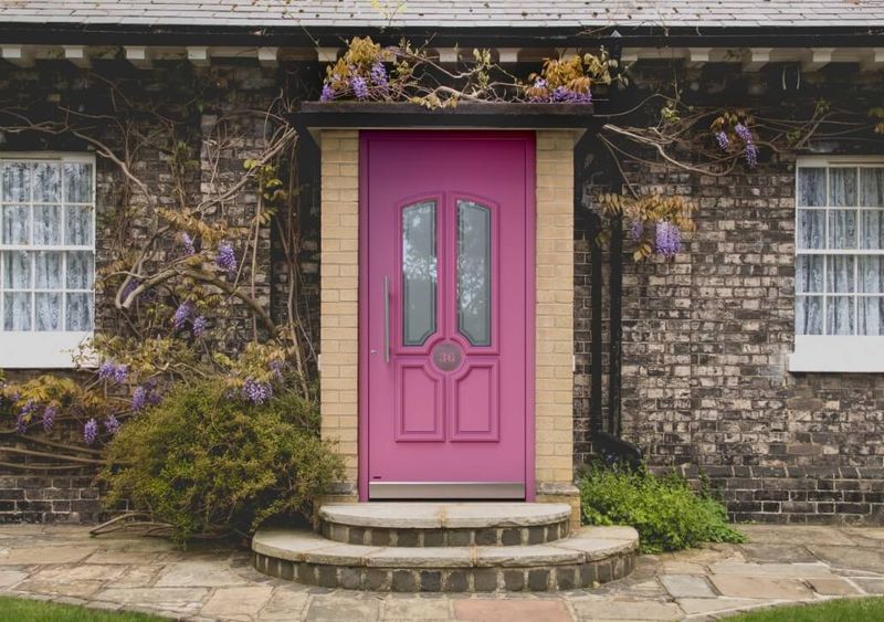
Walking up to a hot pink front door feels like entering a life-sized dollhouse cute for toys but overwhelming on actual homes. This ultra-feminine color creates an immediate shock value that quickly becomes tiresome for both residents and neighbors.
Hot pink fails to complement natural landscaping elements and typically clashes with most exterior paint colors and materials. Even worse, this bold shade makes your house the neighborhood oddity, potentially turning off future buyers if you ever decide to sell.
The intense pigments in hot pink are also notorious for fading unevenly, especially in areas with strong sunlight. You’ll find yourself repainting more frequently just to maintain that shocking hue that wasn’t a great choice to begin with.
3. Bright Orange: The Traffic Cone Look
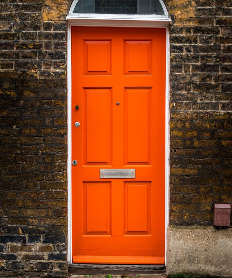
Nothing says “I make impulsive decisions” quite like a bright orange front door. This attention-grabbing color resembles construction equipment and safety gear not exactly the welcoming vibe most homeowners aim for. Bright orange creates a jarring contrast against most home exteriors, particularly with neutral siding or natural materials.
The color’s intensity makes your home look smaller and can overwhelm your entire façade, drawing attention away from architectural details you might want to showcase. Many HOAs specifically prohibit this shade because of its disruptive visual impact on neighborhood aesthetics.
If resale value matters to you, remember that potential buyers often struggle to see past such bold color choices, mentally adding “repainting” to their to-do list before even stepping inside.
4. Electric Blue: The Underwater Fantasy Mistake
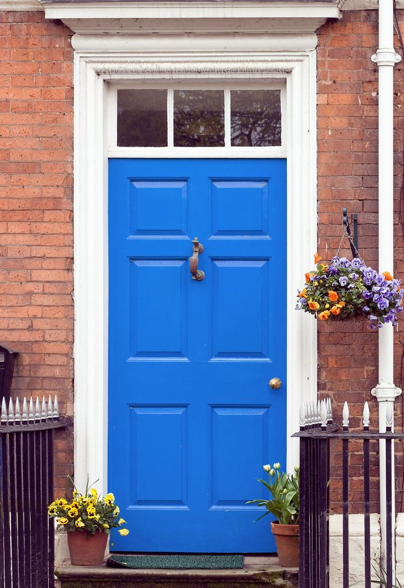
Have you ever seen a door so blue it almost hurts your eyes? Electric blue creates this exact reaction—an underwater fantasy that belongs in a theme park, not on your home’s entrance. This intense color fights for attention with your landscaping and architectural features.
It’s particularly problematic on traditional homes, where such a modern, synthetic-looking color creates a visual disconnect with classic building materials like brick, stone, or wood siding. Electric blue also shows every speck of dirt and pollen, requiring frequent cleaning to maintain its vibrant appearance.
Weather exposure causes this color to fade irregularly, often developing a patchy, washed-out look within just a couple of years that makes your home appear neglected rather than bold.
5. Fluorescent Yellow: The Caution Tape Effect
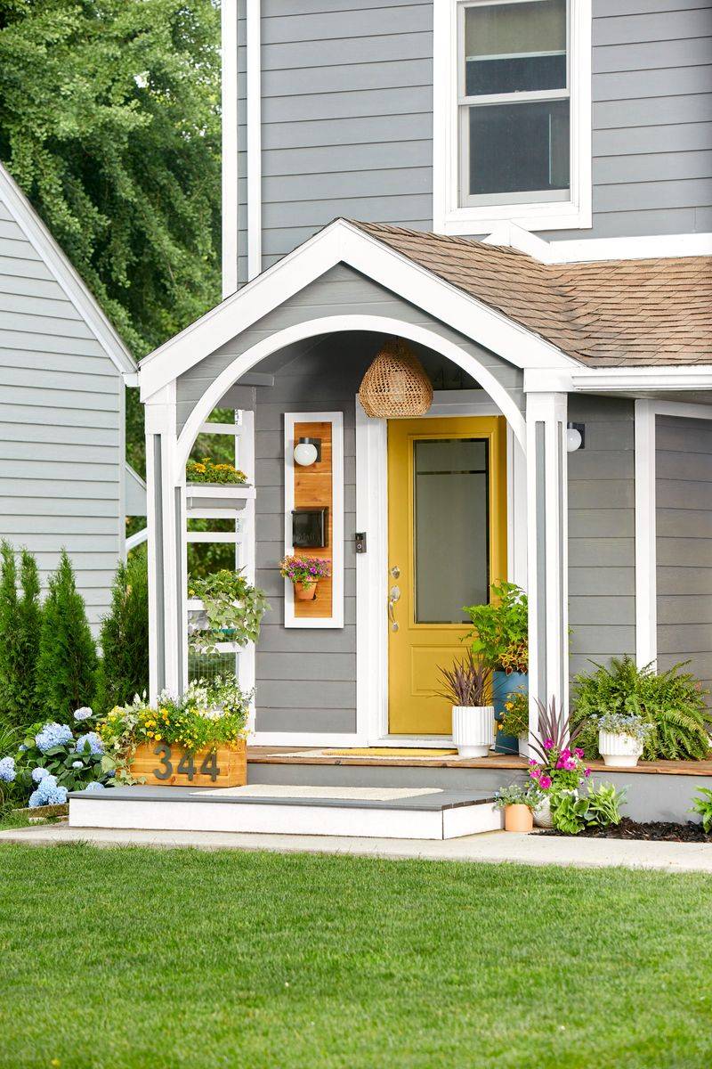
Fluorescent yellow instantly transforms your home entrance into something that resembles caution tape or a hazard sign. This color literally signals “warning” to our brains not exactly the welcome feeling you want to create for guests.
The harsh brightness of this shade makes it nearly impossible to photograph well, meaning your home will always look strange in listing photos or social media posts. It reflects light in a way that can actually create glare for neighbors and passersby.
This color shows dirt dramatically and fades extremely quickly, especially in sunny climates. Within months, not years, you’ll notice uneven patches and a dulling effect that makes your door look neglected rather than intentionally bold. Your fluorescent choice quickly becomes a fluorescent mistake that needs repainting.
6. Purple Grape: The Fruity Faux Pas
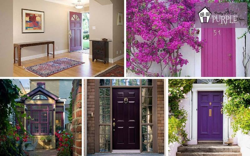
Purple grape might seem fun and quirky at first glance, but this fruity shade quickly becomes the neighborhood eyesore. The intense saturation creates a cartoonish effect that undermines any architectural sophistication your home might have.
This bold purple clashes dramatically with most brick exteriors and landscaping elements. The color is particularly problematic in traditional neighborhoods where it sticks out like a sore thumb among more subdued, classic color schemes that maintain property values.
Though it might express your playful personality, grape purple often appears juvenile and trendy rather than timeless. Real estate agents consistently report that unusual door colors like this one can reduce buyer interest and perceived home value by creating an immediate negative first impression that’s hard to overcome.
7. Fire Engine Red: The Alarm Bell Choice
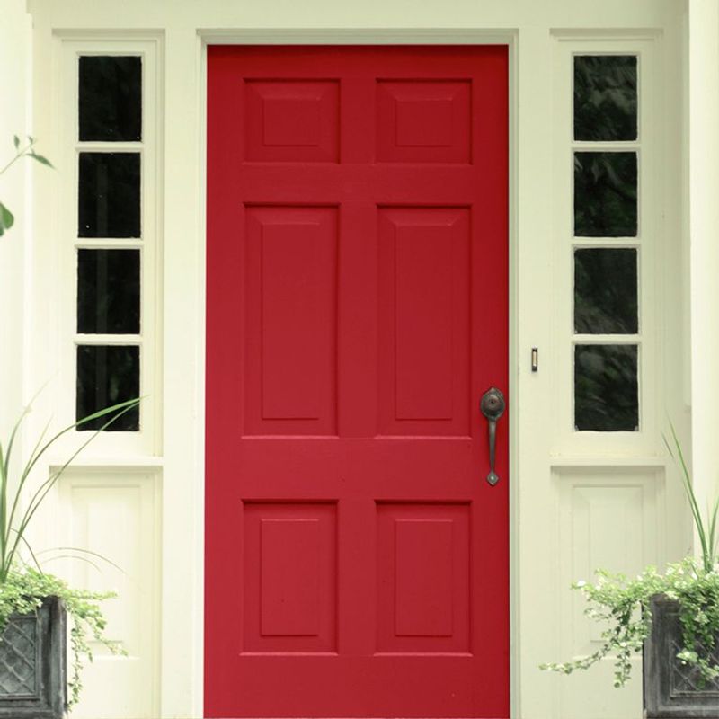
Fire engine red screams emergency rather than elegant entrance. This ultra-bright, saturated red creates an alarming first impression that’s far too intense for residential architecture. Unlike deeper, more sophisticated reds, this blaring shade lacks subtlety and sophistication.
It’s particularly problematic on larger doors where the sheer volume of such an intense color becomes overwhelming to the eye. This shade shows every imperfection fingerprints, dust, and scratches stand out dramatically against the bright background.
The pigments in fire engine red are also highly susceptible to UV damage, causing the color to fade unevenly and develop a pinkish, washed-out appearance within just a couple of years. Your bold statement quickly becomes a maintenance headache.
8. Minty Teal: The Toothpaste Tube Disaster
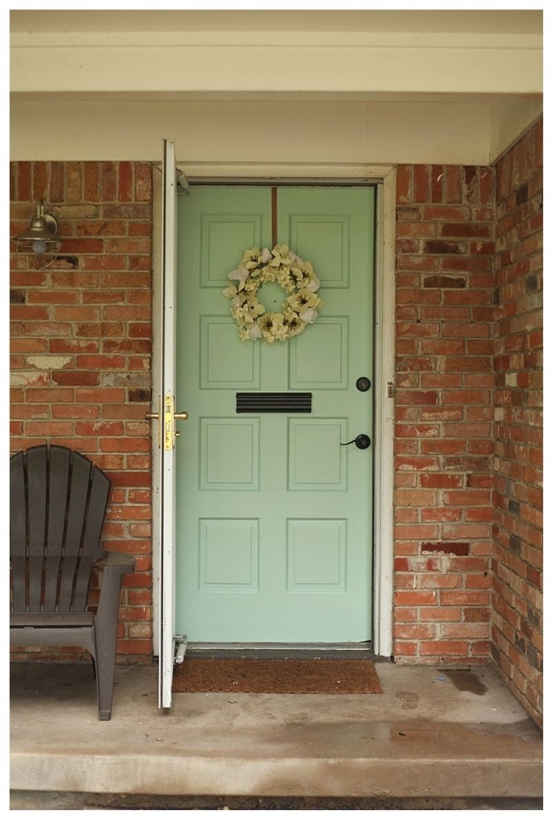
Minty teal might remind you of your favorite toothpaste or mouthwash—not exactly the sophisticated vibe most homeowners are aiming for. This color has become trendy on social media but quickly dates a home in real life.
The pastel quality of minty teal makes it appear washed out in bright sunlight and dingy on cloudy days. It’s particularly unflattering against brick exteriors, where the contrast makes both the brick and the door color look cheaper. This color shows dirt and grime dramatically, requiring frequent cleaning to maintain its fresh appearance.
Weather exposure causes minty teal to fade unevenly, often developing yellowish patches that give your door a sickly appearance rather than the refreshing look you initially wanted. Some things are better left as bathroom accessories, not architectural statements.
9. Bubblegum Pink: The Childish Choice
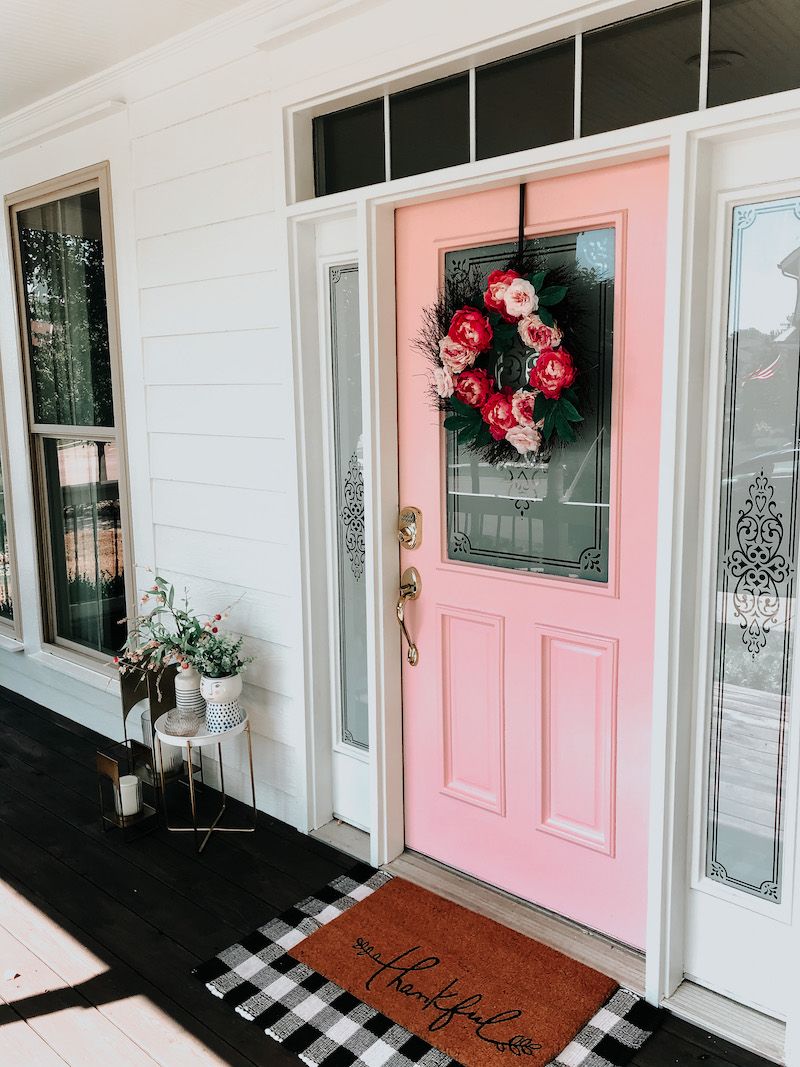
Bubblegum pink transforms your home’s entrance into what looks like a little girl’s bedroom door. This saccharine shade screams immaturity rather than sophisticated homeownership. The juvenile associations with this color make it particularly problematic for resale value.
Real estate agents consistently report that overly gender-specific colors like bubblegum pink can immediately turn off potential buyers who struggle to see past such a personal statement. Beyond aesthetic concerns, this shade shows dirt dramatically and fades quickly in sunlight.
The pink often develops an uneven, blotchy appearance within a year or two, fading to an unattractive salmon color in patches. What started as a whimsical choice quickly becomes a maintenance headache that makes your home look neglected rather than playfully distinctive.
10. Highlighter Yellow: The Eye-Straining Eyesore
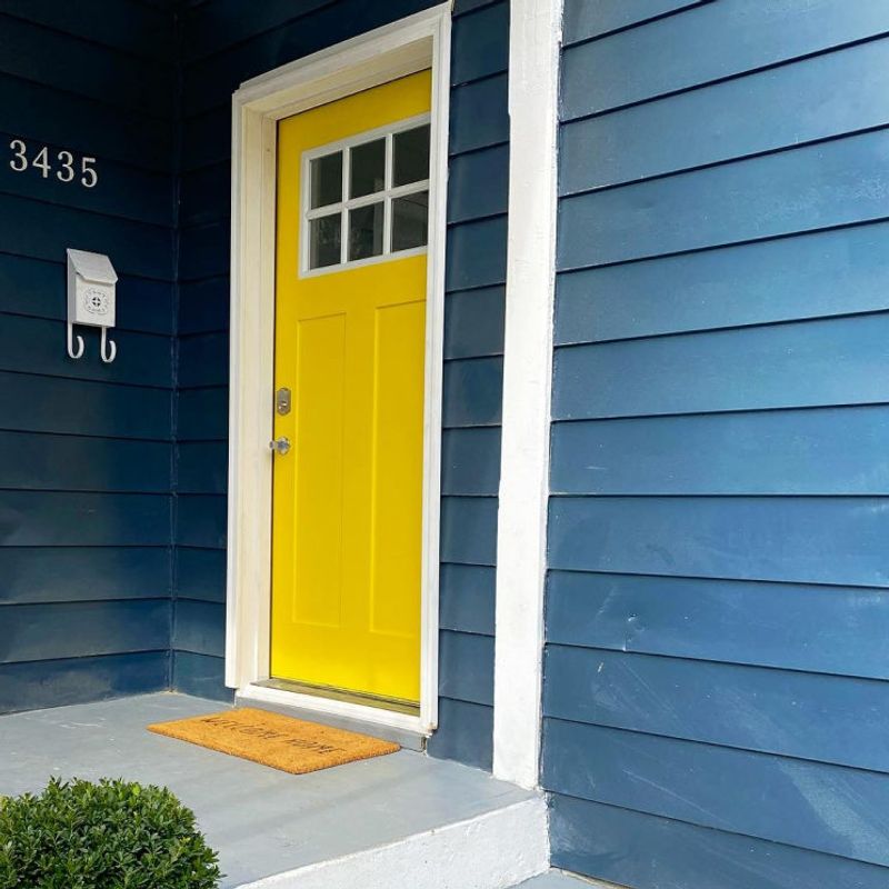
Highlighter yellow does exactly what a highlighter does—it demands attention in the most artificial way possible. This unnaturally bright color creates an almost painful visual experience for visitors approaching your home.
The intensity of this neon shade makes it impossible to photograph well, meaning your home will always look strange in listing photos or social media posts. It creates such a stark contrast with natural surroundings that it makes landscaping efforts appear diminished and washed out. This color is particularly problematic in neighborhoods with natural or historic aesthetics.
HOAs frequently cite these ultra-bright colors as violations of community standards. Even without such restrictions, the color’s inability to harmonize with natural materials like wood, stone, or brick makes it a design choice that’s best left for office supplies.
11. Lime Green: The Sour First Impression

Lime green creates a first impression that’s as sour as its namesake fruit. This acidic color clashes with nearly every exterior material and landscaping element, creating visual tension rather than harmony. The brightness of lime green makes it particularly unflattering in natural light.
On sunny days, it can create an almost fluorescent glow that looks artificial and cheap, while on overcast days, it often appears sickly and uninviting. This color shows dirt dramatically and fades notoriously quickly, especially on doors that receive direct sunlight.
Within a year, the vibrant lime often deteriorates into an uneven, yellowish shade that resembles a neglected tennis ball more than a deliberate design choice. Your bold statement quickly becomes a maintenance burden that makes your home look dated rather than daring.
12. Barbie Pink: The Plastic Fantastic Fail
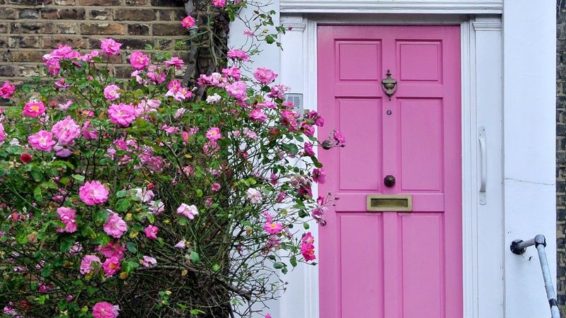
Nothing says “I live in a life-sized toy house” quite like a Barbie pink front door. This plastic-looking shade instantly cheapens your home’s appearance, regardless of its actual value or architectural merit.
The artificial brightness of Barbie pink creates a jarring contrast against natural materials like stone, brick, or wood siding. It’s particularly problematic for homes with traditional architecture, where such a modern, synthetic color creates an uncomfortable visual disconnect.
This shade is also extremely polarizing from a resale perspective. Real estate professionals consistently rank highly gendered colors like Barbie pink among the worst for home marketability. Potential buyers often see such distinctive choices as immediate projects to change, mentally deducting from your asking price before they’ve even stepped inside.
13. Turquoise Neon: The Tropical Overload
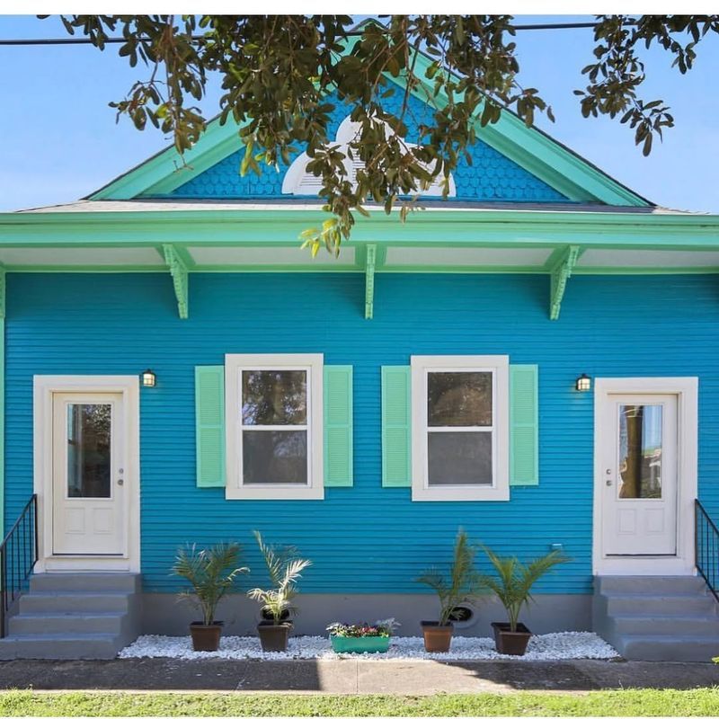
Turquoise neon might work for a beach bar in Cancun, but on your front door, it creates a tropical overload that feels perpetually on vacation and not in a good way. This electric shade overwhelms the eye and diminishes your home’s architectural features.
The intensity of neon turquoise makes it nearly impossible to coordinate with other exterior elements. It typically clashes with landscaping and creates a visual disconnect with the rest of your home’s color palette, making everything look mismatched and poorly planned.
This color is particularly problematic in neighborhoods with natural or historic aesthetics. Even in modern developments, the artificial brightness of neon turquoise creates a jarring effect that makes your home stand out for all the wrong reasons. Save this vibrant shade for small accents or beach vacation rentals.
14. Canary Yellow: The Blinding Brightness
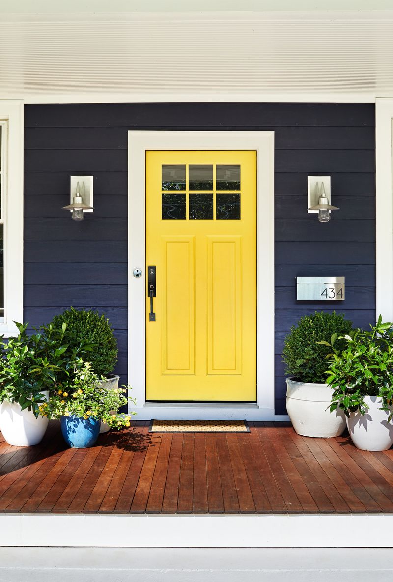
Canary yellow creates the uncomfortable sensation of staring directly at the sun. This overly bright shade draws attention to your door in a way that’s more alarming than welcoming. The intensity of canary yellow makes it difficult to photograph well, meaning your home will always look strange in listing photos.
It also creates such a stark contrast with surrounding elements that architectural details and landscaping appear diminished by comparison. This color shows dirt dramatically and is highly susceptible to fading, especially on south or west-facing doors.
Within a single season, you’ll notice uneven patches and discoloration that make your door look neglected rather than cheerful. What starts as a sunny statement quickly becomes a maintenance headache that requires frequent repainting to maintain its intended impact.
15. Peachy Coral: The Faded-Before-Its-Time Look
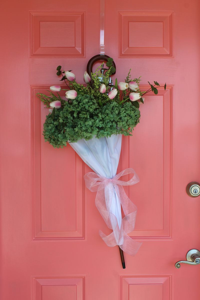
Peachy coral might seem like a softer alternative to brighter options, but this trendy shade is notorious for looking faded and dated almost immediately after application. The color often appears washed out in bright sunlight, creating a tired first impression.
This shade is particularly unflattering against most brick exteriors, where it creates a clashing undertone that makes both the brick and the door color look cheaper. It’s also highly susceptible to showing dirt and grime, with every fingerprint and smudge standing out dramatically.
Weather exposure causes peachy coral to fade unevenly, often developing blotchy patches within the first year. What started as a gentle, trendy color quickly transforms into something that resembles faded salmon or diluted pink grapefruit an unintentional look that suggests neglect rather than careful color selection.
16. Sky Blue Pastel: The Baby Nursery Mistake
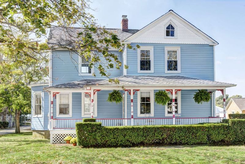
Sky blue pastel instantly transforms your sophisticated home entrance into something that belongs in a baby nursery. This overly sweet shade creates a juvenile impression that undermines the architectural dignity of your property.
The washed-out nature of pastel blue makes it appear faded even when freshly painted. It’s particularly problematic in northern exposures or shaded entrances, where it can take on a grayish, dingy appearance that looks unintentionally neglected. This color shows dirt dramatically and is highly susceptible to mildew staining, especially in humid climates.
The pale background makes every imperfection visible, from water spots to fingerprints. What might work beautifully for a child’s bedroom ceiling becomes a high-maintenance headache on an exterior door exposed to weather and frequent touching.
17. Bright Lavender: The Floral Overload
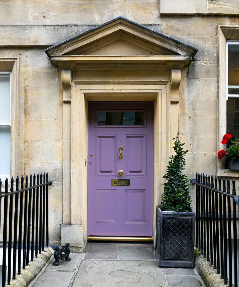
Bright lavender turns your front entrance into something that resembles a flower shop display rather than a sophisticated home entry. This overtly purple shade creates a whimsical effect that quickly becomes tiresome rather than charming.
This color is particularly problematic against red brick or homes with warm-toned exteriors, where it creates a clashing effect that’s visually jarring. It’s also highly trend-sensitive, meaning it quickly dates your home to a specific decorating fad rather than presenting a timeless appearance. Weather exposure causes bright lavender to fade unevenly, often developing a patchy, grayish undertone within just a year or two.
What started as a cheerful purple statement quickly transforms into something that looks faded and neglected. Save this pretty shade for garden flowers, not architectural elements that should stand the test of time.
18. Acid Orange: The Halloween-All-Year Effect
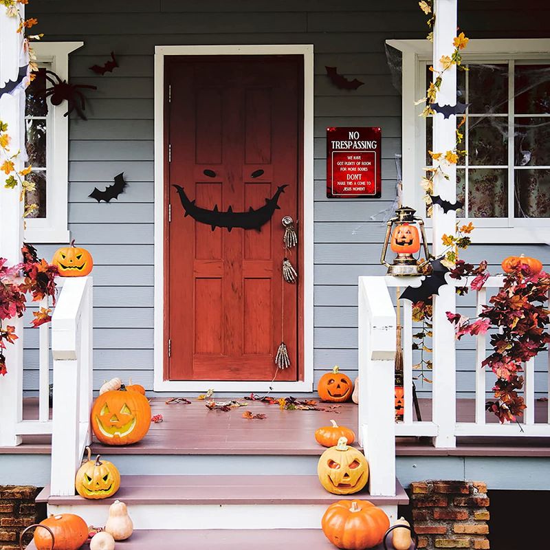
Acid orange creates the uncomfortable sensation that Halloween decorations were never taken down. This unnaturally bright shade has strong associations with plastic pumpkins and seasonal decor—not sophisticated home design.
The intensity of acid orange makes it nearly impossible to coordinate with landscaping or architectural elements. It creates such a stark contrast with natural surroundings that it makes your entire property look artificial and poorly planned. This color shows dirt dramatically and is highly susceptible to UV damage, causing it to fade unevenly and develop a blotchy appearance within just a season or two.
What started as a bold statement quickly becomes a maintenance nightmare that makes your home look neglected rather than intentionally distinctive. Some colors are best reserved for seasonal decorations, not permanent architectural features.
19. Classic Black: The Timeless Statement
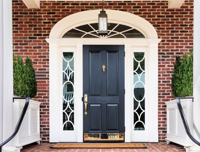
Classic black creates an instant air of sophistication that never goes out of style. This anchor color works beautifully with virtually every architectural style from Colonial to Contemporary, providing a strong visual frame for your entrance. Black doors offer practical benefits beyond their good looks.
They hide dirt and fingerprints remarkably well, requiring less frequent cleaning than lighter colors. The dark surface also absorbs solar heat in winter months, potentially providing a small energy efficiency boost. When selling your home, a black front door can actually increase your property value.
Real estate studies consistently show that homes with black doors sell for higher prices than expected. This timeless choice signals quality and attention to detail, creating a positive first impression that carries through to the entire home viewing experience.
20. Deep Navy: The Sophisticated Alternative
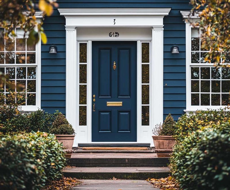
Deep navy delivers the drama of black with a touch more personality and color depth. This rich, sophisticated blue creates a welcoming entrance that complements virtually any exterior material from brick to vinyl siding. Navy offers incredible versatility across architectural styles. It looks equally appropriate on a historic Colonial, a beachy Cape Cod, or a modern Craftsman.
The color’s natural association with water creates a subconscious feeling of tranquility as visitors approach your home. Unlike trendy blues that quickly date themselves, navy has remained consistently popular for centuries.
It hides dirt well and maintains its appearance longer than lighter shades. When paired with brass or nickel hardware, navy doors create a timeless, tailored look that signals attention to detail and design confidence—qualities that translate to higher perceived home value.
21. Rich Charcoal Gray: The New Neutral
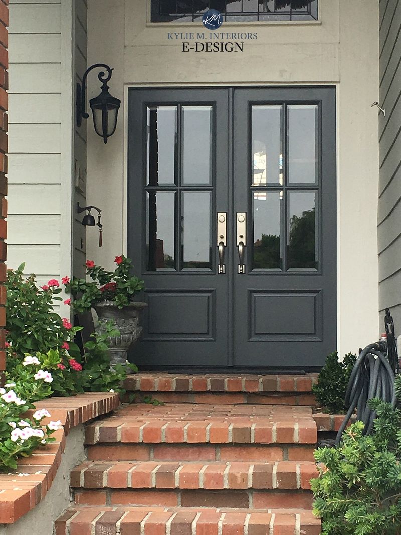
Rich charcoal gray has emerged as the perfect compromise between stark black and lighter neutrals. This sophisticated shade offers depth and drama without the heaviness of pure black, creating a refined first impression for any home style.
Charcoal’s versatility makes it exceptionally practical. It complements both warm and cool exterior palettes, working beautifully with everything from red brick to blue siding. The color’s subtle undertones shift slightly throughout the day as light changes, adding visual interest without being trendy. From a maintenance perspective, charcoal excels by hiding dirt, fingerprints, and minor imperfections.
It maintains its appearance longer than lighter colors and doesn’t show fading as quickly as pure black. Real estate professionals consistently rank charcoal doors among the most appealing to potential buyers, making this choice both aesthetically pleasing and financially smart.
22. Warm Taupe: The Subtle Standout
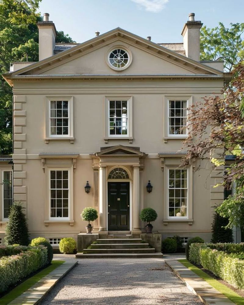
Warm taupe creates a welcoming entrance that feels both current and timeless. This sophisticated neutral bridges the gap between gray and beige, offering depth without overwhelming your home’s exterior palette.
The versatility of taupe makes it exceptionally practical for homes with colorful landscaping or architectural details you want to showcase. Rather than competing for attention, taupe provides a refined backdrop that enhances other elements while still offering more character than plain white. This shade performs remarkably well across different lighting conditions, maintaining its rich appearance from morning to evening.
It hides dirt better than lighter neutrals while avoiding the stark contrast of darker options. For homeowners seeking a color that will appeal to future buyers while still offering subtle distinction, warm taupe provides the perfect balance of personality and broad appeal.
23. Traditional Forest Green: The Heritage Choice
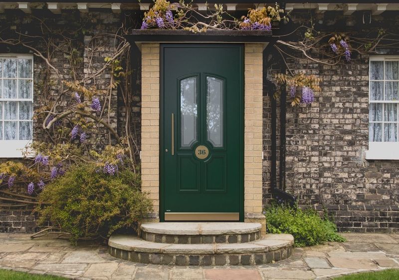
Traditional forest green taps into our collective appreciation for heritage and nature. This rich, deep shade creates a sense of permanence and stability that welcomes visitors while signaling thoughtful homeownership. Forest green works exceptionally well with brick, stone, and natural wood exteriors.
It creates a harmonious connection to surrounding landscaping elements while providing enough contrast to make your entrance distinct. The color’s historical associations with stability and prosperity make it particularly appropriate for traditional architectural styles. Unlike trendy greens that quickly date themselves, forest green has remained consistently appealing for centuries.
It hides dirt well and maintains its appearance longer than lighter shades. When paired with brass hardware, a forest green door creates a timeless look that signals quality and attention to tradition qualities that translate directly to higher perceived home value.
