12 Home Décor Mistakes Interior Designers Notice Right Away And How To Fix Them
Walking into someone’s home, professional interior designers can spot common decorating missteps in seconds flat.
These design blunders can make spaces feel awkward, uncomfortable, or just plain unfinished. The good news?
Most décor mishaps have simple fixes that can transform your space without breaking the bank. Let’s explore the most common decorating mistakes pros notice immediately and how you can easily correct them.
1. Hanging Art Too High
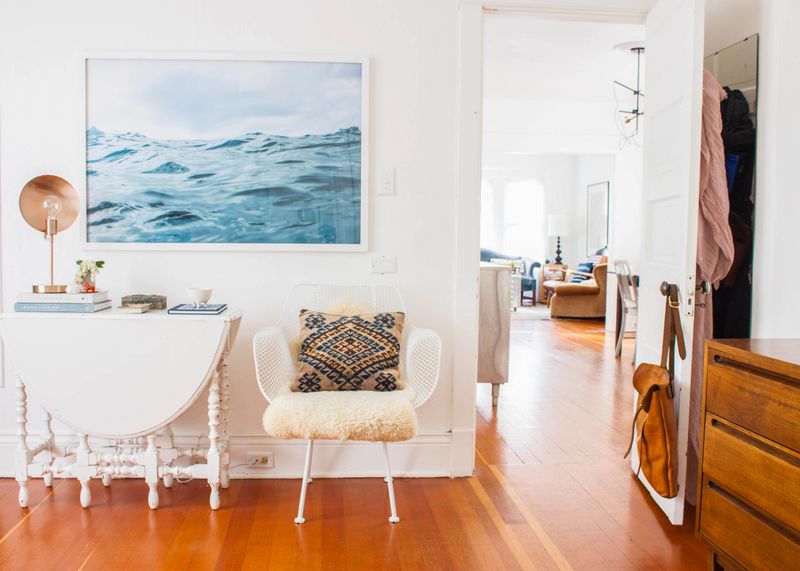
Ever walk into a room and feel something’s off but can’t quite place it? Often, it’s artwork floating awkwardly near the ceiling. Most homeowners hang pictures way too high, creating visual disconnection in the space.
The fix is straightforward: lower that art to eye level, specifically the center of the piece should sit about 57-60 inches from the floor. This height creates a natural viewing experience and helps anchor the room. When hanging art above furniture, leave just 4-8 inches of space between the furniture and the frame.
For gallery walls, treat the entire arrangement as one unit, with the center at eye level. This simple adjustment instantly makes rooms feel more intentional and professionally designed.
2. Rugs Too Small for Space
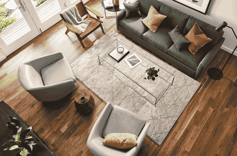
Tiny area rugs floating in vast rooms create that dreaded ‘postage stamp’ effect—making spaces feel disconnected and visually smaller. A too-small rug fails to anchor your furniture grouping and can make even expensive pieces look like they’re drifting aimlessly.
Size up dramatically! Your rug should be large enough for all furniture legs to rest on it, or at minimum, the front legs of each piece. In living rooms, aim for at least an 8×10 foot rug for standard spaces. Dining rooms need rugs extending at least 24 inches beyond table edges so chairs remain on the rug when pulled out.
If budget concerns are holding you back, layer a smaller statement rug over a larger, less expensive natural fiber option like jute or sisal.
3. Cluttered Surfaces
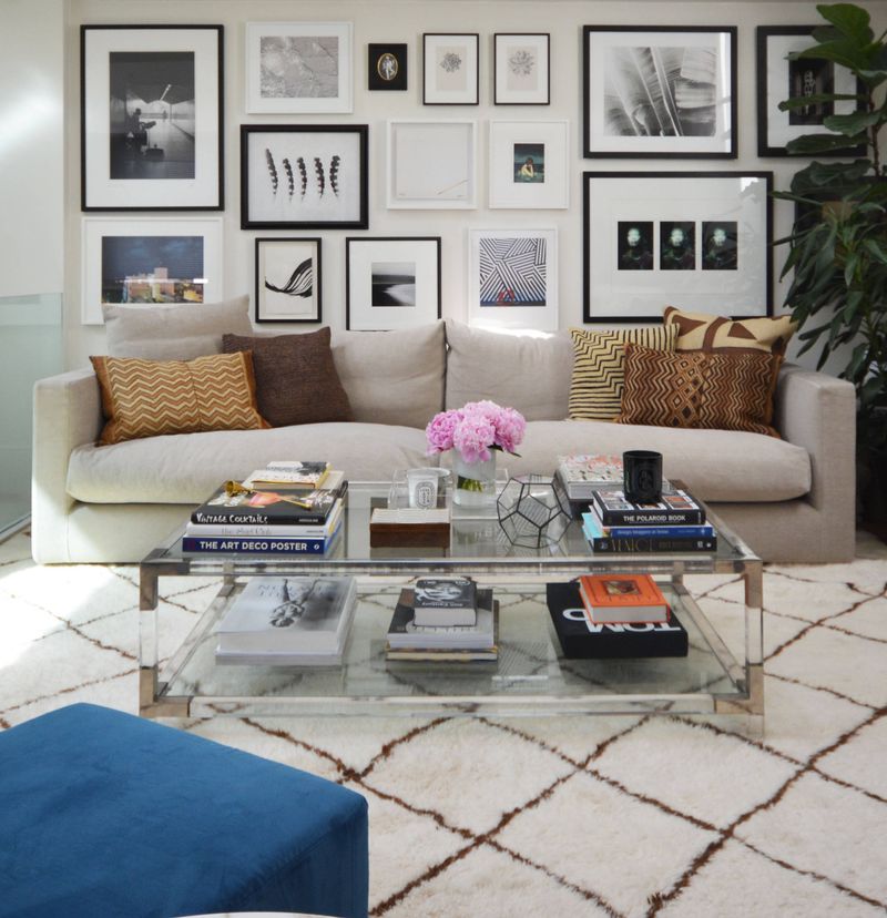
Knickknacks multiplying across every horizontal surface? That coffee table buried under magazines, remotes, and decorative objects? Designers immediately notice when tabletops, mantels, and shelves become landing zones for random items rather than curated displays.
Start fresh by clearing everything off. Then selectively return only what truly deserves display space, following the designer’s rule of three: group items in odd numbers (usually three) with varying heights. Consider the negative space the empty areas as important as the objects themselves.
Invest in attractive storage solutions for practical items like remotes. Remember, your eye needs places to rest between focal points. Embracing this “less is more” approach creates a sophisticated, intentional look that feels both calm and curated.
4. Harsh Overhead Lighting
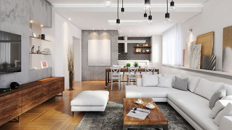
Nothing kills the mood of a room faster than relying solely on harsh overhead lighting. That single ceiling fixture casting unflattering shadows makes everyone look tired and spaces feel institutional rather than inviting.
Create a layered lighting plan with three key elements: ambient (general illumination), task (focused light for activities), and accent lighting (highlighting architectural features or art). Add table lamps on side tables, floor lamps beside reading chairs, and wall sconces to create warm pools of light throughout the space.
Don’t forget dimmers! Installing dimmer switches on existing fixtures gives you control over brightness levels for different times of day and activities. This lighting makeover transforms rooms from flat and cold to dimensional and cozy without major renovations.
5. Furniture Pushed Against Walls
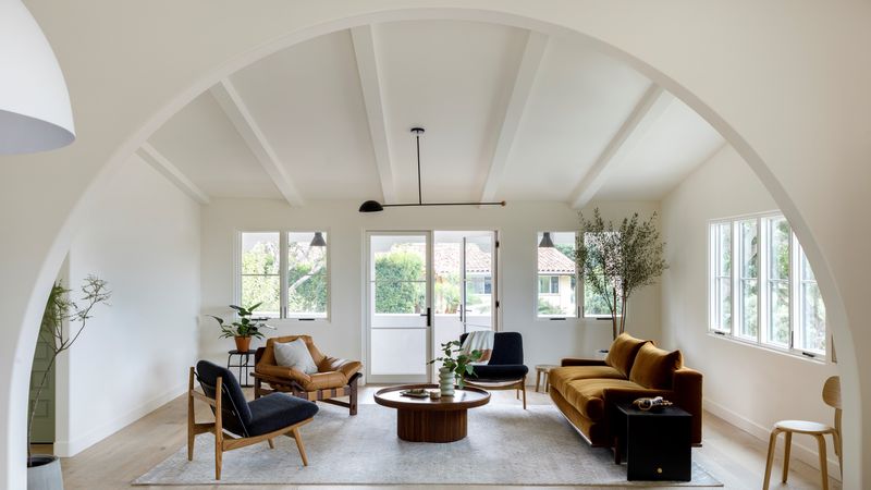
The ‘airport waiting room’ arrangement furniture lined up against walls with vast empty space in the middle screams amateur decorator. This common setup creates cold, uninviting rooms where conversation requires shouting across distances.
Pull those pieces inward! Create intimate conversation areas by floating furniture away from walls, arranged to face each other across a coffee table or ottoman. Even in small rooms, leaving just a few inches between furniture and walls creates an illusion of more space while improving flow.
Use area rugs to define and anchor these conversation zones. This simple rearrangement transforms rooms from sterile and awkward to warm and welcoming, encouraging genuine interaction. Plus, the new layout likely reveals untapped square footage for additional functionality like reading nooks or display areas.
6. Ignoring Window Treatments
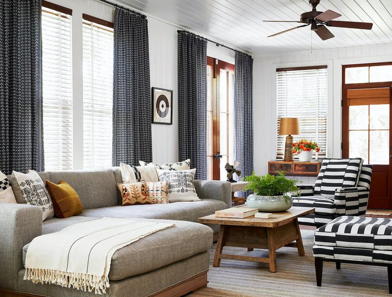
Bare windows make rooms feel unfinished and temporary, like you just moved in or are about to move out. Many homeowners skip window treatments entirely or settle for basic blinds, missing a major opportunity to add style, texture, and dimension.
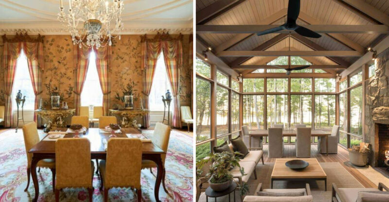
Well-chosen curtains or drapes instantly elevate spaces, adding softness, height, and sophistication. Mount curtain rods 4-6 inches above window frames and extend them 6-12 inches beyond each side to make windows appear larger. Select floor-length panels that just kiss the floor or pool slightly for luxury.
For privacy concerns without sacrificing style, layer treatments—perhaps sheer panels under decorative side panels, or woven shades beneath drapes. This combination approach provides flexibility while adding rich visual interest that transforms rooms from stark to polished.
7. Mismatched Wood Tones
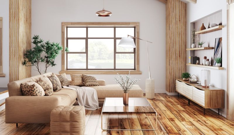
Random wood finishes creating visual chaos? Designers cringe at rooms with jarring combinations of cherry, oak, walnut, and pine all competing for attention. While perfectly matching every piece is outdated, truly random combinations feel accidental rather than intentional.
Instead of replacing furniture, embrace purposeful mixing! Choose a dominant wood tone for larger pieces, then incorporate 1-2 complementary tones for accent furniture. Connect disparate pieces using textiles and accessories a rug that contains both dark and light tones can bridge the gap between ebony and maple pieces.
If certain pieces still stand out awkwardly, consider refinishing just those items. Alternatively, separate mismatched woods by room, creating intentional wood palettes for different spaces. This thoughtful approach transforms wood tone chaos into a curated, collected-over-time look that designers actually strive to create.
8. Too Many Tiny Décor Pieces
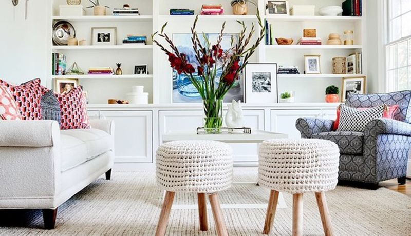
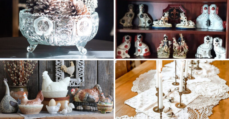
Scattered collections of small decorative items create visual noise and gather dust. Designers immediately spot the difference between meaningful curation and accumulation of trinkets that diminish overall impact and make spaces feel cluttered despite regular cleaning.
Trade those tiny tchotchkes for fewer, larger statement pieces. One substantial sculpture, vase, or bowl makes a stronger impression than twelve miniature figurines. Group smaller meaningful items into contained collections rather than spreading them throughout the room.
When shopping, resist those tempting small impulse purchases. Instead, save for significant pieces that anchor spaces and draw the eye. This doesn’t mean eliminating personal items—just displaying them more thoughtfully. The transformation is immediate: rooms instantly feel more sophisticated, intentional, and remarkably, more spacious despite having larger individual elements.
9. Lack of Texture Variety
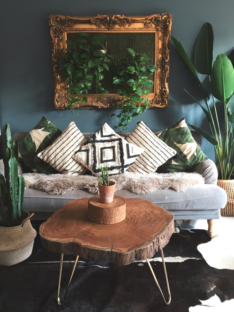
Flat, one-dimensional rooms lack visual interest even when colors coordinate perfectly. Designers immediately notice when spaces are missing tactile elements that engage both eyes and hands, making rooms feel incomplete and uninviting despite technically “matching” décor.
Add depth through textural contrast! Mix smooth surfaces (glass, polished metals) with rough elements (woven baskets, textured ceramics). Incorporate plush textiles through pillows, throws, and upholstery alongside sleeker materials like leather or velvet.
Natural elements provide excellent textural opportunities—consider wood grain, stone surfaces, plants, and organic materials like rattan or jute. Even walls benefit from textural treatments through grasscloth wallpaper, textured paint techniques, or architectural molding. This layering of contrasting textures transforms flat, forgettable spaces into rich, dynamic environments that feel complete and engaging.
10. Overly Matching Furniture Sets
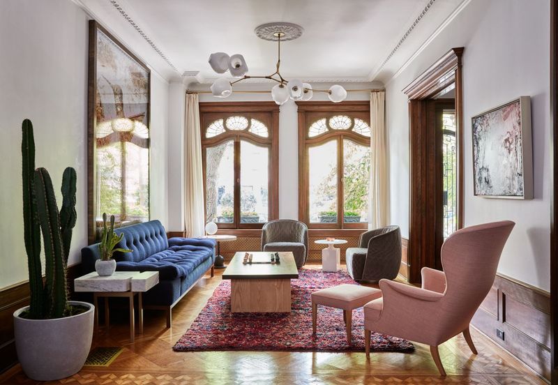
The showroom special—identical sofa, loveseat, and chair plus the matching coffee and end tables—creates that dreaded “furniture store display” look. Designers immediately recognize when homeowners purchase entire coordinated suites, resulting in spaces that feel impersonal and lacking individual character.
Break up those sets! Keep core pieces but replace one or two items with contrasting styles. Swap out matching end tables for vintage finds or modern alternatives. Add an accent chair in a completely different style but complementary color.
If starting fresh, build your room piece by piece rather than all at once. Mix contemporary with traditional, incorporating varied materials, finishes, and forms while maintaining a cohesive color palette. This approach creates spaces that tell your unique story rather than the furniture store’s, with a collected-over-time authenticity that matching sets simply cannot achieve.
11. Choosing Paint Color First
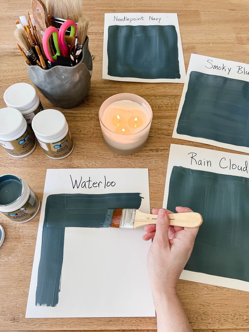
That stunning paint chip that inspired your entire room? Designers know it’s often the source of expensive disappointments. Selecting wall color before furniture and textiles severely limits your options for everything else—and those limitations often lead to compromised design decisions.
Reverse your decorating sequence! Choose key textiles and furniture first, then select paint colors that complement these harder-to-find elements. Paint comes in virtually unlimited options, while that perfect sofa might only be available in certain fabrics.
When you do select paint, test actual samples on multiple walls rather than relying on tiny chips. Colors change dramatically depending on lighting, room orientation, and surrounding elements. This sequencing shift putting paint selection last rather than first prevents costly mistakes and creates more cohesive, harmonious spaces where everything works together beautifully.
12. Bare Walls
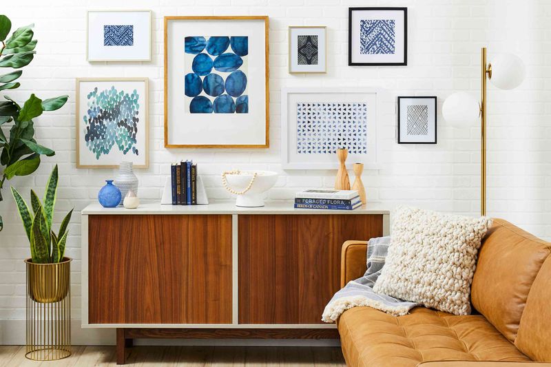
Empty walls scream “temporary living situation” rather than established home. Designers immediately notice when vertical surfaces remain blank canvases, making spaces feel unfinished and impersonal regardless of furniture quality or arrangement.
Walls offer prime real estate for expressing personality! Beyond traditional framed art, consider mirrors (which also expand visual space), textile hangings like macramé or vintage rugs, floating shelves displaying collections, or architectural elements like applied molding or shiplap.
Fear of commitment? Command strips and picture hanging systems allow for experimentation without permanent damage. Start with one statement piece centered above key furniture, then build around it. Group smaller pieces into gallery arrangements for impact. This vertical dimension transformation adds depth, character, and completeness to rooms that previously felt flat and provisional despite beautiful furnishings.
13. Ignoring Scale and Proportion
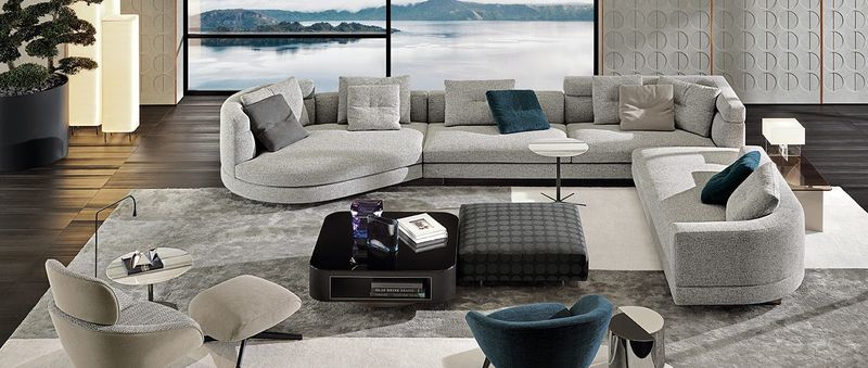
Furniture that’s too large overwhelms rooms while pieces too small appear lost and insignificant. Designers immediately spot these scale mismatches—like massive sectionals squeezing through narrow pathways or tiny coffee tables floating in vast open areas.
Before purchasing, map your space! Measure rooms accurately and create a floor plan (apps make this easy). Then outline potential furniture dimensions with painter’s tape directly on floors and walls to visualize impact. Allow 30-36 inches for walkways and 18 inches between seating and coffee tables.
Consider ceiling height too—taller rooms need vertical elements like bookcases or floor-to-ceiling drapes to feel balanced. When mixing furniture sizes, maintain consistent seat heights (typically 18-20 inches) for comfort. This attention to proper scaling transforms awkward, dysfunctional spaces into rooms that feel perfectly tailored to both their dimensions and your lifestyle.

