22 Home Offenses That Give Designers Instant Heartburn When They Walk Into Someone’s Home
Ever wonder what makes professional interior designers cringe when they step into a home? While beauty is in the eye of the beholder, certain design choices make professionals want to run for the hills.
These common decorating mistakes can drag down your home’s appearance and function. Top designers share the décor choices they consider the biggest offenders.
1. Popcorn Ceilings
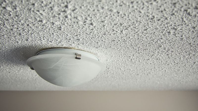
Walking into a room and glancing upward reveals the ultimate time capsule from decades past. Those bumpy, cottage-cheese textures collect dust and instantly date your home.
Popcorn ceilings were popular in the mid-20th century but now scream for an update. Modern designers favor smooth or subtly textured ceilings that create an airier, more contemporary feel.
2. Overstuffed Furniture Blocking Walkways
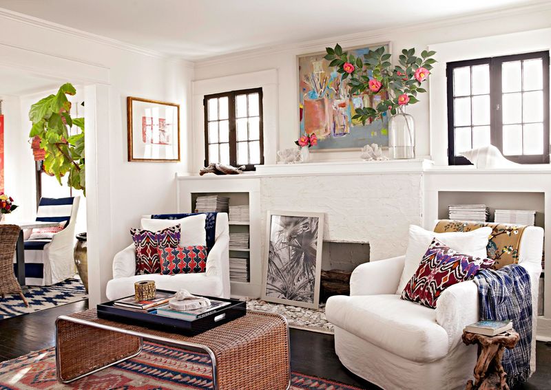
Navigating through a room shouldn’t feel like an obstacle course. When sofas and chairs choke pathways, the entire space feels cramped and unwelcoming.
Furniture placement requires thoughtful consideration of traffic flow. Designers recommend maintaining at least 30-36 inches of clearance for main walkways, allowing people to move freely without awkward shuffling or hip-checking corner tables.
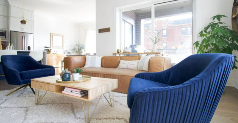
3. Matchy-Matchy Furniture Sets
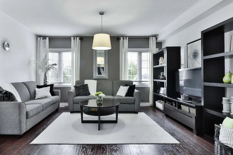
Remember those showroom specials where everything coordinates perfectly? That’s exactly what makes professional designers wince. Matching sets create a flat, uninspired look that lacks personality. True style comes from thoughtfully curated pieces that complement rather than duplicate each other.
Mix textures, finishes, and periods while maintaining a cohesive color palette for a space that feels collected, not ordered from a catalog.
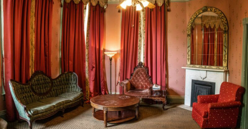
4. Heavy Window Treatments That Block Light
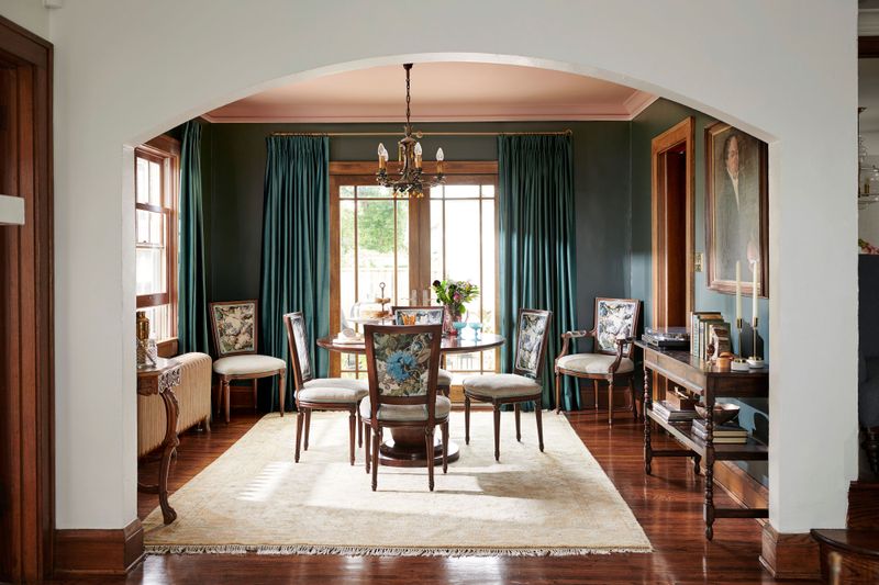
Massive drapes with valances and tiebacks can transform windows into dark caves rather than sources of beautiful natural light. These outdated treatments often involve multiple layers of fabric and ornate hardware. Natural light is precious in interior design.
Heavy window treatments not only block sunshine but make rooms feel smaller and more confined. Modern designers prefer simple, functional window coverings that frame views rather than hide them.
5. Plastic Couch Covers

The squeak and stick of plastic-wrapped furniture immediately transports designers back to grandma’s formal living room. While the intention is preservation, the result is uncomfortable and unwelcoming. Plastic covers send a clear message: this space isn’t for actual living.
Furniture is meant to be used and enjoyed. Modern performance fabrics offer stain resistance without sacrificing comfort, making plastic covers an unnecessary relic.
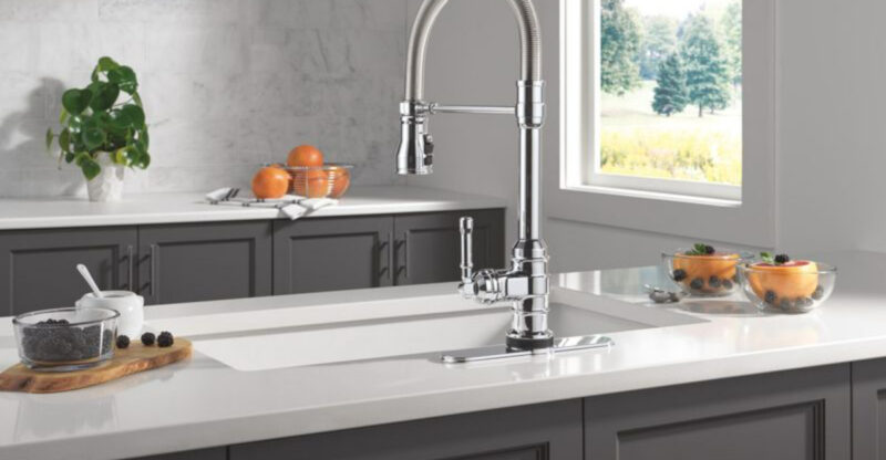
6. Cluttered Countertops In Kitchens And Bathrooms
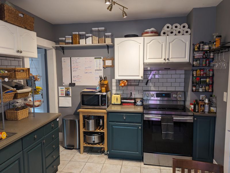
Visual chaos immediately greets the eye when surfaces disappear under appliances, decorations, and everyday items. Counter space should provide both function and visual breathing room. Cluttered countertops make spaces look smaller and less organized.
Designers recommend keeping only frequently used items visible while creating dedicated storage for everything else. This simple change can transform the entire feel of kitchens and bathrooms.
7. Cheap, Paper-Thin Curtains
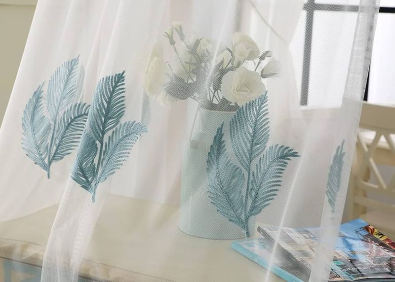
Flimsy window treatments instantly downgrade any room’s appearance. Those translucent, wrinkled panels that barely cover the window frame scream budget compromise. Quality window treatments should have proper fullness and weight.
Even inexpensive curtains can look elevated when they’re properly sized—extending beyond the window frame and hanging from ceiling to floor. The right curtains frame views and add necessary texture to rooms.
8. Faux-Finish Paint Techniques Gone Wrong
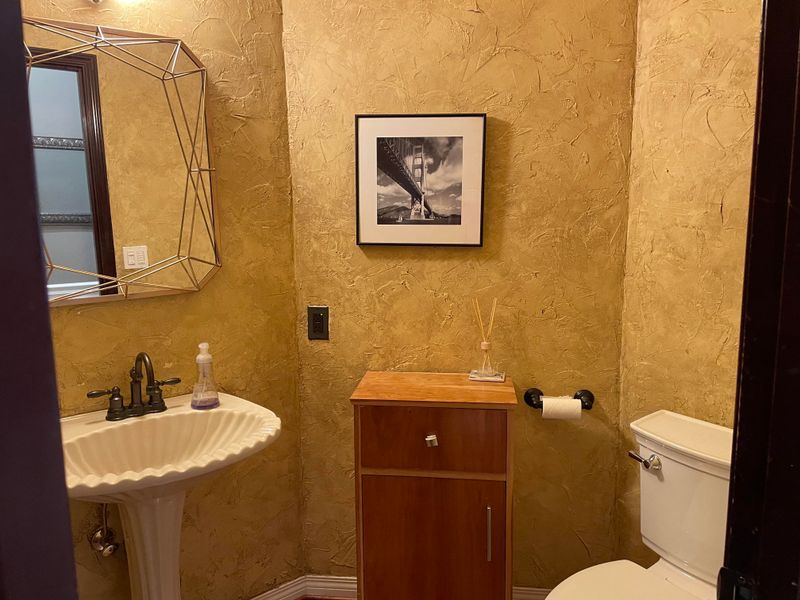
Amateur sponge painting and DIY Tuscan-inspired walls make designers reach for antacids. These dated techniques often result in uneven, busy surfaces that dominate rooms in all the wrong ways. Faux finishes had their moment in the 90s but rarely translate well to contemporary spaces.
Clean, well-executed paint jobs in carefully selected colors create more timeless backdrops for furnishings and art than trendy texture techniques that quickly become dated.
9. Area Rugs That Are Too Small
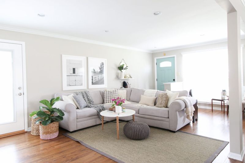
Nothing looks more awkward than furniture floating around a postage-stamp rug. Undersized rugs create visual disconnection and make rooms feel unbalanced and incomplete. Area rugs should anchor furniture groupings, not float adrift from them.
Designers follow the rule that at minimum, front legs of all seating should rest on the rug. In dining areas, rugs should extend at least 24 inches beyond table edges to accommodate chairs.
10. Excessive Wall Décor And Art Clutter
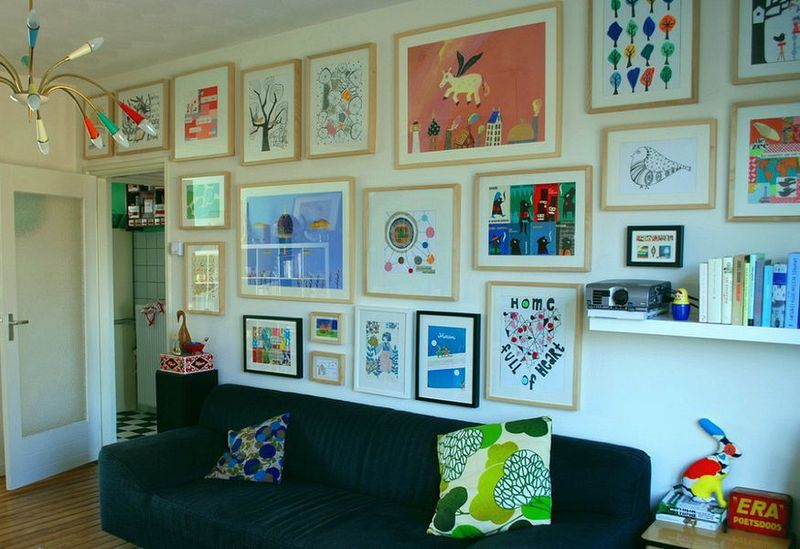
Walls plastered with dozens of small frames and decorative items create visual noise that overwhelms the eye. Gallery walls require thoughtful curation, not just filling every inch of space. Excessive wall décor prevents any single piece from making an impact.
Professional designers advocate for meaningful curation – fewer, larger pieces arranged with intention and proper spacing. This approach creates focal points rather than visual confusion.
11. Too Many Family Photos On Display
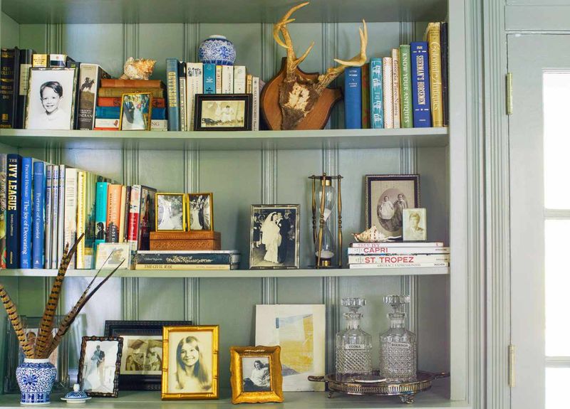
Frames covering every surface turn homes into personal museums rather than designed spaces. While family memories are precious, overwhelming displays create visual clutter and lack cohesion. Family photos deserve thoughtful presentation.
Designers suggest curating collections in dedicated areas like hallways or family rooms, using consistent frame styles. Digital frames offer rotating displays that preserve memories without consuming excessive wall and surface space.
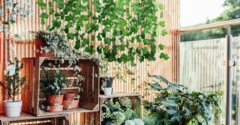
12. Fake Plants Covered In Dust
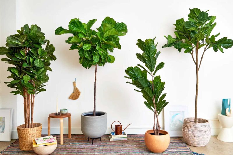
Faded, dusty silk foliage instantly broadcasts neglect and outdated décor choices. Those once-green leaves now sporting a gray film do nothing to enhance spaces.
Artificial plants require regular cleaning to avoid becoming dust collectors. Designers prefer real plants for their air-purifying benefits and natural beauty, but if maintenance is impossible, high-quality faux greenery kept impeccably clean can work in select locations.
13. Outdated Light Fixtures
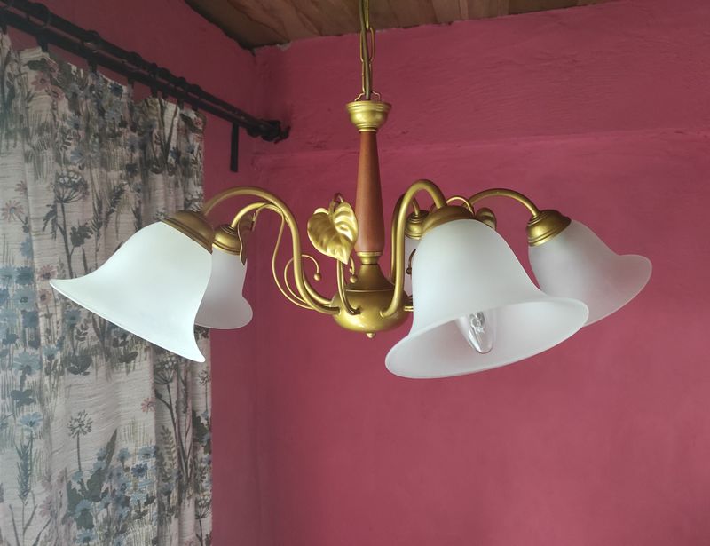
Brass chandeliers from the 80s and fluorescent kitchen boxes instantly date homes. Lighting fixtures function as jewelry for rooms, and outdated pieces drag down otherwise updated spaces. Lighting technology and design have evolved dramatically.
Modern fixtures provide better illumination while serving as architectural elements. Swapping dated fixtures for contemporary designs offers one of the highest returns on investment for visual impact in home updates.
14. Bold Accent Walls In Overwhelming Colors
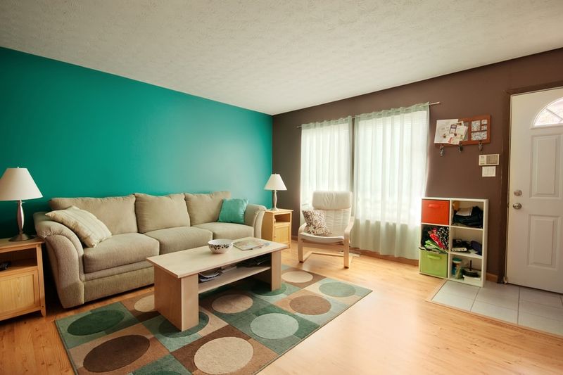
Screaming red dining rooms and electric blue bedrooms make color-conscious designers reach for sunglasses. These high-intensity accent walls often feel disconnected from overall design schemes.
Bold accent walls gained popularity as an easy way to add drama, but many turn into visual shouts rather than sophisticated statements. Designers typically prefer cohesive color stories throughout spaces, using texture and subtle variations rather than jarring contrasts.
15. Out-Of-Scale Furniture For Room Size
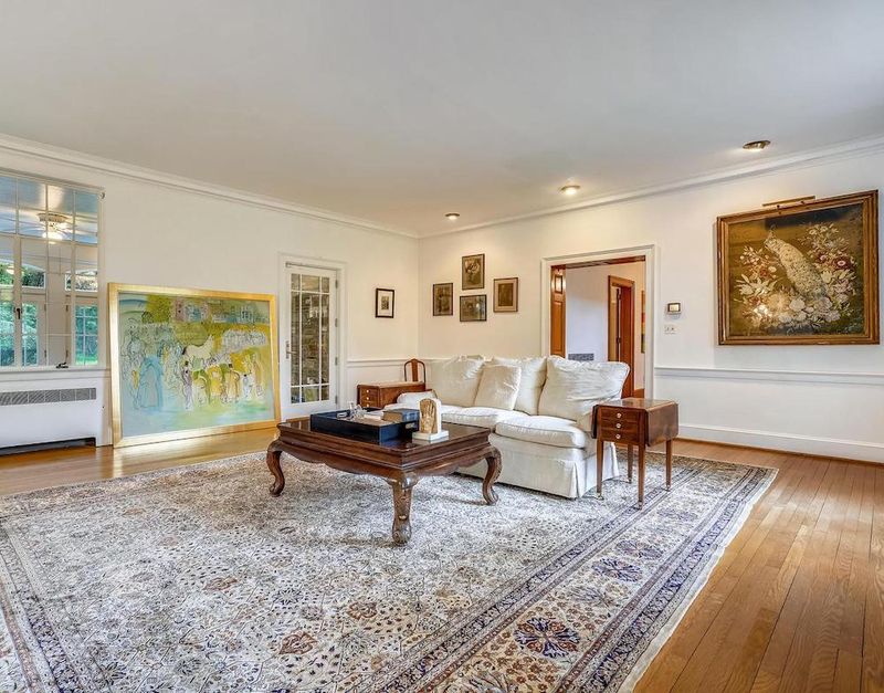
Massive sectionals crammed into tiny apartments or dainty chairs floating in cavernous spaces create immediate proportion problems. Scale mismatches are among the most common and visually jarring design mistakes.
Furniture should relate appropriately to room dimensions. Designers measure carefully before selecting pieces, ensuring proper clearances and visual weight. Even modest spaces can accommodate statement pieces when other elements are scaled accordingly.
16. Generic Art From Big Box Stores Everywhere
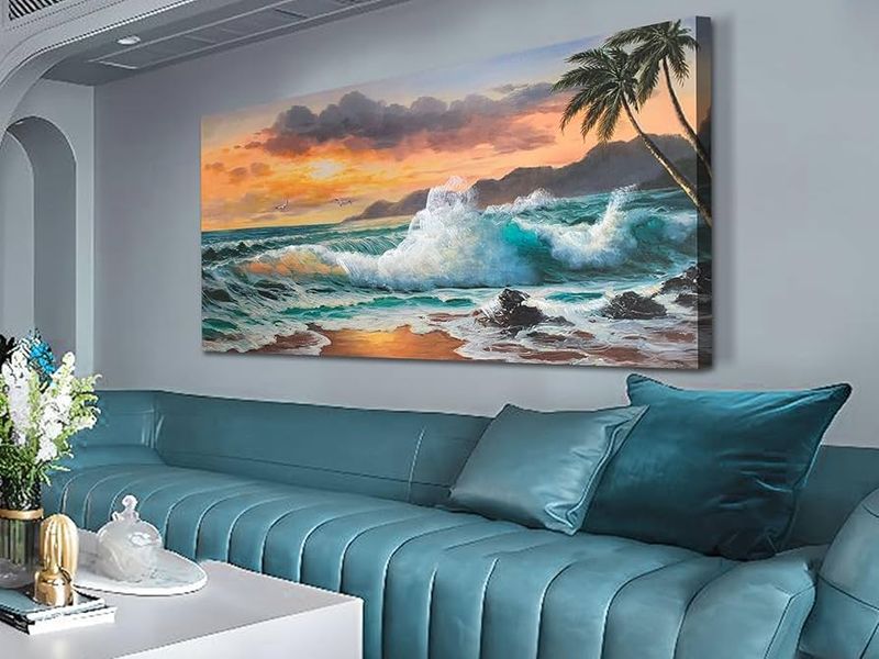
Mass-produced canvas prints featuring inspirational quotes and ubiquitous landscapes signal missed opportunities for personal expression. These pieces appear in thousands of homes, offering nothing unique or meaningful.
Generic art fails to tell your personal story. Designers encourage clients to collect pieces that resonate emotionally – whether original works, photographs, or even framed children’s art. Authentic art choices create homes that feel distinctly yours rather than copied from store displays.
17. Toilet Rugs And Fuzzy Lid Covers
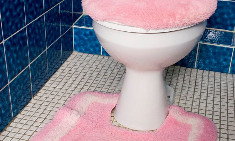
Plush toilet accessories in coordinating colors rank among designers’ most-mentioned bathroom offenses. These fuzzy sets collect moisture, harbor bacteria, and visually overwhelm small spaces. Bathroom textiles should balance function with aesthetics.
Contemporary designers prefer washable bath mats placed strategically near showers and tubs, leaving toilets uncovered. This approach creates cleaner lines while improving hygiene in one of the home’s most intimate spaces.
18. Overuse Of Themed Décor
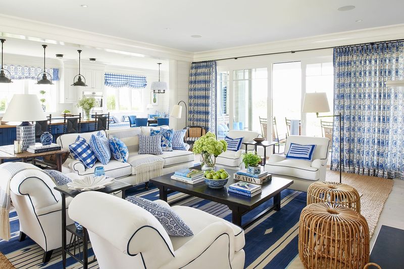
Rooms that scream “beach house” with seashells on every surface or Tuscan kitchens with grape motifs everywhere feel more like movie sets than authentic living spaces. Theme overload sacrifices subtlety for repetitive motifs.
Themed décor works best with restraint. Designers suggest incorporating influences through color palettes and textures rather than literal interpretations. This approach creates spaces that evoke feelings rather than hitting visitors over the head with obvious references.
19. Mirrored Walls From Decades Past
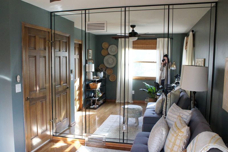
Entire walls covered in mirrors immediately transport designers back to the disco era. While intended to create illusions of space, these reflective expanses often feel dated and disorienting. Mirrored walls dominated 1970s and 80s design but rarely translate well to contemporary interiors.
Modern designers use mirrors strategically – placed to reflect light or views – rather than covering entire surfaces. This targeted approach achieves spatial enhancement without the dated aesthetic.
20. Badly Hung Curtains Or Blinds
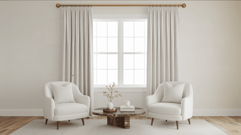
Rods mounted just above window frames with curtains barely reaching the sill make windows appear stunted and rooms feel shorter. This common mistake diminishes architectural features rather than enhancing them.
Window treatments should frame and elevate windows. Professional designers hang curtain rods close to the ceiling and ensure panels reach the floor. This simple adjustment creates an illusion of height and turns standard windows into more dramatic architectural elements.
21. Wires And Cords Visible Everywhere
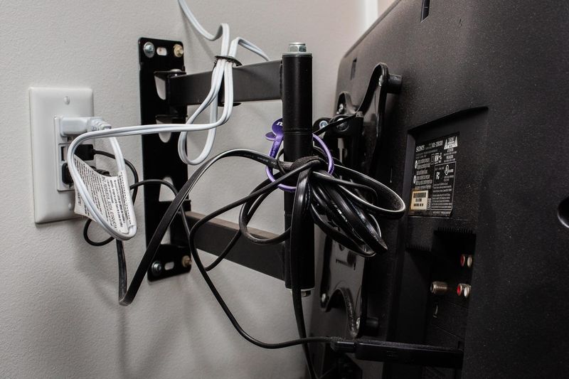
Tangled black snakes trailing from electronics create visual chaos that disrupts otherwise thoughtful design. Exposed cords instantly read as clutter regardless of how organized the rest of the space appears. Cable management separates amateur from professional interiors.
Designers plan for cord concealment through furniture placement, cord covers, and strategic outlet usage. Wireless technology has made this easier, but thoughtful planning remains essential for tech-heavy households.
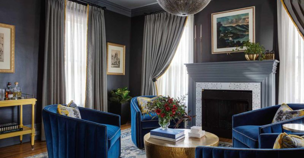
22. Dark, Heavy Colors In Small Rooms
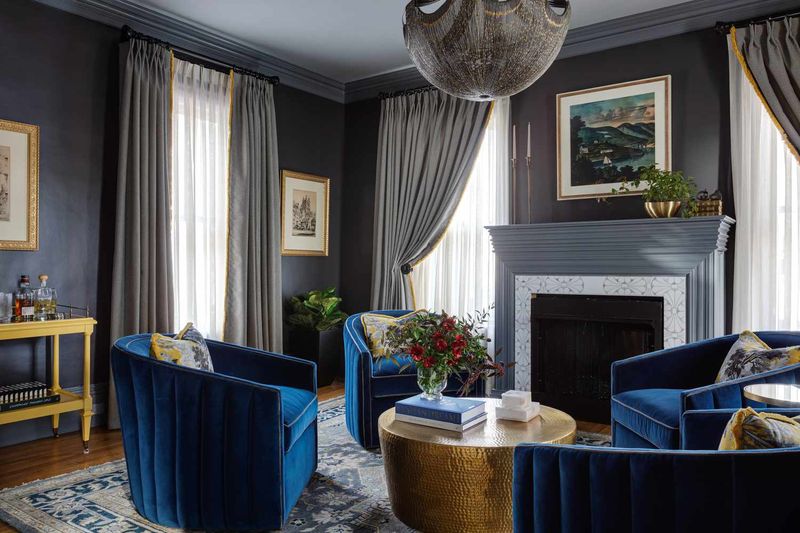
Charcoal walls and mahogany furniture can turn modest rooms into cave-like spaces that feel oppressive rather than cozy. Color dramatically impacts spatial perception. Dark colors absorb light and visually shrink spaces.
While deep tones can create intimacy in large rooms, they often overwhelm smaller ones. Designers typically recommend lighter, more reflective finishes for modest spaces, saving dramatic dark colors for accents or rooms with abundant natural light.

