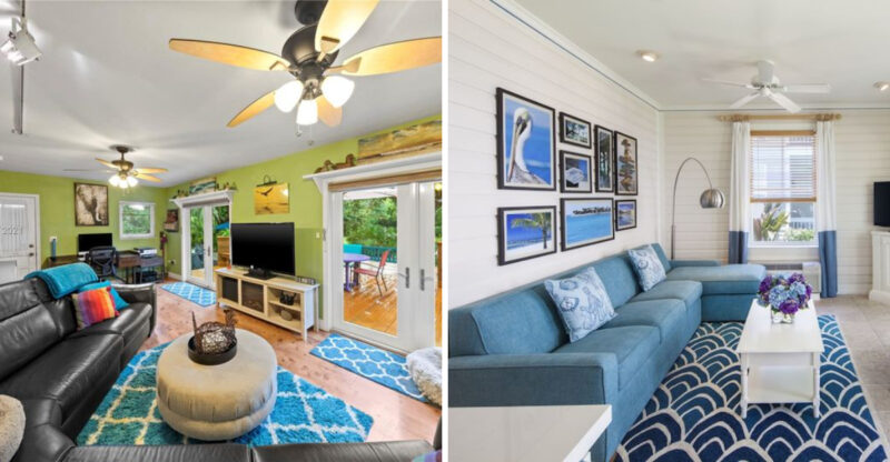
8 Home Styling Trends Professionals May Quietly Avoid
Ever wonder why some home decor trends make professional interior designers wince? While your personal taste should always come first, certain styling choices can quietly sabotage a room’s look and feel.
Drawing on insights from design experts, I’ve highlighted common trends they often wish would disappear.
Keep in mind that results can vary depending on your space and style, but being aware of these potential pitfalls can help you avoid costly mistakes and create a home you truly love.
1. Overboard With Dark Paint
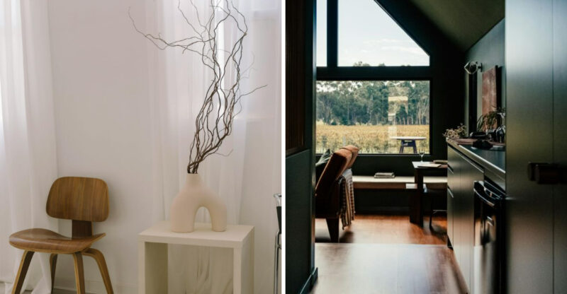
Dark walls can create drama, but professionals know they’re tricky to pull off successfully. Charcoal, navy, and black paints absorb light rather than reflect it, potentially making rooms feel smaller and more confined than they actually are.
Many homeowners underestimate how dramatically dark colors transform a space. What looked cozy in a magazine spread might feel like a cave in your home, especially in rooms with limited natural light. Designers typically prefer using darker hues as accents instead perhaps on a single feature wall or through furniture pieces.
This approach delivers the desired dramatic effect without sacrificing the airy, welcoming feel most people want in their living spaces.
2. Pattern Pandemonium in Tight Spaces
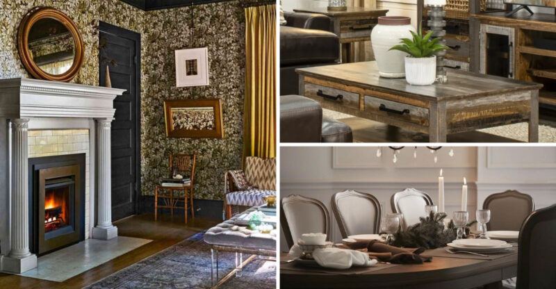
Bold wallpaper can transform a room, but professionals know that busy patterns in small spaces often backfire spectacularly. Intricate, large-scale patterns visually close in walls rather than expanding them.
When a pattern contains multiple colors, shapes, and directions, it demands attention and creates visual noise. In powder rooms, narrow hallways, or compact bedrooms, this visual stimulation can feel overwhelming rather than welcoming. Designers typically recommend simpler patterns with breathing room between motifs for smaller spaces.
Alternatively, they might suggest using bold patterns on just one accent wall while keeping the rest of the space neutral. This creates visual interest without the claustrophobic feeling that comes from being surrounded by busy designs.
3. Form Over Function Furniture Fails
That sculptural chair might look amazing on Instagram, but designers know the disappointment of furniture that prioritizes looks over comfort. Trendy pieces with awkward angles, minimal padding, or impractical dimensions quickly become expensive mistakes.
I’ve seen clients fall for ultra-modern sofas with razor-thin cushions and rigid frames that nobody actually wants to sit on. The result? Beautiful showpieces that remain unused while family members crowd onto the one comfortable chair in the room.
Professional designers typically test-sit furniture before recommending it and consider how clients actually live. They understand that even the most visually striking piece fails if it doesn’t fulfill its primary purpose – whether that’s providing comfortable seating, practical storage, or functional workspace.
4. Pillow Mountain Madness
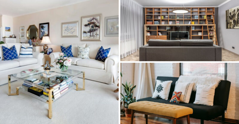
Throw pillows can add color, texture and personality to a space but professionals know when enough is enough. Walking into a room where sofas disappear beneath mountains of decorative pillows sends designers reaching for their editing hats.
Beyond the visual clutter, excessive pillows create a practical problem. Where do they go when someone actually wants to sit down? The floor becomes a pillow dumping ground, or worse, guests feel uncomfortable disturbing your perfect arrangement.
Most designers follow the ‘less is more’ approach with decorative accessories. Three to five well-chosen pillows that complement rather than overwhelm your furniture create impact without the impracticality. Quality over quantity wins every time when it comes to these soft accents.
5. Theme Park Decorating Disasters
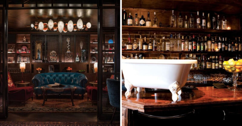
Anchors, shells and rope knots might work for a beach house bathroom, but designers cringe when themed décor takes over entire homes. Heavily themed spaces quickly feel like theatrical sets rather than livable environments.
Nautical, rustic farmhouse, or Tuscan villa themes pushed to extremes create spaces that feel forced rather than authentic. The problem multiplies when themes clash from room to room, creating a disjointed fun-house effect throughout the home. Professional designers typically prefer incorporating subtle thematic elements through carefully selected accent pieces.
A few coastal elements mixed with timeless furniture creates the relaxed beach vibe without screaming ‘I really love anchors!’ This restrained approach feels more sophisticated and allows personalities to shine through without becoming a caricature.
6. Fake Plant Fatigue
Artificial greenery has come a long way, but designers can spot a fake fiddle leaf fig from across the room. While silk plants offer maintenance-free convenience, they collect dust, fade over time, and lack the dynamic energy living plants bring to spaces.
The worst offenders are low-quality artificial plants with unrealistic colors and plastic-looking leaves. These immediately cheapen a space rather than enhancing it. Even high-end faux plants eventually reveal themselves through their too-perfect, never-changing appearance.
Most designers advocate for real plants whenever possible, suggesting low-maintenance varieties like snake plants, ZZ plants, or pothos for plant-challenged clients. If artificial plants are necessary, they recommend investing in the highest quality options and placing them where they won’t be subjected to close inspection.
7. Open Shelving Reality Check
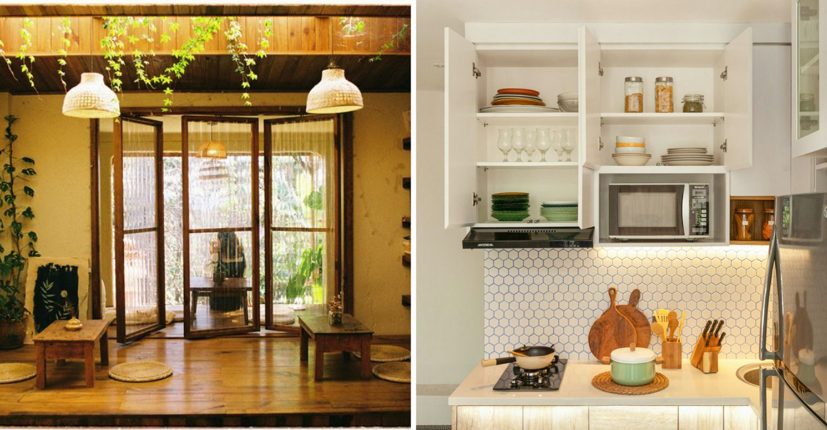
Instagram-worthy kitchen shelving displays look fantastic in photos but create maintenance nightmares in real homes. Designers quietly shake their heads at open shelving installations for clients who don’t have picture-perfect dish collections or the time to maintain museum-like displays.
Cooking creates grease and dust that settles on exposed items, requiring frequent cleaning. Without the protection of cabinet doors, everyday dishes, glasses, and pantry items become visual clutter unless meticulously arranged and edited. Professional designers often recommend limiting open shelving to small areas for display of carefully curated items.
They understand that behind closed cabinet doors is where most real-life kitchen items belong especially in homes with busy families, serious cooks, or those who prefer function over constant styling.
8. Lighting Style Schizophrenia
Lighting fixtures set a room’s tone, which is why designers cringe at spaces mixing industrial pendants, crystal chandeliers, and minimalist sconces. This fixture free-for-all creates visual confusion rather than cohesive design.
While lighting doesn’t need to match perfectly, it should maintain a consistent design language. Ultra-modern track lighting alongside traditional candle-style wall sconces creates stylistic whiplash rather than intentional eclecticism. Design professionals typically select lighting fixtures that complement each other through shared elements similar materials, complementary shapes, or consistent scale.
They understand that lighting should feel intentional rather than coincidental. Even when mixing styles, they ensure fixtures share some common thread that ties the lighting plan together into a harmonious whole.
