28 Home Trends That People Want To Throw Up Over Because They’re So Overdone
Home design trends come and go, but some styles just refuse to fade away.
When a trend becomes too popular, it loses its charm and starts to make people cringe.
We’ve all walked into a house and thought, “Not this again!” as we spot the same tired decor choices we’ve seen a thousand times before. Here are 28 home design trends that have officially overstayed their welcome.
1. Shiplap Walls
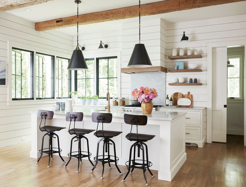
Joanna Gaines has a lot to answer for! Once a charming nod to rustic living, shiplap has invaded every suburban home from coast to coast. The horizontal wooden boards were originally used as exterior siding or in utilitarian spaces like barns.
Now they’re slapped on feature walls, bathrooms, and even ceilings. People install fake shiplap made of vinyl or MDF, completely missing the weathered authenticity that made it special in the first place.
What started as a unique design choice has become the calling card of cookie-cutter farmhouse wannabes. Even real estate agents groan when they spot yet another shiplap accent wall during home tours.
2. Gray Everything
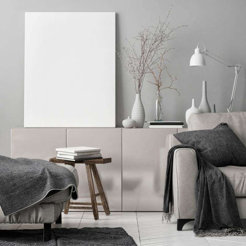
Gray became the go-to neutral about a decade ago, and boy, did people run with it! Walls, cabinets, floors, furniture entire homes drenched in fifty shades of the same boring color. What started as a sophisticated alternative to beige quickly morphed into a personality-free zone.
Walking into these monochromatic spaces feels like stepping into a black-and-white movie, except without any of the charm or character. The worst offenders pair gray walls with gray floors, gray couches, and – you guessed it more gray accents.
Designers are now begging clients to embrace color again. Even a hint of blue or green would break up the depressing concrete bunker vibes these all-gray spaces give off.
3. Barn Doors
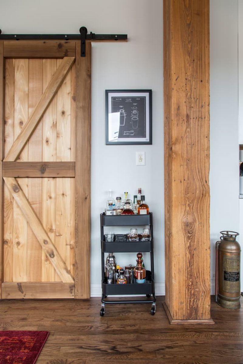
Sliding barn doors burst onto the interior design scene as a space-saving solution with rustic charm. Fast forward a few years, and they’re hanging in every possible location bathrooms, bedrooms, pantries, and closets whether they make sense or not.
The privacy issues alone should disqualify them from bathroom use. Nothing says relaxation like a door that leaves gaps on all sides while you’re trying to do your business! Not to mention the noise factor that metal hardware announces your movements to the entire household.
Most barn doors installed in modern homes have never seen a barn, farm animal, or piece of hay. They’re just hollow core doors with fancy hardware, desperately pretending to have agricultural street cred.
4. Open Shelving
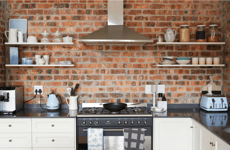
Instagram convinced everyone that displaying their mismatched mugs and pasta jars would somehow look like a magazine spread. Reality check: open kitchen shelving is a dust-collecting, high-maintenance nightmare that requires constant styling to look good.
Your everyday dishes aren’t display-worthy art pieces. Those shelves quickly become cluttered with random items that don’t photograph well for social media. Plus, cooking grease and dust form a lovely film on everything within weeks.
Most people don’t have the discipline to maintain perfectly styled shelves with color-coordinated items. The rest of us just want to hide our mismatched Tupperware and chipped plates behind cabinet doors where they belong. Practicality should trump performative homemaking.
5. Word Art
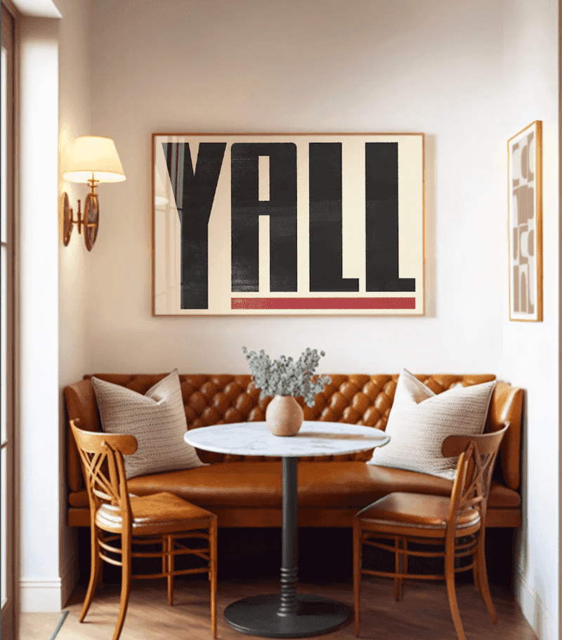
Nothing screams “I have no personality” quite like a wall covered in generic inspirational phrases. “Live, Laugh, Love” and “Blessed” signs have multiplied faster than rabbits in suburban homes across America. These mass-produced pieces lack any genuine meaning or artistic value.
The worst offenders are the giant kitchen words like “EAT” or bathroom commands like “WASH” as if we might forget what rooms are for without helpful reminders. Some homeowners have turned their walls into literal instruction manuals for life.
If you need your wall art to tell you to “Gather” in your dining room or remind you that “Family” is important, perhaps it’s time to reconsider your decor choices. True personal style comes from objects with actual significance, not meaningless platitudes from the home goods store.
6. Faux Farmhouse
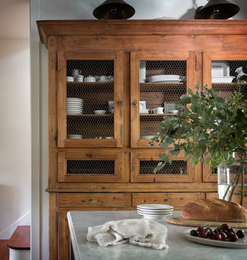
Unless you actually milk cows or grow corn for a living, the farmhouse aesthetic probably doesn’t make sense for your suburban split-level. This trend has people who’ve never set foot on actual farmland decorating with distressed wood, metal milk jugs, and chicken wire accents.
Authentic farmhouse style evolved from necessity and function. Modern interpretations just slap “rustic” elements onto otherwise contemporary homes, creating a confusing design identity crisis. The worst examples mix barn doors, industrial pipe shelving, and reclaimed wood with sleek stainless appliances.
Genuine farmhouses don’t have those cutesy signs with farm animal silhouettes or decorative (never-used) metal watering cans. If your idea of farm life comes exclusively from HGTV marathons, maybe reconsider the aesthetic altogether.
7. Edison Bulbs
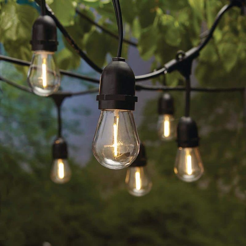
Edison bulbs had their moment a very long, energy-inefficient moment. These exposed filament bulbs cast a warm glow that’s admittedly pleasant, but they’ve been installed in every restaurant, coffee shop, and home bar since 2010.
Beyond their ubiquity, they’re terrible at their primary job: providing light. The amber glow might be atmospheric, but try reading a book or chopping vegetables under these dim decorative elements. Many homeowners install them in clusters or oversized fixtures to compensate for their poor illumination.
The industrial-chic look these bulbs helped define has become so mainstream that it’s lost all edginess. Plus, the environmental impact of these energy hogs is substantial. Modern LED versions exist, but they still symbolize a tired trend that refuses to burn out.
8. Chevron Overload
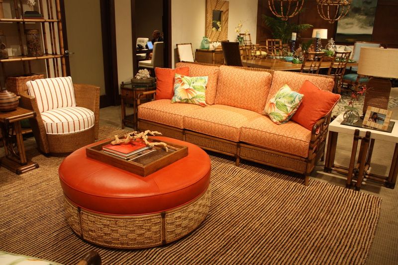
Chemvron patterns zigzagged their way into our homes around 2012 and refused to leave. What started as a fresh geometric alternative to stripes quickly turned into a design epidemic. Rugs, pillows, curtains, bedding – no textile was safe from the chevron invasion.
The worst offenders mixed multiple chevron items in clashing colors within the same room. The busy pattern creates visual chaos when overused, making spaces feel cluttered and disorienting. Even more annoying is how instantly dateable it makes a space look.
Seeing chevron now immediately transports you back to the early 2010s Pinterest boards. While subtle use of this pattern can work in small doses, the full chevron assault we’ve endured has left most design enthusiasts with a permanent zigzag aversion. Some patterns deserve to fade away gracefully.
9. Overused Marble
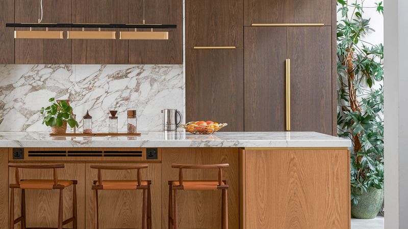
Marble countertops jumped from luxury kitchens to absolutely everywhere, including places where this porous, high-maintenance stone makes zero practical sense. Bathrooms, tabletops, and even walls are now covered in this easily stained material or its countless imitations.
The white-with-gray-veining Carrara variety became so ubiquitous that it lost all sense of specialness. Fake marble accessories flood home goods stores phone cases, contact paper, mousepads, and even toilet brush holders try to capture the luxury vibe but end up looking cheap.
Real marble requires constant sealing and careful cleaning to prevent etching and staining. Most homeowners learn this the hard way after their first red wine spill or lemon juice incident. Sometimes materials should remain special rather than being democratized to the point of meaninglessness.
10. All White
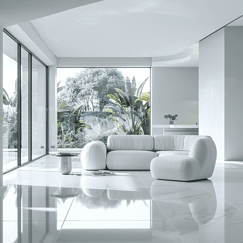
The all-white interior trend turned homes into sterile, museum-like spaces where people seem afraid to actually live. White walls, white furniture, white floors, white accessories these monochromatic nightmares look stunning in magazines but prove impractical for anyone with children, pets, or a coffee habit.
Maintaining these spaces requires constant vigilance and cleaning. The stark white backdrop often creates a cold, uninviting atmosphere that feels more like a laboratory than a home. Even worse is how these spaces amplify every speck of dust and dirt.
Design should reflect personality and warmth, not just photograph well for social media. The all-white trend exemplifies style over substance, creating showcase homes that prioritize appearance over comfort and livability. Real homes have color, texture, and yes, the occasional mark that proves humans actually live there.
11. Matching Sets
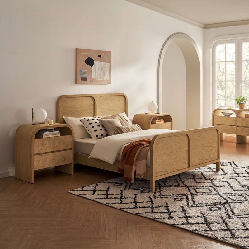
Furniture showrooms convinced generations that buying the complete matching bedroom or living room set was the epitome of good taste. In reality, these cookie-cutter collections lack personality and make homes look like uninspired hotel rooms or furniture store displays.
The matching nightstands, dressers, headboard, and mirror create a boring, predictable space with no visual interest or character. Even worse are the living room trifectas sofa, loveseat, and chair in identical upholstery, often with matching coffee and end tables.
Thoughtfully curated spaces mix complementary pieces that tell a story about the inhabitants. When everything matches perfectly, rooms feel flat and impersonal, as if no actual human made any design decisions. Breaking up sets and incorporating varied pieces creates more visually interesting and authentic spaces.
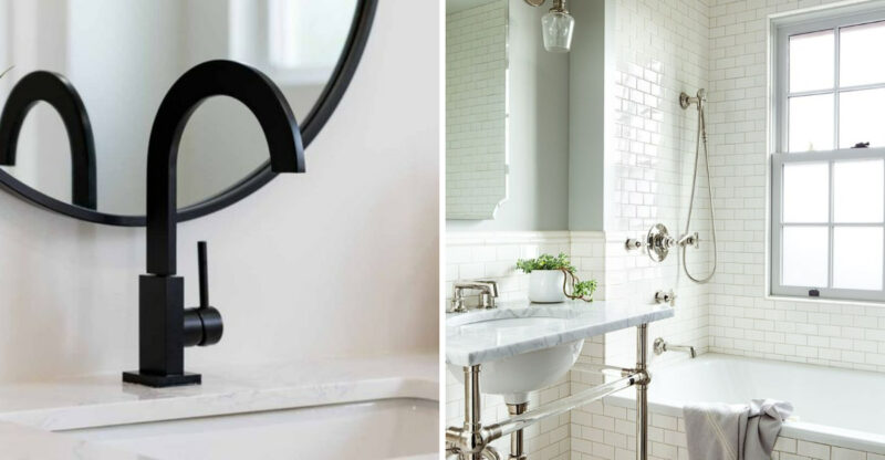
12. Subway Tile
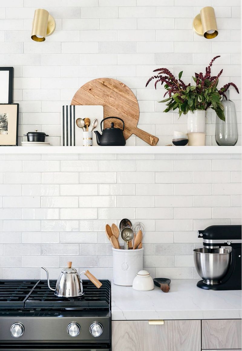
Subway tile has traveled far beyond its original underground stations to cover every kitchen and bathroom wall in America. The simple 3×6 white rectangles arranged in a brick pattern became the safe, default choice for anyone afraid to make a design statement.
The problem isn’t that subway tile looks bad it’s fine, just incredibly predictable. Flipping through home renovation shows feels like watching the same episode repeatedly as another white subway backsplash appears. Some try to spice it up with contrasting grout, but that just screams “I wanted to be slightly different while still playing it completely safe.”
Tile comes in countless shapes, colors, and patterns that could add genuine character to spaces. Yet millions continue installing the same basic white rectangles, creating kitchens and bathrooms that are completely indistinguishable from one another.
13. Minimalist Madness
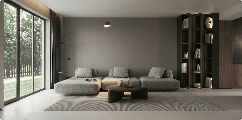
Extreme minimalism transformed homes into sparse, uncomfortable spaces that look unlived-in and cold. These interiors feature bare white walls, nearly empty rooms, and a suspicious lack of any objects that might suggest actual humans with hobbies or interests live there.
Marie Kondo-inspired purging went too far, convincing people to discard meaningful items in pursuit of Instagram-worthy emptiness. The minimalist aesthetic often creates unwelcoming spaces that prioritize a curated appearance over comfort or functionality.
Real homes should reflect the people who live in them, including their collections, interests, and daily lives. When minimalism becomes an extreme sport of owning as little as possible, it stops being mindful and starts being performative. Balance is key thoughtful curation doesn’t mean eliminating everything that makes a house feel like a home.
14. Exposed Pipes
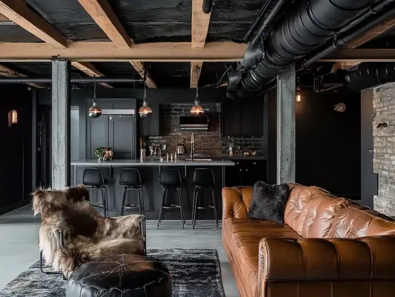
Industrial chic design brought plumbing and ductwork out of hiding and into our living spaces. What began as an authentic feature of converted lofts became a forced aesthetic in suburban homes with no industrial history. Exposed pipes and ducts only make sense in buildings where they were originally visible.
Homeowners started installing fake pipes as decorative elements or leaving plumbing exposed during renovations to capture that coveted “urban loft vibe.” The worst examples feature copper pipes that serve no purpose other than looking industrial, often in homes built decades after indoor plumbing became standard.
This trend ignores the practical reasons why we typically conceal these functional elements. Exposed pipes collect dust, create cleaning challenges, and often look completely out of place in traditional homes. Sometimes architectural elements should stay hidden within the walls where they belong.
15. Sliding Barns
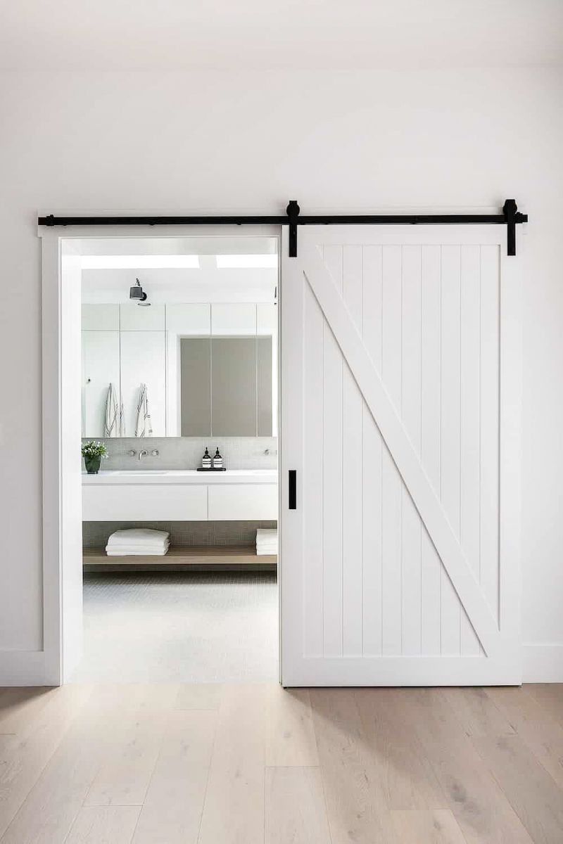
Sliding barn doors represent the perfect storm of form over function in home design. These agricultural imports rarely make sense in residential settings, where doors typically need to provide privacy and sound insulation two things barn doors fail miserably at.
The gaps around all edges mean conversations, sounds, and even smells travel freely between spaces. Try having a private bathroom moment with a barn door that leaves half-inch gaps on all sides! The hardware often derails, creating frustrating functionality issues.
Most residential barn doors are purely decorative versions with no connection to actual barns. They’re typically too heavy for the walls they’re mounted on, leading to structural issues over time. When a door style prioritizes looking rustic over actually working as a door, it’s probably time to reconsider the choice.
16. Distressed Wood
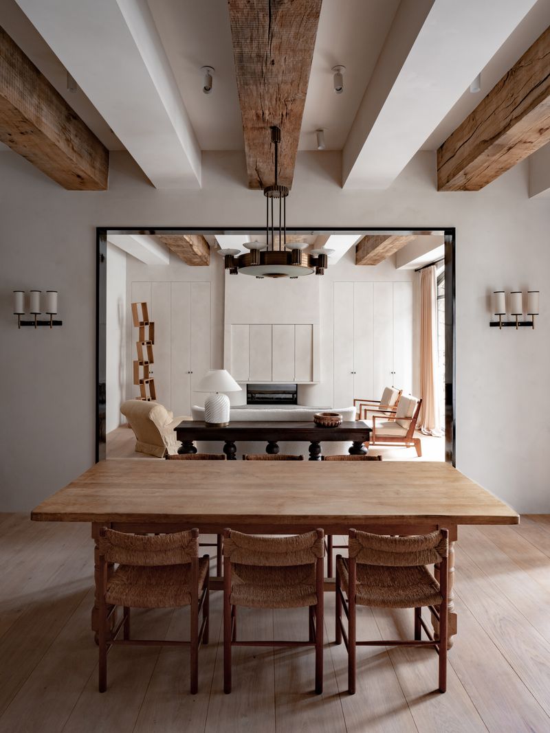
The obsession with artificially aged wood has gone too far. Furniture and flooring manufacturers now deliberately damage new wood products to make them look old and weathered. This manufactured authenticity misses the entire point of what makes genuinely aged materials special.
DIY enthusiasts armed with chains, hammers, and wire brushes attack perfectly good furniture to achieve that “rustic charm.” The results often look contrived and intentional rather than naturally aged. Even worse are the mass-produced “distressed” pieces that all feature identical wear patterns.
Truly antique or reclaimed wood tells a story through its natural patina and wear. Fake distressing is like wearing pre-ripped jeans an attempt to skip the journey and jump straight to the destination. When every surface in a home features the same manufactured imperfections, the effect becomes tiresome rather than charming.
17. Boho Overkill
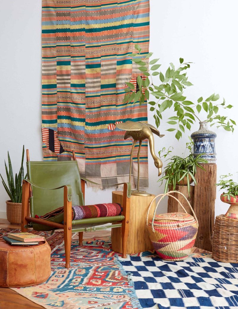
Bohemian style was once about self-expression and collected treasures. Now it’s devolved into mass-produced macramé and identical “unique” items from big box stores. Real bohemian spaces evolve organically over time through travel, personal interests, and meaningful acquisitions.
Today’s manufactured boho rooms feature the same predictable elements – hanging chairs, Moroccan poufs, mandala tapestries, and obligatory houseplants. The style has been commercialized to the point where stores sell complete “boho packages” that anyone can install in a weekend.
Authentic bohemian spaces should reflect individualism and personal journeys. When your “free-spirited” decor matches thousands of Pinterest boards and Instagram posts, it’s no longer bohemian it’s just following a different kind of formula. True bohemian style can’t be purchased as a matching set.
18. Macramé Everywhere
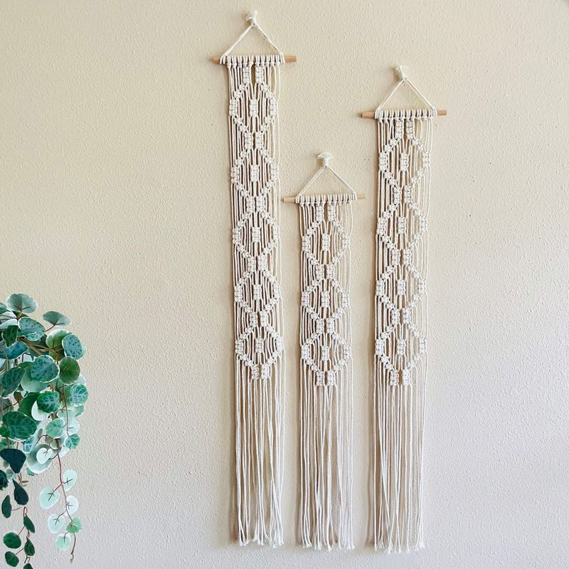
Macramé wall hangings, plant holders, and light fixtures have multiplied like rabbits in modern homes. This 1970s craft revival quickly saturated the market with mass-produced versions that lack the charm and skill of handmade originals.
What started as a genuine appreciation for handcrafted textiles turned into an opportunity for manufacturers to flood stores with machine-made knockoffs. The identical knotted designs hanging in millions of homes defeat the entire purpose of featuring artisanal crafts in your space.
Even more frustrating is how these mass-produced pieces undercut actual artisans making unique, quality macramé. The trend peaked when people started hanging these dust-collecting rope creations in every conceivable space bathrooms, kitchens, and even outdoors where they quickly become weathered and dirty. Sometimes less is more when it comes to knotted cotton rope.
19. Too Much Velvet
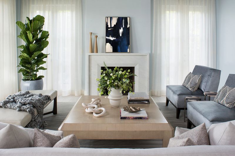
Velvet made a major comeback, transforming from occasional accent to full-room takeover. Velvet sofas, chairs, pillows, curtains, headboards, and even wall coverings created spaces that feel like Victorian parlors or upscale nightclubs rather than functional homes.
The material itself isn’t the problem a single velvet piece can add wonderful texture and luxury. The issue arises when every surface features this high-maintenance fabric. Velvet shows every mark, collects dust and pet hair with magnetic efficiency, and often looks crushed and worn within months of regular use.
In humid climates, velvet furniture becomes downright uncomfortable to sit on. Those plush velvet dining chairs look gorgeous until someone spills red wine or tomato sauce on them. Sometimes practicality should win out over pure aesthetics, especially for homes with children, pets, or humans who occasionally eat food.
20. Fake Plants
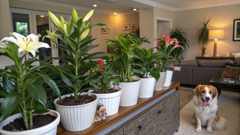
Artificial greenery has invaded homes at an alarming rate. Fake fiddle leaf figs, synthetic succulents, and plastic monstera leaves fill corners where their living counterparts would likely thrive. The worst offenders are the obviously fake specimens with perfect, dust-collecting leaves that fool absolutely no one.
While some high-quality faux plants can look convincing from a distance, most collect dust and look increasingly sad over time. The plastic versions lack the subtle variations, growth patterns, and natural imperfections that make real plants beautiful and interesting.
Living plants improve air quality, create a connection to nature, and bring genuine life to interior spaces. When every plant in a home is artificial, the space feels stagnant and lifeless despite attempts to appear lush and green. Real plants require care, but they reward that effort with actual beauty, not just the simulation of it.
21. Gallery Walls
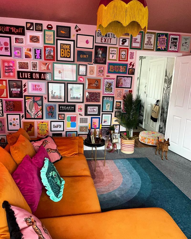
Gallery walls started as thoughtful collections of meaningful art and photographs. They’ve devolved into chaotic arrangements of random frames filled with generic prints and meaningless quotes. Many homes now feature these busy wall collages that overwhelm spaces with visual noise.
The worst examples mix incompatible styles, colors, and themes with no cohesive vision. Pinterest and Instagram convinced people that throwing together unrelated pieces would somehow result in a curated, artistic display. Instead, many gallery walls look like the clearance section of a home goods store exploded on the wall.
Meaningful art deserves space to breathe and be appreciated. When every inch of wall space is covered in a jumble of frames, the individual pieces lose impact. Quality over quantity applies to wall art just as it does to most aspects of design.
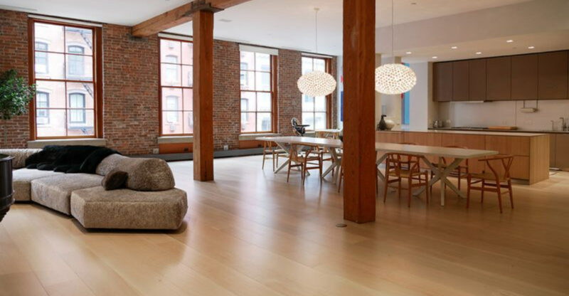
22. Industrial Coldness
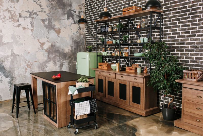
Industrial style brought the factory floor into our living rooms, and not always in a good way. Exposed brick, metal pipes, concrete floors, and utilitarian furniture created spaces that often feel cold, hard, and unwelcoming – more suited to manufacturing than comfortable living.
The worst examples take the aesthetic to extremes with uncomfortable metal chairs, rough concrete countertops, and lighting fixtures that provide more style than actual illumination. Many homeowners discovered too late that industrial-looking spaces photograph well but aren’t necessarily pleasant to live in.
True industrial spaces evolved from necessity and function. Modern interpretations often miss the warmth that comes from balancing raw materials with comfortable elements. When your living room feels like an abandoned warehouse, it might be time to reconsider whether exposed HVAC ducts and cement floors really create the welcoming home environment you desire.
23. Overdone Neutrals
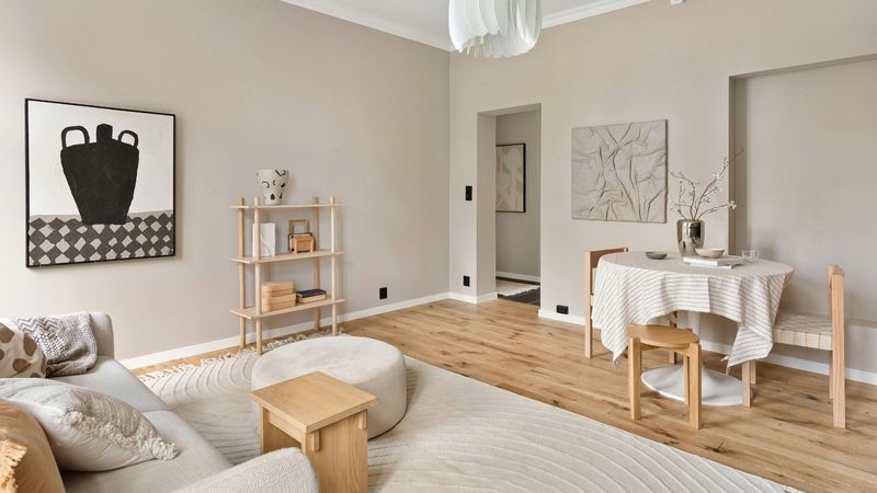
Neutral overload transformed homes into beige and greige deserts devoid of personality or visual interest. These monochromatic spaces with their taupe walls, oatmeal furniture, and cream accents create environments so safe and bland they practically disappear around you.
The fear of color led to rooms that lack energy, emotion, or distinction. Even worse is when these neutral spaces feature different shades that clash subtly warm beige fighting with cool gray in an uncomfortable tension that’s more visually unsettling than a bold color choice would be.
Neutral backdrops can work beautifully when balanced with texture, pattern, and thoughtful color accents. But when everything from walls to furniture to accessories stays within the same limited palette, spaces feel flat and lifeless. Sometimes the safest design choice is actually the most forgettable.
24. Floating Vanities
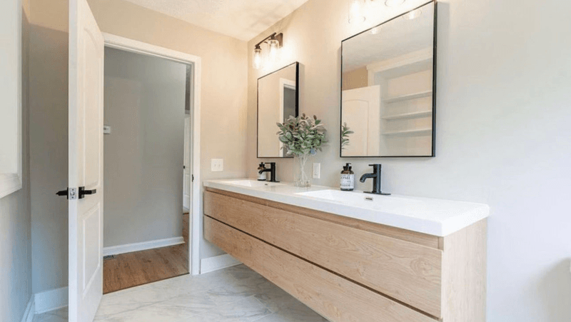
Floating bathroom vanities became the hallmark of modern bathroom renovations, whether they made practical sense or not. These wall-mounted cabinets create the illusion of more floor space while eliminating valuable storage and creating cleaning nightmares.
The gap between the vanity and the floor collects dust, hair, and moisture that’s difficult to clean properly. Many homeowners discover too late that the wall-mounting hardware isn’t sufficient for heavy marble countertops or for supporting someone who leans on the sink edge.
While floating vanities can work well in small powder rooms or minimalist spaces, they’ve been installed everywhere regardless of bathroom size or family needs. The trend prioritizes a sleek look over practical considerations like storage space and durability. Sometimes traditional vanities with legs or bases make more sense both functionally and aesthetically.
25. Gold Fixtures
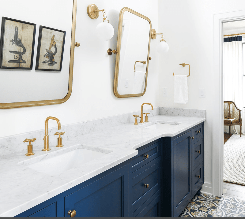
Gold finishes made a massive comeback, quickly transforming from elegant accent to metallic overload. Faucets, cabinet hardware, light fixtures, mirrors, and accessories all received the Midas touch, creating spaces that feel more like King Tut’s tomb than contemporary homes.
The warm brass and gold tones can look stunning when used sparingly. The problem arises when every metal element in a room gets the gold treatment. Even worse is the prevalence of cheap, thin gold finishes that quickly show wear, scratches, and discoloration.
Mixing metal finishes creates more interesting and timeless spaces than the all-gold approach. When trends swing this dramatically from the “anything but gold” attitude of the early 2000s to “everything must be gold” just a few years later it’s a clear sign we’ve reached peak saturation. Moderation would create more lasting appeal.
26. Black Faucets
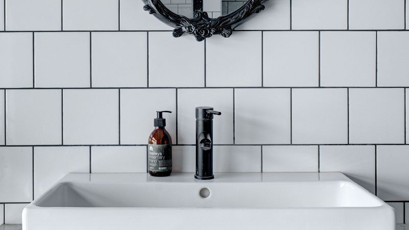
Black faucets and hardware jumped from high-end design magazines to every home improvement store virtually overnight. What started as a striking contrast element became another victim of overexposure and poor execution.
The matte black finish shows water spots, fingerprints, and soap scum more visibly than traditional chrome or nickel. Many homeowners discovered this maintenance nightmare only after installation. The cheaper versions of these fixtures often have coating issues, with the black finish wearing off at touch points to reveal the metal underneath.
Black fixtures can make a beautiful statement when used thoughtfully in the right setting. The problem comes when they’re installed by default without considering the overall design direction or practical implications. When every new bathroom renovation features identical black faucets, the trend has officially reached saturation point.
27. Concrete Counters
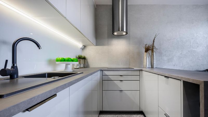
Concrete countertops promised industrial chic style and unique character. What many homeowners got instead were cracking, staining, high-maintenance surfaces that rarely live up to the polished perfection seen in design magazines.
These porous surfaces require regular sealing to prevent staining from common kitchen items like red wine, olive oil, and tomato sauce. Many develop hairline cracks over time due to the natural properties of concrete. The DIY versions are particularly problematic, often ending up with uneven surfaces, air bubbles, and inconsistent coloring.
The weight of concrete also requires special cabinet reinforcement that many installations lack. While professionally installed concrete counters can be stunning, the reality for most homeowners falls short of expectations. Sometimes traditional materials like granite or quartz make more practical sense for surfaces that need to withstand daily kitchen activities.
28. Tired Tropicals
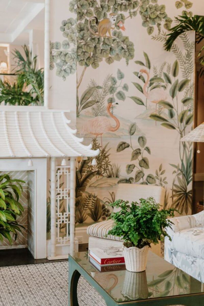
Tropical prints exploded beyond reasonable limits, with palm fronds, monstera leaves, and pineapples appearing on everything from wallpaper to dinner plates. What started as a fresh, nature-inspired trend quickly became visual overload in homes nowhere near tropical climates.
The worst examples feature rooms entirely wallpapered in busy leaf patterns, complemented by matching pillows, artwork, and accessories. These spaces feel like themed restaurant interiors rather than sophisticated homes. The mass-produced tropical items lack the subtlety and quality of the original trend inspiration.
A single statement piece with a beautiful botanical print can add life and interest to a space. But when every element features the same motif, the effect becomes cartoonish rather than elegant. Like most trends taken to extremes, the tropical takeover demonstrates how too much of a good thing quickly becomes tiresome.

