11 Kitchen Colors That Feel Like Home In Salt Lake City And 5 That Miss The Mark
A kitchen in Salt Lake City isn’t just a place to cook – it’s a gathering spot, a morning ritual, a cozy corner after a day in the mountains.
The colors that fill it matter more than trends suggest.
In a city shaped by alpine light, earthy landscapes, and a creative pulse, some shades instantly feel grounded and warm. Others fall flat, too cold or too harsh against what makes this place feel like home.
1. Warm White
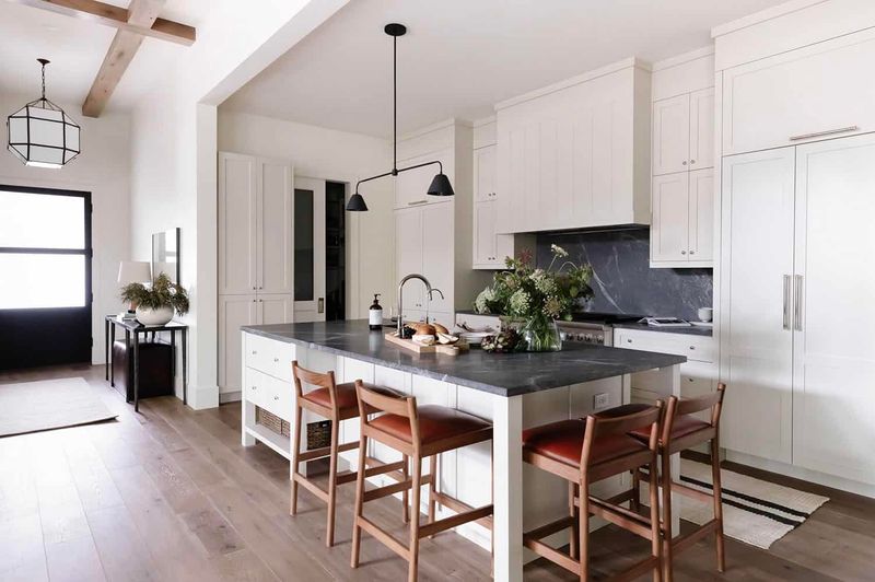
Nothing captures Utah’s snowy peaks quite like a warm white kitchen. Unlike stark alternatives, this gentle shade reflects natural light beautifully during those bright mountain mornings.
The neutral backdrop pairs perfectly with wooden accents reminiscent of local aspen groves. Many Salt Lake homeowners choose this versatile option when they want a timeless look that still feels distinctly mountain-modern.
2. Sage Green
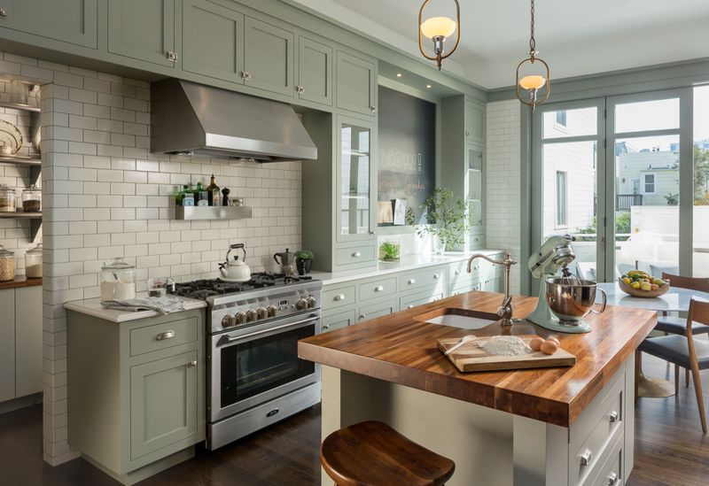
Borrowed from the native sagebrush covering Utah foothills, this soothing color brings the outdoors right into your kitchen. The earthy tone creates a peaceful atmosphere for family gatherings.
Salt Lake City residents appreciate how sage green cabinets complement both modern and traditional designs. During winter months, this verdant hue keeps spaces feeling alive and connected to nature even when snow blankets the landscape outside.
3. Soft Terracotta
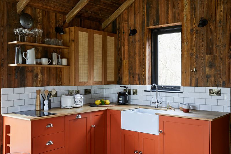
Reminiscent of southern Utah’s spectacular red rock formations, soft terracotta brings warmth and southwestern charm to Salt Lake kitchens. This earthy tone creates an instant feeling of comfort and hospitality.
Families gather naturally in spaces painted this inviting hue. The color performs beautifully in various lighting conditions, maintaining its welcoming glow during both bright summer days and short winter afternoons when sunlight is precious in Utah mountain valley.
4. Muted Navy
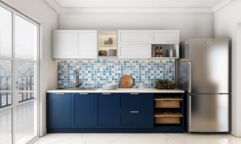
Drawing inspiration from Utah’s star-filled night skies, muted navy brings sophisticated depth to Salt Lake kitchens. This versatile color works beautifully with the popular mountain modern aesthetic many homeowners prefer.
Cabinets in this rich hue create a striking focal point without overwhelming the space. Paired with brass hardware and light countertops, navy kitchens feel both timeless and trendy – perfect for entertaining guests after a day exploring the beautiful mountain surroundings.
5. Dusty Blue
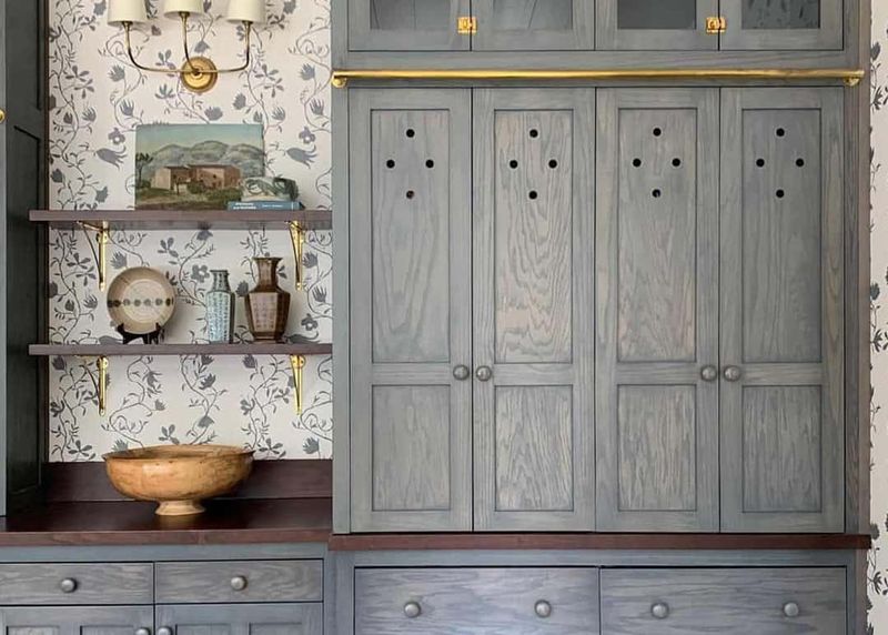
Capturing the essence of the mountain sky just before sunset, dusty blue creates a serene atmosphere perfect for busy Salt Lake families. This soft, muted shade brings calm to cooking spaces without feeling cold or clinical.
Local designers often recommend this versatile color for its ability to complement both traditional and contemporary styles. The hue pairs beautifully with the natural stone and wood elements so popular in Utah homes, creating a harmonious connection to the stunning landscape.
6. Creamy Beige
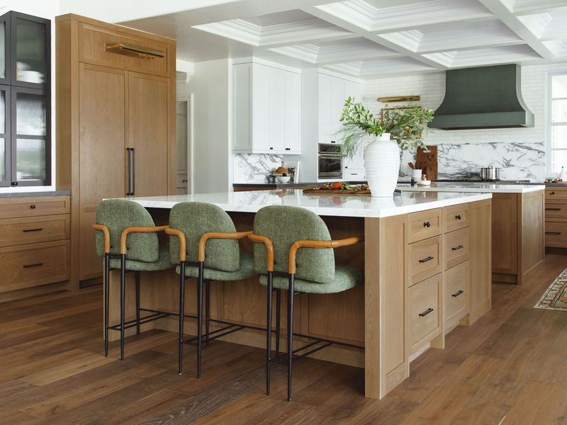
Reflecting the sandy shores of Great Salt Lake, this neutral tone creates an inviting backdrop for culinary adventures. Families appreciate how this versatile color adapts to changing decor trends while maintaining a timeless appeal.
Salt Lake homes benefit from the warmth this shade brings during the snowy winters. The subtle hue allows other elements to shine – from locally crafted wooden cutting boards to colorful farmers market produce displayed in handmade pottery bowls, celebrating Utah’s vibrant artisan community.
7. Charcoal Gray
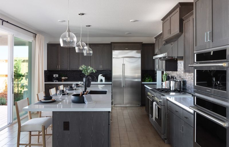
Reminiscent of storm clouds gathering over the Wasatch Front, charcoal gray brings dramatic sophistication to Salt Lake kitchens. This bold choice creates a stunning contrast against the bright natural light that floods mountain homes.
Local homeowners love how this modern neutral pairs with both colorful accents and natural wood tones. During the snowy months, the cozy depth of charcoal creates a welcoming retreat, especially when complemented by warm lighting and textural elements that reflect Utah’s diverse landscape.
8. Buttery Yellow
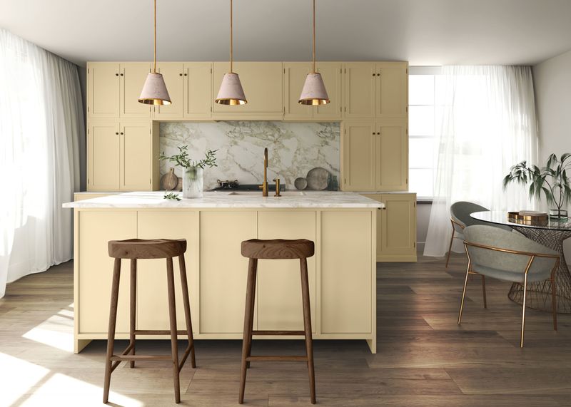
Capturing the golden hour sunlight that bathes the valley each evening, buttery yellow infuses kitchens with cheerful warmth. This sunny hue feels especially welcome during Salt Lake’s snowy winters when daylight hours are shorter.
Families gather naturally in spaces painted this uplifting color. The shade complements the traditional architecture found in many established Salt Lake neighborhoods while still feeling fresh and current. Even on cloudy days, buttery yellow kitchens maintain their inviting glow.
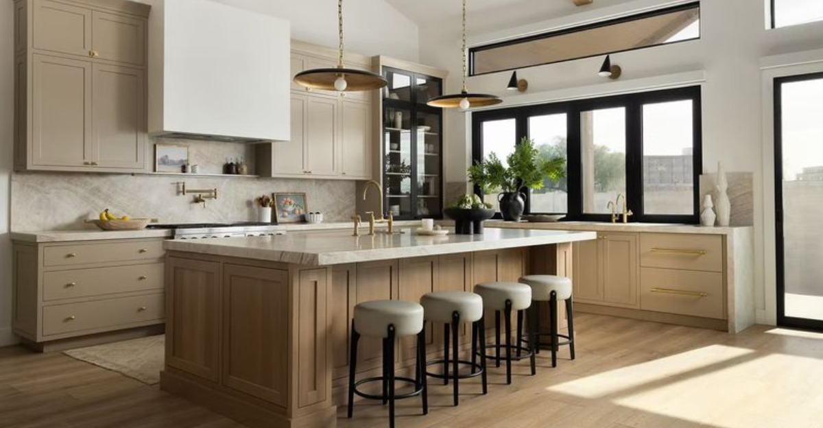
9. Earthy Taupe
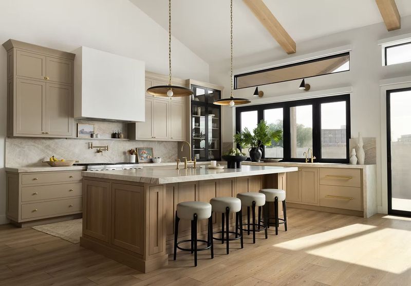
Echoing the subtle hues of the desert landscape, earthy taupe creates a grounded feeling in Salt Lake kitchens. This sophisticated neutral bridges the gap between gray and beige, offering warmth without feeling dated.
Many local homes feature this versatile color as it works beautifully with both contemporary and traditional designs. The shade provides a perfect backdrop for displaying colorful southwestern pottery or locally crafted wood pieces, allowing Utah’s artistic heritage to take center stage.
10. Olive Green
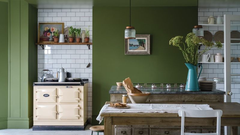
Borrowed from the native scrub oak covering Salt Lake City foothills, olive green brings natural elegance to Salt Lake kitchens. This earthy tone creates a connection to the outdoors that Utah families cherish.
Local designers recommend this versatile color for its ability to feel both timeless and current. The shade works particularly well in homes with mountain views, creating a seamless transition between indoor and outdoor spaces. During winter months, olive kitchens maintain a cozy, grounded atmosphere.
11. Deep Burgundy
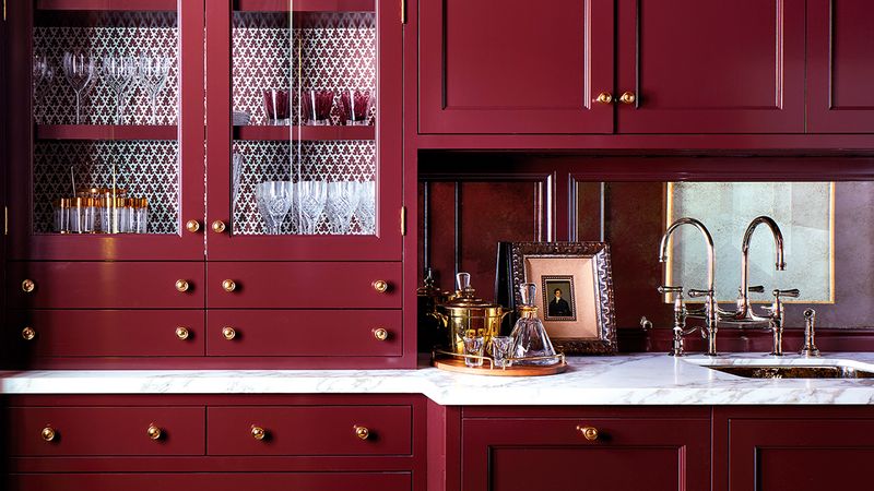
Reminiscent of Utah’s famous fall foliage, deep burgundy adds rich character to Salt Lake kitchens. This bold color choice creates a sense of warmth and luxury that’s particularly welcoming during the snowy mountain winters.
Local homeowners appreciate how this sophisticated hue pairs with the natural stone and wood elements common in Utah architecture. The color feels especially appropriate in historic Salt Lake homes, honoring the city’s heritage while still feeling relevant to contemporary mountain living.
12. Icy Gray
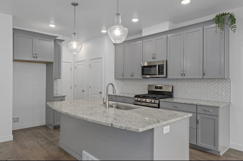
Despite its popularity elsewhere, icy gray feels uncomfortably cold in Salt Lake City kitchens. The harsh tone lacks the warmth needed to counterbalance the snowy winter months and mountain shadows.
Local designers note how this clinical shade creates an unwelcoming atmosphere in what should be the heart of the home. Utah families typically prefer colors that reflect the natural landscape rather than this sterile option that feels disconnected from the mountain community’s warm, hospitable culture.
13. Stark Black
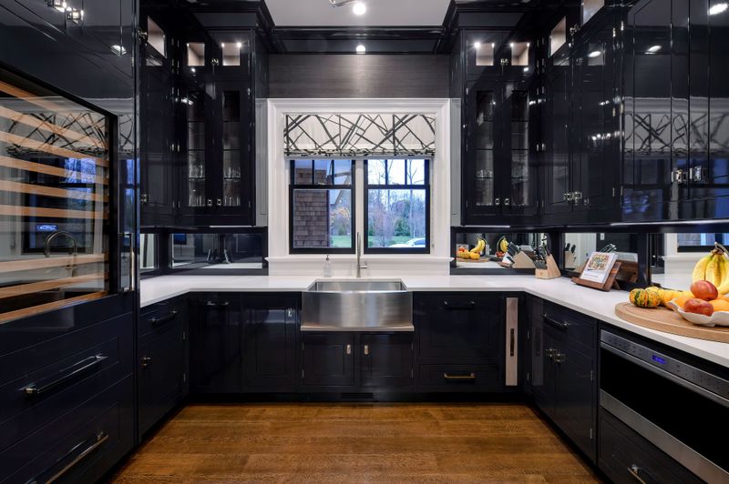
Though trendy in urban settings, stark black overwhelms typical Salt Lake City kitchens. The harsh contrast absorbs light rather than reflecting it – a significant drawback during the mountain valley’s winter inversion periods.
Families find this severe choice creates an imposing rather than welcoming atmosphere. The darkness feels particularly out of place against Utah’s natural landscape of warm earth tones and bright skies. Most local homes perform better with colors that enhance rather than diminish natural light.
14. Neon Yellow
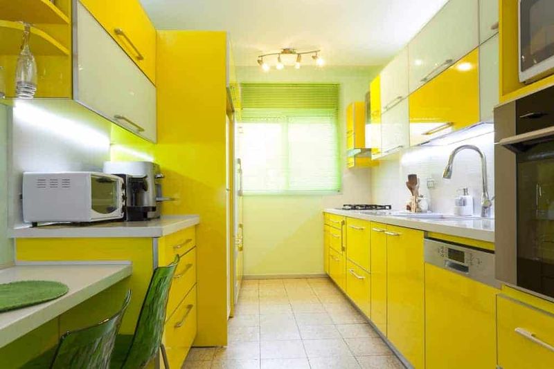
Jarring against the natural mountain landscape, neon yellow creates visual fatigue in Salt Lake kitchens. The artificial brightness clashes dramatically with the organic color palette that defines the region.
Local homeowners quickly tire of this intense hue that never feels settled or comfortable. Utah’s distinctive quality of light – clear and bright at Utah’s high elevation – only intensifies the uncomfortable glare of neon shades, making them particularly unsuitable for the mountain homes.
15. Cold White
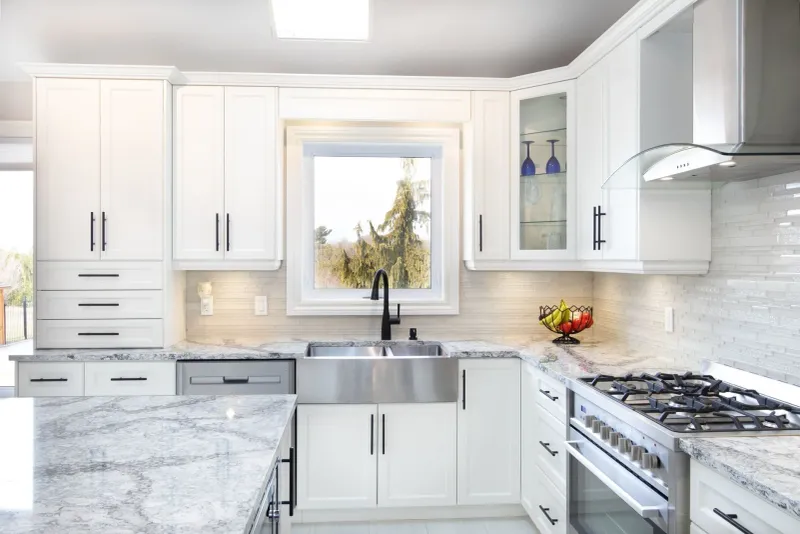
Lacking the warmth needed in this mountain climate, cold white creates an uninviting atmosphere in Salt Lake kitchens. The stark, bluish undertones feel institutional rather than homey – particularly unwelcome during the long winter months.
Families notice how this clinical shade fails to create the cozy gathering space Utah homes need. While warm whites reflect the snowy landscape beautifully, this frigid variation feels disconnected from the community’s welcoming nature and the golden quality of light that bathes the valley.
16. Aqua Blue
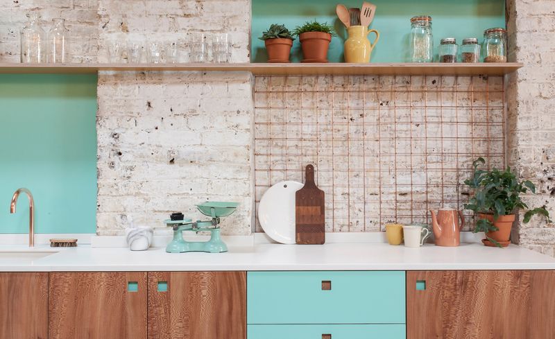
Despite its popularity in coastal regions, aqua blue feels distinctly out of place against Salt Lake City’s mountain backdrop. The tropical associations clash with the desert landscape and four-season climate.
Local designers observe how this beachy hue creates a disconnected feeling in Utah homes. While Great Salt Lake provides water elements to the region, its muted, mineral-rich tones bear little resemblance to the vibrant aqua that works so well in oceanfront properties but feels artificial in the mountain valley.
