10 Gorgeous Kitchen Colors To Try And 4 Tired Shades That Need To Go
Color changes everything – especially in the kitchen. It’s not just about aesthetics; the right shade can make the space feel warmer, brighter, more inviting. Some colors energize a room, others calm it.
And while trends come and go, certain tones have staying power that transcends the moment.
Which hues still feel fresh? And which ones are long overdue for a break? These standout colors are breathing new life into kitchens right now – while a few familiar shades are finally fading out.
1. Soft Sage Green
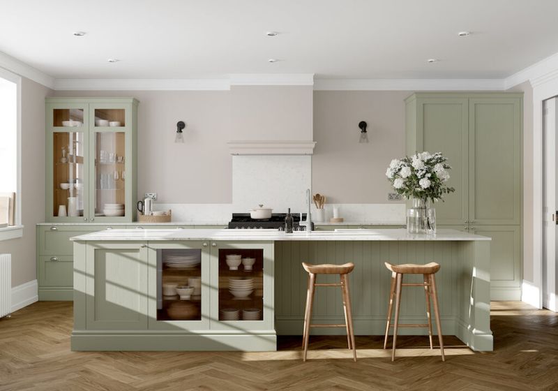
Nature-inspired tranquility finds its way into modern kitchens with this understated hue. Soft sage green creates a peaceful atmosphere while complementing both light and dark cabinetry.
Pair it with natural wood elements and brass fixtures for an earthy, balanced look. This versatile shade works in both traditional farmhouse kitchens and sleek contemporary spaces.
2. Deep Navy Blue
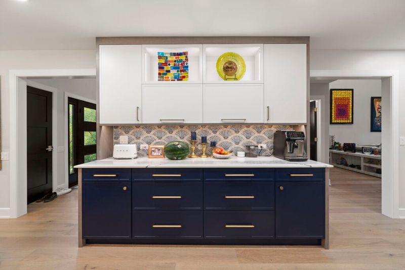
Bold yet surprisingly versatile, navy brings sophisticated drama to any cooking space. Against white countertops, this rich hue creates stunning contrast that never goes out of style.
Kitchen islands painted navy make particularly striking focal points. The color pairs beautifully with gold hardware, marble surfaces, and warm wood tones for a luxurious yet inviting atmosphere.
3. Warm Terracotta
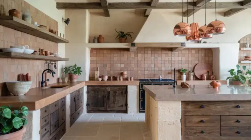
Reminiscent of sun-baked Mediterranean villas, terracotta infuses kitchens with earthy warmth. This rustic orange-brown tone creates an instantly cozy atmosphere that encourages lingering conversations around the table.
Terracotta works wonderfully as an accent wall or backsplash. Complement it with cream cabinets, natural stone, and wrought iron fixtures for a timeless, welcoming kitchen with character.
4. Creamy Taupe
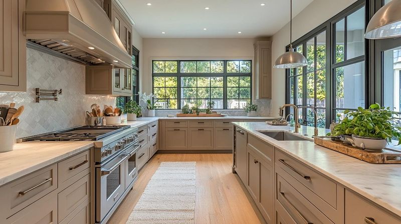
Sophistication meets versatility in this elegant neutral. Creamy taupe provides a warm alternative to stark white without overwhelming the space or competing with decorative elements.
This chameleon-like shade shifts subtly throughout the day as light changes. Perfect for smaller kitchens needing brightness without sterility, taupe creates a soft backdrop that allows wood tones, metallic accents, and colorful accessories to shine.
5. Matte Black
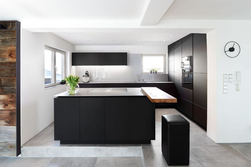
Dramatic and undeniably modern, matte black transforms ordinary kitchens into showstoppers. Unlike glossy finishes that show fingerprints, matte surfaces maintain their sophisticated appearance with minimal maintenance.
Black cabinetry creates stunning contrast against light countertops and backsplashes. For balance, incorporate warm wood elements and metallics to prevent the space from feeling too stark or severe.
6. Dusty Rose
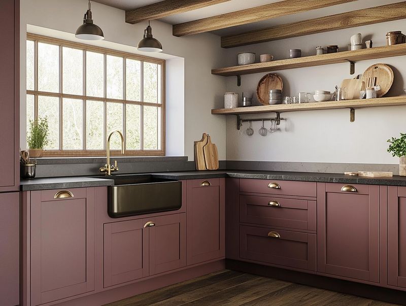
Unexpected yet surprisingly neutral, dusty rose brings subtle warmth without overwhelming the senses. This muted pink creates a welcoming atmosphere that flatters all skin tones – making food presentation and social gatherings more appealing.
Perfect as an accent wall or cabinet color, dusty rose pairs beautifully with gray, cream, or navy. Add brass fixtures and natural textures for a balanced, contemporary look with vintage charm.
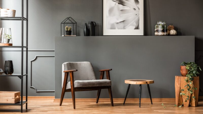
7. Moody Charcoal
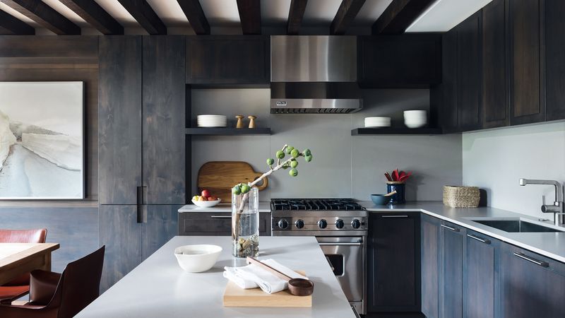
Sophisticated without the starkness of pure black, charcoal creates depth and drama while remaining surprisingly practical. This versatile dark gray hides cooking splatters and everyday wear better than lighter shades.
Charcoal cabinets or walls make white countertops and backsplashes pop dramatically. Balance the moodiness with warm metals like copper or brass, plus plenty of task lighting to keep the space feeling inviting rather than cave-like.
8. Sky Blue
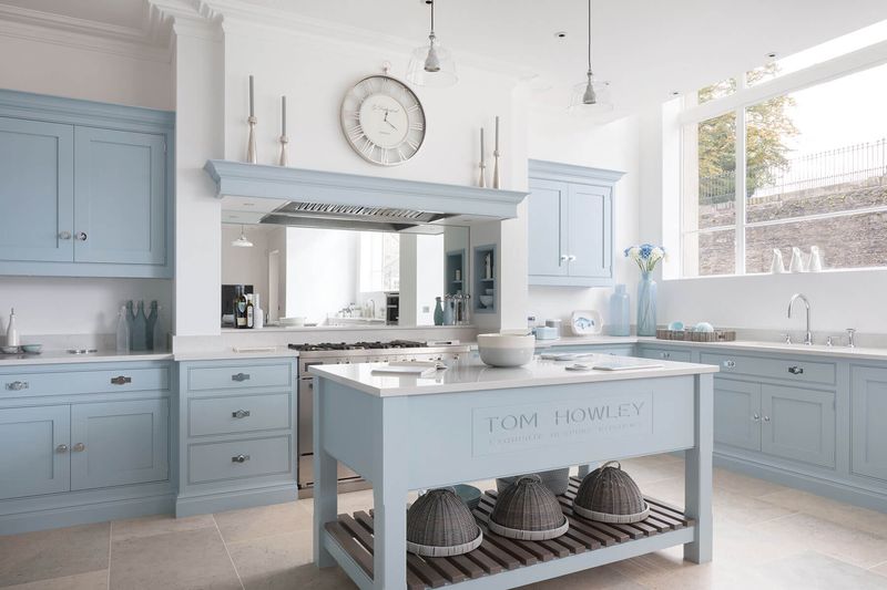
Cheerful without being childish, sky blue evokes clear horizons and endless possibilities. This uplifting color psychologically promotes calm and focus – perfect qualities for busy cooking spaces.
Light blue cabinets or walls create an airy, expansive feeling that works especially well in smaller kitchens. Pair with crisp white trim, natural wood tones, and brushed nickel hardware for a fresh, timeless look.
9. Olive Green
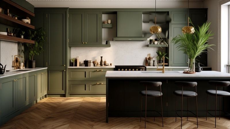
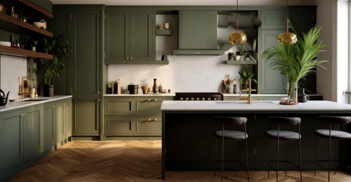
Heritage charm meets contemporary style with this sophisticated neutral-adjacent green. Olive connects beautifully to nature while providing more character than standard neutrals like beige or gray.
Especially stunning on kitchen islands or lower cabinets, olive green pairs magnificently with brass hardware and marble countertops. Add natural wood elements and cream accents for a balanced, organic aesthetic that feels both timeless and fresh.
10. Buttery Yellow
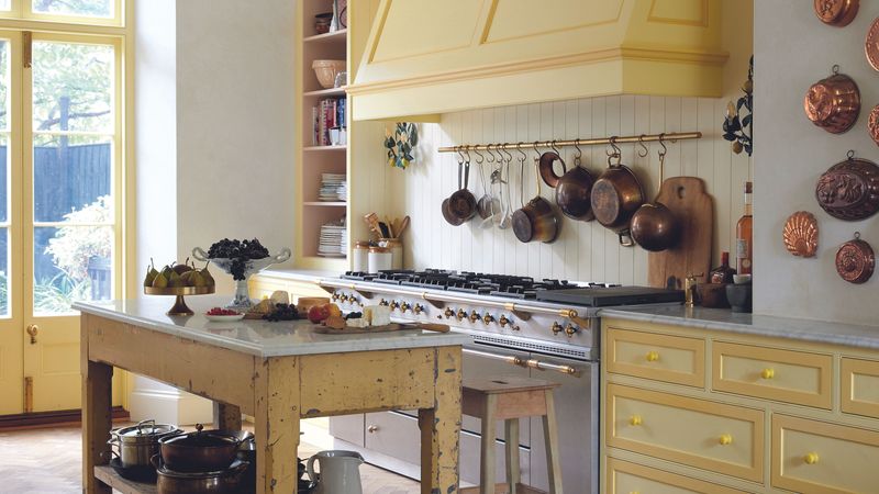
Sunshine captured in paint form, buttery yellow infuses kitchens with cheerful warmth regardless of weather outside. This soft, mellow shade creates an instantly welcoming atmosphere without the overwhelming brightness of primary yellow.
Yellow walls or cabinets pair beautifully with crisp white trim and blue accents. For a farmhouse feel, incorporate natural wood elements and vintage-inspired fixtures that enhance the color’s nostalgic charm.
11. Harsh Pure White
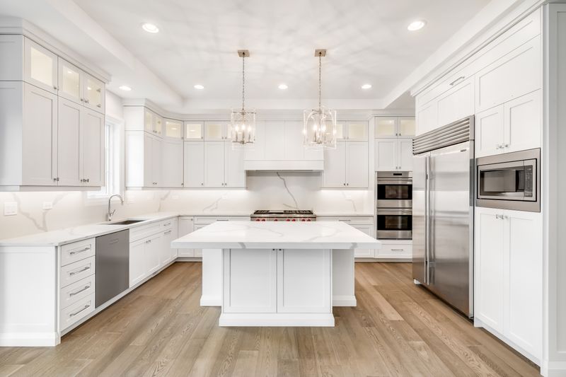
Once the hallmark of modern kitchens, stark clinical white now often reads as sterile and uninviting. Without warming elements, these spaces can feel more like laboratories than homes.
The unforgiving nature of pure white shows every smudge and splatter. Consider warmer alternatives like off-white, cream, or greige that maintain brightness while adding dimension and hiding imperfections better than their starker counterpart.
12. Cherry Wood Red
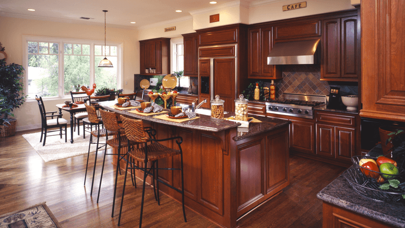
Popular in the early 2000s, this orangey-red wood tone now dates kitchens instantly. The heavy, formal appearance can make spaces feel smaller and darker than they actually are.
Rather than living with this tired finish, consider painting existing cherry cabinets in a contemporary color. Alternatively, if replacing cabinetry, opt for lighter wood tones or painted finishes that create a more current, open atmosphere.
13. Cold Gray
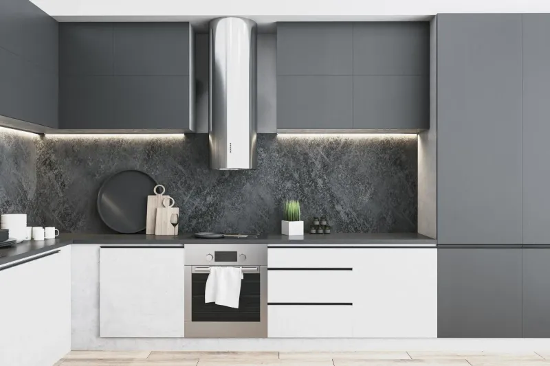
Flat, lifeless gray without undertones creates kitchens that feel institutional rather than inviting. This once-trendy neutral now often reads as depressing and bland when used throughout a cooking space.
Instead of cold gray, choose warmer grays with beige, green, or blue undertones. These more complex neutrals change subtly throughout the day with shifting light, adding dimension and interest to your culinary environment.
14. Lime Green
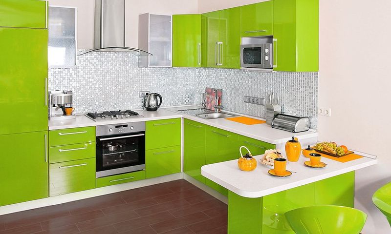
Vibrant to the point of jarring, lime green quickly becomes visually exhausting in kitchens. This high-energy color, popular during certain retro periods, creates spaces that feel chaotic rather than appetizing.
For a more livable green, consider softer alternatives like sage, olive, or mint. These subdued options provide character without overwhelming the senses, allowing for longer-term enjoyment without rapid trend burnout.

