Maine Designers Reveal 17 Paint Trends On Their Way Out And 5 Already Gone
The walls of our homes tell stories through color, but those stories change with time. Maine’s interior designers have their fingers on the pulse of paint trends that are fading into the background.
I’ve gathered insights from these experts about which color schemes are on their way out and which have already disappeared completely.
Let’s explore these shifting paint palettes that might inspire your next home refresh.
1. Gray-on-Gray Palettes (on the way out)
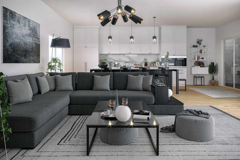
Remember when every magazine featured those sleek, monochromatic gray spaces? The all-gray look that dominated the 2010s is losing its appeal fast. Maine designers report clients specifically requesting “anything but gray” these days.
The problem isn’t gray itself but the overuse of layered grays without contrast. Those spaces that once felt sophisticated now read as flat and uninspiring. Many homeowners are discovering that living in completely gray surroundings can actually affect mood negatively during Maine’s already gray winters.
If you still love gray, try incorporating it with warmer elements like wood tones or pairing it with vibrant accent colors that bring life to the space.
2. Cool White Walls (on the way out)
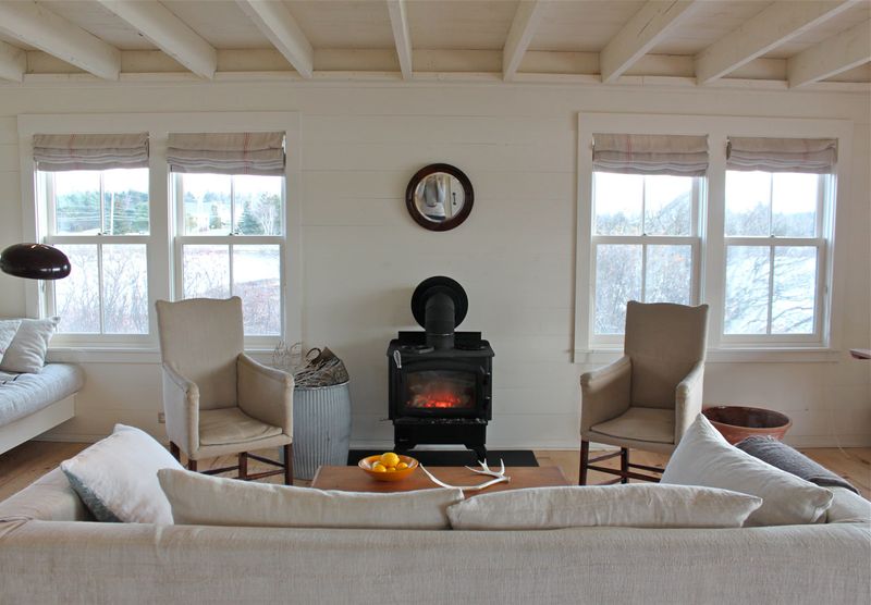
Those stark, cool-toned whites that made spaces feel like art galleries are rapidly falling from favor. Maine designers note that these clinical whites often make rooms feel unwelcoming, especially during the state’s long winters when natural light is limited.
Homeowners are discovering that cool whites can cast bluish shadows that make spaces feel colder than they actually are. This sterile feeling contradicts the current desire for homes to feel like cozy sanctuaries rather than pristine showrooms.
Warmer whites with subtle undertones of cream, beige, or even pink are taking their place, creating spaces that feel clean yet inviting. These softer whites reflect light more gently and complement natural materials better.
3. High-Gloss Finishes (on the way out)
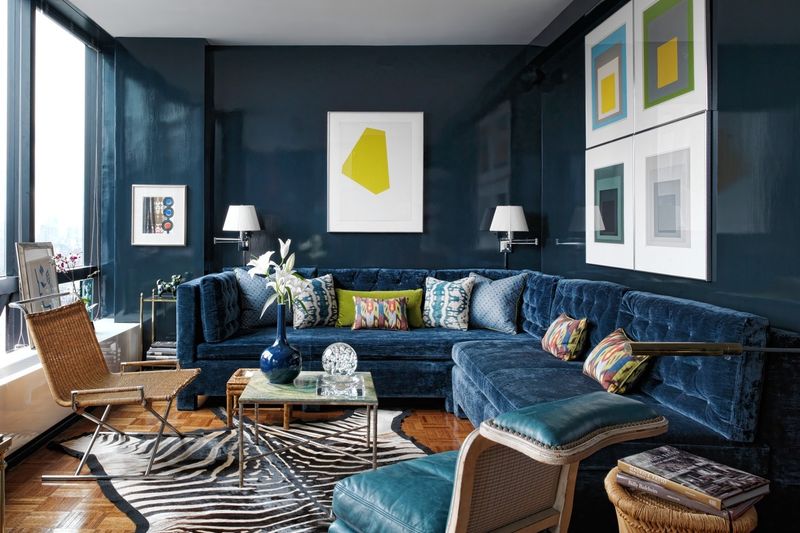
The era of super-shiny walls is dimming fast. High-gloss finishes once symbolized luxury and modernity, but Maine designers report clients actively avoiding this reflective look. Every imperfection becomes glaringly obvious under that mirror-like surface.
Practical concerns are driving this shift too. High-gloss paint shows every fingerprint, smudge, and dust particle. In coastal Maine homes, where humidity fluctuates dramatically, these finishes can also highlight wall imperfections that develop over time.
Matte and eggshell finishes are taking center stage instead. They offer a sophisticated look without the maintenance headaches, hide imperfections better, and create a more relaxed atmosphere that better suits today’s casual living preferences.
4. Deep Burgundy Accents (on the way out)
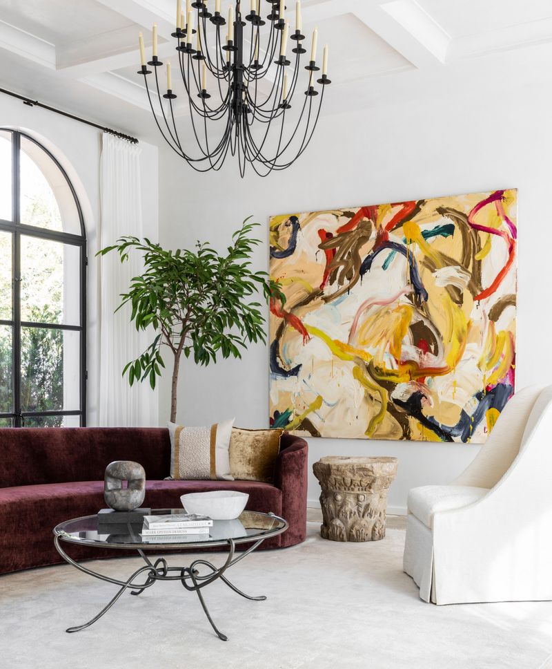
The rich, wine-colored accents that once signaled sophistication are corking up. Maine designers report clients specifically mentioning burgundy as a color they want to avoid, associating it with dated 1990s interiors.
This deep red tone that once adorned dining rooms and libraries now feels heavy and formal in today’s more casual living environments. The color can make spaces feel smaller and darker – particularly problematic in Maine’s northern latitude where natural light is precious.
Lighter berry tones and more vibrant reds are stepping in when clients want warmth without the heaviness. These brighter alternatives bring energy rather than weight to a space while still offering rich color.
5. Sage Green Overuse (on the way out)
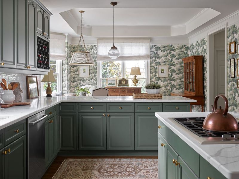
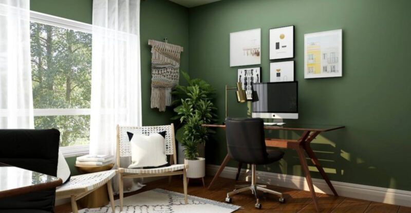
The gentle sage green that exploded during the pandemic is becoming a victim of its own popularity. Maine designers report seeing this once-fresh color now appearing in every possible application – from kitchen cabinets to entire room schemes – creating sage overload.
What made sage special was its subtle, natural quality. But as mass retailers flooded the market with sage products, the color lost its distinctive appeal. Many homeowners now associate it with that specific “pandemic renovation” timeframe.
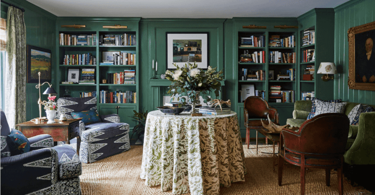
Designers aren’t abandoning green altogether though. They’re shifting toward more varied green tones – from deeper forest greens to brighter emeralds that offer more personality and staying power than the now-ubiquitous sage.
6. Bright Coral Walls (on the way out)
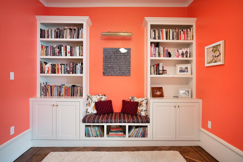
The bold coral walls that made a splash a few years back are fading faster than a summer sunset. Maine designers note this vibrant pink-orange hybrid often clashes with the state’s natural landscape and traditional architecture.
While initially energizing, many homeowners discover that living with such an intense color day after day becomes visually exhausting. The color can also reflect unflattering tones on skin and furnishings, making spaces feel less comfortable than anticipated.
Softer, more nuanced peachy tones are taking coral’s place when clients want warmth without the intensity. These gentler variations integrate more harmoniously with Maine’s natural light conditions and complement rather than compete with the views of forests and coastlines outside.
7. Dusty Lavender (on the way out)
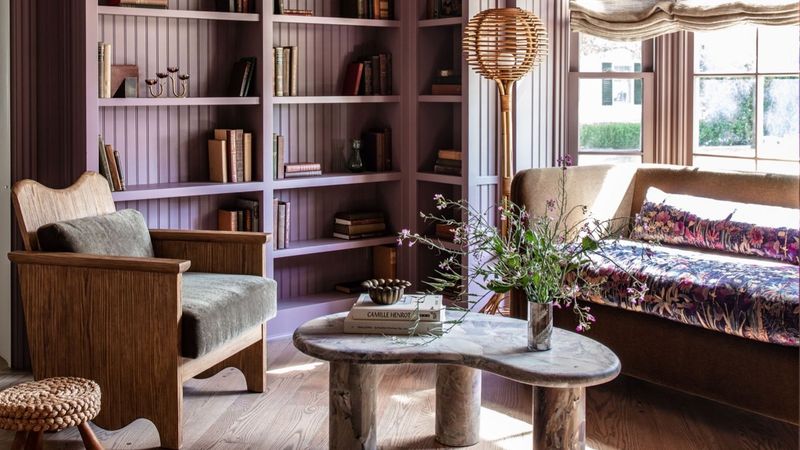
The muted purple-gray tone that briefly captured hearts is wilting from popularity. Maine designers report clients specifically mentioning dusty lavender as a color they’re tired of seeing in design magazines and social media.
This color often presents challenges in real homes because it changes dramatically throughout the day. What looks like a sophisticated gray-purple in bright light can turn muddy and drab as the sun sets a particular issue in Maine’s northern latitude with its significant seasonal light variations.
Clearer purples with either more blue or more red are proving more successful when clients want a purple tone. These more defined purples maintain their character regardless of lighting conditions and pair more predictably with other colors in a space.
8. Lemon Yellow Kitchens (on the way out)
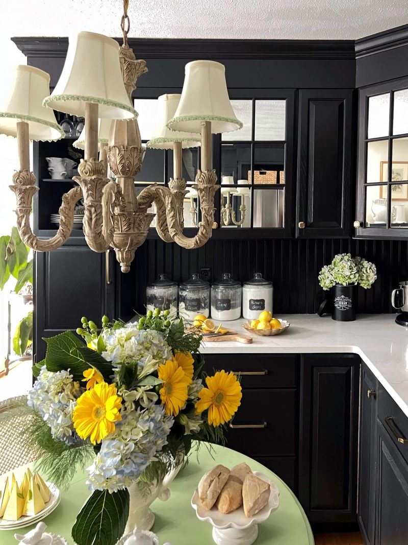
The zesty yellow kitchens that promised perpetual sunshine are losing their appeal faster than spoiled milk. Maine designers report that this once-popular choice for brightening kitchens now feels dated and overwhelming to many homeowners.
Practical concerns drive this shift too. Bright yellow shows every splatter and smudge, making kitchens look dirty even when they’re not. The color’s intensity can also make food preparation spaces feel chaotic rather than energizing.
Softer buttery tones or yellow as a carefully placed accent are replacing all-over lemon schemes. These more restrained approaches provide warmth without the visual intensity, creating kitchens that feel cheerful but not chaotic – especially important in Maine homes where the kitchen often serves as a refuge during long winters.
9. Navy as the “new neutral” (on the way out)
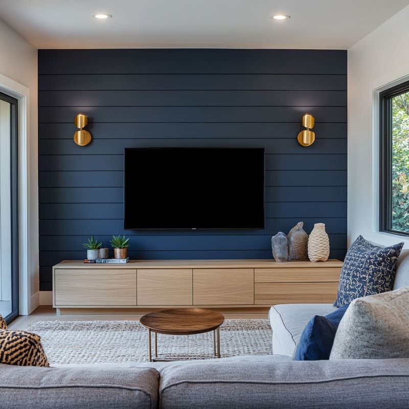
The deep blue that was declared the “new neutral” is sailing into the sunset. Maine designers note that while navy remains beautiful, its overuse as a supposed neutral has revealed its true nature it’s actually quite dominant and specific.
Homeowners discovered that navy doesn’t actually work like true neutrals such as beige or gray. It creates a very particular mood and doesn’t easily accommodate changing decorative styles or seasonal adjustments. In Maine’s coastal communities, the color can also feel like an obvious theme rather than a sophisticated choice.
True neutrals with subtle undertones are reclaiming their rightful place as versatile backgrounds. When navy appears now, it’s used more intentionally as an accent rather than pretending to be something it’s not a genuine neutral.
10. Red Dining Rooms (on the way out)
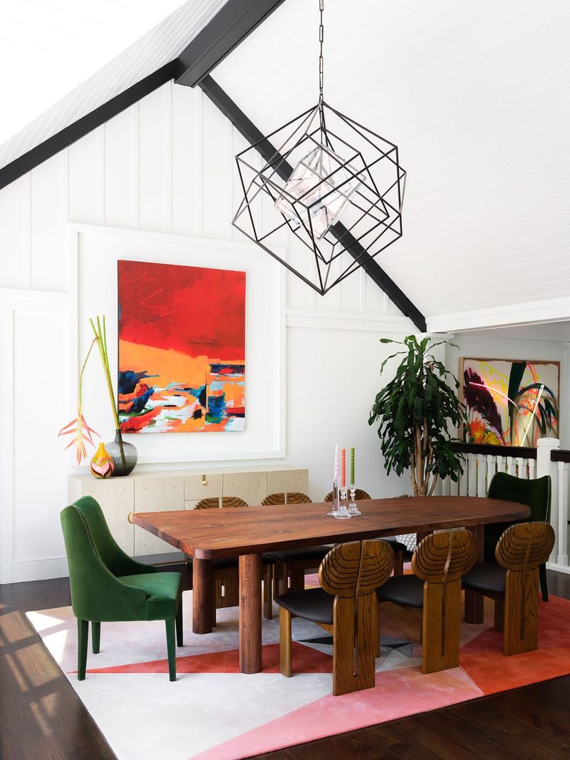
The classic red dining room that once signaled formal elegance is being served its last course. Maine designers report that these dramatic crimson spaces, once considered timeless, now feel theatrical and outdated to many homeowners.
Beyond aesthetics, there are practical reasons for this shift. Studies suggest that red stimulates appetite and conversation – once considered perfect for dining – but can also increase stress and tension, making leisurely meals less relaxing. In Maine’s traditional homes, these bold red rooms often feel disconnected from the rest of the house’s flow.
Softer, more complex colors like terracotta, russet, or even deep coral are taking red’s place when clients want warmth and drama. These alternatives create inviting dining spaces without the intensity that pure red brings to mealtimes.
11. Black Interior Doors (on the way out)
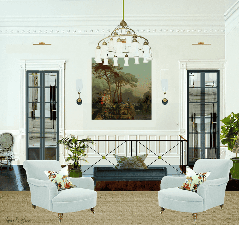
Those dramatic black interior doors that flooded social media are slowly closing on their moment. Maine designers note that while initially striking, these dark statements often prove impractical in real homes, especially in Maine’s traditional architecture.
Black doors show every fingerprint, dust particle, and scuff mark, creating maintenance headaches. They can also make hallways and transitional spaces feel smaller and more closed-in problematic in Maine’s older homes with already modest doorways and corridors.
Softer alternatives like charcoal, navy, or deep green are stepping in when homeowners want architectural contrast. These less severe options provide definition without the harsh contrast of pure black, maintaining the architectural interest while better complementing Maine’s natural light conditions and traditional home styles.
12. Peach Tones Everywhere (on the way out)
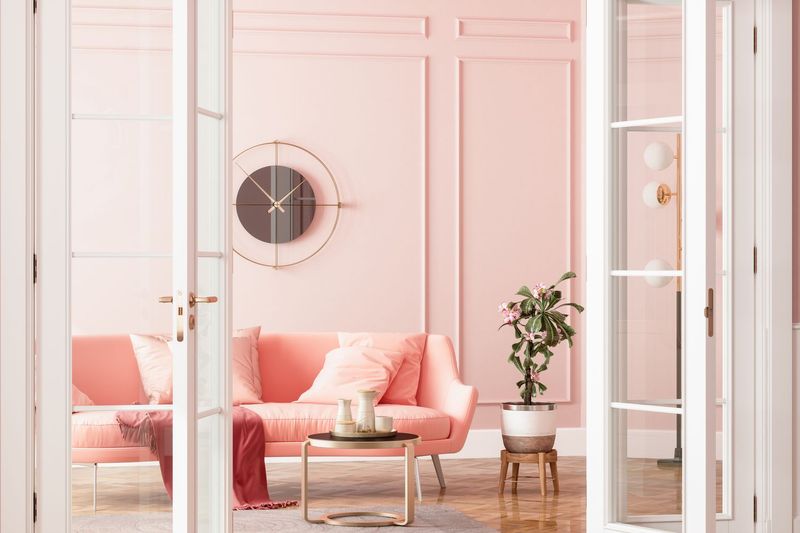
The soft peach tones that promised to warm up spaces are no longer looking so sweet. Maine designers report that this color, which briefly dominated as a “new neutral,” is rapidly falling from favor due to its specific associations with late 80s and early 90s design.
Practical issues contribute to peach’s decline too. The color can cast unflattering tones on skin and furnishings, especially in Maine’s northern light. Many homeowners discover that peach is surprisingly difficult to coordinate with other colors without creating a dated pastel scheme.
Warmer beiges with subtle terracotta undertones are taking peach’s place when clients want warmth without the retro associations. These more sophisticated options provide similar warmth but with greater versatility and a more timeless quality that works better in Maine’s diverse home styles.
13. Chocolate Brown Walls (on the way out)
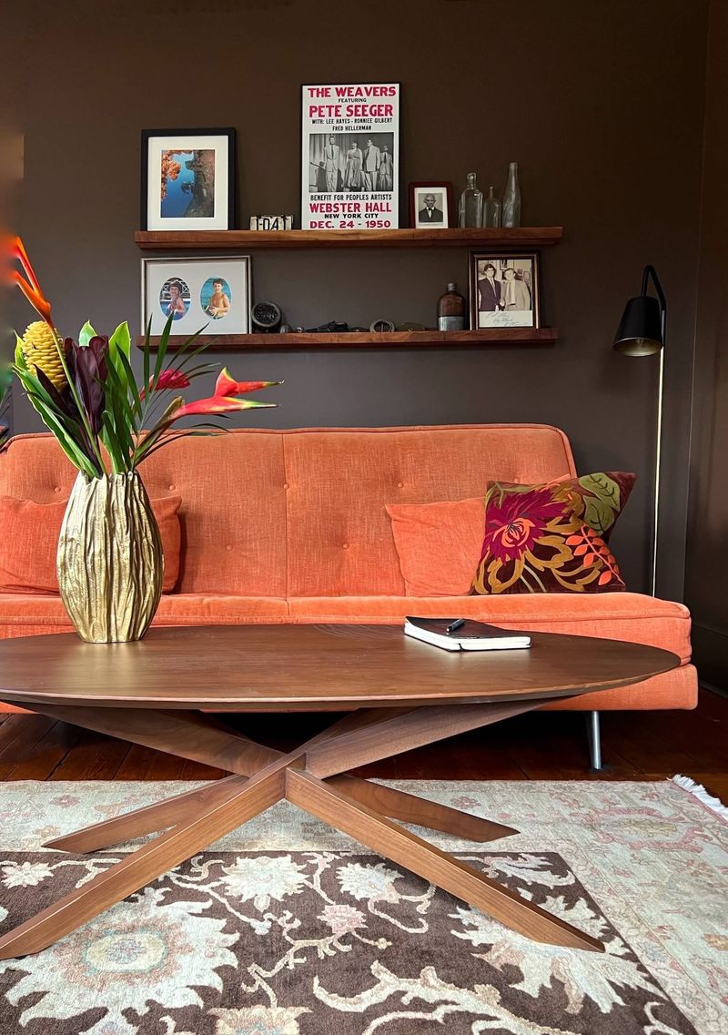
The rich brown walls that once created cozy dens are melting from popularity. Maine designers note that these dark chocolate tones, while initially dramatic, often make spaces feel smaller and more confined – particularly problematic during Maine’s long winters when natural light is already limited.
Maintenance issues accelerate this trend’s decline. Dark brown walls show dust and imperfections more readily than lighter colors. The heavy tone can also make rooms feel perpetually dark, increasing reliance on artificial lighting even during daylight hours.
Lighter, more complex browns with gray or taupe undertones are emerging as alternatives when warmth is desired. These updated neutrals provide richness without the heaviness, creating spaces that feel cozy yet spacious – a balance particularly valued in Maine’s seasonal living patterns.
14. Teal Accent Walls (on the way out)
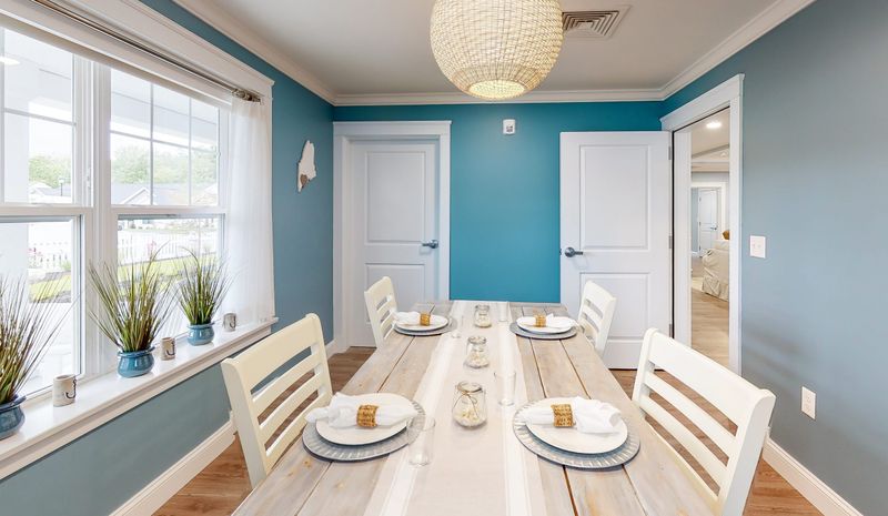
The bold teal accent walls that made such a splash are drying up fast. Maine designers report that this once-trendy pop of color is increasingly viewed as a dated design shortcut rather than a thoughtful choice.
Homeowners have discovered that single-wall color statements often feel disconnected from the rest of their space. The specific blue-green that dominated in the mid-2010s has become so recognizable that it immediately dates a room to that era, much like avocado green instantly recalls the 1970s.
More integrated color approaches are taking its place. Rather than concentrating bold color on just one surface, designers are incorporating color through furnishings, art, and accessories, or using more subtle color variations throughout a space – creating rooms that feel cohesive rather than featuring that one shouting teal wall.
15. Mustard Yellow Pops (on the way out)
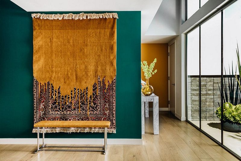
Those punchy mustard yellow accents that spiced up neutral rooms are losing their flavor. Maine designers note that this specific yellow-gold tone, which dominated as an accent color, now immediately identifies a space as designed in the late 2010s.
The challenge with mustard is its domineering nature. What was intended as a small pop of personality often ends up visually taking over a space. In Maine’s natural light, which tends toward the cool end of the spectrum, mustard can sometimes appear muddy or drab rather than rich and vibrant.
More versatile accent colors like terracotta, olive, or burnt orange are taking mustard’s place. These alternatives offer similar warmth but with greater sophistication and staying power – important considerations for Maine homeowners who may not redecorate frequently due to the state’s relatively short design season.
16. Olive Green Cabinets (on the way out)
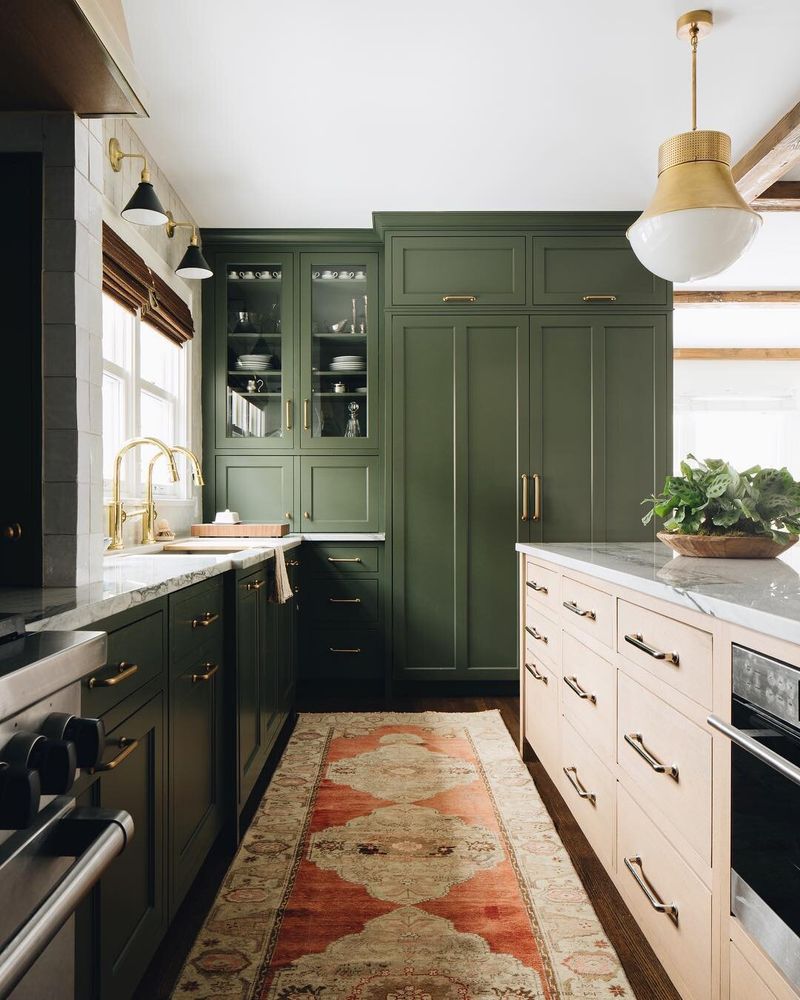
The army-inspired olive green cabinets that marched into kitchens are retreating from popularity. Maine designers report that this specific muddy green, while briefly celebrated for its “not quite neutral” quality, is increasingly seen as tied to a very specific moment in design history.
Practical concerns accelerate olive’s decline. The color can make kitchens feel darker and more enclosed, particularly in Maine’s northern light conditions. Many homeowners also find that olive green creates challenging color combinations with countertops and backsplashes, limiting future update options.
Clearer, more defined greens like sage, forest, or emerald are taking olive’s place when clients want colorful cabinetry. These alternatives provide character without the murky quality that makes olive cabinets increasingly read as trendy rather than timeless in Maine’s diverse home styles.
17. Slate Blue Bedrooms (on the way out)
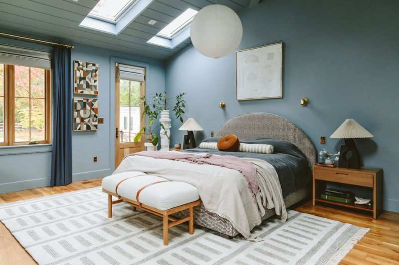
The moody slate blue bedrooms that promised sophistication are being tucked away. Maine designers note that this specific blue-gray tone, once touted for its calming properties, often reads as cold and depressing in actual lived experience – particularly problematic during Maine’s long winters.
Beyond aesthetics, there are practical considerations. Slate blue can make bedrooms feel smaller and darker, reducing the sense of restfulness that’s so important in sleeping spaces. The color also tends to absorb rather than reflect light, increasing reliance on artificial lighting.
Warmer blues with subtle green or purple undertones are emerging as alternatives when clients want blue bedrooms. These updated options provide serenity without the chilliness, creating sleep spaces that feel genuinely restful rather than cold and shadowy throughout Maine’s dramatic seasonal light changes.
18. Tuscan Gold Walls (already gone)
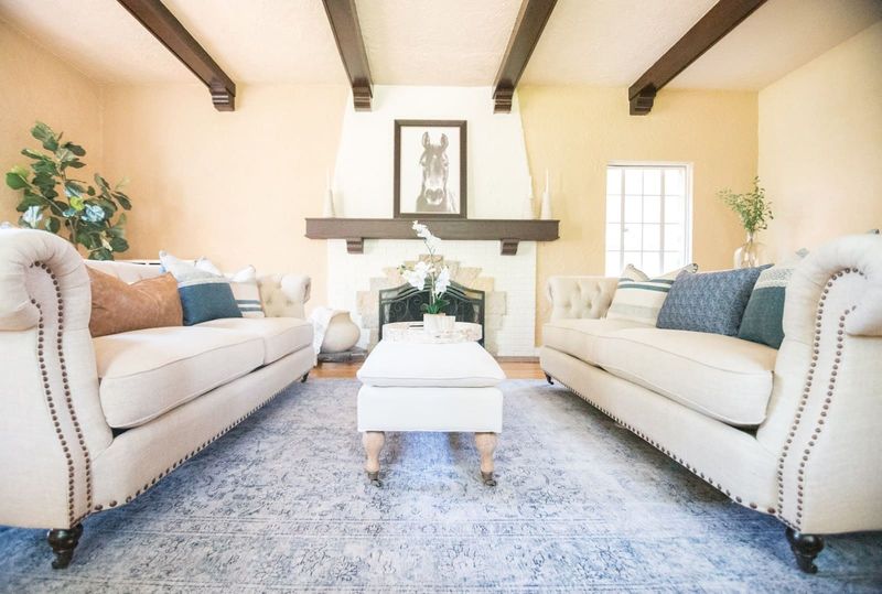
The warm yellow-gold walls that transported us to Italian villas have completely vanished from Maine’s design landscape. This once-ubiquitous color defined early 2000s homes but now immediately signals a space that hasn’t been updated in decades.
The heavy yellow-orange undertones that seemed rich and inviting twenty years ago now read as dingy and dated. Maine designers report that Tuscan gold is often the first thing new homebuyers plan to change when purchasing older homes, viewing it as an immediate renovation necessity rather than a design choice.
Today’s warm neutrals have shifted toward much softer, more complex undertones – gentle creams with subtle warmth rather than bold golden yellows. This shift reflects broader changes in design aesthetics from heavy, dramatic Mediterranean influences toward lighter, more understated approaches.
19. Hunter Green Bathrooms (already gone)
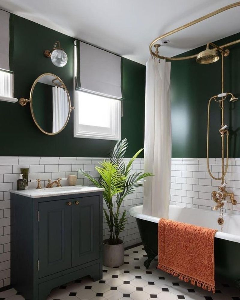
Those dark forest green bathrooms that once signaled luxury have completely disappeared from Maine’s design vocabulary. This deep, saturated green dominated 1990s bathrooms, often paired with brass fixtures and floral wallpaper borders in upscale homes.
Hunter green’s complete disappearance stems from both aesthetic and practical concerns. The color makes already small bathrooms feel cramped and cave-like. It also shows water spots dramatically, creating constant cleaning challenges in a moisture-rich environment.
Today’s bathroom palettes have shifted toward much lighter, more reflective tones that maximize space and light. When green appears in contemporary Maine bathrooms, it’s typically in much softer sage tones or as an accent rather than an all-encompassing color scheme – creating spaces that feel fresh and clean rather than dark and enclosed.
20. Mauve Bedrooms (already gone)
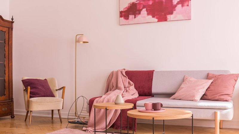
The dusty purple-pink bedrooms that once dominated suburban homes have completely vanished from Maine’s design landscape. This specific color, which reached peak popularity in the late 1980s and early 1990s, now immediately dates a space to that era.
Mauve’s total disappearance reflects how specifically tied it was to a particular moment in design history. Often paired with seafoam green accents and country-style furniture, the color created a very distinctive look that hasn’t translated well across decades. Maine designers report that mauve is frequently mentioned by clients as a color they specifically want to avoid.
Today’s purple-toned spaces use either much clearer lavenders or more sophisticated plums rather than the muted, dusty quality that defined mauve. This shift reflects broader design changes from muted pastels toward either cleaner colors or more complex, nuanced tones.
21. Forest Green Carpeting (already gone)
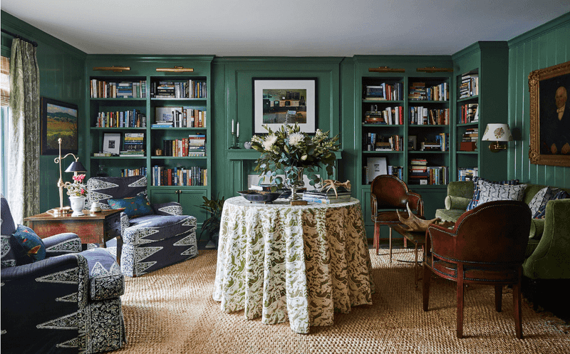
The deep green wall-to-wall carpeting that once covered floors in upscale homes has been completely pulled up from Maine’s design landscape. This specific flooring choice, which peaked in the 1990s, now immediately signals to potential homebuyers that a complete renovation is necessary.
Beyond dating a space, forest green carpeting presents practical problems. It shows every speck of dust and lint, making maintenance a constant challenge. The dark color also absorbs rather than reflects light, making spaces feel smaller and darker particularly problematic during Maine’s long winters.
Today’s flooring choices have shifted dramatically toward natural materials like wood and stone or neutral carpeting when softness is desired. This change reflects broader design movements toward authenticity and light-maximizing choices rather than statement-making colored carpets that dominated late 20th century interiors.
22. Coral Pink Bathrooms (already gone)
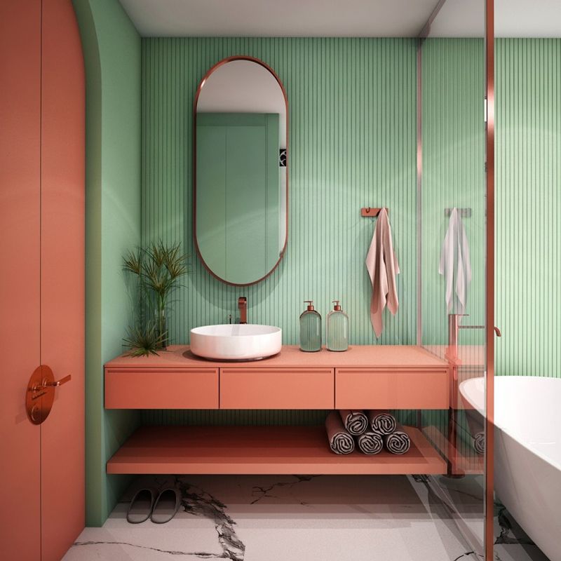
The salmon-toned pink bathrooms that were once considered chic have been completely gutted from Maine’s design vocabulary. This specific peachy-pink shade dominated bathrooms from the 1950s through early 1960s, often appearing in tile, tubs, sinks, and even toilets.
Unlike some vintage trends that have seen revival, coral pink bathrooms remain firmly in the “immediately renovate” category. The color is so specifically tied to mid-century construction that it can’t escape its strong period associations. Maine designers note that homes with intact coral bathrooms typically sell for less specifically because buyers factor in immediate renovation costs.
Today’s bathroom palettes have shifted toward timeless whites and soft neutrals for fixed elements, with color introduced through easily changeable accessories. This approach reflects greater awareness of resale value and the desire for bathrooms that won’t quickly look dated.

