9 Minimalist Home Touches That Don’t Quite Work In Real Life
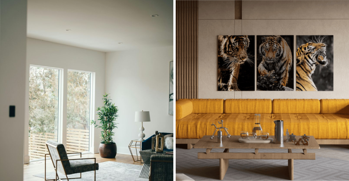
Minimalism looks amazing in magazines, but does it always work in real life? While clean lines and clutter-free spaces feel calm and stylish, some minimalist design choices can turn out to be less practical than they seem.
From hard-to-clean surfaces to furniture that sacrifices comfort for looks, a few popular ideas may leave you rethinking your next update.
In this article, we’ll look at nine minimalist touches that often fall short in everyday living, and what you can do instead. However, keep in mind that every home is different, and what doesn’t work for one space or lifestyle may work well for another.
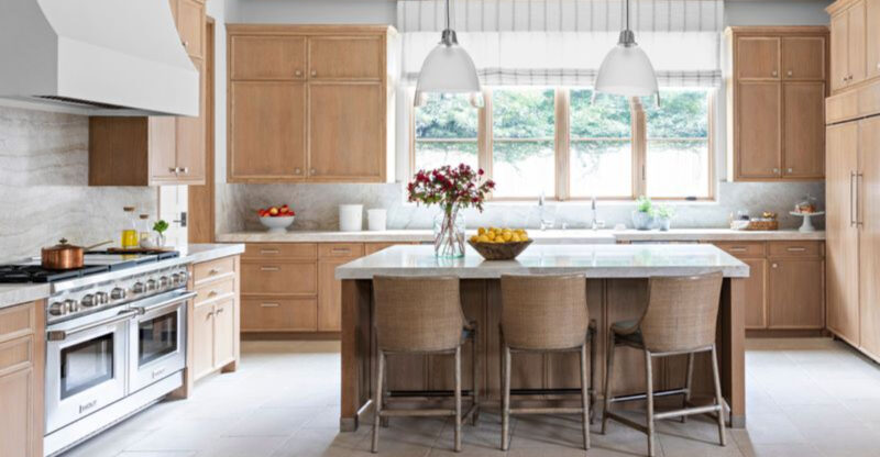
1. Open Shelving In The Kitchen
Ever tried keeping those pristine open shelves looking magazine-worthy? The reality involves dust collecting on your dishes and everything being constantly on display. Your mismatched mug collection and that promotional plastic cup from the state fair suddenly become focal points.
Open shelving demands perfect curation and regular cleaning. Most homeowners find themselves rearranging items before guests arrive or apologizing for the “everyday look” of their kitchen.
Unless you’re willing to commit to a highly curated collection of matching items, traditional cabinets with doors might be your better friend.
2. All-White Interiors
How gorgeous those all-white spaces look in design magazines! Then reality crashes in with muddy paw prints, red wine spills, and children wielding markers. White interiors require constant vigilance and immediate cleaning of every tiny mark.
All-white rooms also create unexpected problems like glare from too much light reflection. Many clients report feeling like they’re living in a sterile hospital rather than a cozy home.
Consider introducing some warmer neutrals or textures if you want the minimalist vibe without the maintenance nightmare and clinical feeling.
3. Handleless Cabinets And Drawers
Though they create that sleek, uninterrupted look that minimalists crave, handleless cabinets quickly become a practical nightmare. Your fingers end up constantly searching for grip points, leaving smudges exactly where they’re most visible on those pristine surfaces.
Handleless designs also pose challenges for children, elderly family members, or anyone with limited hand strength. The push-to-open mechanisms often require more force than expected, and the touch-activated ones can be temperamental.
What looks effortlessly elegant in showrooms becomes an exercise in frustration during busy meal preparations.
4. Floating Vanities With No Storage
Where exactly am I supposed to hide my extensive skincare collection? Floating vanities look spectacular in design portfolios but fail to acknowledge the reality of bathroom essentials. The minimal storage forces toiletries to sit exposed on countertops, instantly defeating the clean aesthetic.
Floating vanities also create that awkward dead space underneath that collects dust and hair. Many clients end up adding baskets or other storage solutions that weren’t part of the original design.
Before committing to this look, honestly assess how much stuff you need to store and whether you’re willing to drastically downsize your bathroom supplies.
5. Low-Profile, Ultra-Modern Furniture
If getting up from your sofa requires a strategic plan and possibly assistance, your furniture might be too minimalist. Those stunning low-profile pieces look amazing in design spreads but punish anyone with knee issues or who’s simply tired after a long day.
Ultra-modern furniture often sacrifices comfort for aesthetics. The cushions tend to be firmer, the backs lower, and the overall experience less inviting than traditional designs.
Many clients end up adding non-minimalist pillows and throws just to make these pieces usable, ultimately compromising the clean look they initially wanted. Comfort should never be minimized along with your design.
6. No Visible Storage Solutions
This might be the biggest minimalist fantasy of all! Unless you’re secretly a monk who owns three items total, the “no visible storage” approach quickly crumbles in real homes.
Everyday life generates stuff, mail, keys, charging cables, and those items you use daily but don’t want to constantly put away. Without practical storage options, surfaces become landing zones for life’s debris.
The minimalist dream becomes a constant battle against visible clutter. Most successful minimalist homes actually incorporate clever, abundant storage, they just hide it well. Remember that storage isn’t the enemy of minimalism…visible clutter is.
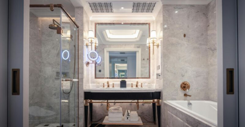
7. Wall-Mounted Faucets
Are they gorgeous? Absolutely! Are they practical? Not so much. Wall-mounted faucets create that coveted hotel-bathroom feel but bring installation headaches and maintenance concerns. When something inevitably goes wrong, repairs require opening up your wall rather than a simple under-sink fix.
Wall-mounted fixtures also tend to splash more, especially if not perfectly positioned during installation. The clean wall space you gain below the faucet often ends up with water stains running down to the basin.
Before committing to this look, consider whether the aesthetic benefit outweighs the potential long-term maintenance issues and installation costs.
8. Bare Windows With No Coverings
However do people actually live like this? The bare window look creates stunning architectural statements but ignores basic human needs like privacy and light control. Your neighbors probably don’t need a daily view of your morning routine.
Bare windows also allow heat to escape in winter and enter in summer, making your home less energy-efficient. Many clients who initially insisted on the no-curtain look eventually install shades or blinds after experiencing their first summer heat wave or realizing their bedroom faces the street.
Consider sleek, minimal window treatments that can disappear when not needed instead of abandoning them entirely.
9. Minimalist Lighting With Low Brightness
When you can’t actually see what you’re doing, the minimalist lighting scheme has gone too far. Those subtle, architectural lighting solutions look spectacular in photos but leave real homes feeling like moody caves where reading becomes a challenge.
Minimalist lighting often prioritizes form over function, creating spaces that look dramatic but lack practical illumination for everyday tasks. Most clients end up adding supplementary lamps that weren’t in the original design plan.
Good lighting should enhance both your space’s appearance and functionality. Too many minimalist schemes only achieve the former.

