Never Regret A Paint Color Again Avoid These 8 Common Mistakes
Choosing the perfect paint color can transform your home from drab to fab in just a few coats.
But many of us have experienced that sinking feeling when the dried paint looks nothing like we imagined. I’ve been there too!
Whether you’re refreshing your bedroom or tackling a complete home makeover, avoiding these common color mistakes will save you time, money, and disappointment.
1. Ignoring Natural Light

Light changes everything when it comes to wall colors. A gorgeous gray that looked perfect in the store might appear purple in your north-facing bedroom. I learned this lesson the hard way after painting my entire living room a “neutral” beige that transformed into an unflattering salmon pink by sunset.
Morning light tends to be bluer, while evening light casts golden tones. Rooms with southern exposure receive warm, consistent light throughout the day, while northern exposure creates cooler, shadowy conditions that can make colors appear darker or more muted.
Test your paint at different times of day before committing. What looks perfect at noon might feel completely wrong at dinner time when you’re actually using the space.
2. Skipping Sample Testing
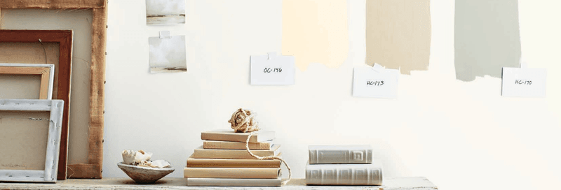
Those tiny paint chips from the hardware store lie. They’re simply too small to give you an accurate picture of how a color will dominate your wall. When I painted my kitchen without testing first, what looked like a cheerful yellow on the chip turned into an overwhelming neon experience that made my morning coffee routine feel like a rave party.
Paint sample boards or large sections of your actual wall to see the true effect. Home improvement stores now offer peel-and-stick samples that can be moved around different walls.
If you’re hesitant about testing directly on your walls, paint large poster boards instead. This allows you to move them around the room to see how the color interacts with your furniture, flooring, and lighting throughout the day.
3. Forgetting Undertones
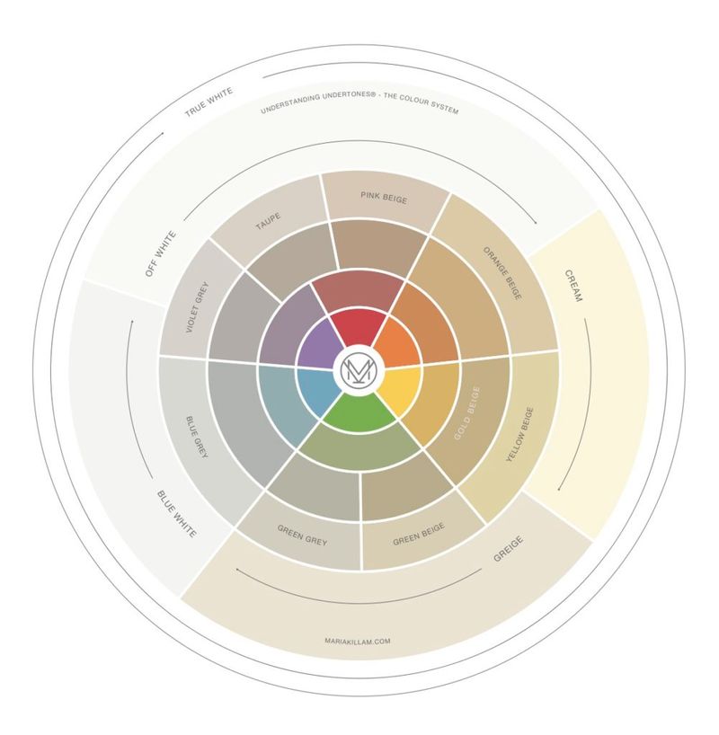
Undertones are the sneaky color influences hiding beneath the surface of neutrals. That “perfect white” might actually have pink, yellow, or blue undertones that clash with your furniture. My dining room disaster taught me this when my “clean white” walls had green undertones that made my cherry wood table look sickly.
To identify undertones, compare several similar shades next to each other on a white background. The underlying hues become more obvious when viewed side by side.
Warm undertones (yellow, orange, red) create cozy, inviting spaces but can sometimes look dingy. Cool undertones (blue, green, purple) feel crisp and fresh but might come across as stark or clinical if you’re not careful. Always match undertones with your existing décor for harmony.
4. Choosing Colors Too Quickly
Impulse color decisions often lead to regret. After spotting a gorgeous teal room on social media, I immediately painted my office without considering how it would work with my existing furniture. The result? A clashing disaster that gave me headaches during Zoom calls.
Colors evoke emotions and set the mood for your space. Blues and greens typically create calm, while reds and oranges energize. Consider how you want to feel in the room before selecting a shade.
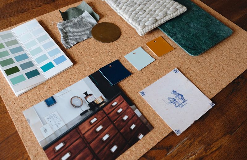
Take time to gather inspiration, create a mood board, and live with color ideas before committing. Collect fabric swatches, magazine clippings, or Pinterest images that resonate with you. This process helps you identify patterns in your preferences and ensures your final choice aligns with your true style, not just a passing fancy.
5. Overlooking Room Function
Room purpose should guide your color choices. My bright red kitchen seemed like a bold, fun choice until I realized it made me feel anxious while cooking. Different spaces serve different functions, and colors can either enhance or hinder those activities.
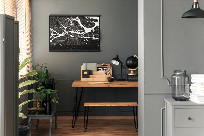
Bedrooms benefit from soothing colors that promote rest soft blues, gentle greens, and calming neutrals. Home offices work well with colors that boost focus without causing distraction moderate blues, balanced greens, or warm neutrals often hit this sweet spot.
High-energy spaces like kitchens and exercise rooms can handle more vibrant colors if that matches your personality. Think about when you use the room most and what activities happen there. Then choose colors that support rather than fight against the room’s purpose.
6. Relying on Trends Alone
Trendy colors come and go faster than you can say “accent wall.” I jumped on the millennial pink bandwagon in 2018, only to grow tired of it six months later. What’s Instagram-worthy today might feel dated tomorrow, especially with bold or unusual colors.
If you love following trends, consider incorporating them through easily changeable elements like throw pillows, artwork, or small furniture pieces. These items are much less expensive and time-consuming to replace than repainting an entire room.
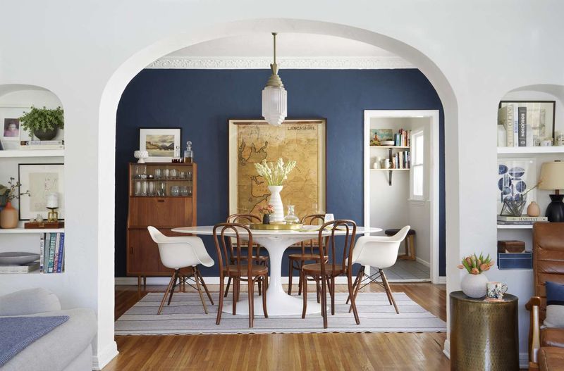
For walls, consider timeless colors with staying power soft neutrals, classic blues, and versatile greens tend to age well. You can always add pops of trendy colors through accessories. This approach gives you flexibility to refresh your space without major overhauls when the next color trend arrives.
7. Not Considering Adjacent Rooms
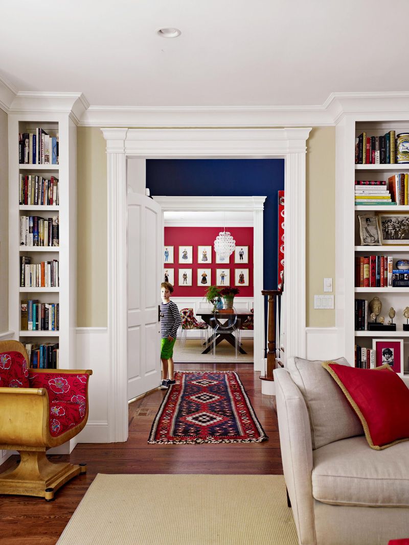
Colors that don’t flow from room to room create a choppy, disjointed feeling throughout your home. My bright blue living room next to a yellow kitchen created a jarring transition that felt like walking between completely different homes. The overall effect was chaotic rather than cohesive.
Open concept homes especially need a thoughtful color strategy. You don’t need identical colors everywhere, but the palette should feel connected and intentional.
Create a whole-home color scheme by selecting shades from the same color family or choosing colors with similar intensity levels. Another approach is to use a consistent neutral for most rooms, then incorporate different accent colors in each space. When standing in one room, you should be able to see into the next without experiencing color whiplash.
8. Using the Wrong Finish
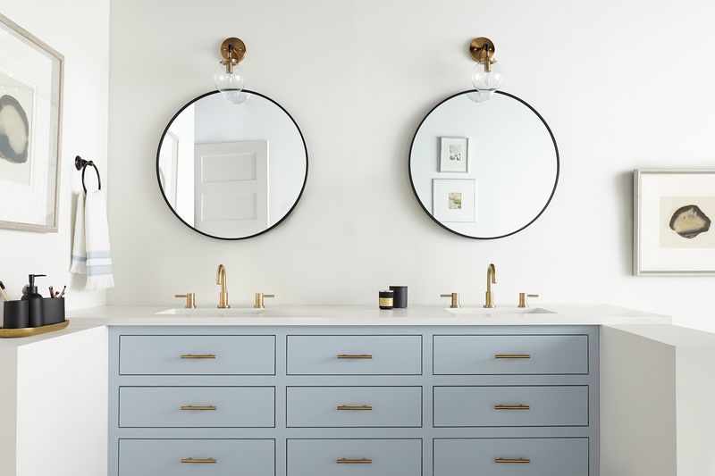
Paint finish can make or break your color choice. My first apartment bathroom looked terrible not because of the color, but because I used flat paint that showed every water spot and couldn’t stand up to cleaning. Each finish dramatically affects how a color appears and performs.
Flat/matte finishes hide wall imperfections but are harder to clean, making them poor choices for kitchens and bathrooms. Eggshell and satin offer a subtle sheen with decent durability for living areas and bedrooms. Semi-gloss and gloss finishes are highly washable but highlight every bump and crack in your walls.
Darker colors often look richer in matte finishes, while lighter colors can handle more shine without becoming overwhelming. Always consider both color AND finish together they’re partners that need to complement each other for successful results.

