10 Outdated Furniture Colors We’re Saying Goodbye To In 2025, According To Designers (And 10 That Are Trending Instead)
Home design evolves constantly, and furniture colors are no exception to this rule. What was once the height of style can quickly become dated as new trends emerge. Leading interior designers are already predicting which furniture color schemes will fade away in 2025 and which fresh hues will take center stage in our living spaces.
Let’s explore which colors to retire and which ones to embrace for a contemporary home look.
1. Farewell to Cherry Red
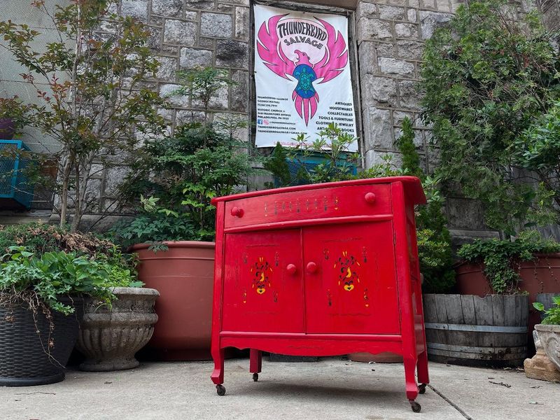
Remember when cherry red furniture dominated living rooms? That bold statement piece is losing its appeal fast. Designers note that the intensity of cherry red often clashes with today’s more balanced color schemes.
Many homeowners find this vibrant shade too overwhelming and difficult to coordinate with other elements. The color tends to visually shrink spaces and can feel aggressively energetic in rooms meant for relaxation.
2. Hello to Terracotta
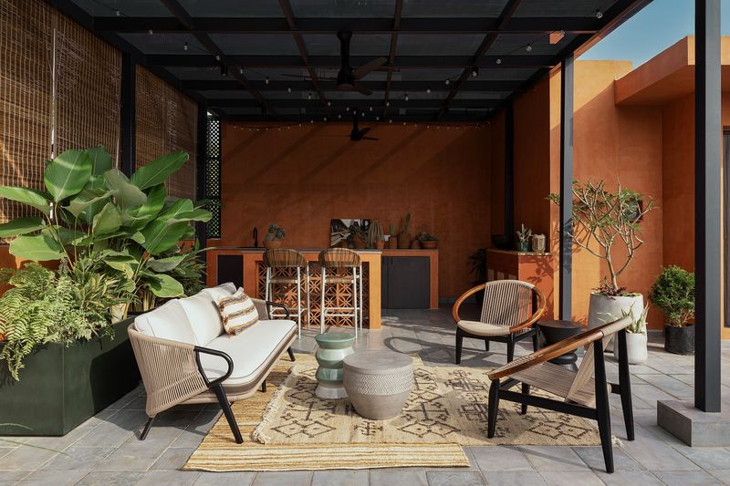
Earthy warmth is making a triumphant return through terracotta furniture pieces. This rusty orange-brown shade brings natural elements indoors without overwhelming your space.
I’ve noticed how terracotta adds instant coziness while remaining sophisticated. It pairs beautifully with neutrals, greens, and blues for a balanced look.
The color’s connection to nature makes it perfect for those seeking a grounding element in their home decor while staying current.
3. Chocolate Brown Is Fading
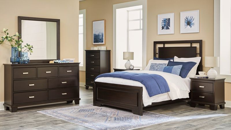
Those dark chocolate brown leather sofas and wooden furniture pieces that were everywhere in the early 2000s are quickly becoming design relics. The heavy, masculine energy they bring feels outdated compared to today’s lighter aesthetic preferences.
Many homeowners report these pieces make rooms feel smaller and more confined. The rich tone that once signaled luxury now often reads as stuffy and overwhelming when used as a dominant furniture color.
4. Sage Green Takes The Spotlight
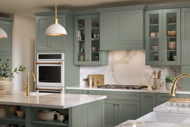
Walking into homes with sage green furniture pieces instantly transports you to a peaceful, nature-inspired sanctuary. This muted green has captured designers’ hearts for its versatility and calming presence.
You’ll find this color works in virtually any room, from living spaces to bedrooms. It functions almost like a neutral but with more personality and depth.
Sage pairs wonderfully with natural materials like light woods, rattan, and linen for an effortlessly chic look that feels both timeless and current.
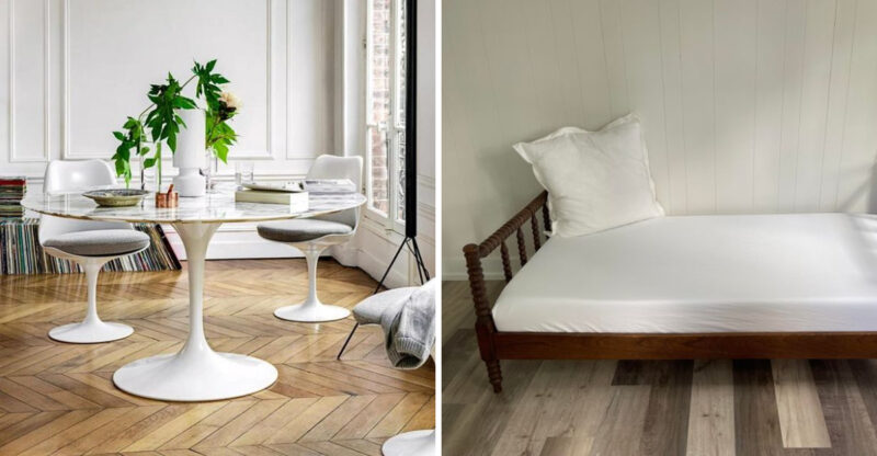
5. Pure White Is Too Stark
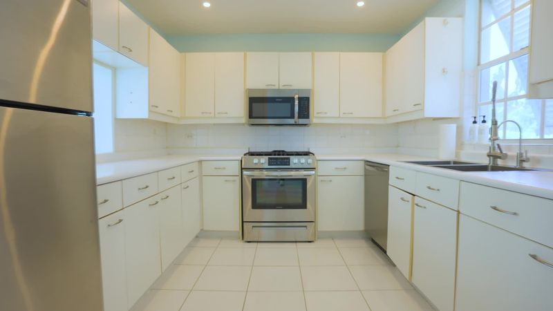
Bright white furniture is falling from grace in designer circles. While it once represented clean minimalism, today’s experts see it as lacking warmth and character in home environments.
Families especially find pure white impractical, showing every spill and smudge. The clinical feeling it creates runs counter to the cozy, lived-in spaces many now prefer.
Maintenance becomes a constant battle, with white upholstery requiring frequent cleaning to maintain its pristine appearance.
6. Warm Ivory Is Rising
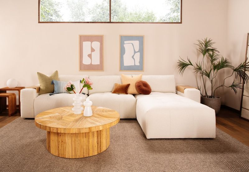
Stepping away from stark whites, warm ivory furniture brings softness to any room without sacrificing that light, airy feeling. The subtle cream undertones create depth that pure white simply can’t achieve.
I’ve found ivory pieces hide minor imperfections better while still maintaining visual lightness. They work beautifully across different design styles from modern to traditional.
This shade creates a perfect backdrop for both bold accents and subtle textures, making it incredibly versatile for changing seasonal decor.
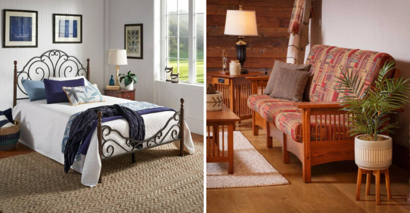
7. Navy Blue Is Sailing Away
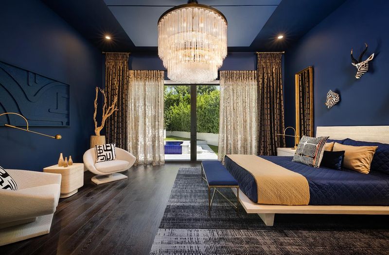
Navy blue furniture, once the darling of designers seeking a “safe” bold color, is gradually losing its appeal. The nautical associations have become too predictable and themey for contemporary spaces.
Many homeowners report feeling boxed in by navy’s limited pairing options. The color can dominate a room, making it difficult to evolve your style without completely replacing major furniture pieces.
Its popularity in recent years has also led to overexposure, making it feel like yesterday’s trend rather than tomorrow’s.
8. Ochre Yellow Shines Bright
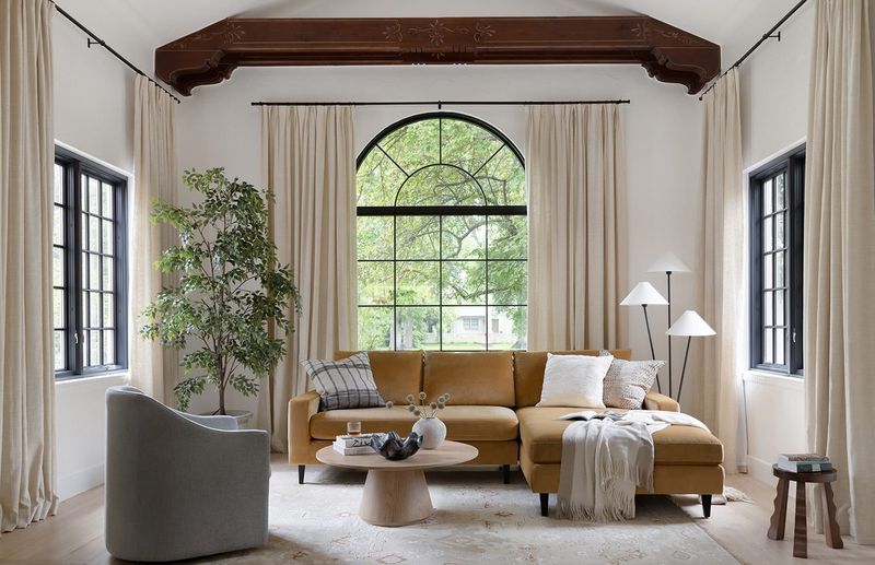
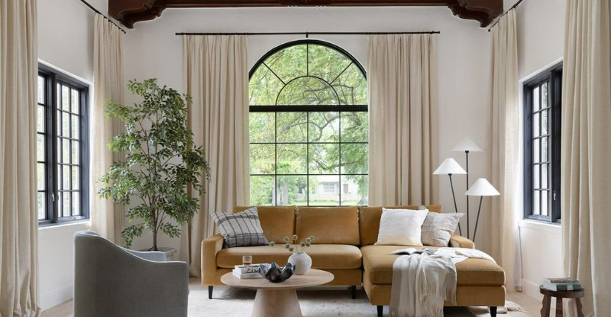
Sunshine is making its way indoors through ochre yellow furniture that instantly energizes living spaces. This golden-yellow hue adds warmth without the intensity of brighter yellows.
You’ll notice how this color creates a focal point without overwhelming the room’s design. It works particularly well in neutral spaces that need a touch of personality and warmth.
Designers are pairing ochre pieces with natural textures like wood and rattan for an earthy, grounded look that feels both fresh and timeless.
9. Gray Is Losing Its Grip
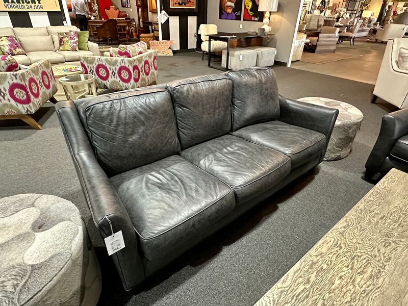
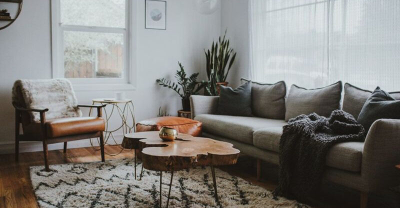
The gray revolution that dominated the 2010s is finally fading. Those gray sofas, chairs, and beds that seemed like safe, versatile choices now read as uninspired and lacking personality in today’s more expressive design landscape.
Homeowners increasingly report feeling cold and disconnected in all-gray spaces. The color that once represented sophistication has become the symbol of playing it too safe.
Even designers who championed gray are now seeking warmer, more nuanced alternatives that bring life to interior spaces.
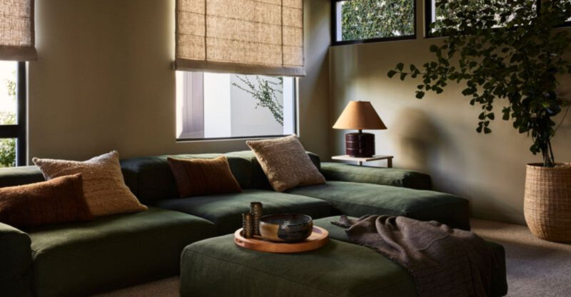
10. Moss Green Grows In Popularity
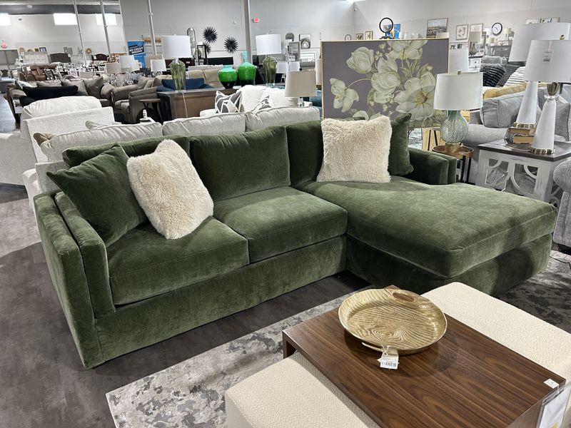
Deeper than sage but still wonderfully natural, moss green furniture creates instant character in any room. This rich, organic shade brings the forest indoors without overwhelming your space.
I’ve seen moss green velvet sofas become the heart of living rooms, drawing everyone in with their inviting depth. The color has enough presence to anchor a room while remaining surprisingly versatile.
Pairing beautifully with brass, wood, and natural textiles, moss green furniture pieces feel both luxurious and connected to nature.
11. Black Furniture Is Fading To Background
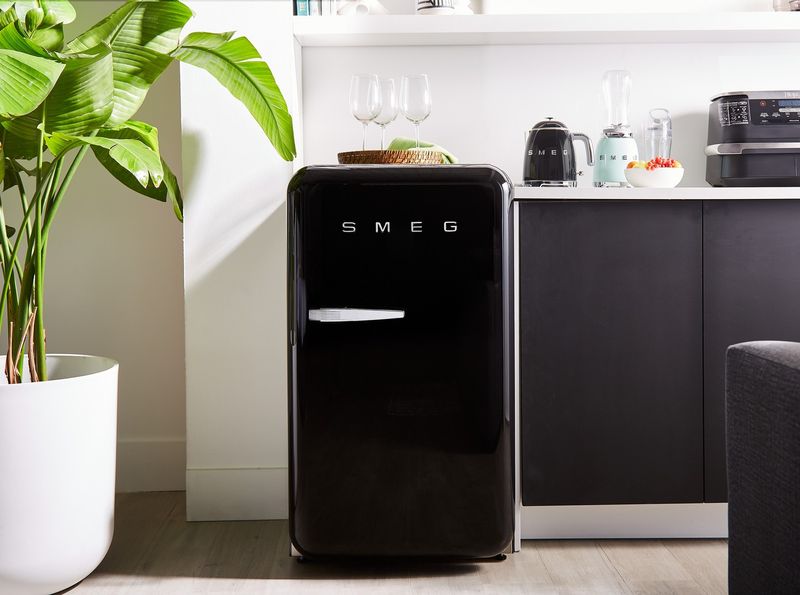
Those sleek black furniture pieces that once seemed sophisticated and timeless are increasingly viewed as heavy and dominating. Black coffee tables, dining sets, and entertainment centers create visual weight that can overwhelm today’s lighter aesthetic preferences.
Many homeowners find black furniture shows dust more obviously than other colors. The harsh contrast it creates with walls and flooring can make spaces feel choppy rather than cohesive.
Even in modern spaces, the severity of black is being replaced by more nuanced dark tones.
12. Blush Pink Remains Delightfully Current
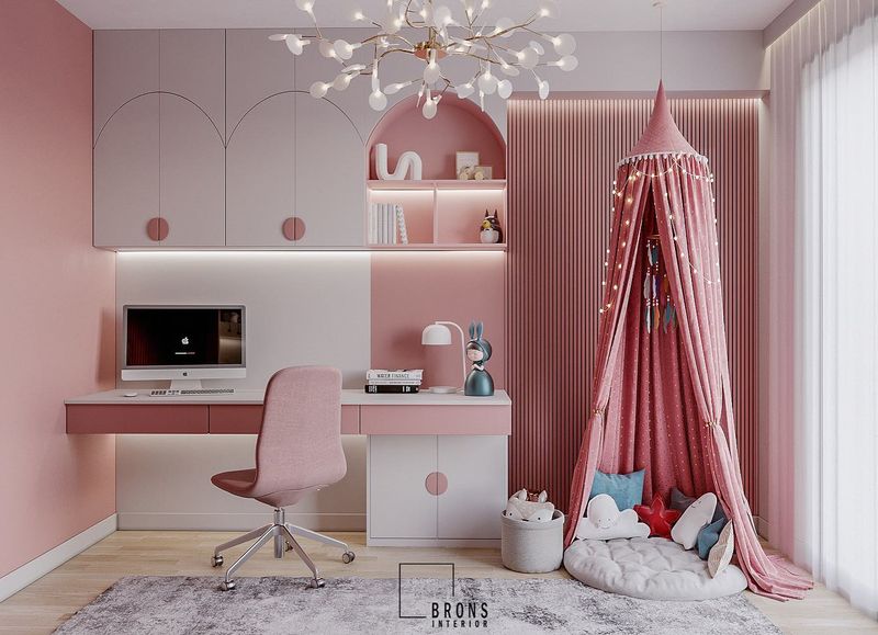
Soft blush pink continues to charm its way into our hearts and homes through statement furniture pieces. Far from being just a feminine color, this versatile hue works as a sophisticated neutral with personality.
You’ll find blush pink sofas and chairs adding warmth without overwhelming a space. The color plays well with both cool and warm palettes, making it surprisingly adaptable.
Designers are pairing blush with natural woods, brass accents, and textured fabrics for a look that feels both fresh and timeless.
13. Espresso Finish Is No Longer Everyone’s Cup Of Tea
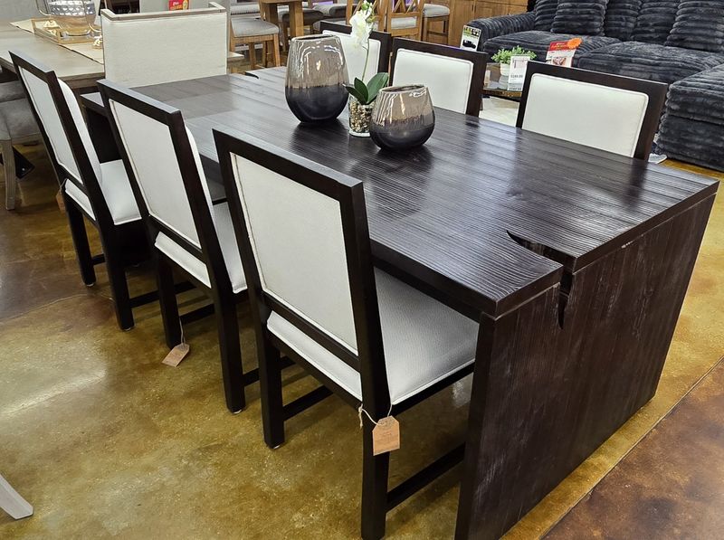
Those dark espresso-stained furniture pieces that dominated the early 2000s are quickly becoming design relics. The heavy, formal appearance of these deep brown items feels at odds with today’s lighter, more casual aesthetic.
Many homeowners note how espresso furniture tends to show dust and scratches more prominently. The color’s popularity in mass-produced furniture has also contributed to its dated feel.
Even traditional spaces are moving toward medium-toned woods that feel less imposing and more versatile.
14. Olive Green Marches Forward
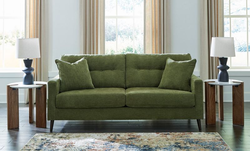
Military inspiration meets sophisticated comfort with olive green furniture taking command of stylish interiors. This understated yet distinctive color brings natural elegance to living spaces without shouting for attention.
I’ve watched olive green transform from a niche choice to a designer favorite for its amazing versatility. It pairs beautifully with everything from brights to neutrals while maintaining its character.
The color’s natural heritage makes it perfect for those seeking furniture that feels grounded yet distinctive in an increasingly digital world.
15. Burgundy Is Bottling Up
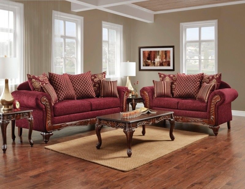
Once the sophisticated choice for traditional homes, burgundy furniture is quickly falling out of favor with designers and homeowners alike. The rich wine-colored sofas and chairs that dominated the 90s now feel heavy and dated.
Many find burgundy’s formal associations too stuffy for today’s more casual living. The color tends to darken spaces and can feel seasonally limited, associated primarily with fall and winter.
Even in traditional settings, lighter, more versatile colors are taking precedence over this once-popular shade.
16. Caramel Leather Looks Delicious
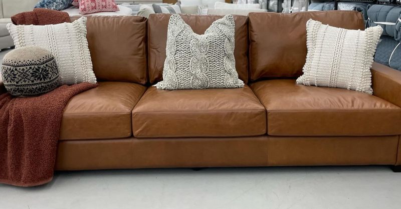
Rich, honeyed caramel leather furniture is experiencing a delightful renaissance in contemporary homes. This warm neutral brings instant sophistication while aging beautifully over time.
You’ll notice how caramel leather develops a gorgeous patina that tells the story of your family’s life. It works across design styles from mid-century modern to contemporary farmhouse.
Designers are embracing this shade for its ability to warm up minimal spaces while providing a timeless quality that fast-fashion furniture colors simply can’t match.
17. Teal Is Taking A Timeout
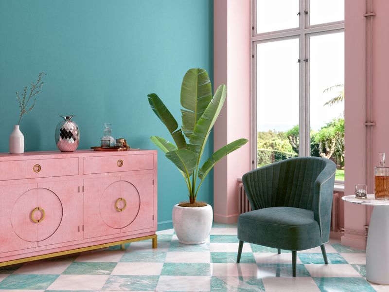
The bold teal furniture that made splashy statements in the 2010s is gradually retreating from the spotlight. This jewel tone that once felt fresh and daring now often reads as dated and overly trendy.
Many homeowners report feeling locked into specific color schemes with teal as a dominant furniture color. The boldness that initially attracted people to teal pieces can quickly become tiresome as design preferences evolve.
Even color enthusiasts are moving toward more subtle, versatile options that offer longevity beyond a specific trend cycle.
18. Rust Orange Rises From The Ashes
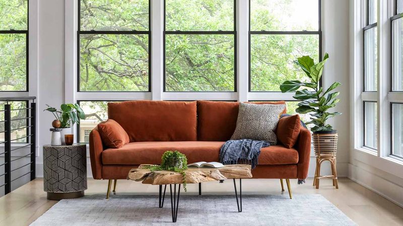
Warmer than terracotta but softer than bright orange, rust-colored furniture brings sophisticated warmth to contemporary interiors. This earthy, spice-inspired hue adds instant character to neutral spaces.
I’ve seen rust orange velvet chairs become conversation starters in otherwise understated rooms. The color has a vintage quality while feeling completely current and fresh.
Designers are pairing rust with cream, navy, or sage green for balanced combinations that feel both timeless and on-trend for the coming years.
19. Purple Is Losing Its Royal Status
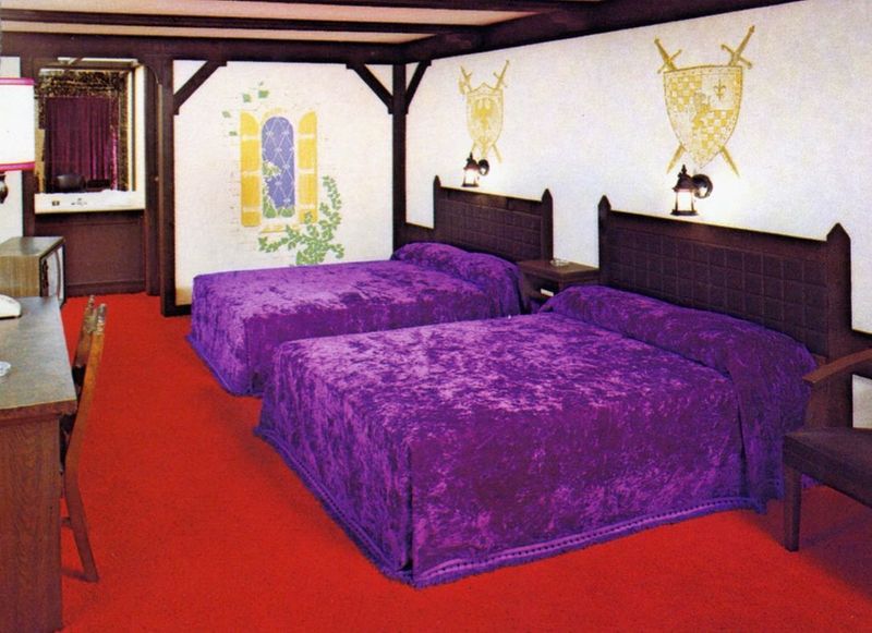
The regal purple furniture that once signaled luxury and creativity is increasingly viewed as a challenging commitment. From eggplant sofas to lavender chairs, purple in all its forms is being replaced by more versatile options.
Many homeowners find purple difficult to integrate into evolving design schemes. The color’s strong personality and specific associations can make it feel like a statement that quickly becomes dated.
Even purple enthusiasts are moving toward more subtle ways to incorporate their favorite color through accessories rather than major furniture pieces.
20. Mustard Yellow Adds Zesty Energy
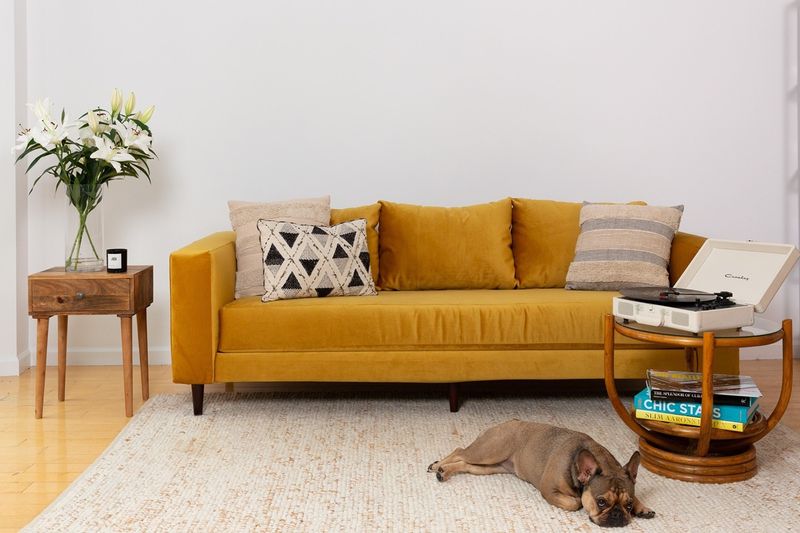
Bringing retro vibes with modern sophistication, mustard yellow furniture energizes spaces without overwhelming them. This rich, slightly muted yellow adds instant personality while remaining surprisingly versatile.
You’ll find mustard pieces creating warm focal points in otherwise neutral rooms. The color brings sunshine year-round and pairs beautifully with blues, greens, and warm neutrals.
Designers are using mustard yellow chairs, sofas, and ottomans to infuse personality into spaces that might otherwise feel too safe or predictable.


