15 Paint Colors In Texas Designers Say Are Officially Out
Texas homes have always been known for their bold style and unique character. But design trends shift quickly, and what looked amazing five years ago might feel tired today.
I’m here to share which paint colors Texas designers are saying goodbye to this year, so you can keep your space looking fresh and modern.
1. Gray Everything
Gray took over every room in Texas for nearly a decade, but designers are ready to move on. Walls, cabinets, and furniture all drowned in shades of gray made homes feel cold and lifeless. I’ve noticed that many people chose gray thinking it was a safe neutral, but it ended up making spaces feel uninviting.
Warmer tones are taking its place now. Beiges, creams, and soft whites create a more welcoming atmosphere. Texas designers recommend swapping gray for colors that bring warmth back into your home and make you actually want to spend time there.
2. Millennial Pink
Remember when dusty rose pink covered every Instagram feed? That soft blush tone felt fresh and modern for a hot minute, but now it screams dated. I saw this color everywhere in Austin and Dallas, from bedrooms to coffee shops.
The problem is that millennial pink became too trendy too fast. It lost its charm when everyone jumped on board. Texas designers now suggest richer, more complex colors that won’t look tired in a year. Think terracotta, sage, or even bold jewel tones that have staying power and personality beyond social media trends.
3. Stark White Walls
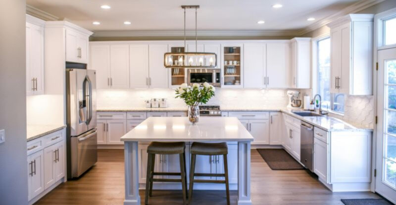
Bright white walls might seem like a clean slate, but they often create a harsh, sterile feeling. I’ve walked into homes that felt more like hospitals than cozy living spaces. The intense brightness can actually strain your eyes and make rooms feel unwelcoming.
Designers across Texas are choosing softer whites with undertones instead. Creamy whites, warm ivories, and whites with hints of yellow or beige add depth without the harshness. These gentler shades still keep rooms bright and airy but feel much more comfortable and lived-in for everyday family life.
4. Accent Wall Obsession
Bold accent walls had their moment, but that moment has passed. Painting one wall a completely different color now feels choppy and disconnected. I remember when everyone thought this was the easiest way to add personality, but it often just broke up the flow of a room.
Texas designers prefer creating cohesion throughout spaces now. Using color strategically through furniture, art, and accessories works better. If you want visual interest, try varying shades of the same color family instead of jarring contrasts that make rooms feel smaller and disjointed.
5. Beige Builder Basic
That flat, lifeless beige that came with your builder-grade home needs to go. I know it seemed safe and inoffensive, but it’s actually just boring. This color doesn’t complement anything and makes spaces feel generic and forgettable.
Modern neutrals have so much more character now. Designers throughout Houston and San Antonio recommend choosing beiges with interesting undertones like greige, taupe with pink hints, or warm sand colors. These updated neutrals still work as backgrounds but add sophistication. Your home deserves better than the cheapest contractor-grade paint that lacks any personality or warmth whatsoever.
6. Navy Blue Overdose
Navy blue became the go-to sophisticated color, but now it’s everywhere. I’ve seen entire homes with navy in nearly every room, which feels heavy and repetitive. What started as a classy alternative to black turned into another overused trend.
The color can make rooms feel smaller and darker, especially in Texas homes without tons of natural light. Designers suggest trying other rich colors like forest green, burgundy, or even chocolate brown for depth. These alternatives provide that same dramatic effect without feeling like you copied every design blog from three years ago.
7. Teal and Turquoise
Bright teal and turquoise had a serious run in Texas bathrooms and bedrooms. These blue-green shades felt beachy and fun initially, but they’ve lost their appeal. I notice they often clash with furniture and make updating decor really difficult.
The problem is these colors are too specific and trendy. They lock you into a particular style that feels dated now. Texas designers recommend softer, more versatile blues or greens instead. Think muted sage, soft sky blue, or even deeper emerald tones that work with various design styles and won’t require a total room makeover next year.
8. Tuscan Yellow Gold
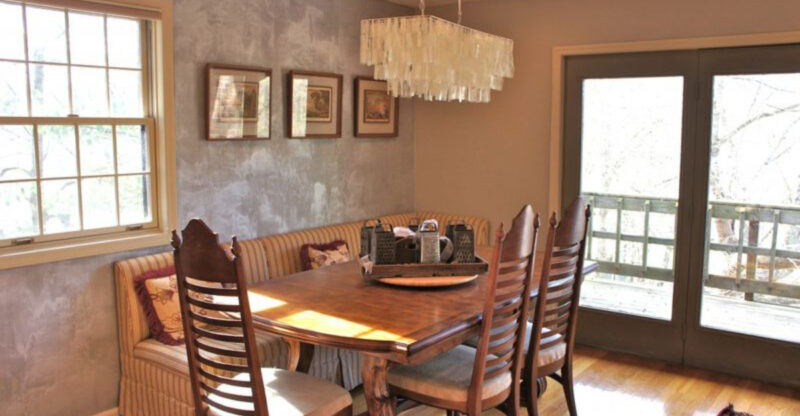
Those warm golden yellows that dominated Texas kitchens in the early 2000s need to retire. I remember when everyone wanted that Tuscan villa vibe, but it now looks incredibly dated. The color often made spaces feel darker rather than sunny and inviting.
This particular shade of yellow has strong brown undertones that can look muddy. Modern kitchens benefit from cleaner, brighter colors or sophisticated neutrals. Texas designers prefer soft whites, light grays with warm undertones, or even pale buttery yellows if you want warmth without the heavy, old-fashioned feel that golden Tuscan shades bring.
9. Chocolate Brown Rooms
Deep chocolate brown walls felt cozy and sophisticated once upon a time. But I’ve found they make rooms feel cave-like and gloomy, especially without perfect lighting. This color absorbs light rather than reflecting it, which is tough in many Texas homes.
Brown is hard to decorate around too. It limits your furniture and accessory choices significantly. Designers now suggest lighter, more complex neutrals that add warmth without the heaviness. Try warm taupes, soft caramels, or even lighter coffee shades if you love brown tones but want something more current and livable for everyday spaces.
10. Red Dining Rooms
Bold red dining rooms were supposed to stimulate appetite and conversation. But honestly, I think they just gave people headaches. The intensity of bright or deep red walls can feel overwhelming, especially in smaller spaces where families gather regularly.
Red is a tricky color that rarely photographs well and can clash with wood tones. Texas designers are moving toward softer, more sophisticated dining room colors now. Consider warm terracotta, soft coral, or even rich burgundy if you want warmth. These alternatives create inviting spaces without the visual assault that bright red walls deliver every single mealtime.
11. Purple Feature Walls
Purple seemed like a fun, unexpected choice for bedrooms and bathrooms. But most purple shades feel juvenile or overly trendy now. I’ve noticed that purple is incredibly difficult to coordinate with other colors and often looks out of place.
Whether it’s lavender, eggplant, or bright violet, purple rarely ages well in home design. It tends to clash with skin tones in bathrooms and makes bedrooms feel less restful. Texas designers recommend sticking with colors that promote calm and work with your existing furniture. Soft blues, gentle greens, or warm neutrals create better foundations for rooms you use daily.
12. Lime Green Accents
Bright lime green had a brief moment as an energetic accent color. But that moment is definitely over. I remember seeing this shade pop up in kids’ rooms and home offices, and it always felt too intense and distracting.
The color is harsh on the eyes and doesn’t pair well with much. It screams early 2000s in the worst way possible. If you want green in your Texas home, designers suggest choosing more sophisticated options. Deep forest greens, soft sage, or muted olive tones bring nature indoors without the cartoon-like brightness that lime green delivers relentlessly.
13. Orange Terracotta Overload
Terracotta came back strong recently, but it’s already becoming overdone. I appreciate the Southwestern vibe, but when every design magazine features the same burnt orange walls, the trend loses its appeal. Too much terracotta can make homes feel one-note and predictable.
The color works beautifully in small doses but overwhelms when used on all walls. Texas designers recommend using terracotta more strategically now through tiles, pottery, or single accent pieces. For walls, consider softer peachy tones or warm neutrals that nod to the trend without committing fully to something that’s already peaking.
14. Black Matte Everything
Matte black walls looked dramatic and moody in design magazines. But in real life, I find they’re impractical and make spaces feel cramped. Black shows every fingerprint, scuff, and imperfection, which is frustrating for busy Texas families.
The color also absorbs natural light, making rooms feel smaller and darker than they are. Unless you have massive windows and perfect lighting, black walls are tough to live with. Designers now prefer lighter, more practical colors that still feel sophisticated. Deep charcoal, navy, or rich brown provide depth without the maintenance nightmare and cave-like atmosphere that black creates.
15. Seafoam Green Bathrooms
Seafoam green bathrooms bring back memories of vintage fixtures and outdated tile. This pale blue-green shade feels stuck in the past rather than fresh and coastal. I’ve seen too many Texas bathrooms where this color made the space feel old and uninviting.
The color doesn’t complement modern fixtures and often clashes with skin tones in mirrors. It’s neither bold enough to make a statement nor neutral enough to work as a background. Texas designers suggest choosing cleaner whites, soft grays, or even spa-like greens with more gray undertones for bathrooms that feel current and relaxing instead of dated.

