7 Paint Shades That Designers Say To Skip, And 5 More That Rarely Work Well
Picking the right paint color can make or break a room. As a designer, I’ve seen homeowners waste time and money on shades that just don’t deliver the magic they promised on those tiny sample cards.
Before you crack open another paint can, let me share which colors design pros avoid at all costs. And, a few more that need perfect conditions to work.
1. Bright Yellow That Screams “Caution Tape”
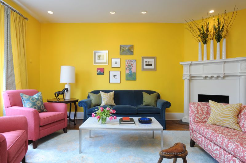
Ever walked into a room and felt instantly anxious? That’s what happens with intense yellow walls. The color literally speeds up metabolism and can make babies cry more often!
Bright yellow might look cheerful on a paint chip, but splashed across four walls, it transforms into an aggressive attention-grabber that’s impossible to ignore. Instead, try buttery or mustard yellows that have brown undertones for warmth without the visual shouting match.
2. Bubblegum Pink That Belongs In Barbie’s Dreamhouse
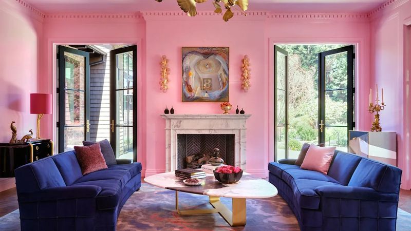
How quickly a cute pink turns into a saccharine nightmare! That bubblegum shade might seem fun and playful at first glance, but living with it feels like being trapped inside cotton candy.
Bubblegum pink creates rooms that feel juvenile and dated faster than you can say “millennial pink.” When clients insist on pink, I guide them toward dusty rose, mauve, or blush tones that bring warmth without the kindergarten vibes.
These sophisticated alternatives actually complement other colors rather than fighting them.
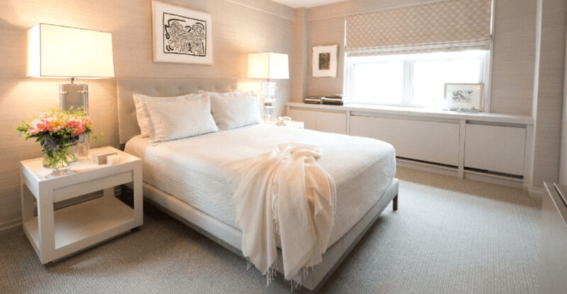
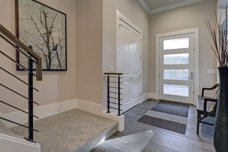
3. Builder Beige That Screams “I Gave Up”
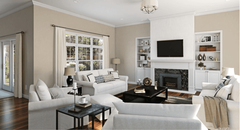
Where personality goes to die! That flat, uninspired beige found in rental apartments and flip houses tells visitors you’ve completely surrendered to blandness.
Builder beige earned its terrible reputation by being neither here nor there, not warm enough to feel cozy, not cool enough to feel modern.
The worst part? It makes everything look dirty over time. For neutral lovers, greige (gray-beige hybrids), warm taupes, or soft whites offer much more sophistication and flexibility without the institutional feel.
4. Fire Engine Red That Turns Rooms Into Infernos
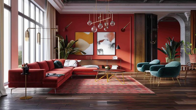
Though dramatic on a feature wall, bright red covering an entire room creates a space where relaxation goes to die. Your blood pressure rises just looking at it!
Fire engine red might seem bold and passionate, but it’s physically exhausting to be surrounded by. The color literally increases heart rate and creates feelings of alarm, not exactly what most people want for their living spaces.
When clients crave red, I suggest burgundy, terracotta, or rust tones that provide warmth without the visual assault.
5. Brown That Mimics Something Unmentionable
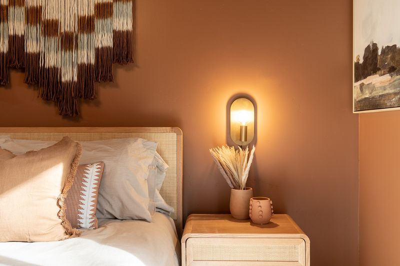
If you’ve ever wondered why certain brown paints make people uncomfortable, trust your instincts. Some muddy brown shades resemble things we’d rather not be reminded of while eating dinner.
Brown can be rich and gorgeous in the right tone, but those murky, yellowish-browns create spaces that feel perpetually dirty. The worst offenders make even beautiful furniture look dingy.
For brown lovers, choose walnut, chocolate, or coffee tones with red or purple undertones instead of those with yellow or green bases.
6. Fluorescent Green That Belongs In A Highlighter
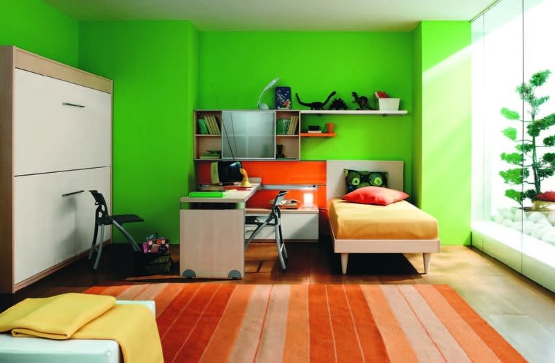
Did someone say alien laboratory? Those electric lime greens might work for sports equipment, but on walls, they create spaces where calm thoughts go to disappear.
Fluorescent green reflects on skin tones in the most unflattering ways possible, making everyone look slightly ill. Even worse, it competes with absolutely everything else in the room.
If you’re craving that green energy, choose sage, olive, or emerald tones that bring nature indoors without the radioactive glow.
7. Peach That Makes Everyone Look Jaundiced
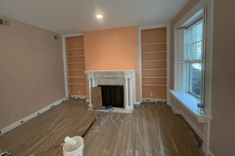
Though trendy in the 80s, peach paint creates the perfect storm of unflattering light reflection. Standing in a peach room makes everyone look like they need medical attention!
Peach walls cast that sickly orange glow onto everything, skin, furniture, artwork, you name it. The color has a way of making even expensive furnishings look cheap.
If you’re drawn to warm, soft colors, consider terracotta, apricot with brown undertones, or muted coral instead for warmth without the unflattering effect.
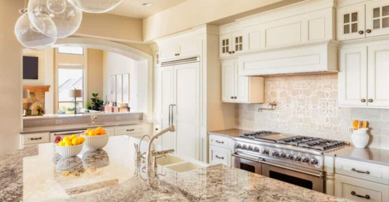
8. Pure White That Shows Every Fingerprint
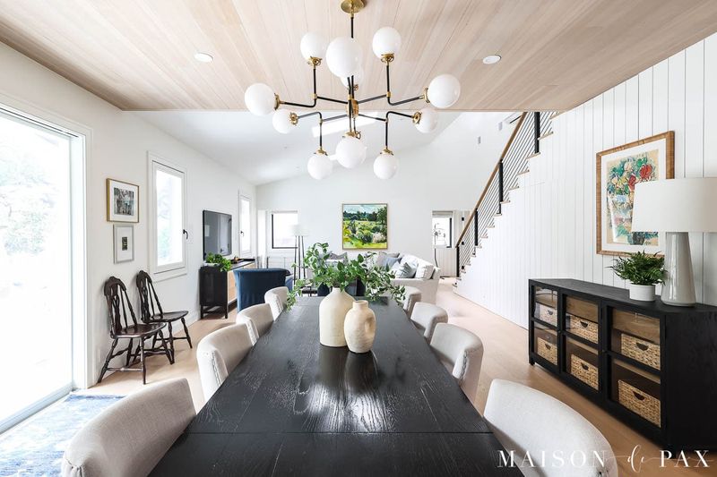
While designers love white, stark pure white walls quickly become maintenance nightmares. Every scuff, smudge, and fingerprint stands out like a crime scene!
Pure whites look stunning in magazines but brutal in real homes with actual humans. They also create harsh, clinical environments that feel cold rather than clean.
For white lovers, I suggest off-whites with subtle undertones. Cream, ivory, or whites with hints of gray that hide imperfections while still creating that bright, airy feeling.
9. Navy Blue In Small Spaces
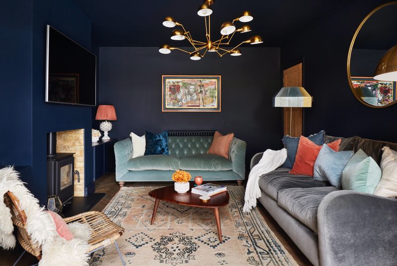
Though gorgeous in large, well-lit rooms, navy blue can turn small spaces into depressing caves. Without abundant natural light, navy walls seem to creep inward, making rooms feel tiny and claustrophobic.
Navy blue absorbs light rather than reflecting it, which is problematic in already-limited spaces. The depth can be dramatic and sophisticated, but only when the room has enough square footage and windows to handle it.
For smaller spaces craving blue, consider slate blue, colonial blue, or medium blue-grays instead.
10. Mustard Yellow In Bedrooms
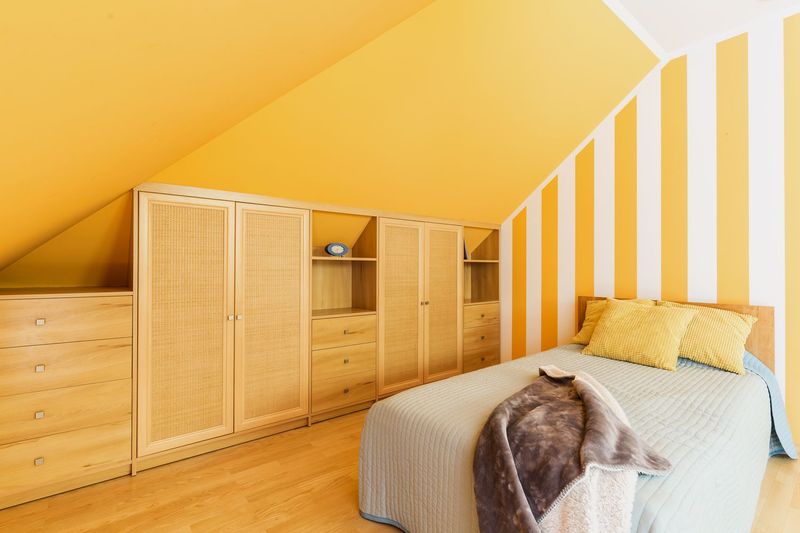
Are sleep and relaxation overrated? That might be the question when someone chooses mustard yellow for bedroom walls. This color energizes rather than calms, exactly what you don’t want where you sleep.
Mustard yellow contains significant amounts of red undertones, which stimulate the brain and increase alertness. While great for productivity zones, it’s counterproductive in spaces designed for rest.
Consider pale buttery tones, soft wheat, or creamy yellows with white undertones that won’t fight against your circadian rhythm.
11. Mint Green In Dining Areas
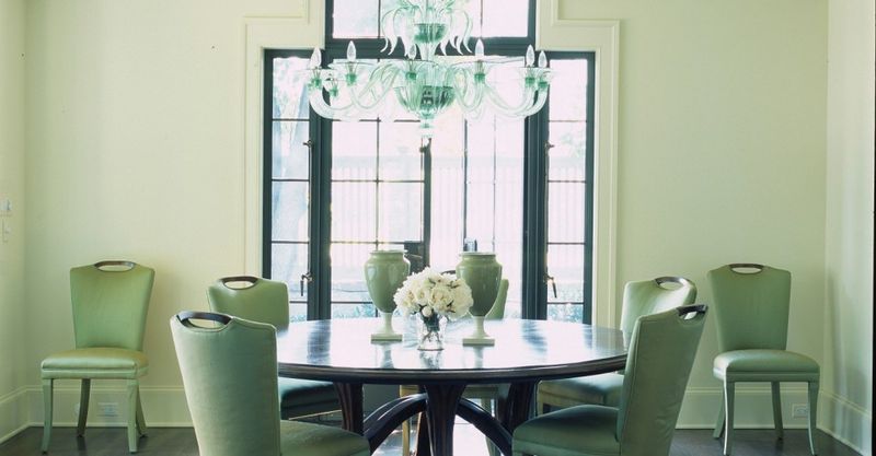
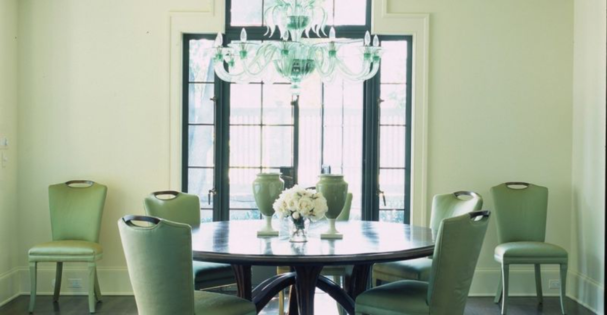
Though refreshing in small doses, mint green walls can turn dining experiences into appetite-suppressing events. Food simply doesn’t look appetizing when reflected against minty walls.
Mint green casts a cool tone that makes food (especially warm-toned dishes like pasta, meat, and bread) look unappetizing. The color also tends to make white plates disappear visually.
For those wanting green dining spaces, olive, sage, or forest greens create much more flattering backgrounds that actually enhance the dining experience.
12. Purple That Feels Like A Teen Bedroom
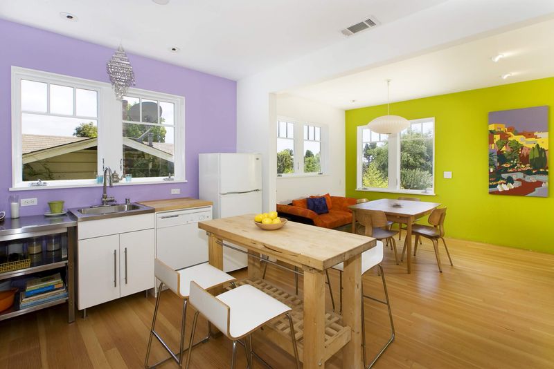
When clients request purple, I approach with caution. Middle-range purples often read as juvenile, regardless of how sophisticated the furniture might be.
Purple presents a unique challenge, too bright and it screams “tween bedroom,” too muted and it can look dirty. The sweet spot exists in either very pale lavenders that read as neutrals or deep, rich eggplants that feel luxurious.
Those middle-range purples, however, consistently disappoint in adult spaces regardless of how they’re styled.

