6 Popular Paint Colors That Could Look Dated In 2026
Paint colors trend like fashion what’s fresh today can feel outdated tomorrow. As we approach 2026, some popular shades are starting to show their age and may not stand the test of time.
While personal taste always matters, keep in mind that these trends can shift quickly, so choose colors thoughtfully if you want your home to stay stylish for years.
1. Beige: The Neutral That’s Losing Its Appeal
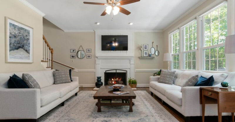
Once the go-to color for homeowners seeking a safe, inoffensive backdrop, beige is increasingly viewed as the hallmark of dated design. Interior designers are moving away from these warm neutrals in favor of cleaner, crisper alternatives.
The problem with beige isn’t just its ubiquity it’s how it can make spaces feel stuffy and uninspired. Many newer homes are embracing either true whites or more saturated, personality-filled colors instead.
If you’re still fond of neutral walls, consider shifting toward greige (gray-beige hybrids), soft whites, or even pale sage tones. These alternatives provide the same versatility without the early-2000s connotations that plain beige increasingly carries.
2. Olive Green: From Trendy to Tired
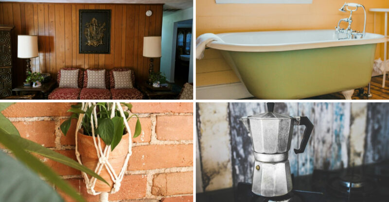
Remember when olive green walls felt so sophisticated and earthy? This military-inspired shade exploded in popularity during the 2010s, appearing everywhere from accent walls to entire living rooms. However, its moment in the spotlight appears to be fading fast.
Designers note that olive’s muddy undertones often make spaces feel smaller and darker than they actually are. The color also strongly evokes specific design eras, making it quickly identifiable as belonging to a particular time period.
Are you still drawn to green walls? Fortunately, there are plenty of alternatives. Sage, mint, and emerald greens offer similar natural vibes without the time-stamp effect that olive increasingly carries.
3. Harvest Gold: The Retro Shade Making an Unwelcome Comeback
Though harvest gold experienced a brief nostalgic revival, this throwback to 1970s appliances and bathrooms is already showing signs of retreat. The yellow-orange tone initially returned as part of the vintage design wave, but its staying power seems limited.
What makes harvest gold particularly vulnerable to dating is its distinctive character. Unlike true neutrals that can adapt to changing decor, this color immediately evokes specific historical associations that are difficult to escape.
Did you jump on the harvest gold bandwagon? Consider transitioning to more timeless alternatives like warm terracottas or sophisticated ochres if you still love that sunbaked color family. These related hues offer warmth without the specific vintage baggage.
4. Peach: The Sweet Shade Turning Sour
Peach enjoyed a massive resurgence in recent years as part of the larger pastel revival. Its warm, flattering glow made it a darling of social media and design magazines alike. Yet this candy-colored trend is already showing signs of oversaturation.
The problem with peach lies in its specificity and recognizability. When future homeowners see peach walls, they’ll immediately think “early 2020s” not exactly the timeless look most people aim for when painting.
If you’ve fallen for peach’s warm embrace, consider pivoting to more enduring alternatives like soft terracotta or subtle blush tones. These related colors offer similar warmth and flattering qualities without being quite so firmly anchored to our current moment in design history.
5. Pastel Blue: The Baby Shade Growing Old
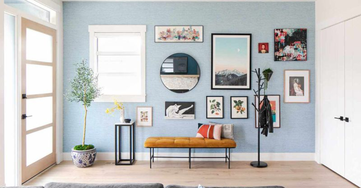
Soft, powder blue walls have cycled in and out of fashion for decades. Their most recent popularity surge came with the cottagecore and coastal grandmother aesthetics. However, design forecasters predict this sweet shade will soon feel as dated as baby nurseries from the 1980s.
Where pastel blue goes wrong is in its lack of depth and sophistication. The color often reads as timid rather than intentional, and its associations with nurseries and outdated bathrooms are hard to shake.
Looking for alternatives? Navy, slate blue, and even teal offer the serenity of blue with more staying power. These deeper, more complex blues feel intentional rather than default, and they’re less likely to scream “this room was painted in 2023!” to future visitors.
6. Taupe: The Compromise Color Nobody Wants Anymore
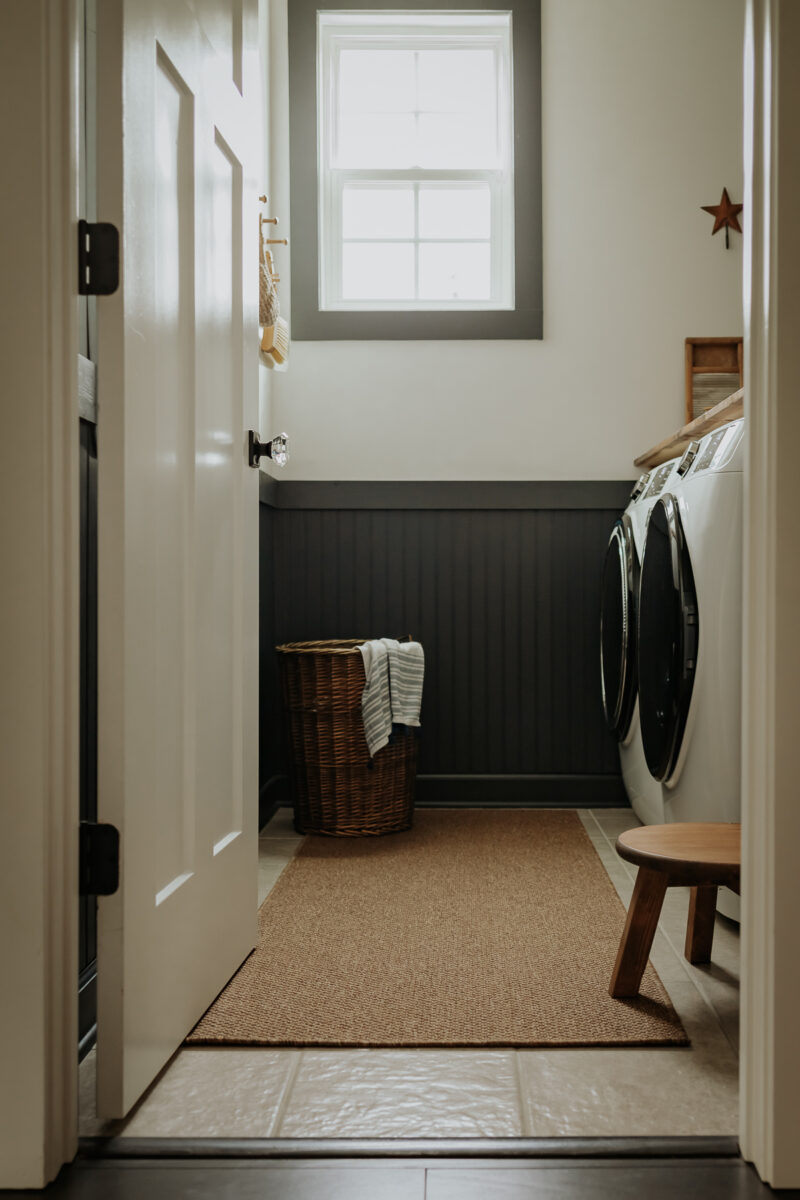
Taupe rose to prominence as the perfect middle ground between beige and gray not too warm, not too cool. This diplomatic approach to color made it wildly popular in the 2010s, but its middle-of-the-road nature is precisely what’s pushing it toward dated territory.
The fundamental issue with taupe is its indecisiveness. Rather than making a statement, it often reads as a compromise that pleases nobody. Many homeowners are now embracing either warmer or cooler tones instead of this ambiguous in-between.
If you’re currently living with taupe walls, consider moving toward either end of the spectrum either embrace the warmth with true beiges and browns or commit to the coolness with authentic grays. Either direction offers more clarity and intention than the increasingly dated middle ground.
