Portland Designers Share 6 Kitchen Features To Avoid And 6 That Instantly Elevate The Look
Portland’s top kitchen designers know what makes or breaks a beautiful cooking space. They’ve seen every trend come and go, from the good to the downright ugly.
Whether you’re planning a full renovation or just want to freshen up your kitchen’s appearance, knowing which features to embrace and which to avoid can save you from costly mistakes.
Here’s what Portland’s design experts recommend for creating a stunning, timeless kitchen.
1. Busy granite countertops (avoid)
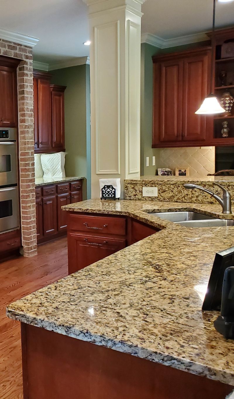
Remember those speckled, multi-colored granite countertops that dominated kitchens in the early 2000s? Portland designers unanimously agree it’s time to say goodbye. These visually overwhelming surfaces create chaos rather than calm in your kitchen space.
The problem isn’t granite itself, but those particular patterns with gold, brown, and black specks competing for attention. They clash with practically everything and make your kitchen feel dated instantly. Plus, they limit your design flexibility for years to come.
Instead, consider solid-colored quartz or subtle veined marble-look surfaces that provide a clean backdrop for your kitchen activities. Your eyes (and future home buyers) will thank you for choosing a more restful countertop option.
2. Overly ornate cabinet molding (avoid)
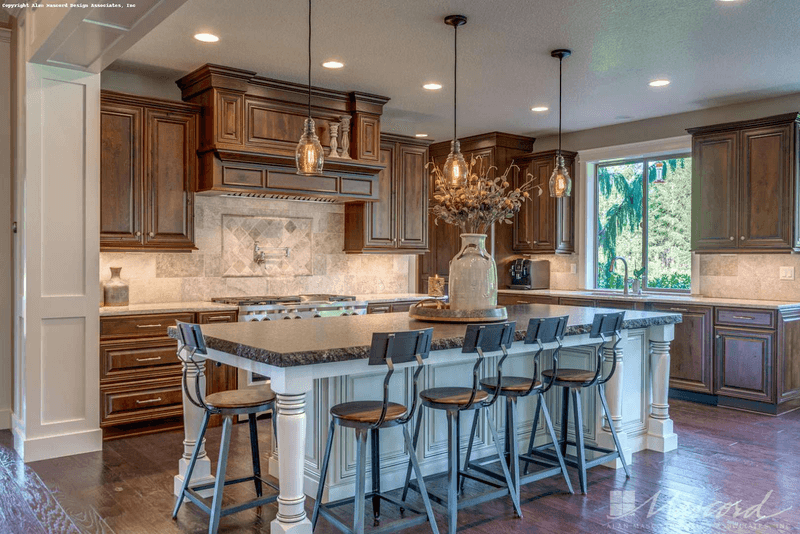
Gone are the days when intricate crown molding and ornate cabinet details signaled luxury in a kitchen. Those fussy scrollwork details and elaborate cabinet doors collect grease and dust while making your kitchen feel like a stuffy Victorian parlor.
Portland designers point out that these decorative elements feel distinctly outdated in today’s homes. They create visual weight that makes kitchens feel smaller and more cramped than they actually are. Cleaning those detailed crevices becomes a nightmare too!
Modern kitchen design favors clean lines and simpler profiles that create an airier, more spacious feeling. Your kitchen should feel like a functional, contemporary space rather than a museum of decorative woodwork from centuries past.
3. Fluorescent overhead lighting (avoid)
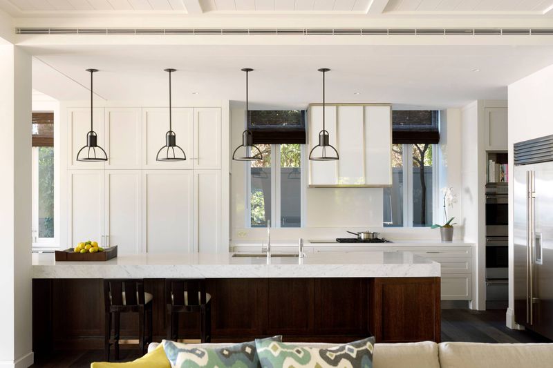
If you’ve ever noticed how everyone looks sickly under harsh fluorescent lights, you understand why Portland designers cringe at these fixtures. That cold, bluish glow does nothing for your complexion—or your food!
Fluorescent lighting casts unflattering shadows, makes colors appear washed out, and creates an institutional feeling more suited to office buildings than homes. The subtle buzzing noise these fixtures often develop drives many homeowners crazy too.
Warm, layered lighting transforms how your kitchen feels. Designers recommend replacing fluorescent panels with recessed lighting for general illumination, then adding under-cabinet lights for task areas and decorative pendants for style. This lighting approach makes both your kitchen and its occupants look infinitely better.
4. Glossy, outdated backsplashes (avoid)
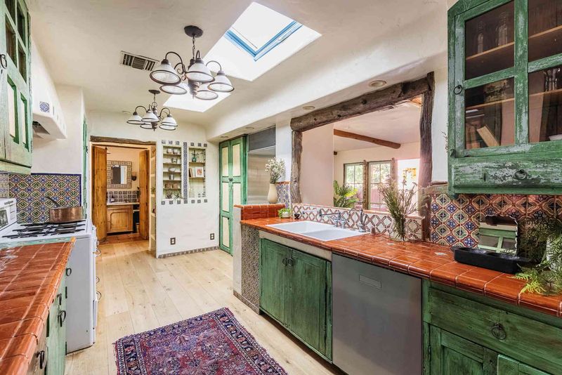
Those shiny 4×4 ceramic tiles with painted fruit motifs or busy decorative inserts? Portland designers say they instantly date your kitchen to the 1990s. Highly glossy backsplashes with contrasting grout lines create visual chaos that fights with everything else in your kitchen.
Another dated backsplash mistake is the diagonal installation pattern, especially when paired with decorative accent tiles randomly scattered throughout. This approach looks busy and creates a dizzying effect that designers warn against.
Today’s kitchens benefit from simpler, more cohesive backsplash treatments. Think larger format tiles, subtle textures, or continuous materials that create a sophisticated backdrop rather than competing for attention. Your backsplash should complement your countertops and cabinets, not fight them for visual dominance.
5. Bulky built-in microwaves (avoid)
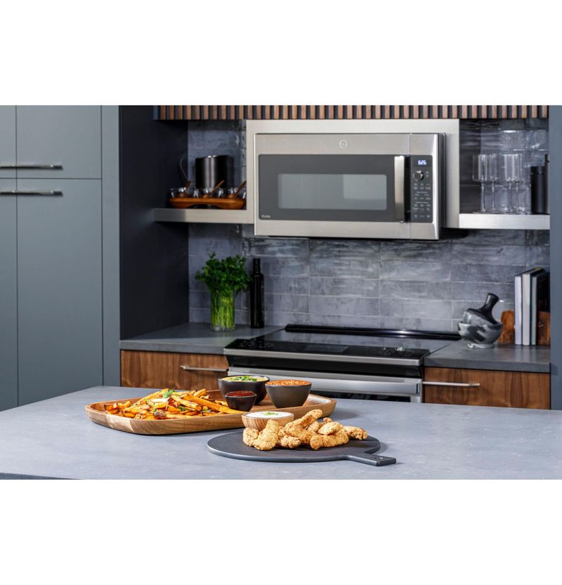
Have you noticed how those massive microwave-hood combinations above stoves create an instant eyesore? Portland kitchen designers point to these bulky appliances as major design mistakes that visually weigh down your kitchen.
These oversized units create a top-heavy appearance that disrupts the clean lines of modern kitchens. Their awkward height also makes them dangerous for shorter people who must reach up over a hot stove to retrieve heated items.
Forward-thinking designers recommend relocating microwaves to below-counter positions or integrating them into cabinetry for a sleeker look. This approach not only creates a more balanced visual appearance but also improves functionality and safety. Your kitchen instantly looks more custom and thoughtfully designed without that massive microwave commanding attention.
6. Mismatched hardware finishes (avoid)
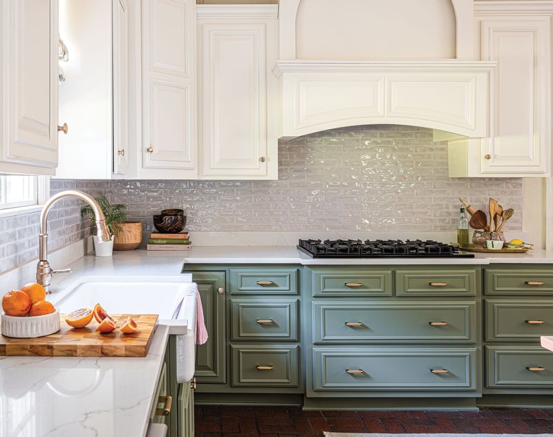
Walking into a kitchen with brass cabinet pulls, stainless appliances, chrome faucets, and bronze light fixtures creates instant visual confusion. Portland designers cite this mixing of metal finishes as a common mistake that makes kitchens feel unplanned and disjointed.
When every metal element speaks a different design language, your eye doesn’t know where to rest. This chaotic approach makes even expensive kitchens look like they were assembled piecemeal over time rather than thoughtfully designed.
Aim for consistency with two complementary metal finishes at most. For instance, matte black hardware pairs beautifully with brass lighting, or brushed nickel works well with chrome. This coordinated approach creates a cohesive, intentional look that elevates your kitchen’s overall appearance without requiring a complete renovation.
7. Matte black fixtures (elevate)
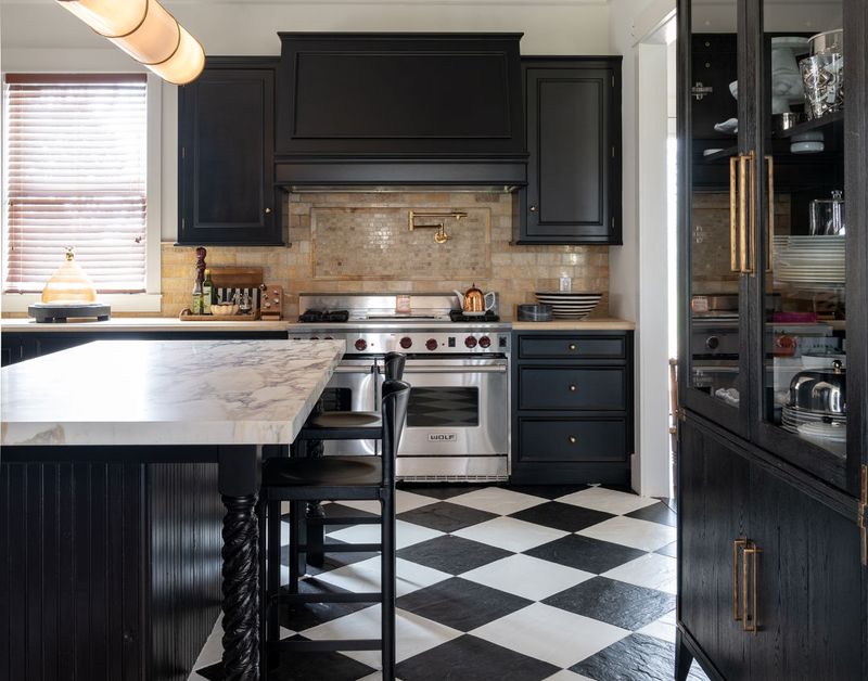
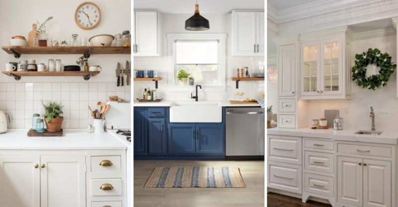
Matte black faucets, cabinet pulls, and lighting create instant drama in kitchens that feel too bland or basic. Portland designers love how these sophisticated fixtures add definition and architectural interest without overwhelming the space.
Unlike trendy finishes that quickly look dated, matte black has proven its staying power. It pairs beautifully with virtually any cabinet color, from crisp white to natural wood tones. The non-reflective surface also hides water spots and fingerprints better than chrome or nickel.
For maximum impact, use matte black consistently throughout your kitchen—faucet, cabinet hardware, lighting, and even appliances if budget allows. This creates a cohesive, intentional look that feels both modern and timeless. Even in a simple kitchen, these striking dark accents add a designer touch that elevates the entire space.
8. Open shelving with clean styling (elevate)
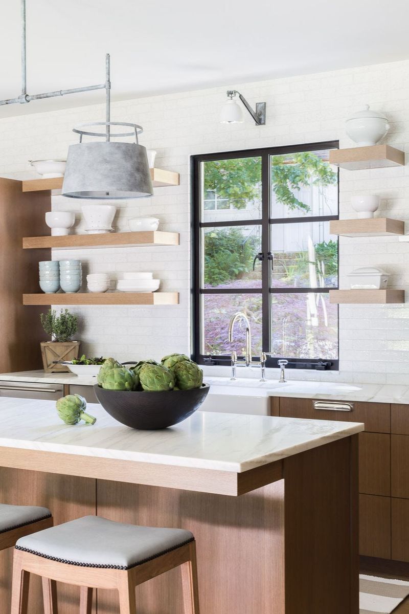
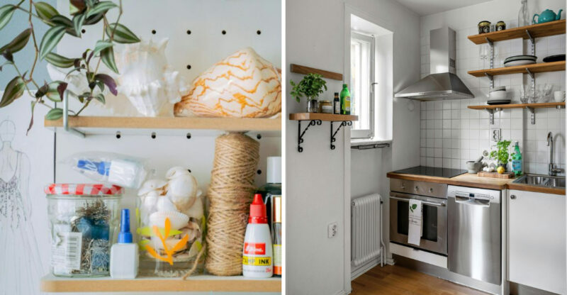
Strategic open shelving transforms ordinary kitchens into magazine-worthy spaces when done right. Portland designers recommend replacing a few upper cabinets—not all—with simple floating shelves to create breathing room in visually heavy kitchens.
The key is restraint in styling. Limit displayed items to those with beautiful forms and consistent color palettes. White ceramics, clear glassware, and wooden cutting boards create a cohesive look that feels intentional rather than cluttered.
For maximum impact, install open shelves on a focal wall, perhaps flanking a window or range hood. This approach creates an opportunity to showcase personality while maintaining functionality. Even budget kitchens look instantly more custom and thoughtfully designed with this simple modification that combines practicality with visual interest.
9. Subtle, textured tile backsplashes (elevate)
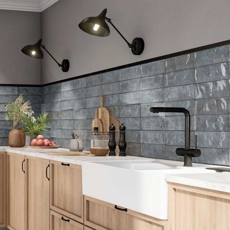
Handmade-look ceramic tiles with slight imperfections and dimensional surfaces create magic in kitchens. Portland designers love how these subtle textures catch light throughout the day, adding visual depth without overwhelming the space.
Unlike flat, machine-perfect tiles, these artisanal-inspired options create movement and interest. Think zellige tiles with their characteristic variations, subtle relief patterns, or elongated subway tiles with a handcrafted appearance. Their slight irregularities make them feel special and custom.
For maximum impact, designers recommend keeping the color relatively neutral while letting texture do the heavy lifting. Soft whites, pale greens, or muted blues in these textured formats create sophisticated backdrops that elevate everything around them. This approach works in virtually any kitchen style, from modern farmhouse to sleek contemporary.
10. Integrated range hoods (elevate)
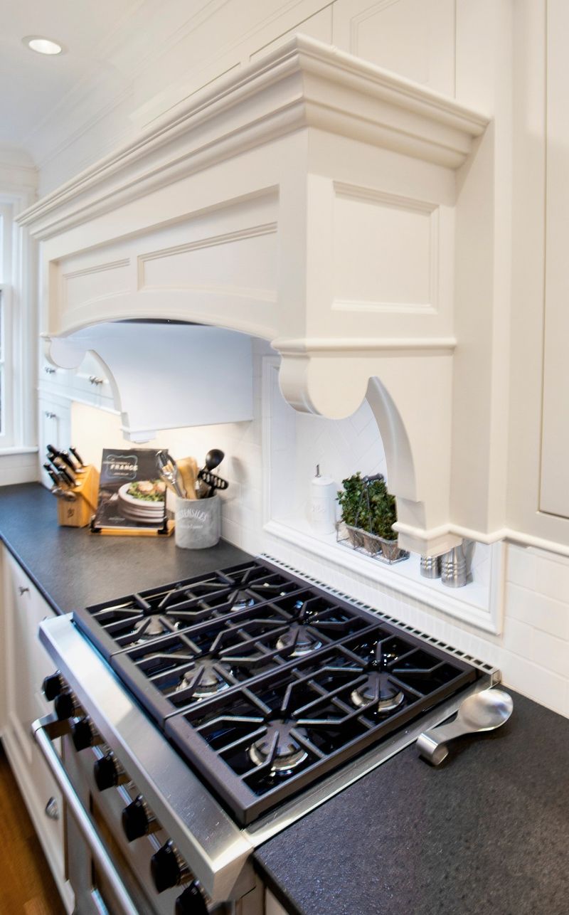
Custom-built range hood surrounds transform basic ventilation into architectural statements. Portland designers point to these integrated elements as game-changers that instantly elevate kitchen designs from ordinary to extraordinary.
Unlike standard stainless steel hoods that call attention to themselves, integrated designs blend seamlessly with surrounding cabinetry or architectural features. They might be wrapped in the same material as your cabinets, covered in plaster for an old-world feel, or framed with wooden details that coordinate with other elements.
The magic happens when these hoods become intentional focal points rather than necessary eyesores. They create visual anchors that draw the eye exactly where you want it, establishing hierarchy and purpose in the kitchen layout. Even modest kitchens gain custom character through this thoughtful approach to what’s typically an overlooked utilitarian element.
11. Light wood cabinetry (elevate)
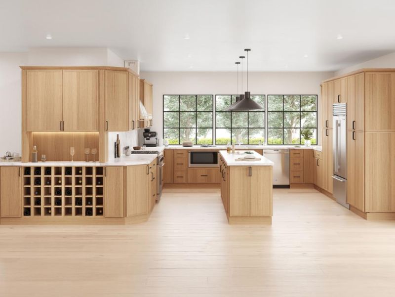
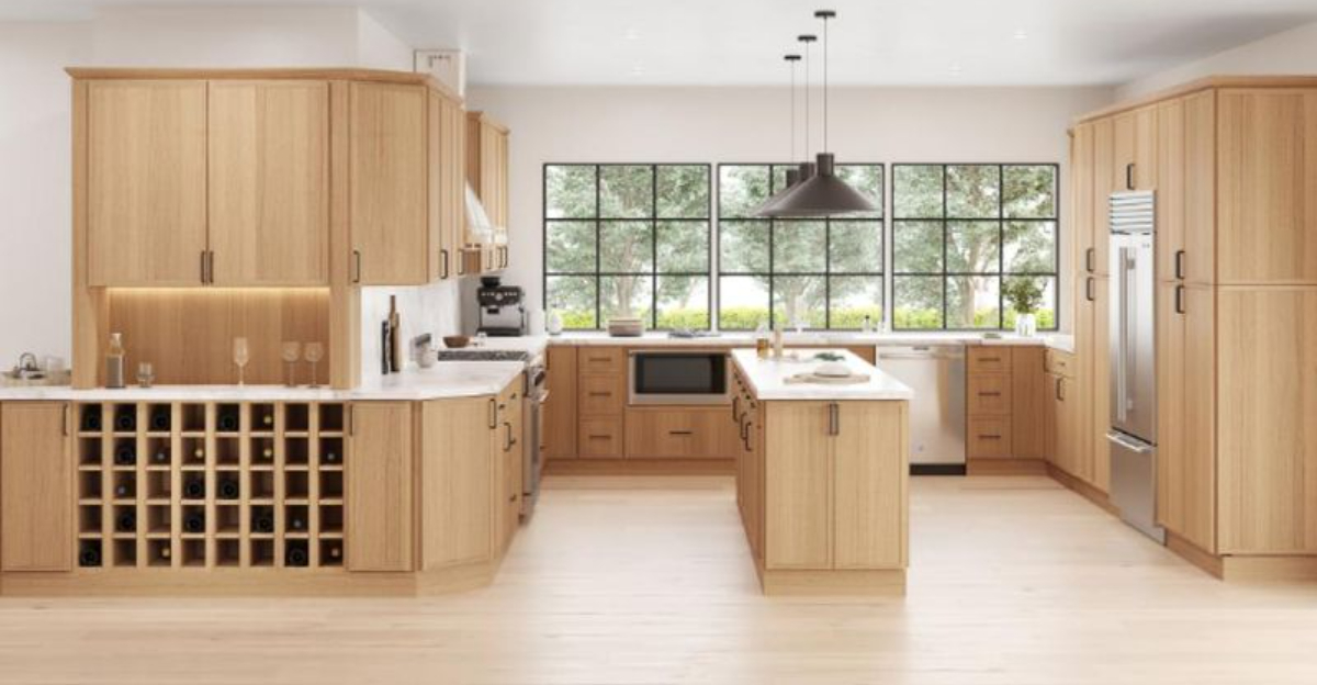
Natural white oak, maple, and ash cabinetry have replaced darker woods in Portland’s most admired kitchens. These lighter woods bring warmth without heaviness, creating spaces that feel both cozy and spacious.
What makes these cabinets so special is their ability to bridge different design styles. They work equally well in modern, Scandinavian-inspired spaces and more traditional settings. The visible wood grain adds natural texture and character that painted cabinets simply can’t match.
Designers particularly love how these lighter woods reflect natural light, brightening kitchens that might otherwise feel cave-like. For maximum impact, consider cabinets with minimal detailing and simple hardware that lets the beautiful wood take center stage. This approach creates timeless appeal that won’t look dated in five years, unlike trendy cabinet colors that quickly reveal their age.
12. Statement pendant lighting (elevate)
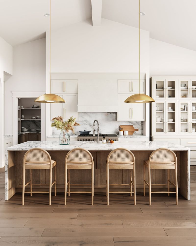
Oversized or architecturally interesting pendant lights create instant personality in kitchens. Portland designers frequently use these eye-catching fixtures to transform otherwise simple spaces into memorable ones.
The right pendants function as jewelry for your kitchen they add character, define zones, and create visual interest at varying heights. Look for fixtures with interesting shapes, materials with beautiful patina, or unexpected scales that command attention without overwhelming the space.
For maximum impact, designers suggest hanging pendants over islands or dining areas where they won’t interfere with sightlines or workspace. The best choices relate to other elements in your kitchen while still standing out as special. Even in budget renovations, splurging on distinctive lighting delivers significant design impact per dollar spent, instantly elevating the entire room’s appearance.

